|
| Group |
Round |
C/R |
Comment |
Date |
Image |
| 39 |
Nov 23 |
Reply |
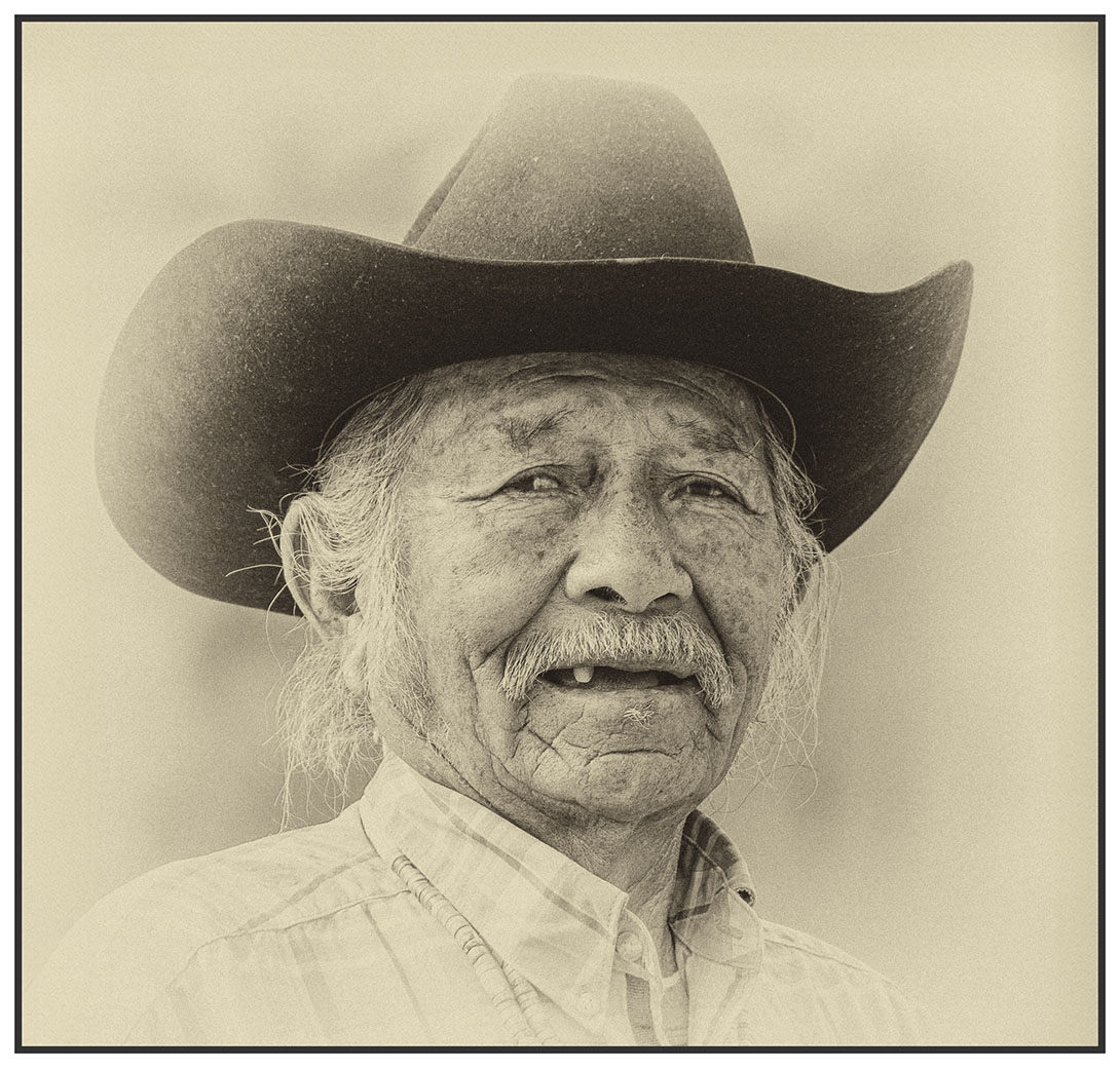
Thanks, Dave. I submitted it to ACCC several years ago, It didn't do well. I have always loved this photo and with my new understanding of monochrome, decided to try it again. When I joined the Group I sent it to you and asked for your input as to why it didn't do well. I held it for 18 months and just reprocessed. |
Nov 15th |
| 39 |
Nov 23 |
Comment |
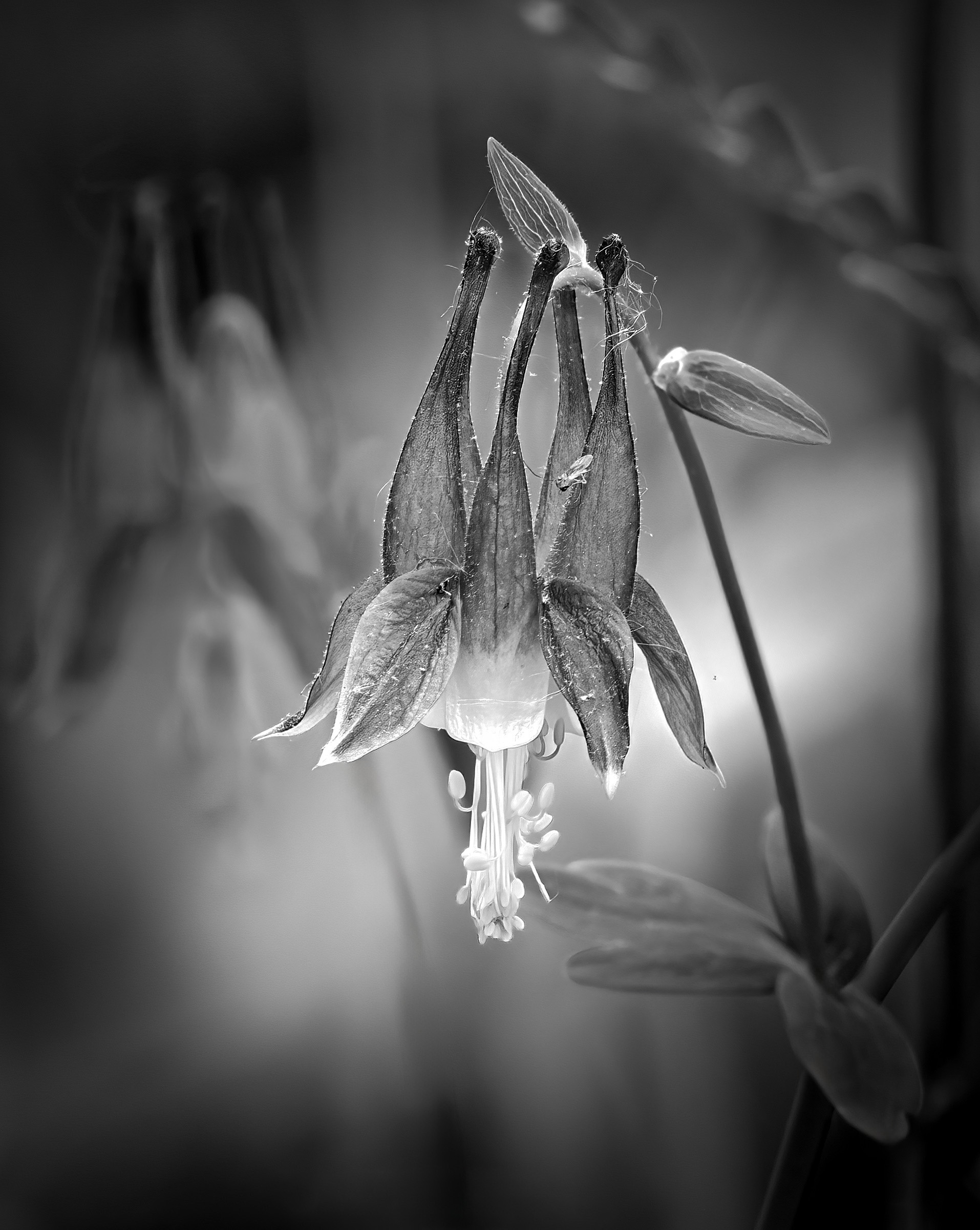
This is a striking photo of the Columbine. I like how the light is on it. I found the white spots a bit distracting, so using the remove tool, I removed them. Them I blurred the flower on the left a bit and applied a vignette. Sorry, I have no experience with HDR but I like how the flower "pops" now. |
Nov 15th |
 |
| 39 |
Nov 23 |
Comment |
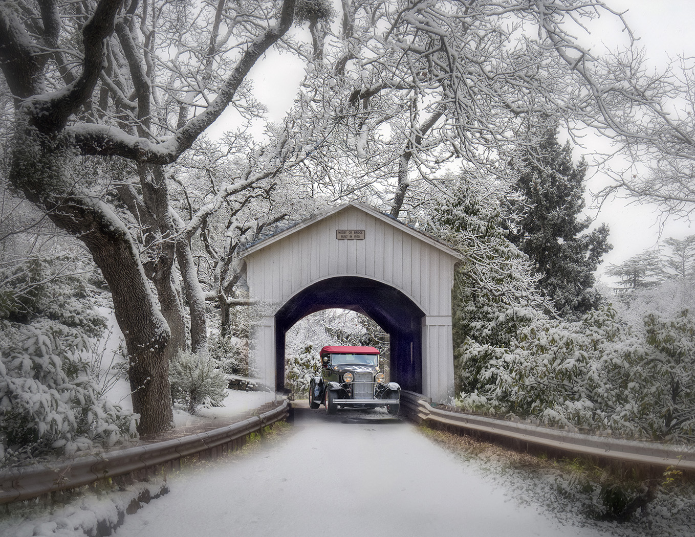
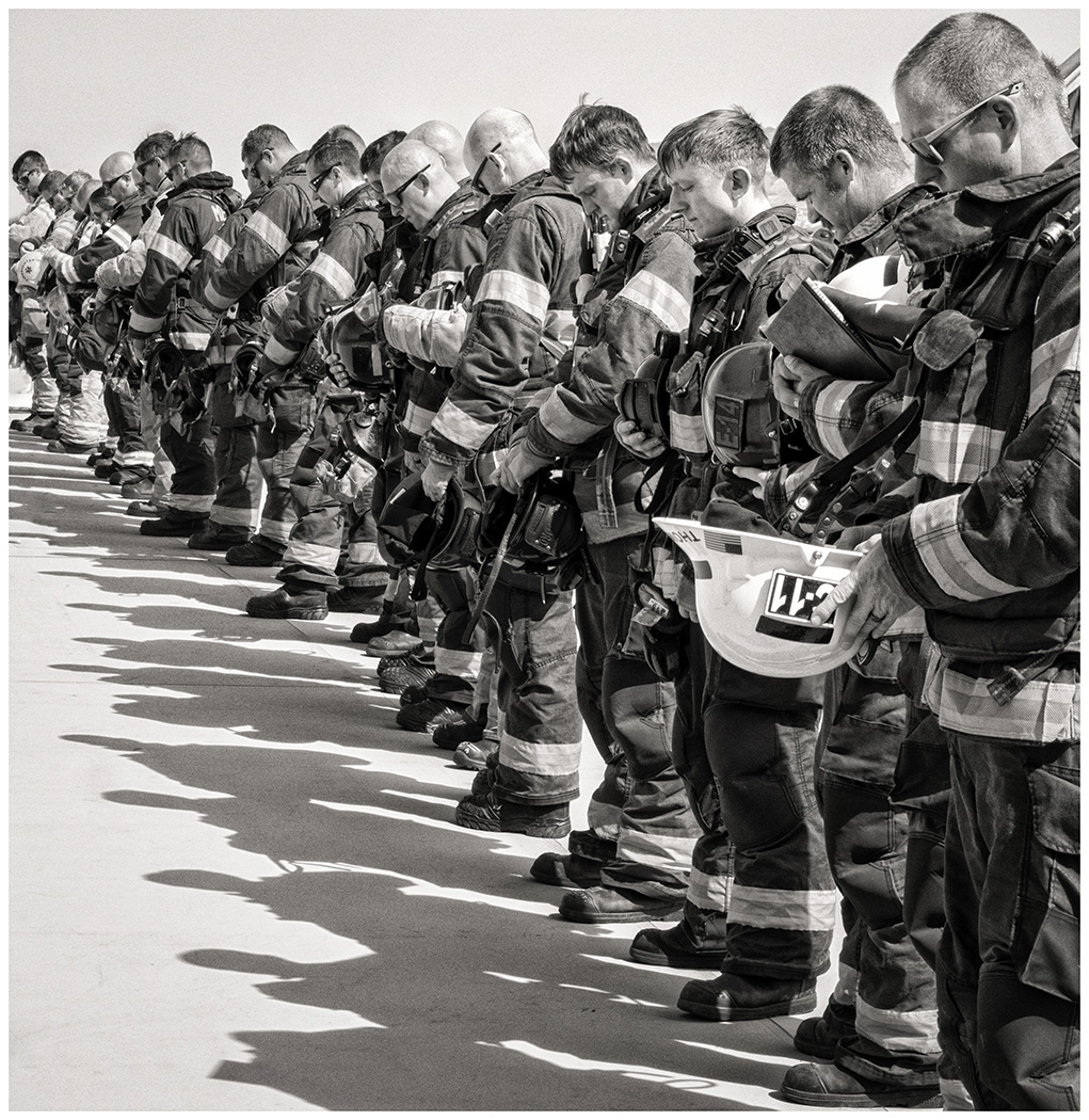
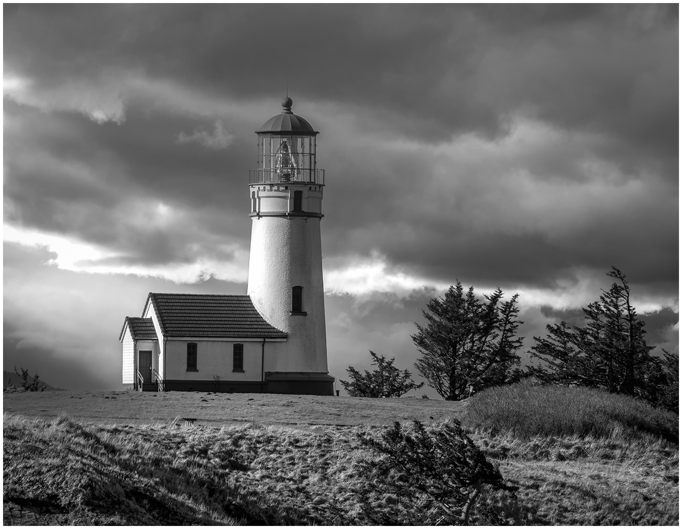
Wonderfully done. The tones all work to show off the hood ornament. Definitely a Black and White! |
Nov 15th |
| 39 |
Nov 23 |
Comment |
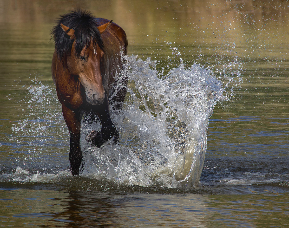
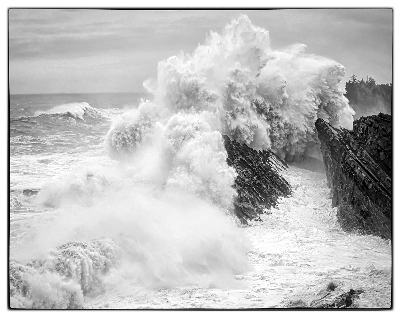
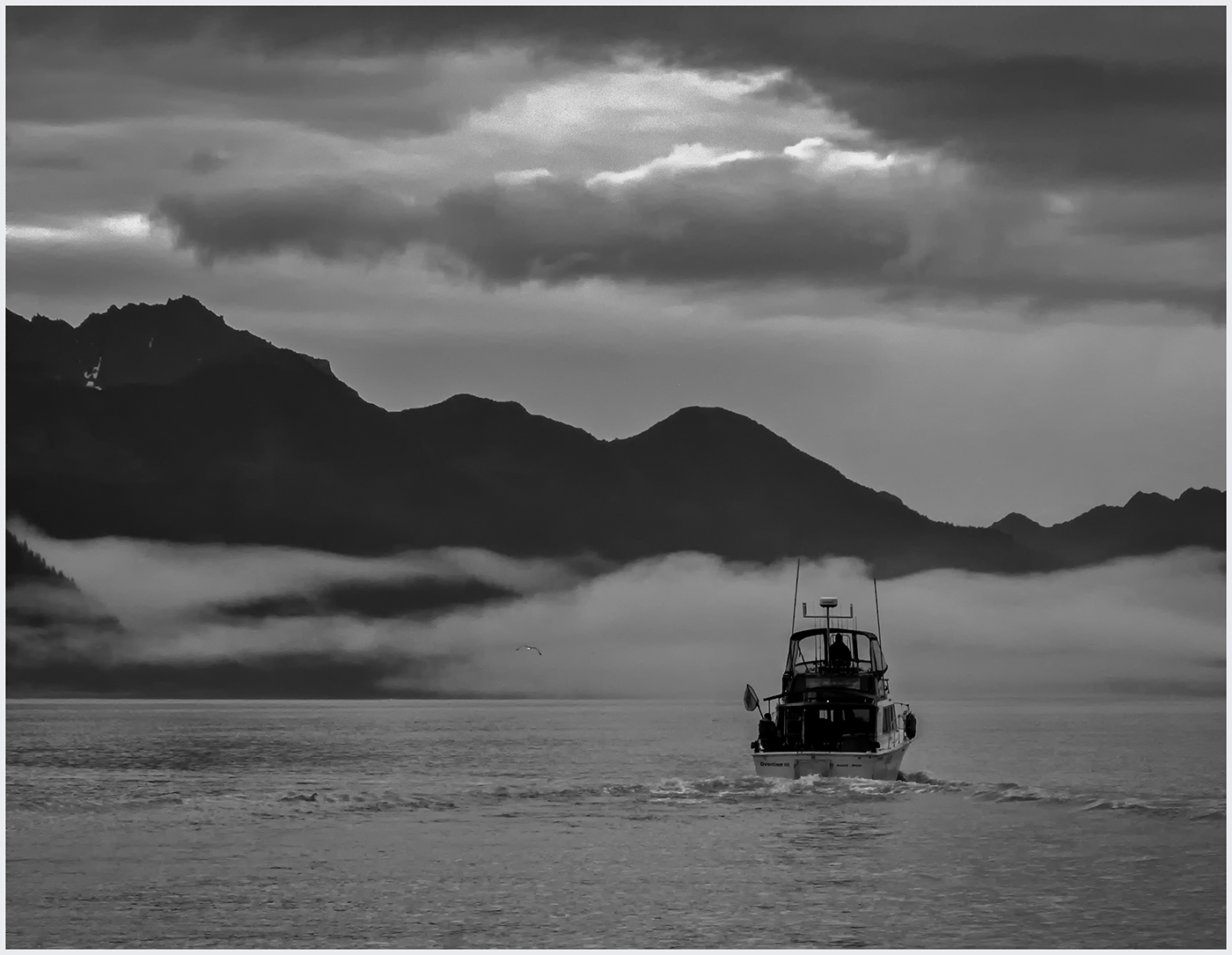
I agree with everyone, the gull is not necessary to your story. With the gull removed, there is more emphasis on the splash on the right and the rim light on the left. I cropped in and lightened the highlights on the left, increasing the Rim Light. What do you think? |
Nov 15th |
 |
| 39 |
Nov 23 |
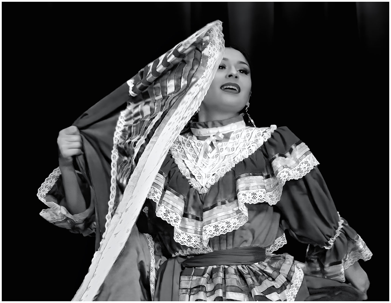
Comment |
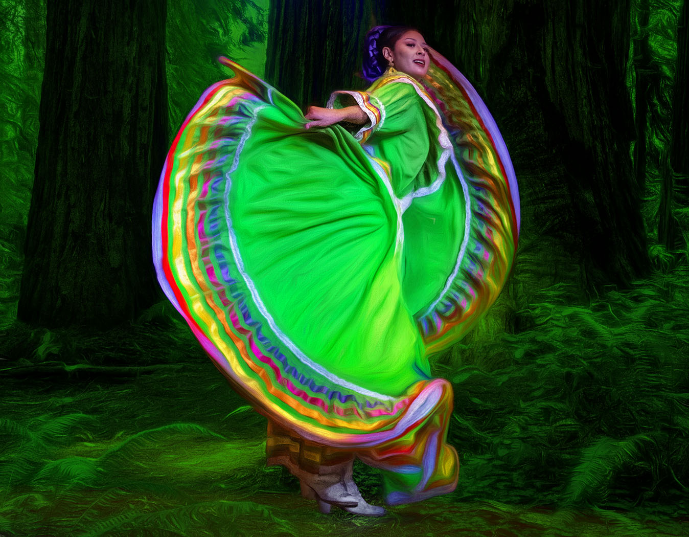
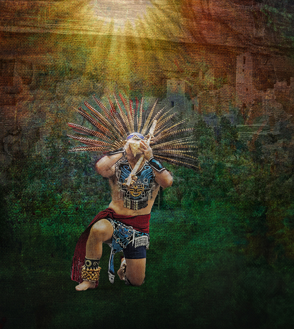
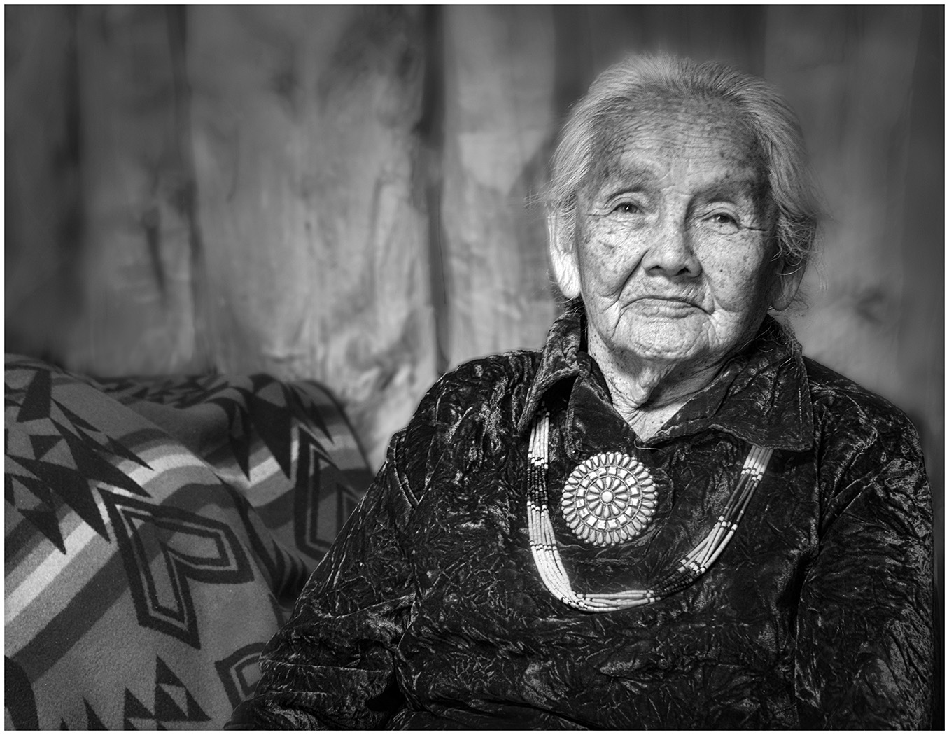
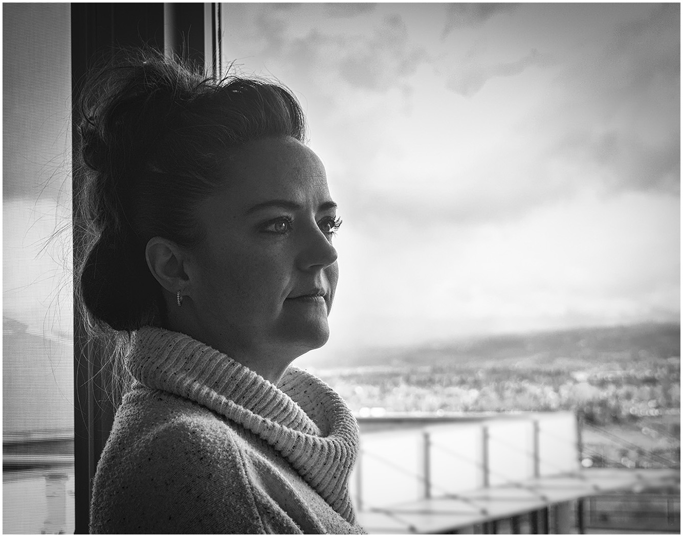
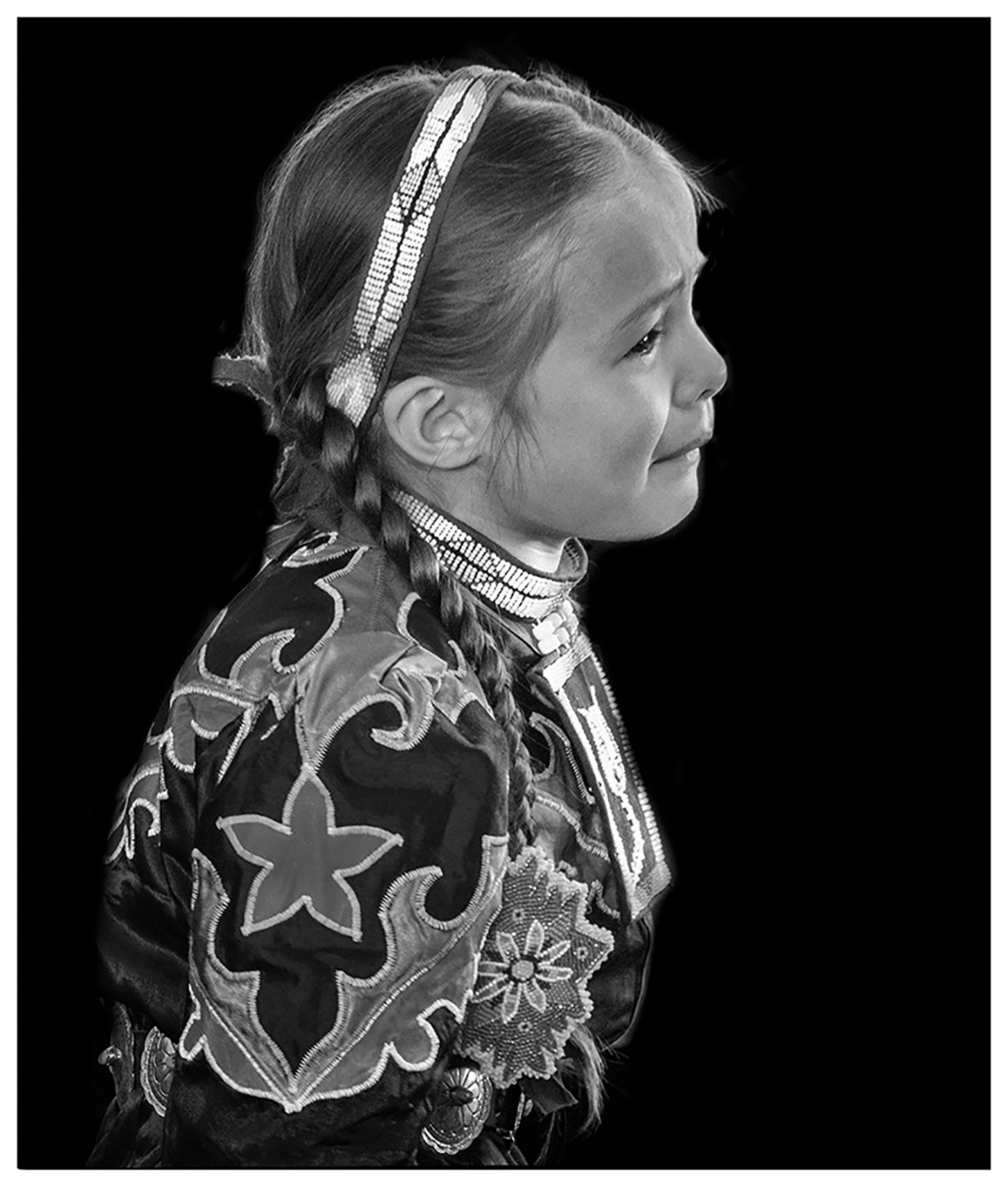
I love the Creativity of the Portrait. The others have discussed the lighting changes they would make. I would like to see her hair on the top right and left lightened just a bit. Just to give a touch of more separation. Beautiful and Dramatic. |
Nov 15th |
| 39 |
Nov 23 |
Comment |
I really enjoy your street shots. You have developed quite the eye. I like the "old photo" filter you have chosen. The grittiness. I would suggest you crop in on the left to get rid of the dark wall and make it a vertical. I think it brings more focus to your subject. The rail leads right to it. I played with it a bit and brightened your subject. Also, I took out the rail in the upper part, left of the rail. Here is my version. |
Nov 15th |
 |
| 39 |
Nov 23 |
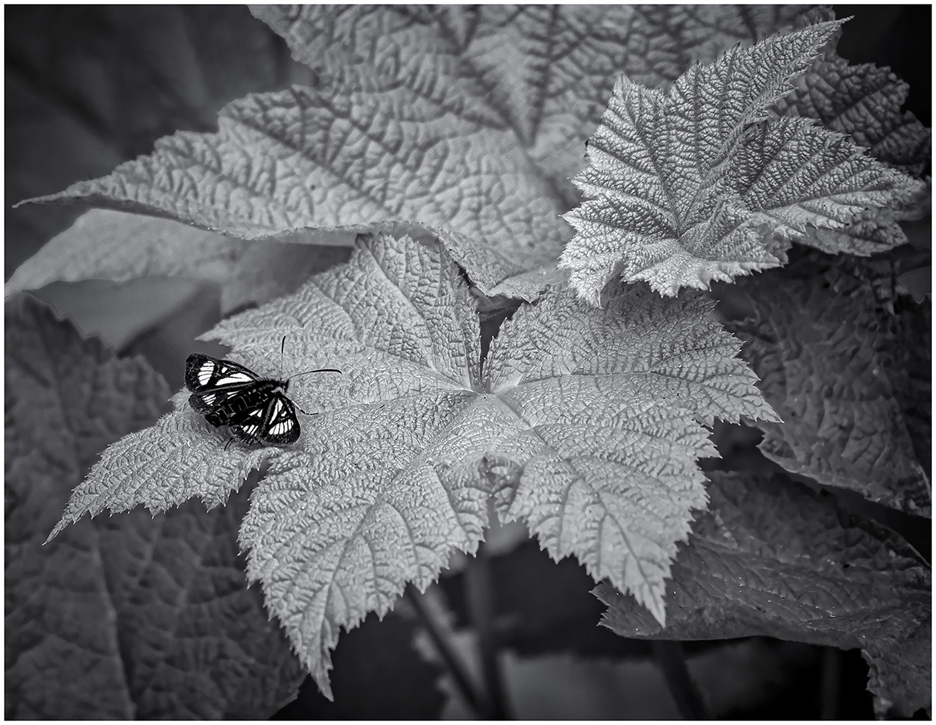
Comment |
Good shot of the lizard. I would like to see a little more contrast with him and the Background. I am not sure what the blurred part on the right is. Would you consider removing it?
I like the leaves on the left. They set the scene, but the ones on the right distract me. |
Nov 15th |
| 39 |
Nov 23 |
Reply |
Thanks for your input, Paul. |
Nov 15th |
| 39 |
Nov 23 |
Reply |
Thank you, Ken. I appreciate your comments. |
Nov 15th |
| 39 |
Nov 23 |
Reply |
Thank you, Vincent. |
Nov 15th |
| 39 |
Nov 23 |
Reply |
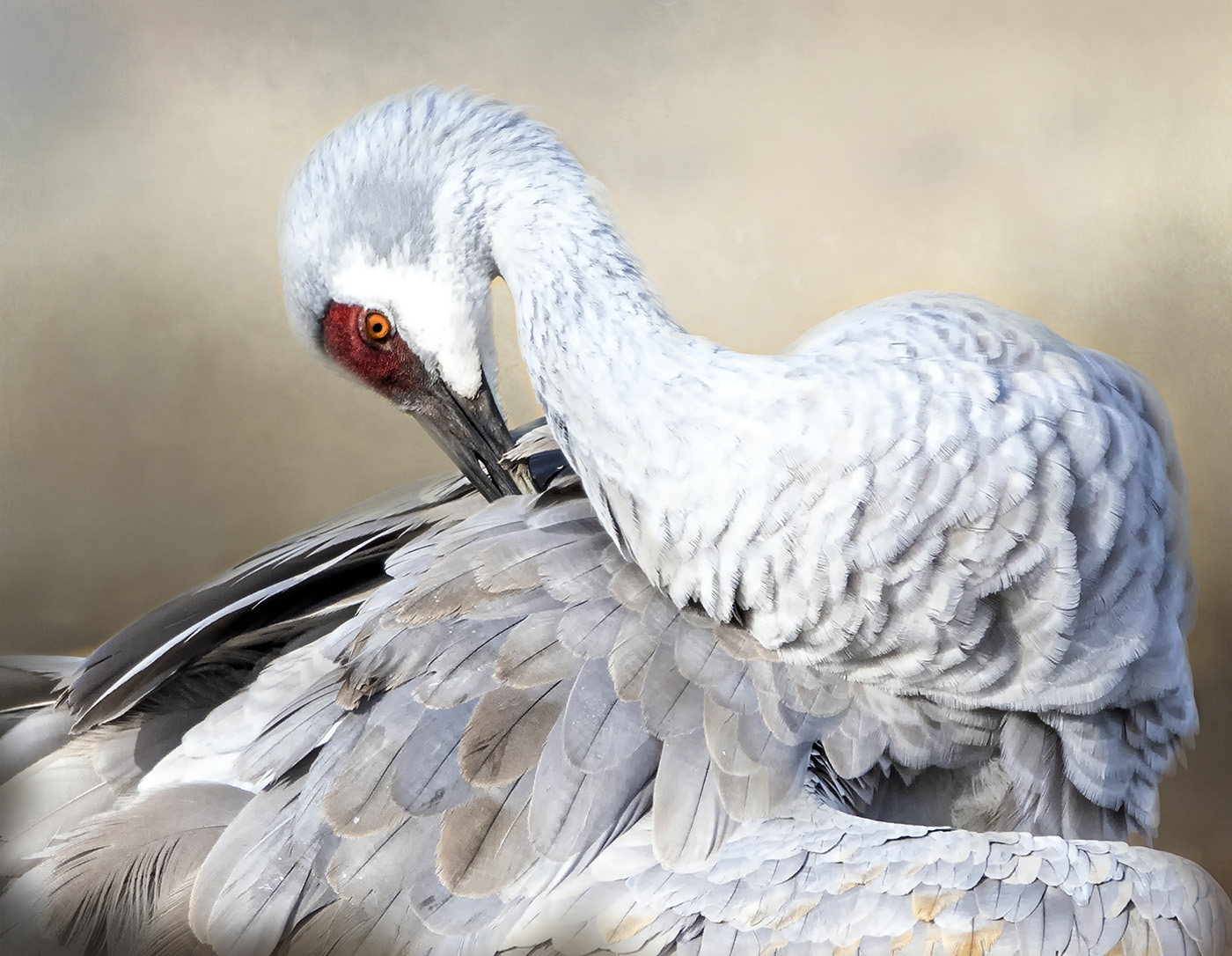
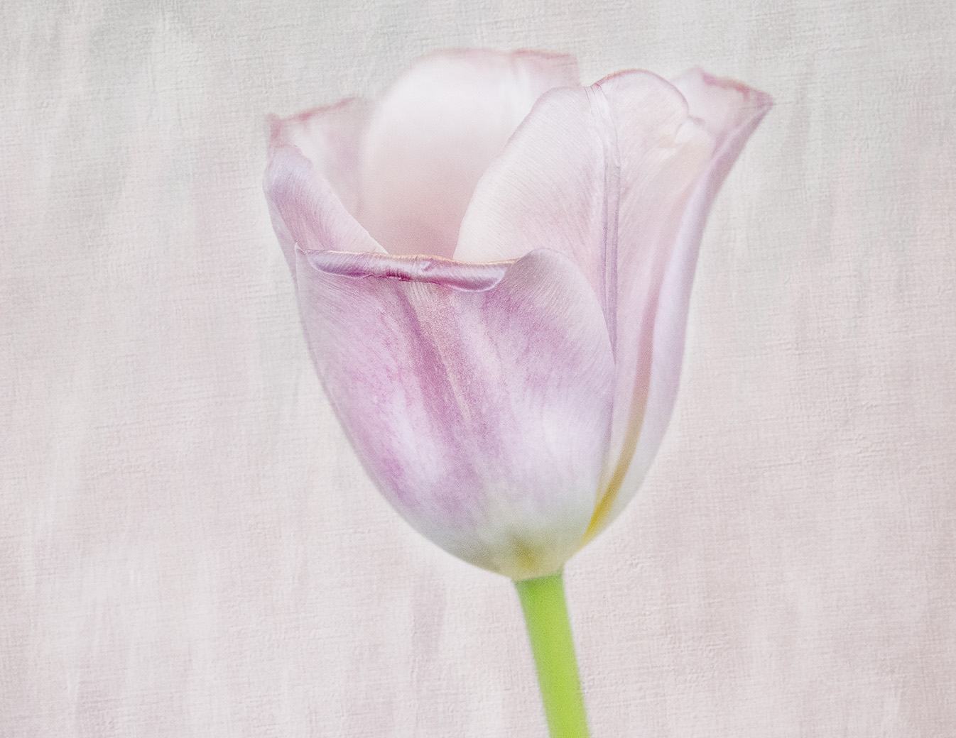
Thank you so much, Jerry. This photo shows me how much I have learned in tonality. |
Nov 15th |
| 39 |
Nov 23 |
Reply |
I see what you are saying, but when I lightened it, the highlights became blown.
|
Nov 15th |
6 comments - 6 replies for Group 39
|
| 65 |
Nov 23 |
Reply |
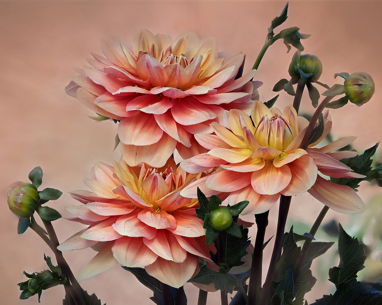
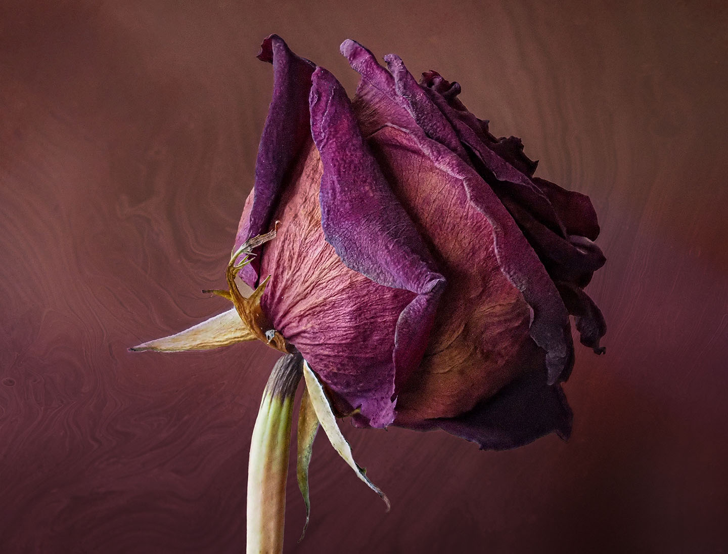
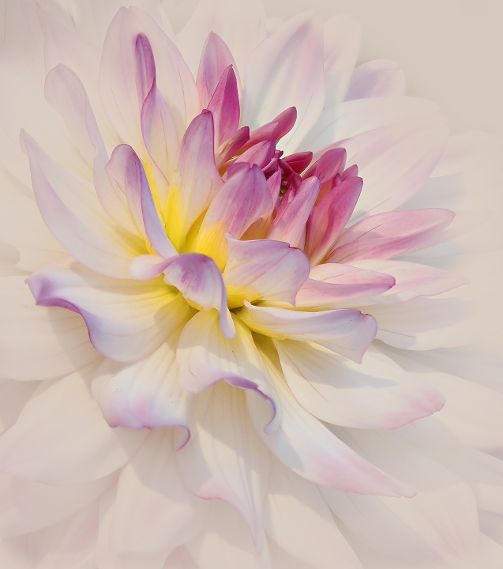
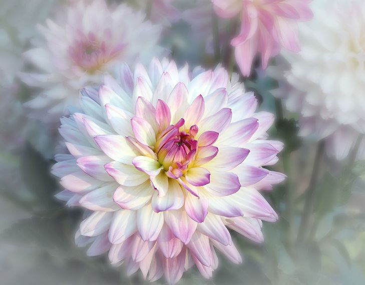
Thank you, Maria. Today I was taking photos of a dried dahlia. |
Nov 19th |
| 65 |
Nov 23 |
Reply |
I like it! |
Nov 15th |
| 65 |
Nov 23 |
Reply |
Thanks, Diana. This flower leads to so many different versions. Do you like my triptych idea? |
Nov 15th |
| 65 |
Nov 23 |
Reply |
Thanks, Dick. I tried it on a diagonal and didn't get it. If you have time, would love to see your version. |
Nov 15th |
| 65 |
Nov 23 |
Reply |
Thanks, Melanie. Such different feels to each photo. I still like the Filters, but the Black and White show so much more detail. I might try a triptych with this! |
Nov 15th |
| 65 |
Nov 23 |
Comment |
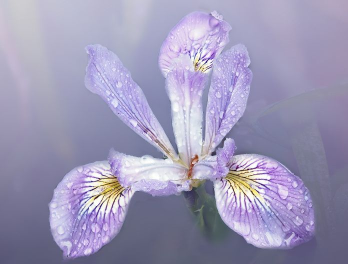
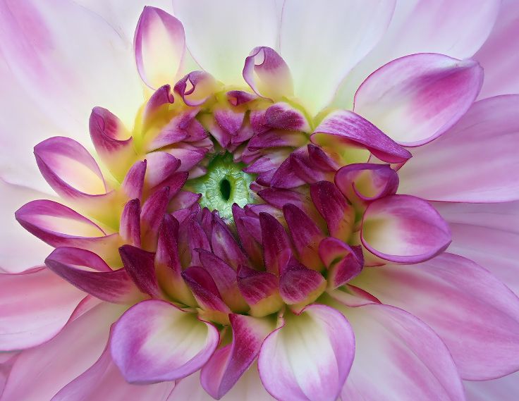
You always choose flowers that are so graceful, Maria. This time, I love the grace of the stem as it brings the viewers eye up to the flower at the end. I might try removing the lower bud, as I find it distracts from the curve. Also, personally I would put the water drops back in. I do not find them distracting, but that they add interest. Of course, that only is my opinion. Beuatiful, again. |
Nov 12th |
| 65 |
Nov 23 |
Comment |
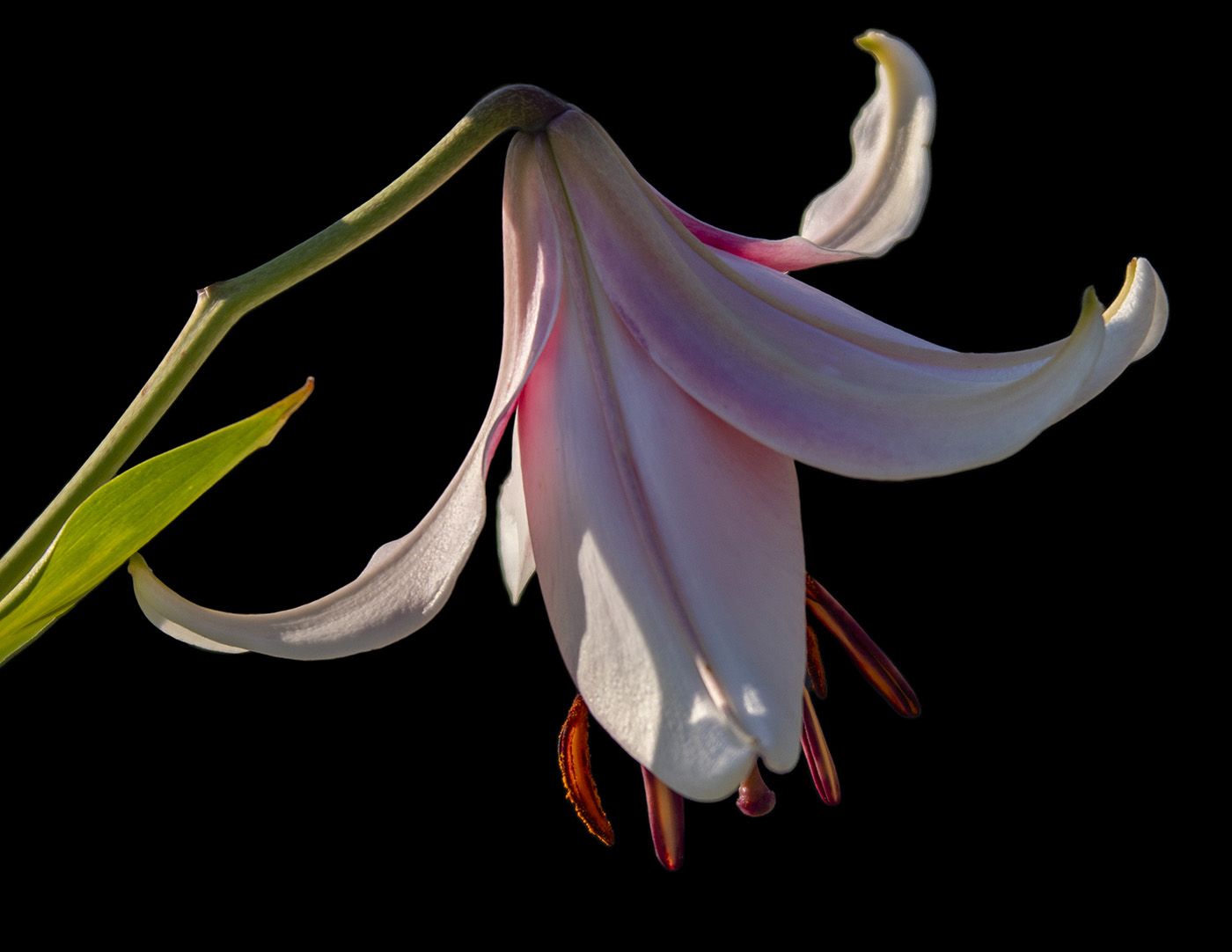
I think this is beautifully done, Melanie. You cropped in to focus on the essential and got rid of a lot of busyness. I like the shallow depth of field. The water is a bit too bright. My eye does go to the center and then up to the flower. Maybe lower the highlights or exposure?If I was being hypercritical, I would get rid of the stem in the lower right. A beautiful photo. |
Nov 12th |
| 65 |
Nov 23 |
Comment |
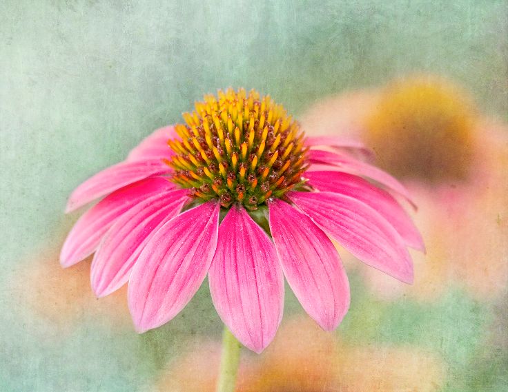
Hi Diana, I love to photograph sunflowers as they are getting passed their prime. I took some time to play with your photo. I hope that is ok. I like the curve of the stem. I cropped in on the right, because I felt there was a bit too much negative space. Then in Camera Raw I brought up the shadows in the Center. I felt that the gray was a good neutral background, but wanted to see how it looked with a hint of yellow. I used 1 of my textures in Vivid Light Blend Mode with a fill of 35%. It's a different feel and might not be what you wanted. What do you think? |
Nov 12th |
 |
| 65 |
Nov 23 |
Comment |
Beautifully rendered, Dick. I like the deeper tones than in the original. The Center is perfect in placement and in sharpness. I have NIK, but never use Analog. Can you share some thoughts about it? |
Nov 12th |
4 comments - 5 replies for Group 65
|
10 comments - 11 replies Total
|