|
| Group |
Round |
C/R |
Comment |
Date |
Image |
| 39 |
Oct 23 |
Reply |
I'm glad. It's a wonderful image. |
Oct 15th |
| 39 |
Oct 23 |
Comment |
The transparency of the Hosta is wonderful. The vase and the leaves are delicate. I therefore, do not think you need a grunge texture. If you wanted a texture, I would go with an off white canvas with broad brush strokes. I think it would complement the fragility of the subject better. |
Oct 14th |
| 39 |
Oct 23 |
Comment |
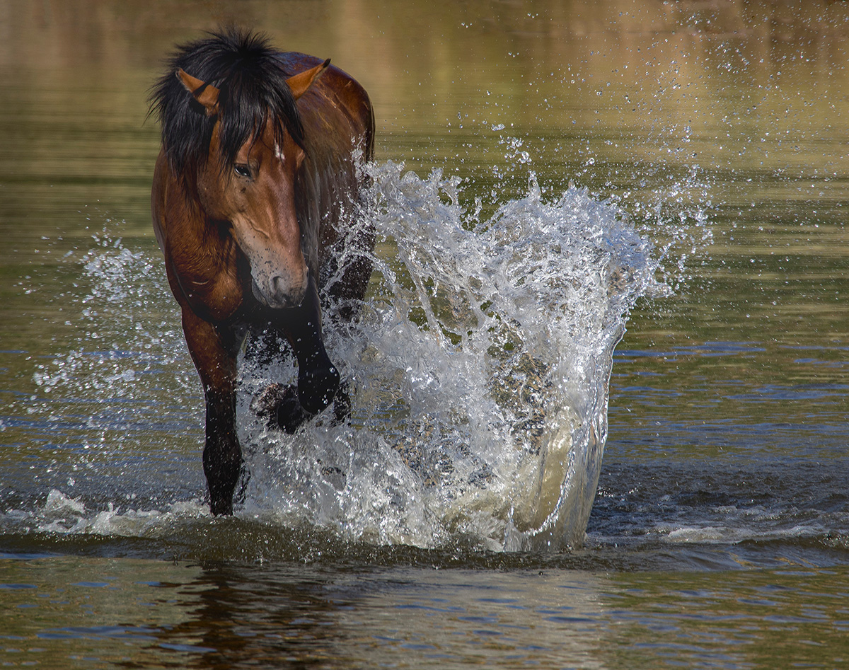
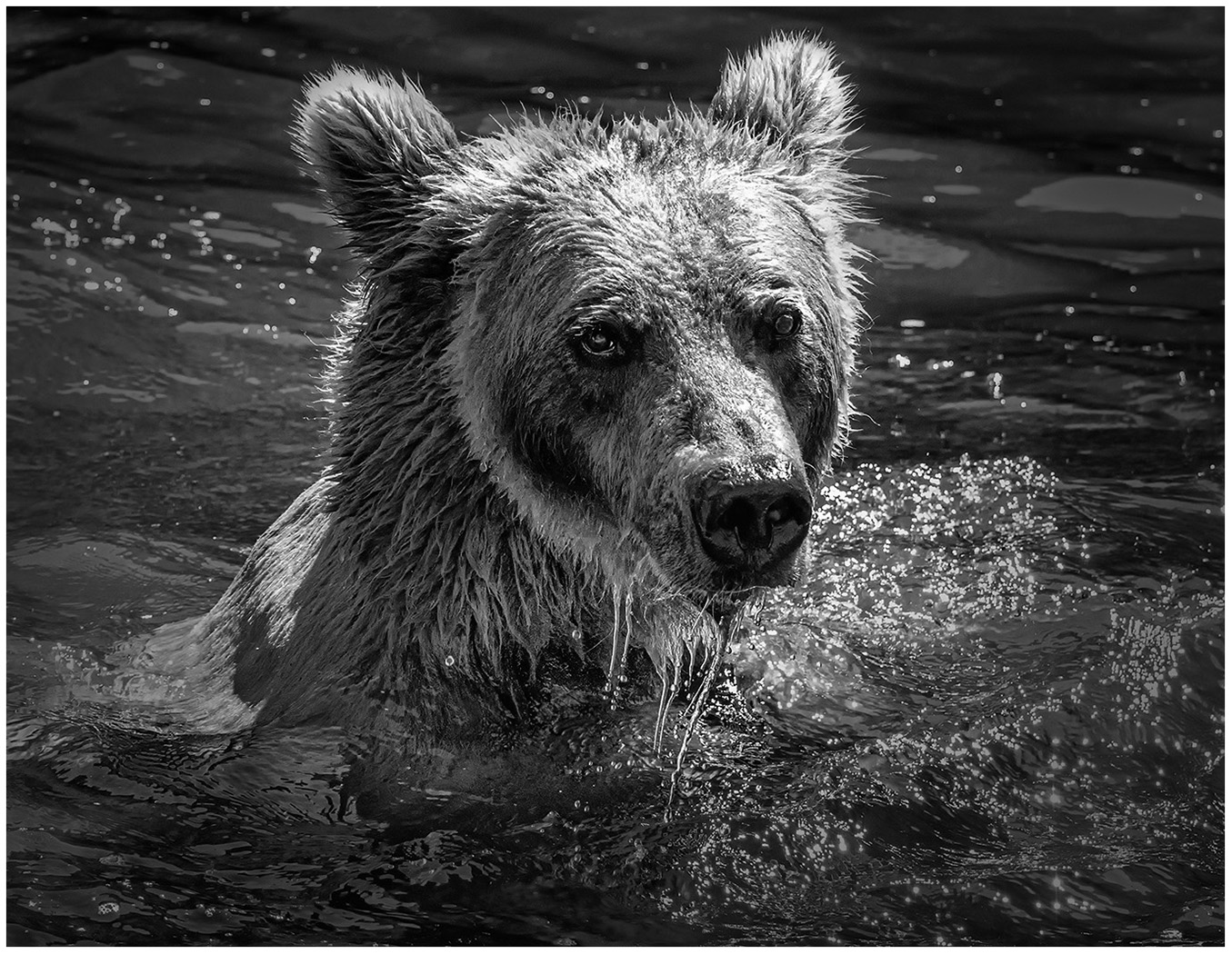
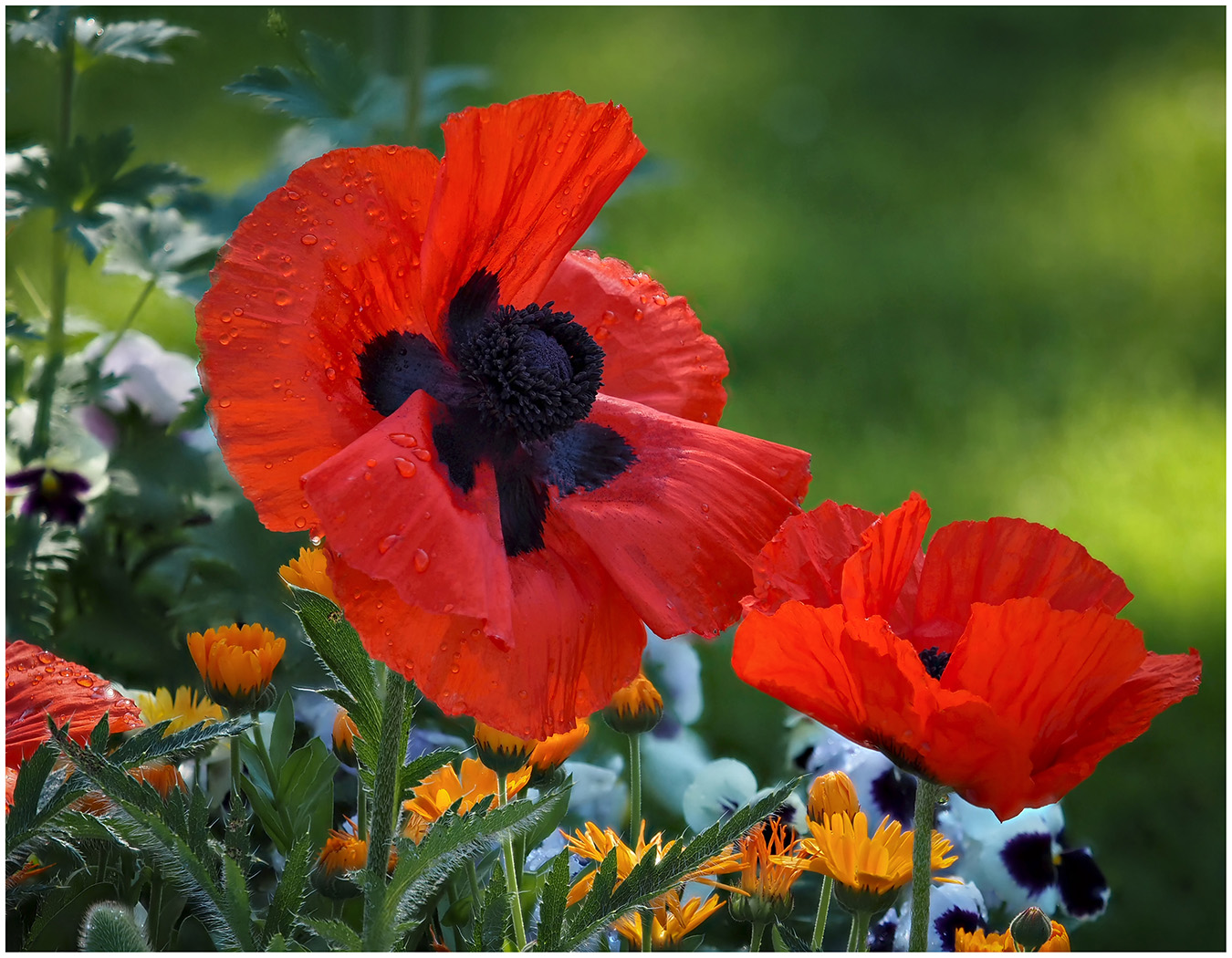
A great photo, but I prefer the color version, more contrast to see the bear and the water droplets. In Black and White, there is not enough contrast. Too many grey tones. Keep it as color. |
Oct 14th |
| 39 |
Oct 23 |
Comment |
I love the symmetry of the Dome. You captured it well. It works well in both color or B&W version. The color version lends itself to the space station feel. |
Oct 14th |
| 39 |
Oct 23 |
Comment |
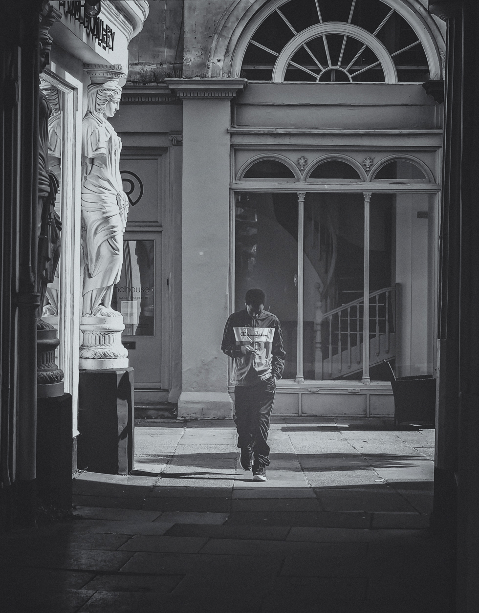
This is a wonderful capture. I started experimenting to see how to suggest putting more emphasis on the boy. I cropped in a bit on the left and right and added a vignette. Then I tried to brighten the subject...more emphasis on him. What do you think? |
Oct 14th |
 |
| 39 |
Oct 23 |
Comment |
Beautifully captured. I just have one thought...Do you need the lights on the upper right and left. If you removed them, our eyes would travel more easily to the back (or front) of the church. |
Oct 14th |
| 39 |
Oct 23 |
Comment |
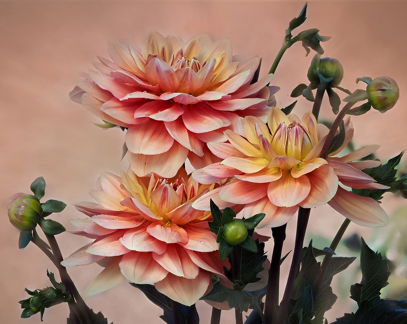
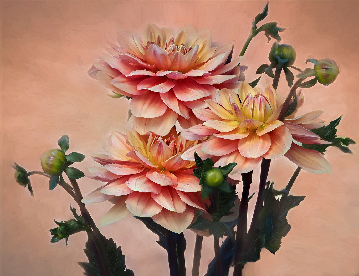
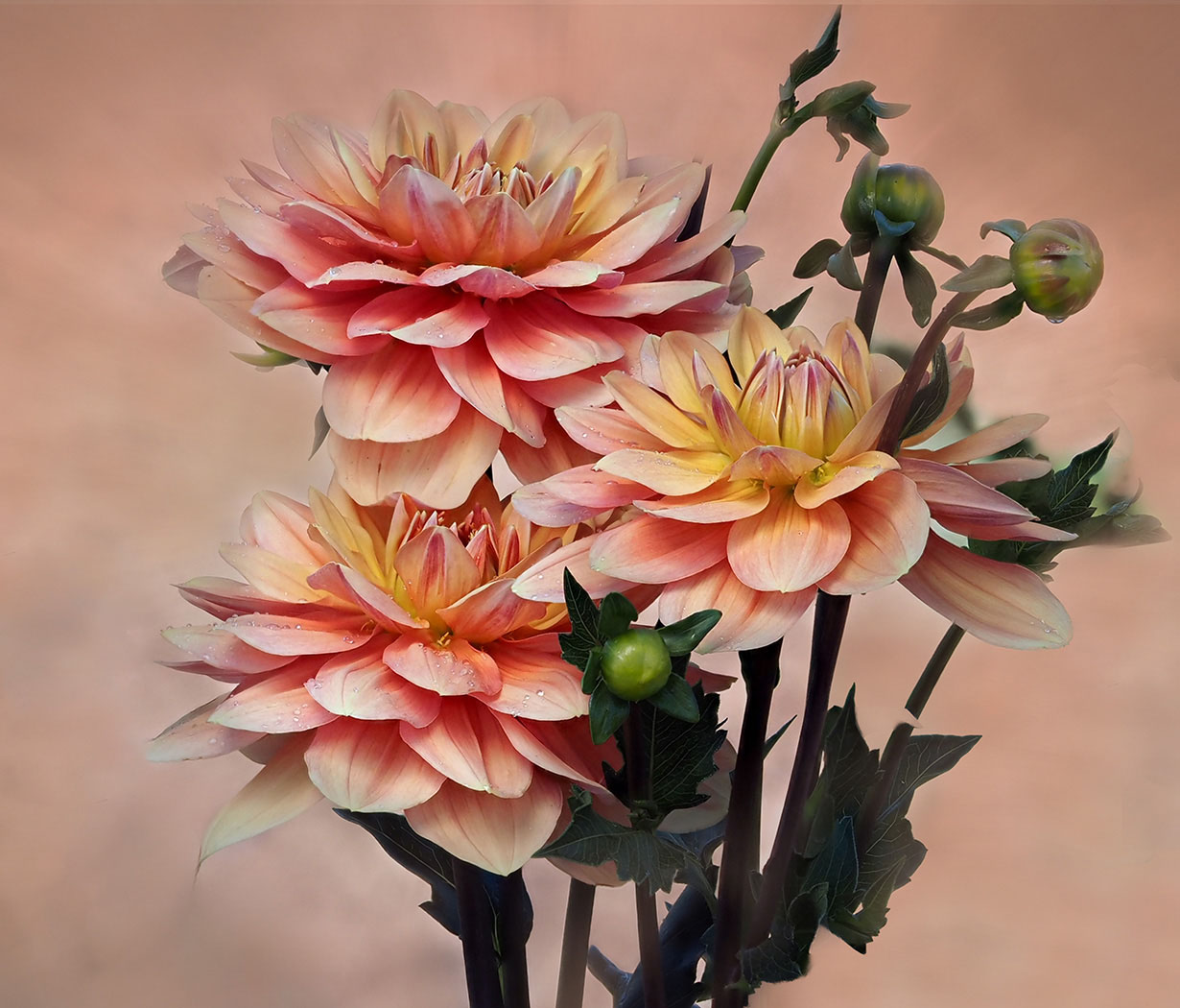
I love the contrast/tone of the flowers. Well, I guess I'll join the Group and say that a crop up from the bottom would put the focus on the flowers more. Also, I think I prefer a grouping of 3 and would remove the flower on the left that is focused away. It doesn't add that much. |
Oct 14th |
6 comments - 1 reply for Group 39
|
| 65 |
Oct 23 |
Comment |
Thanks, Diana. I enjoyed following the suggestions and its truly better now. |
Oct 20th |
| 65 |
Oct 23 |
Reply |
Thanks, Dick. I do too.
|
Oct 19th |
| 65 |
Oct 23 |
Reply |
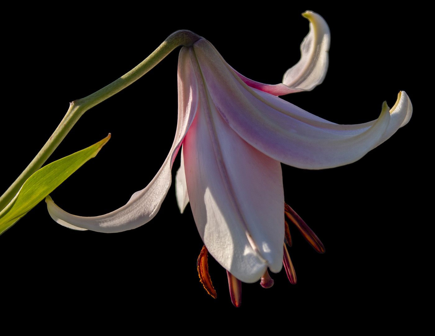
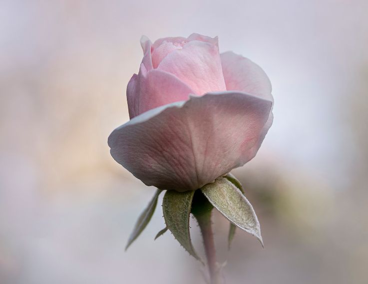
Then I put the left bud back in...which do you like best? |
Oct 19th |
 |
| 65 |
Oct 23 |
Reply |
I took the Bud on the left out as well as the leaves on the bottom. What do you think? |
Oct 19th |
 |
| 65 |
Oct 23 |
Reply |
Thank you, Jodi. Please look at what I posted on Melanie's reply and see which one you like the best. |
Oct 19th |
| 65 |
Oct 23 |
Reply |
I think I would like to see more room on the left. If you left it soft green, you could try leaving the blurred thistle on the right, but take out everything else. You could take it up a little on the bottom, but I like the feel of the stem. Lots of possibilities. |
Oct 17th |
| 65 |
Oct 23 |
Reply |
Thanks, Melanie. I agree with all the comments. It's funny how you look at something, think it's a go, and then when the comments come in it's "Why didn't I see that?" Definitely no bud on left and bottom leaves out. So easy to do now with the Remove Tool. |
Oct 17th |
| 65 |
Oct 23 |
Reply |
Thank you, Maria. I agree about cleaning up the leaves on the bottom. |
Oct 16th |
| 65 |
Oct 23 |
Reply |
Thanks, Dick. I agree. No bud on left. |
Oct 15th |
| 65 |
Oct 23 |
Comment |
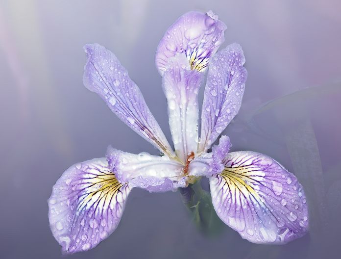
What a beautiful water lily. I'm betting it was during full sun. The lighting looks a bit harsh to me. I would try to bring the Highlights down and the shadows up. As you bring the highlights down, the pink will come out more. I love the one water drop on the bottom. Can you do a crop of the original where it shows more or take it out. I also would try to crop in on the right to the edge of the top petal. I would love to see the original. |
Oct 12th |
| 65 |
Oct 23 |
Comment |
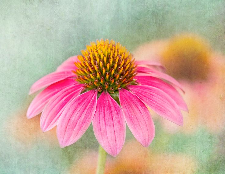
Nicely and creatively done Jodi. You have focused nicely on the phlox, but it is a bit soft...unless you wanted it that way. The light pink blooms are a bit distracting and I would crop them out to the top of the phlox you are focusing on. And I would soften the color and highlights of the stem. I like the concept of the lace texture. How would it look if it was a shade lighter, so you could see the lace texture more? |
Oct 12th |
| 65 |
Oct 23 |
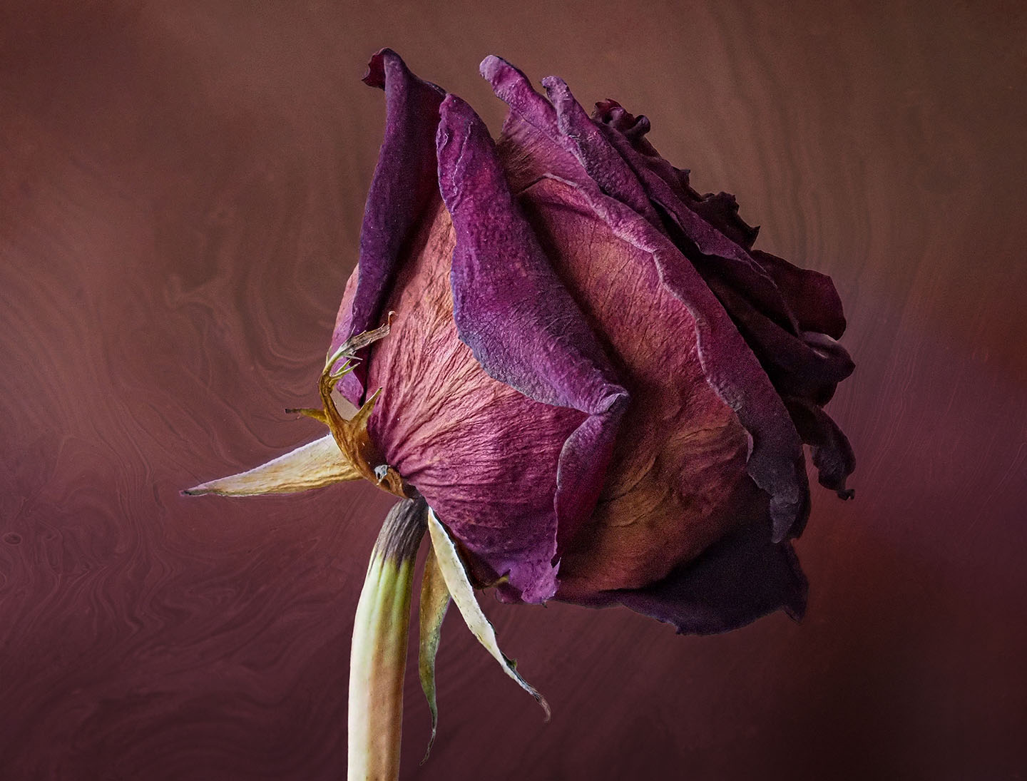
Comment |
Lovely. I like how you converted the original to a vertical. I agree with you that the purple on the right was distracting. By changing the background to purple you have created a beutiful "Study in Purple", but I have to admit I like the soft green background of the original too. I might try extending the green background and see if you like the Contrast. |
Oct 12th |
| 65 |
Oct 23 |
Comment |
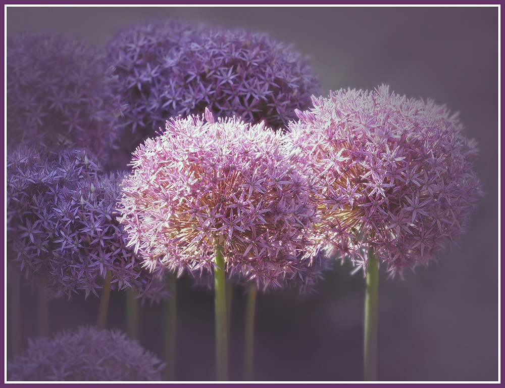
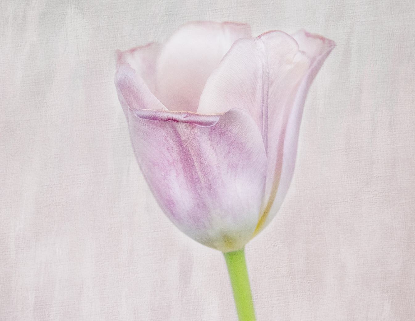
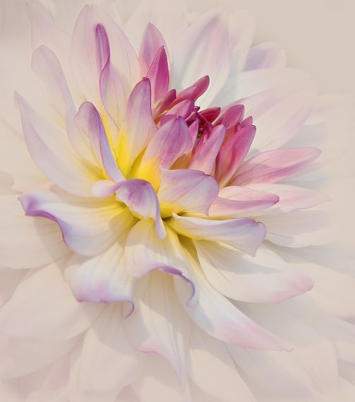
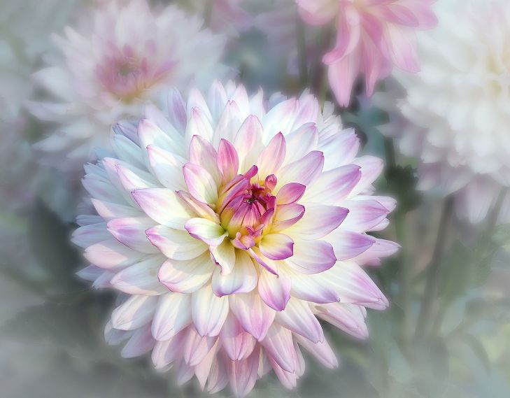
Beautifully done, Diana. You have the Center in focus and the softness radiates out. Nice even lighting. I like the choice of color for the Background texture. Do you remember which Blend Mode you used? I minor suggestion is to add a bit on the top. |
Oct 12th |
| 65 |
Oct 23 |
Comment |
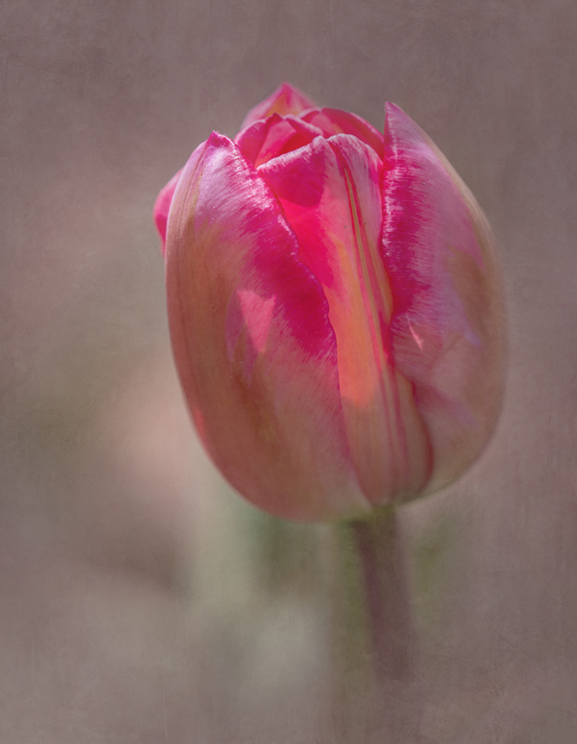
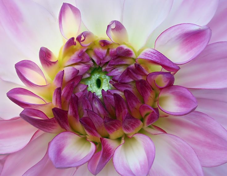
A beautiful study of color, texture, and lines. Abstract in nature. I love how the lines radiate out from the Center. |
Oct 12th |
6 comments - 8 replies for Group 65
|
12 comments - 9 replies Total
|