|
| Group |
Round |
C/R |
Comment |
Date |
Image |
| 39 |
Jun 23 |
Reply |
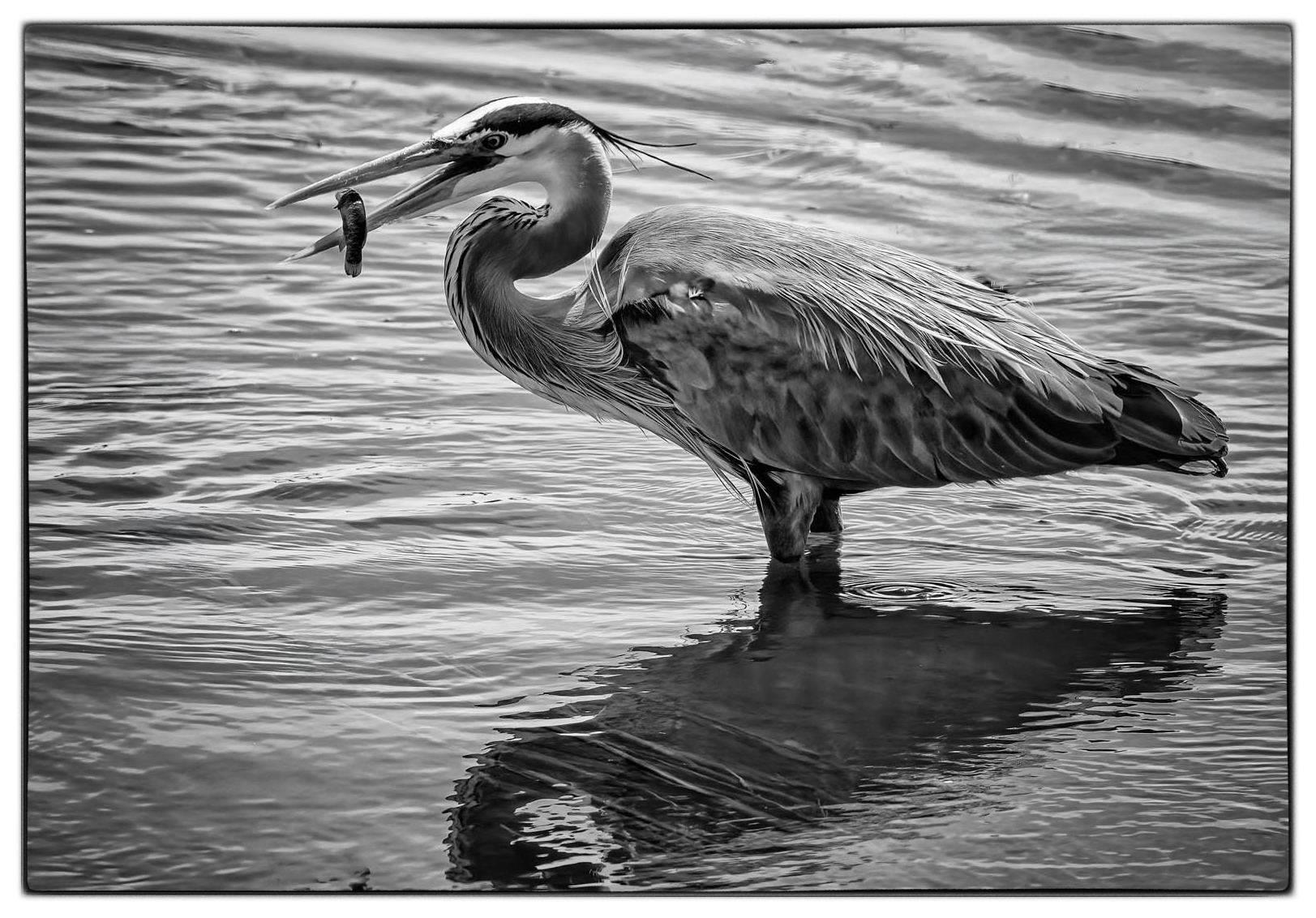
Yes...the dead spot is the Black Hole. Kathleen Clemmons, who I follow for Flower Photography suggested brightening spots with Control Points using Viveza. It just gives it the extra punch. |
Jun 16th |
| 39 |
Jun 23 |
Comment |
What a great gig, working at a Wildlife Refuge. For some reason the elements all work together better in the color. The branches in the water frame the heron in the color, but I find distracting in the B&W. I might crop them out in the B&W and crop in on the right. Then I would clean the water...more focus on a wonderful catch....for you and the Heron. |
Jun 16th |
 |
| 39 |
Jun 23 |
Comment |
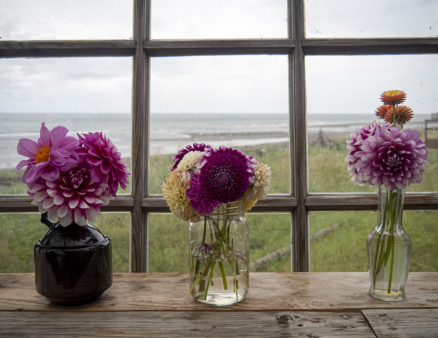
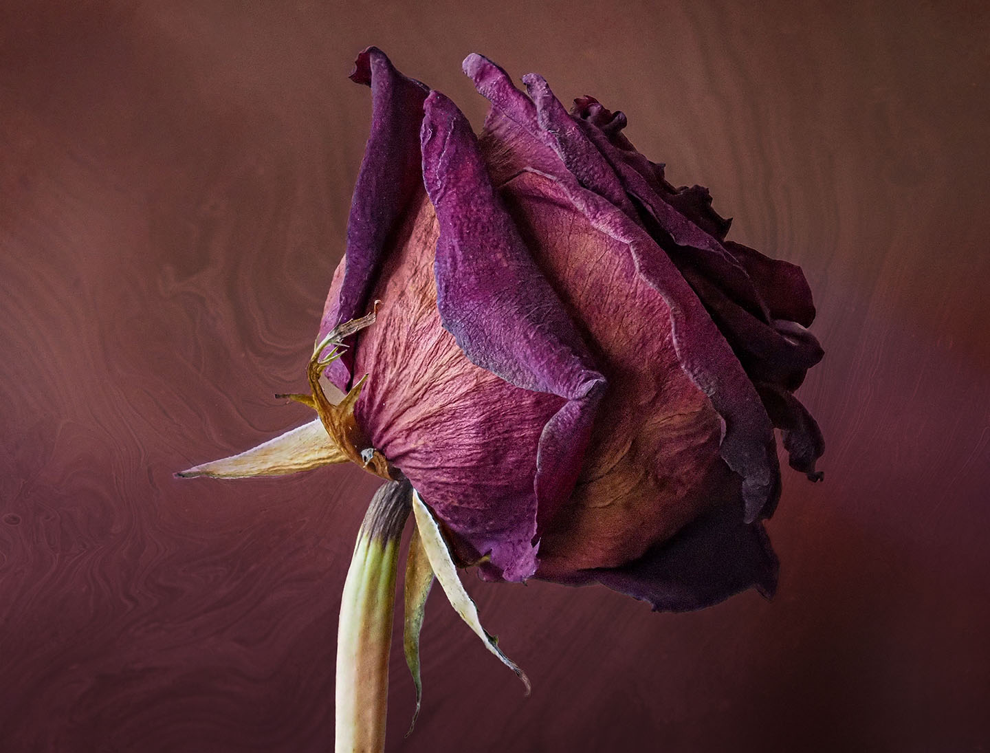
I really like the tonal quality of the photo. Still Life is difficult to set up. I like that you used 3 objects, but , in my opinion,the spoon is not harmonious with the other 2 objects. Perhaps, a bowl on the left that is lower and wider than the object on the right. I agree with the other comments. This image needs some work, but it is definitely worth it. |
Jun 16th |
| 39 |
Jun 23 |
Comment |
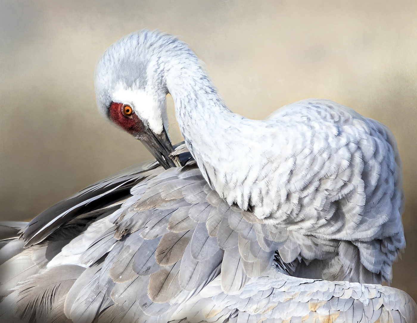
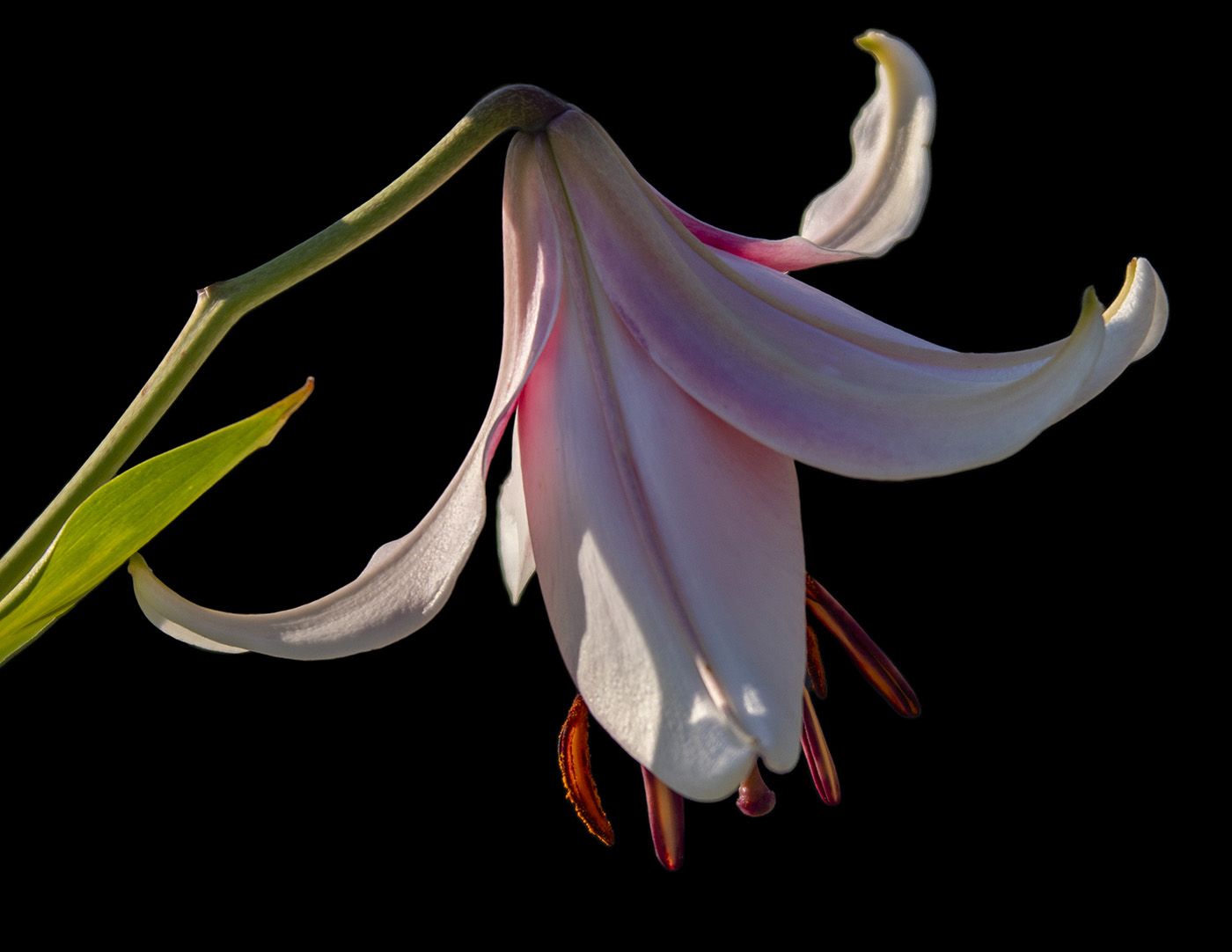
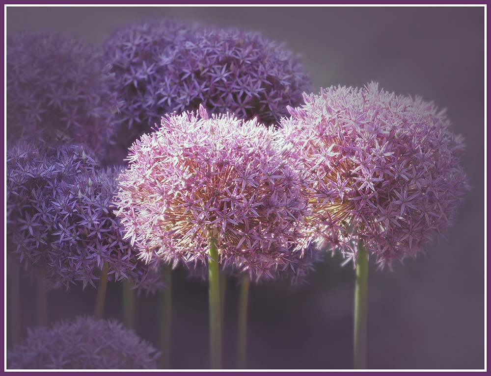
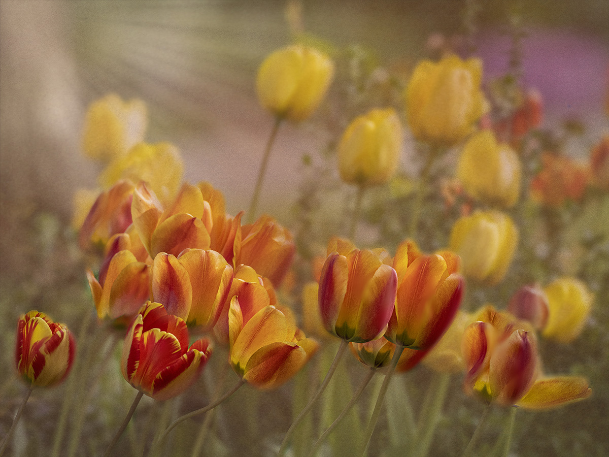
Nice composition of the 3 flowers. The contrast works well in B&W. There is a leaf in the upper left, that I find a bit distracting. I would take it out. Try to lighten/brighten the flower on the upper left, using Control Points in NIK Viveza Another minor improvement would be to take out the dark spot in the bottom right flower. It is yellow in the original, but too dark in the B&W. I also like the idea of a tighter crop. |
Jun 16th |
| 39 |
Jun 23 |
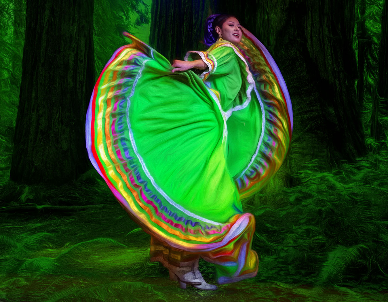
Comment |
You are a Master at this Dancer series. Each one is striking.Are they hanging in a Gallery somewhere? They become striking in B&W. The tones are spot on. |
Jun 16th |
| 39 |
Jun 23 |
Comment |
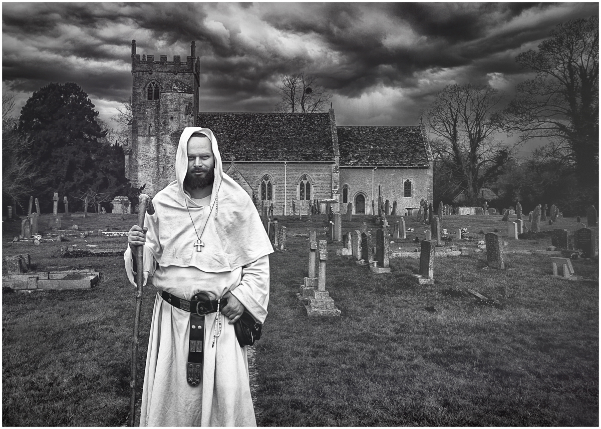
I love this composite image. The threatening sky creates a mood. The graveyard adds to it, but the monk looks too friendly. Using the Neural Filter in PS, I changed his expression to Anger. Too me, it now goes with the mood. What do you think? Does it even matter? By the way, this is the 1st time I tried the Neural Filters. |
Jun 16th |
 |
| 39 |
Jun 23 |
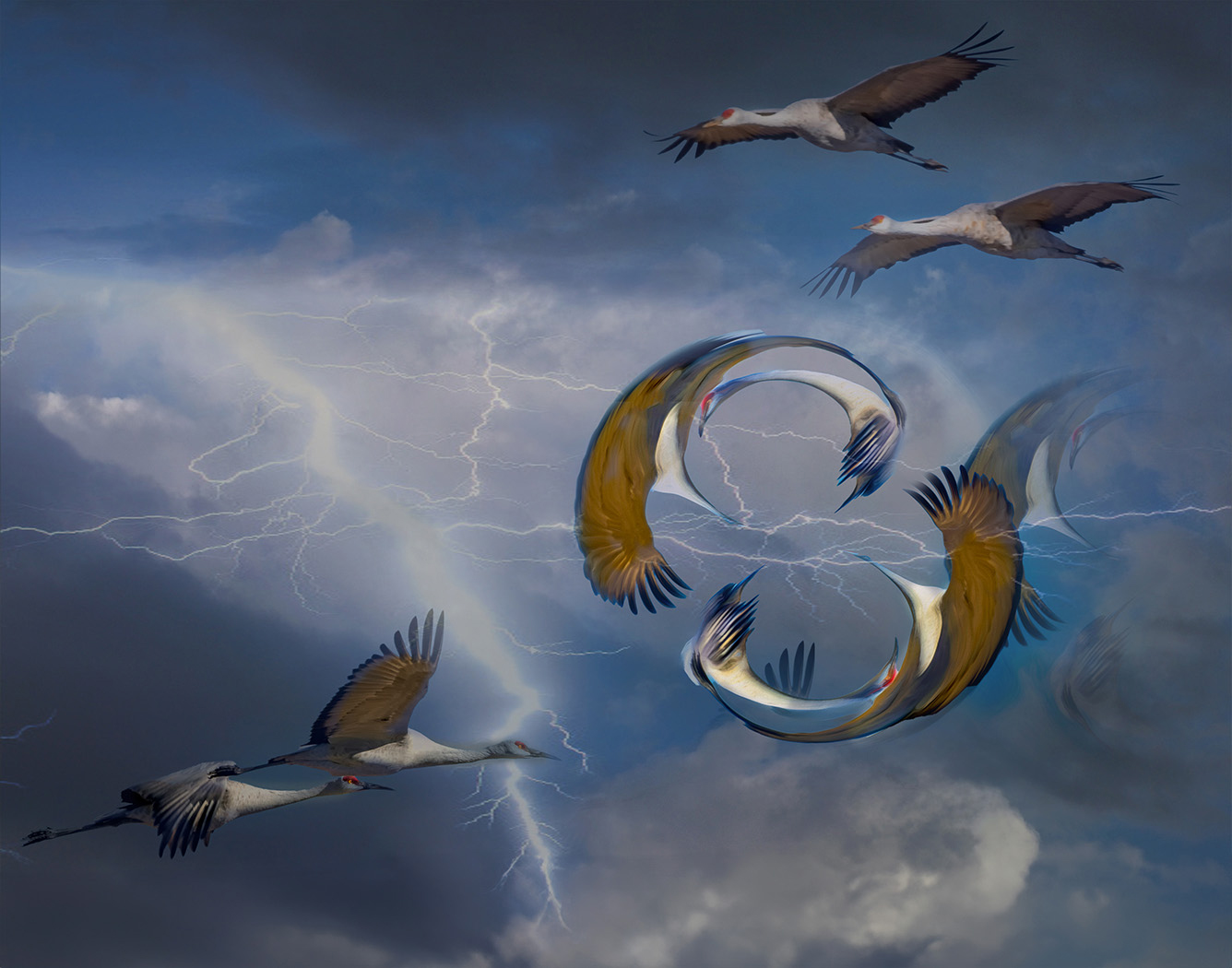
Comment |
I see what people are saying about if it was a long exposure, the clouds would be a little streaked. True...but as a composite, I like the effect. The composite works. I particularly like the different textures. My eye keeps traveling inside the scene. |
Jun 16th |
| 39 |
Jun 23 |
Reply |
Thanks, Kathryn. Will try it a bit lighter. |
Jun 16th |
| 39 |
Jun 23 |
Reply |
Thanks, Paul. I appreciate your comments. |
Jun 16th |
| 39 |
Jun 23 |
Reply |
Thanks for your input, Vincent. I appreciate your thoughts. Makes for a good discussion.
|
Jun 16th |
| 39 |
Jun 23 |
Reply |
Thanks for the suggestion. I was hesitant to make the clouds too dark, but I will try it. |
Jun 16th |
| 39 |
Jun 23 |
Reply |
Thanks, Dave. I cropped the foreground up about halfway and like it. |
Jun 16th |
| 39 |
Jun 23 |
Reply |
Thanks, Jerry. |
Jun 16th |
6 comments - 7 replies for Group 39
|
| 65 |
Jun 23 |
Reply |
Thank you, Rebecca and welcome to the Group. There are many talented photographers in this Group on all different levels. You will learn from us all. I look forward to see what you share. |
Jun 26th |
| 65 |
Jun 23 |
Reply |
Thanks, Maria. Already done!
|
Jun 19th |
| 65 |
Jun 23 |
Reply |
Whenever you add a new Layer, you get to choose the Blend Mode and next to it is Opacity. Under Opacity is a slider. Move it down from 100% until it is the intensity(opacity) you like.
Kathleen has tutorials on her website and also courses.I have taken 2 of her courses through Creative Live. Jackie does tutorials through Phlorography and workshops. She and Kathleen just finished a joint workshop. I would love to attend one...Diana Duffey from this Group also has taken some courses from Kathleen. Are you on FaceBook? |
Jun 16th |
| 65 |
Jun 23 |
Comment |
That is interesting that they dye the water Black. I have never seen that before. It is a wonderful image, but I think I prefer the softness of the original colors. The finished is a bit too saturated for me. |
Jun 14th |
| 65 |
Jun 23 |
Comment |
Hi Maria. Wish we were with you! Enjoy your time. I love this capture and Melanie has already written everything I was thinking. |
Jun 14th |
| 65 |
Jun 23 |
Comment |
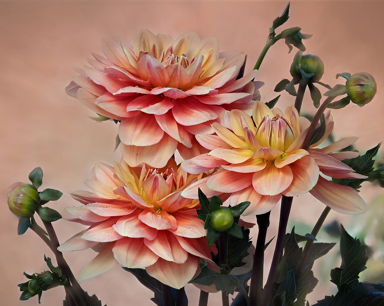
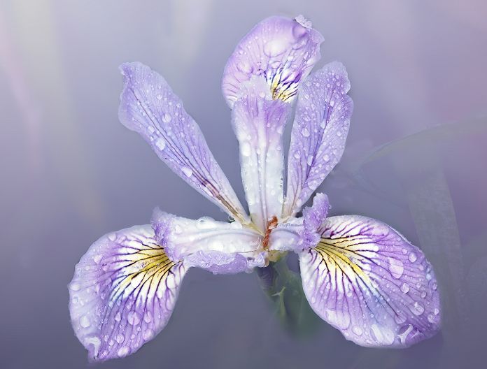
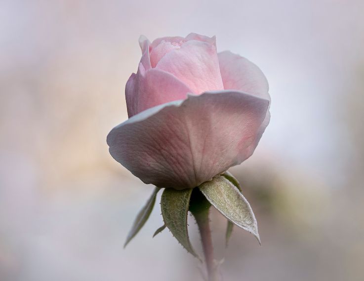
You have done a really good job, Jodi. Just a few suggestions to play with. In Color Efex Pro, you might try Glamour Glow. It might work and it might be too bright. I also would bring down the Opacity on the Background a bit so that it is less strong Contrast to the soft pink peony. Are you familiar with the work of Kathleen Clemmons? She is my inspiration in Flower Photography. Also, Jackie Kramer of Phlorography. |
Jun 14th |
| 65 |
Jun 23 |
Comment |
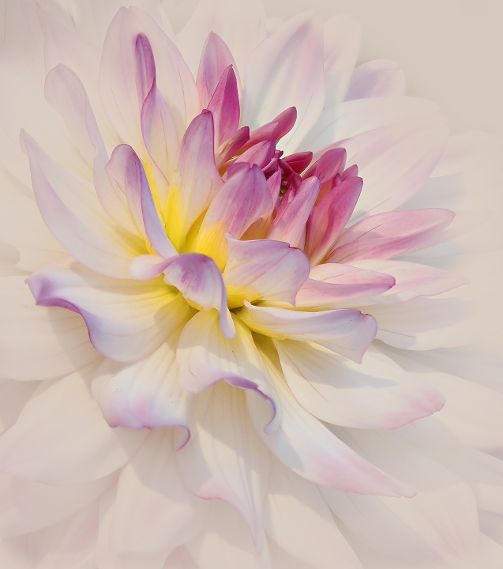
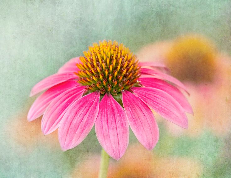
Beautifully done, Melanie. The sharpness is there in the area you intended it to be. The increased saturation is a beautiful sunshine yellow. The softness in the bottom right does not bother me as the center subject is so sharp. If you wanted you could have cloned out further. I wonder how the new PS Remove tool would have worked. |
Jun 14th |
| 65 |
Jun 23 |
Comment |
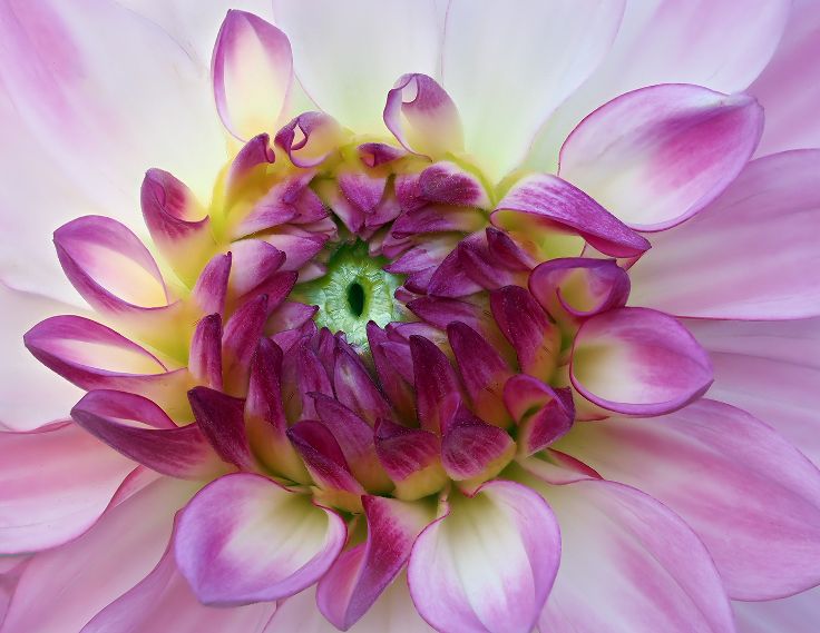
Advances in technology have made focus stacking much easier to do. The incamera focus stacking in my camera will focus stack up to 50 points automatically. I have learned that I usually just need 8-12. The rest is overkill. Because of my eyes, I generally use auto focus. |
Jun 14th |
| 65 |
Jun 23 |
Reply |
Thanks, Jodi. As soon as I saw it up on the screen, I saw it.I definitely will fix it. |
Jun 14th |
| 65 |
Jun 23 |
Reply |
Thanks, Diana. I appreciate it:) |
Jun 14th |
| 65 |
Jun 23 |
Reply |
Thank you, Dick for your comments. |
Jun 14th |
| 65 |
Jun 23 |
Reply |
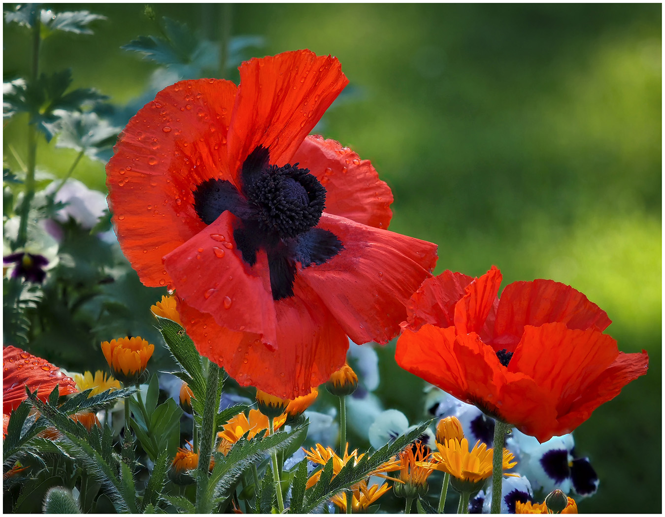
Thank you, Melanie. It is different for me. I generally am attracted to softer colors. But those red poppies just called to be photographed. |
Jun 14th |
5 comments - 7 replies for Group 65
|
11 comments - 14 replies Total
|