|
| Group |
Round |
C/R |
Comment |
Date |
Image |
| 39 |
May 23 |
Comment |
You do like your old cars and they make a great subject for you:) I like the angle of the shot, but would have liked to see the complete headlight on the left and more of the diagonal of the bumper. |
May 17th |
| 39 |
May 23 |
Comment |
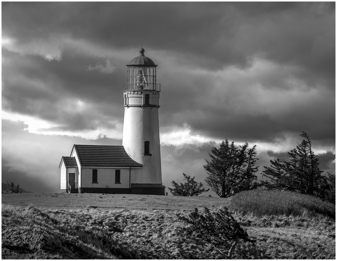
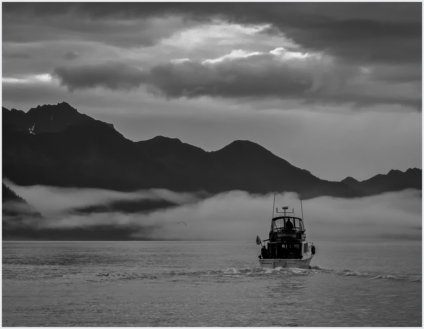
Brrr...You're a long way from Sun City, Dorothy:) I like both versions, but particularly like the way the sky is glowing in the color version. Is there a way to brighten the sky like that with a layer that brings out the whites? I use the NIK Collection Viveza and think a control point with brightness raised might help. Nice catch. |
May 17th |
| 39 |
May 23 |
Comment |
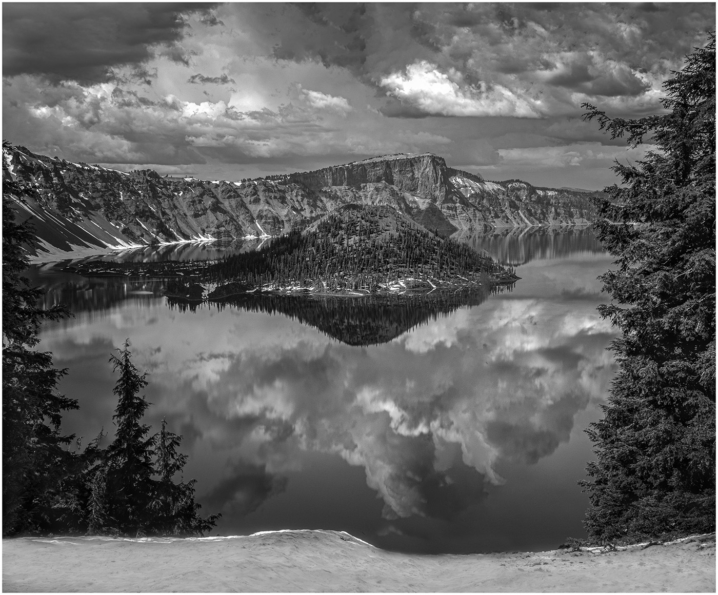
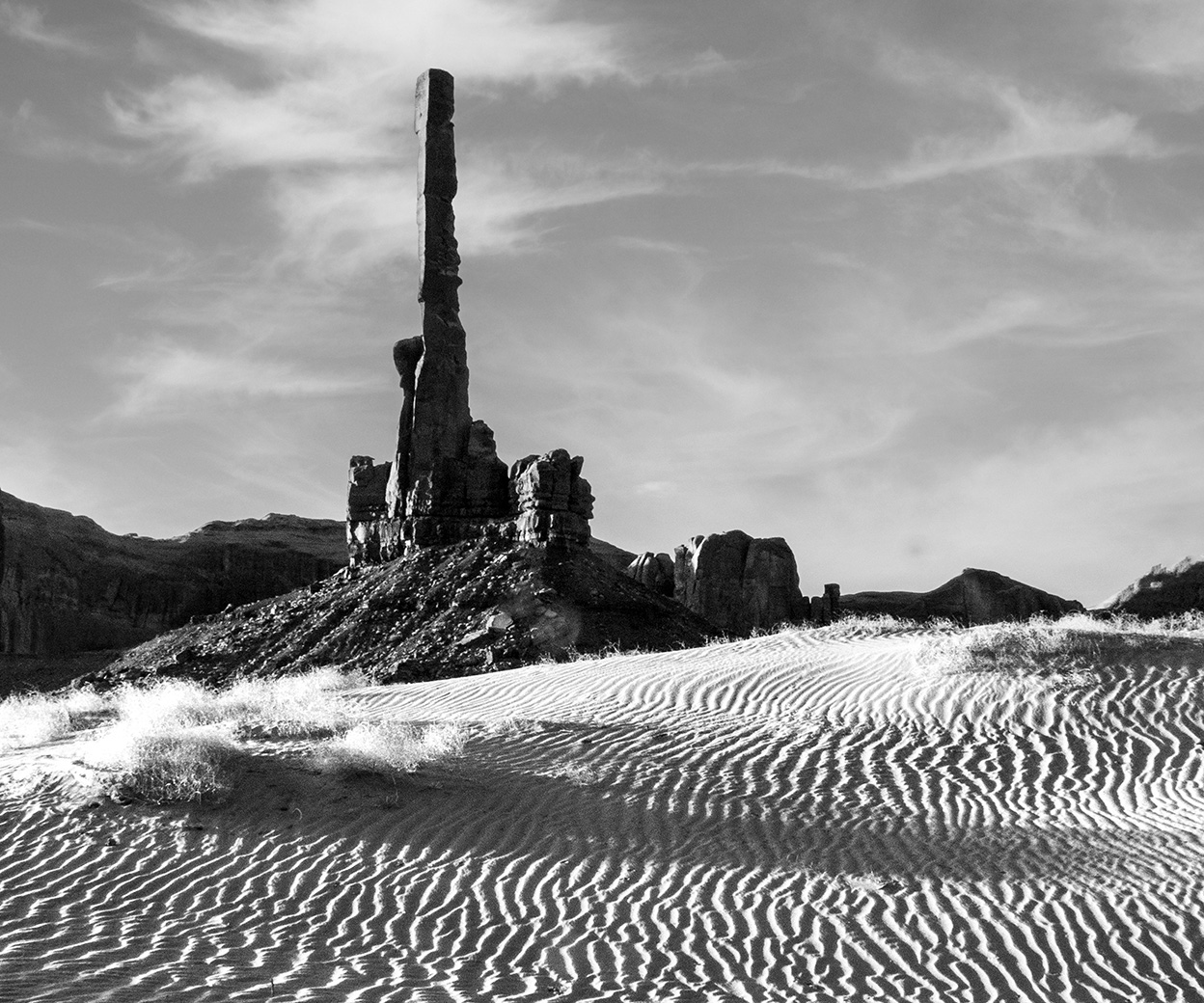
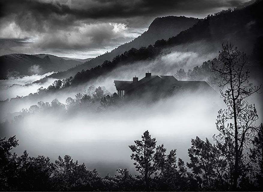
Again, agreeing with everyone to crop up and put more emphasis on the cloud. I would also like to see a bit more contrast between the sky and the clouds. Perhaps upping the Clarity might help. I love the rock formations at Bryce, but that is another subject. |
May 17th |
| 39 |
May 23 |
Comment |
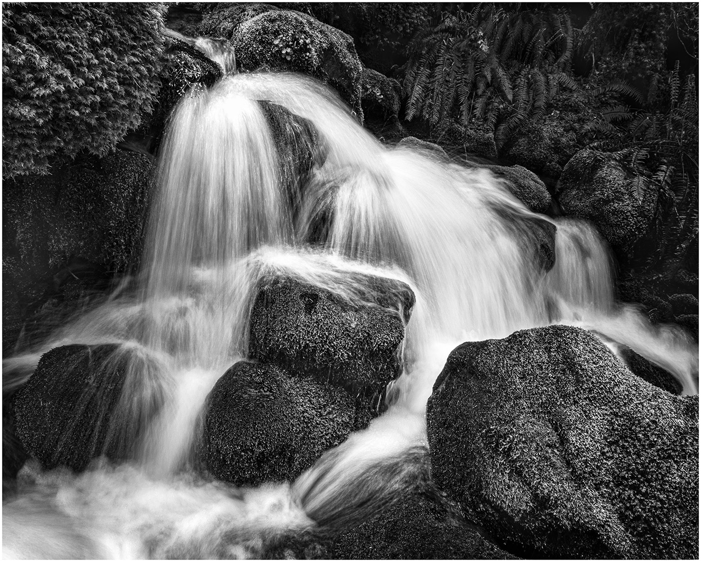
I like the square format as it lends to the symmetry of the reflection. I believe I can set my camera for square format and will try it.I am glad that you converted it to Black and White as the water in color is too murky and not pleasing. The sky looks a bit overworked and noisy. I would suggest trying a Graduated Neutral Density filter and a denoise program. Next to the reflections of the short pillars, there are branches reflected. I would try to remove them, as they are a distraction to the reflection. |
May 17th |
| 39 |
May 23 |
Comment |
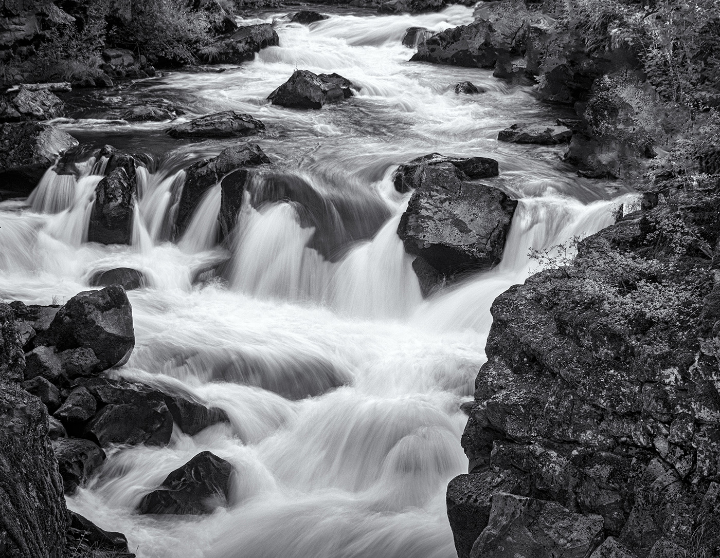
I just love the tones. I like how the dark rocks are in contrast with the ethereal water. Since you are using your phone, are you able to do long exposures. I prefer your original crop as it allows us to follow the line of rocks and
arrive at the waterfall.
|
May 17th |
| 39 |
May 23 |
Comment |
Thank you for all your comments. When I see them together, I agree. I like the original crop and I should have brought the textures and shadows out in the rock formation. How come I don't see it until it is on the screen? |
May 17th |
6 comments - 0 replies for Group 39
|
| 65 |
May 23 |
Reply |
I admire your work and your eye, Melanie. What type of texture would you recommend? |
May 21st |
| 65 |
May 23 |
Reply |
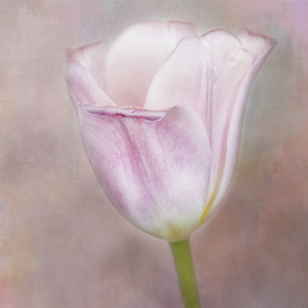
Thank you for taking another look, Dick. The photo was taken inside,not near a window. The reason it may look flat to you is the Blend Mode I used was Overlay. Again. I liked how it blended together, quite obviously, not a look that everyone prefers. I do appreciate other input, but then I go back to what I like. I also would like to see more room around the edges, not a Vertical. |
May 18th |
| 65 |
May 23 |
Comment |
What Melanie said. It is so beautifully rendered. |
May 16th |
| 65 |
May 23 |
Comment |
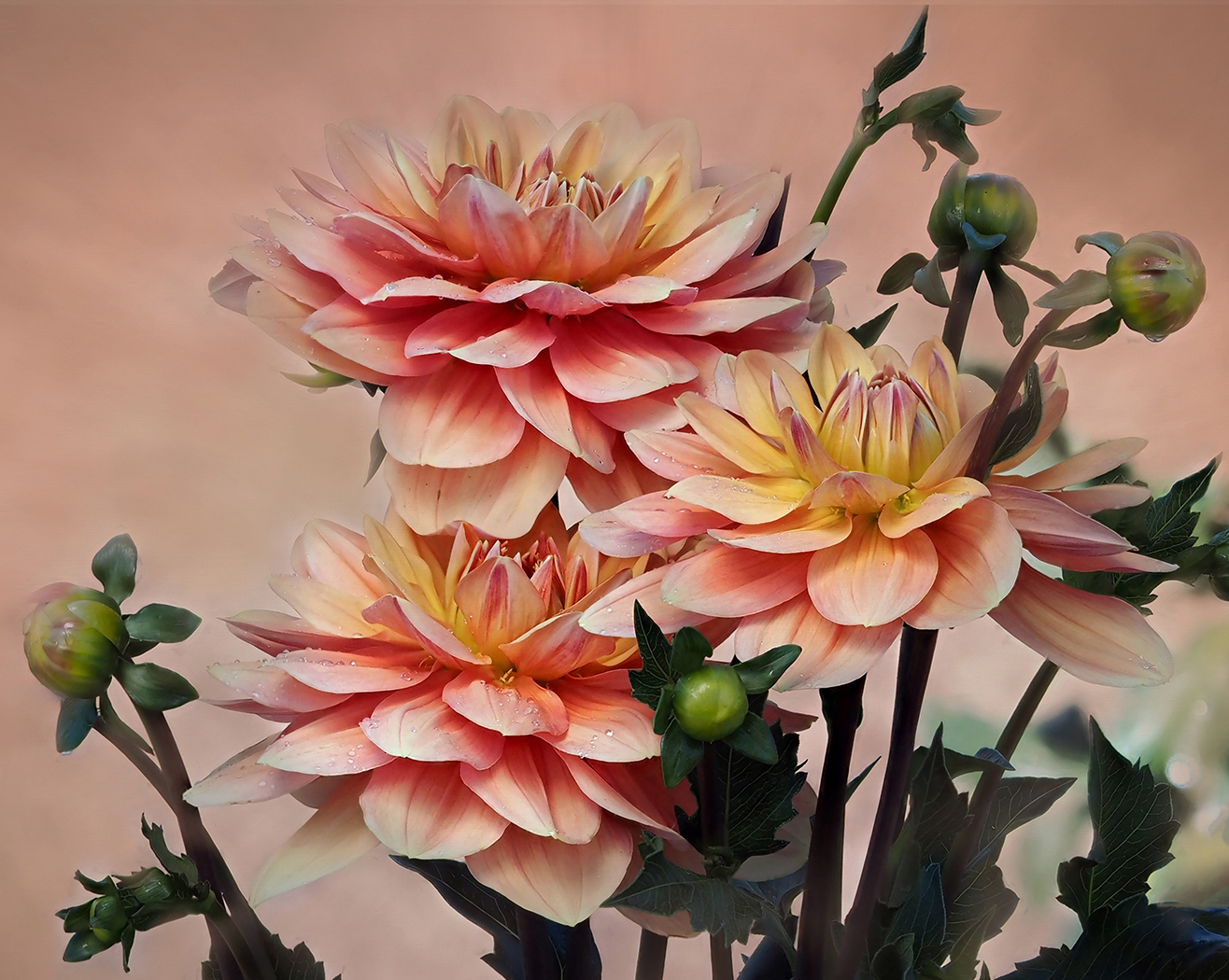
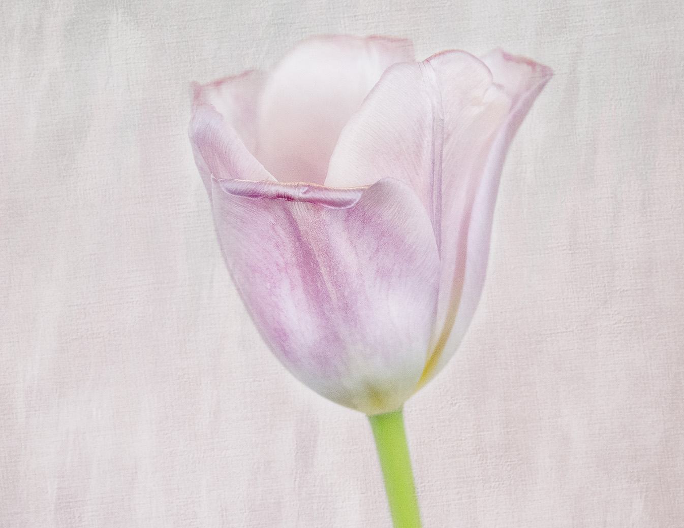
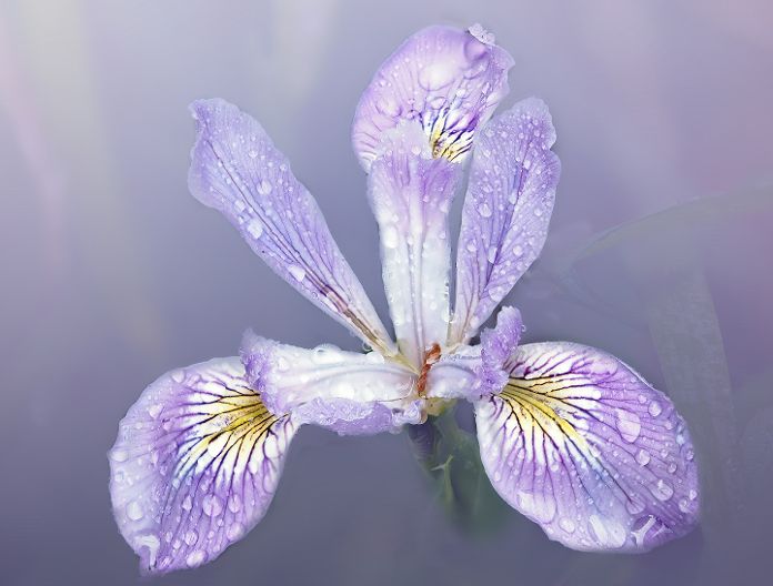
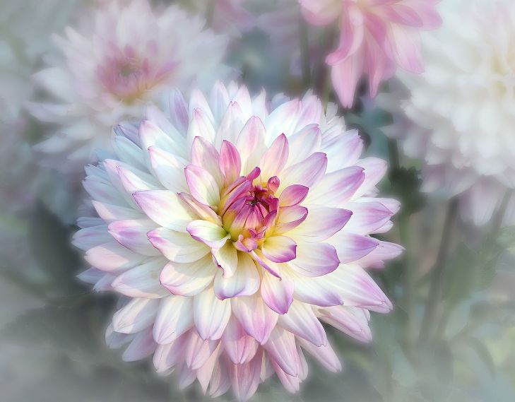
Hi Jody, An interesting flower with a vibrant color. When I look at it, the top of the bud, with its varied petals are most interesting. I desaturated the green a bit to not compete with the vivid purple and then cropped in to showcase the curves and bud. It might not be sharp enough now. I, too, would have used a texture with less grunge effect. |
May 16th |
 |
| 65 |
May 23 |
Comment |
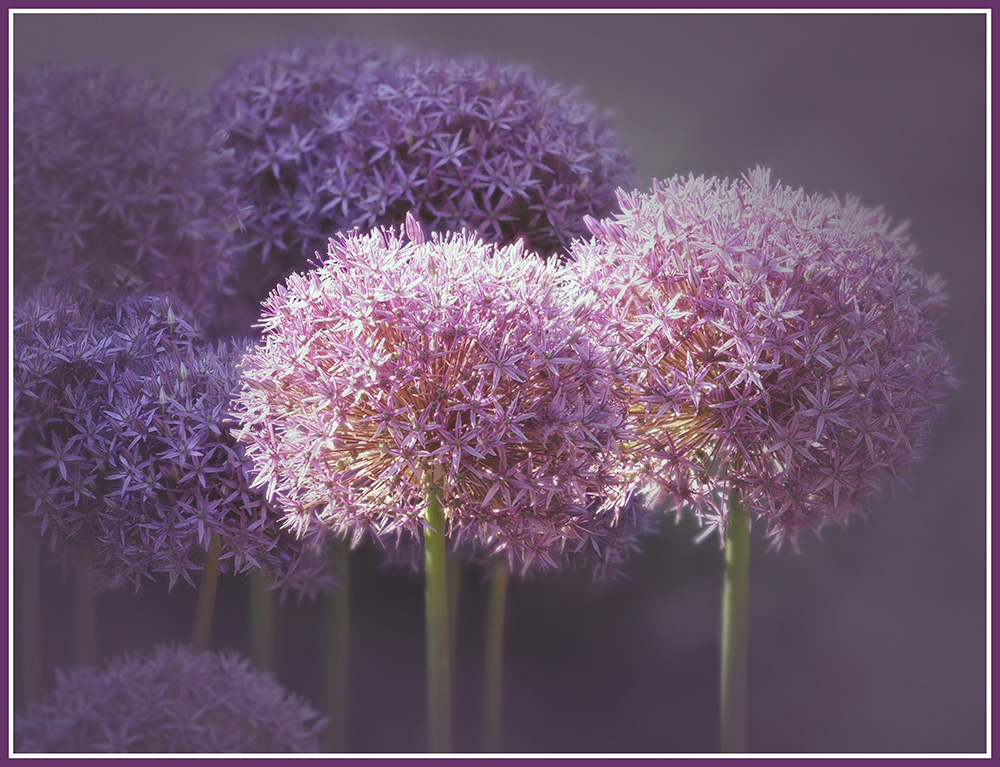
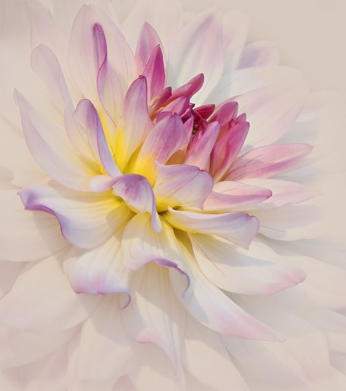
Wow! Such a unique use of saturation. It gives a totally different feel than you usually do (which I love). I can get lost in the detail. |
May 16th |
| 65 |
May 23 |
Comment |
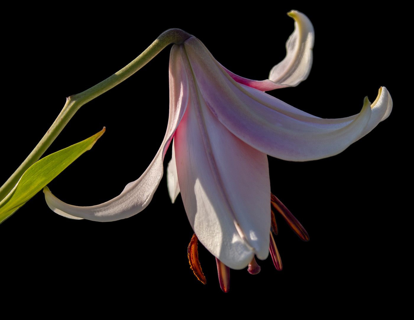
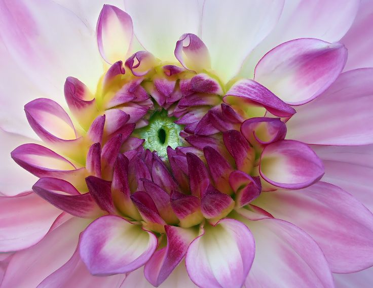
Beautifully done. It is difficult to get the front petal as well as the back petal in focus. I like the idea of using the background sheet, but, unfortunately, it does look flat. You might find a softer green texture and use Overlay Blend Mode to give the background more interest. |
May 16th |
| 65 |
May 23 |
Comment |
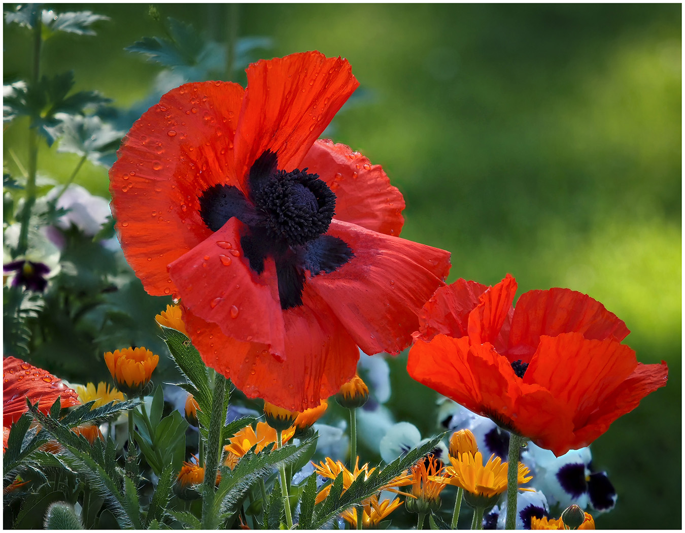
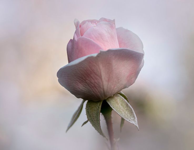
A striking image of light and tones. |
May 16th |
| 65 |
May 23 |
Comment |
Thank you all for your Comments. When we sit down to work on an image, we have a Vision of how we would like the photograph to look, what emotion we would like to evoke. Because I was working with the soft look of Lensbaby and the palest pink tulip, I wanted to keep that feel. I enjoy this Group because we are all experienced and talented flower photographers. Your input is appreciated. Because of that I cropped the image to Vertical, but did not like it...not enough breathing room. So I cropped it to square. I then tried changing the background. What do you think? Personally, I still prefer the pale pink. |
May 16th |
 |
6 comments - 2 replies for Group 65
|
12 comments - 2 replies Total
|