|
| Group |
Round |
C/R |
Comment |
Date |
Image |
| 12 |
Mar 23 |
Reply |
:) |
Mar 12th |
| 12 |
Mar 23 |
Reply |
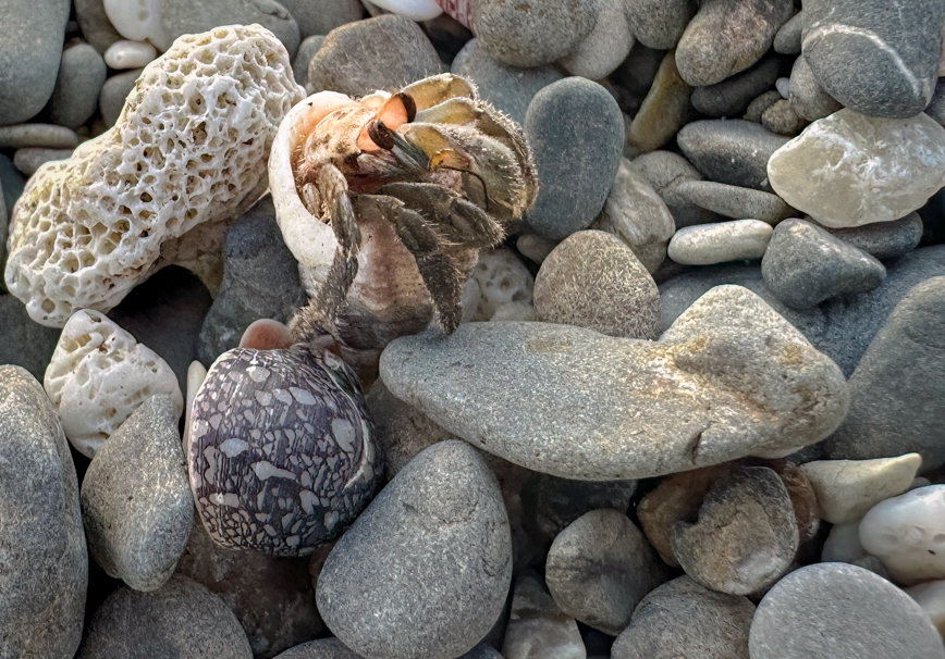
The assignment was not for a Macro, but for a close up. I have many Macro lenses that I could have used. |
Mar 11th |
| 12 |
Mar 23 |
Comment |
I love this story and I could just see you chasing him to get him in the right position! Would you consider cropping the top down a bit to put more emphasis on the crab? |
Mar 10th |
 |
| 12 |
Mar 23 |
Comment |
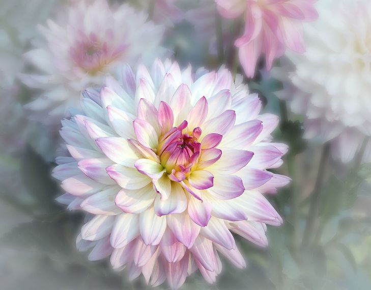
It is always a challenge to get that drop before it falls! You did well. I love the colors, but would have liked to see a bit more contrast and structure in the petal. |
Mar 10th |
| 12 |
Mar 23 |
Comment |
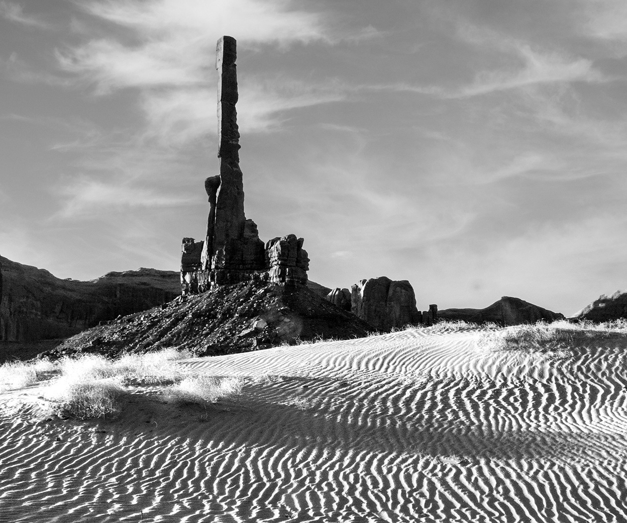
A truly creative example of shooting a Close Up. What lens did you use? How many mm away? How many square inches is your subject? Great job! |
Mar 10th |
| 12 |
Mar 23 |
Comment |
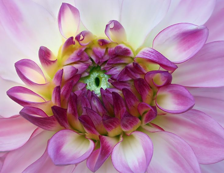
A wonderful Close Up...the eye and the bits of food show it well. You were able to crop in significantly and keep the sharpness. |
Mar 10th |
| 12 |
Mar 23 |
Comment |
This is a beautiful Close Up, Carole. I love how you are peeking in and drawn right into the Center. The blurred petals in the foreground are a bit of a distraction to me. Too much contrast? Yet, in the Original, it is so nice and soft it all works together. And it is Art...maybe you didn't need to post process it as much! |
Mar 10th |
5 comments - 2 replies for Group 12
|
| 39 |
Mar 23 |
Reply |
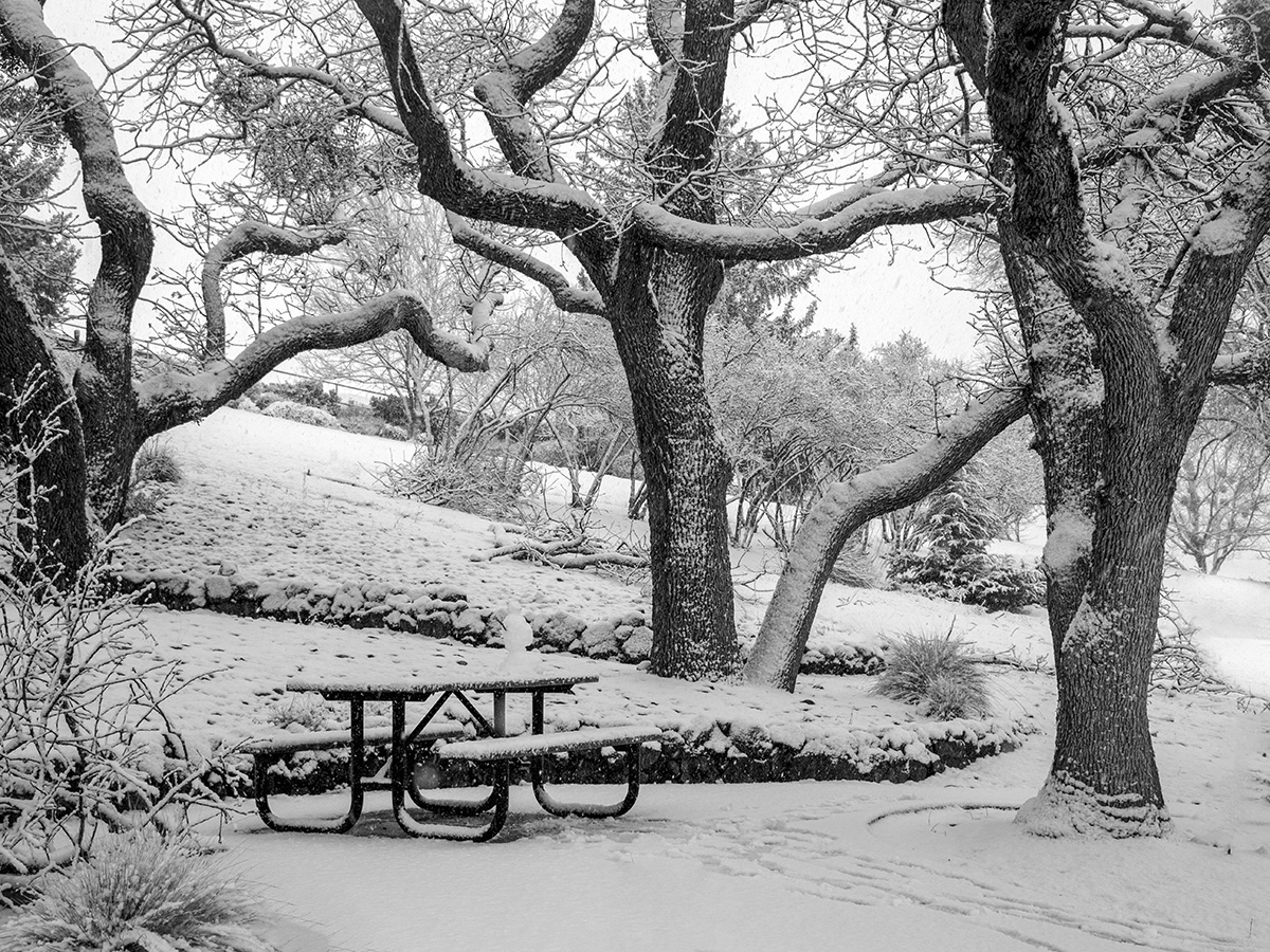
Thanks, Kathryn. I agree. Sometimes you experiment when you should have left well enough alone! |
Mar 12th |
| 39 |
Mar 23 |
Comment |
In the original, my eye is drawn to the contrast of the driftwood and the color of the rocks. In the Black and White I see textures. Nicely cropped in for a close up. |
Mar 12th |
| 39 |
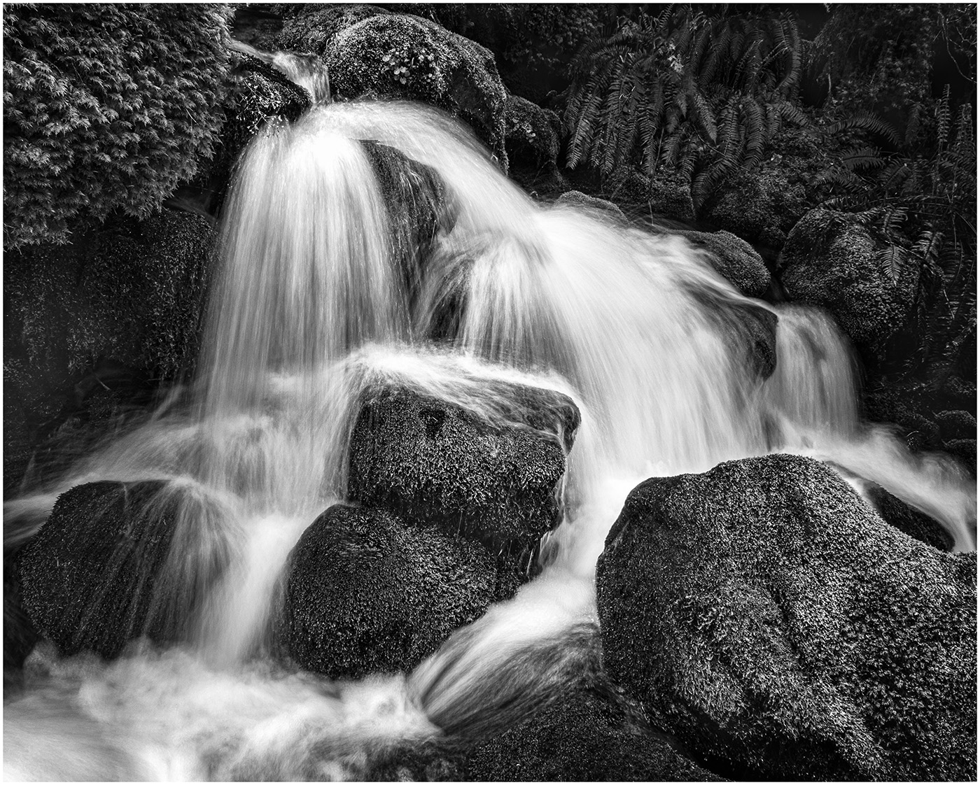
Mar 23 |
Comment |
A beautifully framed waterfall. I like the textures and tones. My only suggestion, would be a slower shutter speed to make the falls more "cotton candy" or a faster shutter speed to show the force. And extra points for navigating the right spot without falling in! |
Mar 12th |
| 39 |
Mar 23 |
Comment |
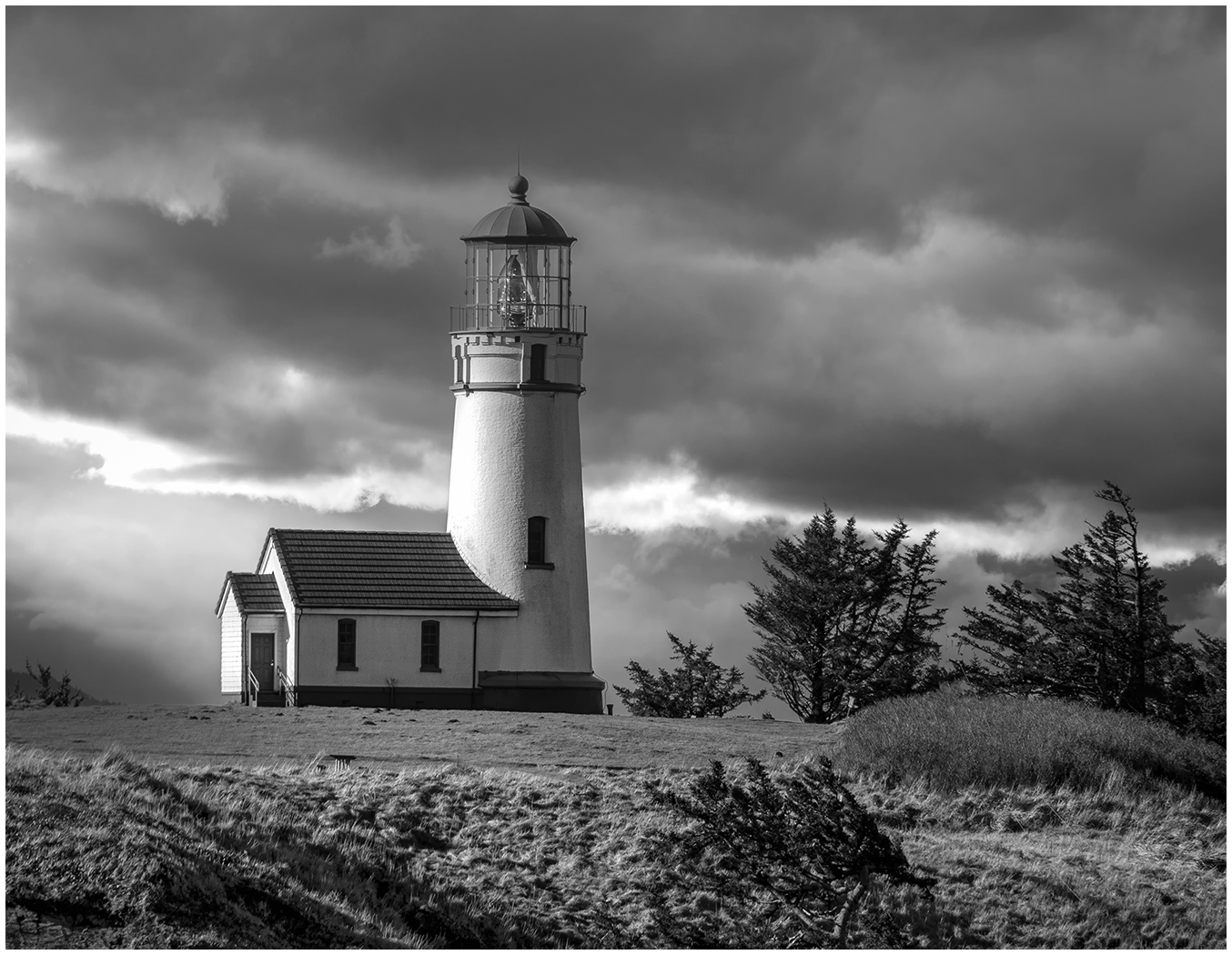
I like the tones and the contrast of the towers against the sky. I am looking at the original crop on the left and think I prefer it as opposed to the crop on your submission. I do like the crop up from the bottom. I think it works well in B & W. I miss those blue skies. |
Mar 12th |
| 39 |
Mar 23 |
Comment |
Your Ballet Dancer shots make me jealous that you have such an opportunity. This one is perfect in Black and White. The tone of her back seems to detract in the color version, yet blends well in B & W. The way she is bending down, her tutu resembles a flower, her body the stem. |
Mar 12th |
| 39 |
Mar 23 |
Comment |
A wonderful Action Scene. I like the tones and the DOF created by the player in the front and the 2 players squaring off. A real nit pik...I would take out the hockey stick sticking out from the left side. Must have been fun and challenging to try and capture. |
Mar 12th |
| 39 |
Mar 23 |
Reply |
Thank you, Ken. I was not sure, but seeing it posted, I definitely prefer the original B & W and the contrasts. |
Mar 12th |
| 39 |
Mar 23 |
Reply |
Thank you, Dave. I think I confused the issue when I submitted the original and the High Key version. This is the B & W that I used to convert to a High Key filter in SilverEfex Pro. My question was does the Effect work or is the Original Black and White better? Seeing it on the screen, I definitely prefer the original B&W. |
Mar 12th |
 |
| 39 |
Mar 23 |
Reply |
Thank you for commenting on my photo, Lance. I am not sure I was clear in stating the amount of post-processing I did. I did not add snow. What I added to the Black and White conversion was a High Key Filter. All else is Photography. Please see the Original Black and White I posted in response to Dave's comments. |
Mar 12th |
5 comments - 4 replies for Group 39
|
| 65 |
Mar 23 |
Reply |
Thanks, Jodi. I look out my window and still see grey clouds! |
Mar 10th |
| 65 |
Mar 23 |
Reply |
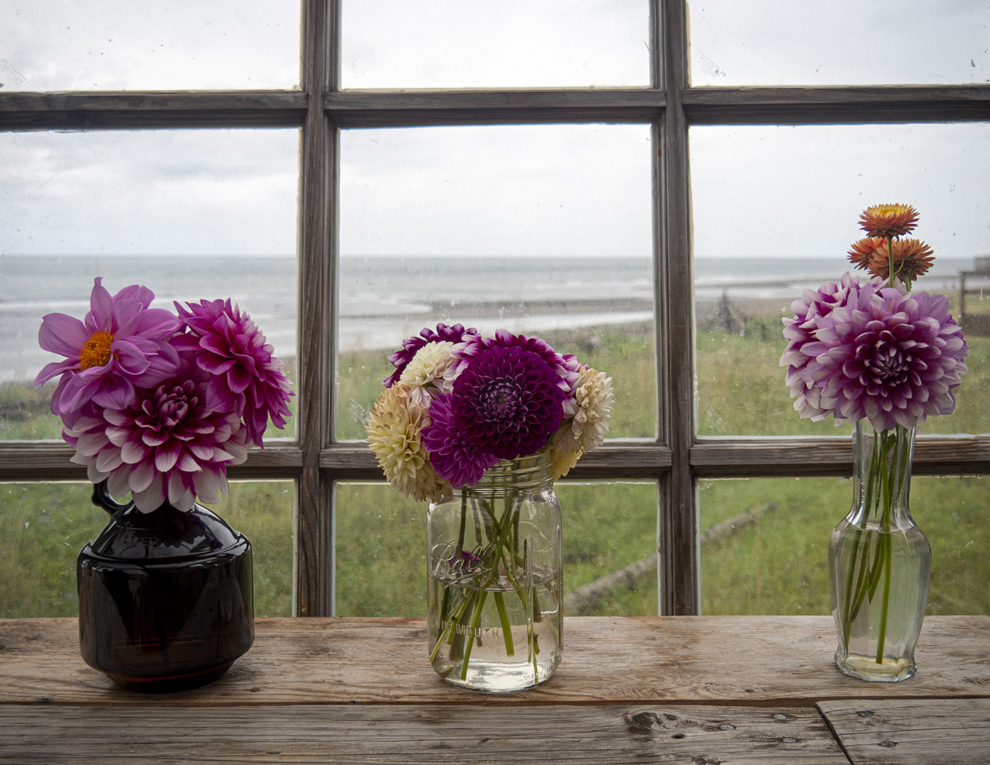
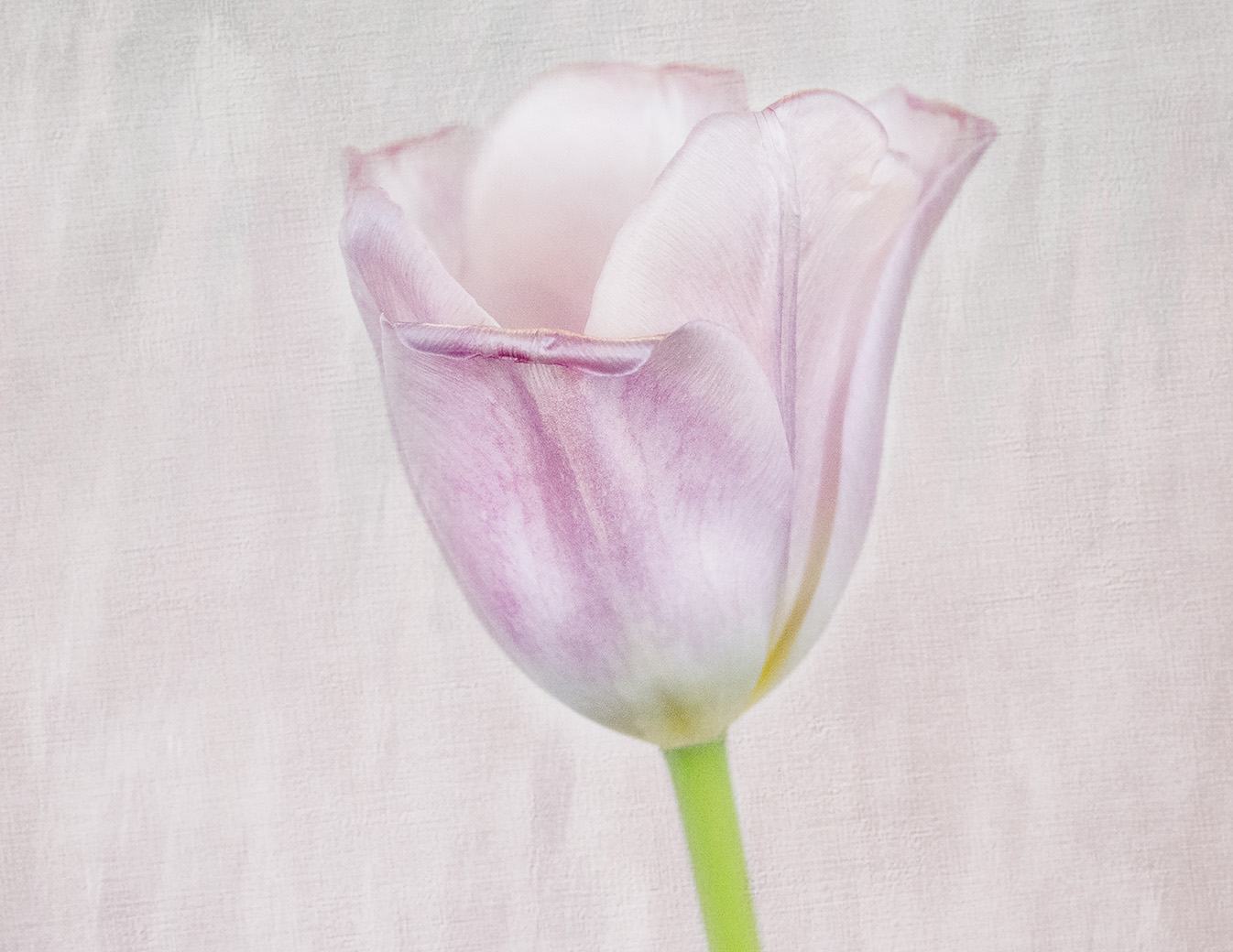
Thank you, Dick. I do like your crop and where you are going with keeping the one tulip. It looks as if you are adding a bit of space on the right. And here is a question for you and the others...I kept this a rectangle with the ratio of 4:3. It is easy to print and find an inexpensive frame. I actually used the photo for "March" in a Floral Calendar. Given those contraints, how would you Crop it? |
Mar 10th |
| 65 |
Mar 23 |
Reply |
Thanks for explaining, Melanie. Kathleen Clemmons calls this "Shooting Through". I'm still trying to Master that technique. |
Mar 10th |
| 65 |
Mar 23 |
Comment |
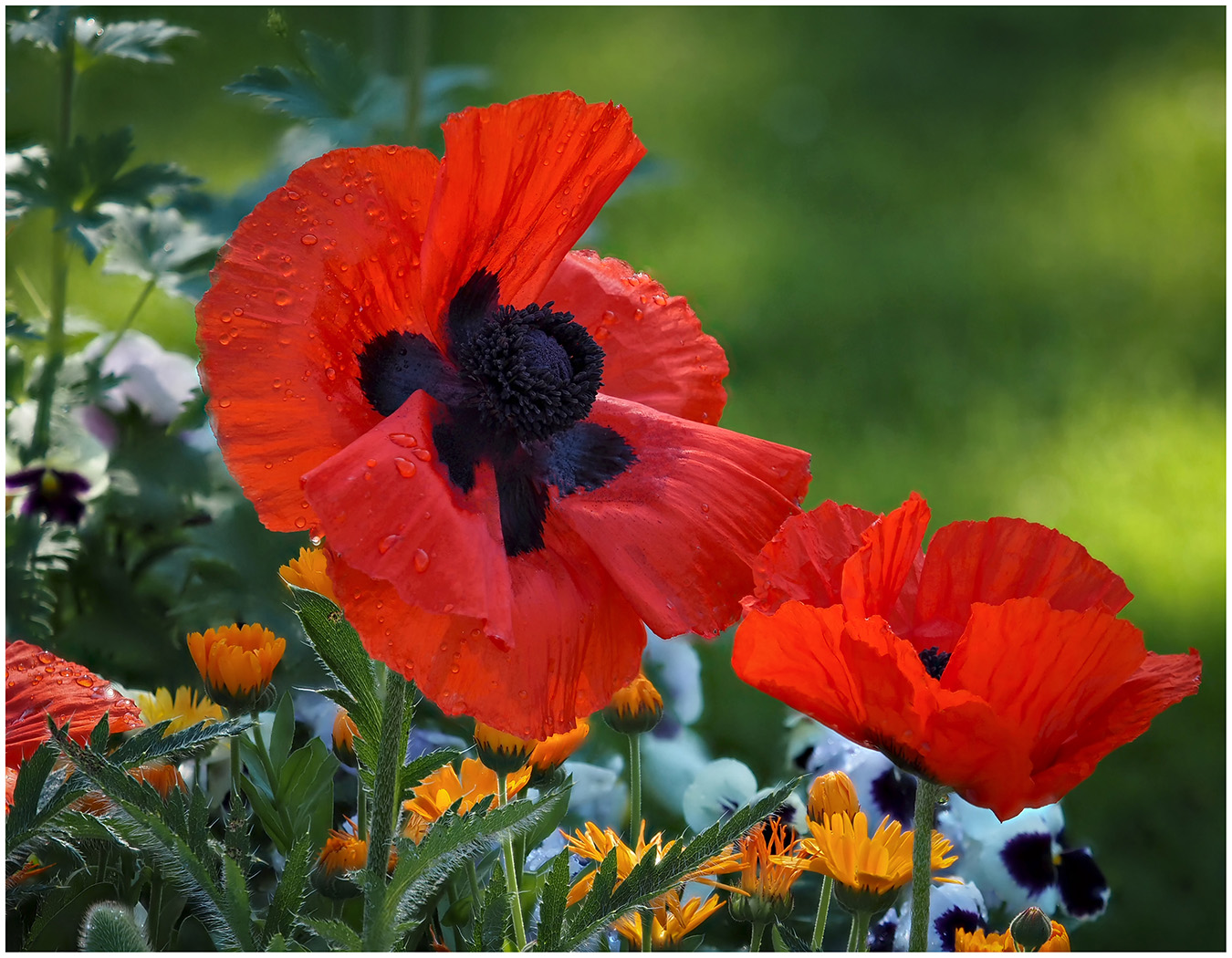
What a great catch to find the ladybug. I think I prefer the lower saturation in colors because then there is more contrast with the ladybug. I agree with Melanie I would have cropped up. |
Mar 9th |
| 65 |
Mar 23 |
Comment |
A beautiful duo. Wonderful tones. I like how you focused on the Background and I like the soft texture. By flipping the photo it does look more balanced and as if they are dancing together. |
Mar 9th |
| 65 |
Mar 23 |
Comment |
I like the crop and how you rotated and positioned the lily off center. I also like it converted to monochrome because then we are seeing the shape of the flower. I like the shadows on the petal. Again, it is interesting in monochrome. Good job! |
Mar 9th |
| 65 |
Mar 23 |
Comment |
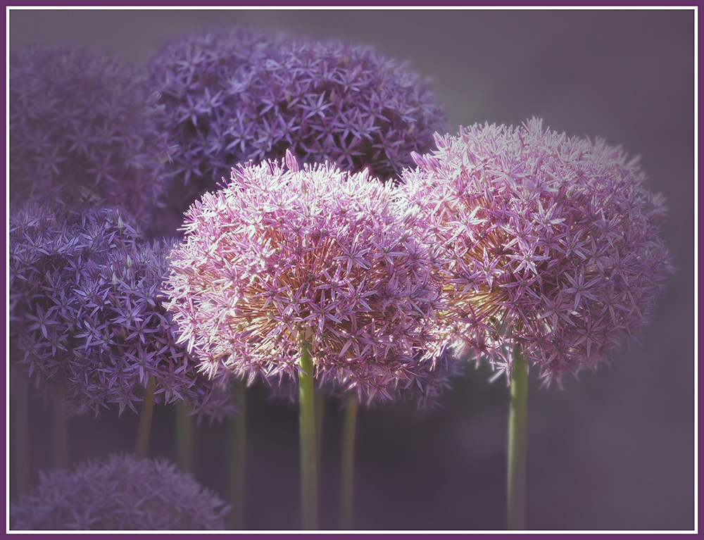
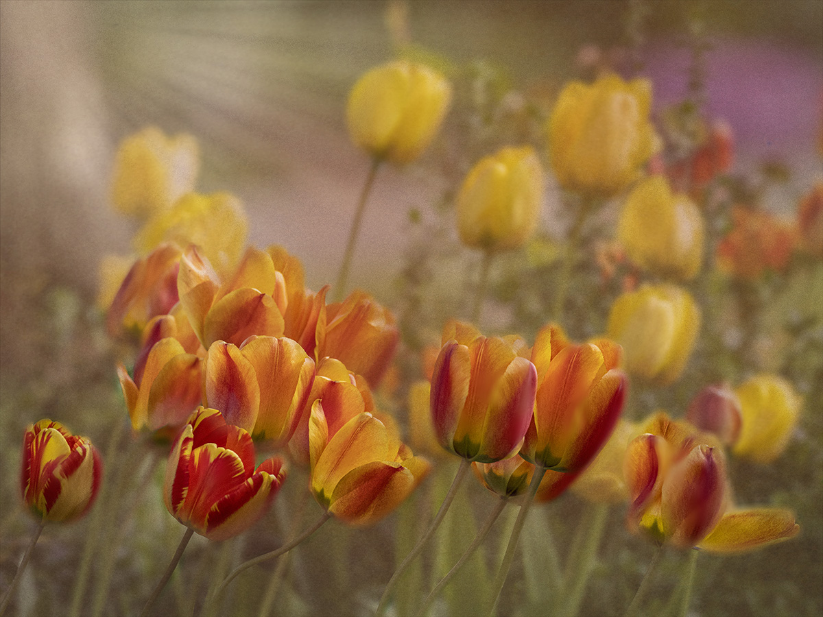
Well, we both chose a field of flowers this month. I like the colors and the complimentary green. I do agree with Dick in cropping the left in a bit. When you say, you have the Lens almost touching the foreground flower...can you explain more? |
Mar 9th |
| 65 |
Mar 23 |
Comment |
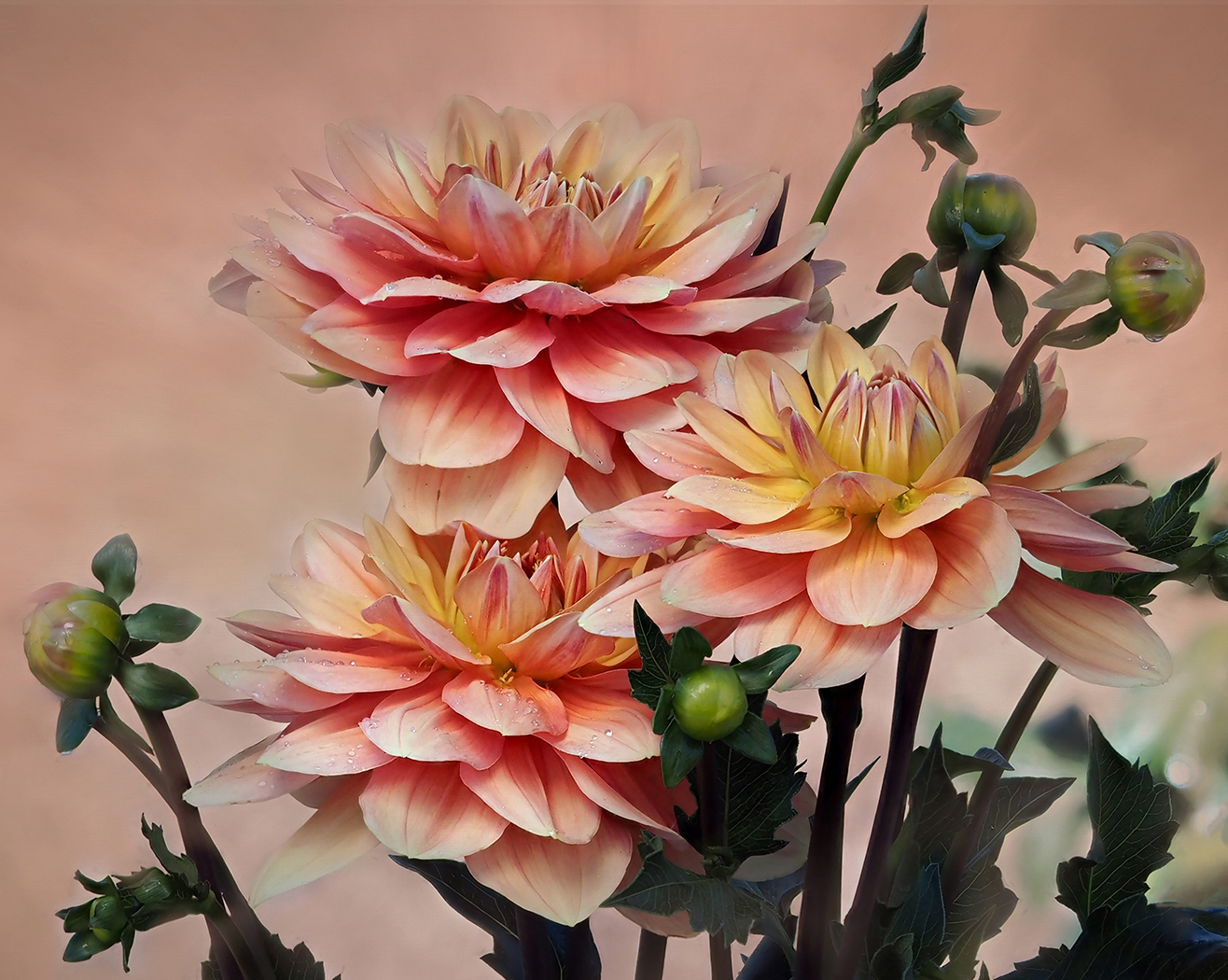
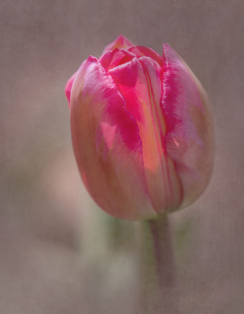
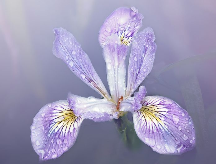
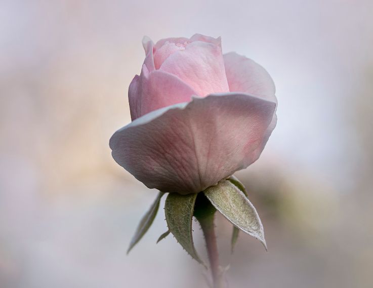
So glad to see your rose here. We have missed you! The rose is beautifully executed. I agree, a soft texture, as you usually do, would make it more dreamy. The white appears a bit stark. |
Mar 9th |
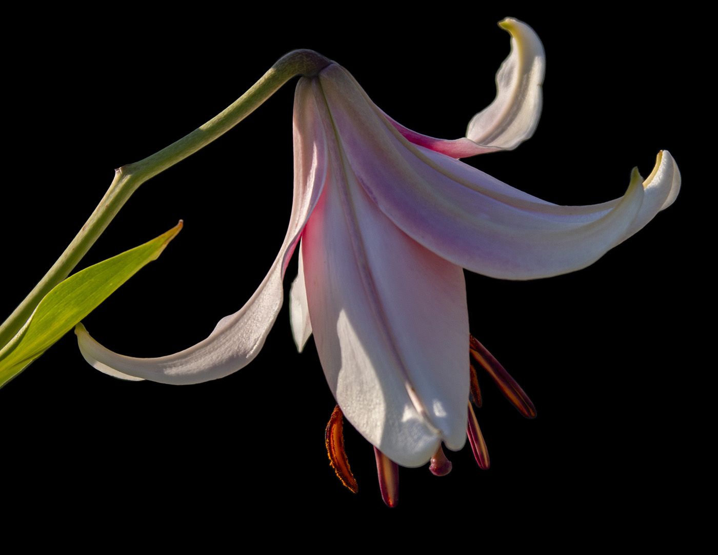
| 65 |
Mar 23 |
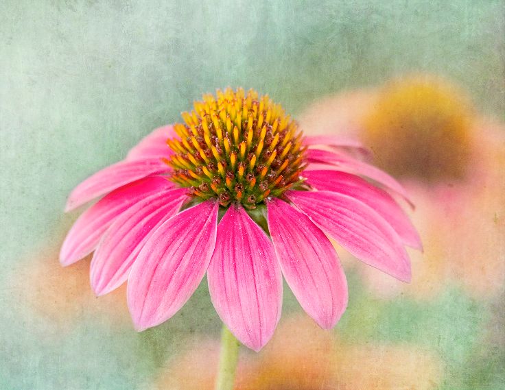
Comment |
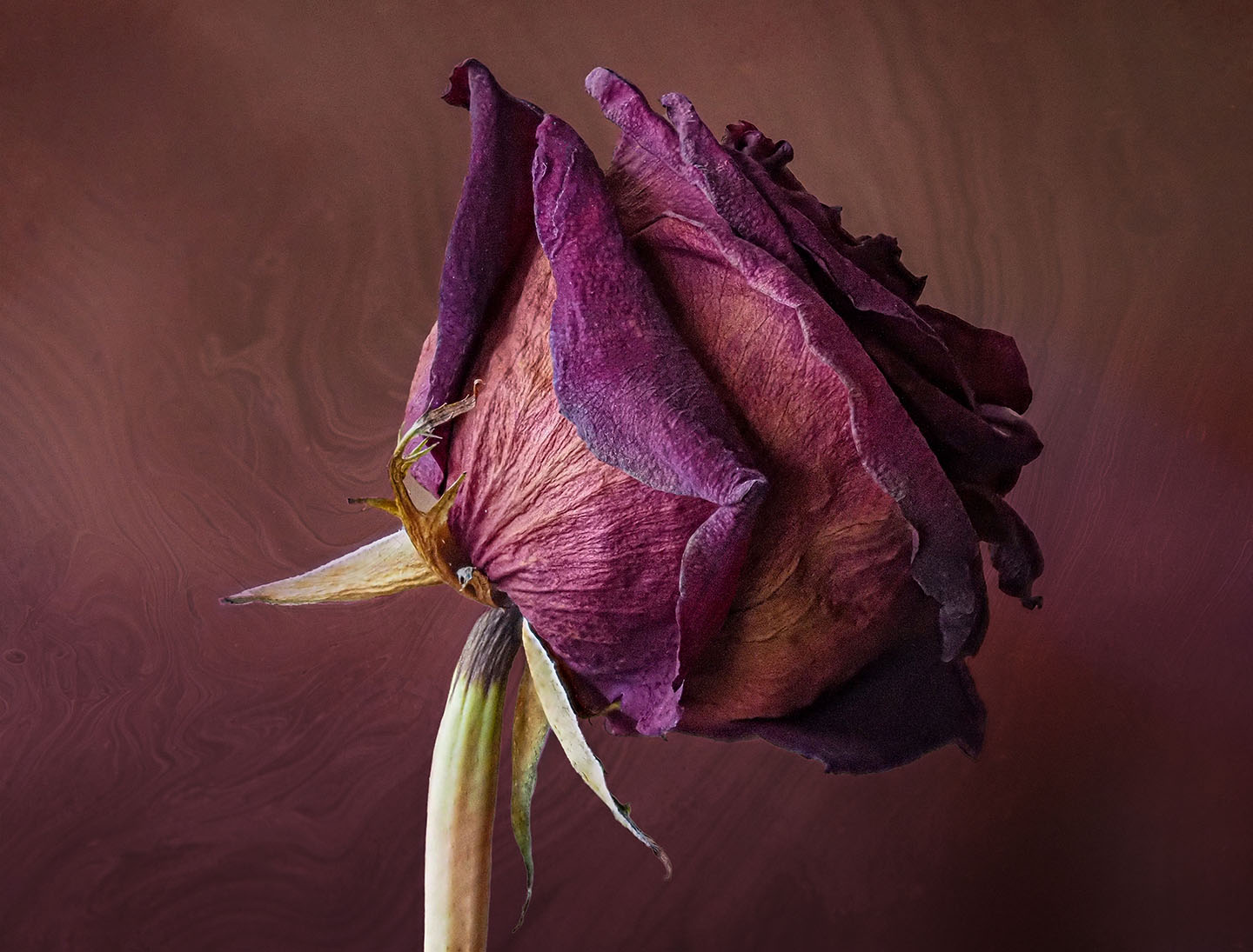
A beautiful rendition of this flower...the color and the texture. I like the Contrast with the Black background. Personally, I would like to see a little more black space around the flower. Just a smidgeon. I am confused about you liking the LensBaby look. Did you do this with a Lensbaby and stacked it? The reason I am asking is because I think of lensbaby as blurred, impressionistic. If I could use my Velvet 56 in a different way that would be interesting. |
Mar 9th |
| 65 |
Mar 23 |
Reply |
Thanks for your input Melanie. I see what you are saying about the crop. I wanted to show a field of tulips with emphasis on the foreground. Your crop still does this. I would take out the stem and the tulip to the right of the stem, however. As for noise, that is the texture I chose...not married to it. While I know that DeNoise is the denoiser of choice, I find Define 2 in the NIK Collection does a fine job for me. |
Mar 9th |
6 comments - 4 replies for Group 65
|
16 comments - 10 replies Total
|