|
| Group |
Round |
C/R |
Comment |
Date |
Image |
| 12 |
Feb 23 |
Reply |
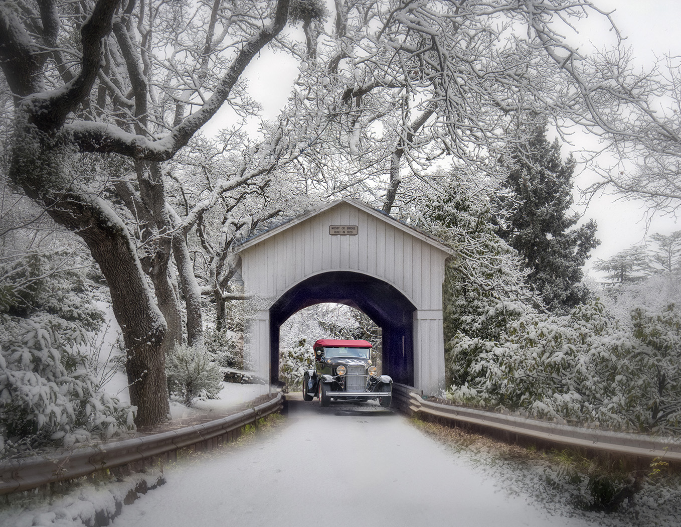
Next year's Christmas Card! |
Feb 26th |
| 12 |
Feb 23 |
Reply |
Thanks, Carole. I, too. use the Adjustment Brush in ACR now more than I Dodge and Burn. i also have just discovered presets for ACR. |
Feb 26th |
| 12 |
Feb 23 |
Comment |
Thank you, Lee Ann for taking the time to reedit my photo. It creates a totally different look. What I visualized was a soft background that blends into the bird. It took me 3 layers to get the effect I was looking for. Each photo has so many possibilities. |
Feb 19th |
| 12 |
Feb 23 |
Reply |
Thank you, Barbara. I feel that everytime we change the background we are creating Art, and moving away from documenting. It's a slippery slope, but I have fun.I do agree with what you are saying and will go back and subtly change the exposure and whites in the blown areas. I do want to keep it white, though, since those areas are white. It's good to have so many eyes look. |
Feb 19th |
| 12 |
Feb 23 |
Reply |
Thanks, Carole. I can see what you did and I like the change, but how did you do it? |
Feb 19th |
| 12 |
Feb 23 |
Reply |
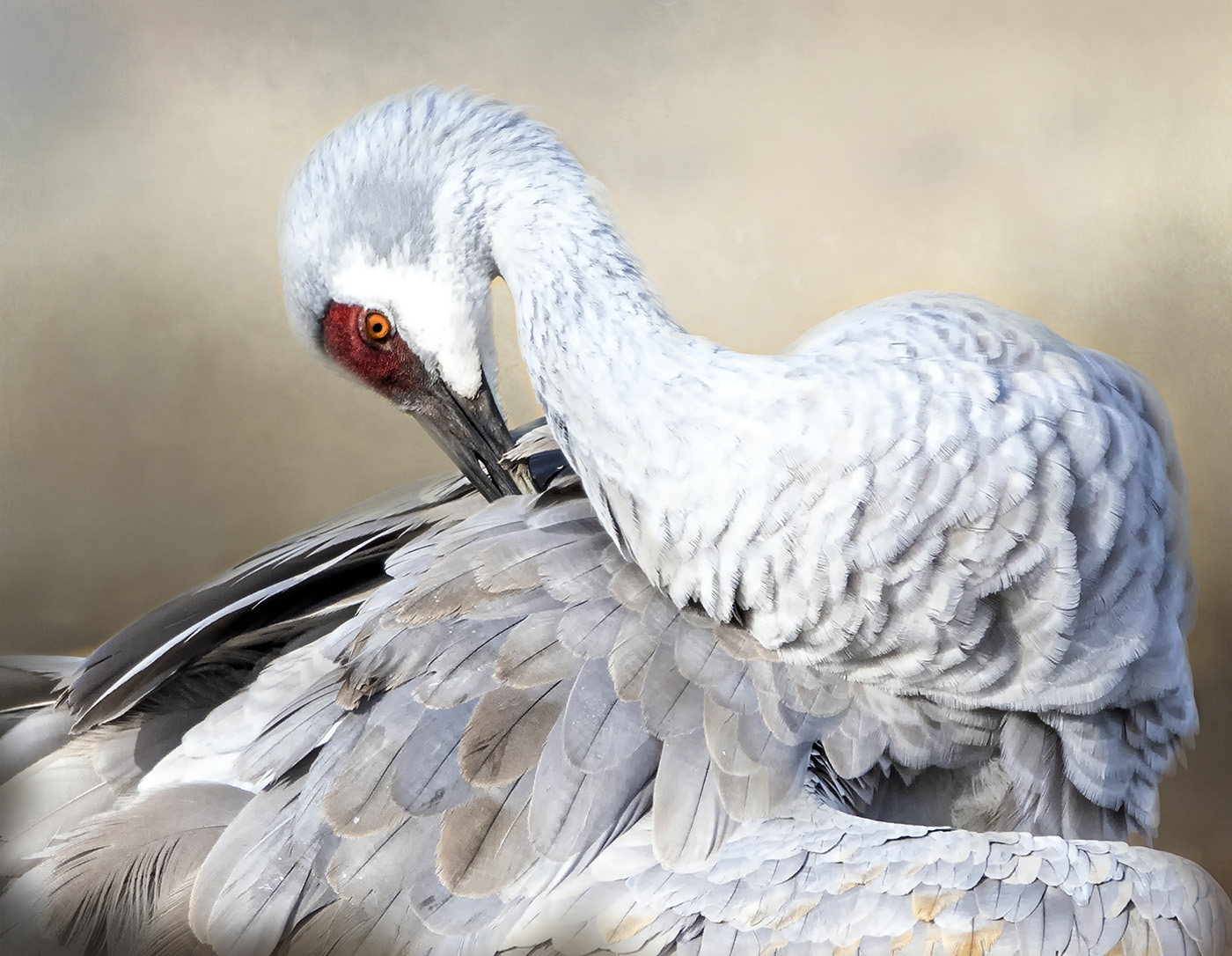
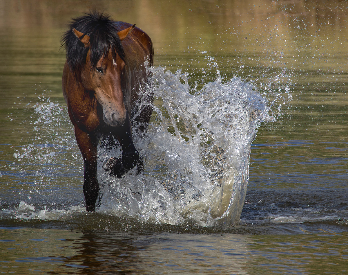
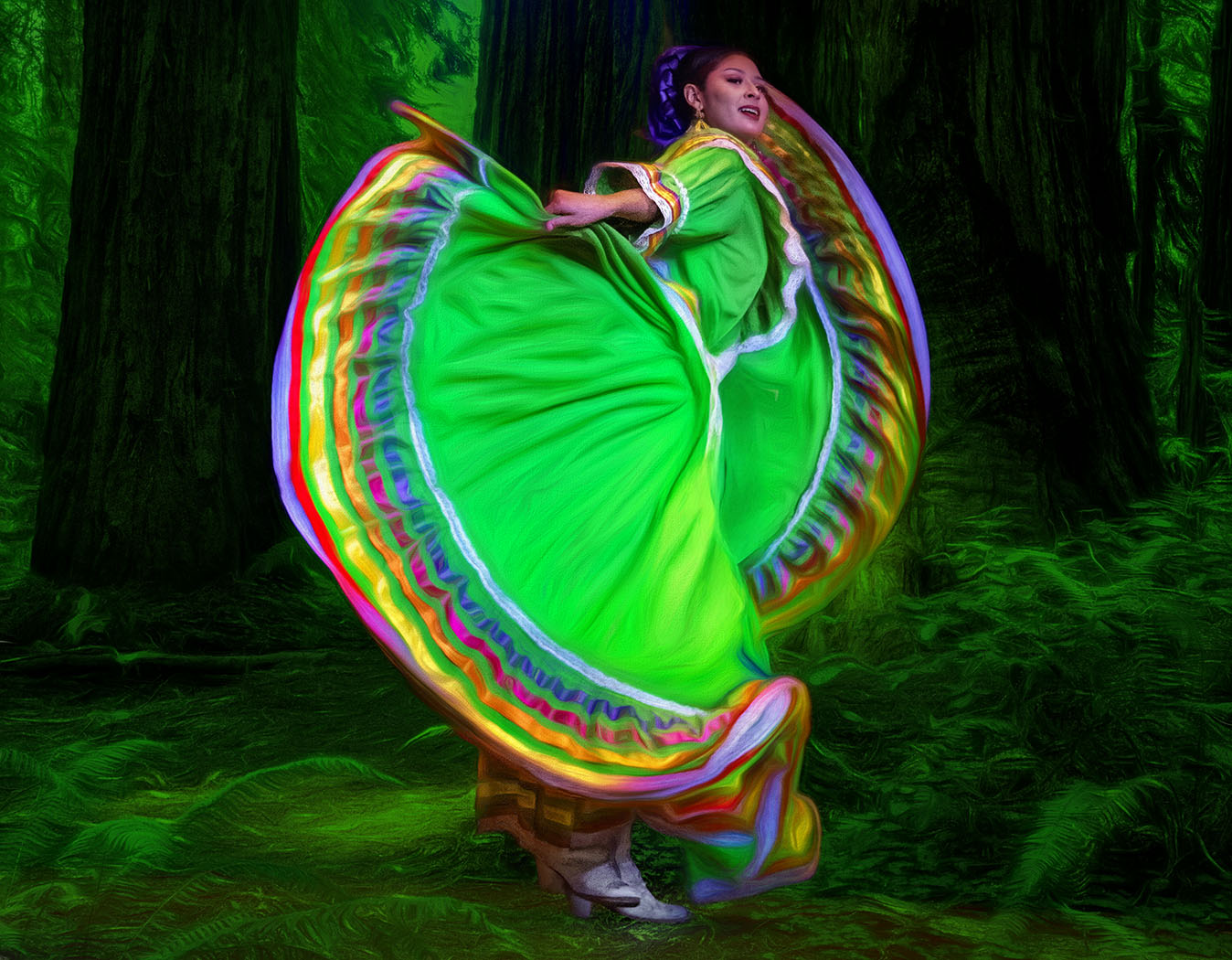
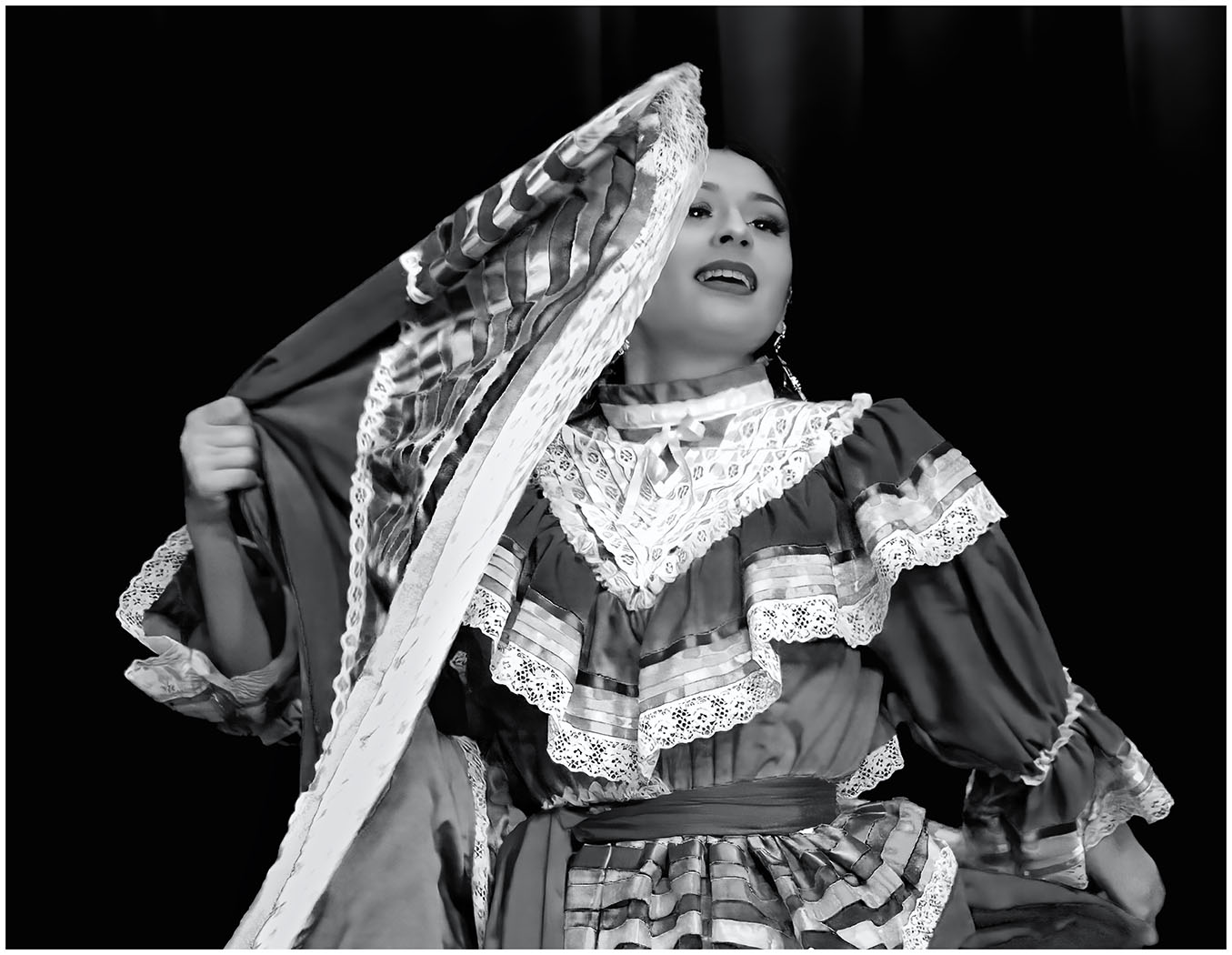
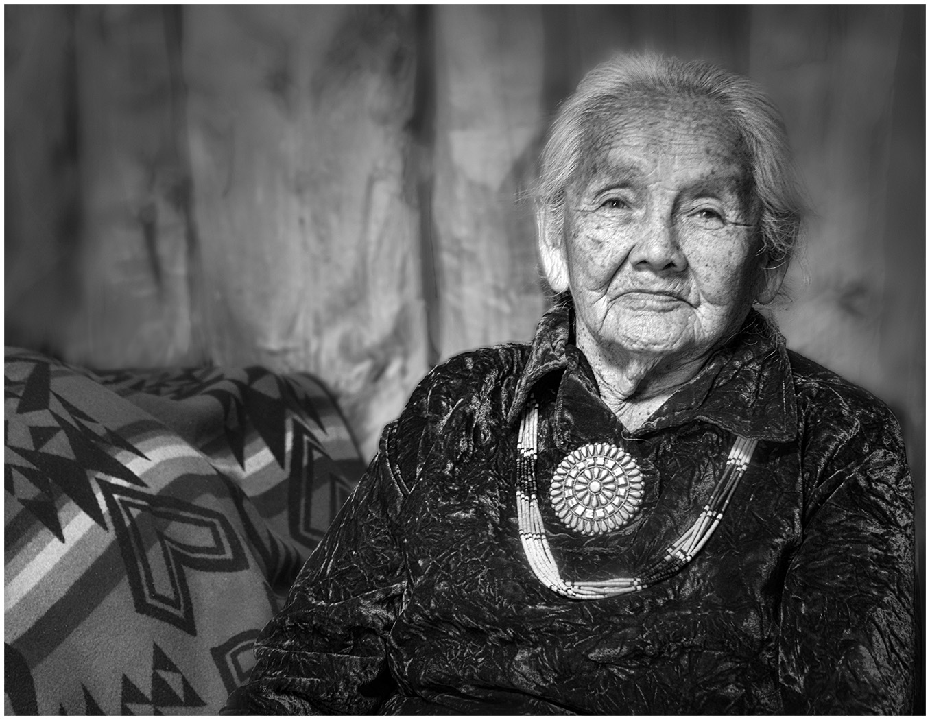
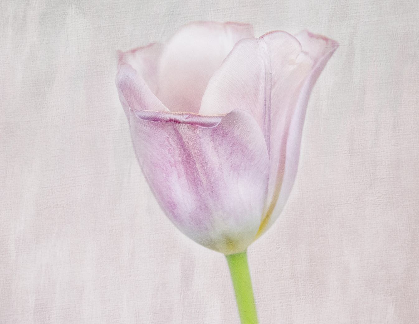
Thank you, Ally. Bosque del Apache is a magical place. As for your comment about liking to see a vertical, I have a couple of thousand other poses I would be happy to share with you :) in every pose imaginable. When I use textures, I use a Layer in Photoshop, changing the Blending Mode and Opacity. I use a Layer Mask to reveal what I wish to keep. Just Google Texture Backgrounds...otherwise I can suggest some videos.I took this photo in the morning around 9:30. ISO was on Auto and was 340.
|
Feb 19th |
| 12 |
Feb 23 |
Reply |
Thank you, Chane. I think it is important to keep the white patch, because if you look at a Sandhill Crane, it has a pure white patch under its eye. I will go back, however, and mask it and bring the exposure and whites down in those areas. |
Feb 19th |
| 12 |
Feb 23 |
Reply |
Thank you, Chane for your comments. About the Background...I tried it just blurring the original, but liked the effect better with an Art Texture. I know it is the difference between a photograph and digital art, but I do enjoy using textures to replace a busy background on wildlife "portraits". I understand that you think that the white areas are blown, but they are not. I have shadows and highlight blinkies set on my camera, They did not come on. Then, again, when I take it into ACR I have the warnings set. Again, they did not come on. So, I have to assume, the white areas are not blown. I agree it appears so, but not. As for changing the colors of the feathers to yellow, I'm not sure what you mean. The feather colors ring true as Sandhill Crane feathers. I appreciate your ideas.
|
Feb 8th |
| 12 |
Feb 23 |
Comment |
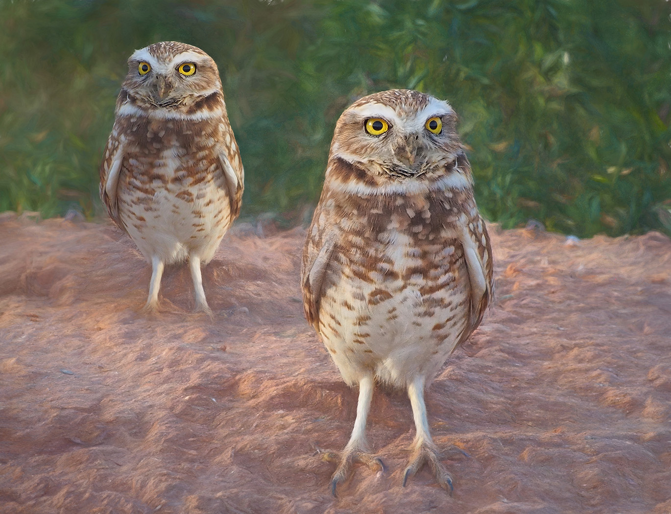
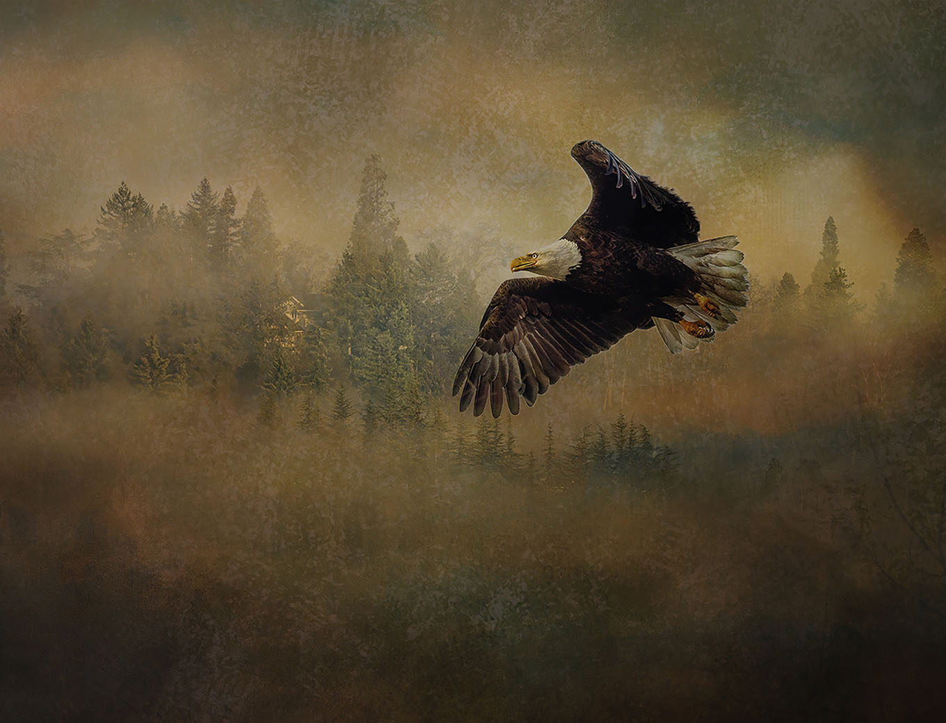
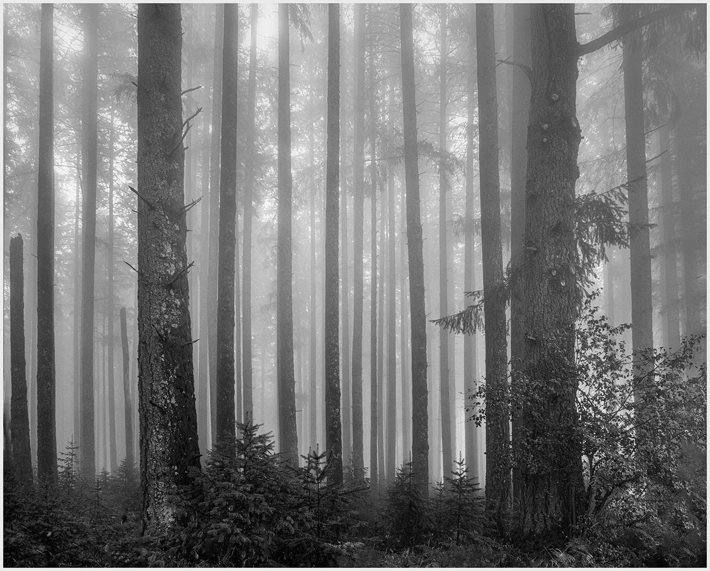
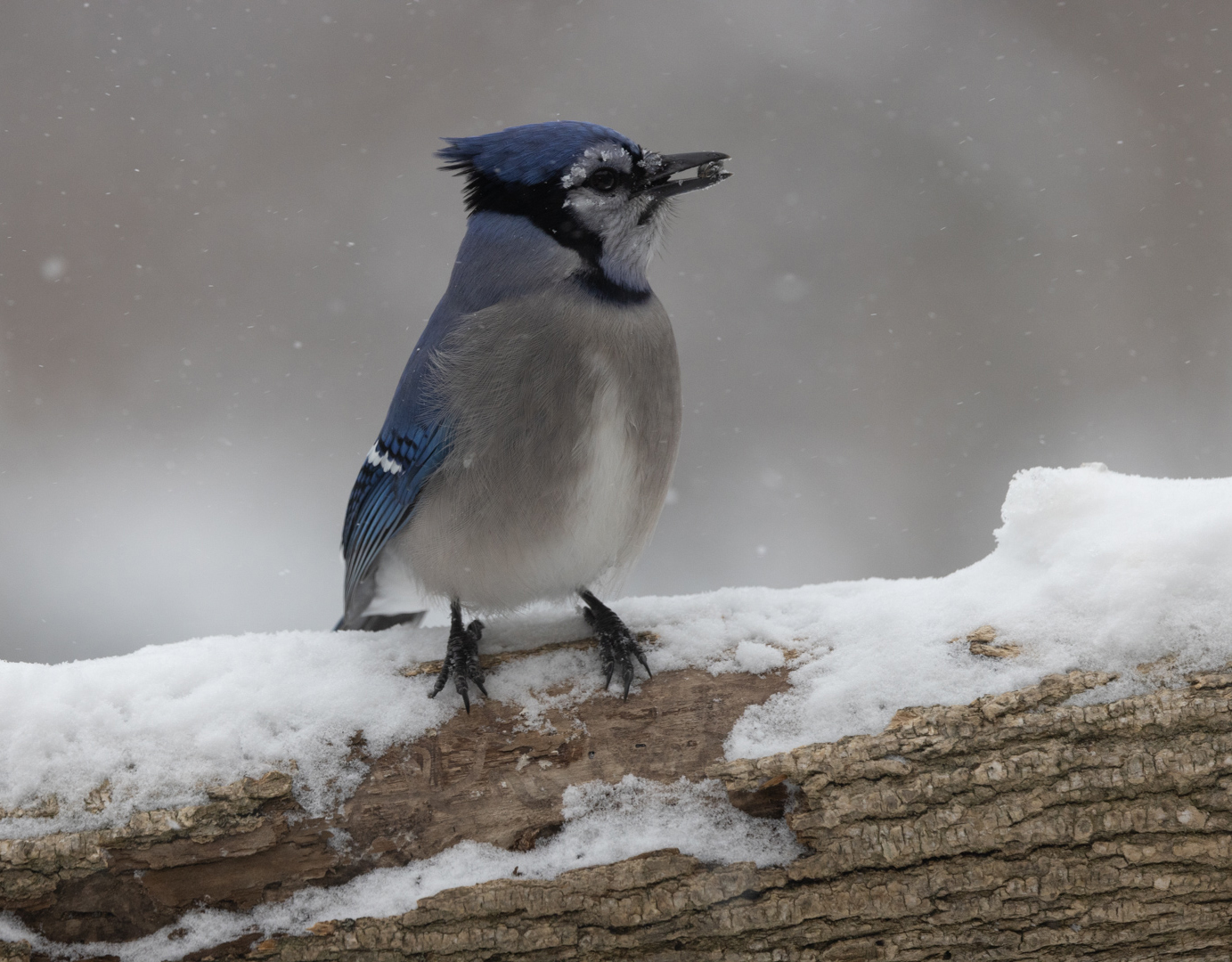
Definitely a Winter feel to the photo. Barren trees and tiny birds. Where do they go when it snows? I usually get my largest zoom lens and try to capture 1 in isolation. Interesting take. Something to think about. |
Feb 7th |
| 12 |
Feb 23 |
Comment |
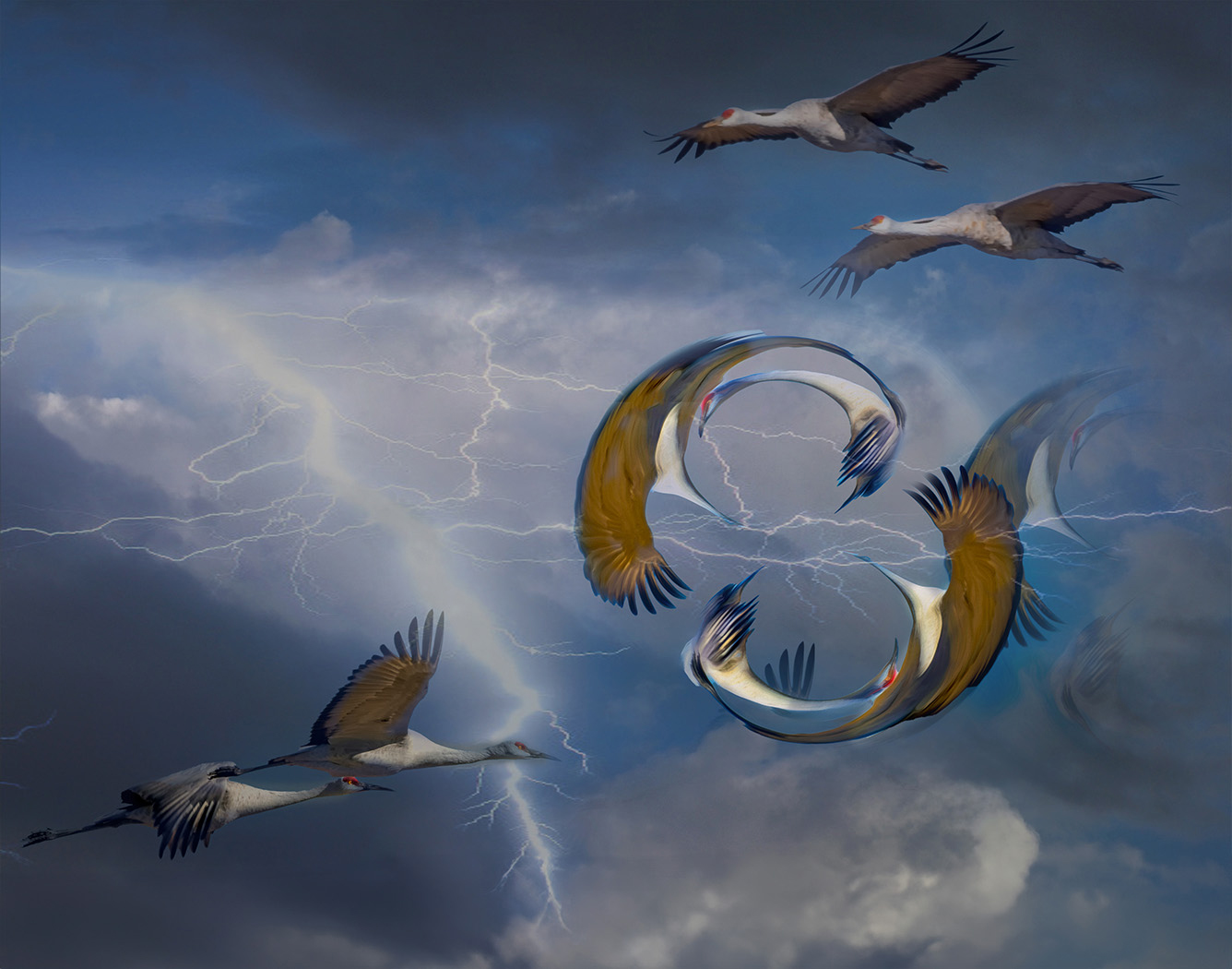
These guys are so fast! Good capture. I see you had a really fast shutter speed...I usually try 1/2500, will try 1/3200 next time. I like how you captured the wings, 1 still and 1 showing movement. I agree...I prefer only the one flower. |
Feb 7th |
| 12 |
Feb 23 |
Comment |
Thanks for explaining your setup, Chane. Perfect!The detail of the bird's eye and the birdseed in his beak are what my eye goes to immediately. I love the detail in the log and I might have left it for balance with this crop. Not sure if it changes your vision too much. It is still a close up of the bird and the detail remains. What do you think? |
Feb 7th |
 |
| 12 |
Feb 23 |
Comment |
My eye goes right to the bird, framed by the frozen branches. A nice highlight in his eye. I might have lightened it a bit. I like how Connie adjusted the levels to intensify Contrast. I might think of removing the small branches on the top left. It distracts my eye from the perfect framing. |
Feb 7th |
| 12 |
Feb 23 |
Comment |
Cardinals are definitely the bird of winter. I have seen few here in Winter. He stands out well against the background and I like the detail in his perch. Frozen little icicles say "Winter". |
Feb 7th |
| 12 |
Feb 23 |
Comment |
Beautiful photo of a Cardinal. The contrast of the red against the white is what my eye goes to immediately. I like how you took out the branches, leaving just a hint and added the white vignette. The 2nd bird balances the composition. I might have tried to remove him and see how it looks with just the cardinal. Can you explain more about using strokes to sharpen the image? |
Feb 7th |
| 12 |
Feb 23 |
Reply |
Thank you, Connie. |
Feb 7th |
7 comments - 8 replies for Group 12
|
| 39 |
Feb 23 |
Reply |
Thank you, Vincent. I agree with you about the white frame. Truthfully, I didn't think of it as setting off the picture, bu just a means of adding contrast between the background and photo. I will look at it more critically in the future. |
Feb 20th |
| 39 |
Feb 23 |
Reply |
Thank you, Paul. I never thought to shorten the trees. Good thought. |
Feb 20th |
| 39 |
Feb 23 |
Reply |
Thank you, much appreciated. |
Feb 20th |
| 39 |
Feb 23 |
Reply |
Thank you, Ken. |
Feb 20th |
| 39 |
Feb 23 |
Comment |
This is a beautiful shot. It is so striking in B&W. and does tells a story, but my eye keeps going back to the girl sitting straight and looking down. What expression in her face! I would love to see a photo of just her. Did you take one? |
Feb 10th |
| 39 |
Feb 23 |
Comment |
Both shots are beautiful. I do like the muted Grunge tones of the color shot. Do you have NIK Color Efex Pro? I might try Bleach Bypass to give the bricks a grungier contrast and then mask out the subject. It would be interesting to see the effect when you convert it to B&W. Great use of shadows and light. |
Feb 10th |
| 39 |
Feb 23 |
Comment |
Once again, your Dancer shots are wonderful. I like the conversion to B&W and the Crop. The only suggestion I would have is masking out the vignette on the dancer's forward foot. I would like to continue the line of her leg. The back leg, can keep the vignette (shadow) but lighten it a bit. These inspire me. |
Feb 10th |
| 39 |
Feb 23 |
Comment |
Beautiful photo, Paul. I like the soft background, the texture of the leopard, and the Contrast. But when I look at the Color version, the muted, blurred colors of the Background really set the white of the leopard off. Tough decision. I am going to go out on a limb here, and say I think I like the Color version a tad better. |
Feb 10th |
| 39 |
Feb 23 |
Comment |
I love the simplicity and minimalism of this, Dave. And it works so well in Pano. As I was scrolling down, I didn't get to the bottom of the entire photo, but liked its balance..so...one small suggestion, did you try cropping up from the bottom a bit? |
Feb 10th |
5 comments - 4 replies for Group 39
|
| 65 |
Feb 23 |
Reply |
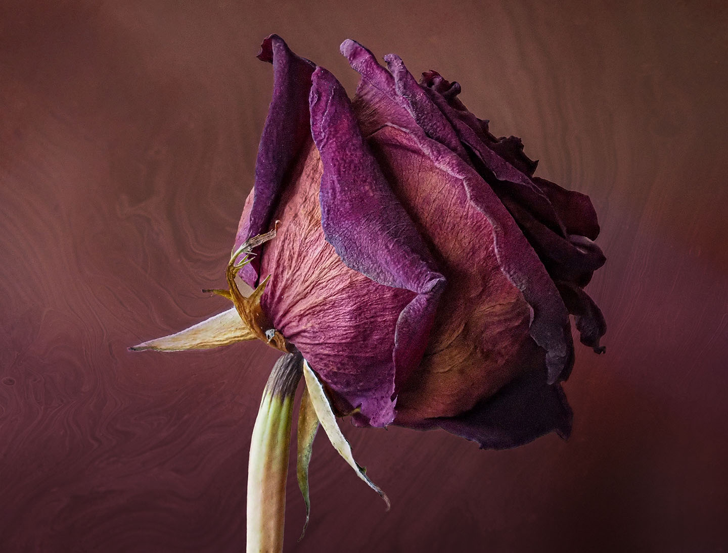
Thank you, Melanie. "Memories" seemed appropriate with Valentine's Day coming up. More dried flowers. |
Feb 11th |
| 65 |
Feb 23 |
Reply |
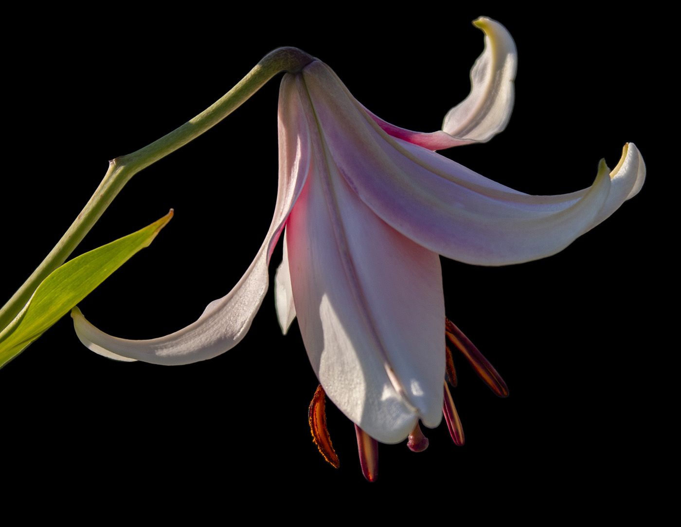
Thanks, Jody. I love your metaphor for life. I need to remember that. Finding the proper texture was interesting. I made one of my own using the colors of the flower, but it needed something more. Then I remembered that during lockdown I had downloaded hundreds of Free Textures and this one might work. As for focus stacking, it is a tool I use often to keep the sharpness of the flower. I shoot with an Olympus M1-X and it does focus stacking in camera. I know that many other cameras have that feature. Good luck!
|
Feb 10th |
| 65 |
Feb 23 |
Comment |
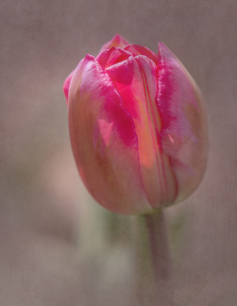
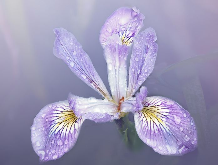
Once again, a beautiful photo. I like the detail of the flower and how you have chosen the Background texture to blend with it. Lovely. |
Feb 8th |
| 65 |
Feb 23 |
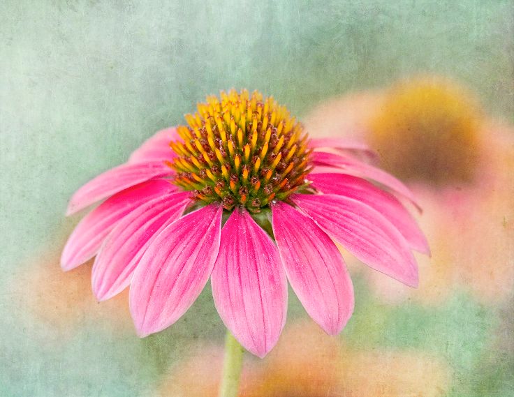
Comment |
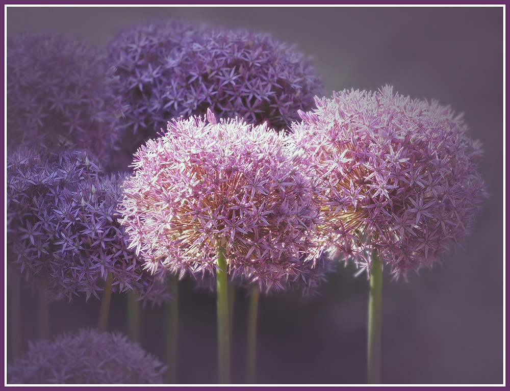
Welcome, Jody. I love your capture and post processing of the flower. And I like your choice of Aperture. The Center is sharp and compliments the Blue petals. Their softness adds to the Composition. I agree with Maria, that I would take out the small dark leaf on the left. It distracts from that shade of blue. |
Feb 8th |
| 65 |
Feb 23 |
Comment |
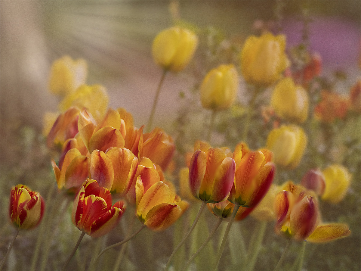
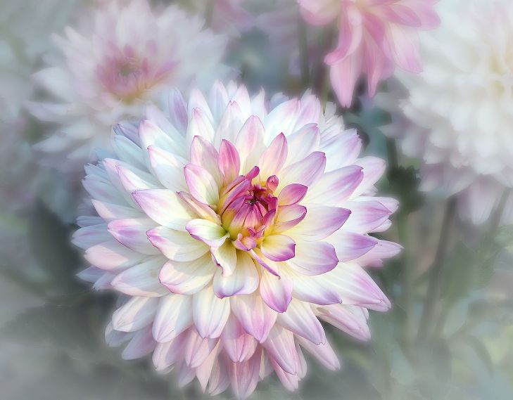
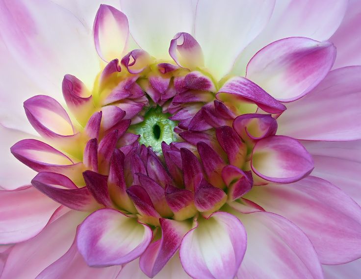
Photographing flowers is so much about their color and shape to me, yet I do try monochrome just to see the comparison. This photo makes it. The softness sets a mood.It allows us to focus on the lines and the center. The depth of the Center is wonderful. Not to be overly fanciful, but I can visualize Thumbelina sitting inside. I love the softness and am surprised you used F11. It looks much more like an F4 to me. I understand Maria's comment about the blur in front of the Center. Perhaps, if this was stacked you could have had the curve in front of the Center more in focus, and still retained its softness. |
Feb 8th |
| 65 |
Feb 23 |
Reply |
Thank you, Maria. I think I need to photograph drying flowers more, They are so interesting. |
Feb 8th |
| 65 |
Feb 23 |
Comment |
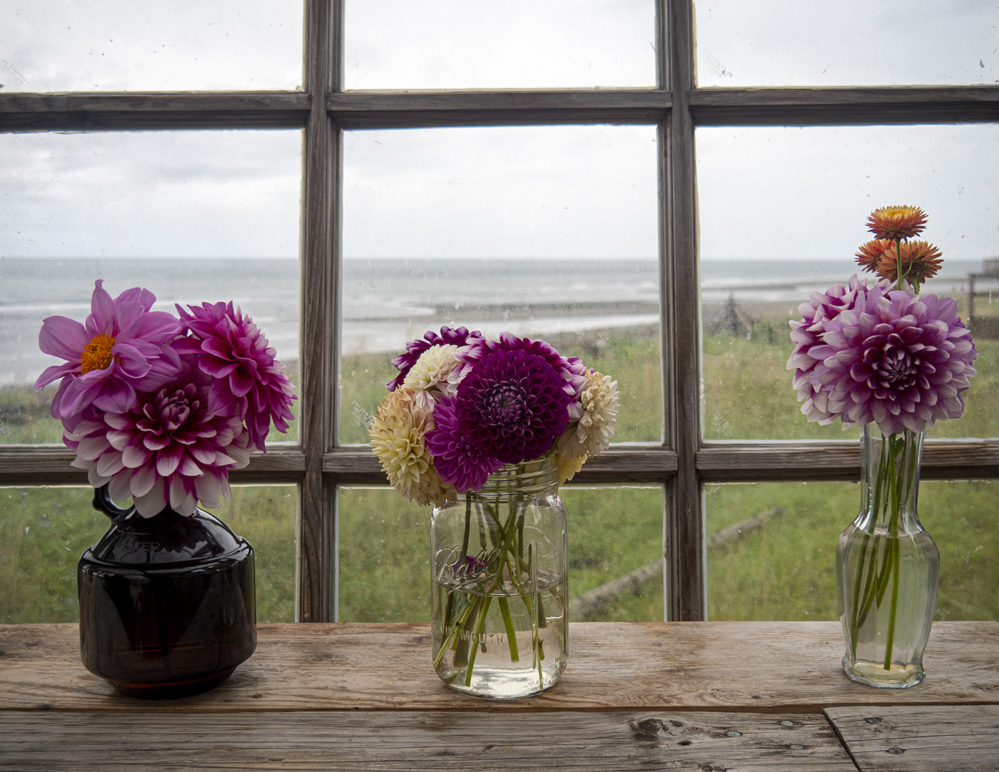
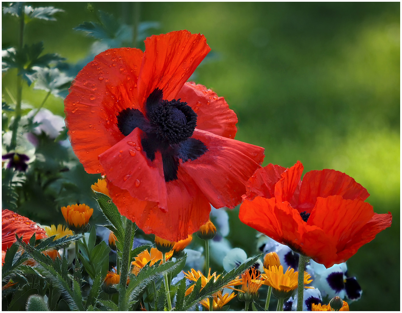
Hi Al, I am impressed that you were able to submit an image this month. Hope you are mending well. What first catches my eye are the colors of the flowers and the vase and the contrast to the black background. Since the Contrast is so beautiful,I have to admit, I prefer the darker shade of the original. The light on the bottom right is distracting to me. I, too, prefer just the vase and petals. |
Feb 8th |
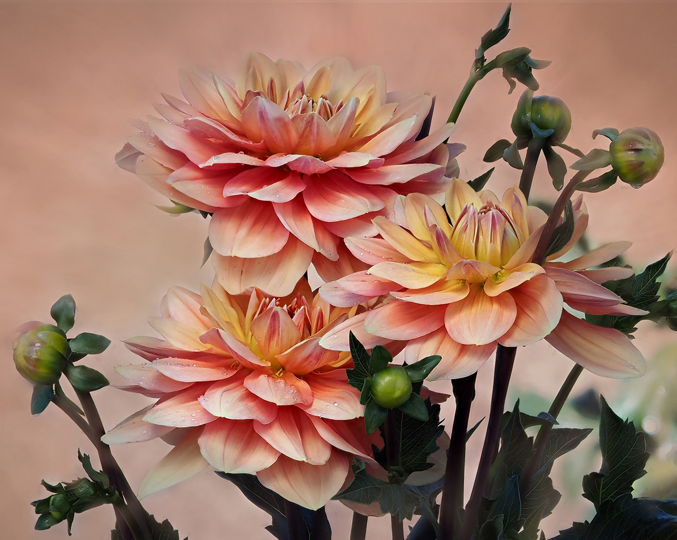
4 comments - 3 replies for Group 65
|
16 comments - 15 replies Total
|