|
| Group |
Round |
C/R |
Comment |
Date |
Image |
| 12 |
Jan 23 |
Reply |
Thank you, LeAnn. It is a truly moving experience, still hard to imagine. |
Jan 23rd |
| 12 |
Jan 23 |
Reply |
Thanks, Ally. I am glad it turned into an interesting photo discussion, because this was a difficult subject for me. |
Jan 16th |
| 12 |
Jan 23 |
Reply |
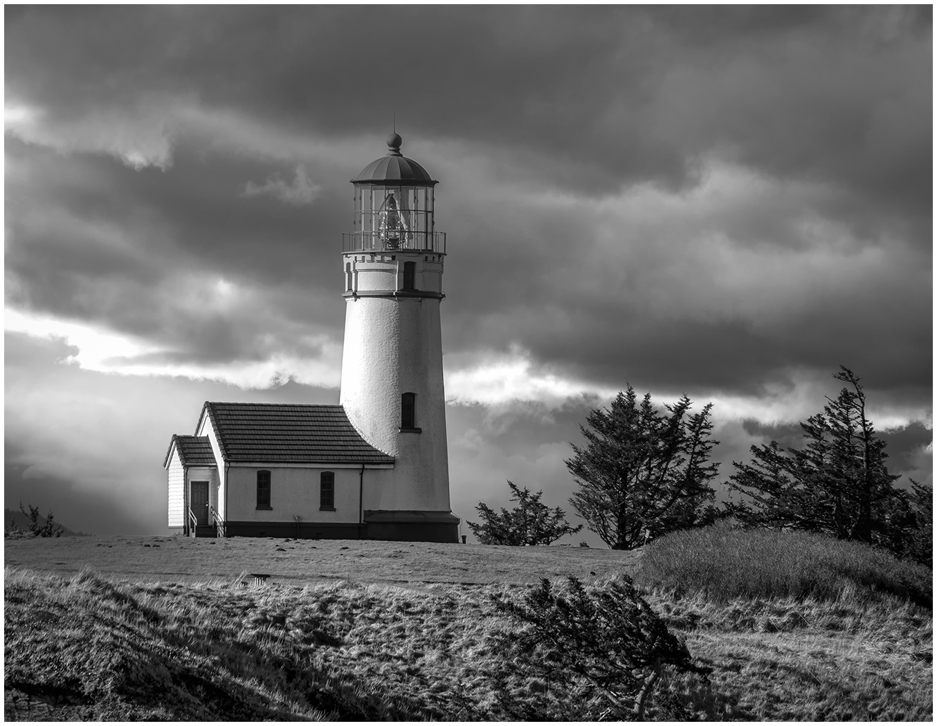
Thanks, Barbara. And it was the blue sky reflection that I wanted to capture. Not many Fall days that there is sky that color in NY. |
Jan 14th |
| 12 |
Jan 23 |
Reply |
Another version, but the vertical feels a bit cramped to me. I would like to see more on the right. |
Jan 14th |
| 12 |
Jan 23 |
Comment |
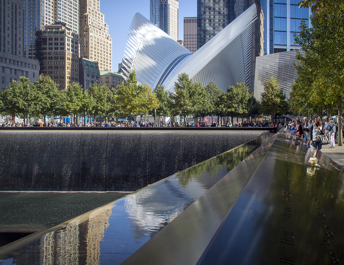
I thought that I had already posted a response. I probably forgot "submit". Anyway, I love the architectural lines of the building, highlighted by the lights against the dark sky. I find it interesting that this is in Texas, as I see it reflecting an Adobe style. I prefer Carole's crop highlighting that Architecture. Nice catch. |
Jan 13th |
| 12 |
Jan 23 |
Reply |
I do like seeing this as a pano too. |
Jan 13th |
| 12 |
Jan 23 |
Reply |
Thanks, Connie. That's what keeps this interesting...all the different eyes on 1 photo. |
Jan 12th |
| 12 |
Jan 23 |
Comment |
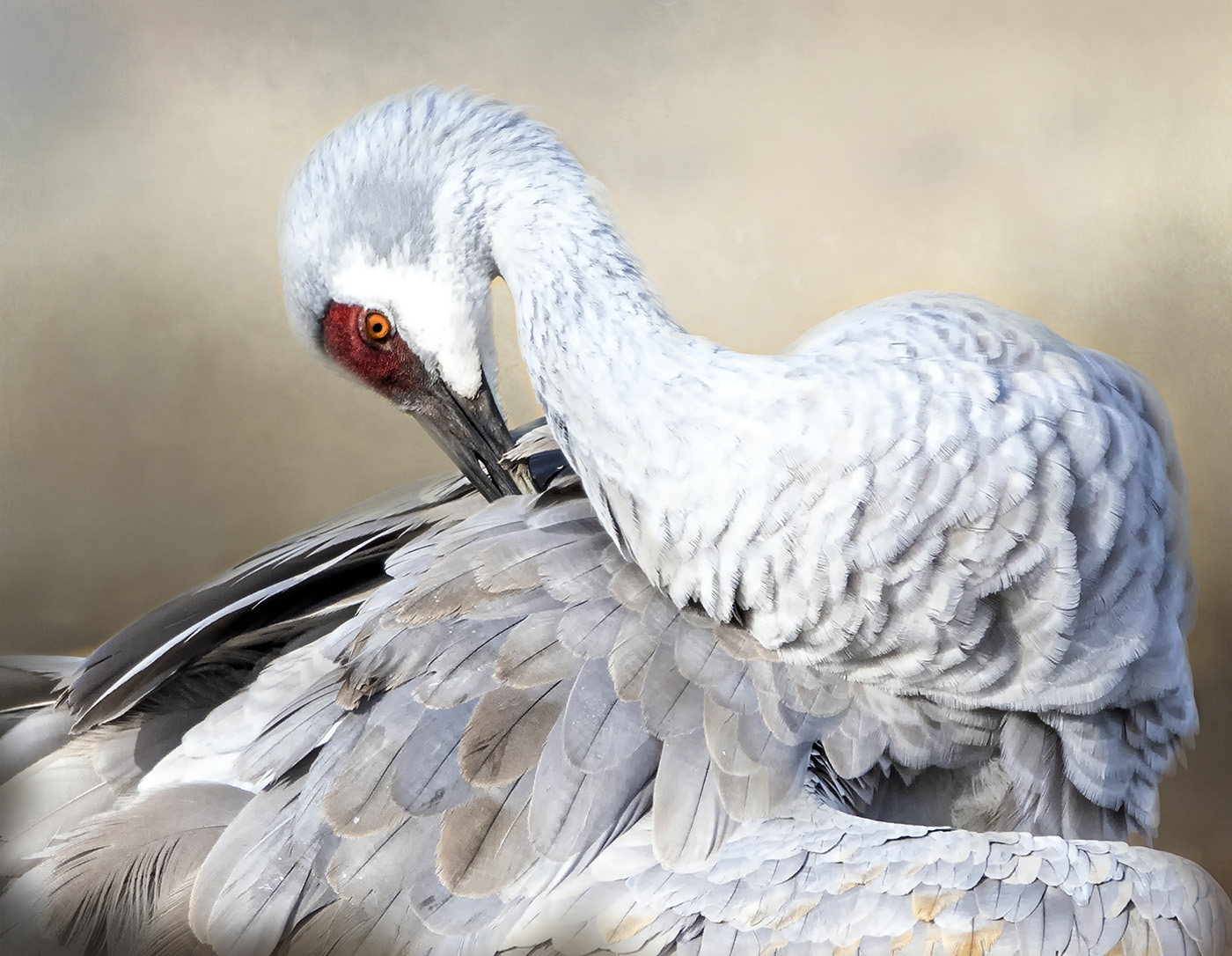
I like how you focused on the 1 portion for your photo. In the color version we get to see reflections and textures. In the Black and White it is the Minimalism that hits me. I do like both. This month I have enjoyed seeing your Color and your Black and White version, as well as Connie's. Maybe we should have that as an Assignment, (Carole?) |
Jan 10th |
| 12 |
Jan 23 |
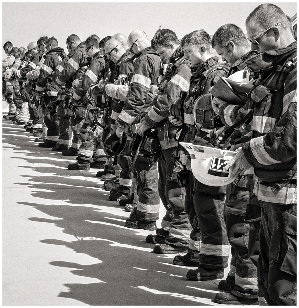
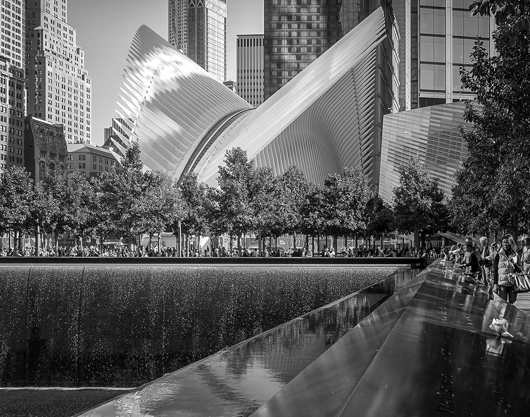
Comment |
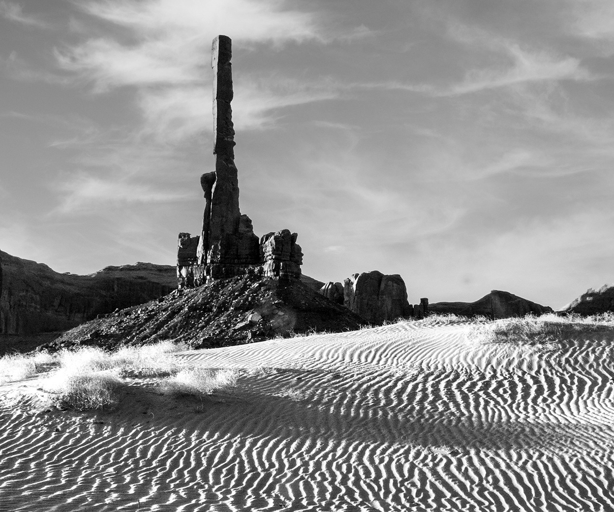
Just an old steel beam is interesting, especially with its texture. The story that goes with it and the hole on top to let the sunlight in on Sept.11 is truly a scientific marvel. I wonder how many Memorials are like this throughout the Country.
|
Jan 10th |
| 12 |
Jan 23 |
Reply |
I love it! The monochrome simplifies it so it is a study of lines and tones. For some reason I think it has more depth. lol...I got a visual of a squirrel crossing a road. I will call it creativity. |
Jan 9th |
| 12 |
Jan 23 |
Comment |
An interesting shot of looking up and the reflections. How did it look in Monochrome? |
Jan 8th |
| 12 |
Jan 23 |
Comment |
An interesting choice for Architecture. I love old, dilapidated buildings. The tones go well with the subject. I like the bicycles leaning against the building and wonder if you have a close up of them. |
Jan 8th |
| 12 |
Jan 23 |
Comment |
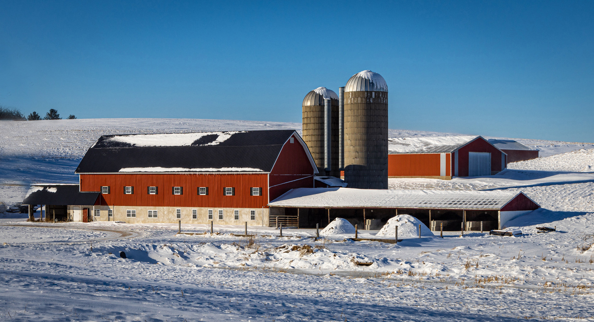
I like the lines of the silos and barn, the color red against a blue sky. But not zero degrees? No thank you! I lived in Wisconsin 2 winters when I was much younger. One morning the radio said it would be 5 degrees that day and I thought "Yes, it will be above zero." Time to leave when I can acclimate to that!
I like your crop, but would you consider cloning the trees on the left. There is not enough of the tree, as it is. I would like to see more or less. What do you think? |
Jan 8th |
 |
| 12 |
Jan 23 |
Reply |
Thank you, Chane. I didn't even think B & W and that is an interesting concept. It becomes a different picture and I think I would crop up and in on the left more. What do you think? |
Jan 8th |
 |
| 12 |
Jan 23 |
Reply |
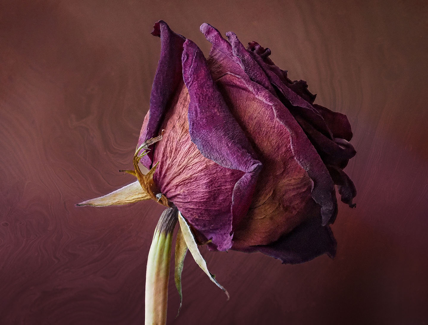
Thank you, Connie. I did take from different perspectives and while with non-photographers. I could have stayed all day. I have one with just the rose and the name, |
Jan 7th |
| 12 |
Jan 23 |
Reply |
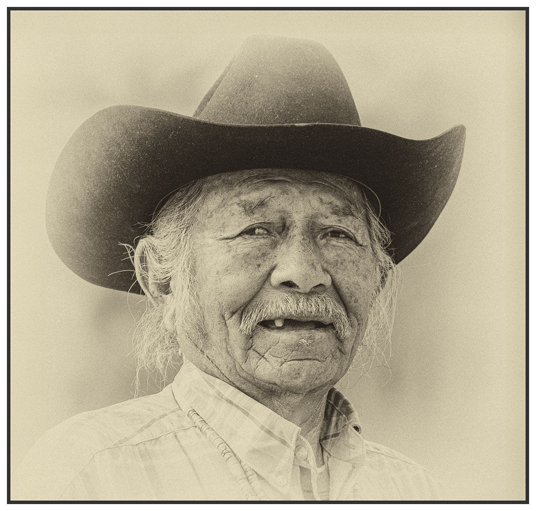
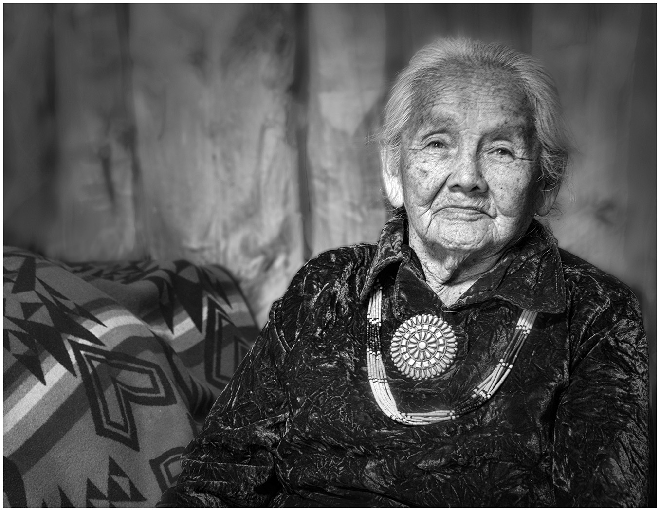
Thank you, Carole.
As additional powerfully emotional info, do you see
the white rose in the lower right? The border has each person who lost their life's name carved. Each year on their birthday, a white rose is placed by their name. |
Jan 4th |
6 comments - 10 replies for Group 12
|
| 39 |
Jan 23 |
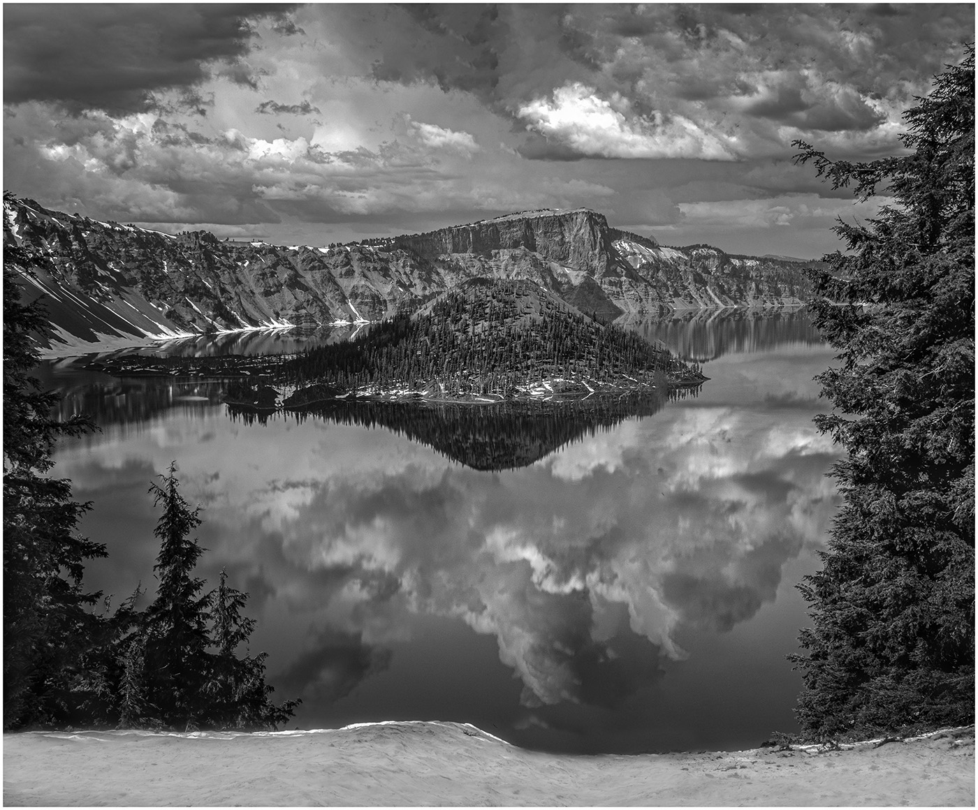
Comment |
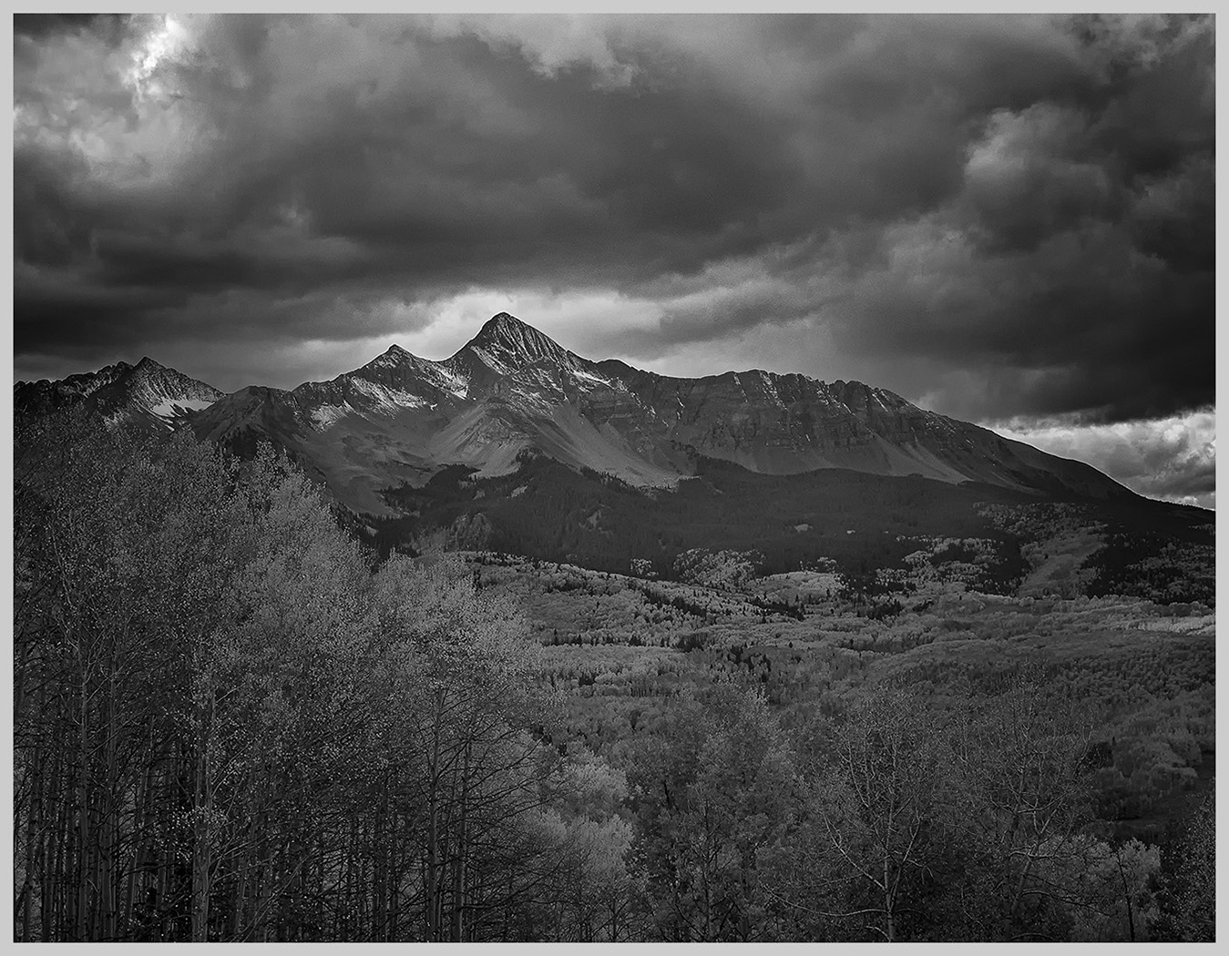
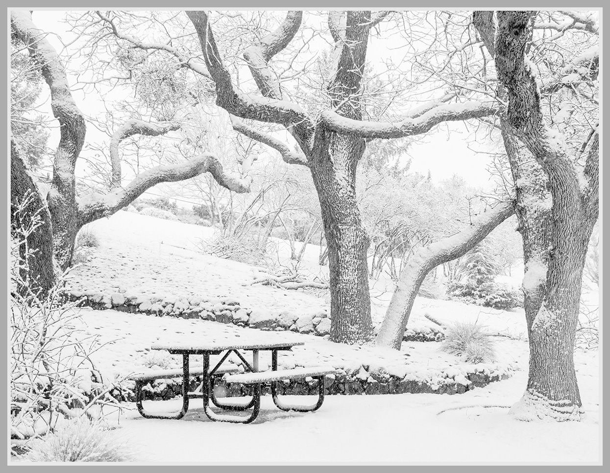
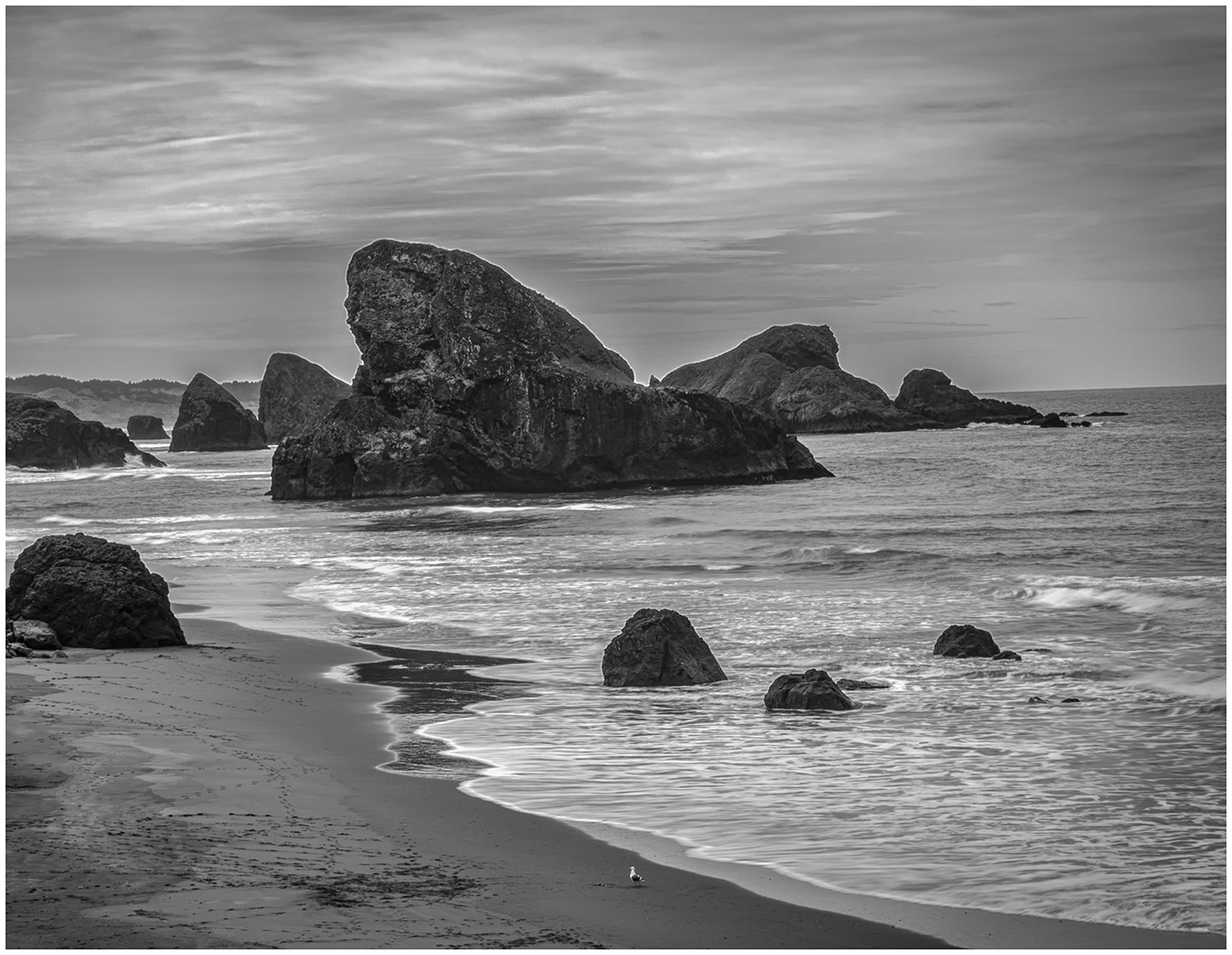
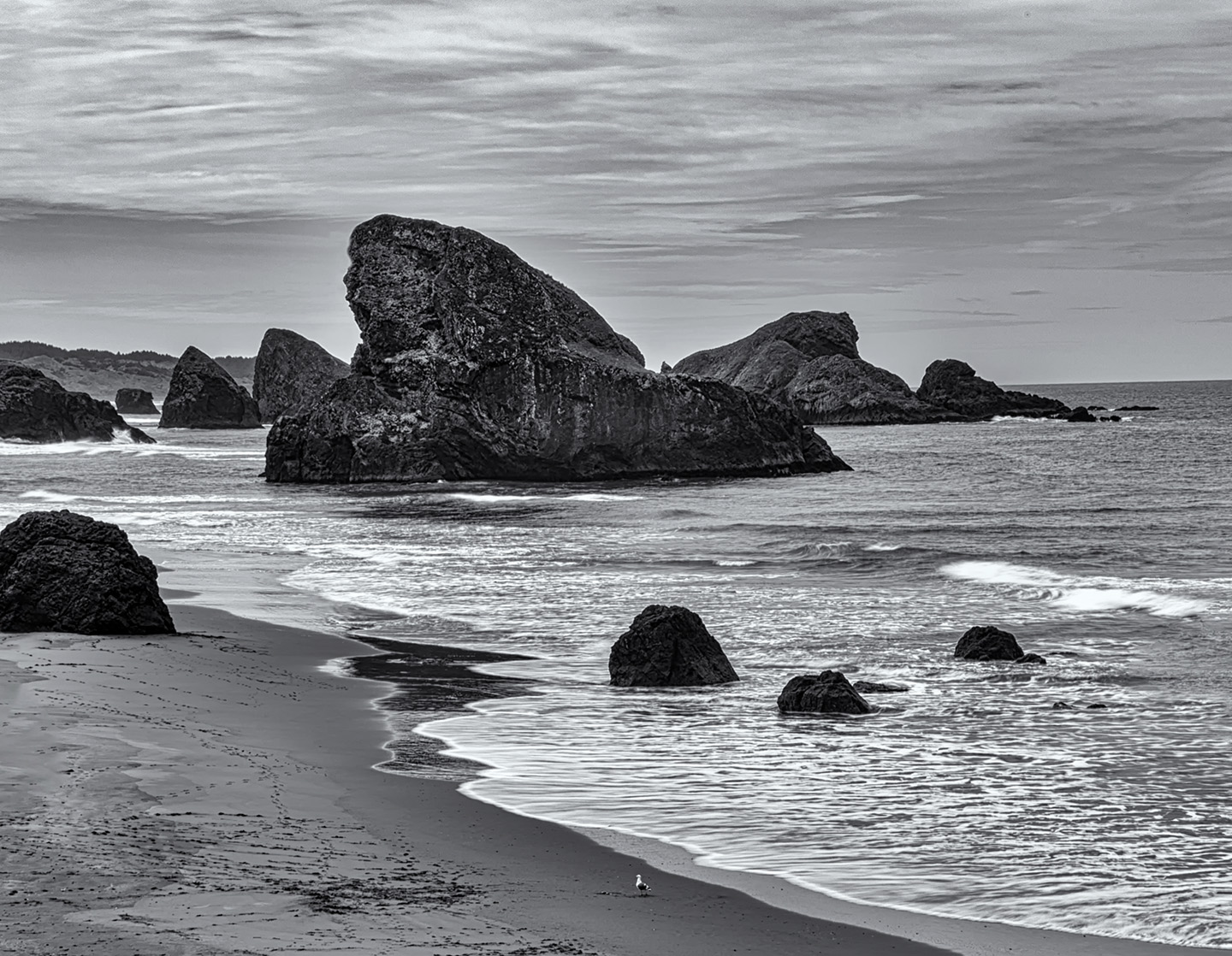
Beautifully done. The tones and levels of contrast in the B & W all work together. What I truly like is your crop to a panorama. My eye goes to the farm, which is hardly seen in the original, then up to the white fluffy clouds, and finally the mountains. It works! |
Jan 15th |
| 39 |
Jan 23 |
Reply |
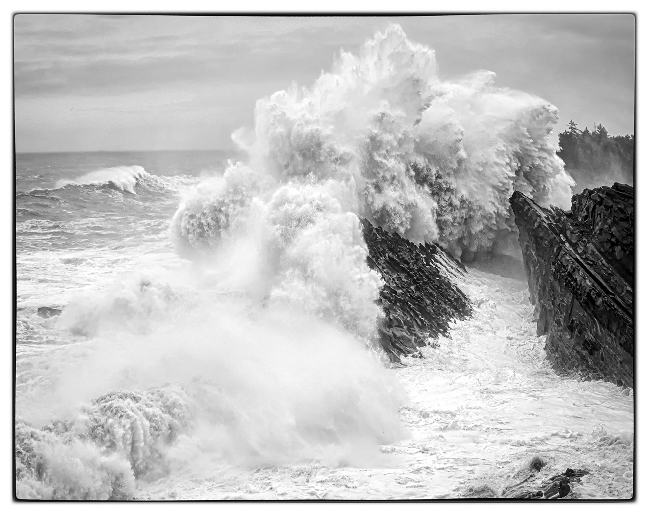
Thank you, Paul. Yes, those rocks on the left are bothersome. I was so taken by the diagonal the waves and shoreline formed that I didn't think much about them. I think I would just prefer to take them out. Rest assured, I will have my eagle eye out for halos in the future! Thanks for the tip. We are off to the Coast this week to photograph the winter King Waves. Hopefully, we will catch some. |
Jan 15th |
| 39 |
Jan 23 |
Reply |
Thank you, Ken. That does seem to be the consensus. But for me, it is a totally different image that I did take as I worked the scene. |
Jan 10th |
| 39 |
Jan 23 |
Comment |
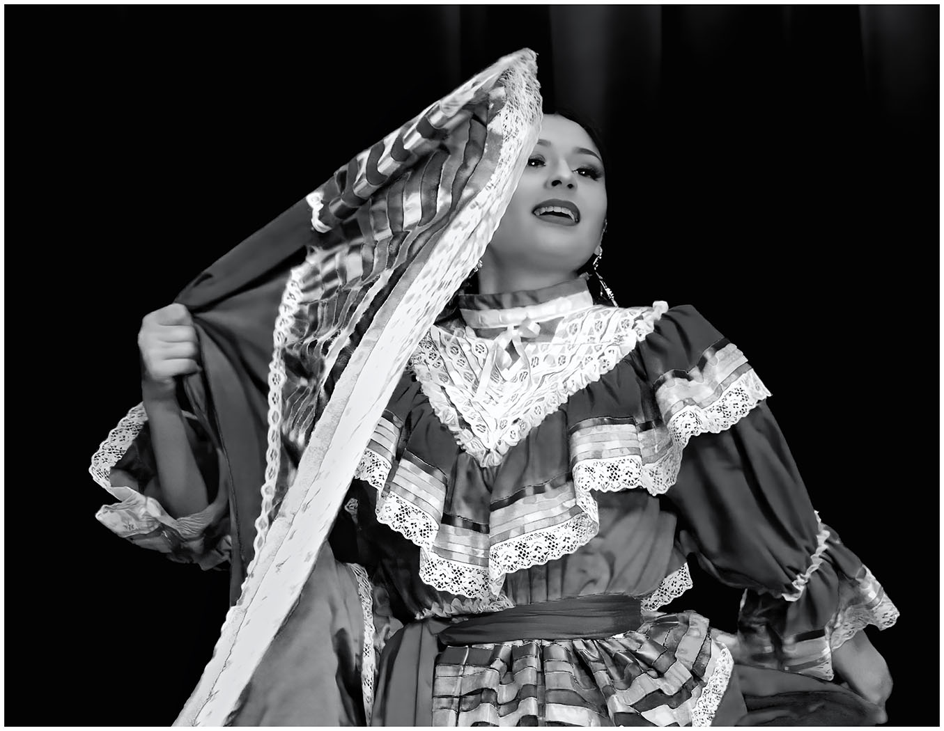
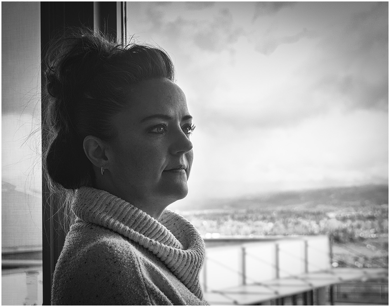
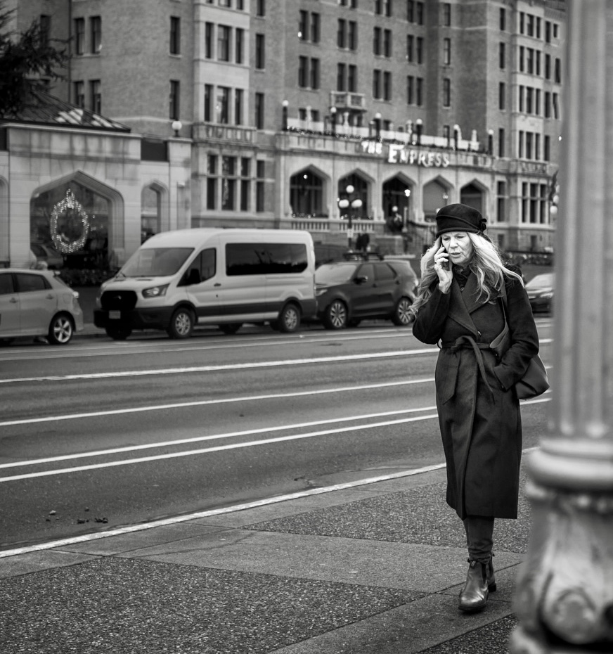
Street Photography is always challenging...a subject that intrigues me, as it intimidates me. When I first saw this title, I thought she was the Empress...than I saw the hotel marquee in the Background. Wonderful tones and storytelling. I find the pole to be too close to her and distracting. Did you try to crop in a bit on the right? I don't think it takes away from the Story. Or you could try to move her a bit to the left in PS, using the Move Tool. I tried just a crop, then the sky separating the pole and the building was distracting, so I cloned it out. Also brought the Empress sign a little more into focus. What do you think? |
Jan 10th |
 |
| 39 |
Jan 23 |
Comment |
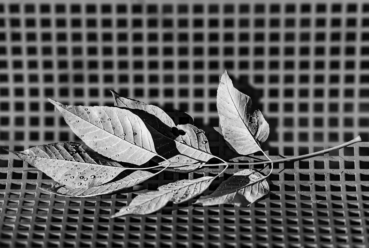
I do like the concept for the photo. The tones and textures in the color shot seem more in alignment than in the black and white. In the B&W the textures and the tones seem as if they need more contrast. Something more to distinguish foreground from background. I played a little with your photo. Using Layers, I brought down the Highlights, upped the Texture and Clarity of the leaves on the Bench. I selected the subject and using Inverse, blurred the Bench. Then revealed the base of the Bench. What do you think? It might not be your Vision. |
Jan 10th |
 |
| 39 |
Jan 23 |
Comment |
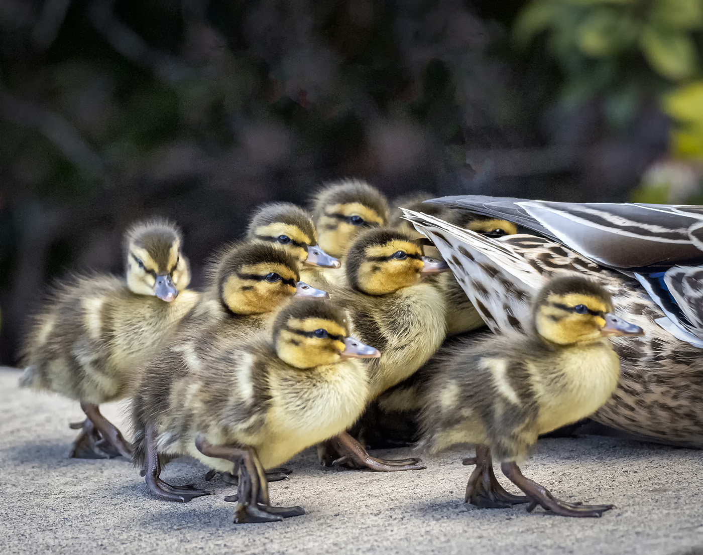
A wonderful adventure! Thank you for sharing. I had always wanted to photograph puffins and finally got the opportunity this summer in Alaska. They were everywhere. I was surprised at how small they were. I think I was expecting them to be the size of geese...they were more the size of small ducks. I agree with Kathryn's suggestions...just to make it pop more. I might crop in a bit of the left, also. Your photo makes me smile. |
Jan 10th |
| 39 |
Jan 23 |
Comment |
There is nothing more beautiful than a cactus backlit at sunset. The cactus needles are so sharp and backlit. You captured it beautifully. My only suggestion as I looked at it was to darken and simplify the Background. I see the background as more distracting in B & W. Then I scrolled down and I see that the others gave you the same suggestion. |
Jan 10th |
| 39 |
Jan 23 |
Reply |
Which is why a discussion like this is so helpful. Just something else to see and consider. |
Jan 6th |
| 39 |
Jan 23 |
Reply |
Thanks for taking the time to work with my photo. As always, it was "What was your vision?" Personally, I prefer the higher contrast on the rocks as in my original. I have many versions of this scene and preferred more of the ocean than the rocks to the left. Also I wanted more of the diagonal showing...it is about shapes and triangles for me. But I did consider it. Thank you for taking the time to show me another option.
|
Jan 6th |
| 39 |
Jan 23 |
Reply |
I have spent the morning trying to get rid of the halos...a fantastic learning experience. I know that there is a simple Selection process, but I couldn't do it. I went back and looked at each layer. The halos seemed to come in when I used the Clarity slider (too much) and the Contrast Slider. Instead of using the ACR sliders, this time I went in to Silver efex Pro and used the Fine Art Filter with a Selenium 1 tone. I will be checking for halos much more diligently in the future. |
Jan 6th |
 |
| 39 |
Jan 23 |
Reply |
Wow do I see that halo now! How did I miss it??? |
Jan 5th |
5 comments - 6 replies for Group 39
|
| 65 |
Jan 23 |
Reply |
In looking at this again, I forgot to mention, how I like the sharpness in the foreground and how the dandelion fades to out of focus in the Background. Lends itself to the ethereal feeling. |
Jan 22nd |
| 65 |
Jan 23 |
Reply |
Thank you, Maria. I appreciate it. |
Jan 22nd |
| 65 |
Jan 23 |
Reply |
Thank you. |
Jan 22nd |
| 65 |
Jan 23 |
Reply |
Thank you, Melanie. |
Jan 12th |
| 65 |
Jan 23 |
Reply |
Thank you, Al. I appreciate your kind words. I did not want it to appear simply floating. It is always a treat to find them in a Forest...let alone with water drops. |
Jan 10th |
| 65 |
Jan 23 |
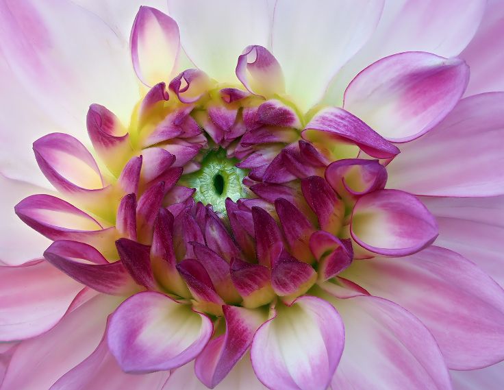
Comment |
You have captured this Dandelion with great detail. I can just picture a little girl off to the right, wishing on Dandelions. A very Minor suggestion...clone out the white line on the left. Very minor, but a bit distracting! |
Jan 10th |
| 65 |
Jan 23 |
Comment |
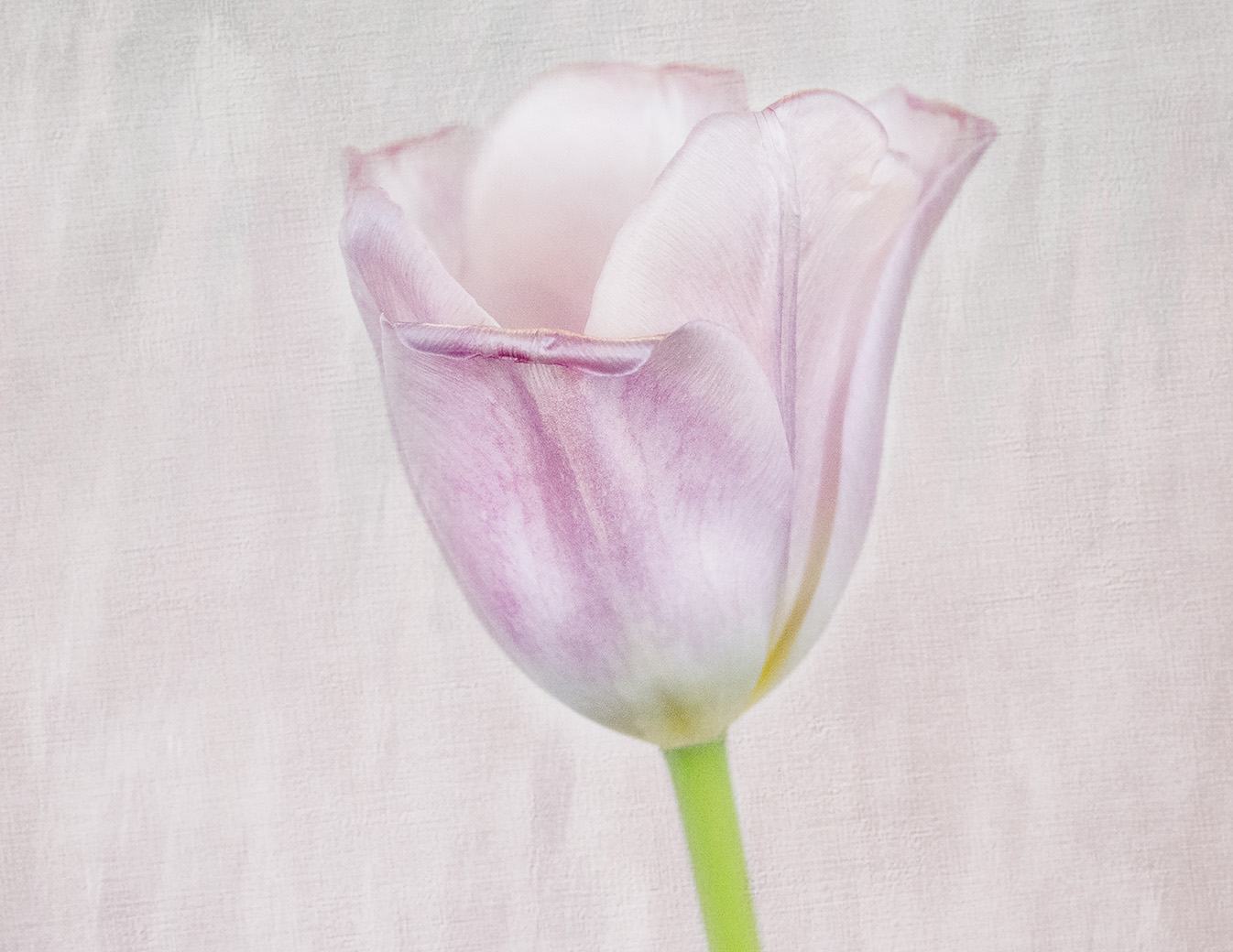
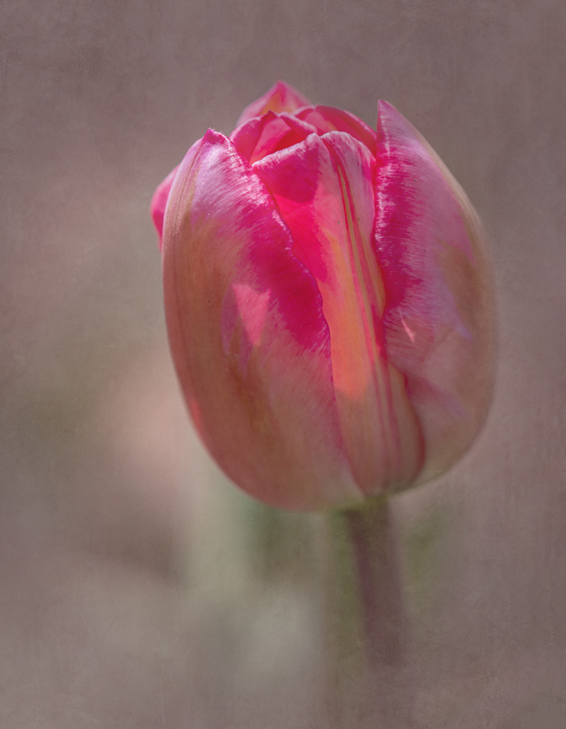
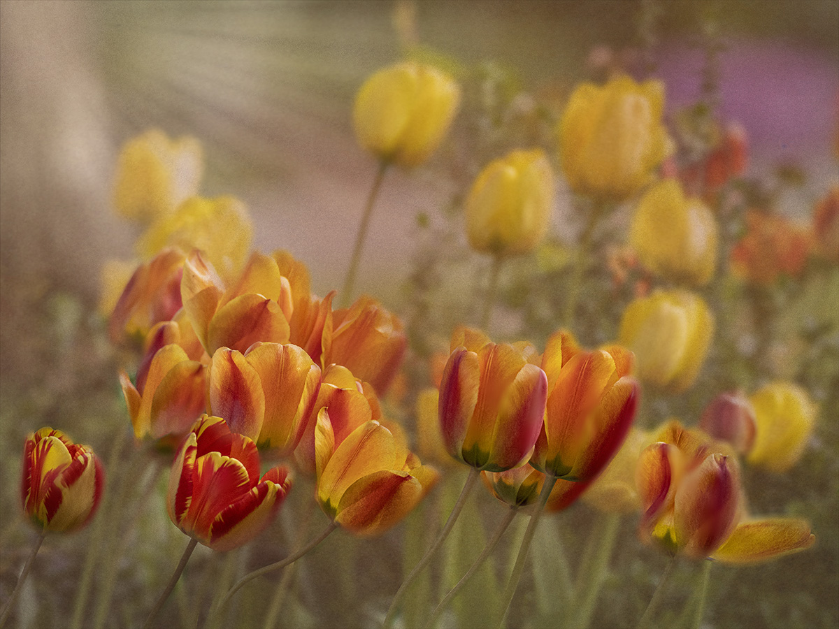
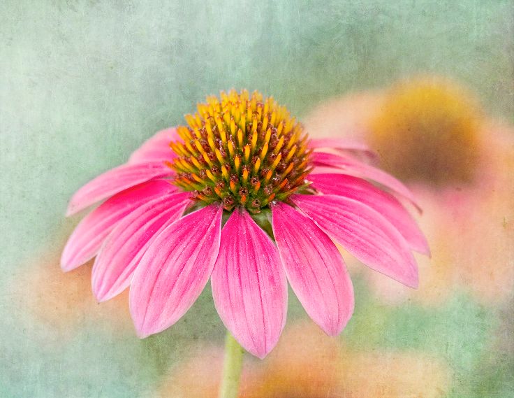
Those Cactus Flowers are beauties. Who said there is no color in the Desert? I like how you have the main bloom in focus and the background a bit out of focus. |
Jan 8th |
| 65 |
Jan 23 |
Comment |
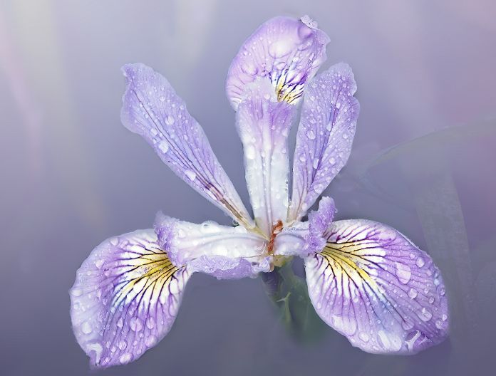
Creative! I like how you brought the colors out on the iris.I might bring the saturation down on the yellow green in the glass a bit to focus on the tones of the iris. |
Jan 8th |
| 65 |
Jan 23 |
Comment |
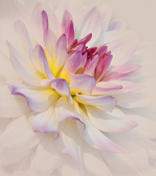
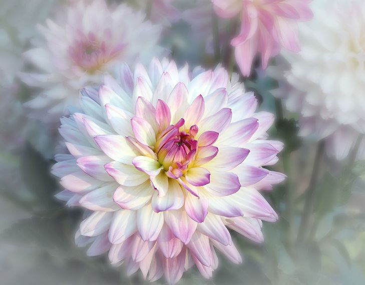
I love the High Key Effect and the softness of what you created. Taking out the leaf added to the minimalism. Beautifully done! |
Jan 8th |
4 comments - 5 replies for Group 65
|
15 comments - 21 replies Total
|