|
| Group |
Round |
C/R |
Comment |
Date |
Image |
| 12 |
Dec 22 |
Comment |
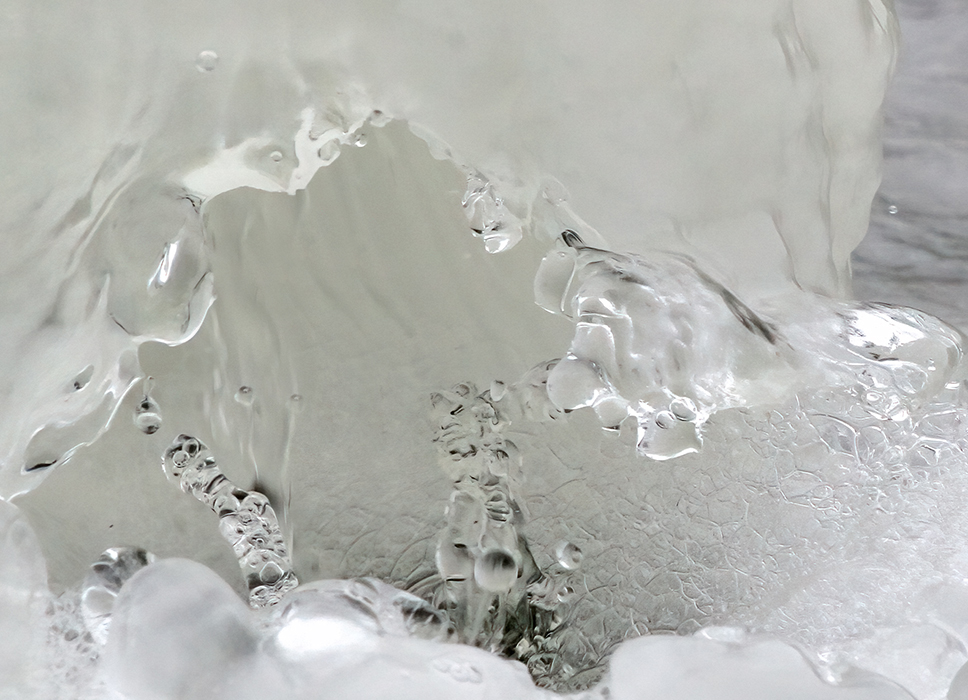
What a wonderfully, creative view of an "ice cave". I like how you focused on the center and the ice. The depth draws me in. Because I like the center of the photo so much, I tried to crop up a bit to focus my eye more on it. But, then, the one drip seemed to fight with the sharp icicle for attention,so I blurred it a bit. What do you think? |
Dec 7th |
 |
| 12 |
Dec 22 |
Comment |
Sorry...don't feel cold and damp. Sitting here with a warm cup of coffee! I like all the frozen droplets you captured, particularly their reflection in the water. There is a white blur near the top. My eye goes right to it. Did you consider trying to clone it out? |
Dec 7th |
| 12 |
Dec 22 |
Comment |
What fun and nicely done, Barbara. I went through one winter shooting lots of frozen flowers, following Kathleen Clemmons blogs. I lived in Arizona then...and it was sunny all winter...so I would take the frozen block out of its container and shoot (quickly)on my back porch. The backlit natural light showed the bubbles and variations in the ice. I also found that different colors reacted to the ice differently. I love that you did this. You have inspired me to try again.
|
Dec 7th |
3 comments - 0 replies for Group 12
|
| 39 |
Dec 22 |
Comment |
Those old steam engines are fun to photograph when they come through. The angle of the train feels like it is speeding on past. While I like the drama of the new sky, I am wondering if there can be more contrast between the sky and the engine. Lighten the clouds a bit? Bring down the Blacks in the engine a bit? I would like to see the engine stand out a bit more. |
Dec 11th |
| 39 |
Dec 22 |
Comment |
I like how the detail extraction adds Grunge to the Black and White. I think that the angle is a bit different from the original. I like how you seem to be looking up more and the crop of the tire. |
Dec 11th |
| 39 |
Dec 22 |
Comment |
I particularly like how you converted the sky in the Black and White. I enjoy seeing the network of lines in close up. |
Dec 11th |
| 39 |
Dec 22 |
Comment |
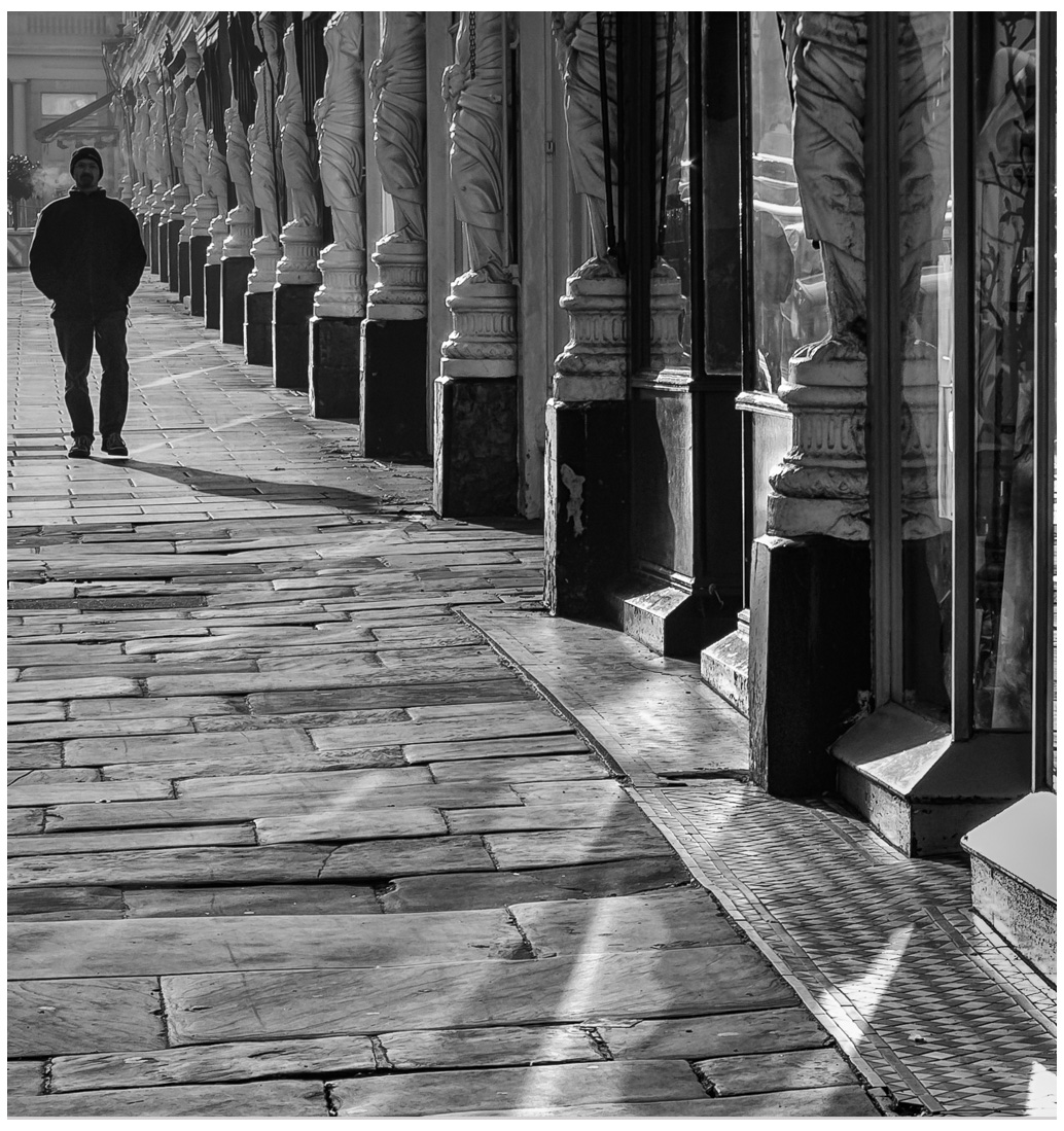
A wonderful photo of lines and shapes and tones and textures. I agree with the others to lighten the shadows on the man a bit. Because I am so intrigued with the columns on the diagonal, I might try cropping on the right so that the car reflections are no longer there. They fight with my eye continuing on the diagonal. A wonderful Black and White. |
Dec 11th |
 |
| 39 |
Dec 22 |
Comment |
The Black and White turns the head shot into a beautiful portrait. The tones contribute to the simplicity of the photo. I like the crop off of the top. If I did it, I would think I accidentally cropped off the top of her head. The way you have done it brings the focus to her face. I agree with Vincent...there is a different angle to her head and I like it better. The smile is a bit different too. I do like the B&W, I want to linger on the shot longer. |
Dec 11th |
| 39 |
Dec 22 |
Reply |
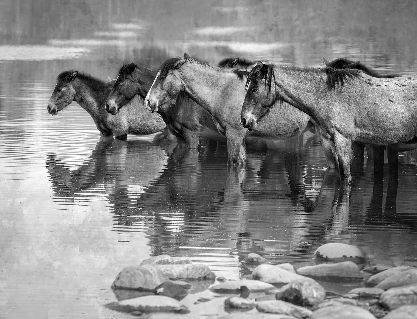
Thank you, Ken. I did process the B&W with the river rocks initially, but I felt it took away from the diagonal of the horses in Black and White. |
Dec 11th |
 |
| 39 |
Dec 22 |
Reply |
Thank you, Vincent. I like the B&W version too because it seems to put more emphasis on the shape and texture of the horses. |
Dec 11th |
| 39 |
Dec 22 |
Comment |
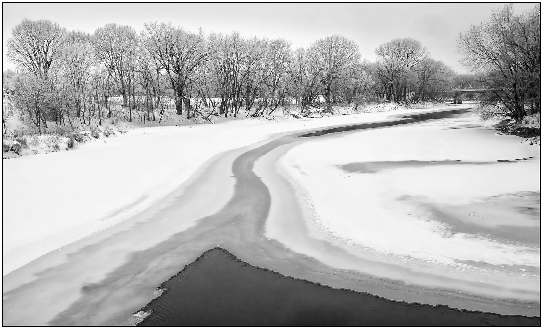
I like the leading lines of the snow and ice right to the bridge. The different tonalities of the ice add to the Depth of Field. Two minor suggestions.... How would it look if you cropped in on the left to begin at the line of the taller trees. My eye gets distracted by the line of shorter trees, then taller trees. And I would clone out the footprints on the right. I find them a bit of a distraction.Here it is cleaned up. What do you think? |
Dec 11th |
 |
6 comments - 2 replies for Group 39
|
| 65 |
Dec 22 |
Reply |
Thank you so much, Melanie.
|
Dec 7th |
| 65 |
Dec 22 |
Reply |
Thanks, Al. I appreciate it. |
Dec 7th |
| 65 |
Dec 22 |
Reply |
I think I will too! |
Dec 7th |
| 65 |
Dec 22 |
Comment |
Nice image of the Morning Glory. I think I might try cleaning up the extra branches and cropping it vertically, though. What do you think? |
Dec 7th |
| 65 |
Dec 22 |
Comment |
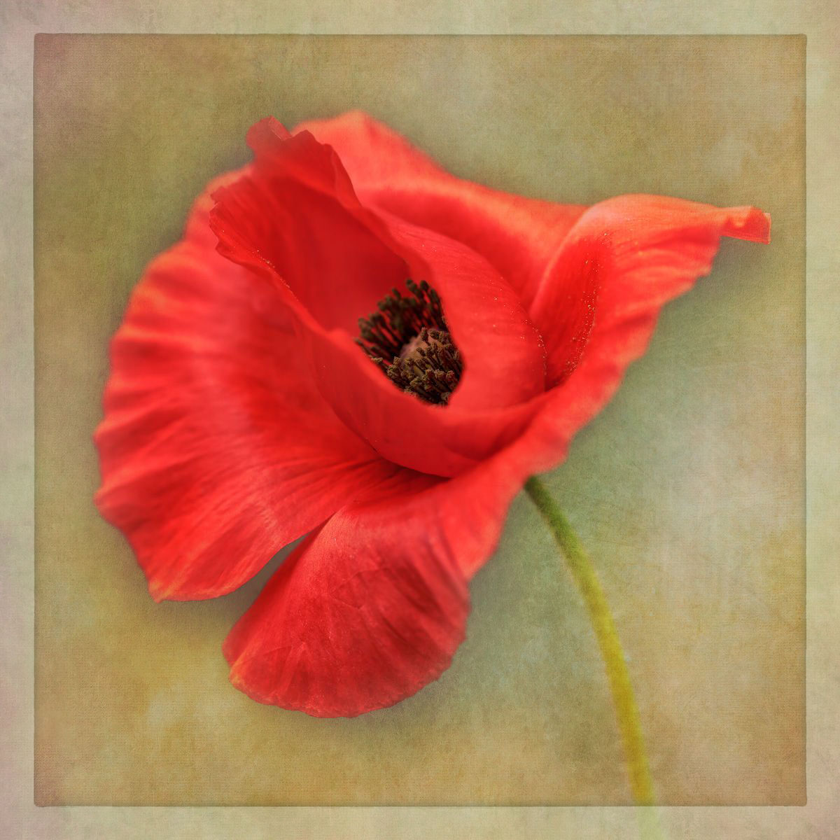
I like the softness of and tone of the poppy. Red is a difficult tone to get right (for me at least). While I like the idea of using a texture, I am not sure about using one with so much orange and yellow. I took the liberty of adding a soft green texture to it at 60% opacity. It softens it but keeps your tonal variations. What do you think? |
Dec 7th |
 |
| 65 |
Dec 22 |
Comment |
Wow! What a fun transformation! |
Dec 7th |
| 65 |
Dec 22 |
Comment |
I like the vibrant colors of the flowers. How would it look if the green was not as saturated to put more emphasis on the colors of the flowers? I like the close crop and the diagonal of pink that you created with the crop. It leads us in and up to the purple. |
Dec 7th |
| 65 |
Dec 22 |
Reply |
Thank you, Marti. What a great idea to "visit" other Groups. |
Dec 7th |
4 comments - 4 replies for Group 65
|
13 comments - 6 replies Total
|