|
| Group |
Round |
C/R |
Comment |
Date |
Image |
| 12 |
Nov 22 |
Reply |
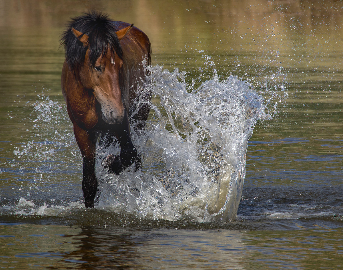
Thanks, Lee Ann, I hadn't noticed it before, but now it bothers me each time I look at the photo. |
Nov 12th |
| 12 |
Nov 22 |
Reply |
Thank you, Carole. I agree...the blobs on the right must go. |
Nov 12th |
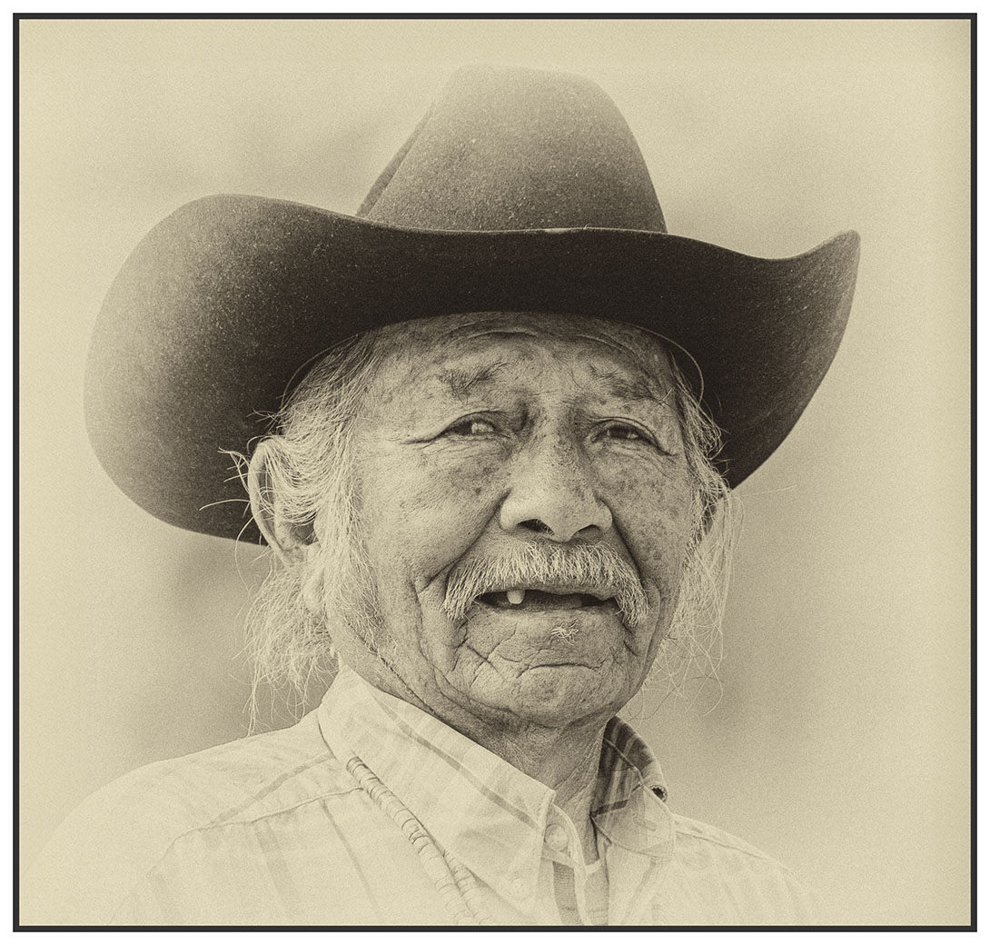
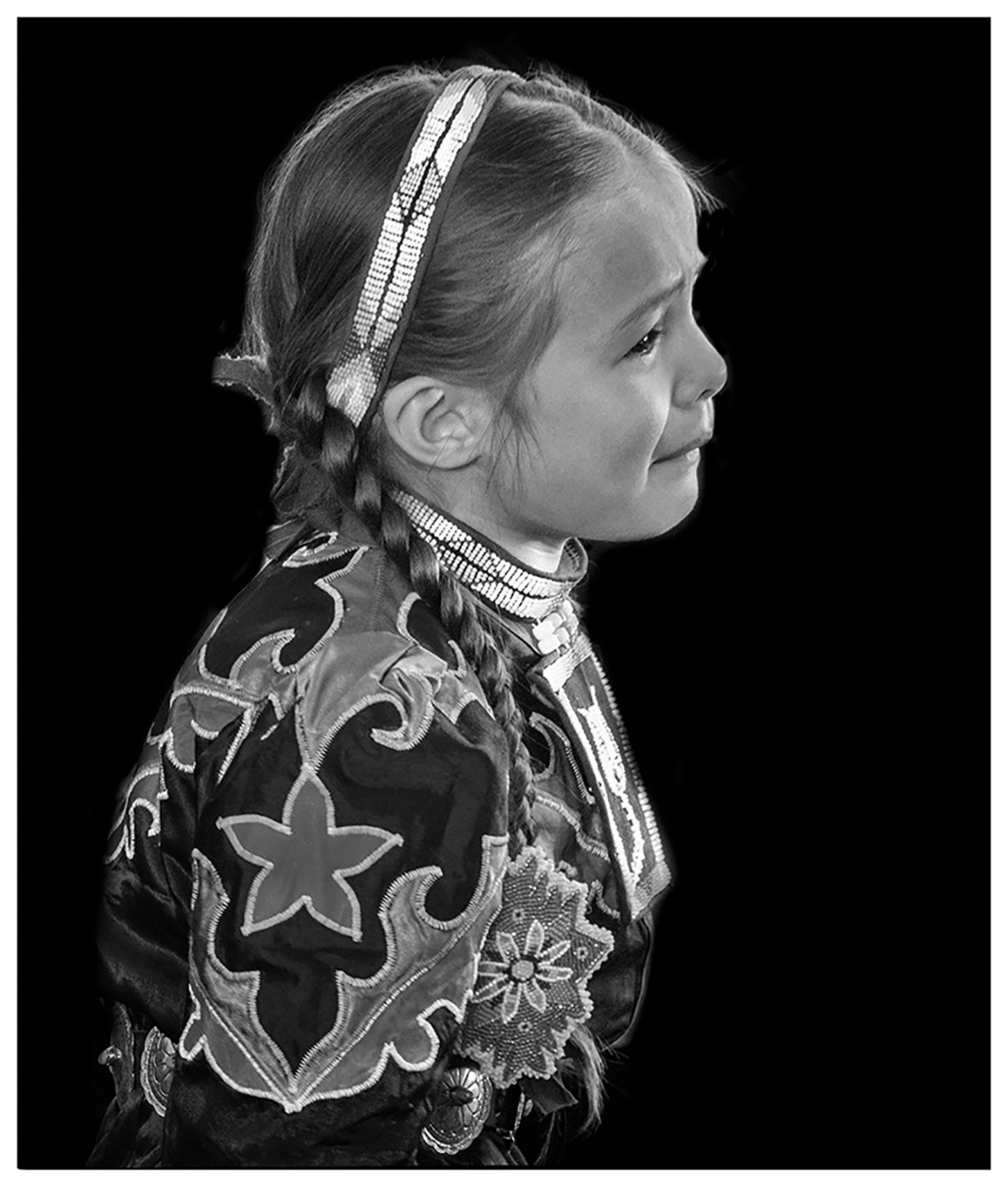
| 12 |
Nov 22 |
Comment |
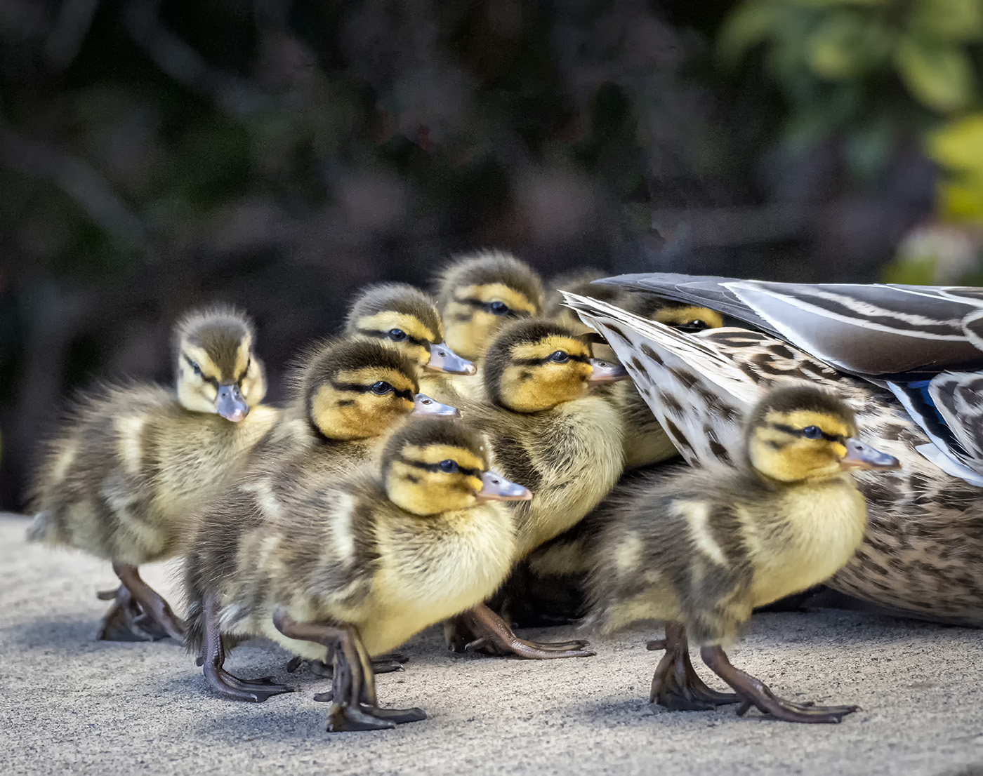
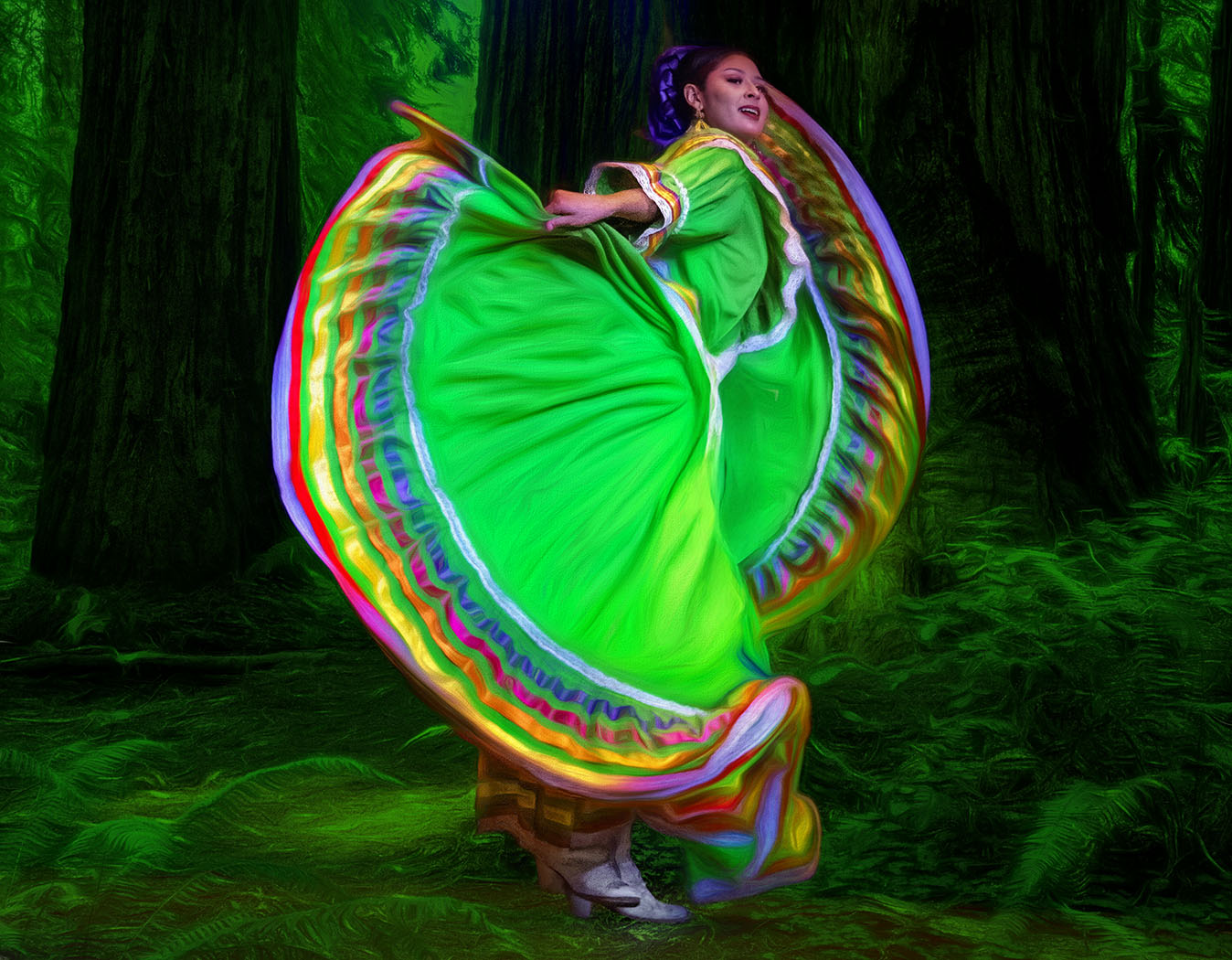
Babies and puppies...guaranteed to get an awww. I don't take babies often, but love to photograph animal babies. |
Nov 12th |
| 12 |
Nov 22 |
Comment |
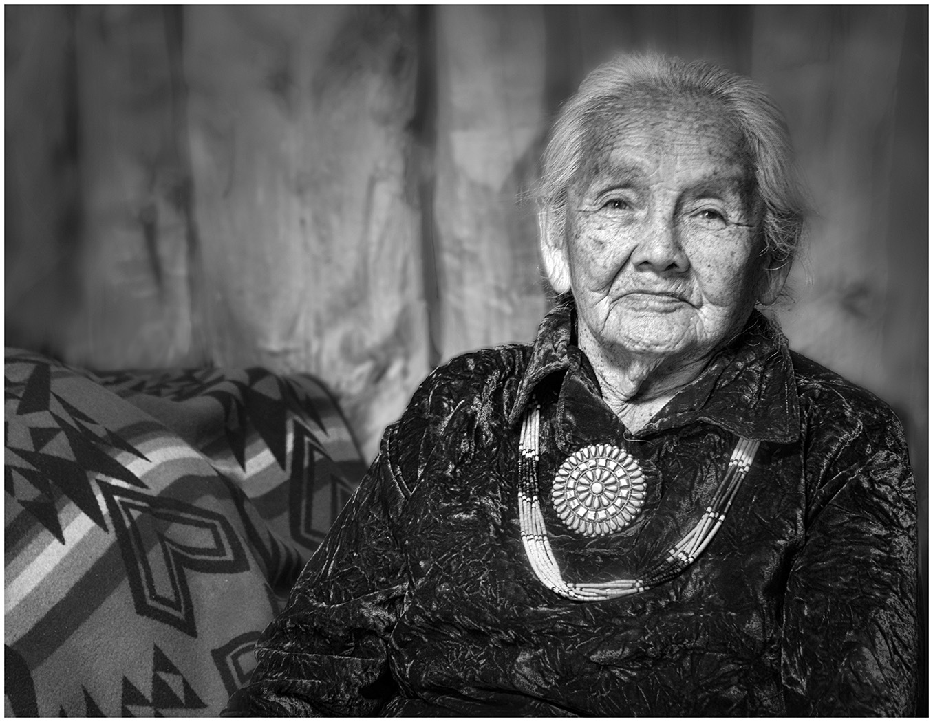
She is delightful! You could have used this as a photo for "Joy" also. The only thing I might do is clone out the pattern on the far left side. My eye goes right to the little cutie, but then is distracted on the border design. |
Nov 12th |
| 12 |
Nov 22 |
Comment |
Looks like you had fun...so many possibilities. |
Nov 12th |
3 comments - 2 replies for Group 12
|
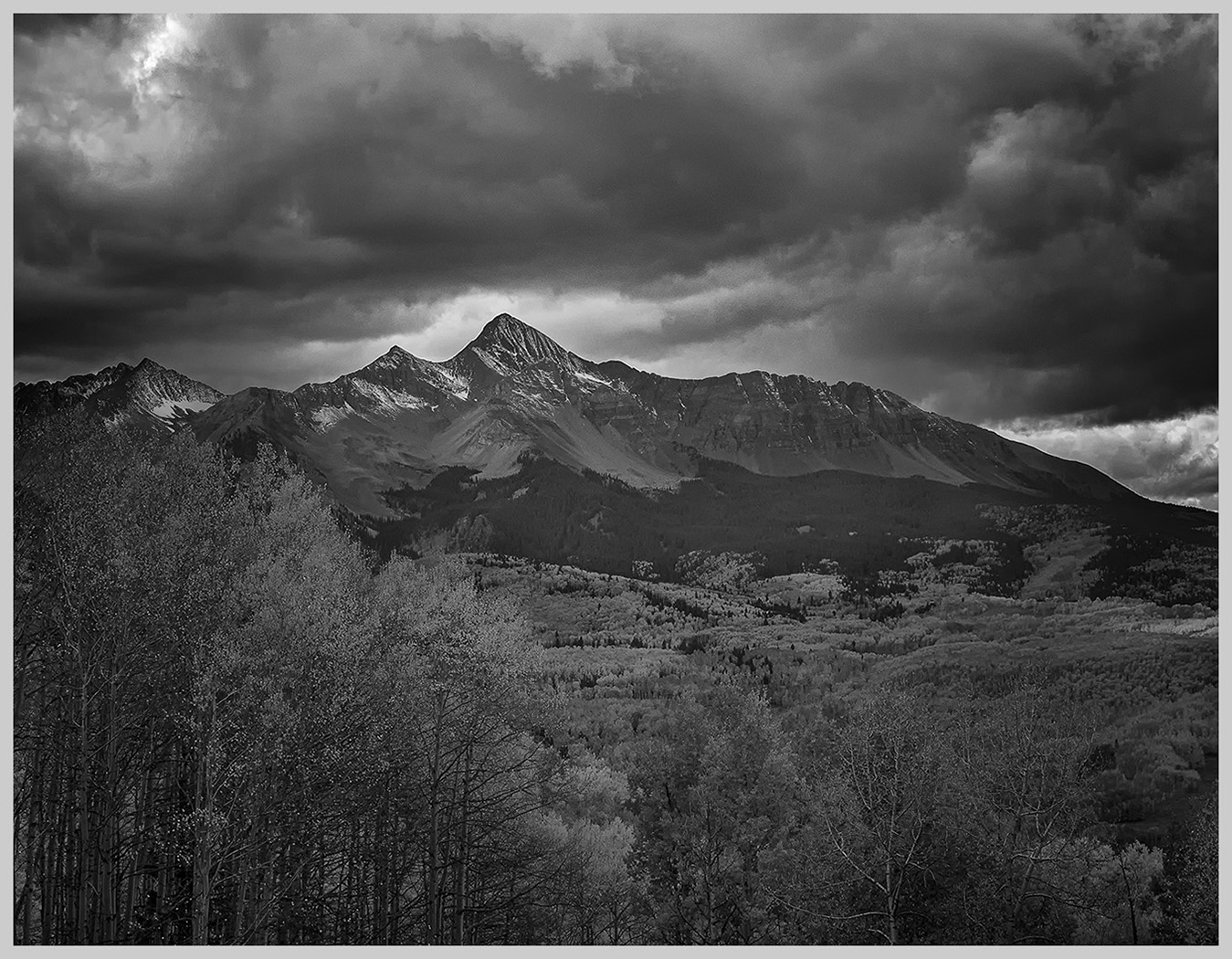
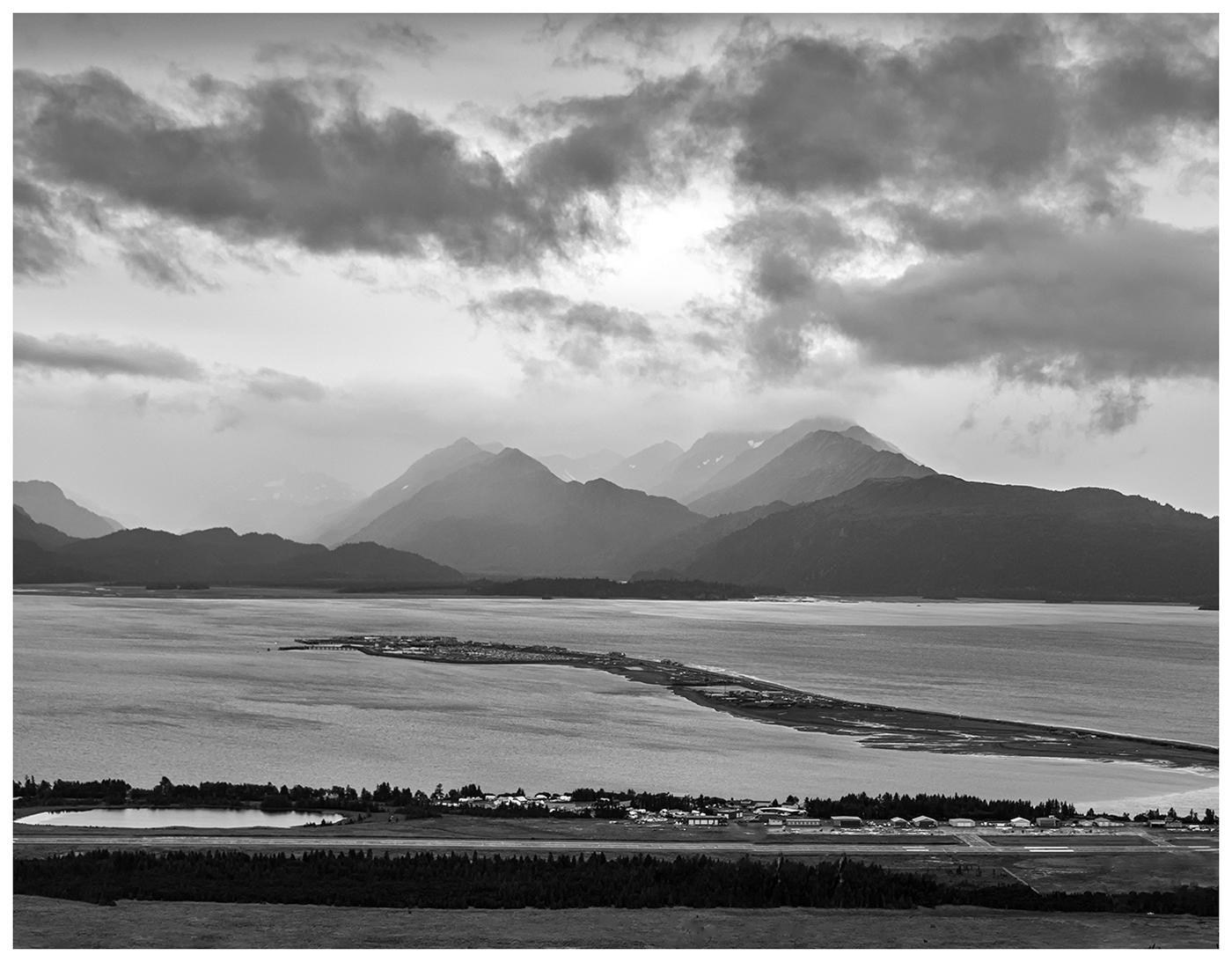
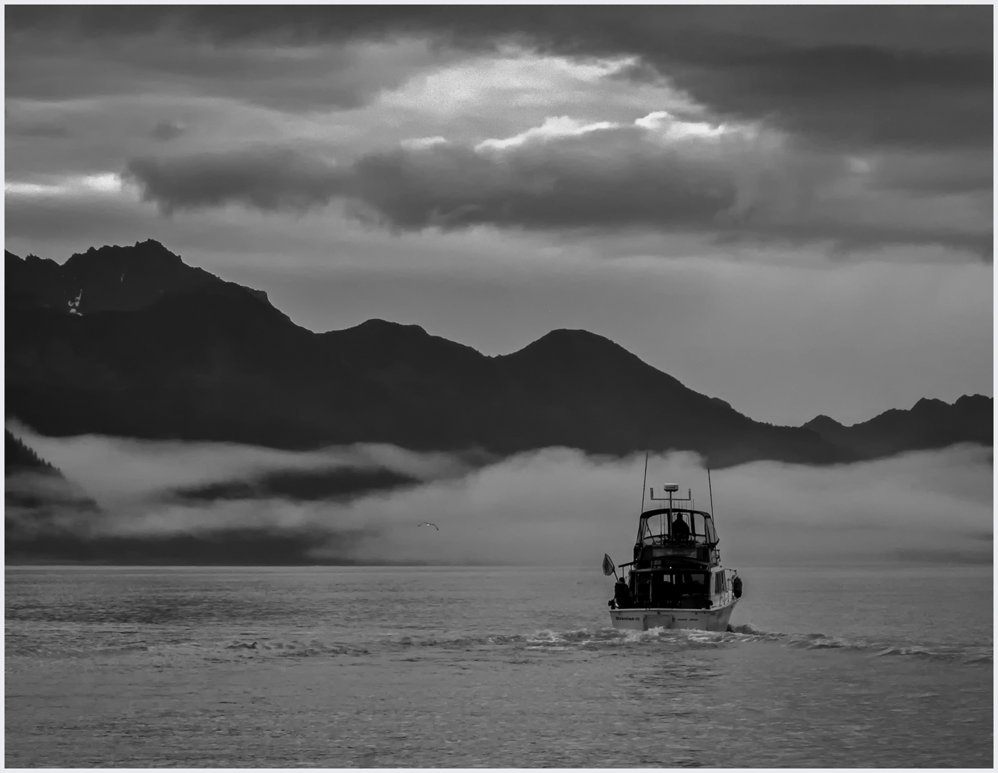
| 39 |
Nov 22 |
Reply |
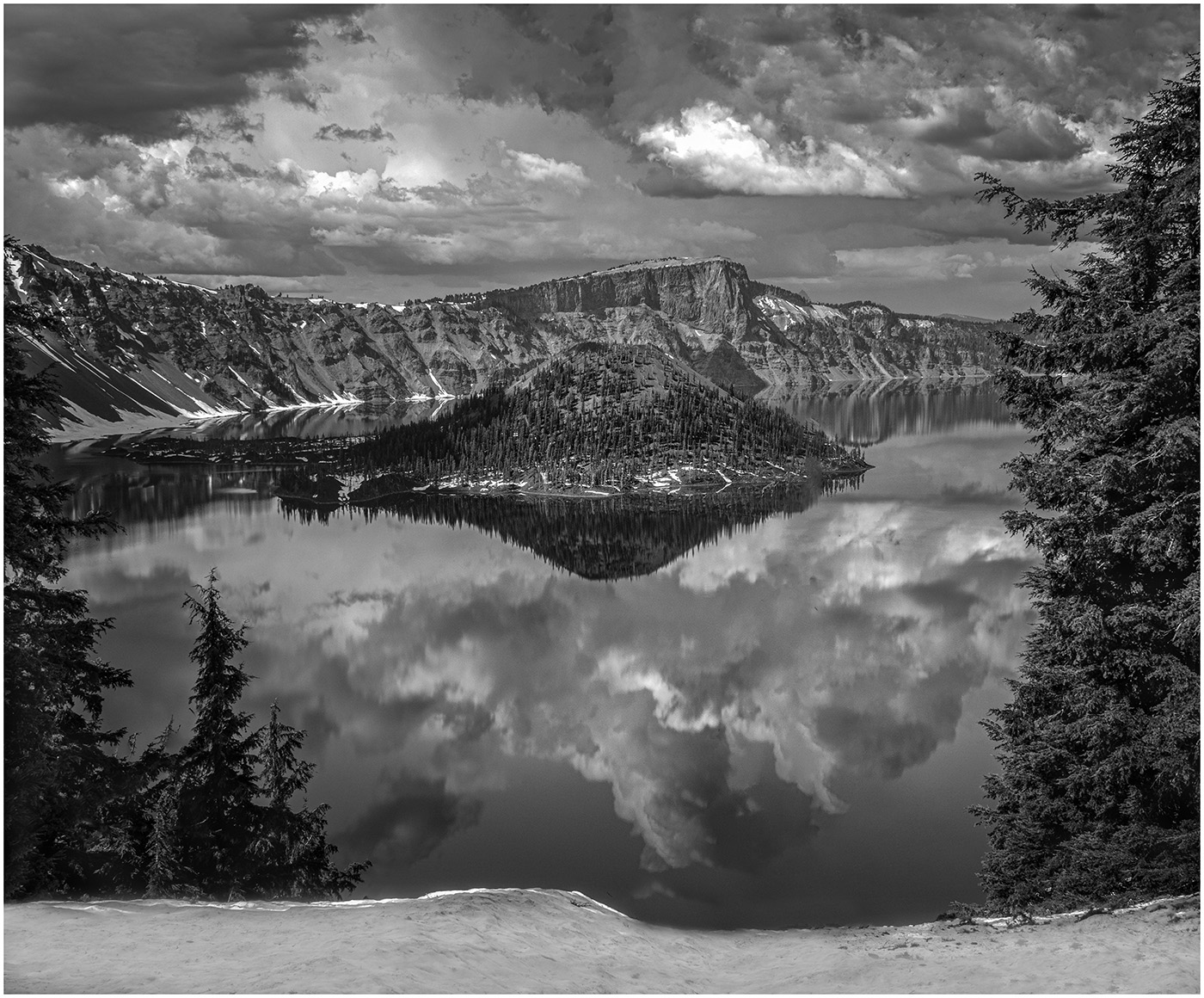
Thank you, Paul. I had not thought of the contrast between the foreground and mountains. I actually took some without the foreground. I will compare. We were staying at the very end of the Spit and I have closeups of those mountains. |
Nov 16th |
| 39 |
Nov 22 |
Reply |
ok...next time I check the border too. The clouds are important to me too and I like them dark, but I like the look of cropping them down a bit. |
Nov 15th |
| 39 |
Nov 22 |
Reply |
Thank you, Kathryn. You really studied this. I didn't even notice the land on the right. But I will take it out. Also, a good idea to crop up a bit and down, but I do prefer the dark, heavy clouds. Thanks for your insight. |
Nov 14th |
| 39 |
Nov 22 |
Reply |
Thank you, Vincent. I do agree to crop the clouds down for a more panoramic image. As for the white border, I really didn't think of it as part of the photo. I did it because it was suggested we do that to provide contrast with the black background. |
Nov 14th |
| 39 |
Nov 22 |
Reply |
Thanks, Dave. I do prefer the darker clouds also. I feel I am getting better at tones. |
Nov 14th |
| 39 |
Nov 22 |
Reply |
Thank you, Jerry. I should have said that this was handheld. I agree that the clouds can be cropped down a bit, but I do like the dark, stormy clouds. I need to study the graininess of the water. It was raining, would that effect it. So....WWAD...What Would Ansel Do? I'd love anyother suggestions... |
Nov 14th |
| 39 |
Nov 22 |
Reply |
Thanks...I have that program and love it, but I never heard it referred to as SEP...now I know:) |
Nov 12th |
| 39 |
Nov 22 |
Comment |
A wonderful infrared type of glow and tone to this. So creative to think of converting a Halloween scene to Black and White. Minor suggestions...To bring the eyes in to Center more, I would leave the same crop, but clone out the figures to the right of the tree and on the left, the figure to the left of the ghost. |
Nov 12th |
| 39 |
Nov 22 |
Comment |
Vincent, pardon me but I don't understand what SEP means. I do know I like the conversion to Black and White and in the adjusted version you can see her skin tones, yet it still keeps that High Key "feel". |
Nov 12th |
| 39 |
Nov 22 |
Comment |
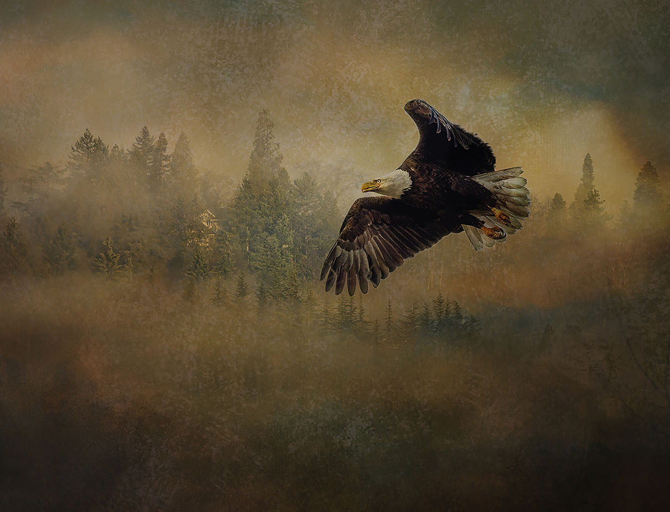
A beautiful shot of a Raven flying. It's not easy to get texture on such a dark bird! I was going to suggest cloning out the branches, but you already did it! I prefer your original crop with more negative space on the right. It gives him room to fly. Personally, I think he is too close to the edge with the new crop. |
Nov 12th |
| 39 |
Nov 22 |
Comment |
The conversion to Black and White keeps the focus on the emotion of the story. The leading lines of the walls bring the eye right to the woman. Since our eye goes right to her,I would like to see a little more room on the right for balance.
Definitely a photo worthy of being in an exhibit on Homelessness. |
Nov 12th |
| 39 |
Nov 22 |
Comment |
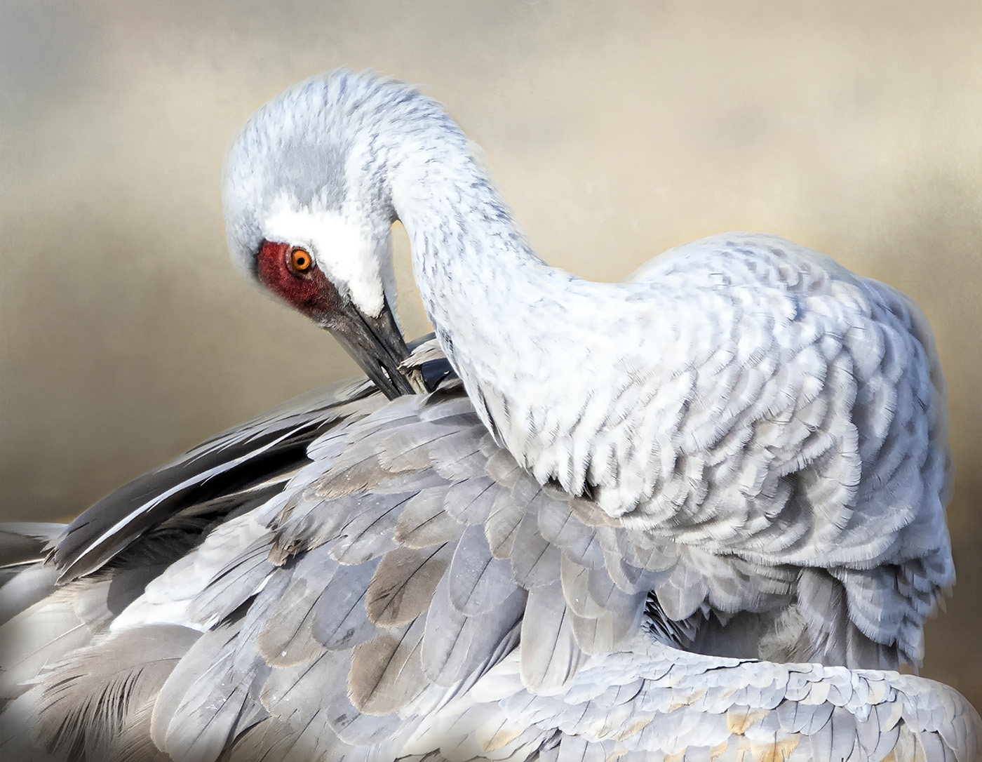
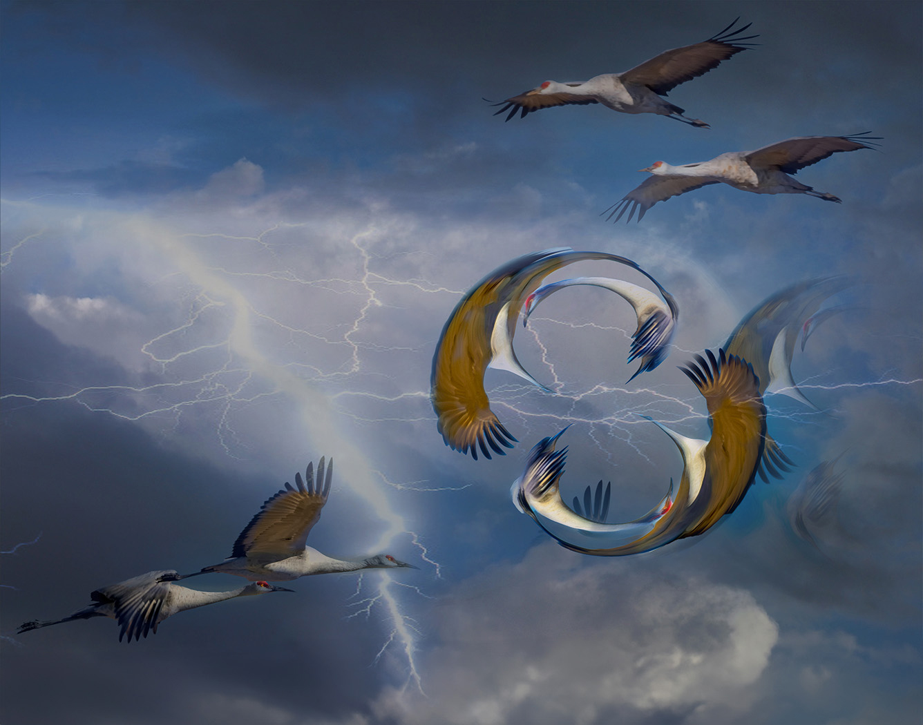
Great detail in each and every crane. I can hear them squawking and honking or whatever you call their prehistoric sounds. Converting it to Black and White helps keep focus on the cranes . An amazing sight... |
Nov 12th |
5 comments - 7 replies for Group 39
|
| 65 |
Nov 22 |
Reply |
Thank you, Al. It's a challenge. |
Nov 14th |
| 65 |
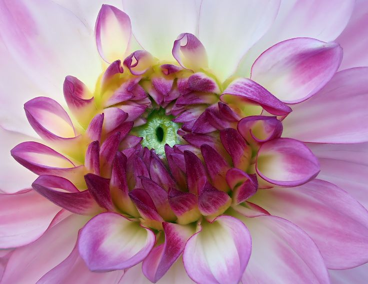
Nov 22 |
Reply |
Thanks, Melanie. I guess I didn't expect such a learning curve with the Velvet 56. I would have been happier with the edge of the main petal being in focus too. I think 5.6 would have had that effect. I will continue my discovery with the LensBaby next month too...afterall, this is a Study Group:) |
Nov 13th |
| 65 |
Nov 22 |
Reply |
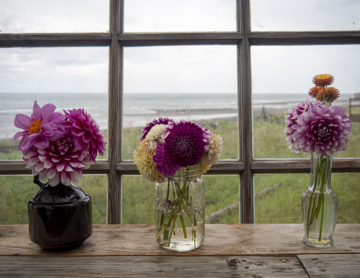
I am going back to 5.6. I love Kathleen's work. She is my inspiration when photographing flowers, especially dahlias! I wrote her and said, sometimes I sit there and think WWKD...What Would Kathleen Do? She liked that. She also says she stays around F4 nd F5.6 with her Velvet 56. I love taking flowers and focus stacking, but you have inspired we to stay with the Velvet 56. I will try again next month. If you want to continue this conversation through the month, my email is feyaz0702@gmail.com...(for Diana and/or anyone else.) |
Nov 12th |
| 65 |
Nov 22 |
Comment |
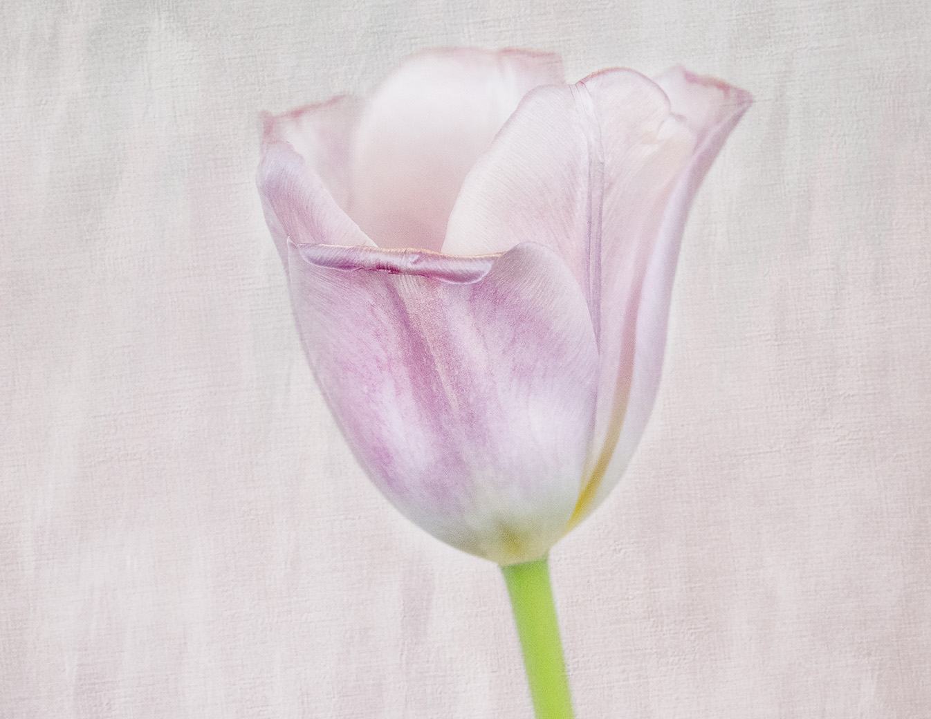
I love the flowing lines of the tulips. I even like your original with more of the vase showing and then cropping down on the flowers on the top. I would then clone out the light stems as Maria suggested. The yellow and green work so well as complimentary colors. I might have sharpened the flowers and stalks a bit less to bring out the texture, but make them more natural looking. I read somewhere of a guy who buys flowers for his wife every week...it's a win-win situation:). |
Nov 12th |
| 65 |
Nov 22 |
Comment |
Beautiful, delicate Dogwood lends itself to B & W. I like how Maria converted to background to Black. Much more dramatic.
|
Nov 12th |
| 65 |
Nov 22 |
Comment |
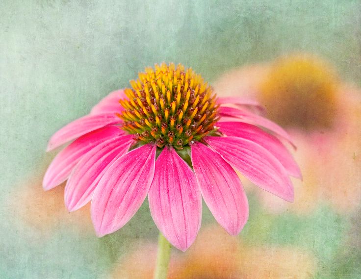
You captured the flowers perfectly....sharpness, yet soft. The only suggestion I would have is extending the green to the entire background. The brown background, although nicely blurred seems to detract from the cohesiveness of the photo. My eye goes right to the brown, If it was green, it would go directly to the flower. |
Nov 12th |
| 65 |
Nov 22 |
Comment |
This is a beautiful and unique rendition of a sunflower. I like how my eye goes right to the center and then flows to the leaf. I reversed it, as Maria suggested, and personally, I prefer the flower on the left.The texture is perfectly muted and I like how it fades from green to yellow. I agree with Diana, perhaps the upper left corner could be green.Nicely done! |
Nov 12th |
| 65 |
Nov 22 |
Comment |
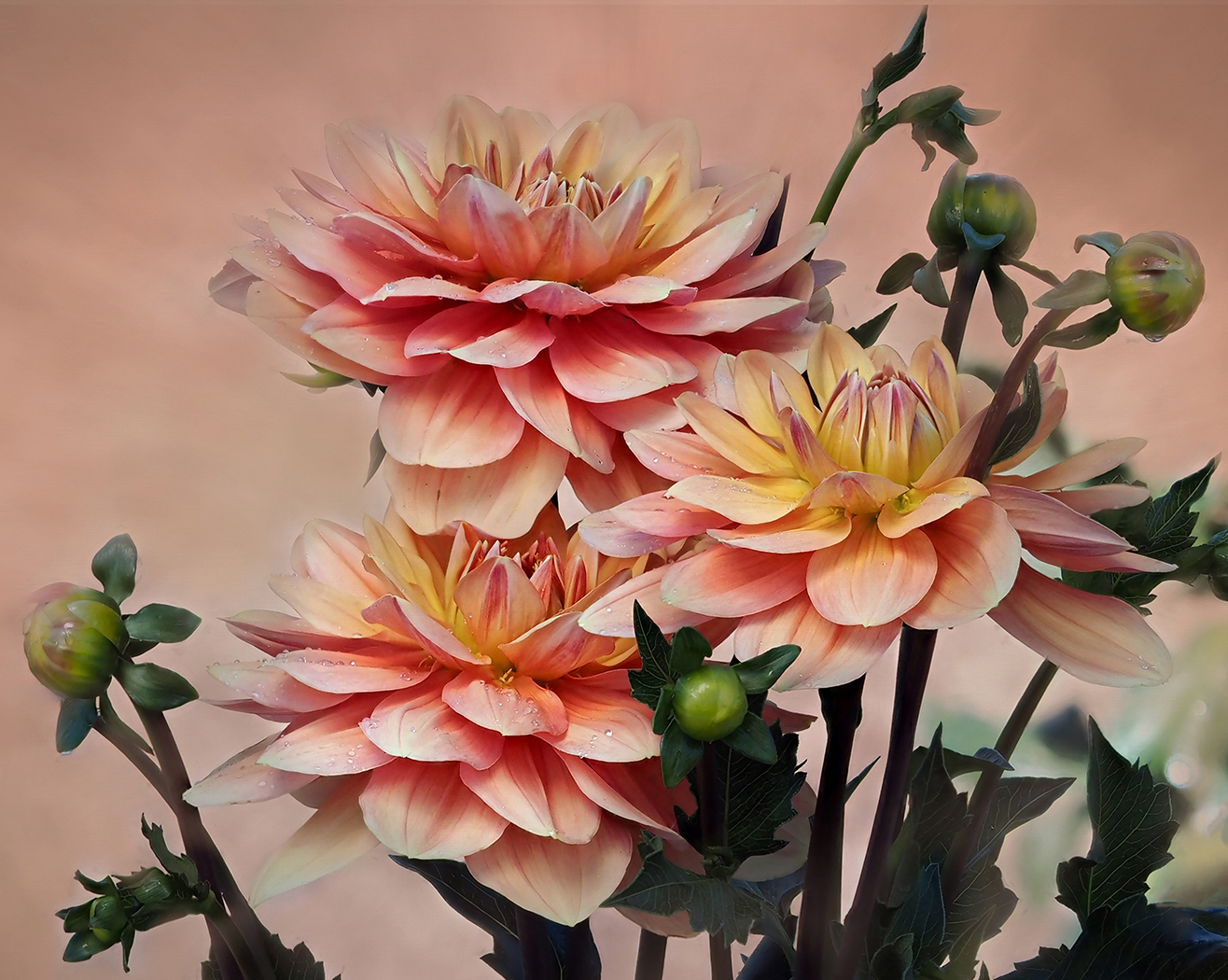
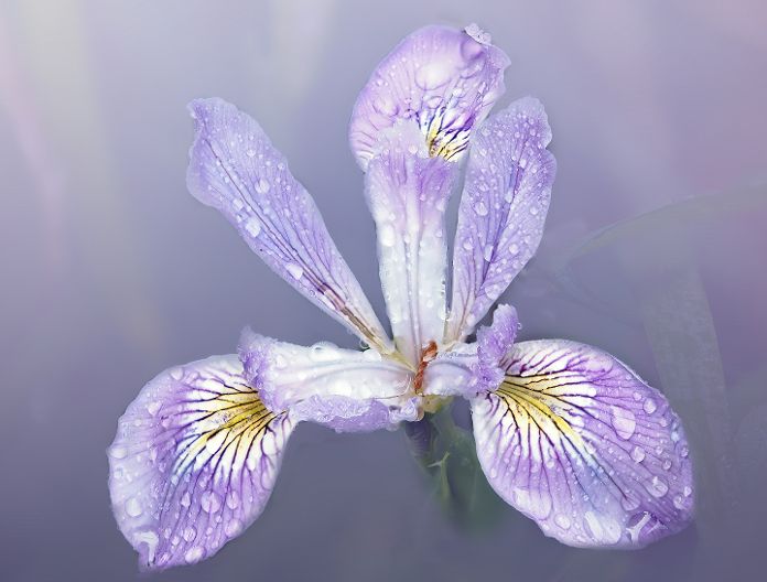
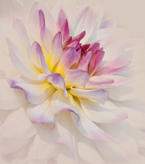
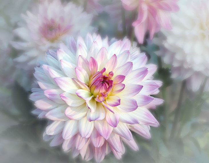
This is a beautiful photo of a Dahlia. My favorite to shoot with a Lensbaby. I do like the richness that the 5.6 gives it. Lighting, background texture all work.
Have you ever taken a class with Kathleen Clemons? You did everything she recommends.
|
Nov 12th |
5 comments - 3 replies for Group 65
|
13 comments - 12 replies Total
|