|
| Group |
Round |
C/R |
Comment |
Date |
Image |
| 1 |
Oct 22 |
Comment |
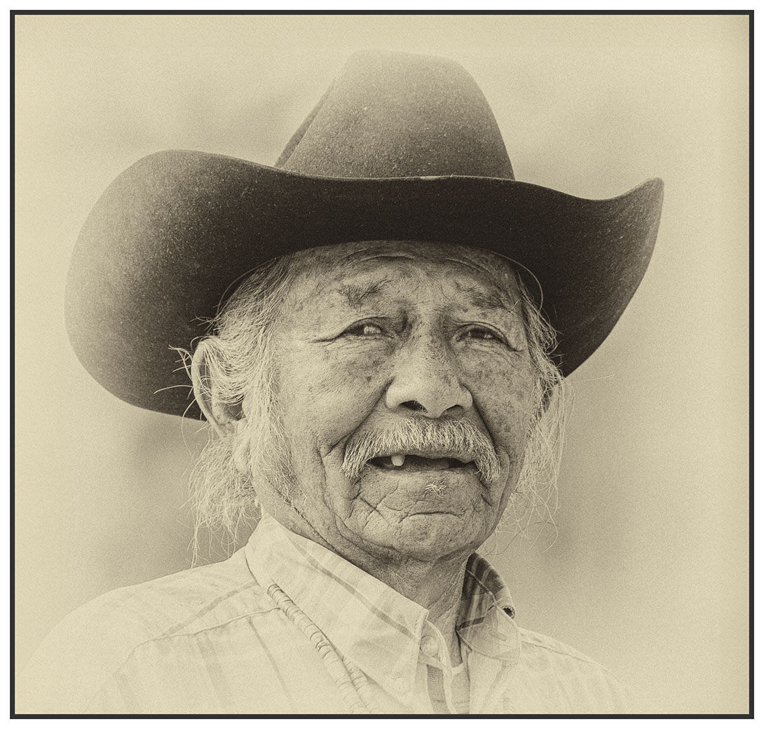
Hi Sol, I like the angle you captured here...also the tones of the day.
|
Oct 10th |
1 comment - 0 replies for Group 1
|
| 12 |
Oct 22 |
Reply |
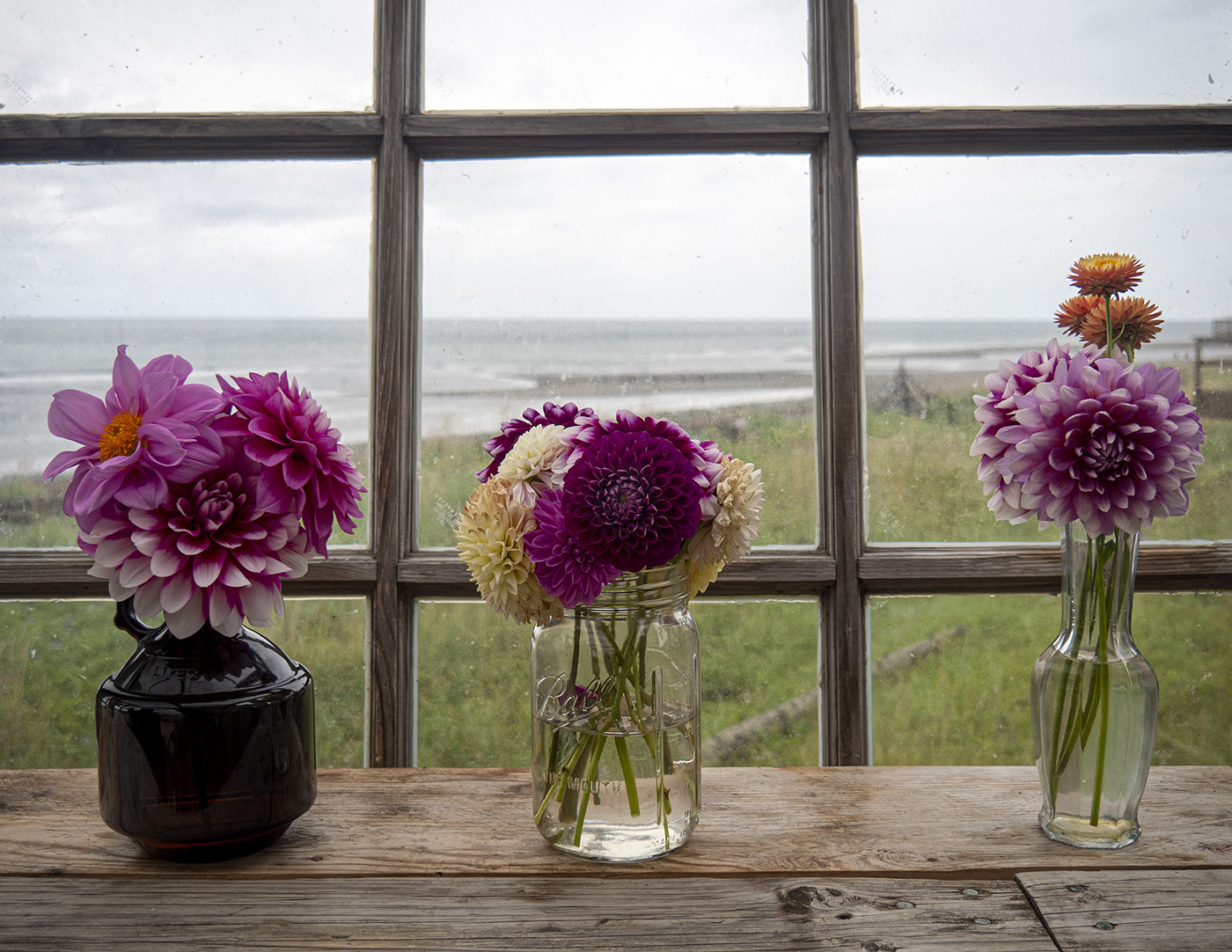
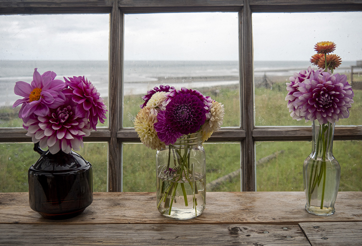
Carole, I am having difficulty understanding your comment about "window light" and "in a window". Personally, I don't think the flowers should have been brightened. It is the light that was photographed on a rainy, gloomy day in Alaska.To brighten them would not have reflected the window light of the day. "This image looks as if I'm on vacation with some bad weather, and I'm making the best of it." That's exactly what it was. |
Oct 26th |
| 12 |
Oct 22 |
Reply |
Yes, your crop and converting it to Black and White really focuses us. |
Oct 26th |
| 12 |
Oct 22 |
Reply |
Yes, your crop and converting it to Black and White really focuses us. |
Oct 26th |
| 12 |
Oct 22 |
Reply |
Thank you, Gavin. The photo is growing on me. Of the 2 crop suggestions, I think I prefer the one with the window frame. |
Oct 16th |
| 12 |
Oct 22 |
Comment |
This is a view that calls for standing with a cup of coffee and looking out. What a great start to the day. I see the subject more as "Through the Window" , though, rather than "Window Light" |
Oct 15th |
| 12 |
Oct 22 |
Comment |
What a wonderful "get". I do like the suggested crop and the black and white helps focus on the Action. What did it look like in color? I can foresee a series of "Through the Window" |
Oct 15th |
| 12 |
Oct 22 |
Comment |
What a special photo! Perfect in the soft light, the reflection, and the memory. No suggestions... |
Oct 15th |
| 12 |
Oct 22 |
Reply |
Thank you, Connie. I have to admit that I was so involved with the light and the flowers that I did not concentrate on the window bars themselves. I think I do like it with the top bar as a border. What do you think? |
Oct 15th |
 |
| 12 |
Oct 22 |
Reply |
Thanks, Ally. I agree. |
Oct 13th |
| 12 |
Oct 22 |
Comment |
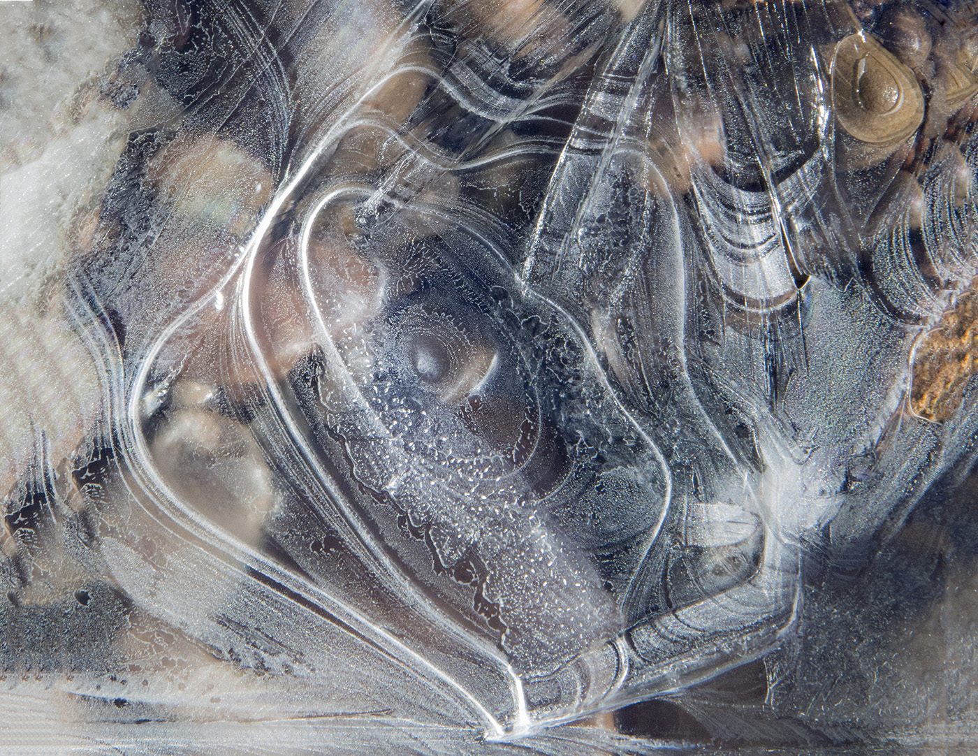
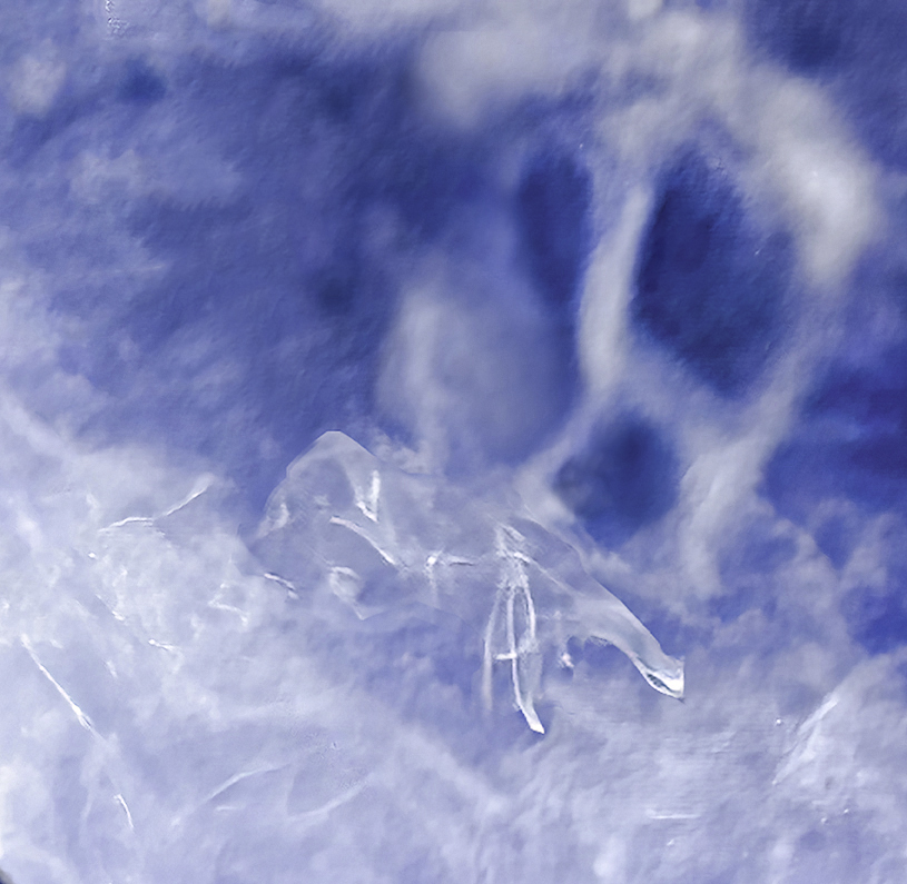
A totally unique and creative take on Window Light. This is just my personal opinion, but could you try desaturating the blue a bit. To me, the smoke is dreamy, ethereal. It might capture that mood more if there was less contrast. I took the liberty of bringing it back into Camera Raw. Using Color Mixer, I desaturated the blue a bit. Then, moved the texture slider up a bit and the dehaze, down a bit. What do you think? |
Oct 10th |
 |
| 12 |
Oct 22 |
Comment |
Nicely planned and executed. That Still Life course intrigues me. The only minor suggestion I have involves the background. The pattern distracts my eye a bit. My eye goes to the swirls. Did you try one with less of a texture? |
Oct 10th |
| 12 |
Oct 22 |
Reply |
Thank you, Lee Ann. As I look at the image I agree, the upper wooden bar adds nothing to the image. |
Oct 10th |
5 comments - 7 replies for Group 12
|
| 39 |
Oct 22 |
Reply |
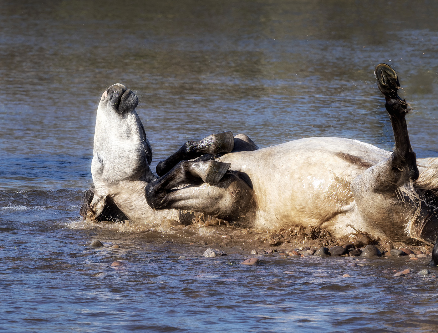
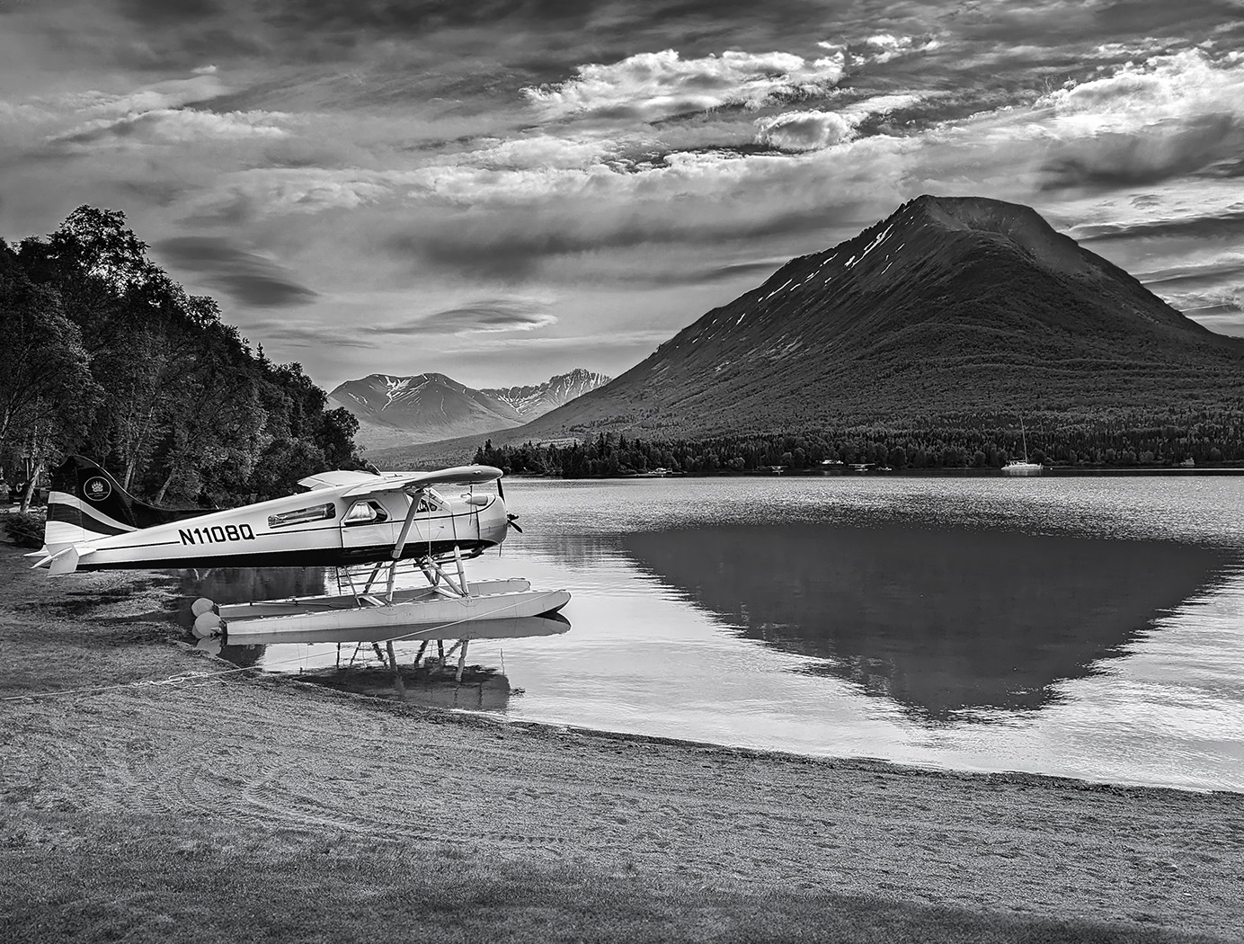
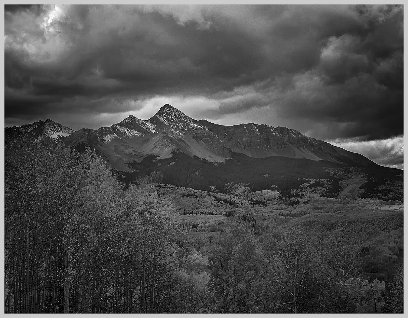
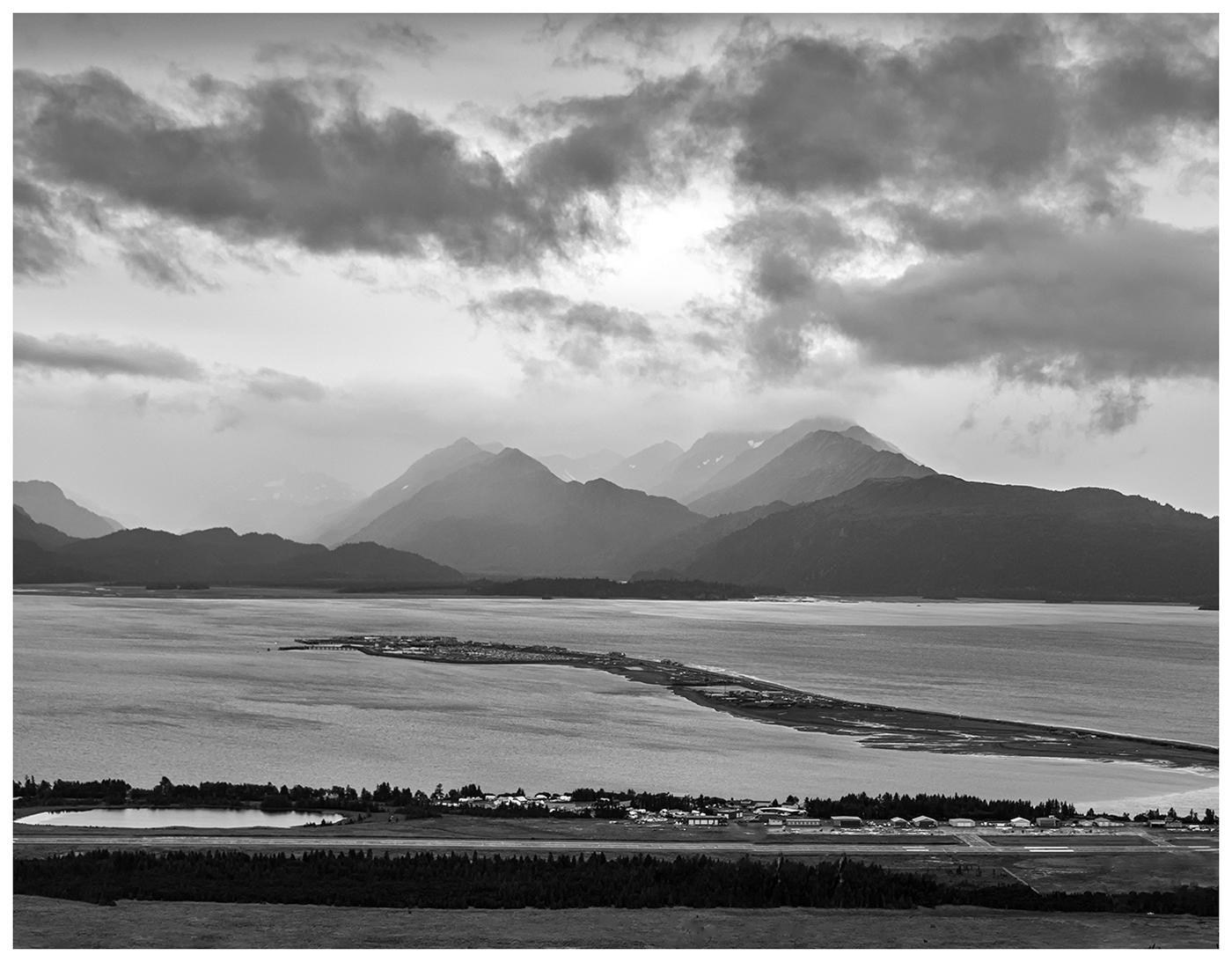
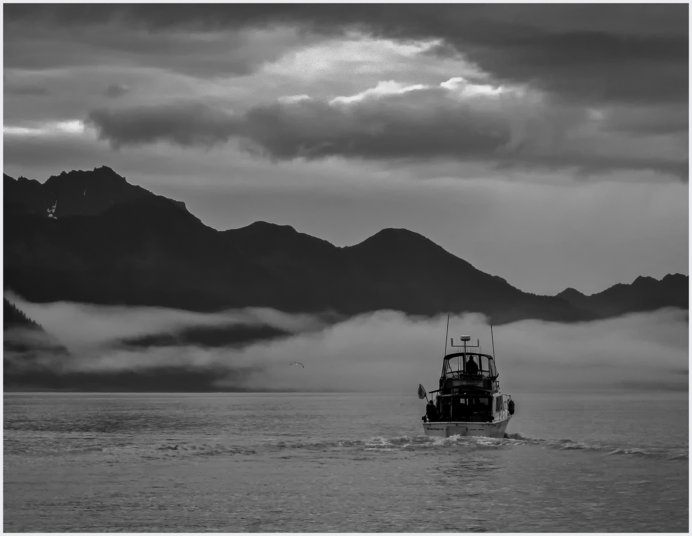
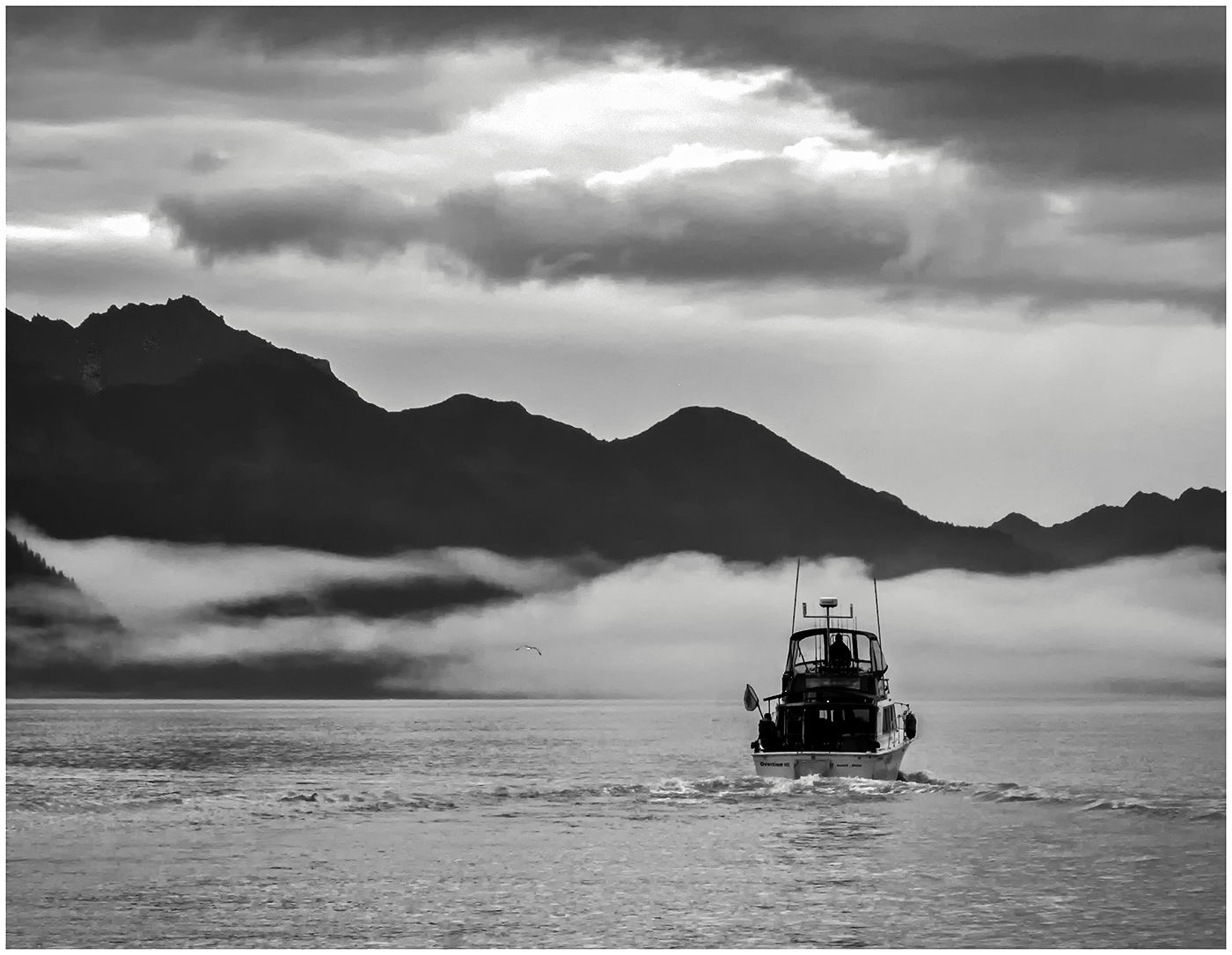
I am confused about the "flat" mountains. This was 15 minutes after sunrise on a rainy foggy morn. The mountains were mostly dark shapes. As the sun came up, it was the clouds that became interesting, the mountains remained dark. Question: How much do you keep the photo as a capture of the light and mood as it was and how much do you change it to make it more appealing? A good discussion question. |
Oct 18th |
| 39 |
Oct 22 |
Reply |
And I truly appreciate the input. |
Oct 18th |
| 39 |
Oct 22 |
Reply |
Thank you, Paul. You have brightened spots but kept the moodiness. When I brightened it per Kathryn's suggestion, I thought it was a bit too bright and did not capture the moodiness of the morning.
|
Oct 17th |
| 39 |
Oct 22 |
Comment |
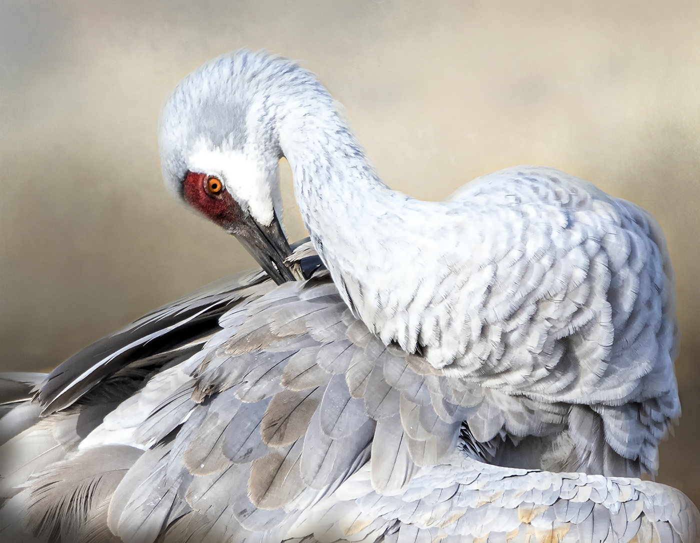
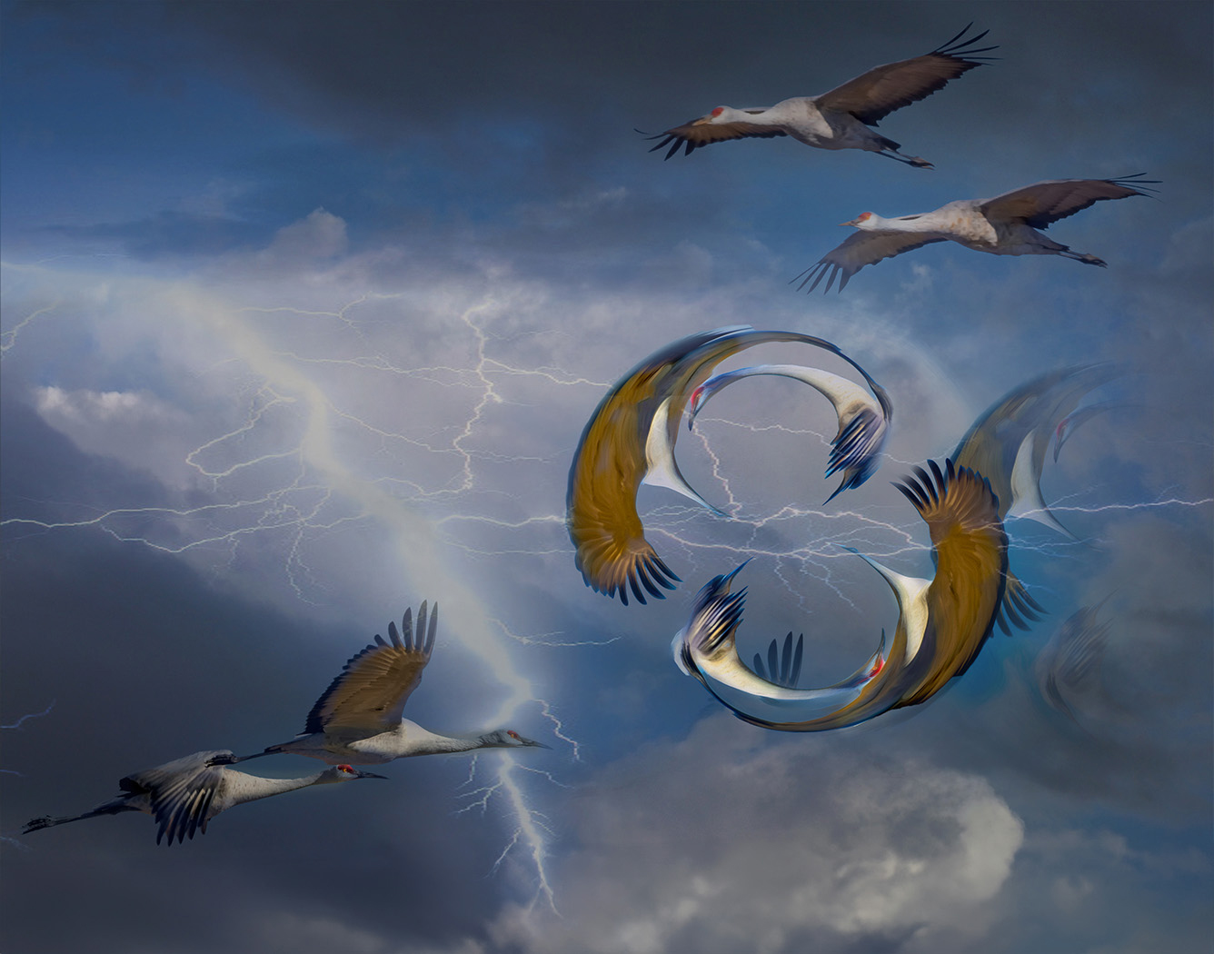
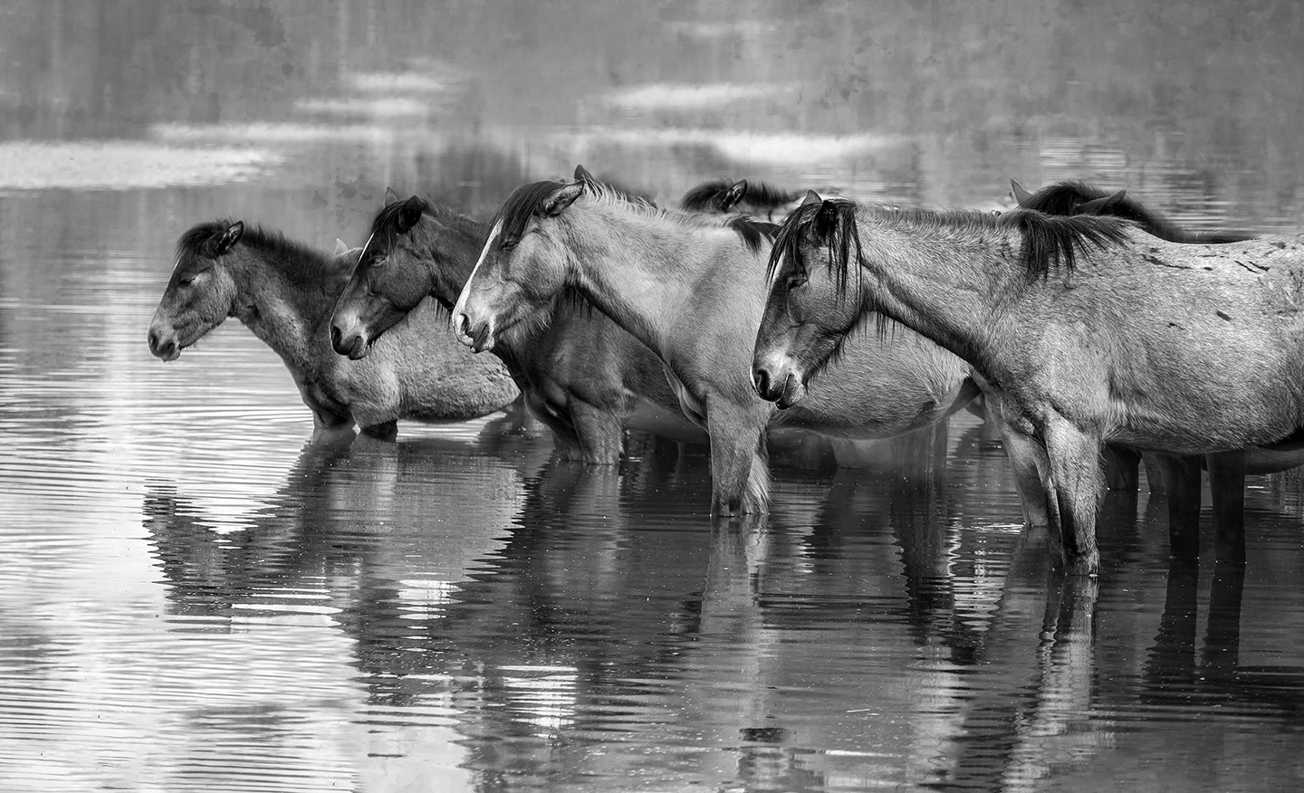
The texture and sharpness on the 2 birds flying makes them a strong subject. The white birds make them an excellent subject for Black and White. As Kathryn suggested, I would like to see the 3rd bird and extraneous signs removed. As I begin to look at the photo, my eye goes first to the background and then the birds.By cropping down on the top and bringing in the right a bit, the viewer would focus directly on the birds. |
Oct 16th |
| 39 |
Oct 22 |
Comment |
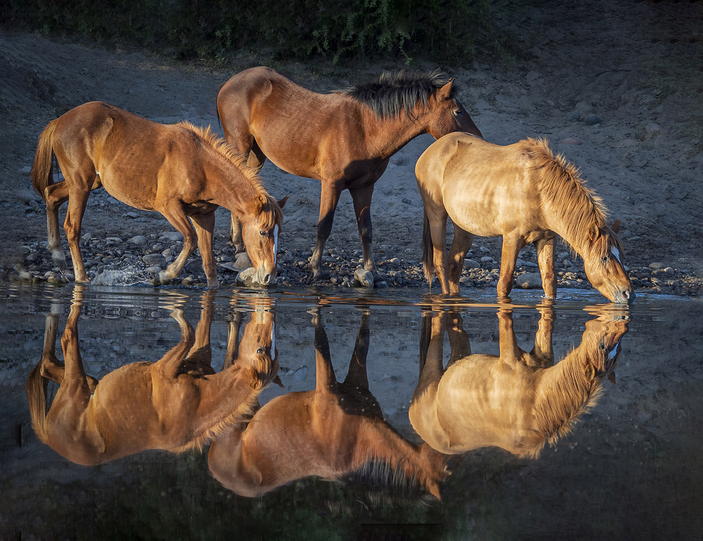
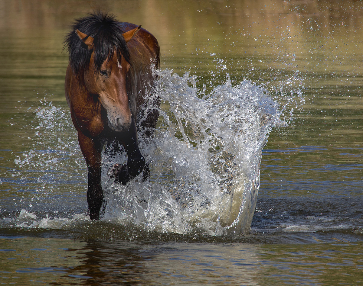
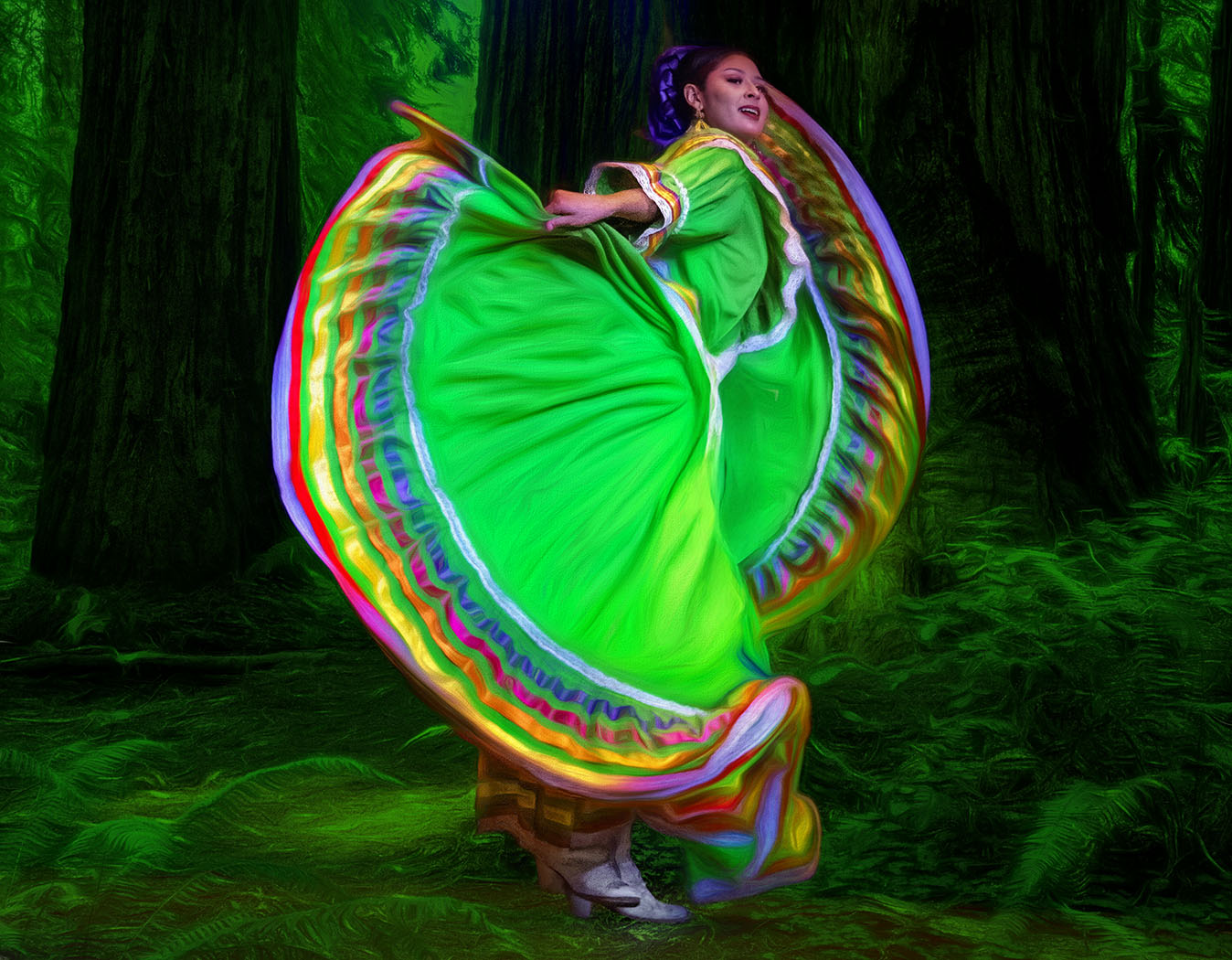
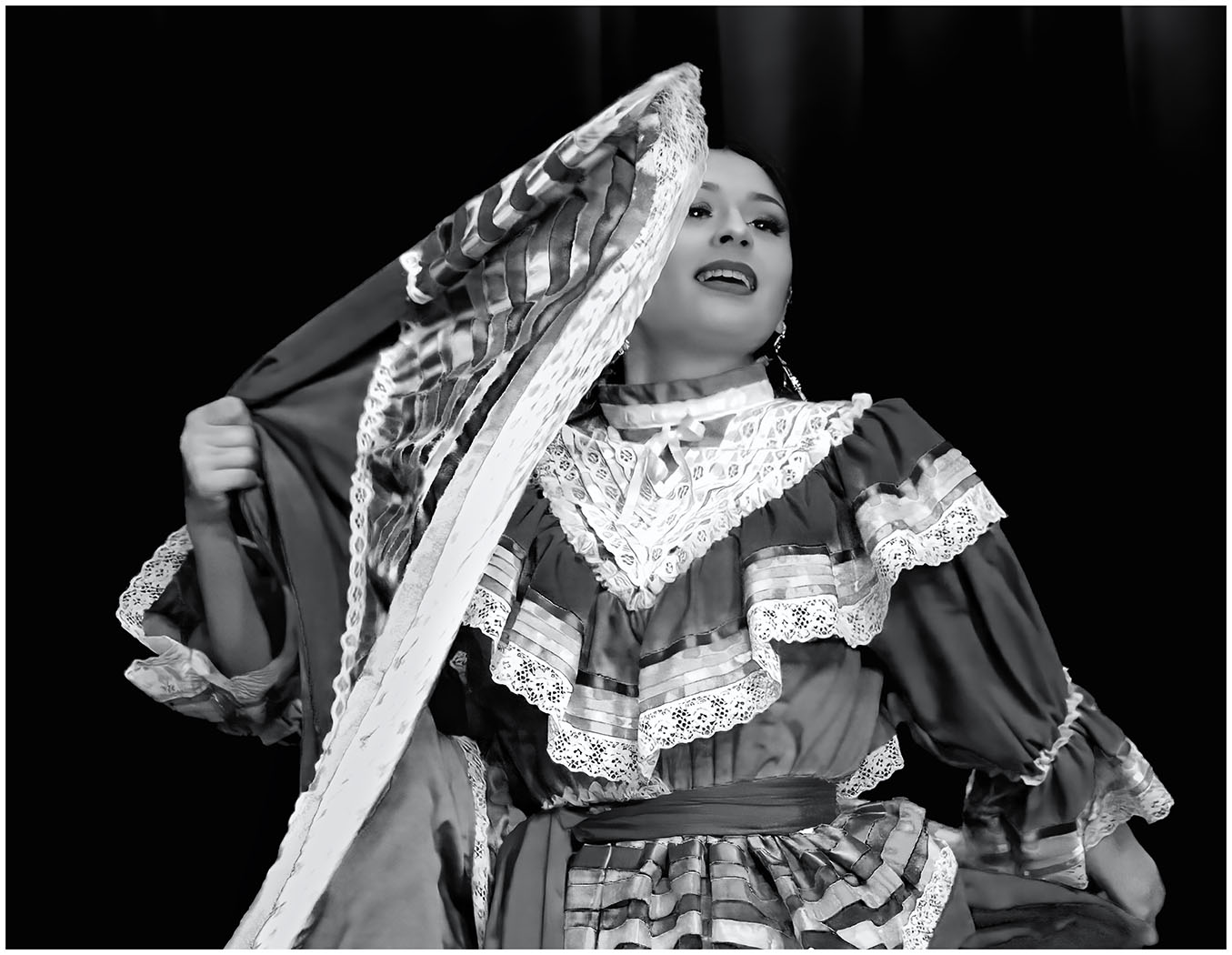
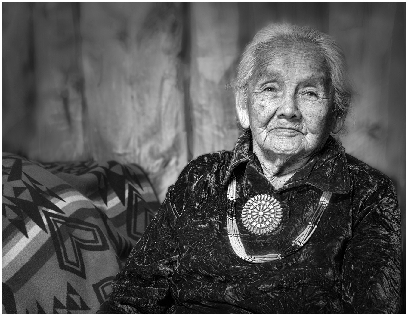
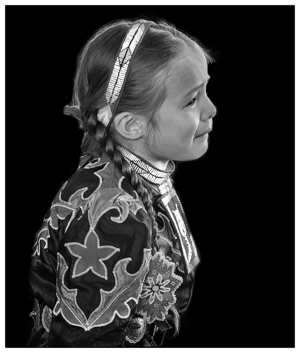
A beautiful photo of a beautiful young woman and her horse. The photo is nicely cropped as square and has beautiful tones. The only comment I have is more about the set up and not the photo. Did you consider having her stand on the other side of the horse so there would be light between her stomach and the dark horse? Because of the dark skirt it is difficult to differentiate between her and the dark horse.In the color version there is more contrast. |
Oct 16th |
| 39 |
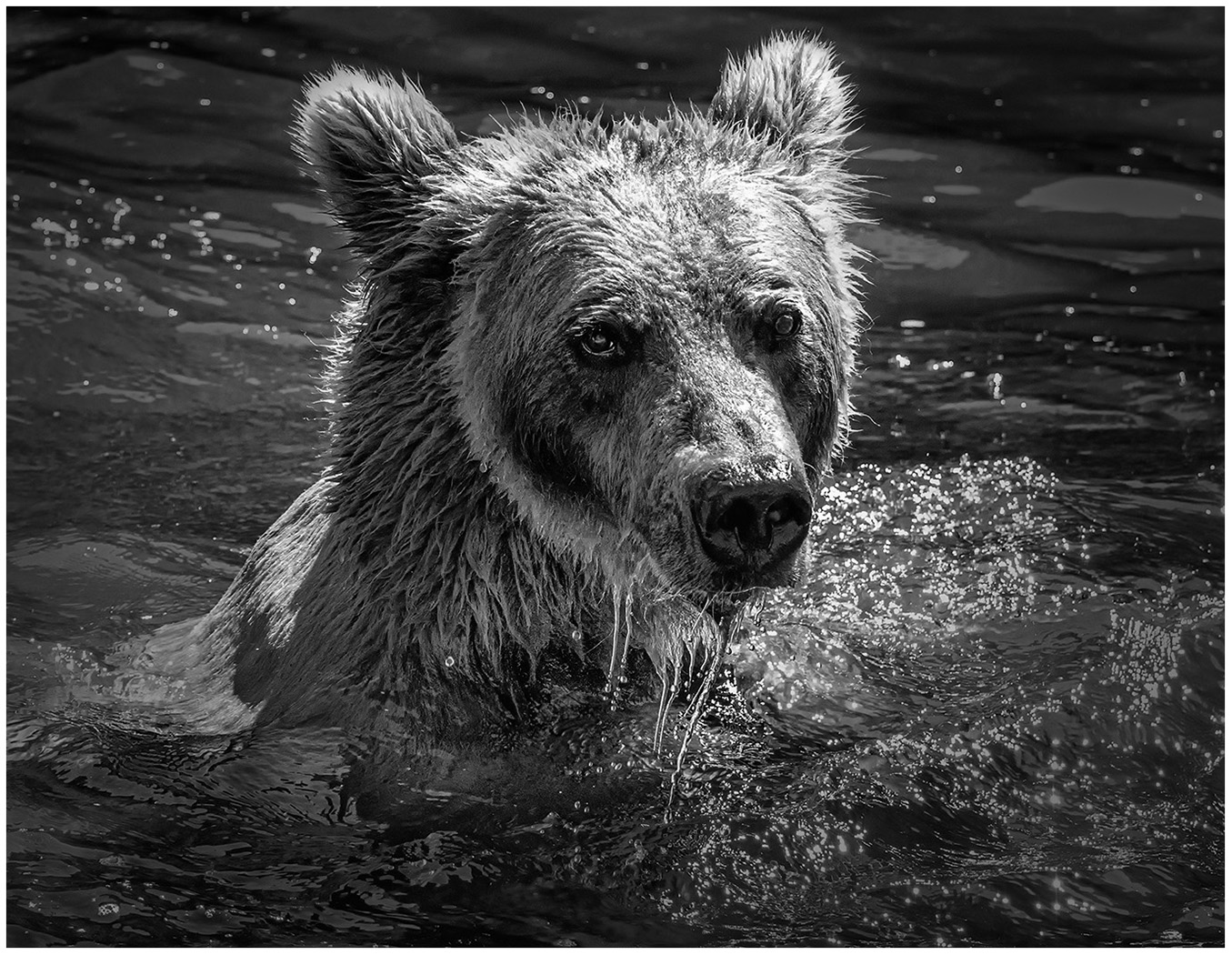
Oct 22 |
Comment |
I like how the deer stands out from the background, while the foreground is so sharp. For some reason, I don't usually think of converting wildlife shots to Black and White, but this works. Did you consider cropping a bit on the right so that the deer is not in the center? I like the blrred fencepost framing him. |
Oct 16th |
| 39 |
Oct 22 |
Comment |
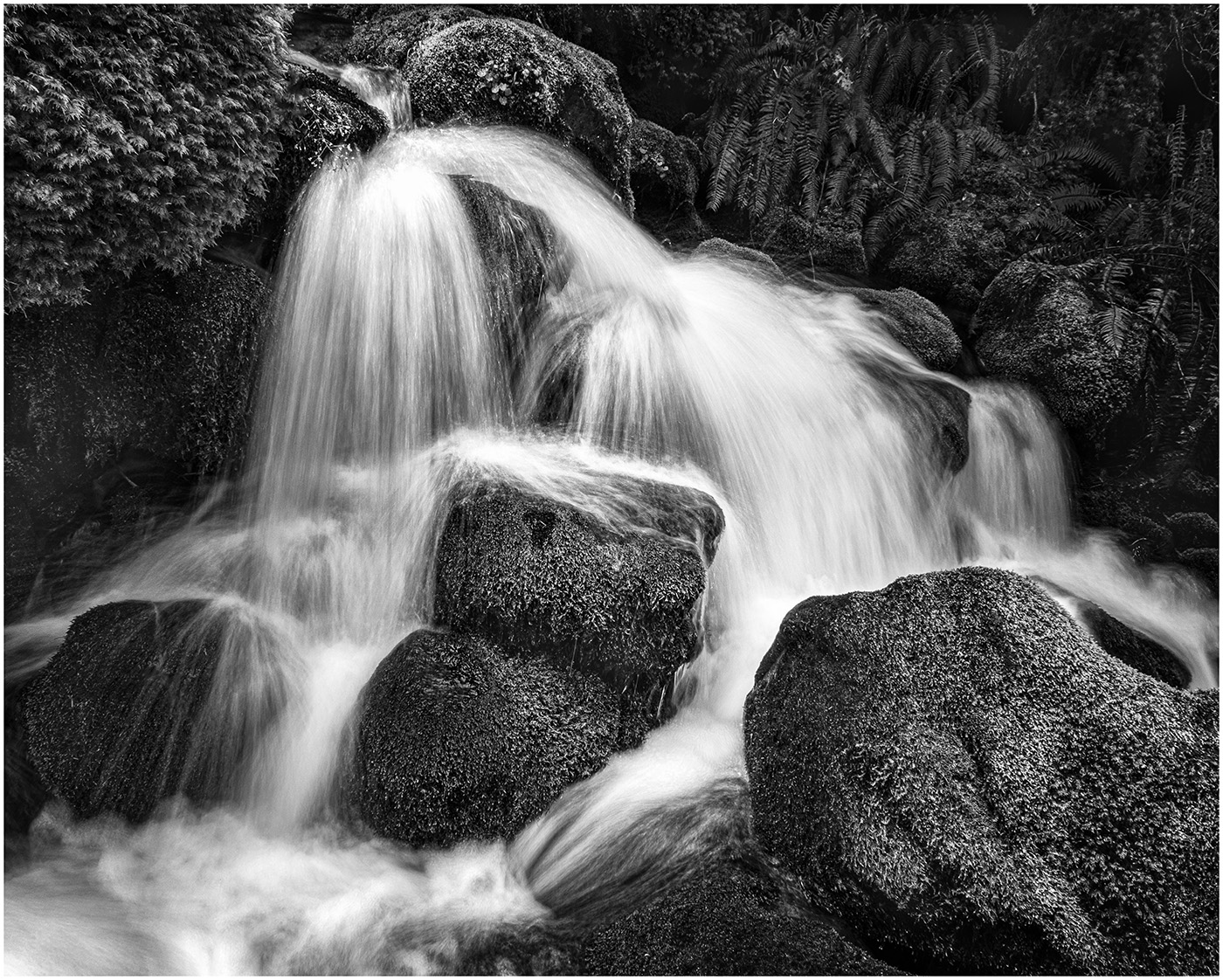
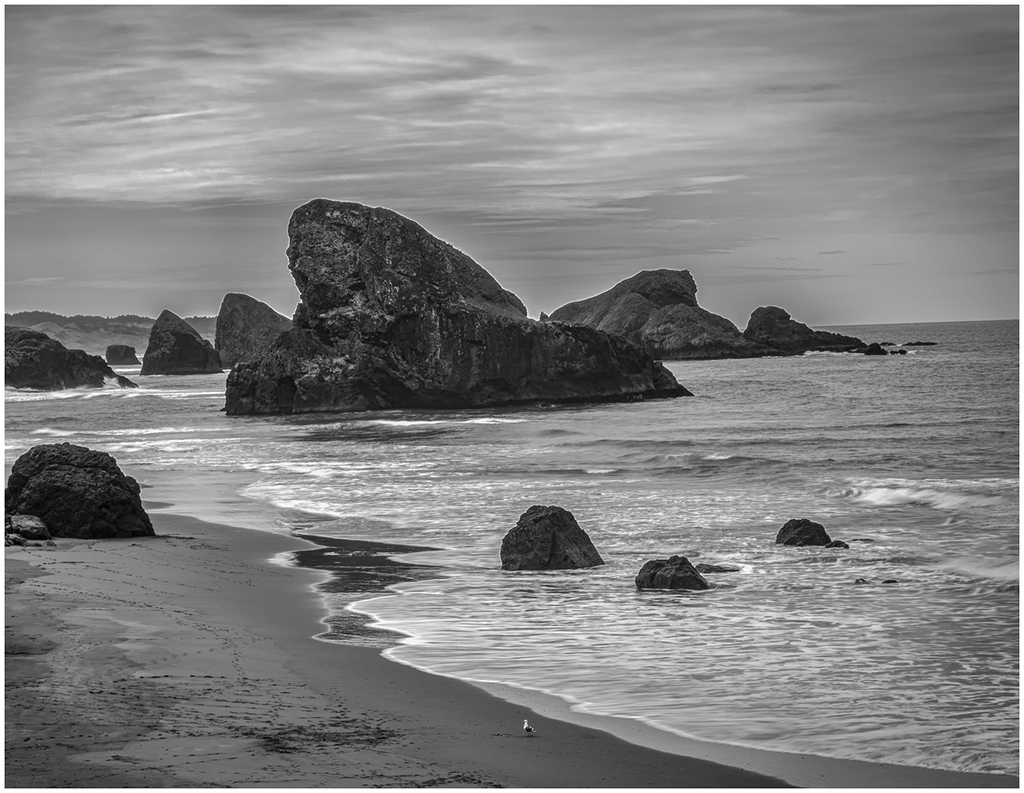
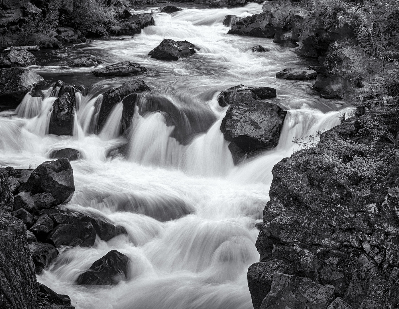
I like how you have cropped the original so now my focus is on the largest falls. In the original, the big rocks were competing with the water. In the Black and White, they tone down and our focus is on the subject. Nicely done!
|
Oct 16th |
| 39 |
Oct 22 |
Comment |
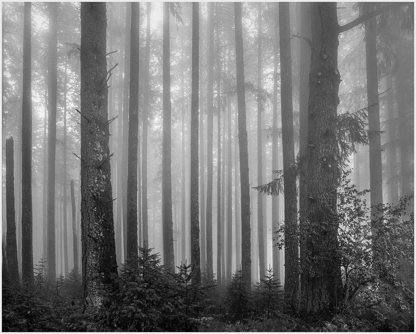
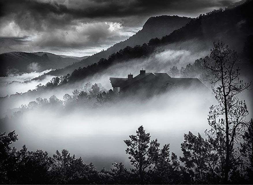
I like the conversion to Black and White. The green is toned down and now focus is on the shape of the trees. The sky looks more dramatic and contributes to the mood. |
Oct 16th |
| 39 |
Oct 22 |
Comment |
This has an infrared feel to me and as such, it is nicely done. But I have to admit, I prefer the original with the fall colors ,in particular the reflection. Those yellows can really be brought out. |
Oct 16th |
| 39 |
Oct 22 |
Reply |
Thank you, Kathryn for your suggestions.
How does this look? I do like it brighter. |
Oct 9th |
 |
6 comments - 4 replies for Group 39
|
| 65 |
Oct 22 |
Reply |
Thank you, Diana. As I said, I am just not confident with the Velvet. I have never liked the result with the 2.6. I will challenge myself to post a 2.6 image next month. |
Oct 15th |
| 65 |
Oct 22 |
Reply |
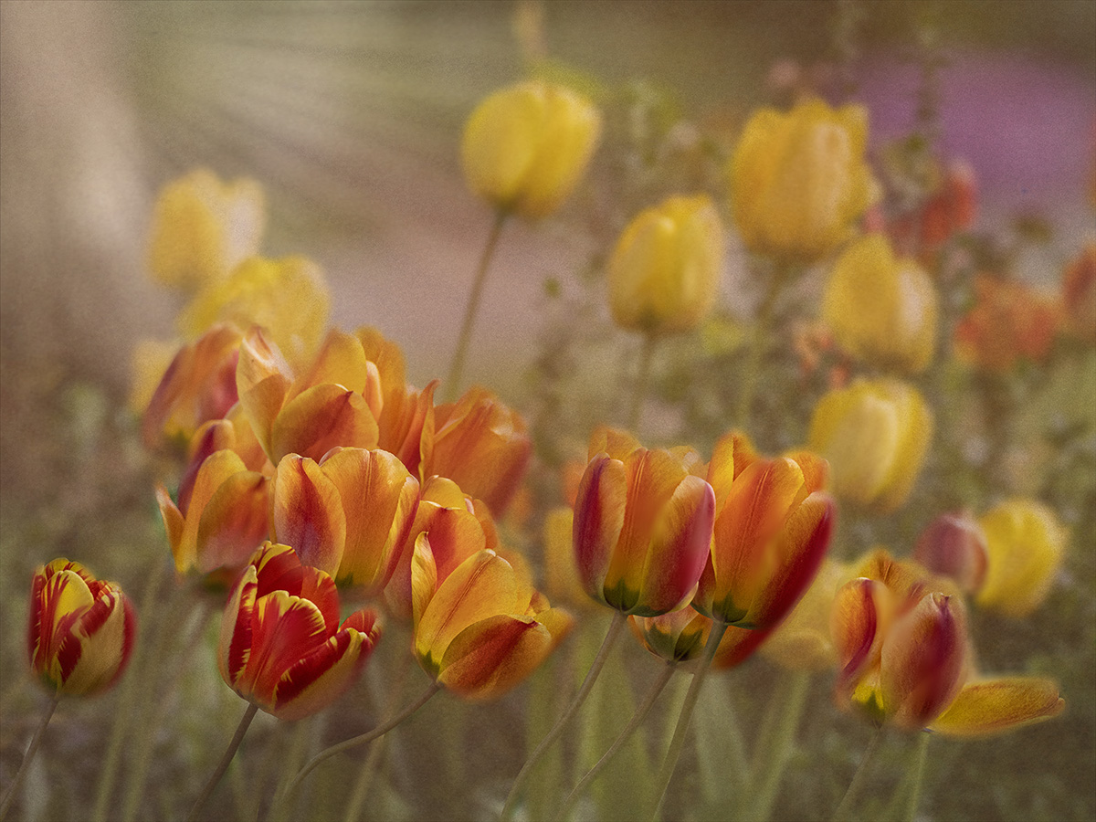
Diana, I don't think I expressed myself well enough about the color. IMHO Orange flowers are difficult to get that soft focus, because of the vivid color. I think you did a great job. Not too saturated at all! And the fact that you painted it after using the lensbaby...an interesting combination. I have not used a Macro lens with the Velvet 56. First, I have to experiment enough to like my photos using the Lensbaby alone. I will keep sharing lensbaby shots, since I need lots of suggestions. I learned a lot of subtleties with this shot. |
Oct 15th |
| 65 |
Oct 22 |
Comment |
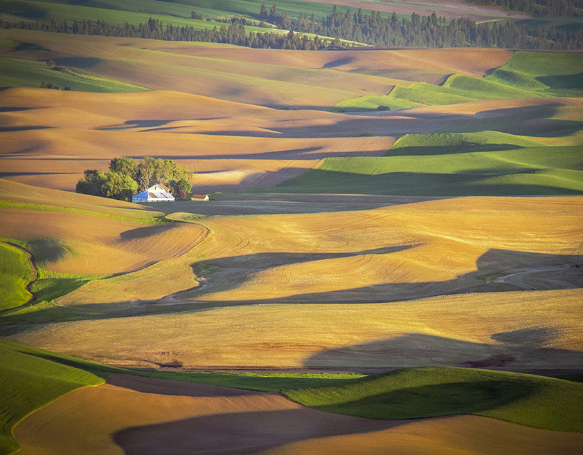
The Sonoran Desert Museum is one of my favorite places to visit. I love the meandering paths and wildlife. Always a fun visit. As Melanie has commented, this is more a scenic shot to me. I am not sure of which plant you would like us to focus on. Perhaps a close up of the cactus and surrounding yellow flowers. |
Oct 15th |
| 65 |
Oct 22 |
Comment |
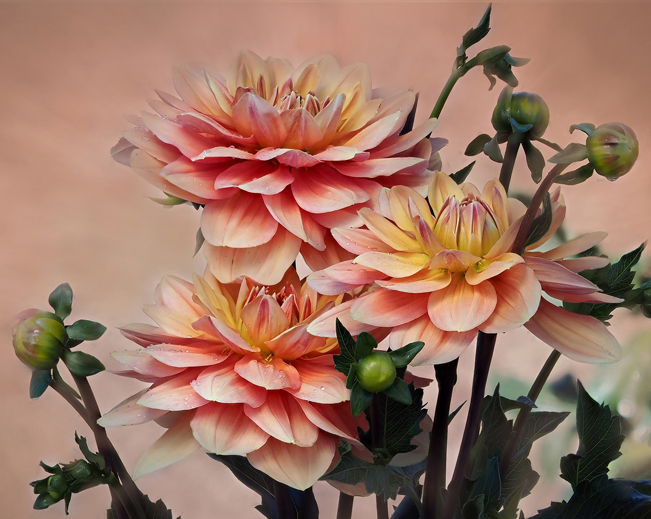
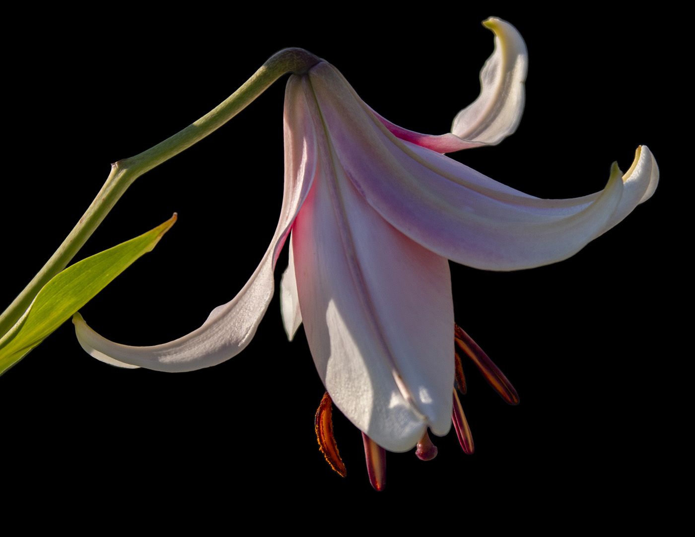
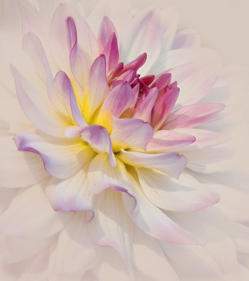
A beautiful lily. I like Maria's rendition of a softer background and image rotation. It highlights the flower more. |
Oct 15th |
| 65 |
Oct 22 |
Comment |
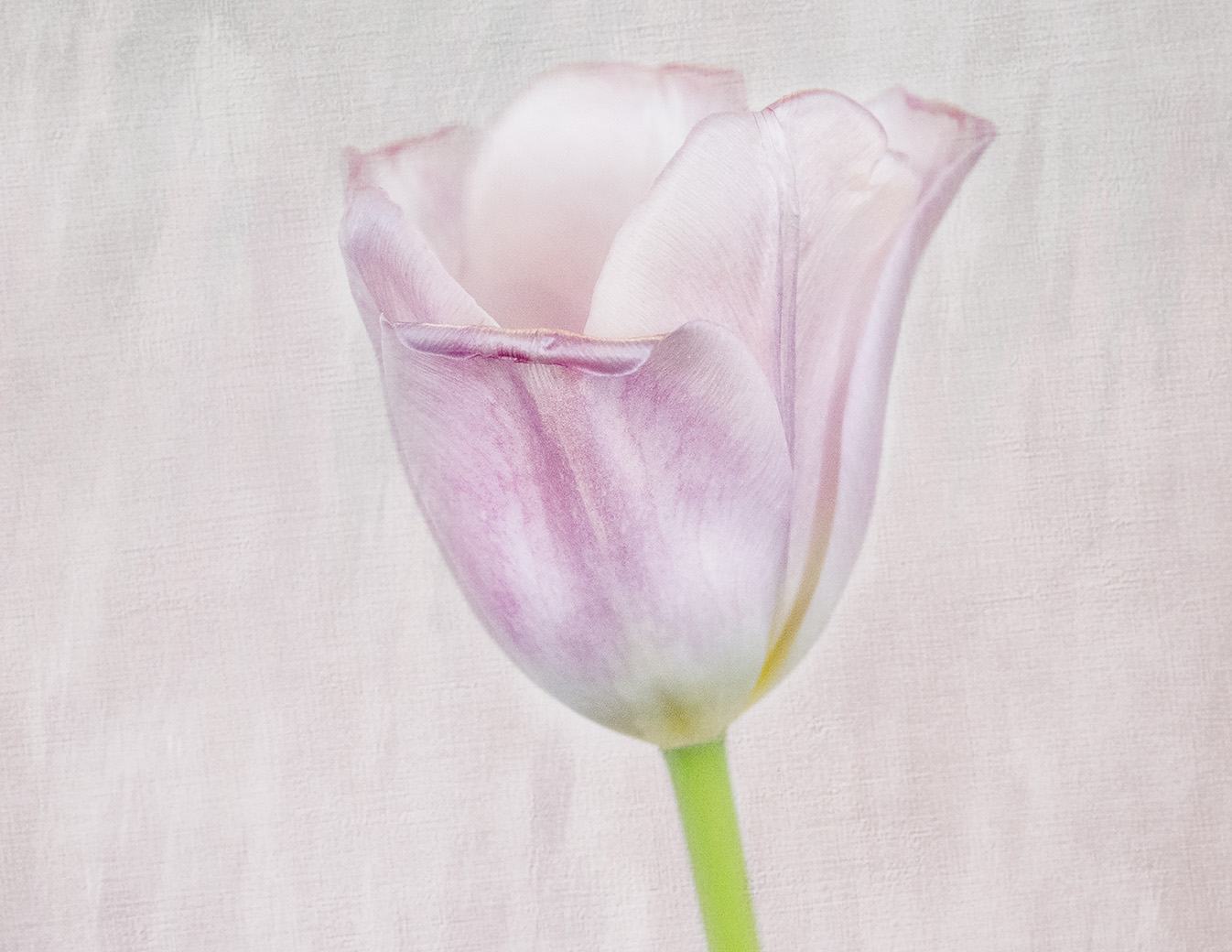
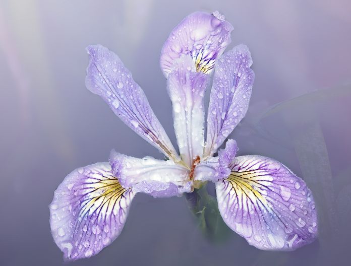
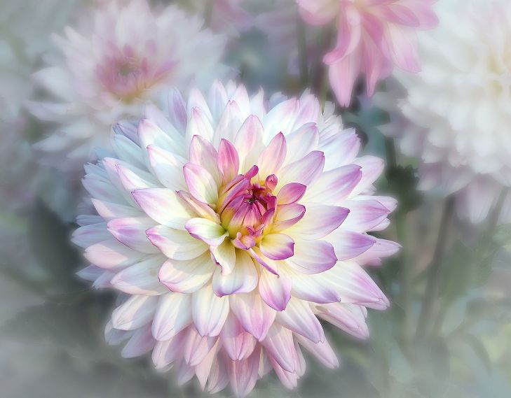
I like how the texture blends with the flowers. It is soft and soothing. I also like your technique of using a frame to bring your eye to the center and the flowers. I am not sure what adding blue to the texture would do to the mood. The only minor suggestion I might have is taking out the dead petal to the right and below the center flower. It is a bit distracting to me. |
Oct 15th |
| 65 |
Oct 22 |
Comment |
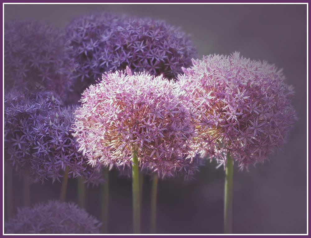
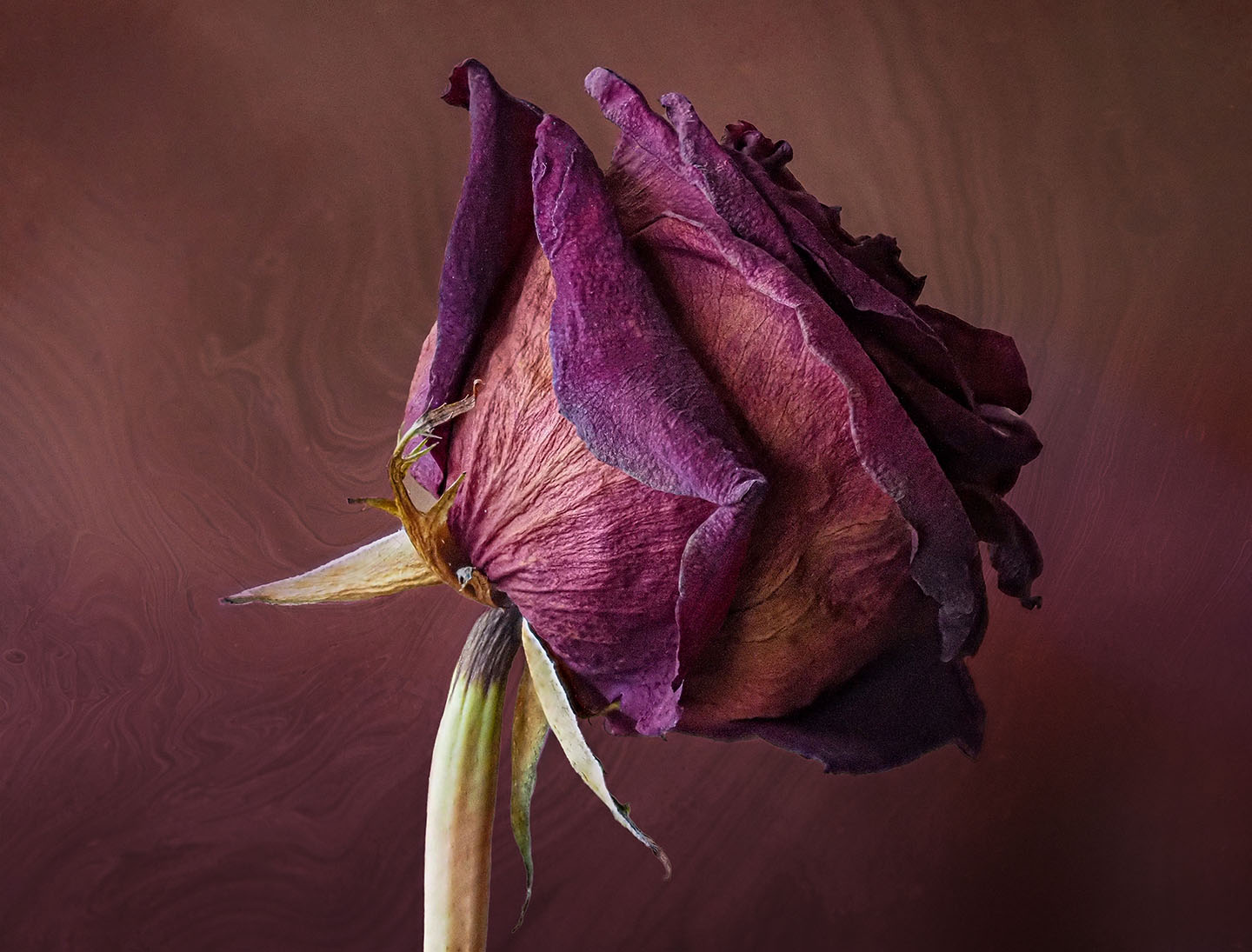
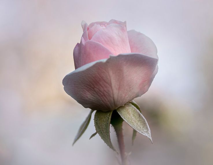
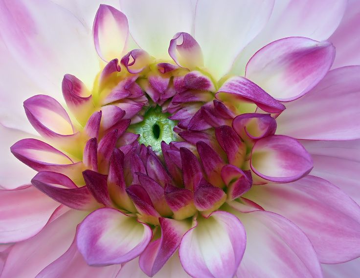
Simply Beautiful! It always amazes me how a simple reversal changes the whole flow and feel of a photo. I like the texture and the fact that you made it from the flower itself. With a vibrant purple it would have been difficult to match the tones. Nicely done! |
Oct 15th |
| 65 |
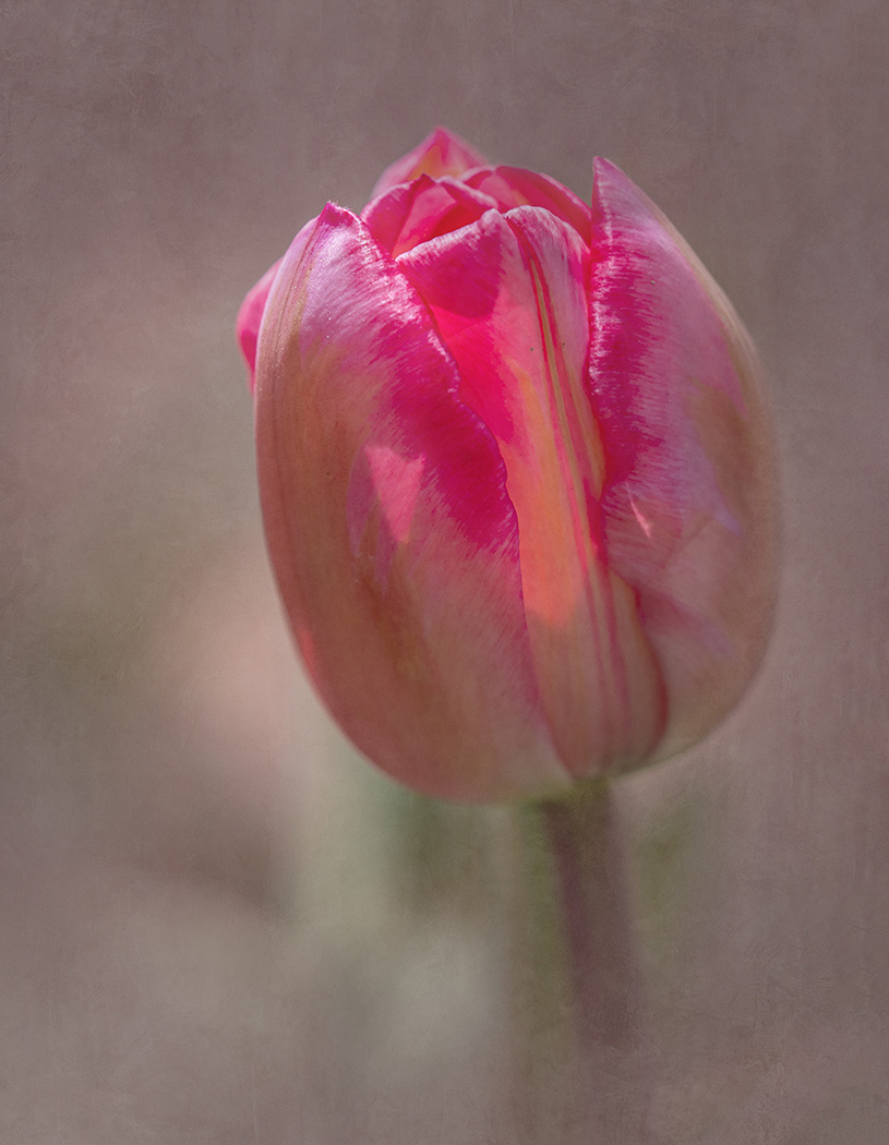
Oct 22 |
Comment |
I think you did a fantastic job...focus on the center and then soft focus fall out on the rest. The purpose of Lensbaby is the soft diffusion of focus and light and you have captured it well. The color could be too vivid or saturated, but you have captured it so it just draws you in. How do you find the Sweet 50 as compared to the Velvet series? You spent a lot of time on this image and it shows. Well done! |
Oct 15th |
| 65 |
Oct 22 |
Reply |
Thanks, Sol. And the other flowers out of focus is definitely from using the LensBaby. |
Oct 13th |
| 65 |
Oct 22 |
Reply |
Thank you, Al. It is a Grunge texture that I used. |
Oct 13th |
| 65 |
Oct 22 |
Reply |
Thank you, Maria. Lensbaby is difficult for me to decide the effect I want. |
Oct 13th |
| 65 |
Oct 22 |
Reply |
Thank you, Melanie. I like your suggestion about bringing out the vein detail and normally I would do it. The question I have, is would that ruin the lensbaby effect? Do I need a lensbaby lens then? |
Oct 13th |
5 comments - 6 replies for Group 65
|
17 comments - 17 replies Total
|