|
| Group |
Round |
C/R |
Comment |
Date |
Image |
| 12 |
Aug 22 |
Reply |
Thanks, Ally. Perfect symmetry would have had the light horse in the Center! (lol) |
Aug 10th |
| 12 |
Aug 22 |
Comment |
It must have been a wonderful visual display to see all these flags and I would have grabbed my camera too. Unfortunately I agree with Carole and Ally that it is not really symmetrical.
One flag pointing to the right and another pointing to the left would have been symmetrical. I think of symmetry as 2 halves of a whole...but that might be too literal. |
Aug 8th |
| 12 |
Aug 22 |
Comment |
This is a great photo...and from Montana! I need to put this on my list. I do agree that this is really not symmetry from this angle. If only the front statue was not there, we could peer down the line and see symmetry. Now, I think it reflects more a great Depth of Field study or of repeating patterns. |
Aug 8th |
| 12 |
Aug 22 |
Comment |
I love that you took the time to create your own unique image. I have never met Hazel, but learned how to use textures with Hazel's webinars. (There was some good out of isolation in 2020). Nicely done! |
Aug 8th |
| 12 |
Aug 22 |
Comment |
I love the simplicity of the symmetry (how's that for a mouthful) It has a calming effect. Nicely done.
Symmetry in reflections is always fun. |
Aug 8th |
| 12 |
Aug 22 |
Comment |
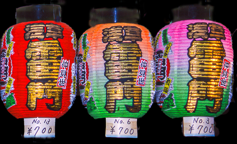
Well, the votes are in...I too, like the odd number of 3 lanterns. If you wanted it to be a bit more dramatic, how about a black background? Here's a quick and dirty example...
I love to look for symmetry, |
Aug 8th |
 |
| 12 |
Aug 22 |
Reply |
Thank you, Carole. I wanted to photograph something new for the assignment, but everytime I thought "Symmetry" I my mind went back to this. It was taken in January 2020.
I have seen videos on how to make a reflection in PS, but it seems like too many steps to replicate. |
Aug 8th |
| 12 |
Aug 22 |
Reply |
Thank you, Gavin. This was a true example of right time, right place. As soon as I saw them I just said "Wow." These horses are part of the Salt River Herd in Mesa,Arizona. With a desert habitat,they don't always get enough to eat in the summer, but at least they have the River. I have photographed wild horses in Arizona, Utah, Colorado, North Dakota, and Wyoming. If you are ever planning a trip, message me and I will give you specifics. |
Aug 8th |
| 12 |
Aug 22 |
Reply |
Thank you, Connie. I debated where to crop the Reflection, but I decided the focus should be on the Symmetry. Thanks for agreeing. |
Aug 8th |
5 comments - 4 replies for Group 12
|
| 39 |
Aug 22 |
Reply |
Thank you, Vincent. It is how I like to see water over rocks , so right now I find it interesting and something to tuck away in my mind, but we shoot for ourselves, not judges:) Correct? |
Aug 17th |
| 39 |
Aug 22 |
Reply |
Thanks for "picking a little". That's what makes us think. And I will think about the crop. My reasoning for cropping both the top and the left was that it wasn't adding much to the photo. The bush on the left was a distraction to the subject. And for the top, I wanted still more emphasis on the water. I will do it again and see how I feel. |
Aug 17th |
| 39 |
Aug 22 |
Comment |
What a great idea of using Live Composite for fireworks. I will have to try that next year (I also have a Mark II). Also, it was creative to convert to B & W. It shows the Contrast so well. Good job! |
Aug 13th |
| 39 |
Aug 22 |
Comment |
Great image, Kathryn. Definite eye contact! Just some minor suggestions...I would like to see the rocks on the bottom a bit darker to differentiate them from the background more. Also, if you could Dodge a bit around the eyes, it would accentuate that eye contact. What power he conveys! |
Aug 13th |
| 39 |
Aug 22 |
Comment |
I like how you have post processed this. The sky is so dramatic. And I find the framing of the church interesting. I started wondering how it would look with a different cropping off of the right to put more of an emphasis on the framing of the Church. What do you think? |
Aug 13th |
 |
| 39 |
Aug 22 |
Comment |
Paul, I truly like this image. Old rustic images lend themselves to B & W. I love the tones and the textures. There is something disconcerting about the basket, however. I'm not sure what it is. It appears to be floating in front of the scene, without contributing much to the scene. How would it look without it at all? Or is that another photo? |
Aug 13th |
| 39 |
Aug 22 |
Comment |
I find this image intriguing because of it being IR. It is a whole different way of thinking and seeing. I converted a camera a few years ago and hardly ever remember to use it. But enough about me and back to your image. My only suggestion would be to get rid of the lanterns at the bottom. They distract me as the viewer. Without them, my eye goes to the car and then moves around the entire scene. An inspiration in Infrared. |
Aug 13th |
| 39 |
Aug 22 |
Reply |
Thank you, Kathryn. |
Aug 13th |
| 39 |
Aug 22 |
Reply |
Thank you, Jerry. This was an interesting exercise in mostly using the ACR controls instead of bringing it into SilverEfex Pro.
|
Aug 13th |
| 39 |
Aug 22 |
Reply |
Thanks, Paul. That is a very interesting remark that some judges don't like the silky effect of water. Do you know what their reason is? I usually try all kinds of shutter speeds and go back to a silky effect that still has some detail in the water. That is my goal.
I will try to Dodge and/or Burn and see what I can do. |
Aug 13th |
5 comments - 5 replies for Group 39
|
| 65 |
Aug 22 |
Reply |
Thank you, Diana. I jokingly like to think WWKD...What Would Kathleen Do? |
Aug 11th |
| 65 |
Aug 22 |
Reply |
Glad you like it. Do you have NIK? |
Aug 10th |
| 65 |
Aug 22 |
Comment |
Hi Russell, I am always on the search for a cone flower. I love how the petals seem to dance. I agree with the others about cropping top and bottom. While the contrast of the green and pink compliment each other, I would like to see the cone flower stand out more. Can you bring the saturation of the green down a bit? So fortunate to see one in this good condition all alone. |
Aug 10th |
| 65 |
Aug 22 |
Comment |
Perfect! I like how you cleaned it up. Besides the line of the flower on the diagonal, I like the subtle frame, with the stem starting below. |
Aug 10th |
| 65 |
Aug 22 |
Comment |
What a beautiful Water Lily. Such a unique perspective.I love the glowing light in the Center. Since you already cleaned it up, the only suggestion I have is an alternative Crop. It seems scrunched in. I would like to see it have more room to sway and flow on the left and right. |
Aug 10th |
| 65 |
Aug 22 |
Comment |
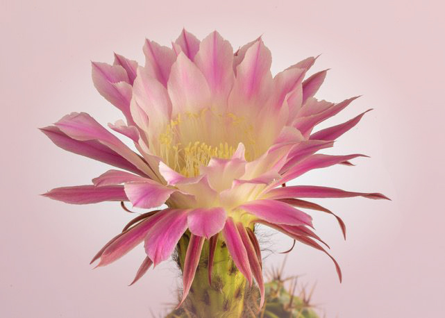
Hi Diana, A beautiful capture of the flower. I like the light background. You said you might add a texture later. I would also suggest a slight vignette, a subtle pink to just add a touch of color. Do you have NIK? In Color Efex Pro I added a Vignette Filter and picked one of the pinks in the flower. When I brought the image back to PS, I used a 58% opacity on the layer. What do you think? Or does it take it away from your Vision? |
Aug 10th |
 |
| 65 |
Aug 22 |
Comment |
Hi Al, And I echo everyone for thanking your taking on the administrative responsibilities of this Group. Love that we all love flower photography. This has great composition and the droopiness of the flowers all add to it. I, too, love to play with textures. It relaxes me. And flowers call me for a texture. Here, I feel the texture does not compliment the yellow tulips. My eye goes right to the Background. How about a pastel green or one with a complimentary color on the color wheel? I also like the dramatic original Black Background. |
Aug 10th |
| 65 |
Aug 22 |
Reply |
Thank you, Maria. I learned how to do the vignette with Kathleen Clemons and a Creative Live class. Do you follow her? I find her flower photography inspirational.
|
Aug 9th |
| 65 |
Aug 22 |
Reply |
Thank you, Julie. It was the "eye" that stood out with me too. |
Aug 8th |
| 65 |
Aug 22 |
Reply |
Thank you, Al. I agree with you about the crop, when I look at it now. I think the petal should have been cropped more or we should see the full petal. I love and always use NIK. It has become an easy finishing effect for me. I also have Topaz Studio 2, play with it, but always go back to NIK. |
Aug 8th |
| 65 |
Aug 22 |
Reply |
Thank you! |
Aug 8th |
| 65 |
Aug 22 |
Comment |
Oh my! I love the soft greys of the monochrome. A real Black and White would have been too harsh. The soft blurred background looks like clouds. But the original with the blurred background and muted colors calls me too. I went to a tulip festival this year. I am going to go back to my photos and see which might translate to monochrome. (after dahlias, I love photographing tulips). Great job!
|
Aug 8th |
| 65 |
Aug 22 |
Reply |
Hi Melanie, Thank you for your comments. As you said in your Bio, I, too enjoy, seeing something and putting my own spin on it. My own Vision...and flower photography lends itself so well to this. I, too, converted a camera to infrared, but I am having difficulty wanting to use it.
I look forward to seeing what you share. |
Aug 8th |
6 comments - 7 replies for Group 65
|
16 comments - 16 replies Total
|