|
| Group |
Round |
C/R |
Comment |
Date |
Image |
| 12 |
Jul 22 |
Reply |
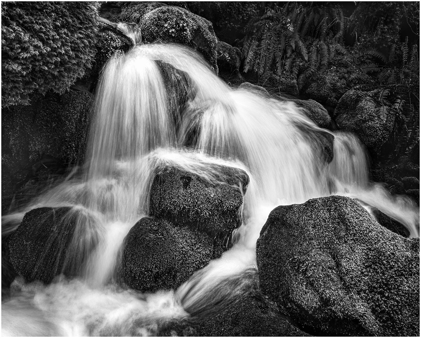
It happens to all of us and I just go "duh!" My husband took a beautiful photo of a stream with rocks in it. We loved that photo...put it in our Annual Calendar we do for friends and families. A friend looked at it and immediately said "What's this?" The toes of his foot were in the bottom right corner! We had looked at that photo so many times! Now we can't look at it without seeing his foot. It has become a running joke'
Glad you think it looks better cleaned up. |
Jul 26th |
| 12 |
Jul 22 |
Reply |
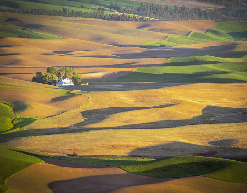
Thanks for taking the time to offer this alternative cropping. I think I prefer the Horizontal to the Vertical. When I stood on top of the Hill looking out, it is the expanse of shadows and patterns that captured my imagination. The Vertical constrains that. Perhaps just a vignetting to bring the eye in?
|
Jul 26th |
| 12 |
Jul 22 |
Reply |
I had originally increased the saturation and contrast and it just screamed at me. So I moved the saturation and contrast down a notch. |
Jul 21st |
| 12 |
Jul 22 |
Reply |
As I look at it more, I would definitely crop down from the top. And, then, I don't think the house adds that much, so I could crop down so there is no house. I don't quite understand how you would make the eye travel around the patterns. |
Jul 21st |
| 12 |
Jul 22 |
Reply |
Thanks, Ally. You are right. I purposely left the trees, but I see they don't contribute much. I like the idea of cropping it down. This photo was taken at the top of Steptoe Butte in Steptoe State Park. From there you have a view of the changing patterns and colors as the sun sets. And like all photographic locations, it was crowded with photographers. |
Jul 16th |
| 12 |
Jul 22 |
Comment |
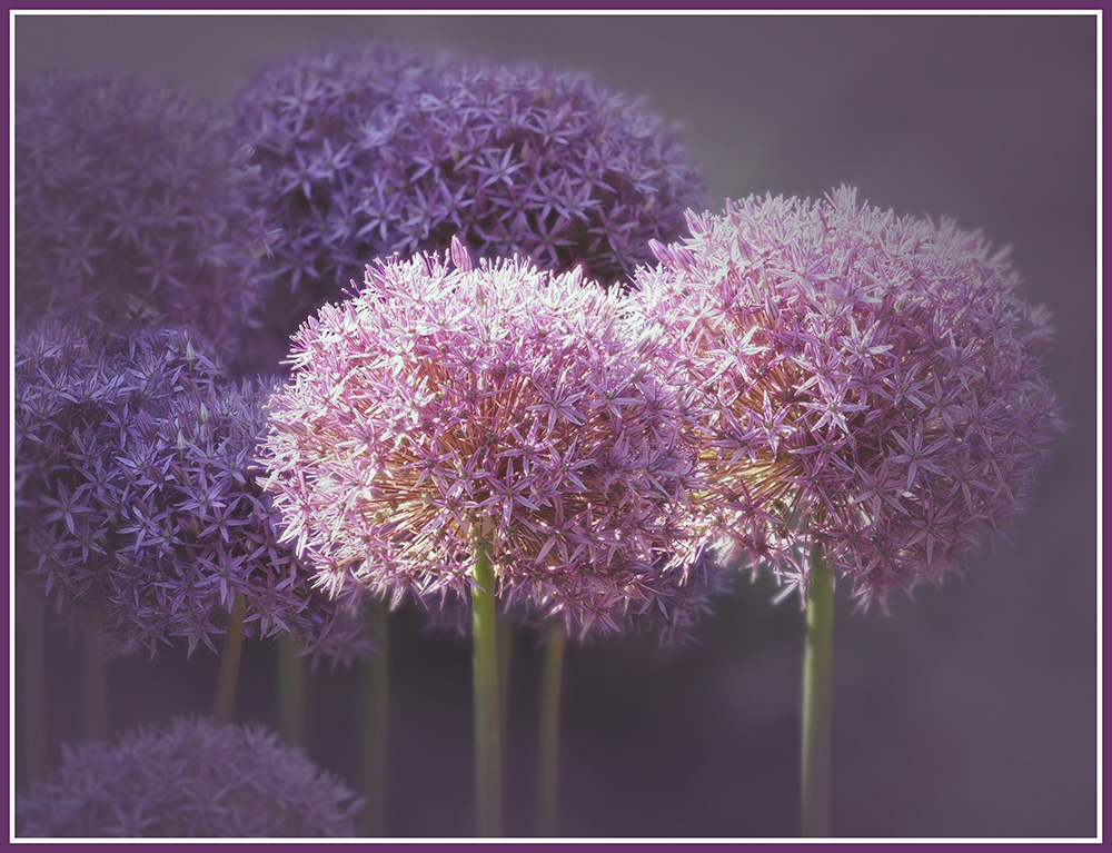
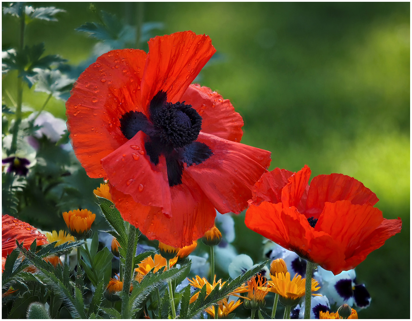
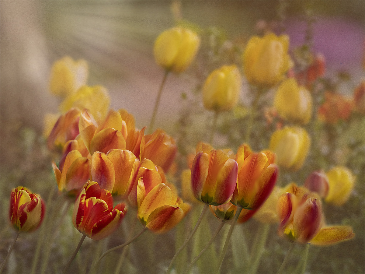
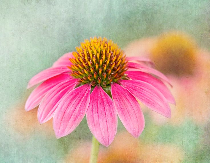
What a great pattern of color! You got the saturation of red just right. Makes me just want to pluck one. |
Jul 12th |
| 12 |
Jul 22 |
Comment |
I had never noticed the pattern before. It is so interesting what they do year after year. I was just wondering if a wide angle shot would show several of these patterns going up the beach or are they too spread out?
|
Jul 12th |
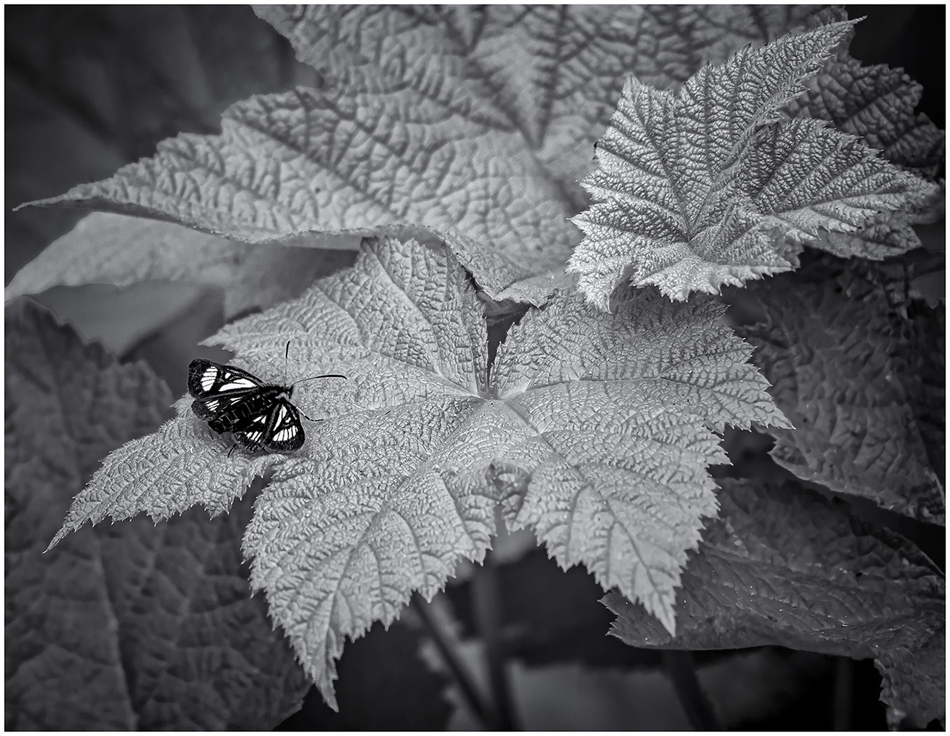
| 12 |
Jul 22 |
Comment |
I like the pattern of leaf veins upon the leaf ridges. |
Jul 12th |
| 12 |
Jul 22 |
Comment |
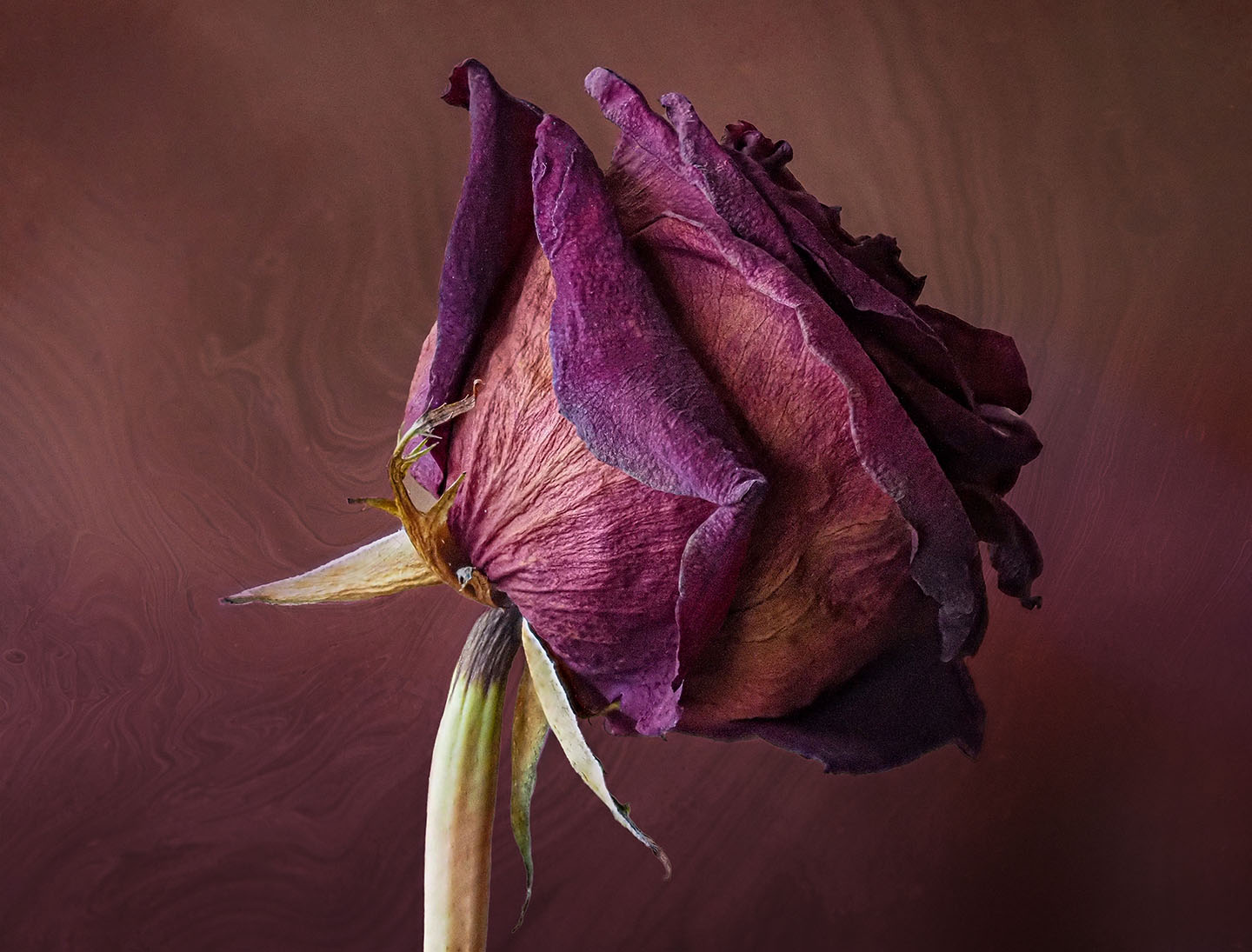
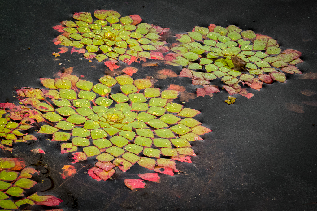
What a beautiful pattern. I had not seen it before. I took the liberty of cleaning the branches and borders to put more emphasis on the gorgeous pattern. I used the Content Aware Fill tool in PS. I also upped the Saturation a bit. |
Jul 12th |
 |
4 comments - 5 replies for Group 12
|
| 39 |
Jul 22 |
Reply |
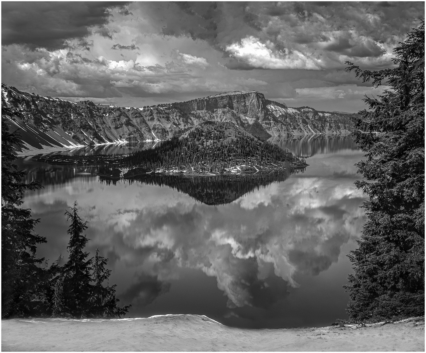
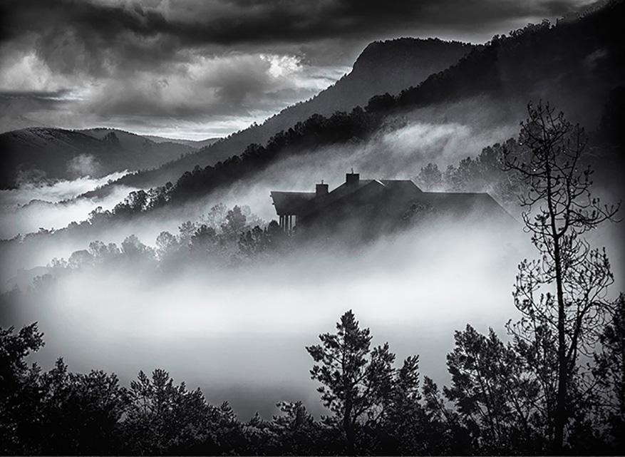
Thank you, Paul for your comments. I am learning that a lot of my problems with B & W are more post processing errors that the original photography. This photo was such a "wow" moment outside my window, that I think I never looked at it objectively. I am getting pretty facile with Masks and layers, but in color. In Black and White, I think I bring it into Silver Efex too quickly and with Landscapes and use too drastic a filter. I will check out Tony Kyper, thank you. |
Jul 15th |
| 39 |
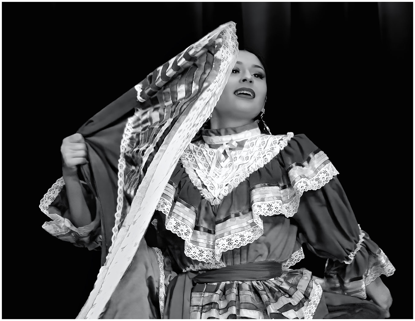
Jul 22 |
Comment |
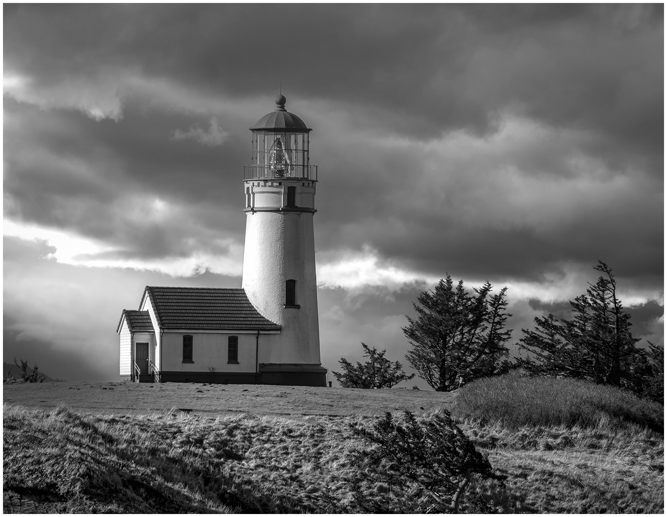
This works so well in Black and White. The Drama and Tension are showcased. My eye goes right to the subject and lingers. I went back and looked at all your photos. I like how you have highlighted your Dancers and isolated them. I look forward to learning from you. |
Jul 12th |
| 39 |
Jul 22 |
Comment |
You were so right to capture the story of father and son in front of the waves. I agree with David that I prefer the Color shot. The color and contrast of the waves seems to set your subject off better. In the Black and White version, the waves seem to compete with your subject. How would it look if you lightened and blurred the focus of the waves a bit? It is only my humble opinion and remember I am a novice to Black and White. |
Jul 12th |
| 39 |
Jul 22 |
Comment |
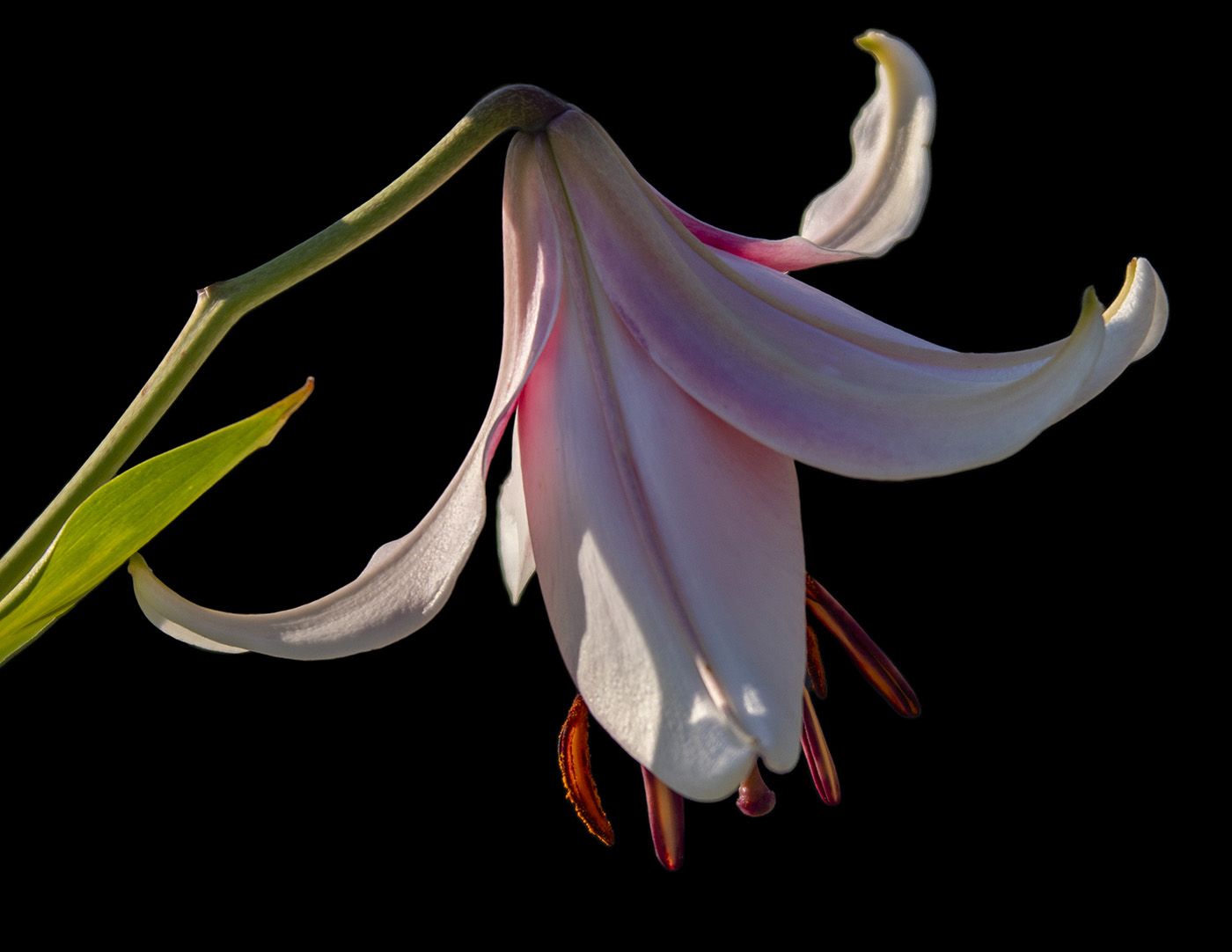
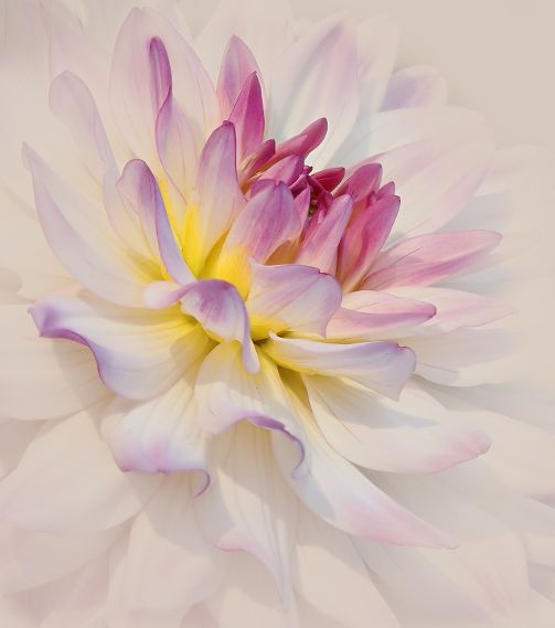
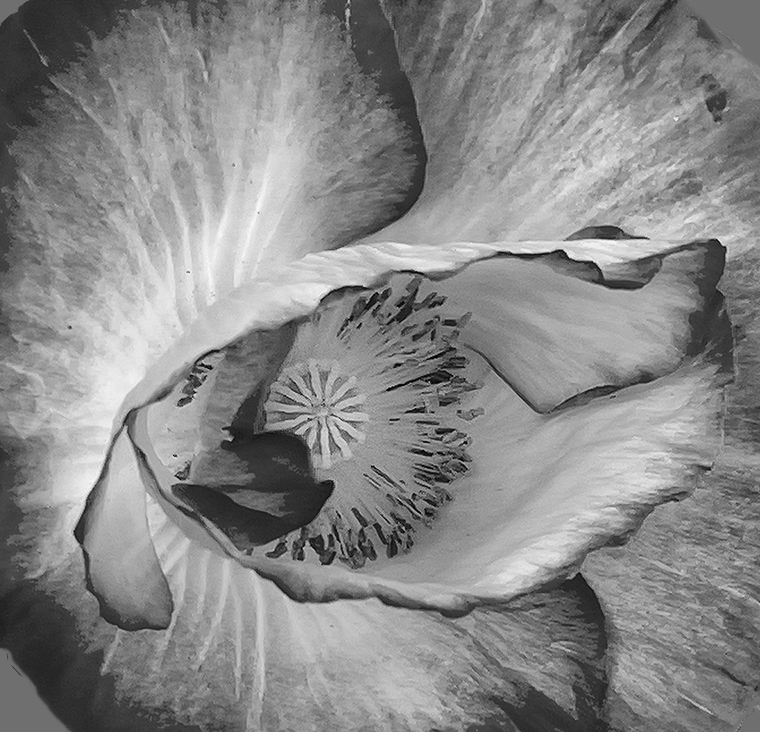
Please excuse me, I am having technical difficulties navigating..so I just deleted my Comment. Let's try again.
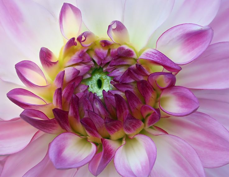
I love photographing flowers. To me it is all about colors, lines, and curves. In the Color Version, the color of the flower catches my eye. In the Black and White version, my eye goes right to the center and the detail. I took the liberty of doing a tight crop to focus more on the Center and the curves of the petals. I also selected the top right and lower left corners and filled with grey. What do you think of this version? |
Jul 8th |
 |
| 39 |
Jul 22 |
Comment |
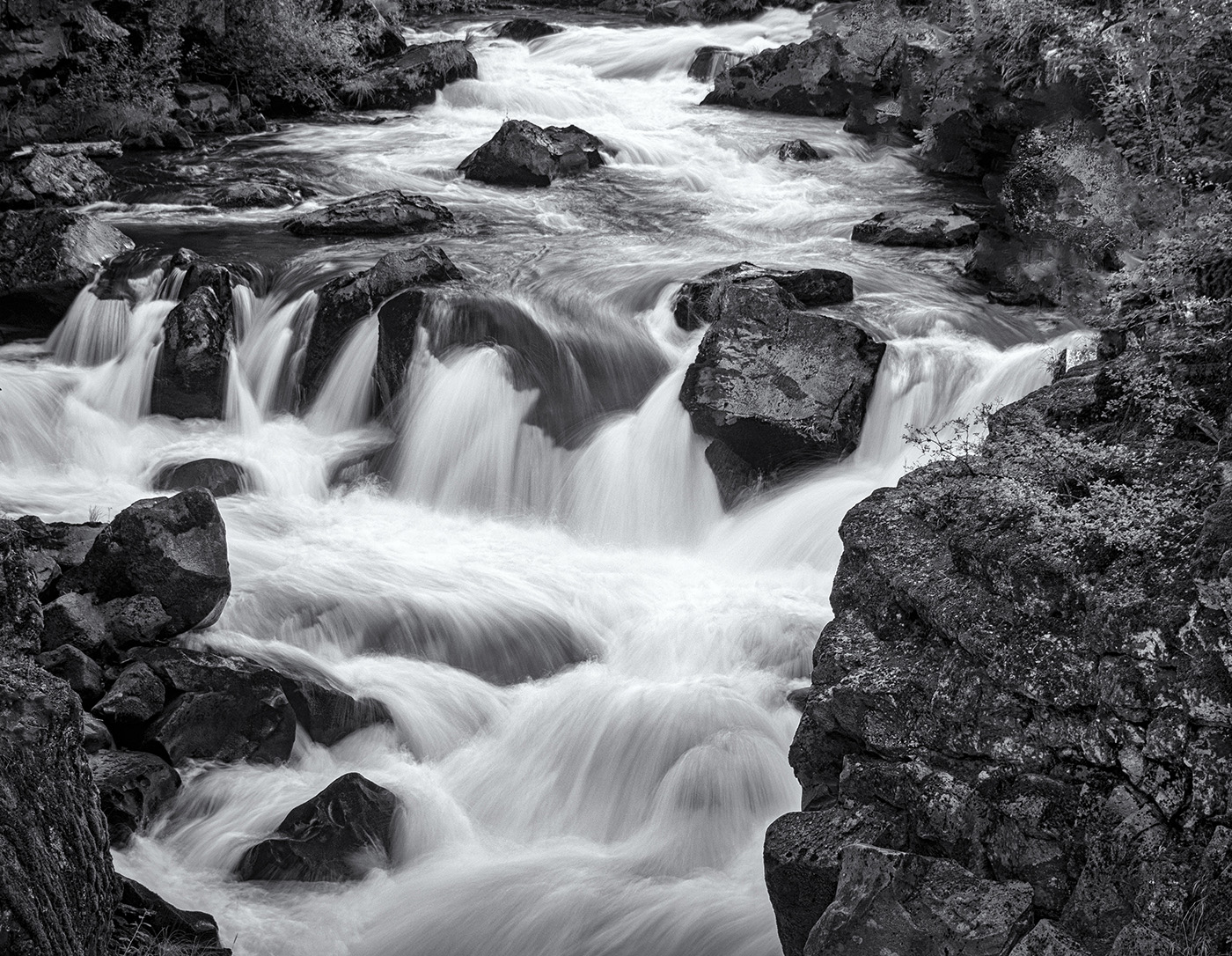
First of all, I am amazed that you got this quality of a photo with an iphone. Secondly, I am amazed that this was in a suburban area not a 3 mile hike. My eye goes right to the waterfall and then continues down in an "S" to the shrubbery on the bottom. Did you consider cropping the top down a bit to focus more on the S of the Falls and the shrubbery? Lovely! |
Jul 8th |
| 39 |
Jul 22 |
Comment |
The sharpness of the bottom center stands out well. I agree with Larry, that the flower on the lower left is a bit distracting and I would crop it out too. I am curious. Did you also try it in Black and White and opt for the sepia or did the sepia tones call you? |
Jul 8th |
| 39 |
Jul 22 |
Reply |
Thank you, David for taking the time to give an in depth critique. I see everything that you are saying. That blown out area makes me want to scream. I wish I had had that feedback back then. And I was just beginning with Silver Efex Pro. I am much gentler now. I look forward to continuing my learning from the Group. Next month I will submit a recent photo. |
Jul 8th |
| 39 |
Jul 22 |
Reply |
Thank you, Jerry. As soon as you mentioned the blown out area, that is what my eye goes to immediately. I wish I could remember exactly what I did, but I know I didn't lighten it. I think what I did was select a too contrasty filter from Silver Efex Pro...like Push Process. I was just beginning with it at the time. I thought I was being dramatic. Now when I look at it, it is under the category, "What was I thinking?" Would I hang this on the wall? Then "Yes"...now.."No!" Too contrasty and blown areas. Thank you for your thoughtful comments. I've already learned a lot. And now another newbie confession...I went to look for the original and it is not where it is supposed to be! Next month..a white border and a more subtle processing.
|
Jul 7th |
5 comments - 3 replies for Group 39
|
9 comments - 8 replies Total
|