|
| Group |
Round |
C/R |
Comment |
Date |
Image |
| 22 |
Nov 22 |
Comment |
A very nice shot and well placed. I think the image could be brightened just a hair - - it seems a bit dull to me. Otherwise I think this is a very nice and interesting image. |
Nov 14th |
| 22 |
Nov 22 |
Comment |
An interesting image and I like the subject matter. I do agree with the cropping low on the trees but certainly not eliminating them. |
Nov 14th |
| 22 |
Nov 22 |
Comment |
Creation of this image must've taken weeks. There's a lot of detail work in this and think your outcome is beautiful. |
Nov 14th |
| 22 |
Nov 22 |
Comment |
I agree with you hundred percent. I shoot rodeos two or three times a year in my greatest problem is isolating the subject. I'm horrible at doing it. Wish I had the skills to remove all the fencing and advertising to concentrate on the image as you have here. Excellent job in my opinion. I have many many shots of bronc riders like this in that position but the backgrounds are a real challenge to me. Good work |
Nov 14th |
| 22 |
Nov 22 |
Comment |
Very nice sharpness on this image and I don't have any problem with the orientation. Great colors and good contrast. Nice job |
Nov 14th |
| 22 |
Nov 22 |
Comment |
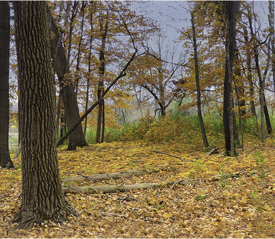
I really enjoy the fall colors no matter where I am. In Colorado of course aspens dominate the scene. In other parts of the country the red oaks and maples really had a tremendous amount of color. But I've always found that forest floor scenes where there is a low concentration of trees very difficult to capture adequately. In this case I thought that maybe cropping out some of the brush like forest would improve the overall image by concentrating on the larger trees and forest floor. Saturating the color helps maybe. What do you think? |
Nov 14th |
 |
| 22 |
Nov 22 |
Reply |
I was looking for autumn color and was stading in a shaded area when I took the shot. I think the exposure adjustment brought out the tint. |
Nov 2nd |
6 comments - 1 reply for Group 22
|
| 65 |
Nov 22 |
Comment |
I do like your black and white version. But I agree that it needs to be segregated a bit more from the background and I would accentuate the detail to make it stand out more |
Nov 14th |
| 65 |
Nov 22 |
Comment |
I like the way is that you've made this image appear to be floating in the air. I agree that the focus could have been a bit sharper and in this case I think I would've added a bit more detail. Beautiful job |
Nov 14th |
| 65 |
Nov 22 |
Comment |
Now that I understand little more how you create these textures, I am very impressed by the final outcomes. The leading leaf line, if you will, really adds a lot to this image and makes the viewer want to spend more time circulating within the frame. Excellent job |
Nov 14th |
| 65 |
Nov 22 |
Comment |
Beautiful effect in finishing this one. I love the full openness of the flower in the way each pedal is so softly colored. Good job |
Nov 14th |
| 65 |
Nov 22 |
Comment |
Great job on this one. Centering of the Rose in this case works very well since the background is evenly muted. The gentle concentration of color really softens the overall appearance of the image. The lenses you are using are evidently very effective in getting the results you want. Nice work. |
Nov 14th |
5 comments - 0 replies for Group 65
|
11 comments - 1 reply Total
|