|
| Group |
Round |
C/R |
Comment |
Date |
Image |
| 12 |
Oct 23 |
Reply |
Connie: I love the contrasting color in the background. It is great to read all these comments and come out with a much better image. Thank you. |
Oct 9th |
| 12 |
Oct 23 |
Comment |
Hi Ally: The first thing I thought of this image was that this is "art." I think it's unanimous that Joan's twist put the bridge in a perfect position. Personally, I love the B&W image. In the color one, I am really distracted by the diagonal line leading up the lady, and also by the blue color. I took the image back into Nik Silver Efex, and I lightened the woman, cropped a small amount off the bottom and darkened all the light areas in the black bars and the distracting artifact in the blue. I think this makes the woman the subject in a good balance. |
Oct 9th |
 |
| 12 |
Oct 23 |
Comment |
Hi Joan: I have always wanted a fish-eye lens, but I wonder how often I would use it, then I see so many interesting images. I wasn't sure what these were until I read your explanation. I first see the front bottom whirligig, then the upper one, then the sunburst, which is lovely. My eye then hits the bottom and stays there. I like Carole's crop. It isolates the subject well and you still get the nice sunburst. I would clone out the bottom right figure on Carole's picture to clean it up more. Great image for your first fish-eye adventure. Were you also using a starburst lens? |
Oct 9th |
| 12 |
Oct 23 |
Comment |
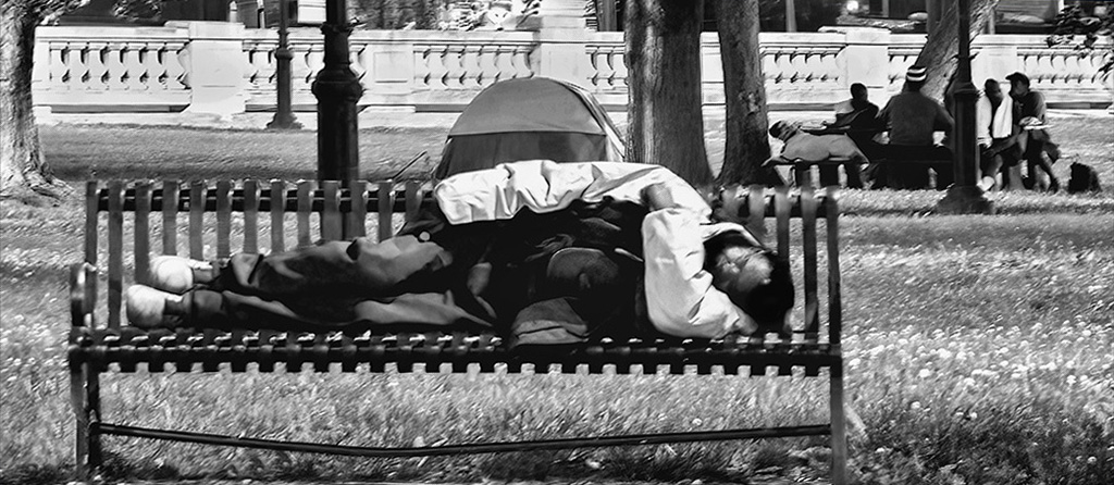
Hi Nancy: This image caught all the action and tells you this is a rodeo, but the referee in the front is definitely the subject. He is where the eye goes first and lingers. I think I would crop off the first fence panel on the left. It doesn't really add anything to the picture and moves your subject and little more to the thirds line. It does tell a story of an intent referee watching the dangerous action of the bull and rider. I do wonder if that is a knife in the referee's back pocket. Perhaps he's planning on red meat for tonight's dinner. LOL |
Oct 9th |
| 12 |
Oct 23 |
Comment |
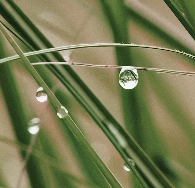
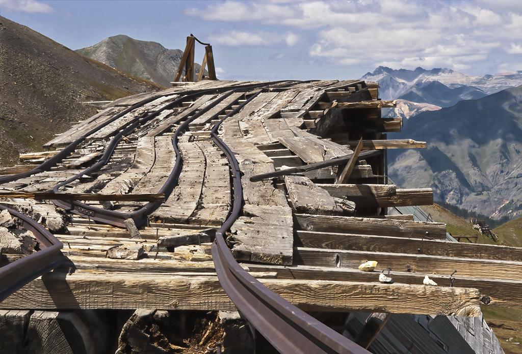
Hi Connie: At first, I thought I was looking down and wondered why everything was so fuzzy. After reading you explanation, I understood. How many times have we lain upon our backs to get "the image?" I love how the wood at the left rim of the image is crisp and clear, but how the wood at the top just moves up and isn't aligned or clear at all. It's like looking through water. I agree with Nancy that the white spot and black spots just above the rim of the table are distracting and should be removed. I would also run this through Topaz Denoise and see if you like the results. You may not and may want to keep the fuzzy appearance. Everything seems to compliment the others. This is a very creative image. |
Oct 9th |
| 12 |
Oct 23 |
Reply |
Carole: See my comment in Nancy's note regarding taking some of the saturation out of two flowers in particular. |
Oct 9th |
| 12 |
Oct 23 |
Reply |
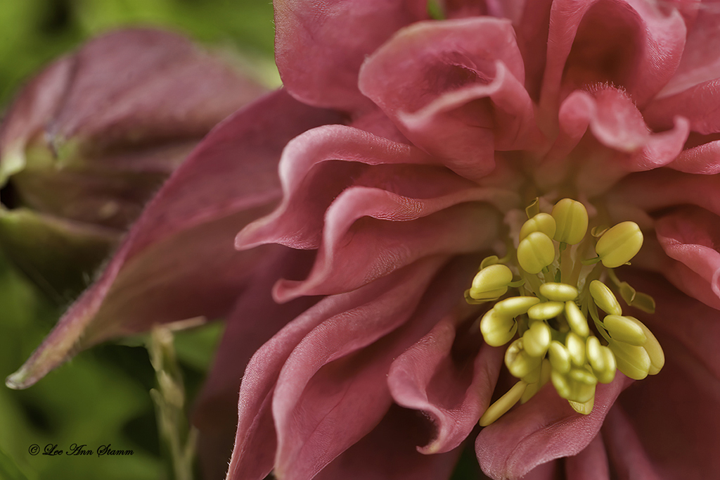
Hi Nancy: I think your awareness of the lines in this image is right on point. They make this picture better than others I have seen. I think, however, only some of the red flowers need to be a little desaturated, particularly the one on the front left and one on the lower left. They don't look as natural as they should. |
Oct 9th |
| 12 |
Oct 23 |
Reply |
Hi Ally: I think working with different camera angles and seeing what others have done is a great assignment, too. I agree the closed sign needs to go. Otherwise very nice. |
Oct 9th |
| 12 |
Oct 23 |
Comment |
Hi Carole: This is a very nice shot. I agree with Nancy about the angle of the wall and tulip leaves. They do help in uplifting the image. I have seen tulips taken from the lower angle before and have done some myself, but this is so interesting with the three walls, trees, and blue sky. I agree with Ally that the closed sign is distracting and should be removed. Nancy worked with saturation on the flowers, and I would say that there are a few red flowers that look oversaturated. I think I would just tone them down some with the eraser and leave the yellows. I hope you didn't sacrifice your knees on this shot and am grateful you didn't get hit by a car. |
Oct 9th |
| 12 |
Oct 23 |
Reply |
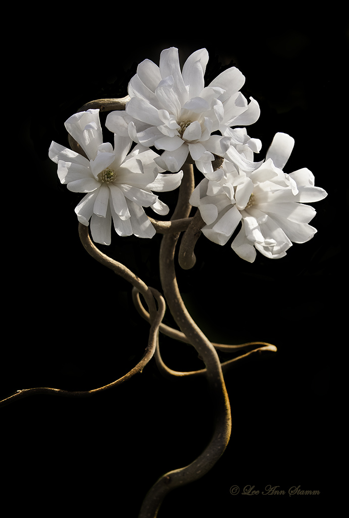
Hi Nancy: Welcome to the group and thank you for your positive comments. I agree that the black is distracting, and I will clone it down in future prints. Another great flower to photograph from the back is an Iris. I decided to show this one because it is an unexpected angle and has an unusual appearance. |
Oct 9th |
| 12 |
Oct 23 |
Reply |
Hi Carole: I think I did crop this down a bit on the left and messed up the equal/unequal distance. That is good to remember. I highly recommend looking at and photographing the back of Queen Anne's Lace. It is much more interesting than the front of the flower. |
Oct 9th |
| 12 |
Oct 23 |
Reply |
Hi Joan: Thank you for your comments and work on my image. I print all my own pictures, and for some reason I had to darken it to get the proper colors on the printer. I like the square format, especially if I had a series of flowers to go with it. I have taken the back of many flowers. It is an interesting perspective. The black also could have been removed by cloning without resizing. Thanks again. |
Oct 9th |
5 comments - 7 replies for Group 12
|
| 37 |
Oct 23 |
Reply |
Thanks Howard: I use Topaz DeNoise with good success. I obviously didn't use the correct settings to take the image. Next time I hope I think better on my feet. |
Oct 22nd |
| 37 |
Oct 23 |
Reply |
Thanks Ricarda: I wound up cropping this image down severely and that took care of most of the problems. The cropping from the bottom, as you suggested, helped a lot. |
Oct 22nd |
 |
| 37 |
Oct 23 |
Reply |
Thanks Bob: I decided to crop it down severely to make it a panorama. That took care of most of the problems. I agree that my settings should have been different, but I didn't have a lot of time to take the image. I wasn't in the greatest of neighborhoods. Street photography clearly isn't my bag. |
Oct 22nd |
| 37 |
Oct 23 |
Comment |
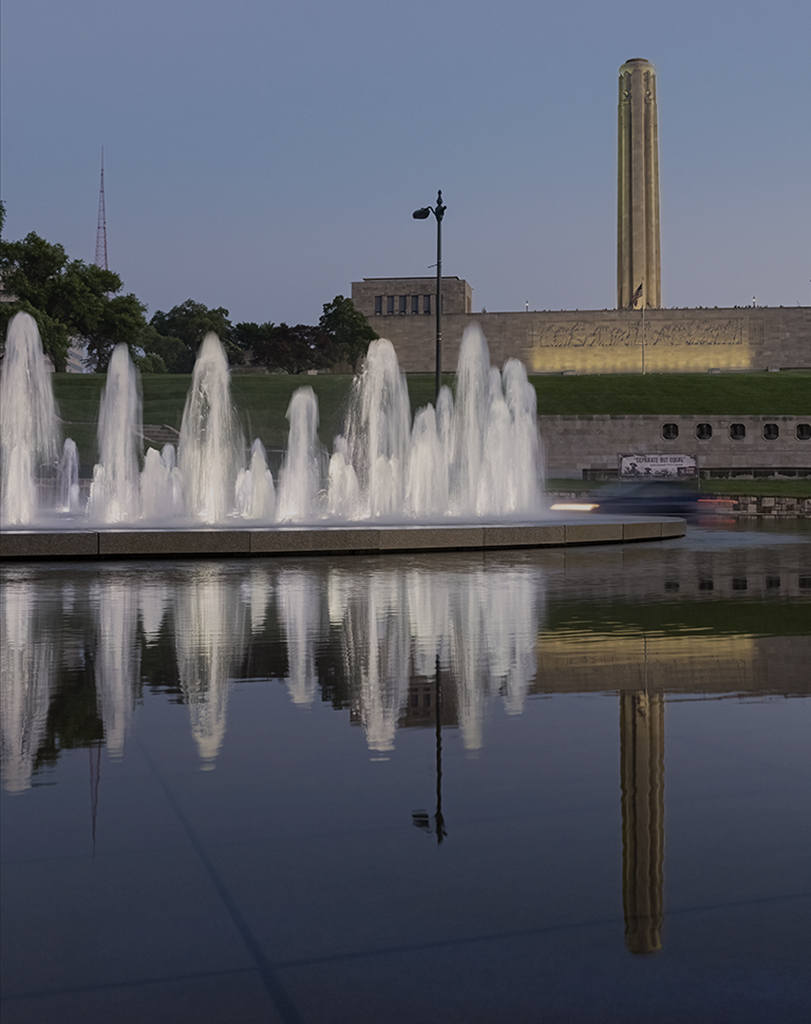
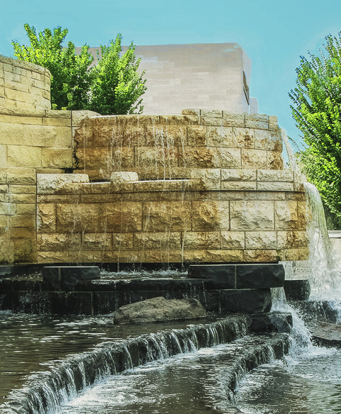
Hi Ricarda: Congratulations for being selected for the showcase this month. Your "Looking for Love" image was delightful.
I always hate when the addition of a sky leaves a white line; however, your blue also bled over onto the building, the trees, and the waterfall at the top making this much more complicated to correct. I'm sure there are a lot easier ways to correct these problems than what I did, but here's my explanation of the image below. First, I tried to clone away the white by replacing it with blue sky. To get into the trees, I took the clone tool down to around 4-5 and reduce the opacity to 50 percent. When you brush blue into the trees, you sometimes turn them blue. So, take the clone brush into the tree and clone more green where the blue took over. This can take some time to correct. For the trees on the left side, I cloned out a lot of the top trees with blue. I just eliminated them as getting rid of the blue would be too difficult. There was a lot of blue on the building too. I picked up parts of the building and cloned them across the top and into the trees. I did the same thing with the building and trees, but reducing the amount of opacity so I could show building in the trees and maintain the tree's color. The top part of your waterfall was also blue. I cloned that too. I adjusted the entire picture once with curves, then adjusted again in levels. Then I used the brightness/contrast tool to adjust once again to get the colors I wanted. I think this makes the fountain the subject, as my eye wants to wander to the top building and stay there in yours. (It still does some, but I don't know how to correct that.) In the course of all the adjustments, my water turned a little green, so I took a light paint brush to turn it white again. I also worked with several of the sliders in the selective color tool.
I don't know how much this helped, but in the beginning I would try to separate the sky from the buildings with the magnetic tool. Blow it up to about 100 or 200 so you can actually see where the magnetic tool corrections need to be. Then when you change the sky, you can use your clone tool easily to clone out the white part that may be left and you won't get blue into the trees and building. That would be easier than trying to correct the problems out of this image.
Hope somewhere in this long explanation that it helps you. |
Oct 21st |
 |
| 37 |
Oct 23 |
Comment |
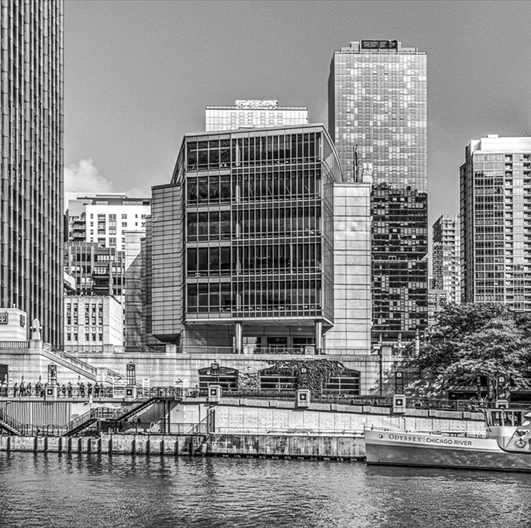
Hi Howard: This is a stunning cityscape of Chicago. I felt like the contrast should be brought up just a little overall, and the buildings on either side of the image should be straightened with the perspective tool. I think these minor adjustments really add to your already wonderful image. |
Oct 21st |
 |
| 37 |
Oct 23 |
Comment |
Hi Bob: I remember looking at this image and forming opinions about it, but I must have been interrupted. I'm surprised my thoughts aren't here. I agree with Ricarda. This is a great image, taken at the right time, at the right settings. All focus is on the horse and rider and wow, what a 45 degree angle that horse is leaning. Bet their times were fantastic. I don't know if the horse and rider were winners, but this photo sure is. |
Oct 21st |
| 37 |
Oct 23 |
Comment |
Hi Peter: I'm a little confused by your image this month. The name implies that the Bird of Paradise is the subject, yet it is completely out of focus while the green leaves behind it are in focus. The dead blossoms don't bother me; this is the cycle of life and often shown in images. There is so much green that the subject gets lost, which is what the name implies and perhaps what you wanted. Normally the background would be blurred out. I'm sorry, but this month I'm not a fan. |
Oct 12th |
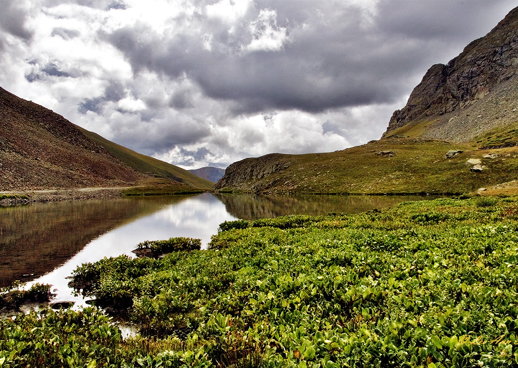
| 37 |
Oct 23 |
Comment |
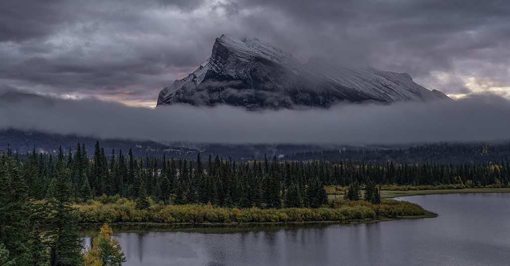
Hi Peter: Banff National Park is on my bucket list, and you have captured this spectacular park so well in your image. It is sharp from top to bottom. The little bit of color around the mountain is perfect. My suggestions are to turn this into a panorama by cropping out a lot of the sky. This helps to take some of the gloom out of the image. Then clone out the two areas of trees over the water on the bottom. They are distracting and don't add anything to your beautiful image. |
Oct 12th |
 |
5 comments - 3 replies for Group 37
|
10 comments - 10 replies Total
|