|
| Group |
Round |
C/R |
Comment |
Date |
Image |
| 12 |
Sep 23 |
Reply |
Thanks Joan. We had a wonderful time in Ireland. It was 13 days well spent, but maybe we planned too much. In retrospect, we wish we could have spent more time in one place, but it was a trip we'll never forget. |
Sep 27th |
| 12 |
Sep 23 |
Comment |
Hi Ally: I find this image humorous. Not really knowing the Croatian culture, I looked up the relationship between men and women. Yay. It says the men are very loving and adore their women. So, my family has always done weird things, and this door reminded me of them.
When I saw this image, I imagined a Croatian woman nagging at her loving husband to drag the door to the patio. She wanted to nail it to the planter as a decoration. He would do anything for her. So, he moved the door. I could be completely wrong, but that's what this door did for me.
The way you composed the image is perfect. Even though the door is right in the middle of the picture, it works. The trees surround and frame the top of the image, and the barrel needs to be there to offset the tree trunks on the other side. The texture and peeling of the door make this image complete. Great Job. |
Sep 18th |
| 12 |
Sep 23 |
Comment |
Hi Joan: Thank you for thinking outside the box and submitting a hole for an interesting door. It feels so ancient and the angle of the wooden walkway and the pathway beyond leads us right through the door. What a great experience. I do wish that there was more at the top, which would throw the image off balance, but I want to see more of the cat-like creatures. They are chopped off at the head. I did, however, crop the image just at the top of the arch to get rid of my curiosity. I think this image is nice and brings it more in line with the rule of thirds. I did just a touch with lightness and darkness. What do you think? |
Sep 18th |
 |
| 12 |
Sep 23 |
Comment |
Hello Barbara: This image is so fascinating with the doors just stuck out in a lot of vegetation. They make one begin to imagine what they were at one time or if some kids were making an elaborate fort. I love it. I like the color enhancement that Connie made and the vignette that Carole added. Otherwise I don't have anything to add, except that I will miss having you in the group. The act of sharing our most heartfelt images and giving positive critiques to one another, makes me feel so close to our members. I hate to see you go, but I wish you much happiness and good health in whatever you decide to pursue. |
Sep 18th |
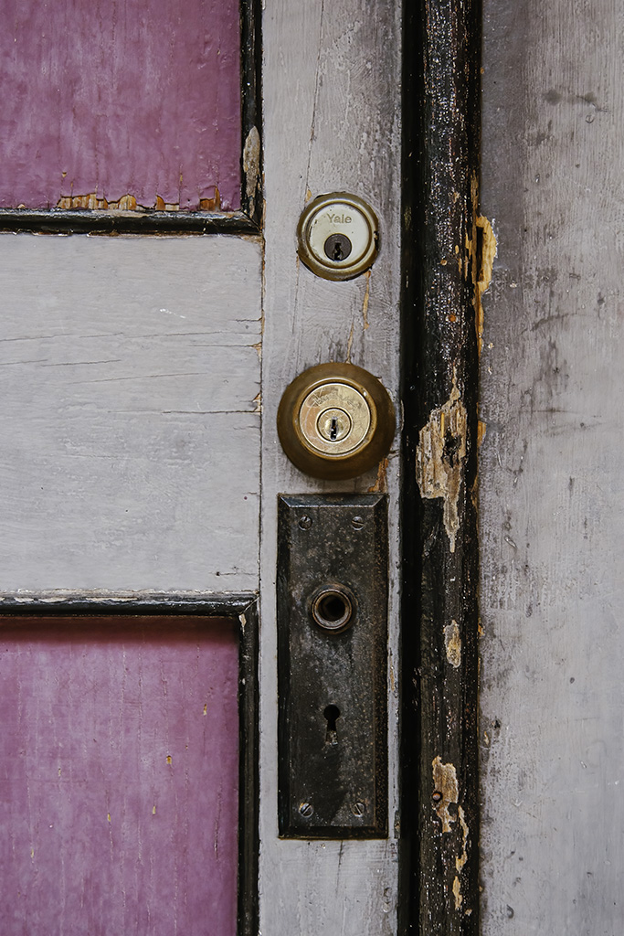
| 12 |
Sep 23 |
Reply |
Thanks Connie. I was so focused on trying to get the lettering readable on the upper locks that it didn't dawn on me how much newer they were. In my mind, that adds to the story. |
Sep 18th |
| 12 |
Sep 23 |
Reply |
Thank you Ally. |
Sep 18th |
| 12 |
Sep 23 |
Reply |
Thanks Carole, I like the way the vignette completes the image by holding the content together and keeps the eyes more on the locks. |
Sep 18th |
| 12 |
Sep 23 |
Comment |
Hi Connie: My eyes just couldn't believe this was a big door. It looked like a cabinet, which also would have been an interesting door. Once I had my head together and looked at the original closely, I thought wow, I'd really like to know your quirky friend. Then I thought WOW. Look at all the work you did to bring us a magical, mystical fantasy door in the heavens. The way you lightened the upper door and added the starburst is very nice. Perhaps a fix for the bright light is to dull it down some and lighten the crow. Right now the crow just looks like a dark spot. If he was lightened then the light would serve the purpose of highlighting him. The difference in the sky from the top to the bottom seems like too much contrast and color difference. Perhaps darkening the bottom some would help. Otherwise, I commend you on your imagination and skill in transforming this door into this image. |
Sep 18th |
| 12 |
Sep 23 |
Comment |
Hi Aaron: It's great to have you in our group, welcome. This door is interesting in so many ways. There is such complete contrast between the door and the building. The vibrant colors of red, green and gold would make this door visible for quite a way. The top and bottom of the door also contrast in style and color. Great capture. In your correction, I feel you lightened the top too much. That draws my eyes instantly to the top, and they stay there. If the bottom of the doors are a little lighter than the top, the angled lines draw your eyes up and around. I would prefer to see the more of the original building. It simply feels cramped to me and too tightly cropped either in camera or processing. I also feel the step should be included. Without it, you lose the natural frame. I really liked studying the images at the top of the door. Wonderful capture. |
Sep 18th |
| 12 |
Sep 23 |
Comment |
Hi Carole: Not only did you do a nice job of straightening this image, but the crop is also excellent. I actually think that a horse in the stable would be distracting and cause the image to be too busy. This is certainly a story-telling image. I can see Lindy as uncompromising in all her duties and that she is out attending to business. Being a horse person, I love this image. |
Sep 18th |
6 comments - 4 replies for Group 12
|
| 37 |
Sep 23 |
Reply |
Peter: I'm sorry you felt threatened. That takes the fun out of taking the image you really wanted. |
Sep 27th |
| 37 |
Sep 23 |
Reply |
Hi Ricarda: Howard and Bob both suggested cropping off the sides. I think that will only work if I bring the bird down, too. Thanks for the suggestion.
We loved Ireland and can't wait to go somewhere else. Any suggestions? |
Sep 27th |
| 37 |
Sep 23 |
Reply |
Hi Peter: I have really struggled with this image. Do I like it or not? I think Howard and Bob maybe have an answer for my problem. I'm going to crop it down to make the items larger. That may do it. |
Sep 27th |
| 37 |
Sep 23 |
Reply |
Hi Peter: I have really struggled with this image. Do I like it or not? I think Howard and Bob maybe have an answer for my problem. I'm going to crop it down to make the items larger. That may do it. |
Sep 27th |
| 37 |
Sep 23 |
Reply |
Hi Peter: I have really struggled with this image. Do I like it or not? I think Howard and Bob maybe have an answer for my problem. I'm going to crop it down to make the items larger. That may do it. |
Sep 27th |
| 37 |
Sep 23 |
Reply |
Thank you, Ian for your comments and for visiting our group. |
Sep 27th |
| 37 |
Sep 23 |
Reply |
Thank you, Bob. I will crop this down as I think that will help with the size of everything. I know the front of the ship is blown out, but I didn't see that until I posted it. I have also noticed how white the clouds are, I will darken them down some. Your comments are appreciated. |
Sep 27th |
| 37 |
Sep 23 |
Reply |
Thanks Howard. I will give that a try. Maybe that's part of my hate relationship with this image. It's all just too small. |
Sep 27th |
| 37 |
Sep 23 |
Comment |
Hi Ricarda: What fun that was!! As expected, the seal is not as sharp as it should be, but the splashes of water and the waves around him are wonderful. To enhance the image some, I'd put catch lights in his eyes. Great capture on the go. |
Sep 18th |
| 37 |
Sep 23 |
Comment |
Hi Howard: Once again, you've made a great capture. The Brahma cattle are an example of the hard conditions where they live. The image is nicely balanced and is enhanced by the muted background. There are several black spots above the Brahma that don't look like flying dirt, and there are some twigs that are muted above the cattle that should be erased. The processing is fabulous and makes this image look like an old painting. I like it. |
Sep 18th |
| 37 |
Sep 23 |
Comment |
Hi Bob: You were in the right place at the right time, but I can't say that much for the dog. His awkward stance makes you wonder how he came down in the water. Good capture. I can see some faded black lines on the right side just before the tree line. They look like an incomplete erase. Also there are two black wires coming out of the Frisbee, which were probably power lines incompletely erased. The sharpening was perfect and the placement of the frisbee makes a triangle out of the dog, man and frisbee. To bring more attention to your main subjects, I would blur all the background then lighten the dog's paw. Great action shot. Love it. |
Sep 18th |
| 37 |
Sep 23 |
Comment |
Hi Peter: You are within your rights to photograph anyone in a public place. However, you cannot use the photograph commercially for advertising or trade purposes without a written release. Street photography is considered an art form and serves as a historical record of people, places, and events. Laws can vary in different areas. You can Google more information of your rights. You don't ever want to be in a bad situation. You can always ask an angry person it they want the image erased or would like a copy, but if you are talking to them, get a release if possible.
That being said, this is a good shot of an interesting character. Without the written Rocky on his hat and shirt, this would probably not have as much value. It really would have improved the shot if you could have captured him going up the stairs. The image is not sharp but that is not always necessary with street photography. Good Attempt. |
Sep 18th |
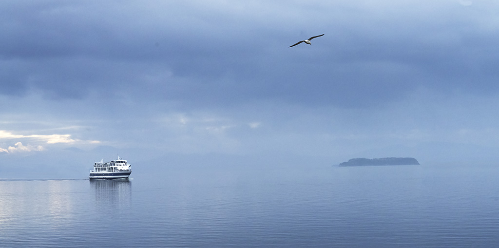
| 37 |
Sep 23 |
Comment |
Hi Peter: Machu Picchu is on my bucket list. The image is so small it is difficult to critique some aspects. However, the color contrasts are wonderful. You were lucky to have an ancient-looking sky and that brief wisp of a cloud. The image is very close to the rule of thirds. I can't make out the ruins, even with a magnifying glass. Just wish it was bigger. |
Sep 18th |
5 comments - 8 replies for Group 37
|
11 comments - 12 replies Total
|