|
| Group |
Round |
C/R |
Comment |
Date |
Image |
| 12 |
Jun 23 |
Reply |
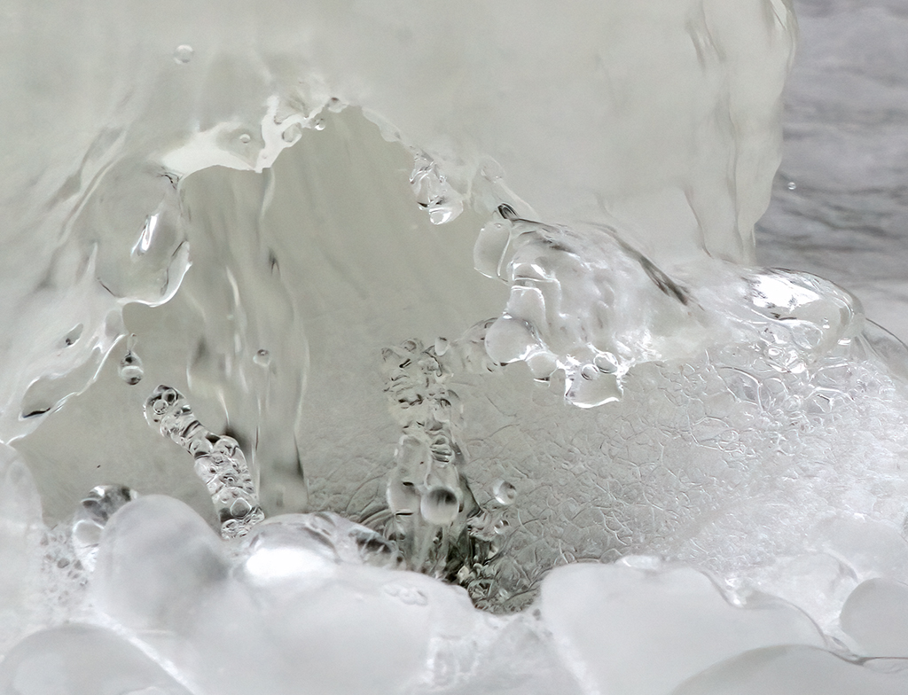
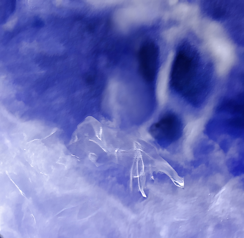
Chane and Barbara: I like what Chane has done with this image. It really makes the waterdrop pop. Pun intended! I have been using a lot more darker backgrounds in my flower images. Reducing the background brings the flower to the foreground. |
Jun 21st |
| 12 |
Jun 23 |
Reply |
Thank you Joan. Glad you enjoyed my submissions. |
Jun 9th |
| 12 |
Jun 23 |
Comment |
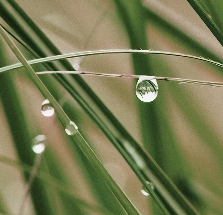
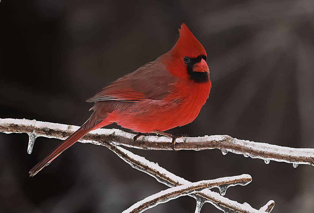
Hi Barbara: This is definitely a "WOW" picture. I was immediately drawn to the waterdrop, which to me, showed a contrasting image of a snowy day. I see red decorations at the top, evergreen trees in the middle and snow at the bottom. This is a dreamworld image to me. I absolutely love it. I think a close crop was necessary for this one. Wow. |
Jun 8th |
| 12 |
Jun 23 |
Comment |
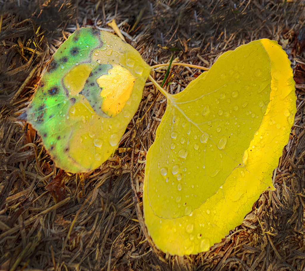
Hi Ally: I wish my backyard had aspen trees. I'm trying hard not to let my color go green! Seriously, this does appear to be a shot that anyone might take. To answer your question about blur or no blur, personally I am the type to love seeing all of nature, as in your image. I also love to see waterfalls with all the pure drops of water flying around. I hate the frozen water shots. I think if you want to create fine art, the things I like don't necessarily fit anymore. The finer art wants us to make an image no one else would make and have intention in the final product.
I decided to make an image that no one else would make, and have the participant look at it and ask what in the heck is that. I used the transformation tool to move both of the leafs and to make the smaller copies to fit on top of the large ones. Don't ask me how I did this, but I played around with different tools. I used the blur tool and burn tool to the background, this made the image stand out. On the leaves, I used the burn and dodge tools, selective color and brightness/contrast.
I cant' say that I like this image, but it shows how you can change an ordinary image into a "What is that' image. |
Jun 8th |
 |
| 12 |
Jun 23 |
Comment |
Hi Al: I wish my backyard had aspen trees. I'm trying hard not to let my color go green! Seriously, this does appear to be a shot that anyone might take. To answer your question about blur or no blur, personally I am the type to love seeing all of nature, as in your image. I also love to see waterfalls with all the pure drops of water flying around. I hate the frozen water shots. I think if you want to create fine art, the things I like don't necessarily fit anymore. The finer art wants us to make an image no one else would make and have intention in the final product.
I decided to make an image that no one else would make, and have the participant look at it and ask what in the heck is that. I used the transformation tool to move both of the leafs and to make the smaller copies to fit on top of the large ones. Don't ask me how I did this, but I played around with different tools. I used the blur tool and burn tool to the background, this made the image stand out. On the leaves, I used the burn and dodge tools, selective color and brightness/contrast.
I cant' say that I like this image, but it shows how you can change an ordinary image into a "What is that' image. |
Jun 8th |
| 12 |
Jun 23 |
Comment |
Hi Connie: I love that you are using frozen water drops for this assignment. That's very creative. I like your image and see it as a print in some child's science book or maybe even in an adult's book, since I learned something, too. My feeling is that I would throw the boiling water to have it fly back in my face and send me the ER. So not only are you creative, but you are also brave.
It's cool to see the motion in this shot, not only in the water, but also in the string of your sweatshirt caught in mid-air. It makes me wonder how you threw the water. Was it under-hand, over-hand, or running and stopping just in time for the water to be flung out. I love it when an image makes me have questions. Good Job. |
Jun 8th |
| 12 |
Jun 23 |
Reply |
Carole: I actually find myself liking your crop better, because it does emphasize the frozen water and the thrower. It confounds me that this is my preference with the person taking up one corner of the image and the water taking up the other. This diagonal line cuts right through the picture. Maybe that's what I like. |
Jun 8th |
| 12 |
Jun 23 |
Comment |
Hi Carole: I have not heard of this technique before. I am so intrigued by the colors of the disc and the shiny, reflecting drops of water. They remind me of buttons, too. Thank you for the links. I found them fascinating. Your image makes me wonder upon the many ways these CDs could be used. Love your image this month. |
Jun 8th |
| 12 |
Jun 23 |
Reply |
Thank You Barbara: |
Jun 8th |
| 12 |
Jun 23 |
Comment |
Hi Ally: Thank you for your suggestion. I agree that it helps some, but results in a pretty small image. |
Jun 4th |
| 12 |
Jun 23 |
Comment |
Hi Joan: It sounds like you threw yourself into trying to get the perfect image. Sometimes just doesn't happen the way you want. The color of the begonia is very nice. You made a lot of good cloning choices. I would have also cloned out the brown spot on the mid-right area. I agree with Carole that the round spot in the upper left-hand corner should be removed. Nice image of a refreshed plant. |
Jun 2nd |
| 12 |
Jun 23 |
Comment |
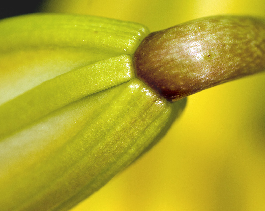
Chane: You have taken a wonderful image for this month. I love the shape of this tulip. The drops reflect a large amount of rain captured beautifully, and yet, the stamen and pistils remained dry. I particularly like the drops running down the leaf all in a row. If I hallucinate, I think I can see you in those drops. |
Jun 2nd |
| 12 |
Jun 23 |
Comment |
Thank You Carole. |
Jun 2nd |
9 comments - 4 replies for Group 12
|
| 37 |
Jun 23 |
Reply |
Sharon: Thank you for visiting our group this month. Your comments were also helpful for me. I have forgotten about how to use the long lens for flowers. Thank you for the reminder. |
Jun 21st |
| 37 |
Jun 23 |
Reply |
Gary: It is always wonderful to have a visiting photographer critique an image. You gave Ricarda some wonderful feedback. I just wanted to let you know that your comments are also helpful for me. Thank you. |
Jun 21st |
| 37 |
Jun 23 |
Comment |
Hi Ricarda: You certainly received a lot of good professional feedback on this beautiful image, which is also helpful for me. For a flower that only blooms once a year, you achieved a fabulous image. I love it. The only additional comment I have is if you plan to frame your image, you should add about 1/2" to 1/3" more at the bottom so you don't cover any petals with a frame. Gorgeous. |
Jun 21st |
| 37 |
Jun 23 |
Comment |
Hi Helen: Being in the Showcase is such a thrill. Congratulations on being picked this month. I love the swirl and color in this image. I'd love to know what you used to start this image. Good job.
Regarding "Window Treatment", I love it. Every bit of detail is wonderful. I am drawn first to the curtain and window, then to that fabulous ceiling. Afterwards, I see the pile of stuff on the floor. Does that mean you don't have a clear subject? I don't think so. It extremely interesting, just like an old, abandoned building is supposed to be. I feel like I'm standing right beside you. Great shot. |
Jun 21st |
| 37 |
Jun 23 |
Comment |
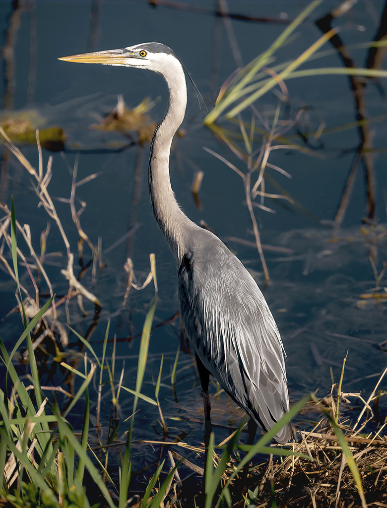
Hi Howard: I'm just wondering if you shot this inside? Your ISO was so high. That being said, the parrot is sharp and clean of snow. It's and amazing shot with lots of detail in the feathers throughout. I love that you turned the background black. This really makes the bird stand out. I'm probably going to be picky, but there are two small white spots on the black area under his beak. I kept moving the picture on my computer to make sure they weren't spots on the monitor. They are not. If you erase those, you have another perfect picture. |
Jun 21st |
| 37 |
Jun 23 |
Comment |
Hi Bob: I'm a little late to the party this month. I love the jumpers. As a child, I would watch them with butterflies in my stomach and then go home and dream about them. Yes, I was a horse crazy girl, but the jumpers were in a separate, untouchable category. This explanation is to say that the soft focus you have throughout horse and rider create a somewhat dreamlike state. I would like to see a catch light in the horse's eye, too. Overall, I really like this image and the great processing you did. It makes me dream about my younger years when I always dreamt about owning a jumper. |
Jun 21st |
| 37 |
Jun 23 |
Comment |
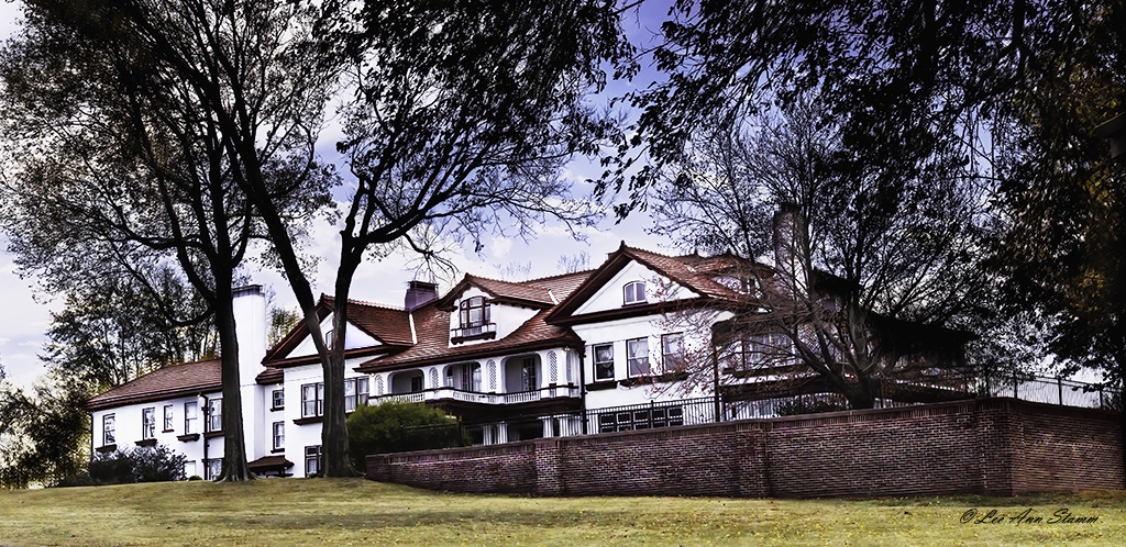
Hi Peter: You are so lucky to have the Longwood Gardens close to you. Great shot of the tower. I do like the changes that Howard made of the image. It needed the added contrast. |
Jun 21st |
| 37 |
Jun 23 |
Comment |
Hi Peter: I love this image just the way it is shown. I don't want to see more of the birds as their fading into the white around them makes them more mysterious. It looks like a fine piece of ink artwork.
Since this image is obviously fine art, you could paint some feet on the front bird and maybe the front foot of the bird in the back. You don't need much and make it subtle. Then I would expand the upper and lower borders a little to get the birds further from the edge. As I said, it's perfectly acceptable as it is, without more work. |
Jun 21st |
| 37 |
Jun 23 |
Reply |
Hi Bob: I'm still not sure about a brighter or bluer sky, but I will try it to see how it works. I agree that the background is distracting. I think I will clone out the house and the sidewalk, then a Gaussian blur would be perfect.
Unfortunately, I don't have any more room on the left side in the original. I would have to really work on expanding that side. I know it can be done but would take a lot of work. Thank you for your suggestions. I appreciate the input. |
Jun 21st |
| 37 |
Jun 23 |
Reply |
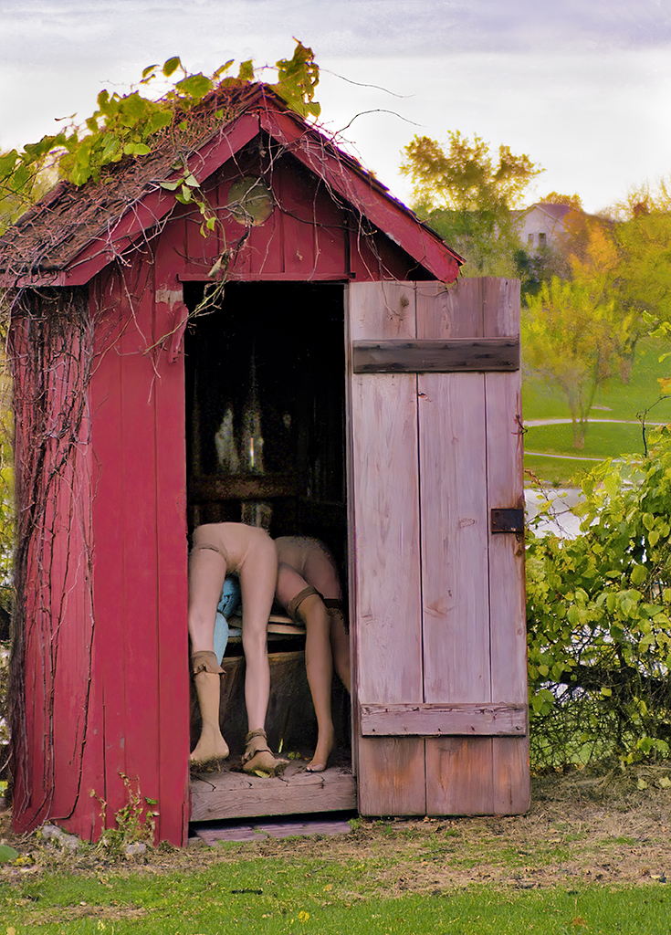
Hi Howard: I thought it was funny. I don't have a clue how the mannikins got there, but I was really surprised when I opened the door. I agree that the background could use some work. I will use the clone tool to remove the house. Then I will bring out a little color in the sky. I don't want it to overtake the outhouse, which is somewhat subdued. Thank you for the suggestions. |
Jun 21st |
| 37 |
Jun 23 |
Reply |
Hi Ricarda: I apologize that this image disturbed you. I would not post an image that I thought was offensive on purpose. All I have seen in this image is the humor.
I never noticed that the building was outside the margin. I agree that I should extend the left side if I had more in the original. Doing that through Photoshop, I believe would be difficult. Unlike others, I have always felt that the dulled sky was suitable for the image. Thank you for your comments. |
Jun 21st |
| 37 |
Jun 23 |
Reply |
Hi Peter: The healing brush has not been my friend. I find it works when I'm working with spots on a solid background. I do agree that the building is distracting and needs to go. Thanks for the suggestion. |
Jun 21st |
| 37 |
Jun 23 |
Reply |
Hi Helen: First, congratulations for being chosen for the showcase this month. Love your technic in making these images.
Thank you for your suggestion. I agree the sky should be more interesting. |
Jun 21st |
6 comments - 7 replies for Group 37
|
15 comments - 11 replies Total
|