|
| Group |
Round |
C/R |
Comment |
Date |
Image |
| 12 |
Mar 23 |
Reply |
Thank You Barbara |
Mar 30th |
| 12 |
Mar 23 |
Reply |
Thanks Conie. Sometimes I think the things I did early on are better than what I'm doing now. It's probably because my head was full of all the information I just learned! Today, it's all just a jumble of information. |
Mar 29th |
| 12 |
Mar 23 |
Reply |
Hi Carole: I agree that the brighter objects in the background are distracting and darkening them helps. You always give such good advice. The image feels complete now. Thank you. |
Mar 28th |
| 12 |
Mar 23 |
Reply |
Thank you Ally. |
Mar 16th |
| 12 |
Mar 23 |
Reply |
Hi Ally: The aperture would be determined by how far away you were. A 2.8 lens is a fantastic lens, but at a further distance you would increase the aperture some. |
Mar 14th |
| 12 |
Mar 23 |
Reply |
Hi Chane:
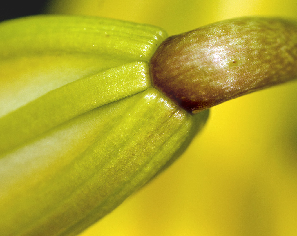
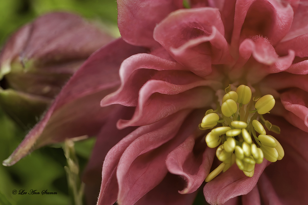
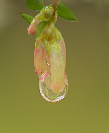
In all honesty, this is one of my first flower pictures. I stacked many of them. In looking at this image, everything that is at the same level is in focus. Perhaps, I didn't stack this one. I just know that a lot of this is in focus, so I thought is was stacked. I apologize for that. Regarding the green, I would not remove it as I feel it adds to the image, and I like the out of focus bud. |
Mar 14th |
| 12 |
Mar 23 |
Comment |
Fran: I'm so sorry. You are absolutely correct about the assignment being close-ups, not macro. Please accept my apology. |
Mar 12th |
| 12 |
Mar 23 |
Reply |
Thank you Lance. |
Mar 12th |
| 12 |
Mar 23 |
Reply |
|
Mar 11th |
 |
| 12 |
Mar 23 |
Comment |
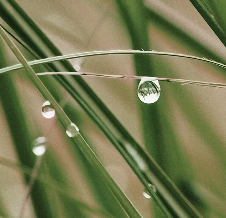
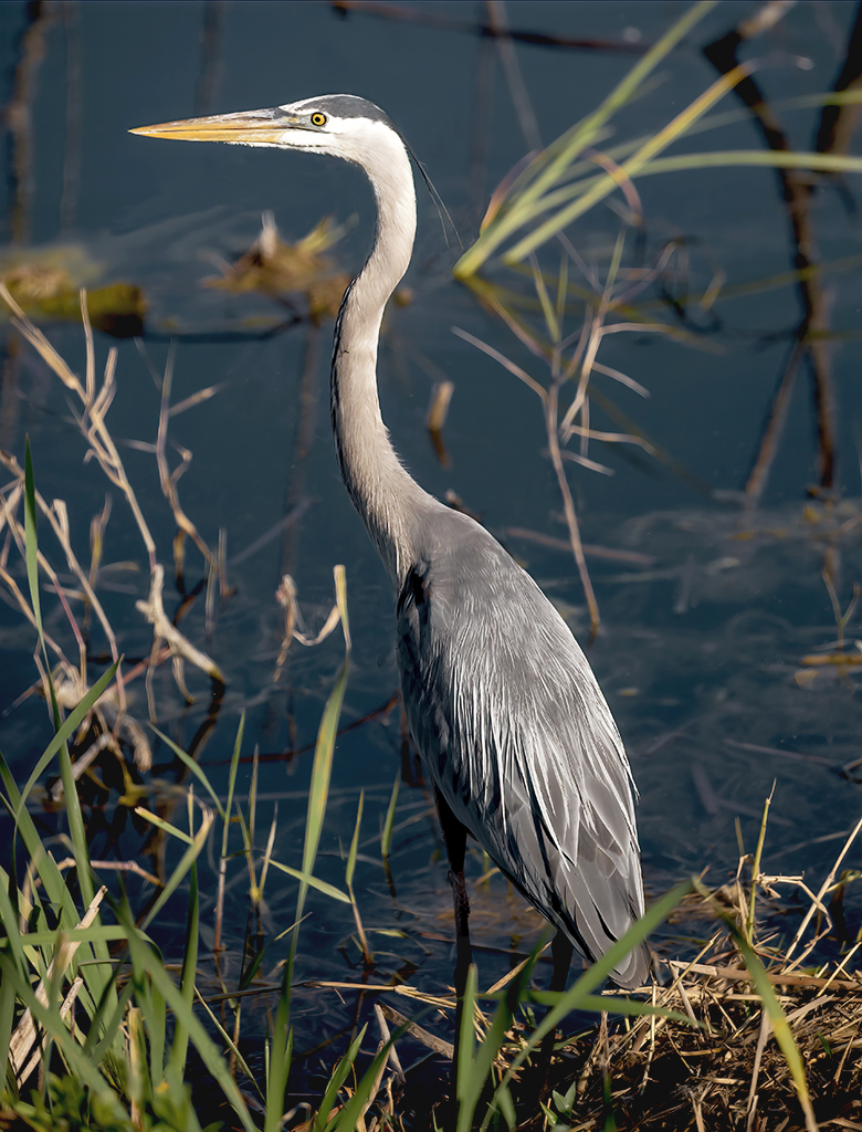
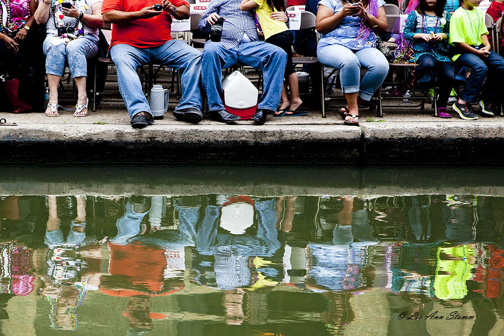
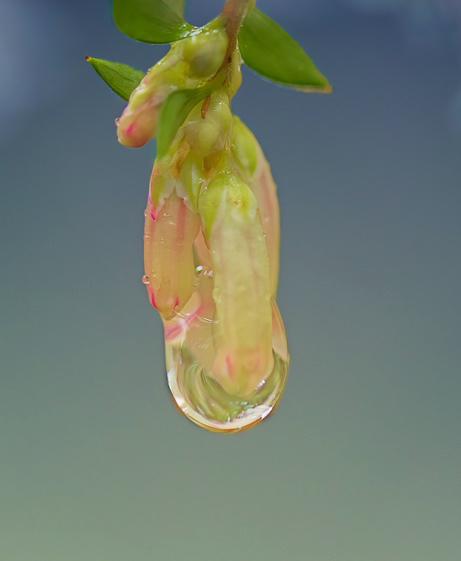
Hi Ally: This is a pretty little blossom that is about to lose it's tear. Nice. However, I think that your image would improve with a change of the background. I offer two selections. If you want to maintain the feel of the forest with green, just darken the green. If background color doesn't matter choose anything that pleases you. This makes the petal stand out. The petal could be a little sharper, but taken at that distance, you did well. |
Mar 11th |
 |
| 12 |
Mar 23 |
Comment |
Hi Fran: The comparison between the two images certainly shows that you are much closer, but I'm not really sure this is a macro. For instance, a macro might be zooming in on the fern on the rock. It is to see intimate detail.
That being said. I, too, love the little sections in nature rather than the whole scene. Your water is beautifully shot, in particular, the little bit seen under the rock. For some reason, I feel like I want to see something more. Perhaps, it's that the rock and the falling water both appear to be your subject, and they both go right across the middle. |
Mar 11th |
| 12 |
Mar 23 |
Reply |
Finally! |
Mar 11th |
| 12 |
Mar 23 |
Comment |
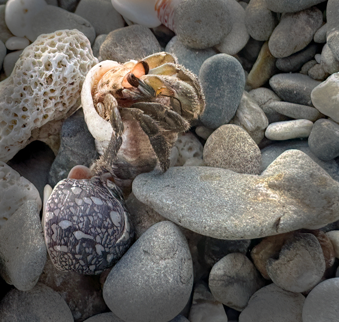
Hi Barbara: You did a great job of capturing this little guy without a shadow. Getting images can sometimes be tricky, and you have to do, what you have to do! It is nice to see him in his own environment. The rocks nicely camouflage him for safety but that makes it difficult to see him clearly.
I agree with Fran that you need some cropping to draw attention to the crab. I actually cropped on the right and left and top to have him stand out. Then I added some vignette. What do you think?
I don't know why my corrected images don't show up with all the corrections. Whenever I post it, it doesn't show the crop on the right. I'll try again. |
Mar 11th |
 |
| 12 |
Mar 23 |
Comment |
Hi Connie: I like your choice of subject. Each embroidery stitch is easily identifiable from my past history of doing this art form. Seeing detail is what's so great about macro. The choice to flip your image was well thought-out. The leading line works. I didn't even notice the brown stitches until you mentioned them. All of your adjustments compliment this image. |
Mar 11th |
| 12 |
Mar 23 |
Comment |
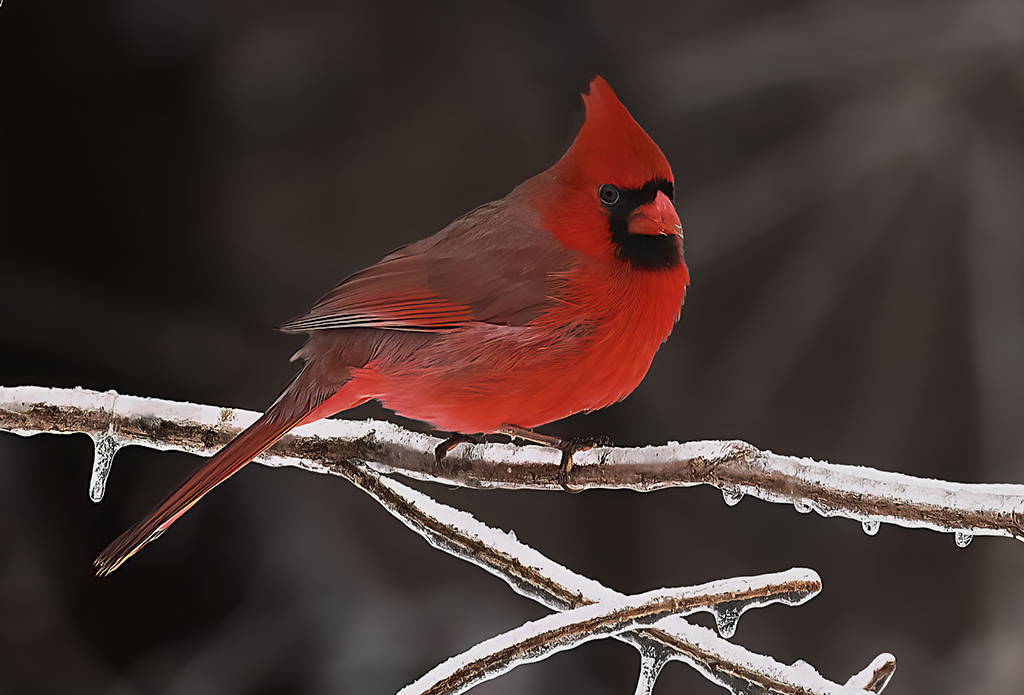
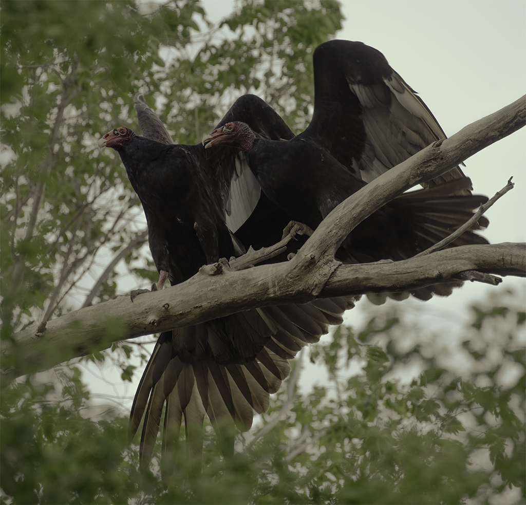
Hi Chane: I love close-up images of birds, and you did an exquisite job capturing this hawk. Thank you for describing your set up. I love that you have a security system that tells you when the birds have arrived.
This is a really great shot and crop. I love seeing his little tongue, seed, and his eye lashes. When I look at the feathers, I feel that they are a little over sharpened. Otherwise, great shot. |
Mar 11th |
| 12 |
Mar 23 |
Comment |
Hi Carole: This is a dreamy shot. The angle is interesting and well thought out. I like everything you did to create an artful image. In comparing the two shots, I can see each step, and I like them in combination. My eyes go straight to the center as you wanted. I don't have any suggestions for improvement. It's perfect the way it is. |
Mar 11th |
7 comments - 9 replies for Group 12
|
| 24 |
Mar 23 |
Comment |
Hi Lance: Thanks for visiting our group with your critique. I always love to see what people from other groups are doing. I love creating flower images, and I find that I am more drawn to it as a specialty. I love your image as a beautiful abstract. The color is perfect and stem (anthem) is placed perfectly. Beautiful. |
Mar 11th |
1 comment - 0 replies for Group 24
|
| 37 |
Mar 23 |
Reply |
Hello Peter: I love getting suggestions for the improvement of an image. I try both of your suggestions before trying to crop it down. |
Mar 28th |
| 37 |
Mar 23 |
Reply |
Hello Peter: I love getting suggestions for the improvement of an image. I try both of your suggestions before trying to crop it down. |
Mar 28th |
| 37 |
Mar 23 |
Reply |
Hi Helen: Thank you for your suggestion of darkening the foreground. I will try that before I crop it down to see which option I like best. |
Mar 28th |
| 37 |
Mar 23 |
Reply |
Good. Great image.
|
Mar 12th |
| 37 |
Mar 23 |
Reply |
I agree Peter that the greens are a little too much. It should be cropped some from the bottom. Thank you for your comment. |
Mar 12th |
| 37 |
Mar 23 |
Reply |
Thank you Howard. |
Mar 12th |
| 37 |
Mar 23 |
Comment |
Hi Ricarda: Welcome to our group. I hope you find it beneficial. This was a great capture of this Juvenile Pelican. I think you are having the same problem I have with my 400 mm lens. I went into photoshop to see if I could resize it, then crop it to bring the pelican forward to see it better. When I opened Photoshop, the pelican was pixelated.
It is hard to get close enough to these fellows to get a sharp, close image. Do you have a teleconverter? That helps to bring it closer, so does a function on the camera that reduces the amount of pixels used if you are shooting with a full sensor. |
Mar 11th |
| 37 |
Mar 23 |
Comment |
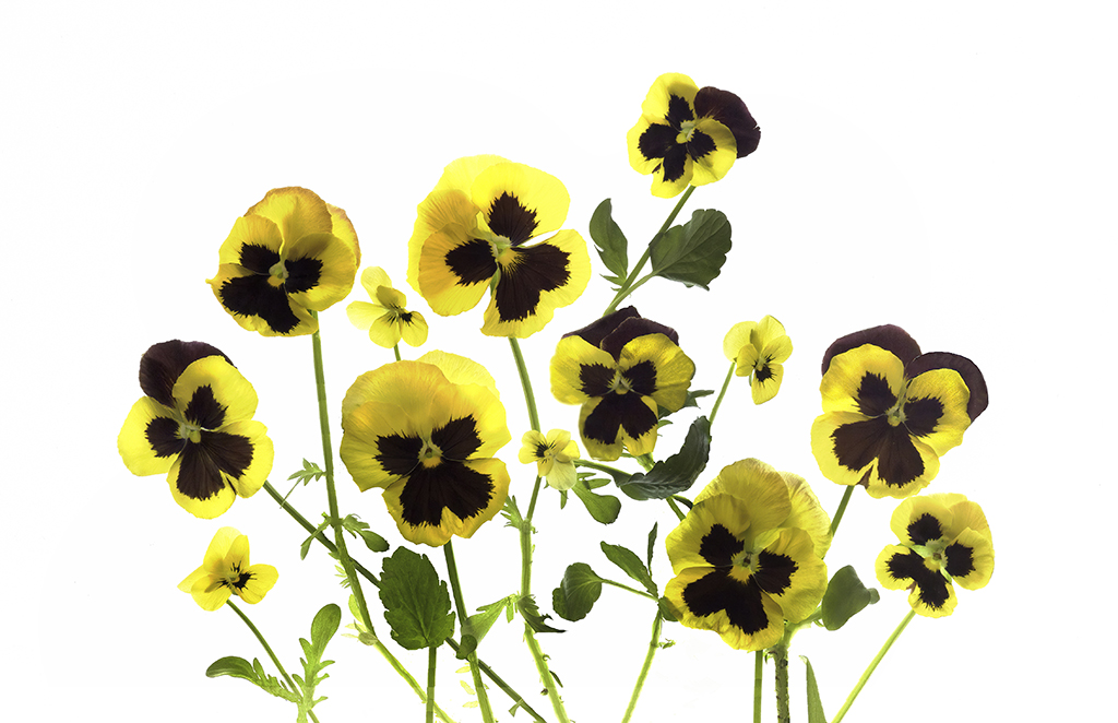
Hi Helen: This flower is a beautiful macro shot. I love the unfurling of all the petals and the slight difference in color of each layer. At first I thought it was the bottom of a big yellow dress all crunched together. I really like it, but I'm not sure I would call it abstract. What did your class think?
Regarding your question, I really couldn't see a lot of difference between the two images.
I'm having iPhone 14 pro envy! |
Mar 11th |
| 37 |
Mar 23 |
Comment |
Hi Howard: Well, Ricarda said everything I wanted to say. This is a beautiful image of a bird in flight. I agree the small twigs in the top are distracting. B&W was a great choice, and the bird does look sharp and in 3D. Gorgeous. |
Mar 11th |
| 37 |
Mar 23 |
Comment |
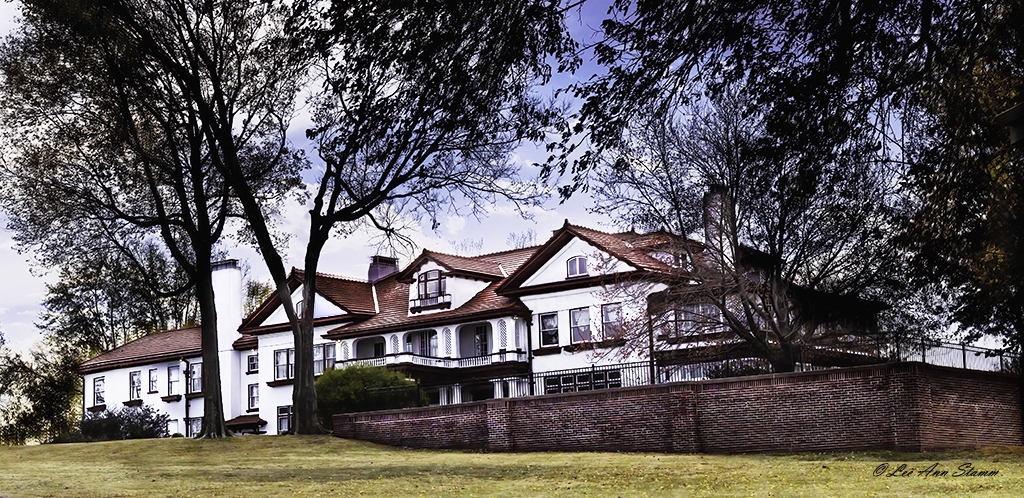
Hi Peter: Thank you for the description of this historic home. It is beautiful in color, angle, and sharpness. The only think I find distracting is the blue fence at the bottom right, but don't remove it.
I do have a comment regarding your statement of "considerable editing." I wonder how different this home is compared to the original. I'm in a group now that is photographing the Longview Farm in Missouri, which has a lot of Missouri history surrounding it. In a critique session, I recommending removing a small hole in the wall trim. I was told that the hole was for a vacuum system that was very unique and one of the first ever used. It was historical. The final lesson I learned was that you don't change much about historical landmarks, maybe some sharpening, white balance correction and curves. |
Mar 11th |
| 37 |
Mar 23 |
Reply |
Hi Vance: I have to say that this is an image taken in 2008, a couple years after I started doing photography full time. I don't know why I chose Shutter Priority at that time. Since nothing was moving, I should have chosen a small aperture in Aperture Priority or Manual. Now I take most of my images manually.
I'm curious why you asked the question. |
Mar 11th |
| 37 |
Mar 23 |
Reply |
Welcome Ricarda and thank you for your comments. I tried multiple crops on this image, which is cropped down quite a bit from the original. If I crop from the right, it puts the apex of the triangle in the center of the image, which I don't like. I do agree that I could crop some from the bottom where the puddle is to bring the focus more to the apex. Thank you for the suggestion. |
Mar 11th |
| 37 |
Mar 23 |
Comment |
Hi Peter: Thank you for all the information provided regarding this little cotton ball. He's beautifully captured and sharp. I might have put a small catch light in his eye, although some might not approve of that manipulation. The only critique I can give is that the black on the right side is very distracting. I would try to clone it to match the lighter color. You want this darling bird as the primary focus. Love it. |
Mar 11th |
5 comments - 8 replies for Group 37
|
| 83 |
Mar 23 |
Comment |
Hi Lance: Thank you doing this important project. I would love to see all your final comparative images. I prefer color to B&W although I have started to experiment with some of my images. That being said I prefer your second image, but I think that sepia was an excellent choice for the conversion. Exceptional image. |
Mar 11th |
1 comment - 0 replies for Group 83
|
| 87 |
Mar 23 |
Comment |
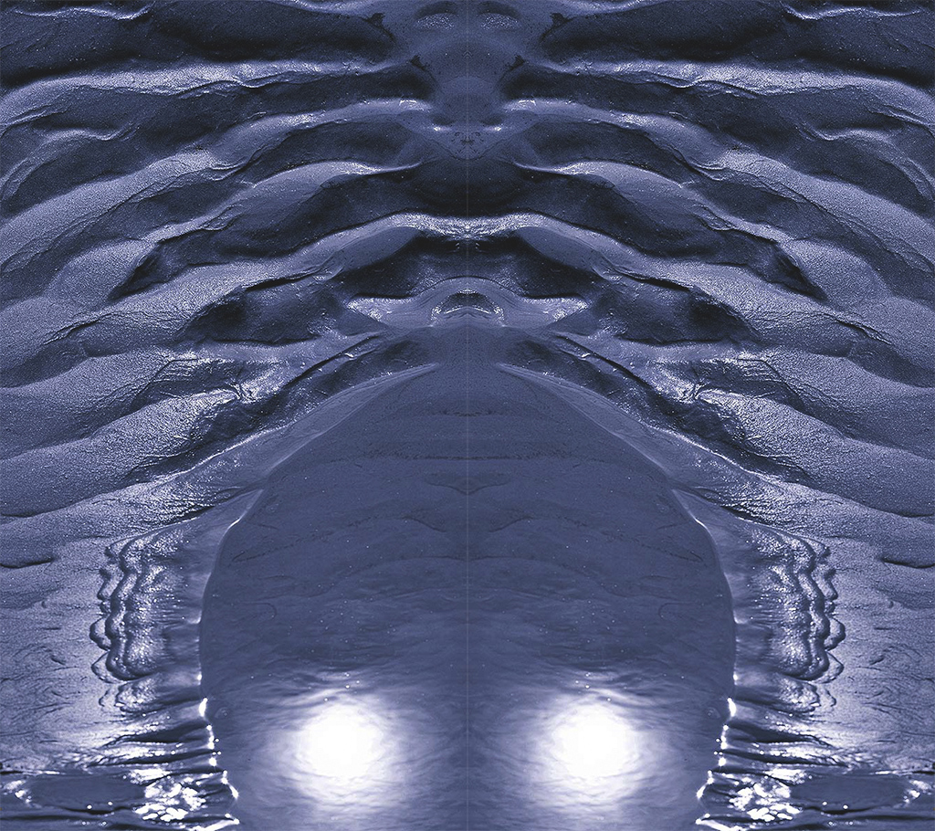
Hi Lance: I certain see the Yin-Yang feeling in this image. Overall, I like it very much. I think you have leaned more toward an abstract image. Like Cindy, it took me a while to realize what I was looking at. At first I thought the sand was the water. I love that I had to study it. The first thing that caught my eye was the sand, then the water, and last the sun. I didn't think the sun was distracting at all, but it was a surprising ending.
I definitely see the art in the image with the close crop and the blue color. After exploring it, I felt serenity.
I played with your image combining it with a flipped version of itself. Then I rotated it 180 degrees. I find it interesting, but I think I would remove the suns in this version. It definitely loses the serenity of your image. Just playing with your interesting image.
I have enjoyed following you in all of your groups. Thanks for visiting mine. |
Mar 11th |
 |
1 comment - 0 replies for Group 87
|
15 comments - 17 replies Total
|