|
| Group |
Round |
C/R |
Comment |
Date |
Image |
| 12 |
Feb 23 |
Reply |
Barbara: I do see what you meant and thank you for working on the image to explain it to me. Between the desaturation and lightening the head, you have made the cardinal look so much better. Thanks again. |
Feb 19th |
| 12 |
Feb 23 |
Comment |
|
Feb 19th |
 |
| 12 |
Feb 23 |
Reply |
For some reason my computer wants to show the Sand Hill Crane. Give me some time to try to get the right image to come up. |
Feb 19th |
| 12 |
Feb 23 |
Comment |
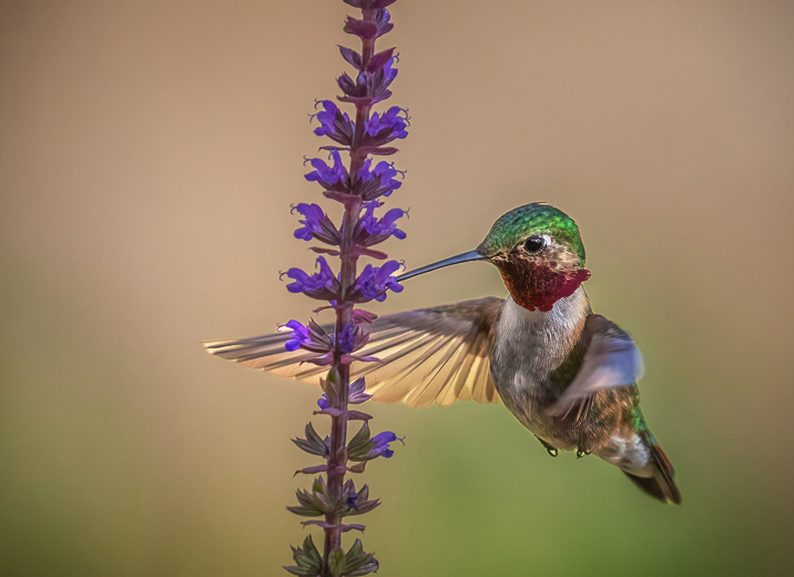
Hi Alley: I love your capture of this hummingbird. Your description of sitting outside with your big hand-held lens sounds like me. However, I have not been successful getting a sharp image. My first impression of this hummingbird was that he was fading into the background. I used my object tool to choose only the bird and then used curves on it. It made the contrast and colors really stand out. Then I used the brightness tool to slightly increase the brightness. I also like the closer crop to highlight the bird. I'm still a little distracted by the tan and green background but decided to leave it. What do you think? |
Feb 19th |
| 12 |
Feb 23 |
Comment |
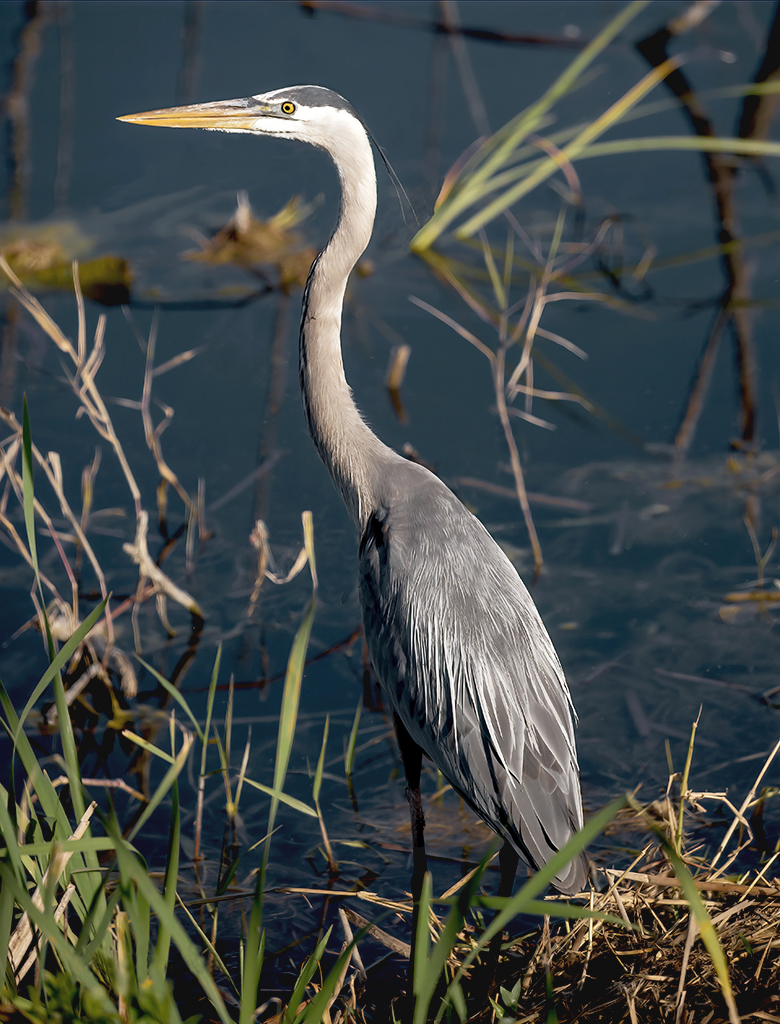
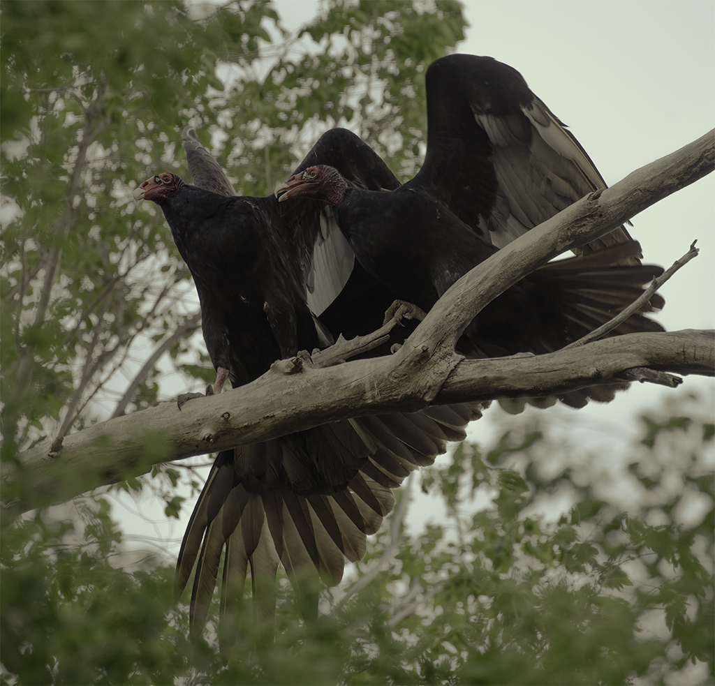
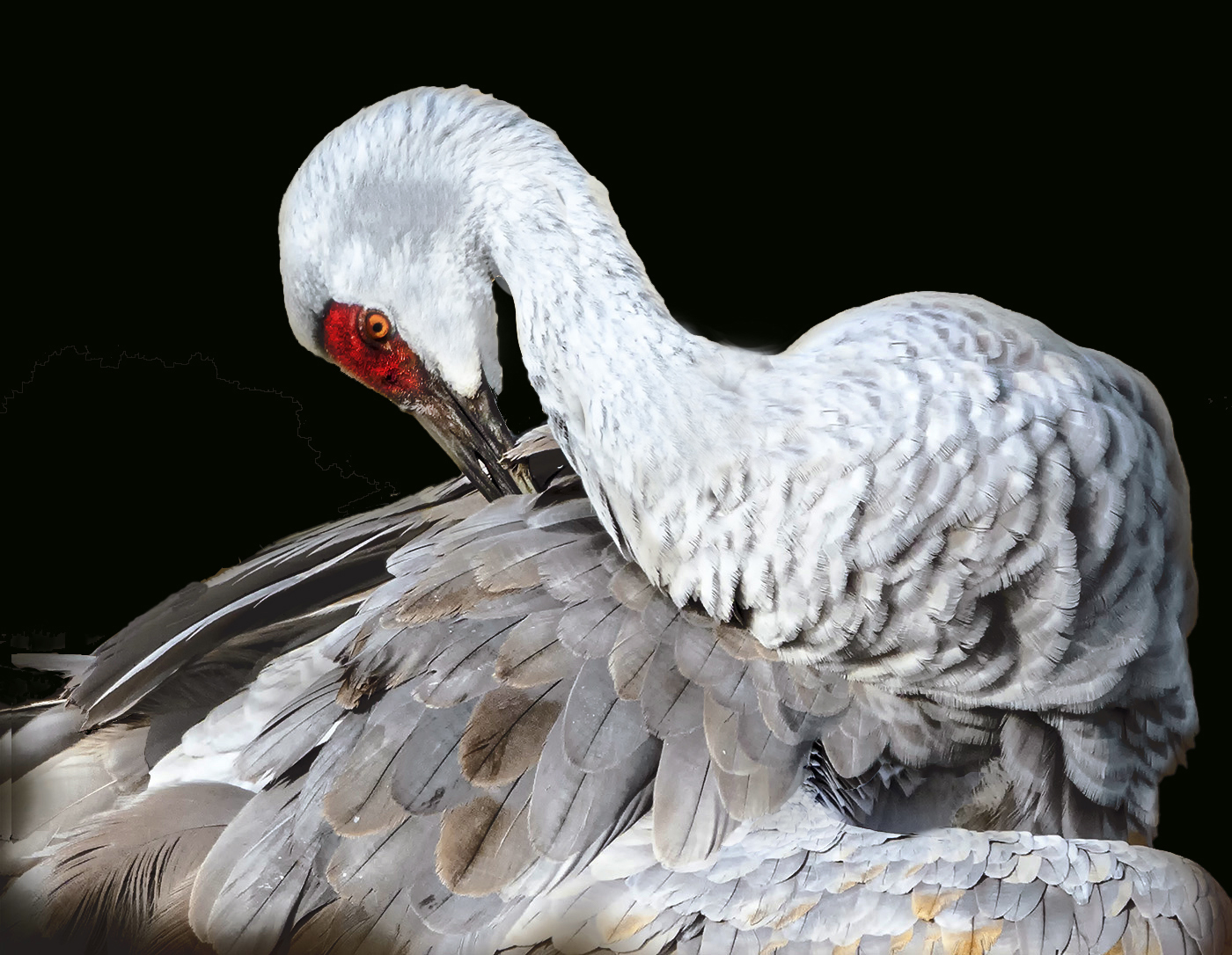
Hi Fran: I have been to Nebraska to photograph the Sand Hill Cranes. It is quite an experience to see that many cranes in one place. I love the cropped image of this bird. The detail is fabulous. I have taken a different approach to editing. I love to see a white bird on a black background. Then all you see is the bird with no distractions from the background. Once the background was changed, I needed to lighten the beak and the red area, so they better matched the original. I do believe your image is burned out because there is no detail in areas of the face and neck. For a piece of fine art, I will often clone other areas over the burned-out piece. Then I will reduce the opacity and try to blend the area. Once that is done, I will take the dodge tool to lighten it back down to normal colors. My crane developed a blue tinge, and I lessened it some in color balance. What do you think? |
Feb 19th |
 |
| 12 |
Feb 23 |
Comment |
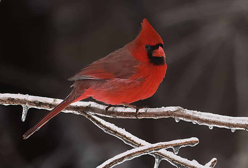
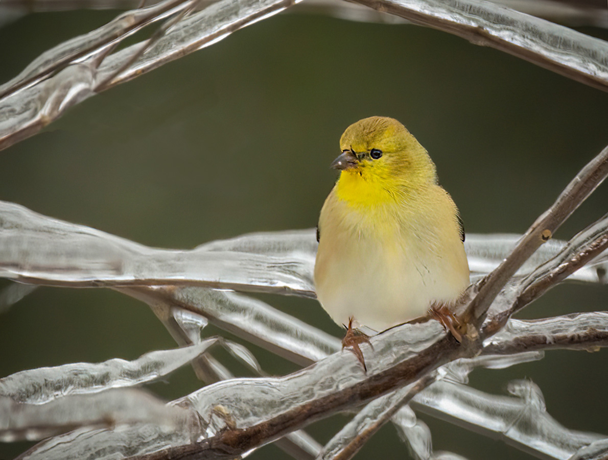
Hi Barbara: Sorry I'm late with my comments this month. I love this little yellow finch. We never see them in winter in Missouri. I bet he was in shock to see all the ice. I don't really know if I improved the image or not. I started with Carole's image which darkened the ice. I removed that nasty little branch, which was so distracting. Just for kicks, I wanted to see what would happen if I straightened the bird some. This cut the size of the image and brought the bird closer. I like the branches on top, which give a nature frame for the finch. I don't know. What do you think? |
Feb 19th |
 |
| 12 |
Feb 23 |
Comment |
Hi Connie: This is another great shot. I love it. Since everyone else has commented, I'll address some of the things they have said. I love the second bird. I think that he gives some warmth to a white image. I love the green wires, which give a balance of color. I agree that the black blob to the right needs to be removed. Rather than lightening the entire image, I just took out all of the black blobs, except under the feeder, which feels like a cast shadow and strengthens the base. Then I slightly lightened the cardinal. The white vignette pulls your eyes straight to the subject. Good job. I really like the frame and appreciate the instructions on how to create one. I copied them for future images. Thank you. Another point, with the green and red and frame, this would make a wonderful Christmas card for next year.
My computer doesn't work with Spyder either. I know that when I print an image, I usually need to brighten it a little. Printing your images can tell you a lot about the color of your image.
I'm really sorry that I'm not posting an image. For some reason, when I post it, all of the black background I erased re-appears. |
Feb 19th |
| 12 |
Feb 23 |
Comment |
Hi Chane: When I saw your image, my mind said that it all needed to be a little lighter. Rather than send you another image, I choose Barbara's as being closest to what I would have suggested. My eye goes straight to the icy eye and seed in her image. In yours, my eye goes to the white chest and then moseys around the image.
This was a great catch. You did a fabulous job capturing this Blue Jay, and I appreciate the description of your set-up. My husband just made a bird tray for my deck rails that I eventually will fill with branches, berries, etc. of each season. I also found a white aspen branch while in Colorado and plan to attach it straight up. Then I will drill small holes on the side to put suet there. This attracts the woodpeckers in a natural state. Good luck on your contest entry. I haven't ever entered one of their contests, but am looking for the time to do so. |
Feb 19th |
| 12 |
Feb 23 |
Reply |
The image looks more cyan than I intended, but it can be easily changed. |
Feb 19th |
| 12 |
Feb 23 |
Comment |
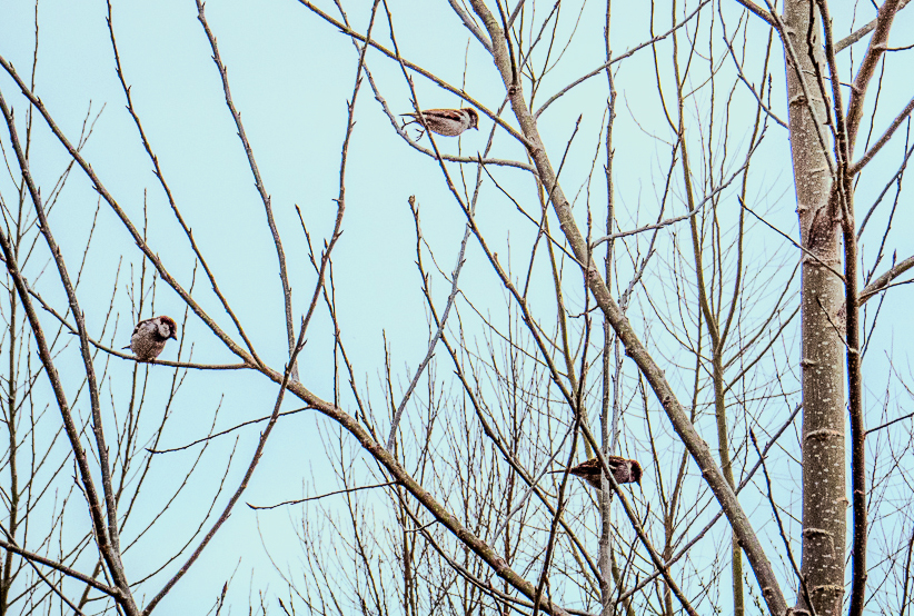
Carole: I love the baren look of the trees, which definitely say, "Winter." However, I did not like the bleak background. We have blue days in winter, so I changed the background to show a blue winter sky. Doing this lost the trees and birds, so I lightened the neutral colors in color select. I also cropped so the birds became larger to see. As for the bird that's taking off - it's still looking down. I think it follows the old adage, "The early bird gets the 'winter' worm." I think these changes made it a more interesting image. What do you think? |
Feb 19th |
 |
| 12 |
Feb 23 |
Reply |
Barbara: Can you explain to me about the cardinal looking neon? I'd appreciate your feedback. |
Feb 19th |
| 12 |
Feb 23 |
Reply |
Ally: I agree that the lightening of the cardinal improved the image. Thank you for your comments. |
Feb 19th |
| 12 |
Feb 23 |
Reply |
Carole: Thank you for the time you spent working on this image. I agree that the cardinal is a little dark, but would not have thought it without your correction. Thank you for your input. |
Feb 19th |
| 12 |
Feb 23 |
Reply |
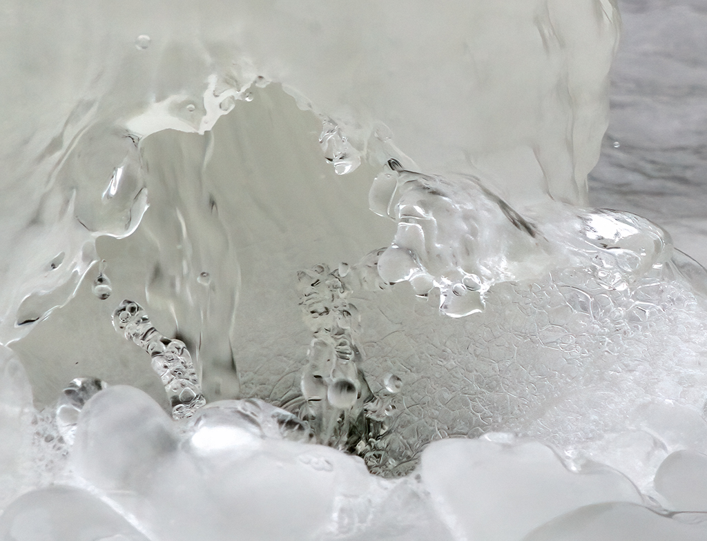
Chane: I agree that there are several areas, especially in the ice that are overprocessed. I should have gone back and erased the sharpening in those areas. Thank you for the constructive critique. |
Feb 19th |
| 12 |
Feb 23 |
Reply |
Thank you Fran. |
Feb 19th |
| 12 |
Feb 23 |
Reply |
Thank you Connie. |
Feb 19th |
7 comments - 9 replies for Group 12
|
| 37 |
Feb 23 |
Comment |
Hi Helen: If I remember correctly, this is the second (and third in group 64) image of symmetry you have shown. I love it, and yes you have an eye for creating symmetry. It inspires me to actually try this instead of procrastinating. Very nice. What category did you enter? |
Feb 19th |
| 37 |
Feb 23 |
Comment |
Hi Howard: This image just did not draw me in. Personally, I don't like groups of leafless trees. I find them boring. I cropped the image way down to eliminate some of the leafless trees. You mentioned the boardwalk, so I tried to make it the subject. I brightened it by using the dodge tool. Then I eliminated the clouds, which seemed to demand too much attention. Perhaps this is too small for the number of megapixels left, but I prefer this image. What do you think? |
Feb 19th |
 |
| 37 |
Feb 23 |
Comment |
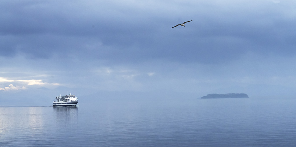
Bob: I can't believe that you captured this pelican with all the boat movement. I know those waters are very choppy. Beautiful image. I do feel that it is somewhat over sharpened, which bothers me most on his right lower wing over the white.
The Galapagos Islands are on my bucket list. I bet you have hundreds of gorgeous animal pictures. I'd love to see them all. Better yet, I should just go! |
Feb 19th |
| 37 |
Feb 23 |
Comment |
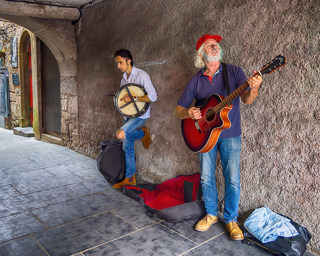
Peter: I can almost hear the band warming up. This image is so colorful, yet my eyes go straight to the singer. Then I see all the vibrant speakers, piano, etc. The drummer was the last thing I saw, and it didn't really bother me that his face was covered. He was not the subject, but he reflects that this is a band, not a solo artist. I like the original best. Good job. |
Feb 19th |
| 37 |
Feb 23 |
Reply |
Howard: You are right, but I really liked the image, so I gave it some processing time. |
Feb 19th |
| 37 |
Feb 23 |
Reply |
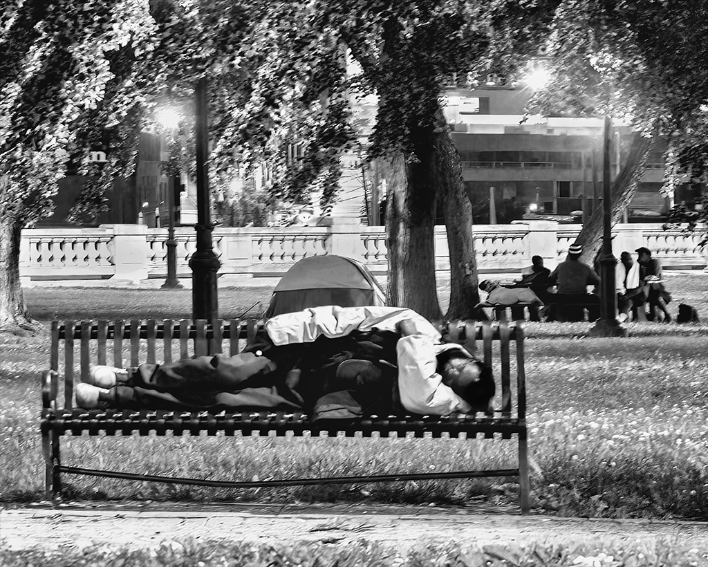
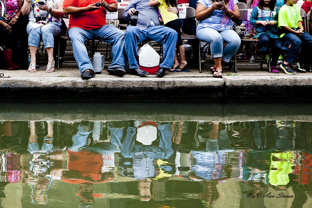
Bob: I really wanted to keep the children in the picture. I should have described it as "Overweight people who are consumed with their cell phones as their bored children wait. Or something like that. |
Feb 19th |
| 37 |
Feb 23 |
Reply |
Thank you Helen. |
Feb 3rd |
4 comments - 3 replies for Group 37
|
| 64 |
Feb 23 |
Comment |
Helen: I love the title. I certainly saw the zebra right away. Without the title, I think I prefer the colored image in group 37. I like the Chinese lantern shape better. Thanks to leading me to this group. |
Feb 19th |
1 comment - 0 replies for Group 64
|
12 comments - 12 replies Total
|