|
| Group |
Round |
C/R |
Comment |
Date |
Image |
| 12 |
Jan 23 |
Reply |
Hi Connie: I actually like this one better. My eyes stay on the steel beam rather than wondering to the flagpole and building.
|
Jan 21st |
| 12 |
Jan 23 |
Comment |
Hi Ally: Looks like you got this month's award for one picture, two perspectives. I saw the bench first, but immediately saw the building once I read the description. Either way this is an interesting photo. I like the color best, because after clicking on the B&W, it seemed too burned out to me. Very interesting shot. You should print this as a party game to see how many people see a bench vs a building's side. |
Jan 18th |
| 12 |
Jan 23 |
Comment |
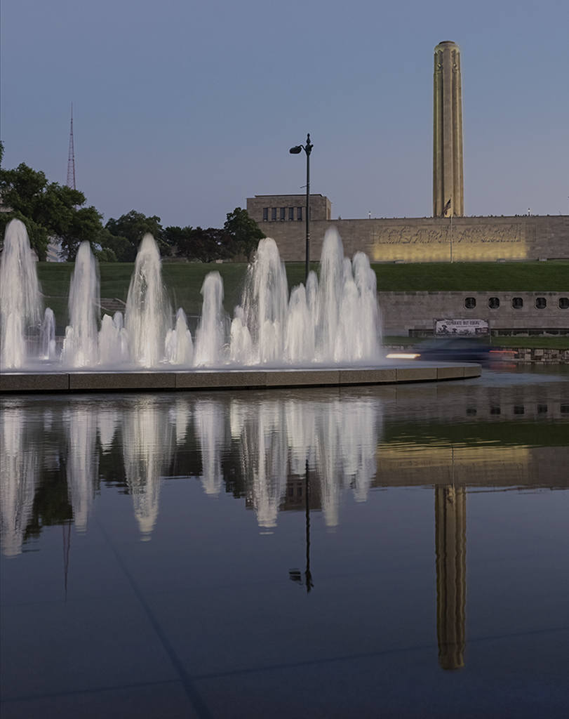
Hi Fran: What a great photo. I love all the angled lines and how the image shows the enormity of the area. The building reflecting in the water is also nice. I tried a variety of crops, but I really like your original photo the best.
It is a great image to show people what they haven't seen around 911. Now I really need to go see it. |
Jan 18th |
| 12 |
Jan 23 |
Comment |
Hi Barbara: I am beginning to seriously look at my images to decide what it was that I like. Then I see if cropping out everything else works. I think if you wanted to show a historical shot, Carole's crop is best, but if you want to show modern day activity around an old theater, then your first shot is best. It's all about intension. I love the story of this theater, and you captured it nicely. |
Jan 18th |
| 12 |
Jan 23 |
Comment |
Hi Connie: I, too, like the looking up in this image, which shows that you are standing in an expansive room. Where are you exactly? I don't have much to add to the suggestions, but I do like what Carole did to complete the image and even though I'm rarely a B&W fan, I think I liked it better than color. |
Jan 18th |
| 12 |
Jan 23 |
Comment |
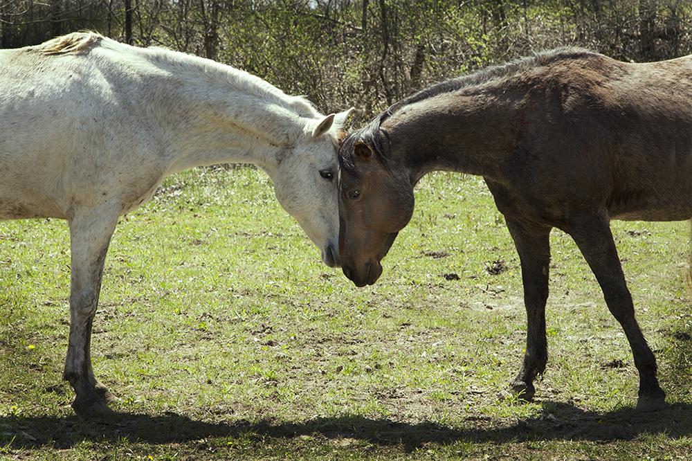
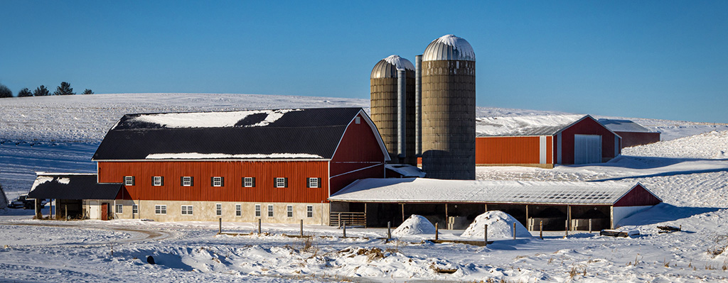
Hi Chane: There are a lot of different opinions on this well-photographed image. Beautiful contrast. This is a set-up that any farmer or horse person would love to own. You nailed it. I am going to disagree with everyone that liked your crop. On your original post, I would crop about 1 1/2" off the lower foreground. Then crop some off the top. This brings your image closer to the viewer and puts the middle of the barn on the lower third line and the hill on the top third line. This also makes the original look like a panoramic. I would also remove the large tree. |
Jan 17th |
 |
| 12 |
Jan 23 |
Comment |
Hi Carole: Like the others, I love the history of this steel piece and how the colors and steel contrast. The size of the steel and the bolts used to hold it together make one realize how much weight came down on the victims of this tragedy. This building would not have fallen under any other circumstance.
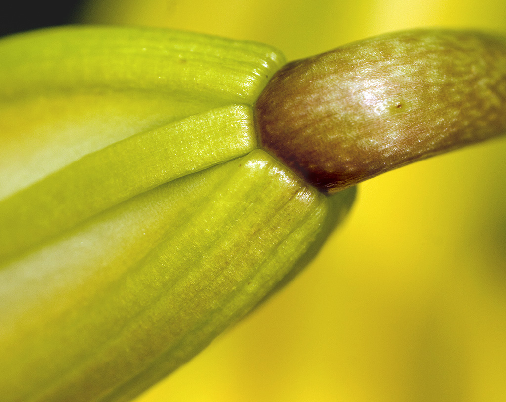
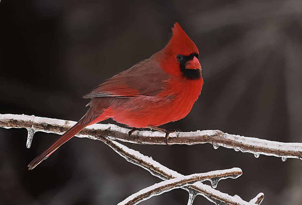
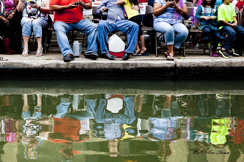
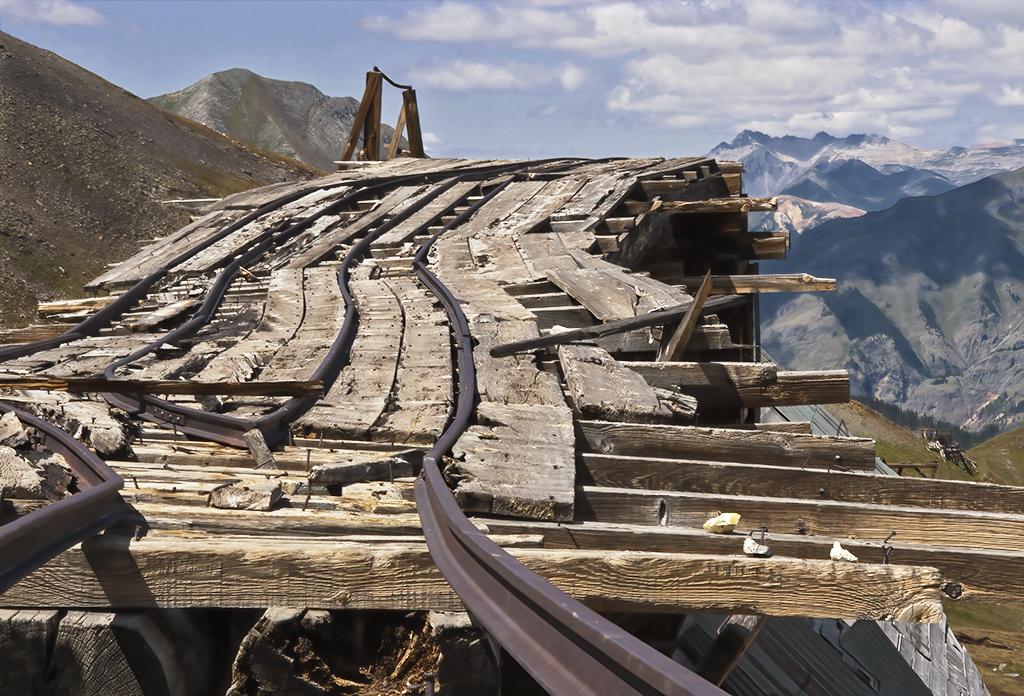
Technically, I find the slant of the flagpole and building on the right distracting, but I have no idea how that could be corrected. If you straighten them, the people, and steel would lean to the right. The memorial on the left is slanted to the left. Straighten it and the flagpole and building would lean even further to the left. Ha Ha. Technically, this is a challenging image, but I think it is perfect the way it is. |
Jan 17th |
| 12 |
Jan 23 |
Reply |
Thank you Ally: As I told Carole, I wanted to show something other than a traditional architecture shot. I try to think out of the box, and sometimes that's a great failure. You never know if you don't try. |
Jan 15th |
| 12 |
Jan 23 |
Reply |
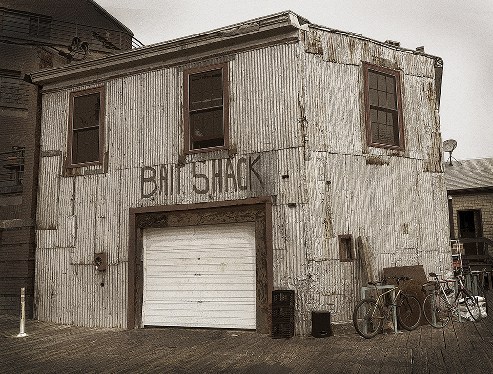
Hi Barbara - It's fun to wonder what its use is now. There were many residences in old buildings. With the bicycles outside, perhaps someone lives there now. The garage door was actually bright white and looked new. Maybe there is an antique car in there. Who knows, but it's fun to pretend. |
Jan 15th |
| 12 |
Jan 23 |
Reply |
Thank you Carole. I have lots of current architecture, but I thought this might contrast with everyone else's. |
Jan 15th |
| 12 |
Jan 23 |
Reply |
Hi Fran: I tried so hard to make the bicycles' colors of red and yellow stand out. I thought that little bit of color would enhance the image, but I just couldn't get it accomplished. |
Jan 15th |
| 12 |
Jan 23 |
Reply |
Hi Chane: I find that the satellite dish distracts me, too. I think I will just clone it out. |
Jan 15th |
| 12 |
Jan 23 |
Reply |
Hi Connie: The original was actually pretty close to sepia, but I did add some grain to make it look older. |
Jan 15th |
6 comments - 7 replies for Group 12
|
| 37 |
Jan 23 |
Comment |
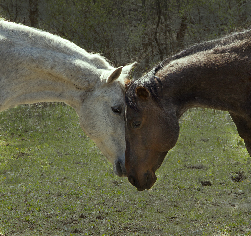
Hi Bob: This photo has given me many struggles. I posted it on Facebook a while ago and had more favorable comments than any other I posted. I think people just like to see horses. I darkened the background more, got rid of the sky, I didn't like the white horse's legs darkened. Instead I got rid of some of the mud and made them a bit whiter. I darken the white horse's hoof and cropped it so close that a frame would cover a hoof and the white horse's back. I also got rid of the shadows at the bottom.
I don't like the crop and wonder if it wasn't better with the black shadows, which gave it a bottom and top frame.
I just don't know. Or perhaps a serious, head's only, crop is best. Comments? |
Jan 17th |
 |
| 37 |
Jan 23 |
Comment |
Hi Helen: You are so lucky to be able to travel to so many interesting places. This is a perfect street shot with the perfect title. It is not sharp, but that doesn't interfere with the story. This was a lucky capture from an aware photographer. |
Jan 15th |
| 37 |
Jan 23 |
Comment |
Hi Howard: I love all the color on these planes. They are very sharp and using the angled position is perfect. The fact that the first plane does not have a white trail improved the image. Did you remove it or was it just shut off? Since these planes are stopped in action, it makes me feel like the first one lost the engine and is going to plummet to the ground, but that's just me. Technically, a perfect image. |
Jan 15th |
| 37 |
Jan 23 |
Comment |
Hi Bob: This is such a emotionally moving image. You don't need to see the baby to see the love in this mother's eyes. Beautiful, beautiful. I wouldn't change a thing.
Your story reminds me of something I just did. I had a picture I loved, but when I printed it, something wasn't right. I finally focused on what made me like the picture. I cropped it way down like you did, and now it's perfect.
I think this is a good lesson for all of us. |
Jan 15th |
| 37 |
Jan 23 |
Comment |
Hi Peter: I'd love to go to Kenya to photograph the surroundings. This image is great in black and white. The cheetah faces are sharp and their gazes intent. It looks like you put a white vignette around the image, which brings the focus on the cats. Your capture was perfect and it goes right along with your story. |
Jan 15th |
5 comments - 0 replies for Group 37
|
11 comments - 7 replies Total
|