|
| Group |
Round |
C/R |
Comment |
Date |
Image |
| 12 |
Oct 22 |
Comment |
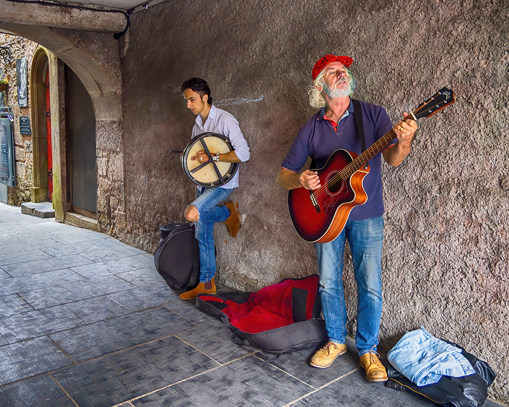
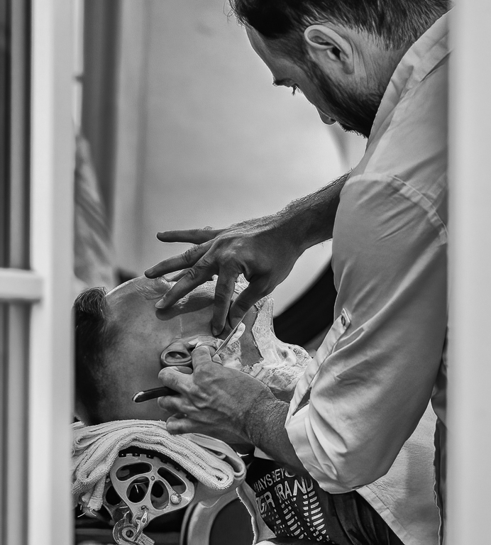
Hi Ally: This is a great street shot. The barber is so intent on doing a good job and the client could just as well be sleeping through the shave. It almost looks like the barber is using the window light to help him see. The only change I would make is to crop out most of the window on the right-hand side. It doesn't add anything and the small bit of left-over window helps create a lovely frame. Thoughts? |
Oct 11th |
 |
| 12 |
Oct 22 |
Comment |
Hi Carole: My first thought was, "Oh how lovely this is." Then I noticed the perfect reflection. The light is perfect and so is the soft focus of your granddaughter. If you have the same window, I advise you to try and get another wonderful photo of her. They would be great in a double frame. I've done this for my husband and his childhood friend. They had a first day of school picture, and I posed them in exactly the same place and the same pose. He and his friend love it. |
Oct 11th |
| 12 |
Oct 22 |
Comment |
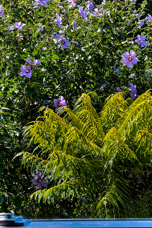
Hi Gavin: I have set aside a place for some Rose of Sharon's to be planted in my yard soon. They are lovely, but I think they get lost in your image. I took out the bottom part of the yellow bush, then added back the windowsill by taking the original image and cropping out only the windowsill. I took the magnetic select tool and chose all the remaining vegetation above the sill and deleted it. Then I moved the sill to the original image. I flattened the image and cloned in greenery from the plant above the windowsill. I think this gives more focus where you want it. Thoughts? |
Oct 11th |
 |
| 12 |
Oct 22 |
Reply |
I like your adjustments, Carole. Where exactly is the adjustment brush in Photoshop Camera Raw? |
Oct 11th |
| 12 |
Oct 22 |
Comment |
Hi Carole: Thank you for the welcome. I am glad that this group will be a challenge for me, and I look forward to the helpful critiques which will make me a better photographer. Thank you, too, for taking the time to show me how this image helped you to see it. Cropping definitely made the face and creature the main attraction. I'm not sure about the vignette. because I think it takes away some of the ethereal look. If I add your crop to Fran's image adjustment, it would be perfect. |
Oct 11th |
| 12 |
Oct 22 |
Reply |
Thank you, Fran, for taking the time to show me your vision. I totally agree that your changes make it more smoke-like, which is what the image is all about. I like your changes better. |
Oct 10th |
| 12 |
Oct 22 |
Comment |
Who says photography is click and print? The many steps you took to make this a delightful image were well worth the effort. I agree with Fran that the background is distracting, and a plain color would work better. If you don't change the background at least blend the background with the table so there's no gap. Otherwise, this is an adorable image with great lighting technique. |
Oct 10th |
| 12 |
Oct 22 |
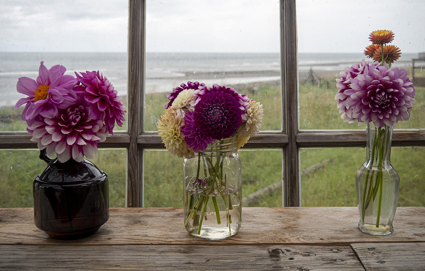
Comment |
Hello Fran: After your description, I would love to see the employee's High Tunnel. This image is lovely and reflects a quaint atmosphere. It's clean and simple with the soft window light. The only critique I have is that the upper wooden bar is somewhat distracting to me, but when I look at it cropped out, I'm not sure it's a better picture. What do you think? |
Oct 8th |
 |
6 comments - 2 replies for Group 12
|
| 37 |
Oct 22 |
Reply |
Thanks Peter. |
Oct 11th |
| 37 |
Oct 22 |
Reply |
Hi Bob: The minute I read your suggestion of deleting the mountains on the left and turning that area to sky, I could see it. And it was great. Thank you so much for that suggestion. I'm going to go back and change that right away. |
Oct 11th |
| 37 |
Oct 22 |
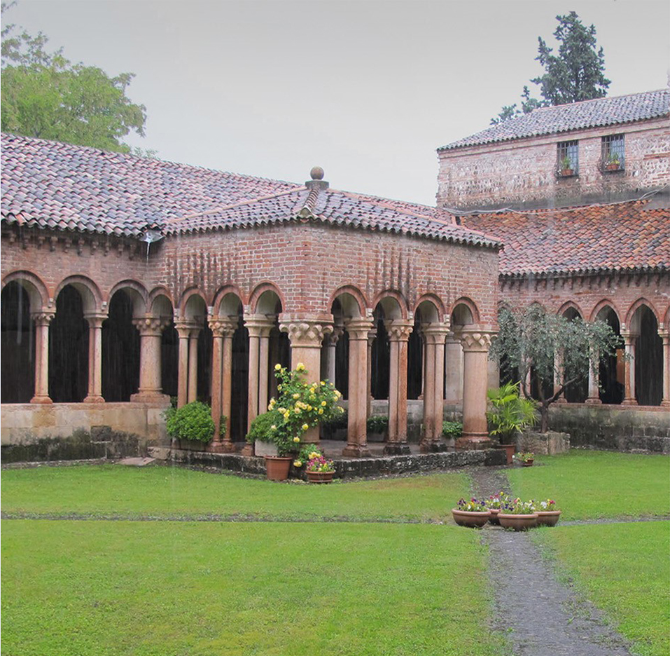
Comment |
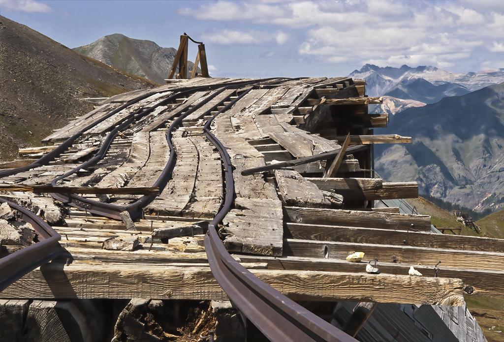
Hi Helen: That must have been a wonderful trip. It's hard to imagine that this structure has been around so long and holds so much history. I really enjoy your image but find several things to be distracting. First the column on the left and the white streaks on the right. I cropped the image, so they were eliminated as well as the right portion of the building. I then straightened the sidewalk with my perspective crop. I think this then shows the subject that you wanted to display. Your thought? |
Oct 8th |
 |
| 37 |
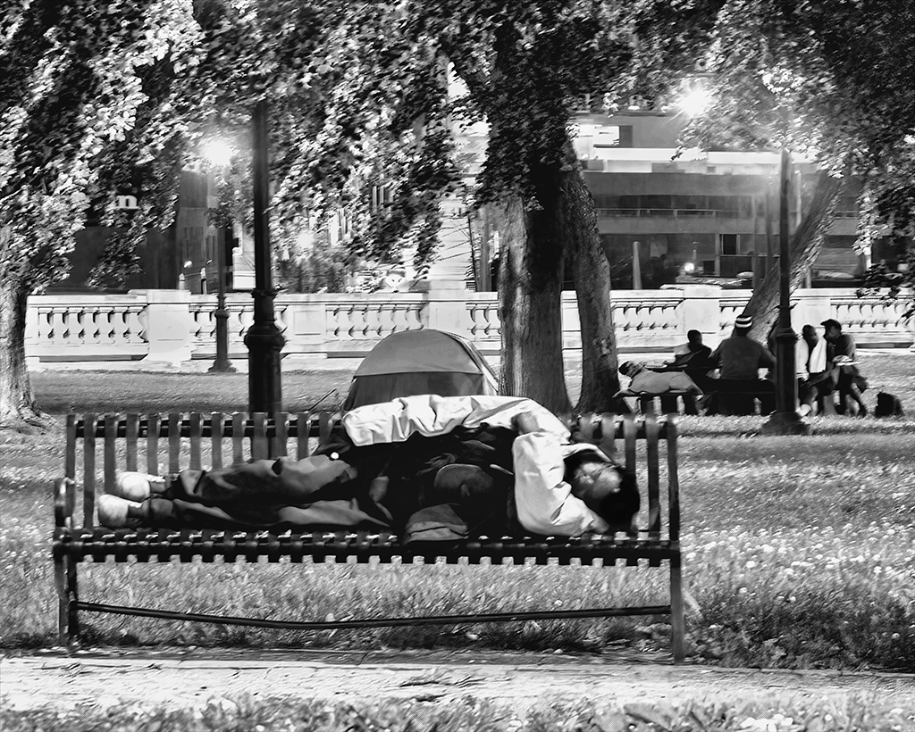
Oct 22 |
Comment |
Hello Howard: Although this image is not beautiful, it is timely. It's display of death for me interprets that the end is flowing, comfortable, and inevitable. Yet we still see life above the death. The image is flawless and leaves much interpretation from the viewer. This is exactly what an image should do. |
Oct 8th |
| 37 |
Oct 22 |
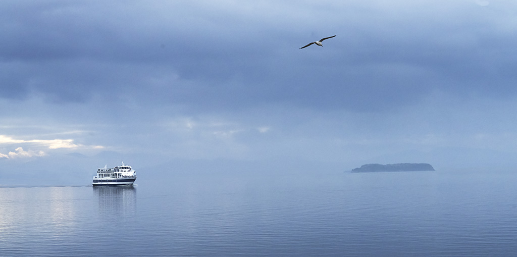
Comment |
Bob - Horse jumping always gives me butterflies at the wonder of this heavy athletic clearing the high boards. This image draws me in, and I am there. Pure perfection. Your efforts and planning in getting this image were well done. Love It. |
Oct 8th |
| 37 |
Oct 22 |
Comment |
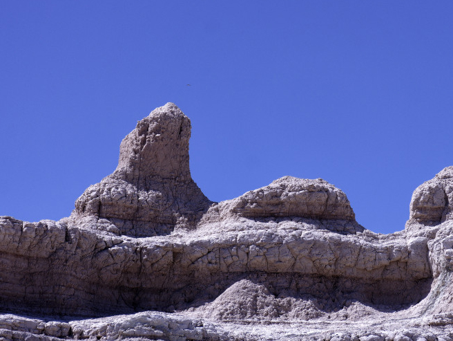
Hi Peter - This is such a fun image. Who doesn't love Snoopy? At first, I didn't see him. Then I read the title. I think if you crop off the distracting rock formation at the right and some of the sky, Snoopy is easily seen. I can't tell if the small smudge above Snoopy's nose is a bird or a smudge, but I would remove it. |
Oct 8th |
 |
4 comments - 2 replies for Group 37
|
10 comments - 4 replies Total
|