|
| Group |
Round |
C/R |
Comment |
Date |
Image |
| 37 |
Jun 22 |
Comment |
I also like the cropped version better. The cropped version is a perfect image to teach students about the impact of thirds. Every section has something a little different. Interest place with a great capture, Ham. |
Jun 18th |
| 37 |
Jun 22 |
Comment |
I love this image. I want to go there right now for the atmosphere and luscious desserts. I agree that the image is fighting for a subject, but I love that the people are not blurred out, because they are a strong second subject showing the joy of being there. Even darkened, my eye goes straight to the lamp. Perhaps darkening the lamp more or even removing it would help. |
Jun 18th |
| 37 |
Jun 22 |
Comment |
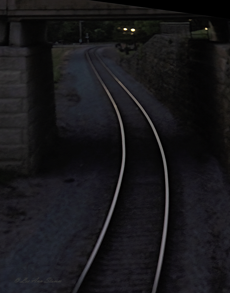
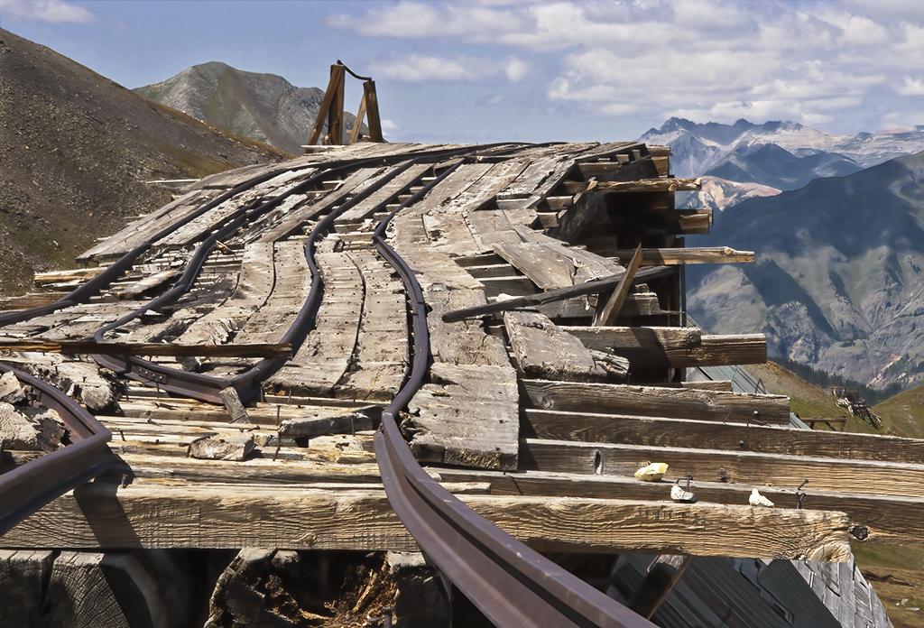
I love this image exactly as it is shown, Howard. Could you share which filter you used to bring out this gritty texture, which is perfect for the subject? Well done. |
Jun 18th |
| 37 |
Jun 22 |
Comment |
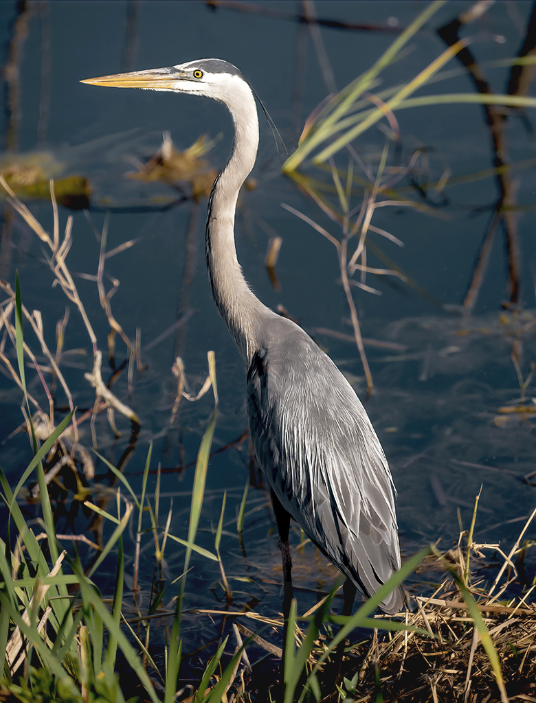
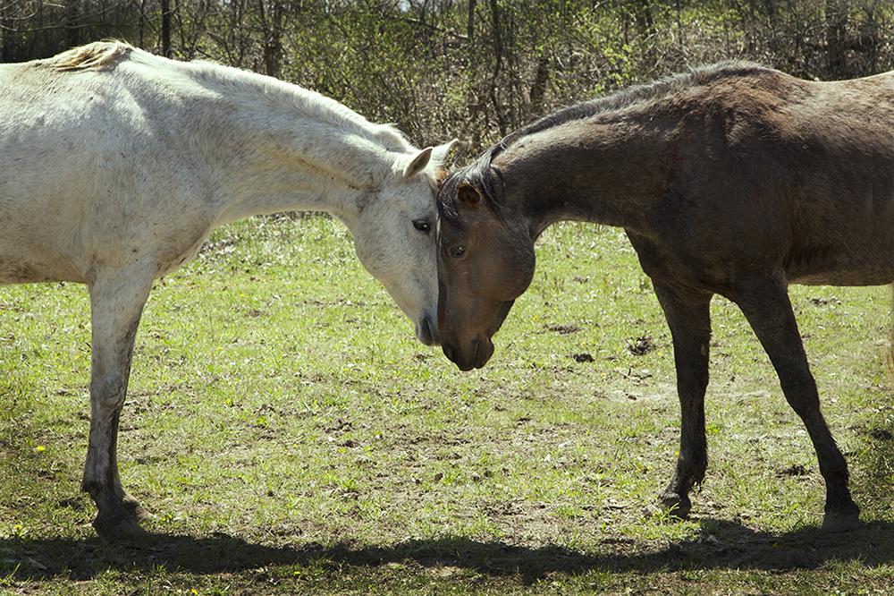
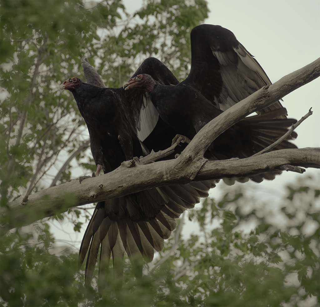
Bob, you have captured nature in its purest form. Beautiful image. |
Jun 18th |
| 37 |
Jun 22 |
Comment |
I like Ham's color correction, too. |
Jun 18th |
| 37 |
Jun 22 |
Comment |
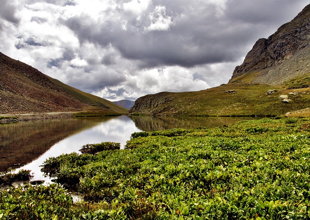
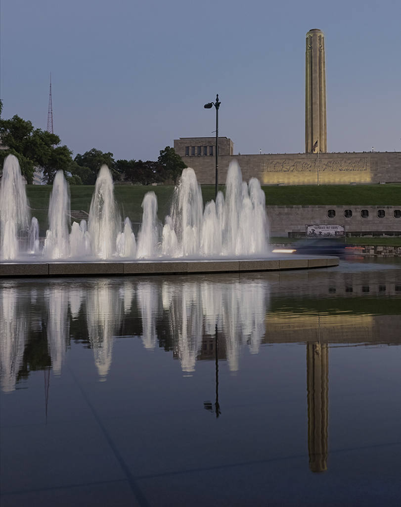
Peter, I love the color contrast you captured between the blues and browns. It is moody in a hopeful way compared to Peter Cheung's image that made you feel more wary. Both are really good in bringing out a mood. I disagree that you should crop at the top, which brings the horizontal line to the middle. I love the bottom of the image, but a crop there brings the horizontal exactly to a thirds line. I like the rocks in the image. They add another interesting element. The reflections in the water pool are wonderful. This is a fabulous capture at Yellowstone. You are so lucky to have gone in May as the park in now closed indefinitely. |
Jun 18th |
 |
| 37 |
Jun 22 |
Comment |
Gorgeous capture Peter. The impact of your image is moody and dramatic. The color of the sky is perfect and beautiful against the snow. My main critique is that the main fence on the left leads the eye right off the page. I think cropping into it where it intersects with the horizontal fence would draw the eye right to the crater, steam and then sky. To me the fencing then frames the crater. Great image - love it.
A question for everyone: If white balance is correct, would the snow be whiter with less of a blue tinge? I don't know. I still struggle with creating an image with a correct white balance. |
Jun 18th |
7 comments - 0 replies for Group 37
|
7 comments - 0 replies Total
|