|
| Group |
Round |
C/R |
Comment |
Date |
Image |
| 37 |
May 22 |
Reply |
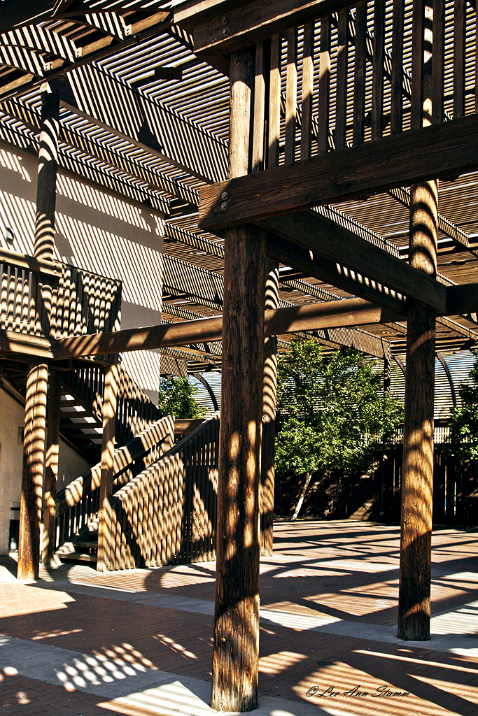
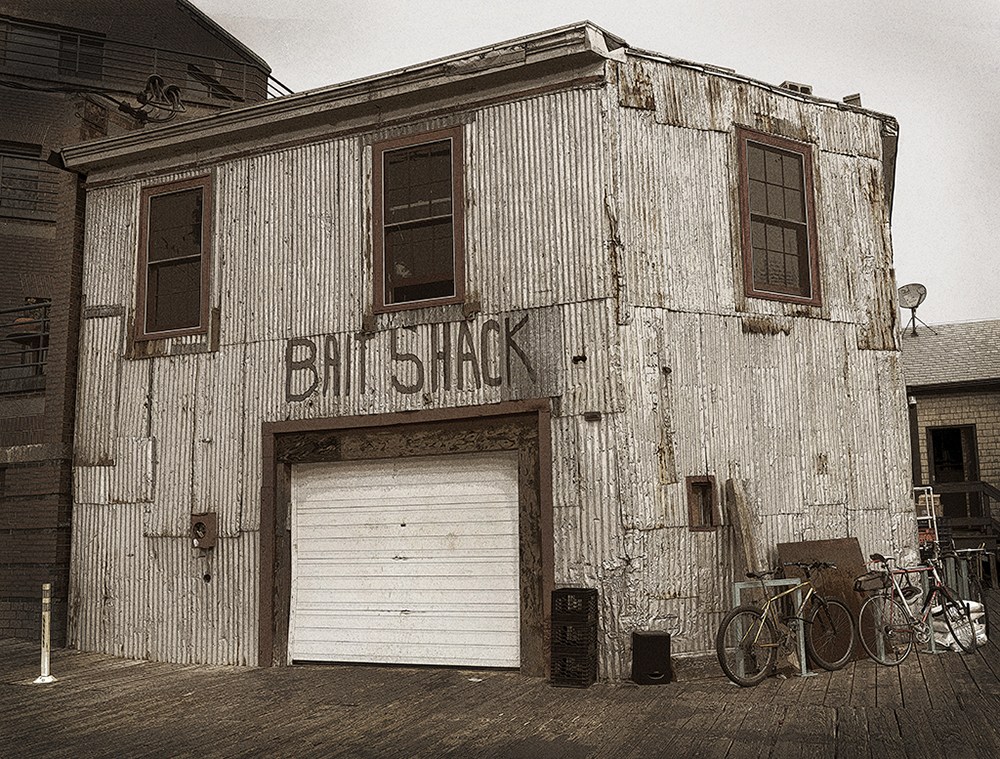
Ham: I like the pilings. They give me a sense of the sturdy, which lasts and what is washed away. This would probably make a good abstract, but I like the "real" that is portrayed here. |
May 26th |
| 37 |
May 22 |
Comment |
Helen: I love your image so much and was baffled by how you came up with your final presentation. As I said, I missed that particular Maryland Photo Alliance program. However, because I signed up, they offered a recorded version, which I watched. It was fascinating. Thank you for broadening my scope of practice by mentioning them. Great image. |
May 26th |
| 37 |
May 22 |
Reply |
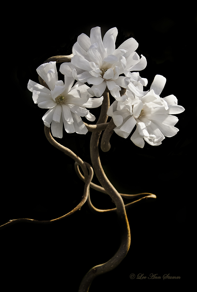
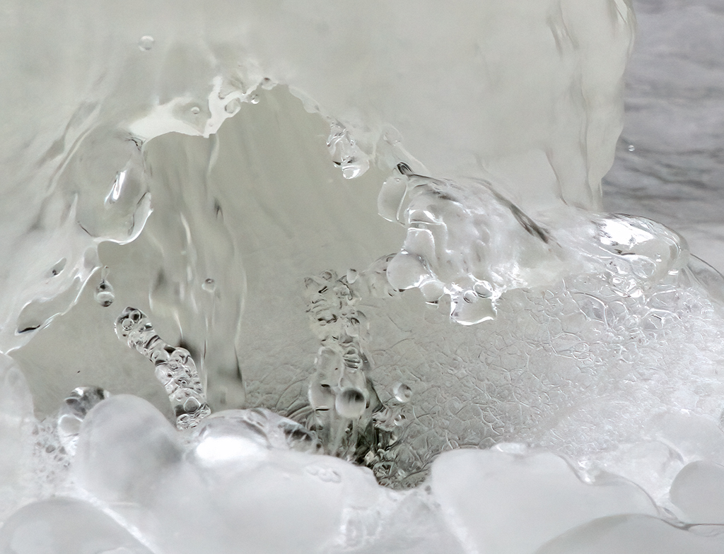
Bob: Really no stacking? Beautiful focus. I'm trying to figure out how this focus is so perfect. After reviewing the settings, was it a slow shutter speed that created this beauty? It was taken on a tripod and your lens was a macro, correct? With an ISO of 100, it seems it would be blown out. Could someone explain this to me? |
May 26th |
| 37 |
May 22 |
Reply |
Howard: The changes you made brought out a different and beautiful image. I like it. |
May 26th |
| 37 |
May 22 |
Reply |
Hi Peter: You are not the first to mention Silver Efex Pro. I will check it out. I plan to play with all the suggestions. Ham showed the use of light edges, but I will also try some dark edges. The foreground grass does feel too bright. Thank you for your comments. All suggestions are appreciated. |
May 26th |
| 37 |
May 22 |
Comment |
Group 37 + TJ: I have thoroughly enjoyed my first experience with this study group. I am here to learn everything I can, and it was fun hearing the different suggestions for this image. I plan to try each one of them and hope to show my original intention of making the mind go back to the struggles of the past. I can't thank you enough. |
May 23rd |
| 37 |
May 22 |
Reply |
Thank you Peter. |
May 23rd |
| 37 |
May 22 |
Reply |
Thanks Howard: I think pushing blacks would be interesting. When I look at this image, it doesn't really have the contrast I was originally looking to obtain. Good suggestion, I will give it a try. |
May 23rd |
| 37 |
May 22 |
Reply |
Hi Bob: Thank you for pointing out the large metal rim on the left-hand side of the image. Frankly, I never saw it there. Now that I have, it is distracting. Ham's image decreased its presence some, but I think it should be removed. Although small sprigs of high grass, their remove would also improve the image. Thanks. |
May 23rd |
| 37 |
May 22 |
Reply |
Hi TJ and thank you for all your suggestions. I just discovered presets and have been experimenting with them. Most of my images have been done the old-fashioned way with multiple adjustments or very few with the perfect image. You have forced me to look into adjustment layers again. For some reason, I can take a class or workshop on using them, but it just doesn't stick. I will also have to look into the Gradient map, which has been a complete enigma to me. |
May 23rd |
| 37 |
May 22 |
Reply |
Hi T J:
Let me start by saying this is the third time I have typed this. We are traveling in the fifth wheel with no internet. This phone keeps getting me out of the site and, I lose everything. I'm going to send my reply in separate emails just to get them to you. |
May 9th |
| 37 |
May 22 |
Reply |
Hi Ham: I agree that the vegetation is distracting, but was uncertain how to remedy the problem. The vignette and yellowing were perfect suggestions. I love the results. Thank you for your suggestions and the example. It was so helpful. |
May 9th |
| 37 |
May 22 |
Comment |
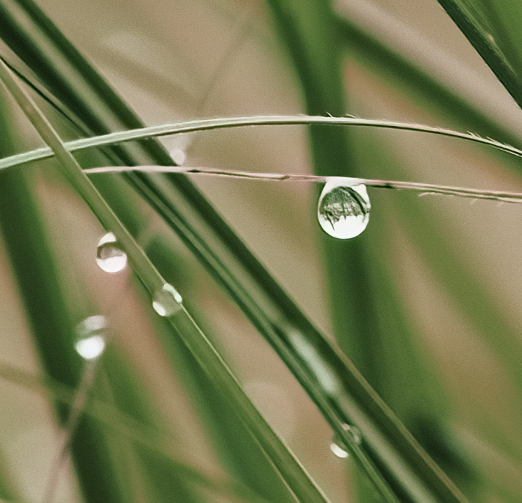
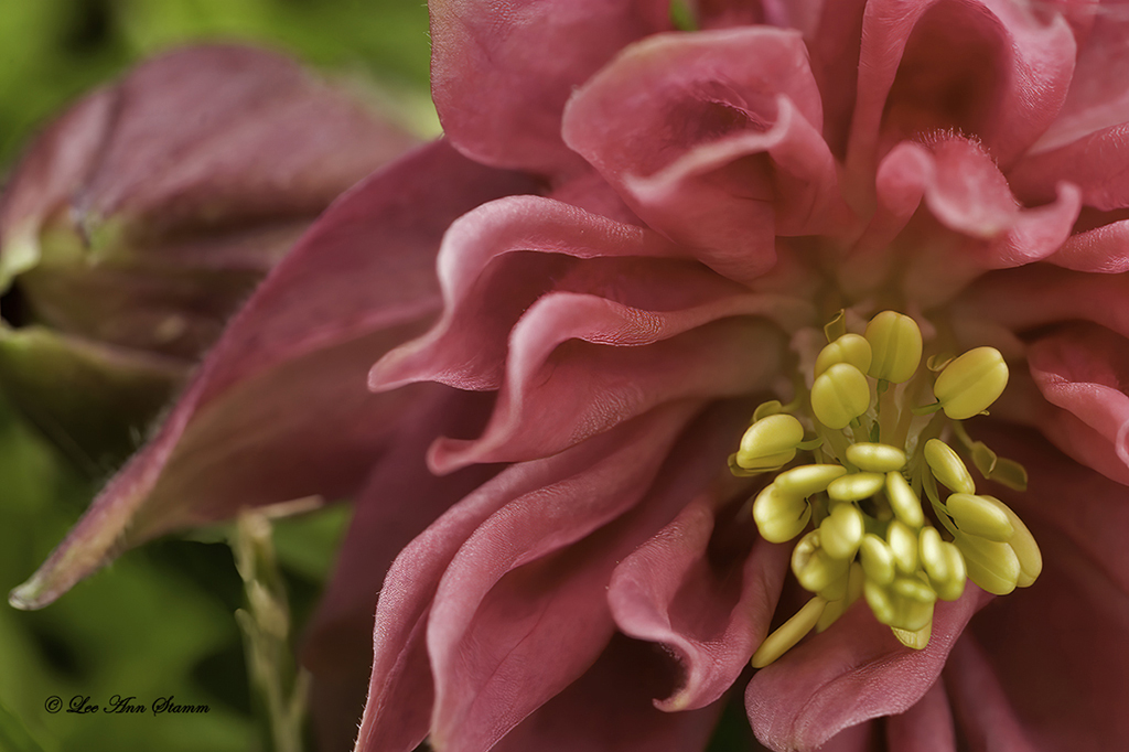
Hi Bob: This iris is stunning with its vibrant color and sharpness. Did you use stacking on this image? If so, well done. My only criticism is that the liquid on the petals does not look real to me. Did you use an oil? The drops are just so big and distracting. The first place my eye goes is to the drops in the foreground. If these are truly rainwater or sprayed water, I apologize to both you and Mother Nature. |
May 7th |
| 37 |
May 22 |
Comment |
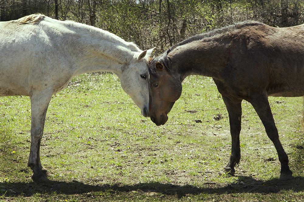
Hello Ham: Your explanation of intent was so good. I look at this old building fading away in the water and yes, I see shreds of past lives going with the building. This is an interesting use of reflection. I don't have any comments that might improve this image. Good job. |
May 6th |
| 37 |
May 22 |
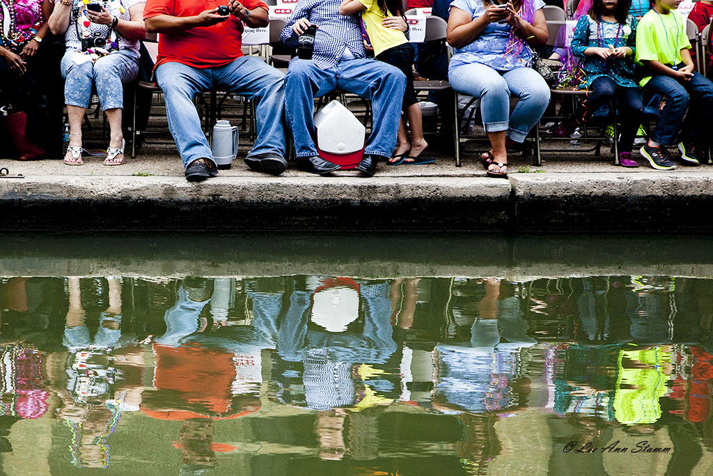
Comment |
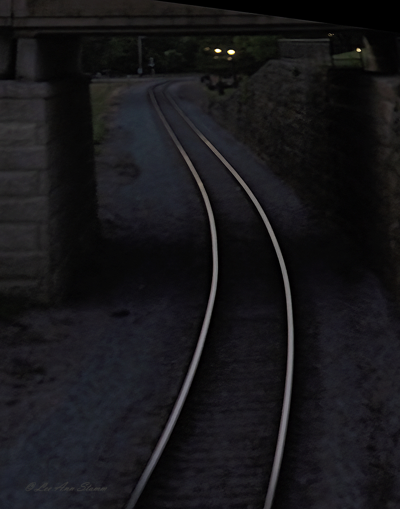
Hi Helen: I love the Maryland Photography Alliance, but I missed this webinar. Your image makes me wish I saw it. This is so interesting, and I thought this was architecture when I first saw it. The diagonal lines draw the viewer right into the middle and then encourages a sneak peek at the background. I love this. It is hard to see that this comes from a stack of chairs. I have no idea how you achieved this image from Original 1. Great job. |
May 6th |
| 37 |
May 22 |
Comment |
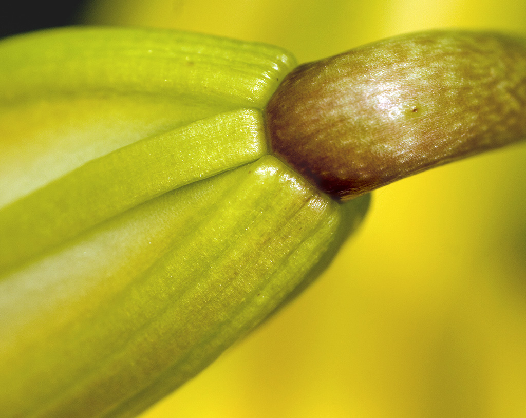
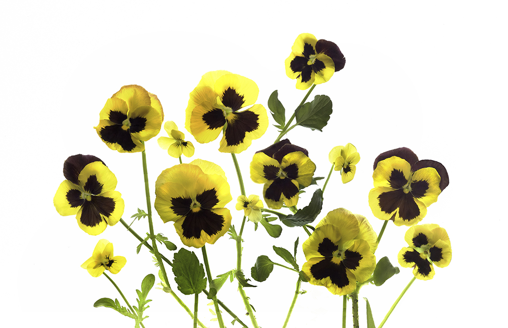
Hi Howard: I love the composition of this image, with the fly contrasting with the yellow and white. The little squiggles of white in the center as so fun. The focus is right in the center where it should be, but the slightly blurred, tube-shaped petals make a perfect frame for the subject. Your use of Topaz was not overdone, which is a common problem. Like Ham, I find the green outside the flower to be a little distracting and perhaps changing the entire background to black would work better. Nice image. |
May 6th |
| 37 |
May 22 |
Comment |
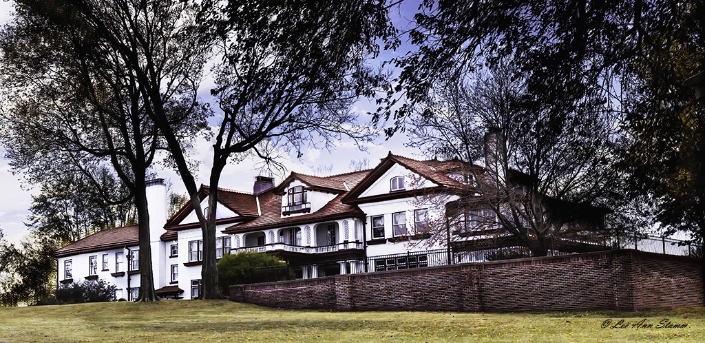
Hi Peter: I have never seen a skyline picture of San Francisco. It is very impressive. I am thinking that your intention was to show the size of the city, which does seem to go on and on. I hope you don't mind that I have a couple of comments and suggestions. First, to me the buildings seem to be chopped off at the bottom. I think if you shot just a little lower to get the base of the buildings it might have been a better shot. Secondly, you might take the blur tool and try to blur the smaller buildings to make the viewers eye go to one subject - the large buildings. Thirdly, if your software has a perspective crop, it will fix the buildings on both sides that have camera distortion leading to buildings that look like they are leaning. It's great to see San Francisco. I'd love to know more about the larger buildings.
Lee Ann |
May 6th |
| 37 |
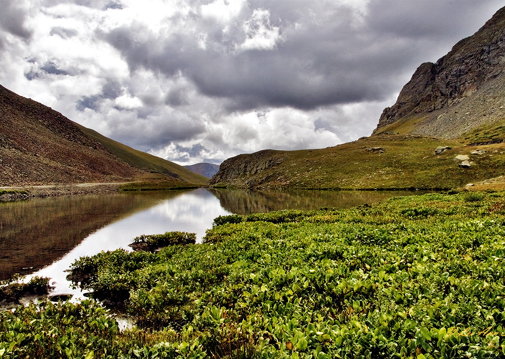
May 22 |
Comment |
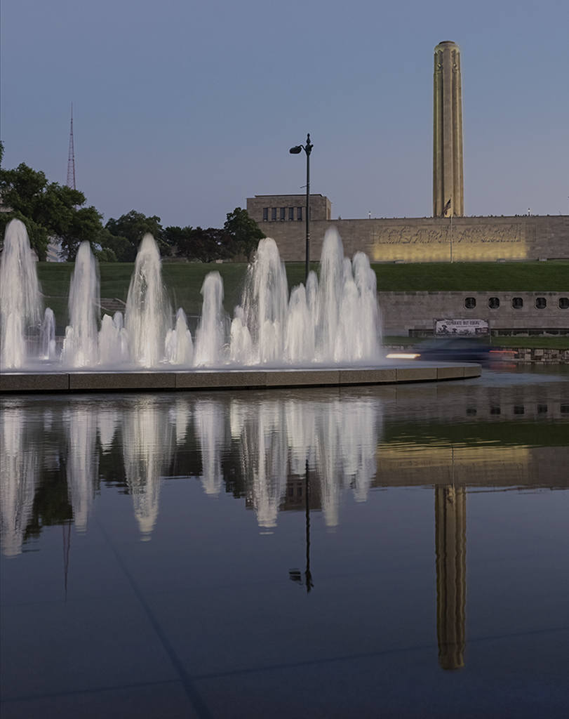
Hi Peter: You have gorgeous color in the city buildings and water. It shows a great use of reflection. My one comment would be to take the city off the midline by cropping out all of the blue water in the foreground. If you hold up a piece of paper over the blue, I think you will notice a big difference.
Lee Ann |
May 6th |
8 comments - 10 replies for Group 37
|
8 comments - 10 replies Total
|