|
| Group |
Round |
C/R |
Comment |
Date |
Image |
| 30 |
Feb 23 |
Comment |
Good composition and a panorama look. I like the way the line of balls leaves the frame and that they diminish in size as they do giving depth to the scene. Did you lighten the right ball in editing? You might try flipping the image so the lightened ball is on the left. Since we read from left to right and are drawn to the brightest area of an image, this may work better, but it is your image. It would be nice to be able to remove the distracting black area between the 2nd and 4th balls. I like the image and especially in black and white. |
Feb 10th |
| 30 |
Feb 23 |
Comment |
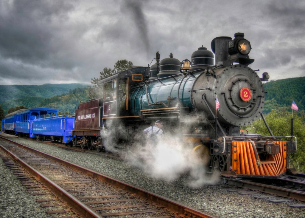
The two people hugging, the train coming in, the snow and all the detail of the wires, towers, rails and other structures make for a very interesting image, one I spent more time looking at. Nice image. I like the composition and placement of the two people, train and tracks. I'd also take the object out by the people's feet. If my photo computer was not in the shop I would try a version of this by making a partial B&W. I'd leave the people and station platform in color, but make the rest of the image B&W. Just a suggestion. By the way, did you edit in any additional snow? |
Feb 8th |
| 30 |
Feb 23 |
Comment |
We are fortunate in Washington to see Sandhill Cranes during their migration. Your image is a nice capture of these birds. Good focus on the heads. I like the sharp birds and blurred fore and background effect you created. Ho mentioned the two bird's heads not separated. Sometimes photographers have to take the shot that's available at the time. I agree with Dorinda that the bird on the left should be cropped out. I find it distracting, especially since it is the only bird with its head down. Nice image though. |
Feb 8th |
| 30 |
Feb 23 |
Comment |
Old military installations are something I like to photograph as well. I would like to know the ISO you used and if you did add sharpening to the image.
Good composition with the placement of the building with less sky and more foreground. As suggestions: the image appears to have a soft focus which was sharpened. It could be my monitor. The yellows and oranges hue could be adjusted and the saturation toned down to make this an even better image.
|
Feb 8th |
| 30 |
Feb 23 |
Comment |
This is a nice example of street photography and keeping your eyes open for opportunities. It took me a moment to determine this was wall art. The composition, sharpness and use of sepia color to help date the scene was well thought out. The street's arrow and white line, along with the moving subject help identify the subject being the wall art. Well Done. |
Feb 8th |
| 30 |
Feb 23 |
Comment |
Your image brings back memories of Yellowstone. Nice contrast of colors and tone - dark sky and trees behind the lighter landscape. On my monitor the sharpness is a little soft and the highlights a bit too bright. Maybe applying denoise and some sharpening might be beneficial. Other things you might try would be to lighten the sky enough to see more cloud detail and to allow a better silhouette effect of the trees against the sky. |
Feb 8th |
6 comments - 0 replies for Group 30
|
6 comments - 0 replies Total
|