|
| Group |
Round |
C/R |
Comment |
Date |
Image |
| 30 |
Oct 22 |
Comment |
Thanks for your responses. I note Robert feels the rose is close to blown out and he likes the rose flipped. I can see his points, but those to me are personal choices which come down to what you the photographer wanted to show. For my taste, I like your placement with the rose on the left and angled to the right. We read from left to right and top to bottom so to me it is a natural placement. I also like the brightness of the image as it looks like an early morning shot where flowers are brighter. Is that what you were going for? |
Oct 7th |
| 30 |
Oct 22 |
Comment |
I like the placement of the rose, with its center in the upper left and the rose itself angled 45 degrees to the lower right. Very nice. The surrounding flowers' color and texture work well with the rose. I do have a couple of questions. 1) did you use a color or photo filter in post-processing the entire image? 2) to me the lower right rose pedal seems not quite as sharp as the rest of the flower. Was that a planned effect? |
Oct 6th |
| 30 |
Oct 22 |
Reply |
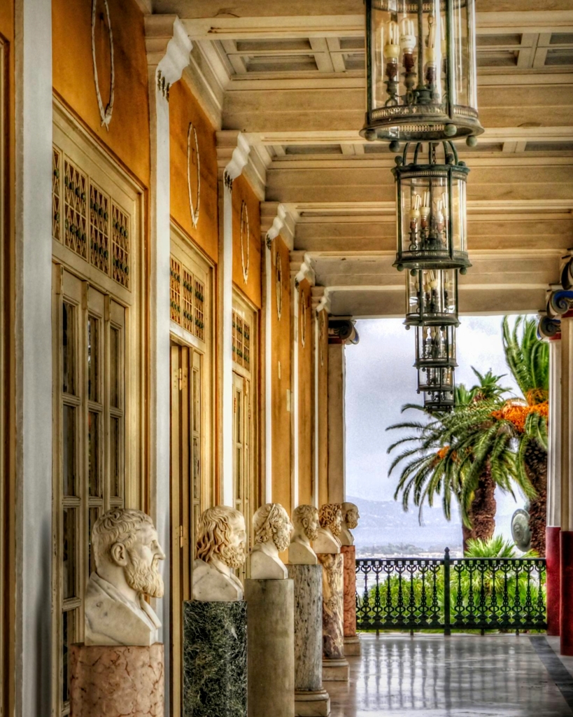
Thanks for your comments. I used HDR because of the high dynamic range of this scene; that is what I use HDR for. You commented on the left wall being unnaturally bright. Yes, I purposely made that area brighter to draw attention to the old statues and palace wall as one's eye moves to the light background. The reason more columns on the right are not showing is because of the telephoto zoom setting used to get the compressed image I wanted. There was no way to get the compressed scene wide enough for all the columns. And your last comment concerned what you called curious distortions. I don't know what you are referring to. The palace is 150 years old and maybe what you are seeing are imperfections caused by age and construction. |
Oct 4th |
| 30 |
Oct 22 |
Comment |
This scene was made for black and white. You did a nice job of processing the final image. I like the simplicity of the scene with the two subjects and their shadows. The only thing I might suggest is to try a version of this image that removes the street drain in front of the bike. |
Oct 4th |
| 30 |
Oct 22 |
Comment |
The bridge is the subject, but you also have those clouds and water reflection which makes for an image of three interesting parts. If you had the opportunity, you might have shot this a little later or earlier in the day for a bit more contrast, but the current image is fine. What I might also suggest is to add a glow filter, but with less effect to the sky. It might give the scene more pop. |
Oct 4th |
| 30 |
Oct 22 |
Comment |
The cloud's color fits well with the dark surroundings of the reflection. The placement of the clouds provides good composition. Just as suggestions to try: you might crop down the top to remove the non-reflective dock areas, remove the right lower object mentioned by Dorinda and I would bring up the reflected shadows a bit to show a little more detail in the scene. |
Oct 4th |
| 30 |
Oct 22 |
Comment |
Very nice silhouette against a colorful sky and clouds. Good composition and balance. The lights and sign in the scene create for me more interest and I want to explore the image more. I also would like to see the power lines gone as they are distracting. But, sometimes, like in this image, removing would be too difficult and you have to take the scene as it is. |
Oct 4th |
6 comments - 1 reply for Group 30
|
| 42 |
Oct 22 |
Reply |
Thanks for providing your reasoning. |
Oct 5th |
| 42 |
Oct 22 |
Comment |
I like the cropped image subject, but it is not sharp. Thanks for showing you original image in your response to Michael. As you say, your submission was a drastic crop and therefore I see that as the main reason the submitted image is somewhat blurry. Also looking at your original image, I wonder why you would focus stack and not just use a small aperture to cover depth of field, I assume you are using a tripod anyway. |
Oct 4th |
1 comment - 1 reply for Group 42
|
7 comments - 2 replies Total
|