|
| Group |
Round |
C/R |
Comment |
Date |
Image |
| 85 |
Nov 25 |
Reply |
Oh, and one last thing I wanted to add about this image. I really like how the shadow of the tree is tying together the two main subjects of the photo. It is almost a leading line between the tree and the tractor, so that the eye goes back and forth between them. And when the eye goes to the tree, it is nice to enjoy the detail in the sky above it! |
Nov 30th |
| 85 |
Nov 25 |
Reply |
Thank you, Richard. Yes, an overnight, or perhaps a week-long stay. I'm considering that for the future! |
Nov 30th |
| 85 |
Nov 25 |
Reply |
Thanks for the comment, Lisa. By too hot, do you mean too warm colors?
But, yes, it wasn't the best lighting. Now that it is snowing here in Milwaukee, I'm wishing I could get up there and get a shot of this lighthouse in the snow!! |
Nov 30th |
| 85 |
Nov 25 |
Reply |
Thanks, Patrick. I agree. It is one of those pictures I look back at and think of how it could have been so much better if the light had been good. Amd I agree about cropping some off of the left, but I didn't because I was trying to maintain the 16X9 aspect ratio (because I used it on the screen saver on my big screen TV). Guess for other purposes, I should have considered the narrower aspect ratio!
I do appreciate the longer focal length on this drone. I took this shot with the 70 mm camera. |
Nov 30th |
| 85 |
Nov 25 |
Reply |
Thanks, Lou. I would also like a closer view of the lighthouse and cliff. I didn't spend a lot of time flying around the area because I knew the light was not optimal. But if I reshoot, I will certainly get that view. I turned the drone around, and there was a rocky island along the shore that was just beautiful. I fired off a few shots, but if I'm there again, I will explore the whole shoreline with my drone!... presumably with better light! |
Nov 10th |
| 85 |
Nov 25 |
Reply |
Thanks, Pete. I think this is a shot I'm going to label as needing to be reshot. The only problem is, it is an 8 hour+ drive to get up there, so I won't be going there very often. But it is such a beautiful area, I certainly hope to return! |
Nov 10th |
| 85 |
Nov 25 |
Comment |
Nice composition. I don't have a problem with the tilt of the bridge... it looks very natural to me. What I think you could do is pump up the fall colors a little more to make the image pop (but then... I wonder if all my fall images are starting to look overdone when I do that. So if you choose not to, I understand!).
There is a brand-new Variance slider in Lightroom (under the Point Color panel) that I would recommend you play around with. It brings colors either closer together or further apart, and does some interesting stuff to fall foliage.
|
Nov 10th |
| 85 |
Nov 25 |
Comment |
What Pete said! It is a good composition. I recommend desaturating the top half of the photo (and straightening the horizon, of course). The problem with the saturated colors in the top half is that you lose the depth in the photo. Landscapes fade the further away they are. A background should always show the natural softness and haze with distance to give it a feeling of depth in the image. I would suggest toning down the greens in the trees on the left, too. I love the texture in the foregound! |
Nov 10th |
| 85 |
Nov 25 |
Comment |
I particularly like the V-shape of the cranes in this photo. You might want to try to brighten up the area of the bridge and the supports that are being constructed. I agree with Lou about the trucks on the bottom. You also have a little bright spot in the lower left corner. I would recommend cropping to the top of that bright spot. That would take out most of the trucks, and you could use the remove tool to remove the rest (as well as the portable toilets if you wanted). But be careful not to crop too close to the bottom of the crane. You don't want it touching the bottom of the picture. |
Nov 10th |
| 85 |
Nov 25 |
Comment |
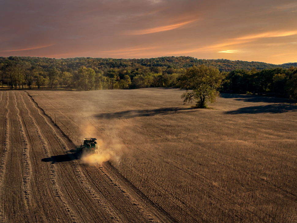
I think the sky replacement is perfect. I would urge you to try to match the color of the sky in the field, especially in the smoke/dust around the tractor.
I agree with Pete about the composition, but I disagree about what to do about it. I would suggest cropping it on the left and bottom, and putting the tractor near the 2/3rds mark. You would lose the slightly crooked pattern in the field... it has a little bit of interest, and you would also lose a bit of that pretty blue in the sky on the left, but I think the dust and right side of the sky, with the single tree on the right, are what this picture is all about, and would really pop! Especially if you added that sky color to the dust.
Here is a quick and dirty edit of what I had in mind... |
Nov 10th |
 |
| 85 |
Nov 25 |
Comment |
Lovely picture, Lou! I think the composition is really good! The land and the tree area in the lower left quadrant looks a little crunchy to me... like it has been oversharpened. I would try to soften it up some. Also, I suggest warming up the colors in that area, especially the sand. I think it would blend well with the warmer colors in the water and sky. You might try to add a little of that sunrise color to the right edge of the lighthouse, too. Sometimes the white lighthouses capture the colors around them quite well and almost seem to glow just like the water.
One tiny thing... that reflection of the cloud in the water on the right side of the sunrise captures too much of my attention. I thought maybe it was rain falling near the horizon, and I stared at it an inordinately long time trying to figure it out. I decided it was just the cloud reflection (I could be wrong) but it drew my attention away from the main subject. I recommend trying to tone it down a little bit (you might need to use a luminosity mask to separate the tones as you brush on a little of the orange-yellow color to tone it down).
Still, a beautiful picture you can be proud of!
I love the Michigan lighthouses, but it is so difficult to get over to that side... Chicago gets in the way, and the ferries are ridiculously expensive! :) |
Nov 10th |
| 85 |
Nov 25 |
Comment |
I love the location (beware of trying to get there during or after it's been raining... the mud sticks to tires so much and makes it very difficult, even for a 4-wheel drive!).
I'm ok with the b&w, but I see two issues with it. The large black shadow occupies too much of the photograph and stalls the viewer's eye for far too long. It looks almost like an abstract in the middle of this photo. I wonder if you lighten it up some if some of the detail there can be recovered, so that it's not just a big black splotch in the middle of the photo.
The other thing is that I think there is too much mid-tone gray in the photo. The canyon floor across the middle is the brightest area, and it also is pretty gray. I think it could be lightened up, and perhaps light up some of the sky above the horizon to match.
|
Nov 10th |
| 85 |
Nov 25 |
Comment |
I don't mind the colors so much, and I see lots of places around here where there is a bright patch of color leading off to trees that look a lot more dull. Still, I think you could have pumped up the colors in the background a bit more. I agree with Pete about the composition. Also, there are blown-out spots in the clouds, although looking at the original, I see you have recovered quite a bit. |
Nov 10th |
7 comments - 6 replies for Group 85
|
7 comments - 6 replies Total
|


