|
| Group |
Round |
C/R |
Comment |
Date |
Image |
| 85 |
May 25 |
Reply |
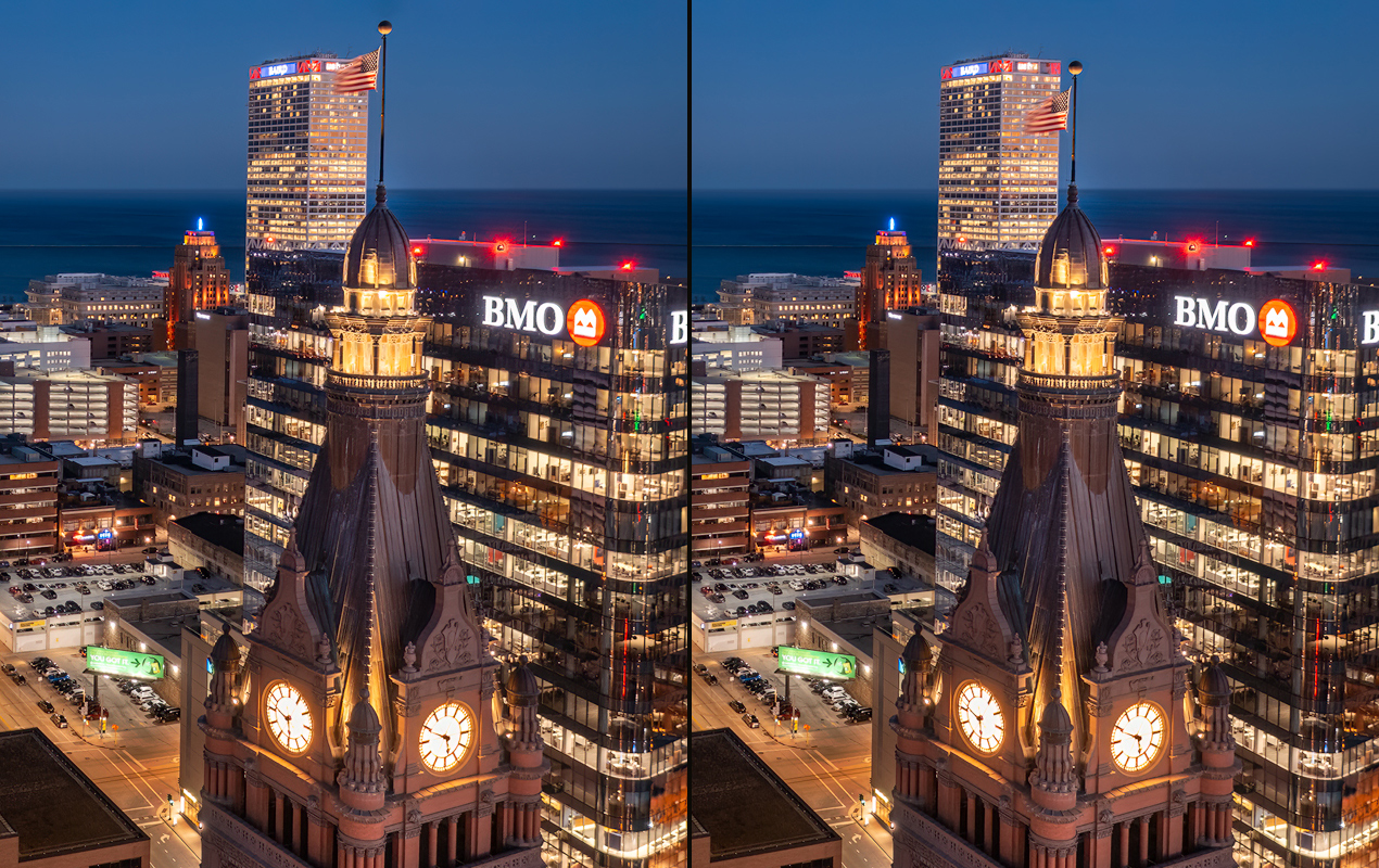
Thanks Richard. I want to go back down there sometime soon when the weather is warmer (still quite cold here in Wisconsin) and fly up and get several views of the facade and the clock tower. The top of the clock tower has some beautiful details. |
May 24th |
| 85 |
May 25 |
Reply |
Thanks Lou. I do think that the top is a little tighter than I would have liked, but I agree that I don't want to add any more sky in the image. But it gave me the idea of moving the flag and pole down since that is the thing that is closest to the top edge of the image.
So I played around with it. I used object select to copy the flag and pole onto another layer and moved it down. Then I turned off that layer and used Generative Fill to fill in the top corner of the building. Here is the before and after. I'm not sure I like it, since it makes the flagpole at the top of the clock tower look out of proportion, but it did solve the problem of being too close to the top!
:) |
May 24th |
 |
| 85 |
May 25 |
Reply |
Thanks Pete. Yes, I agree, I wish I had a little more on the right. I went back to the original image to see if I had cropped off any on the right, but nope! I stitched a bunch of images together to get this view, and the originals didn't have any more on the right either.
I guess that means another trip downtown to shoot it again! :) |
May 24th |
| 85 |
May 25 |
Comment |
I agree with the others about the snow being a nice addition in this photo. And I like how the leading lines lead the eye across the quarry and into the hills, and then on to the mountains. I'm ok with the level, but perhaps if I saw a version a little higher I might agree it would be better. I'd have to see it.
As far as the slightly cyan sky... Lightroom and Photoshop tend to turn sky colors cyan when processing. Adding a little magenta back into the blues will help neutralize the effect and make the sky look a little more natural. |
May 24th |
| 85 |
May 25 |
Comment |
Great processing to bring attention to the inside of the stadium! However, the light colored concrete and the highway probably should not have been lifted quite so much. Those areas almost got blown out and draw too much attention (the viewer's eye typically goes to the lightest areas in a photo first)
Yes, I agree with the others that it is a little too tight. The edges of the stadium should not be so closely touching the edge of the photo.
But otherwise, great shot! |
May 24th |
| 85 |
May 25 |
Comment |
Hi Lou. I also love the addition of the people in this photo. And such beautiful colors! When you added contrast, I think you lightened the hills a little too much. Adding contrast is ok, but I think it should have remained a little darker, because the sun is behind the hills and it should not be so bright on the back-side.
I agree with Pete about the horizon line. You probably don't want to crop off the clouds at the top anymore than you already have. One trick I occasionally use when I want to reduce the sky area and put the horizon at a better location but don't want to lose any clouds or sky color, is to use the transform tool in Photoshop to vertically shrink the sky area a bit rather than cropping (to do this, use a rectangular selection on the sky, use Transform > Free Transform, and while holding down the shift key so it shrinks only in the vertical direction, pick up the handlebar at the top and move it down. Then you can crop off the top of the image you don't need anymore. Sometimes it puts a single pixel-wide line at the bottom of the transform, so look out for that, and remove it if you need to)
You might also want to make the horizon look more level. I know the hills might be angled, but sometimes I rotate the horizon a bit so it doesn't look tilted even when it is not. And cropping off the right to put the people at the 2/3rds line will not lose very much.
Here is a quick edit I did. The changes are subtle, but I think they make a difference (when I darkened the image a bit, the sky color got more intense, but I'm not sure if that was good... the lighter sky color seems to be a little more pleasing). |
May 24th |
 |
| 85 |
May 25 |
Comment |
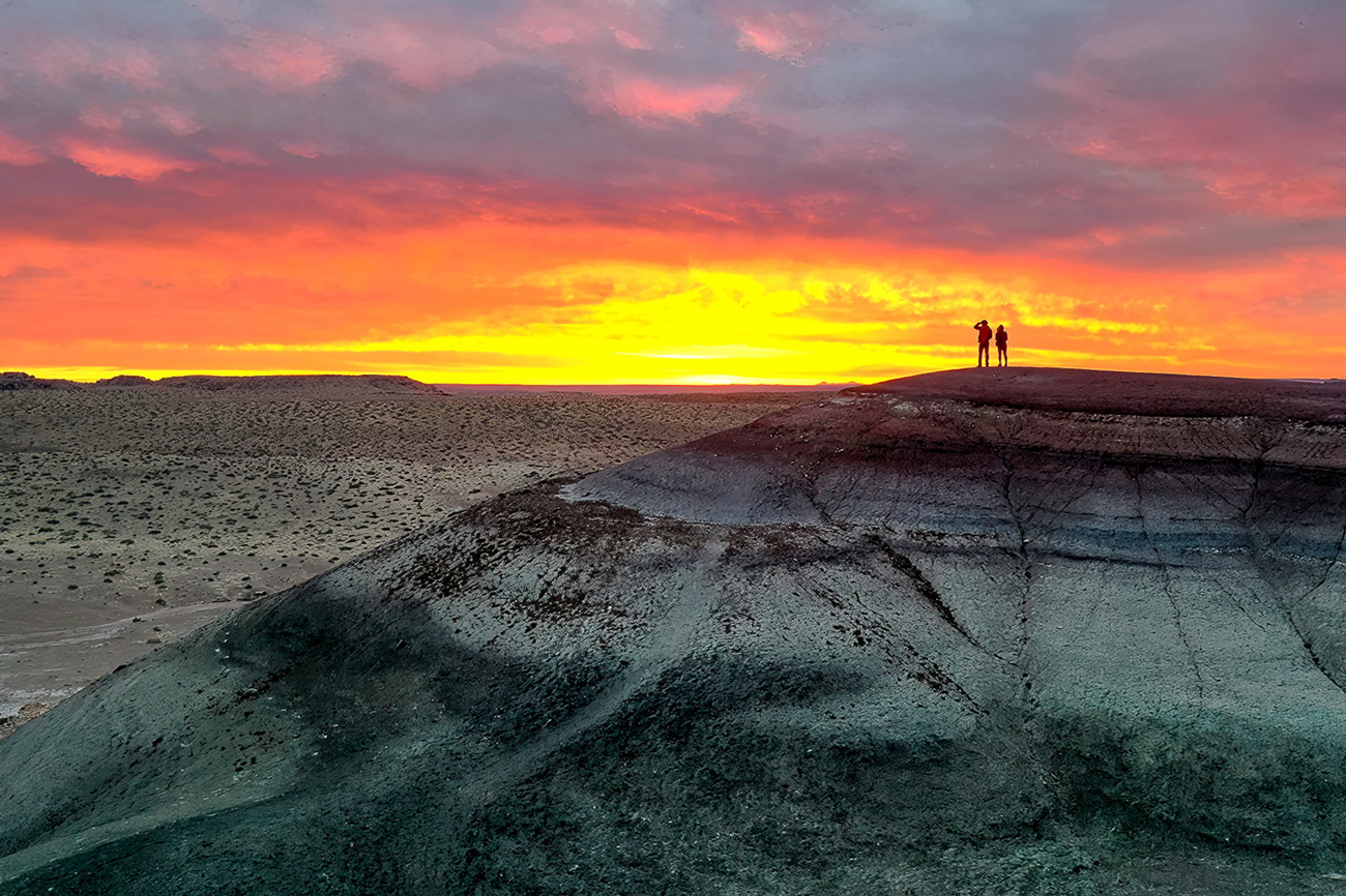
Hi Pete. I like the warm colors. I think there is a little too much fog though, especially for such a small subject. It obscures the subject even more. I would remove some of the fog around the hill. Also, if you remove some (or all) of the fog at the bottom of the image, it will give the image more depth. Since the foreground is closer, it should have less haze and fog.
I also wish the subject were a little larger, but on the other hand, I like the hills and the valley in the image. Beautiful scene! |
May 24th |
| 85 |
May 25 |
Comment |
Hi Lisa. While I appreciate what you were trying to do with B&W and making the image more abstract, I personally prefer the color version. I also like the wider crop. The original is less abstract and it is obvious you are looking down on a building that has been destroyed. I feel it tells more of a story than the more abstract version.
But if you darken down the mid-tone greys in the B&W, I also think it works as an abstract image! |
May 24th |
| 85 |
May 25 |
Comment |
I also love this image. The B&W is an interesting way to handle this iconic location, and shows the drama of the peaks. Unlike the others, I don't mind the space at the top so much... perhaps crop a little. But I like how it shows the environment and creates depth in the scene. I would rather see the highway removed from the background.
Good job! |
May 24th |
6 comments - 3 replies for Group 85
|
6 comments - 3 replies Total
|


