|
| Group |
Round |
C/R |
Comment |
Date |
Image |
| 85 |
Jun 23 |
Comment |
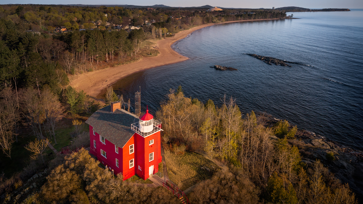
I just wanted to thank everyone for all the comments. I made some changes some of you recommended...I cloned out and darkened down some of the buildings, and I spent some time trying to correct some of the perspective issues. I learned a lot about using the tools to correct some of the angles.
The Transform tool using the guides in Lightroom didn't work very well at all. I tried using the Perspective Warp in PS, but that didn't work so well either. Both of those tools manipulated the entire photo too much. I settled on using the Puppet Warp, but it was hard to control. I wish Adobe would create such a tool where you can control how much it curves things (be able to lock down a set of pins and keep the lines of adjustment straight between them). I had to do some cloning in the end to straighten out some of the lines it curved.
Here is my final cut. |
Jun 30th |
 |
| 85 |
Jun 23 |
Reply |
Hmmm, that's interesting. Do they allow cloning or spot healing? Because those tools are not really that different. |
Jun 15th |
| 85 |
Jun 23 |
Reply |
I probably wouldn't enter the expanded version into a competition... I would enter the original 2X3 real version.
But that brings up an interesting topic... that these would not qualify for a reality-based division. Yet in this case it isn't all that different than the content aware fill I've used many times to fill in the edges of smaller areas on the edges of a photo... such as when I rotate an image but the confines don't quite fit into the image and leave small white (or translucent) triangles in the edges, especially after perspective correction. I guess it can be argued that the content aware fill copies patterns or areas from within the image, while the Generative AI goes out and looks at similar patterns outside of the image.
I did read an article the other day that people who use Adobe's AI (and possibly other companies who will plant meta-data into images that use generated AI to create pixels) will lose their copyright. That gave me pause. |
Jun 15th |
| 85 |
Jun 23 |
Reply |
You mean using Free Transform on the red lighthouse?... or the white buildings at the top? They are so tiny but I can see they are slanted when I zoom in. If I leave them there I should straighten them, but I intend to try and make them less noticeable. If you mean the red lighthouse, then yes, the angle has been bothering me too. It should be easy to fix in Lightroom with Transform Guides though. |
Jun 11th |
| 85 |
Jun 23 |
Reply |
Ha ha! I like it that part of the ship is red to match the lighthouse. However, that boat would be very tiny... perhaps someone is driving a toy boat remotely :) |
Jun 11th |
| 85 |
Jun 23 |
Reply |
Thanks Alex. I had looked at how it worked if I cropped out the sky a bit below the horizon, but it didn't work as well. I didn't want to give too much emphasis to the sky, so I made it quite narrow. I'm ok with the position of the horizon and I don't really think it would help the picture much if I made it a larger sky. I also like the interest that the rocks add to that area. But perhaps they are a little too dark, so I might try to lighten them a little. Thanks for the suggestion.
|
Jun 11th |
| 85 |
Jun 23 |
Reply |
Hi Don. Thanks! Yes, the resolution of the filled-in sidebars is very noticeable if I select the entire side and have the generator fill it in. If I do it in sections restricting the selection to 1024 pixels, then the resolution looks fine. However, I use a lot of adjustment layers and masks in my PSD files, so when I expand the image to 16X9 the masks only go to the original aspect ratio. So I have ended up trying to fix those first, and then turning off all but the base layer when I generate the sides. Some masks are easy to fill in, others are more difficult, especially those where I previously used a luminosity mask. I could turn on all the layers and generate the sides with all layers turned on, but that would make it much more difficult if I ever want to go back and change an adjustment layer or mask. |
Jun 11th |
| 85 |
Jun 23 |
Reply |
Thanks, Lou. I left those two buildings in because a person familiar with the area would notice them missing, especially the dome one (it is the 4th largest sports dome in the world, and the 1st largest dome made from wood). I think the locals would notice them gone if I cloned them out. I do see what you mean though, so I shall go back and try to darken them a little so they don't stand out so. |
Jun 11th |
| 85 |
Jun 23 |
Comment |
Hi Alex,
Interesting view of the scenery in that area. I see lots of fine details that make me want to be closer to them to have a better view. Just like with standard cameras, sometimes the big, expansive views of the scenery from the top of a mountain or an overlook don't always make the best photographs. I love the pattern of the concave or curved line on the bottom left above the road. Unfortunately my eye is drawn away from them because of the roadway beneath them, and it leads the eye to the right and almost out of the picture. Perhaps if you had flown closer you could have captured those without the highway in the bottom of the image. |
Jun 11th |
| 85 |
Jun 23 |
Comment |
Hi Don,
The first thing I thought of when I saw this image was the famous Windows image with the green rolling hills of Tuscany (I believe) with the blue cloudy sky that was the default background for so many years. If I were you, I would play with that idea and crop off the bottom up to the smooth grass. The shape of the hill against the sky is similar to that image. I like how it almost matches!
Adjusting the sky contrast and color would help this image, although there would still be the problem of the misplaced shadows. If you follow the direction of the shadows up to the sky, the sun could certainly be above the picture. If you found a sky with crepuscular rays (God rays) shining down, it might be a knock-out image! |
Jun 10th |
| 85 |
Jun 23 |
Comment |
Hi Janos,
I like the colors, and I agree with Pete about the left side. The bright spots there draw the eye to the edge of the image. I also would like to see a little more at the top. The leading lines in the hill lead my eye up, but there is nothing to see. I spend time sorting it out... is it a hill? what does the top look like?... do the rocks continue?
Shooting with 4 or 5 drones in the air at the same time can certainly be difficult. I remember your concern when you and I had our 2 drones in the air at the same time when we were shooting in Menorca. I had the privilege of shooting this week with an amazing professional drone photographer, and he taught me something about people having two or three drones in the air at the same time (this wouldn't work very well with 4 or 5 though). Just stay close to each other to communicate and ask each other at what altitude they are flying, especially when someone changes. As long as you are flying at different altitudes, then your relative location doesn't really matter (sounds obvious but I hadn't really done that before).
|
Jun 10th |
| 85 |
Jun 23 |
Comment |
I like the pattern, and I like the angle you used. Almost abstract but not quite. I agree with the others that it could use a point of interest, a red car or person in a red jacket, or even a red bicyle. As far as the meaning of the human symbols, I googled "human symbol solar farm" and turned up nada. Maybe it's just showing people where the bathrooms are! :) |
Jun 10th |
| 85 |
Jun 23 |
Comment |
Hi Pete,
Another beautiful image in the American Southwest! Well processed and glad you captured some of those clouds! However, I disagree with the others about cropping out some of the sky. I think it is what gives this image impact. The beautiful blue at the top of the image contrasts so well with the golden hues of the rock, and the large blue negative space at the top adds a bit of minimalism to the shot. I scrolled down to see how it would look with part of the sky cropped off, but didn't see a crop that made it look better... it loses impact the more I "cropped" it. If you do crop it, don't crop it very much, and try to restore that same color that is currently at the top.
I also think it looks ok without a close foreground. While some foreground rocks or ledges might provide a little more depth in the image (especially on the bottom left), it has been a fad lately to add a foreground that takes up half or more of the picture. I always look at those pictures and cover up the top half, and if the foreground cannot stand alone then it doesn't deserve to be included (at least it shouldn't take up so much of the image) and only detracts from the image. I think that fad might be fading (hopefully). |
Jun 10th |
| 85 |
Jun 23 |
Comment |
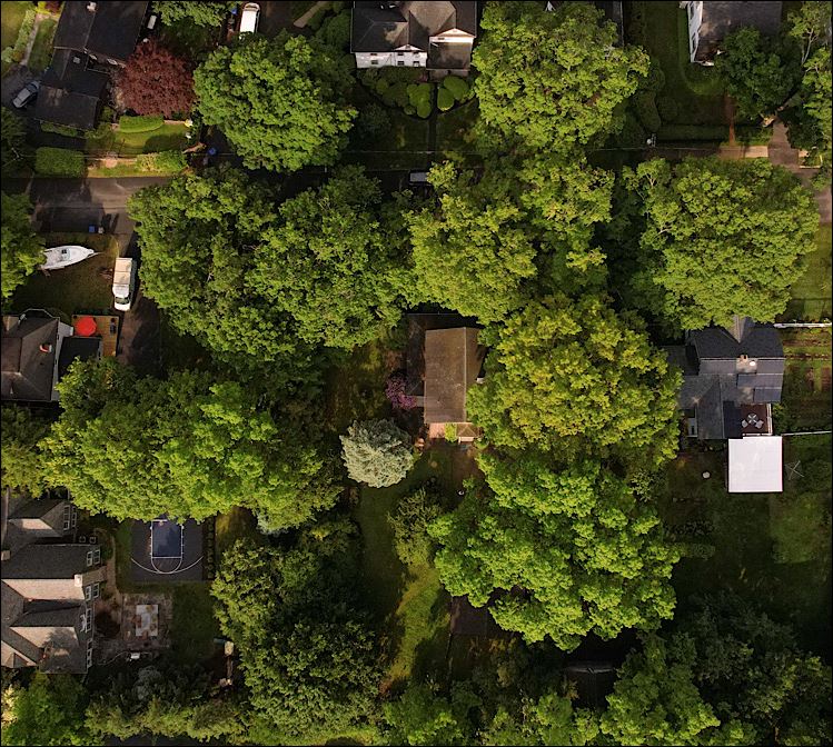
Hi Lisa,
I like the nice greens you have in this image, and I like the way the overhead shot causes the trees to lean away from the middle along the edges. But I think the image is a little too busy and causes the viewer's eye to dart around the image without a well-defined subject to rest on. I would suggest a crop that just catches the trees around the house you are interested in. In this crop, you almost have a pattern in the trees surrounding the house. You could even rotate the image so the pattern of the trees form a more defined pattern, but that would mean the house you are most interested in would be angled. If you do that, I would suggest cloning out the white box and the red umbrella, and perhaps some of the other little distracting details. |
Jun 10th |
 |
7 comments - 7 replies for Group 85
|
7 comments - 7 replies Total
|


