|
| Group |
Round |
C/R |
Comment |
Date |
Image |
| 85 |
Apr 23 |
Reply |
Thank you, Alex! |
Apr 30th |
| 85 |
Apr 23 |
Reply |
Thanks, Don! |
Apr 26th |
| 85 |
Apr 23 |
Reply |
Love your edit! Thanks, it is definitely the right thing to do. I now see how the sky was not adding anything to the picture! |
Apr 26th |
| 85 |
Apr 23 |
Reply |
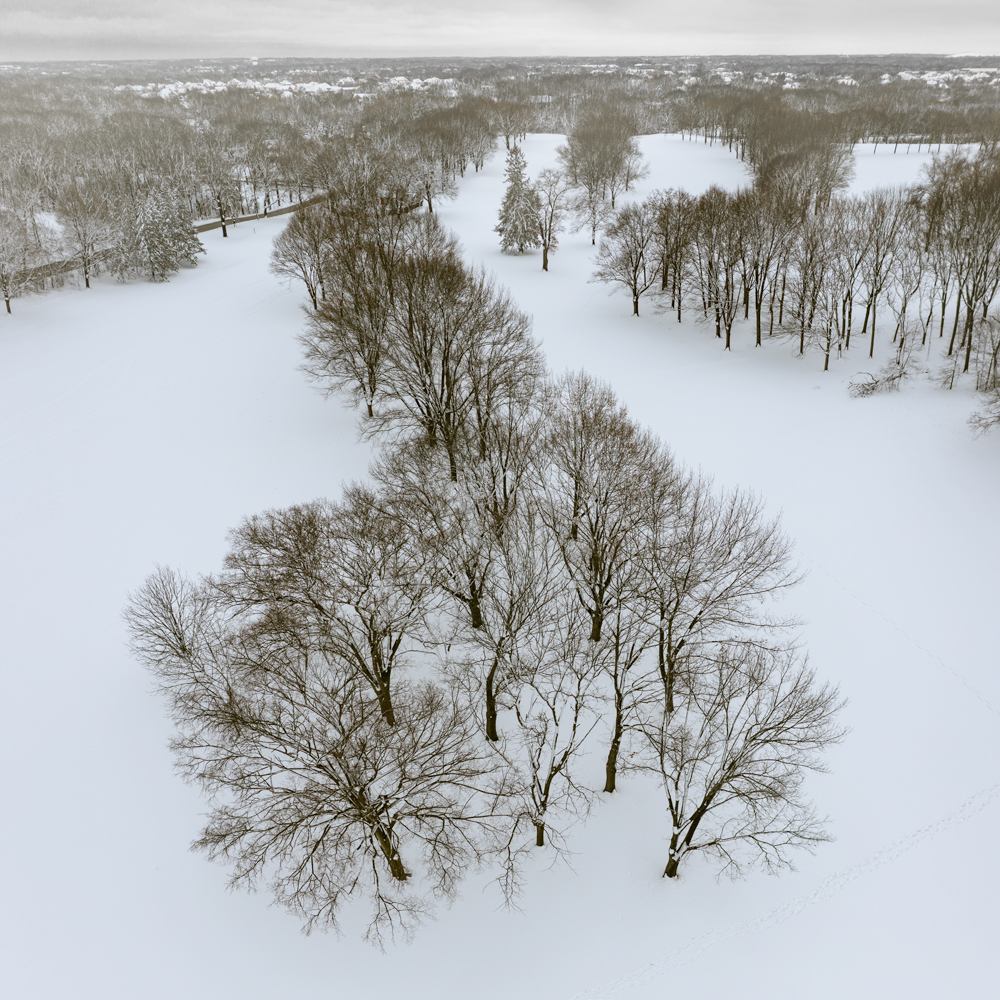
Thanks, the image in the first comment above has been converted to B&W. I thought the sepia color of the sky didn't improve it.
Ha ha! What... don't you see the 3 golf balls in the snow? :) |
Apr 26th |
| 85 |
Apr 23 |
Reply |
Ha ha!
I wasn't too far away. I was thinking of the leading line going from the foreground to the background, and I was also concerned with it leading to nothing. But it sounds like you are saying to put a person in the foreground... perhaps in the gap between the trees? That is an interesting idea, but would it stop the eye from following the leading line, which seems to me to go from the bottom of the picture toward the top?
Hmmm... there is a line of footprints barely visible in that gap of trees leading to the right edge of the picture. I could have made them more visible by increasing contrast there, and the idea of having a person at the end of the footprints, walking to the left is an interesting idea! (However, it is not one of my favorite pictures, so I'm not sure I want to spend much more time with it). |
Apr 26th |
| 85 |
Apr 23 |
Reply |
Thanks, Lou. I try to keep in mind that a comment from a judge is just their opinion, albeit hopefully an educated one. I have always said to take their comments with a grain of salt, but if you hear something over and over again, then perhaps it is something you should listen to!
|
Apr 26th |
| 85 |
Apr 23 |
Comment |
Hi Lou. I think I have to disagree with the others about cropping out the blue sky at the top. Without it the mood of the image changes. I do think, however, that the sky color is better in the original. The adjustment has added more cyan color to the sky, making it look rather unnatural. Sometimes in Lightroom and Photoshop editing a photo can bring out that cyan in the sky. I look for that in my images and add a little magenta back to the sky to give it a more natural look.
I'm ok with cloning out the houses, but be careful with repeating patterns in the cloned area. Try to change up some of the cloning so it doesn't look exactly the same. Perhaps add a little bit of a tree from another area of the photo to cover up part of a tree that looks the same as the others beside it, for example. And in an area where there is grass, smear the pattern a little using either the smudge tool or clone in a little different clone area to disrupt the repeating pattern.
I like how you have brought out the fall colors in the trees, and since that is the biggest area of interest in this photo, I think you should keep as much of the trees as possible instead of cropping the image on the bottom. I understand why you probably did it because it reduces the amount of cloning you have to do for the houses, but I would recommend keeping the bottom and spending more time with the cloning. I know it can be a time-consuming and unpleasant task, but I think it would pay off in the end.
|
Apr 26th |
| 85 |
Apr 23 |
Comment |
Hi Don.
I really like what you have done with the color adjustment, giving it a nice golden-hour look. It also helps the hazy mountains in the background to stand out.
I agree with the others about the buildings on the upper left and the road on the lower right being a distraction. Cropping a little on the left, to just right of the large tree trunk, would take out the largest buildings but leave enough of the tree to balance the composition, although I feel the entire tree adds to the composition.
I also understand your feelings about wanting to document the scene as is. One thing you could try is to select the lightest areas of the buildings and road/sidewalk with a luminosity mask and use a Dodge and Burn layer to darken them down to where they do not stand out as a distraction but still remain in the picture. You might also want to burn in the areas of dirt/sand in the lower left corner so the viewer's eye is not drawn down there.
|
Apr 26th |
| 85 |
Apr 23 |
Comment |
I meant to say "in other parts of the country".
I entered this into a monthly competition this weekend and it got the lowest rating without being "rejected". One of the comments was to remove the tree at the bottom. I tried removing it but decided I liked it better there. Yes, it draws your eye down there, but I think it adds to the diagonal line of the trees coming up from the lower right. What do you think?
She also recommended I remove the color in the sky. I had worked hard to bring out a little bit of the blue color in the sky, but it doesn't really add anything to the picture. |
Apr 3rd |
 |
| 85 |
Apr 23 |
Comment |
Beautiful image, Janos! I love the pattern of the wake behind the boat. It really draws your eye to the otherwise calm water and has such a pleasing shape. What town is that?
I like that you didn't try to enlarge the moon. It would have distracted your eye away from your main subject. As is, it is a nice little surprise when the viewer spots it. |
Apr 3rd |
| 85 |
Apr 23 |
Comment |
My favorite waterfall in Iceland. I have a winter picture from there when the water turns very blue. It is one of my favorite images!
When I first looked at your pictures I thought you must have climbed down the cliff, but then realized it was a drone shot... doh! :) I love the angle. It is nice that you can get to places you cannot otherwise get to!
I know what you mean about flying over water lower than your level... I did that in Menorca last year and it was very nerve-wracking! Good that you had a spotter!
Another great shot, Pete. Also, great article in the PSA Journal!
|
Apr 3rd |
5 comments - 6 replies for Group 85
|
5 comments - 6 replies Total
|


