|
| Group |
Round |
C/R |
Comment |
Date |
Image |
| 85 |
Mar 23 |
Reply |
Thanks Don! |
Mar 26th |
| 85 |
Mar 23 |
Reply |
Thanks Pete. Unfortunately backing up and getting it from further behind me might not be possible. I had to get a LAANC Authorization to fly here and I was near the edge of where I could get approval. |
Mar 26th |
| 85 |
Mar 23 |
Reply |
Thanks Lou. I'm going to try it! Luckily I live close enough that I can go back down there if it ever stops snowing here! (although the building might look quite nice with snow on the dome... I have just been too lazy to go out in the cold!) :) |
Mar 26th |
| 85 |
Mar 23 |
Reply |
Hi Janos,
I will try it next time to see how it looks with the drone being at the same level as the clock. I was trying to line it up so the cross was above the horizon. I have several shots that are lower than this one (but not as low as the clock) and the detail of the cross below the horizon gets lost in the background city.
The better light would have given me not only a prettier sky, but the building started to glow. All I could do was sit there and watch the light, and it only lasted for about 10 minutes! (it took me two weeks of investigations to get my drone flying again... apparently DJI put out new firmware for both the drone and the controller, and I had to download their DJI Assistant software and upgrade it from my computer). |
Mar 26th |
| 85 |
Mar 23 |
Reply |
Thanks Kathy. I also like the vertical and I agree about the green roofs. But I really don't like the black roof at the bottom and I think it draws too much attention, especially looking straight down on it. It might help if I darken down the entire bottom of the photo, but next time I go down there I'm going to try different angles. |
Mar 26th |
| 85 |
Mar 23 |
Comment |
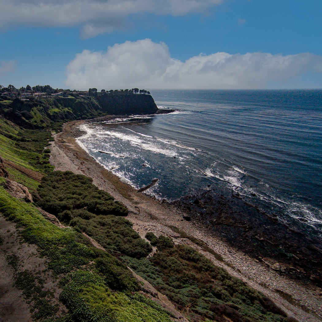
I agree with what the others said, but I think the vertical image loses too much of the beauty of this scene. If you crop it to a square crop by cropping the left side, you still have the entire line of the beach (and I like the diagonal coming out of the lower right corner), more of the ocean with the cloud above it, and part of that lovely green hill above the beach. You would still have part of the bright road in the lower left, but it could be darkened down so it does not draw the eye (I did a quick and dirty job of darkening it, but I would spend more time to make it look better). |
Mar 26th |
 |
| 85 |
Mar 23 |
Comment |
Hi Janos,
I love this area and like Pete, have shot there from several spots on the ground (I've also stayed in that little white house in the middle of the fjord... they were great accommodations!).
It is a beautiful panorama, but frankly, the big curvy road at the bottom of the image ruins it for me. It is so large and out of proportion to the rest of the photo that it draws my eye to it right away and overwhelms the rest of the photo. And I don't see an easy way to crop it off. Doing that, you would have a very wide panorama and would lose the beautiful rocky shore on the lower right. You could possibly try stitching the images together and leaving out or cropping those that include the road at the bottom and allow the stitching program to stretch it to create a rectangular image, but you wouldn't be able to do that in Lightroom. I sometimes use PTGui for stitching more difficult images that are too complicated for Lightroom.
|
Mar 26th |
| 85 |
Mar 23 |
Comment |
Hi Lou,
Great job with the sky as mentioned by the others. I would have tried to clone out that line that looks like an airplane contrail though.
The bottom half of the original looks good, I don't think I would have done much to it... perhaps adding a little bit of vignetting. The loss of detail in the final image is as bothersome to me as the lightened exposure. It looks like it was perhaps over-sharpening that caused the crunchy look and the loss of detail. |
Mar 26th |
| 85 |
Mar 23 |
Comment |
Hi Pete,
I love the composition of this image and the story it tells. I do think the colors are a little off though. IMO, the sky has a little too much cyan and the sand a little too saturated with yellow tones. I know many people love the highly saturated images, but I seem to like the more subtle colors these days.
BTW, I think I know just where this was taken... I�ve been up there on this road to shoot a few times myself, and would love to have had a drone to shoot with. I�ve shot mostly on the north side of Hwy 78 where the ATVs were not allowed because the south side had too many tracks. It�s great that you were able to get there early in the morning when there were strong winds that blew away the tracks (I was there once well into the night and the ATVs were still buzzing over the dunes until the wee hours). |
Mar 26th |
| 85 |
Mar 23 |
Comment |
Hi Lisa,
Like everyone else mentioned, I also like the original better. It shows the environment around the bridge and I especially like the flowing water above the bridge in the image. I�m sorry but the cropped image doesn't do much for me and the rocks along the bank actually become distractions. While the lightened color of the water shows a little more detail at the bottom of the river, the reduced contrast makes the image look a little flatter. |
Mar 24th |
5 comments - 5 replies for Group 85
|
5 comments - 5 replies Total
|


