|
| Group |
Round |
C/R |
Comment |
Date |
Image |
| 85 |
Dec 22 |
Reply |
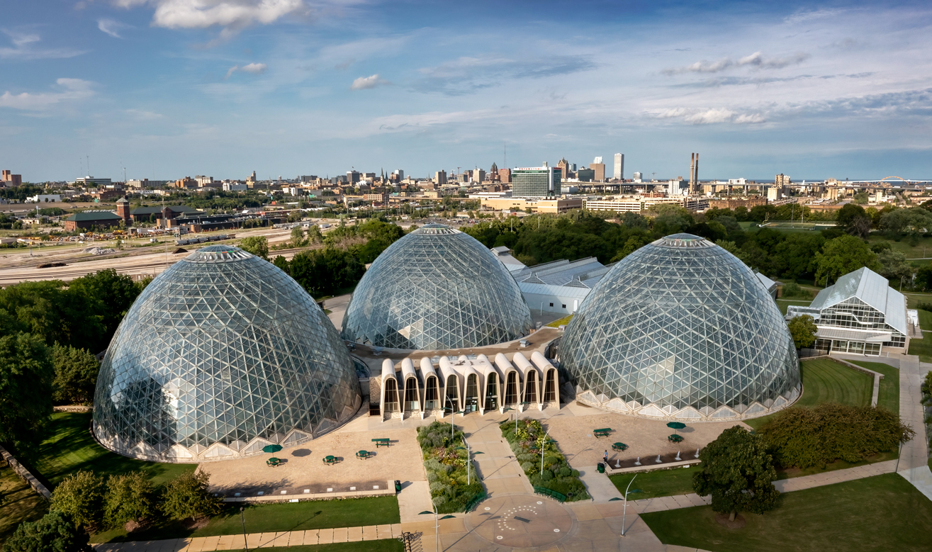
Thanks, Janos. Yes, I was able to crop out the leaning flagpole in the edited photo about posted to Lou's comment. |
Dec 16th |
| 85 |
Dec 22 |
Reply |
Thank you, Lou. You are right, I could achieve Pete's recommendation with just a crop of the existing image. Here is what I came up with. I was also able to remove the leaning flagpole. |
Dec 16th |
 |
| 85 |
Dec 22 |
Reply |
Thanks, Pete. I struggled with the angle because I wanted the main part of downtown, which is over the rightmost two domes, in the picture. I considered moving the drone to the right and centering the domes, but then I would have cut off the main part of downtown. The solution was actually a very easy one, which I will comment on next in Lou's comment. |
Dec 16th |
| 85 |
Dec 22 |
Reply |
Thank you, Don. |
Dec 16th |
| 85 |
Dec 22 |
Comment |
I like the blue color you gave to the photo, and lifting the shadows showing more detail is good, but be careful about too much noise reduction. Too much noise reduction causes a glassy processed look.
This image has two subjects on opposite sides of the image. It might have been nice to be able to tie them together, such as using texture or lines in the watch so the viewer's eye is led from one to the other. Otherwise, it is a nice composition. |
Dec 16th |
| 85 |
Dec 22 |
Comment |
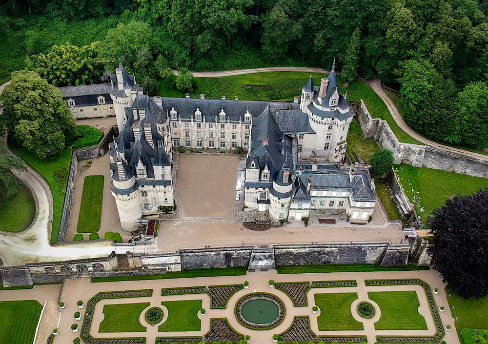
I like the angle too, but I think there is too much distracting detail around the subject, especially at the bottom of the picture. I think it could be cropped in more closely to put emphasis on the castle.
|
Dec 16th |
 |
| 85 |
Dec 22 |
Comment |
Hi Lou. A beautiful scene that certainly deserves multiple images processed from it! I like the area you cropped out for last month's project, and I like the more expansive view you are working with this month.
I really like the composition you have settled on, especially with the diagonal line as pointed out by Don.
You have brightened up the photo, and I think that is good in the darker shadow areas of the photo, but for the midrange to highlights, I think it is a little too bright. The white in the lighthouse is blown out with loss of detail and texture.
The sky replacement is a personal choice, and it certainly changes the mood, but I think all the little white puffy clouds are a bit distracting. I actually think you could have brought out some of the subtle tones and colors of the original clouds which would have worked well, although you would have to be careful that the processing did not turn the sky a more cyan color. I don't think it helped to clone out the lake, and there is a rough edge where the cloning stopped.
And while the sharpening around the architectural structures was an improvement, I think the rest of the image looks oversharpened to the point of looking crunchy, especially in the trees at the bottom of the picture.
|
Dec 16th |
| 85 |
Dec 22 |
Comment |
Hi Pete. Excellent job in processing the colors and contrast. I like that you were able to bring out a little of the turquoise in the water that is so lovely in those glacial lakes, yet so difficult to get just right in post! And I also like the brownish color enhancements you did for the land. The colors fit well together and look very natural.
I have been to Aldeyjarfoss (my favorite waterfall in Iceland) and I believe also to Hrafnabjargafoss, both in winter. I love this expansive view and wish I could have seen it from this view when I was there, it certainly gives a different perspective!
I also like the composition you captured here. Perfect!
The only thing I might recommend is to try adding a little haze to the far background perhaps using a low opacity white radial gradient in some spots. It would be a very narrow band beyond the waterfall/river, but it might enhance the feeling of depth in the picture. It might not work, but it is something to try. |
Dec 16th |
| 85 |
Dec 22 |
Comment |
I've been by this sign many times but it was many years ago. Interesting that you tried to document it. I like what you did with getting the Olympic Circles with the trees behind. Unfortunately, it left the sky looking a bit blown out, and I see from the other original that it was a blue-sky day. One of the most important elements of a good photograph is capturing the beautiful light. I think this could have been captured with better lighting. Even adding a colorful sky in the background would not have fixed the color of light on the sign, or helped much with removing the distractions on both sides of the picture, the parking lots and the wires. I wonder if the sign lights up at night, and if so, perhaps capturing it just as the sun sets and the sign starts to light up might create an interesting photo. |
Dec 16th |
5 comments - 4 replies for Group 85
|
5 comments - 4 replies Total
|


