|
| Group |
Round |
C/R |
Comment |
Date |
Image |
| 85 |
Sep 22 |
Reply |
Thank you, Don. It took quite a few panels to capture the entire scene, including the skyline behind the museum. I manually shoot them. I have found the panorama mode on the camera not to be what I want. The choices are limited as I recall... one is 360 degrees and the other puts the horizon in the center, which is typically lower in the image than what I want. I'm still learning a lot about how to do this (I was wondering why my panels often take on odd shapes when stitched, and I just realized that it was because when I move the camera, it changes the angle of the view)
I said I was going to reprocess using PTGui if I get the time, but I haven't had the time. I am sometimes reluctant to open it and use it because it is a complicated program and it seems to change so much between uses. I have to reinstall each time and then spend time relearning it. It doesn't really incentivize me to go use it again, but I must admit they are making it easier to use. :) |
Sep 16th |
| 85 |
Sep 22 |
Reply |
Thank you Pete. Funny, I contemplated removing them... I even darkened down the bright white structure on the center right a bit. Both that white structure and the red structure are artworks in and around the museum. If I removed them locals would certainly notice, especially with the red one. I contemplated enhancing the color in both that and the reflection in the building to make them more noticeable, because they are well known in the Milwaukee skyline.
(It is on my list of things to do to go shoot the museum from behind the red structure.)
I agree with you that they are a bit distracting, but when they are part of the story it becomes more difficult to decide on whether or not to keep them.
I agree with you about removing the pointed shadow... thanks for pointing it out, I should have seen that!
As far as the pano, I was much too close to shoot this entire scene in one shot. I was hesitant to fly further out over the water because I felt limited in where I could fly. I was right on the north edge of the restricted area due to the airport, and I could see helicopters out over Lake Michigan (they come in and out of the hospital just north of this location, so I didn't know if it was them or the US Coast Guard). Flying around cities can be very difficult! |
Sep 7th |
| 85 |
Sep 22 |
Reply |
Thank you, Janos. I do a lot of processing, so I'm not sure what you mean by "deep post processing" (I try not to over-process my images, but that doesn't rule out doing a lot to them. I have also mentioned before that I don't do things like sky replacements. I have no problem with others doing it, it's just not my thing).
I agree about the water, I will lighten it or color it better. Good observation. I'm not sure what you mean about changing the luminosity. Do you think the museum is too white/bright? Since it is my main subject I brightened it so it would stand out, but maybe that was the wrong decision.
By using the DJI Mini 2 program, do you mean stitching in the drone itself when capturing the shot(s)? I have done that before but I typically don't do that because it saves the result to jpg, and I always shoot in raw and want the raw dng images for processing. If there is another DJI software you mean, I would welcome hearing about it. |
Sep 7th |
| 85 |
Sep 22 |
Comment |
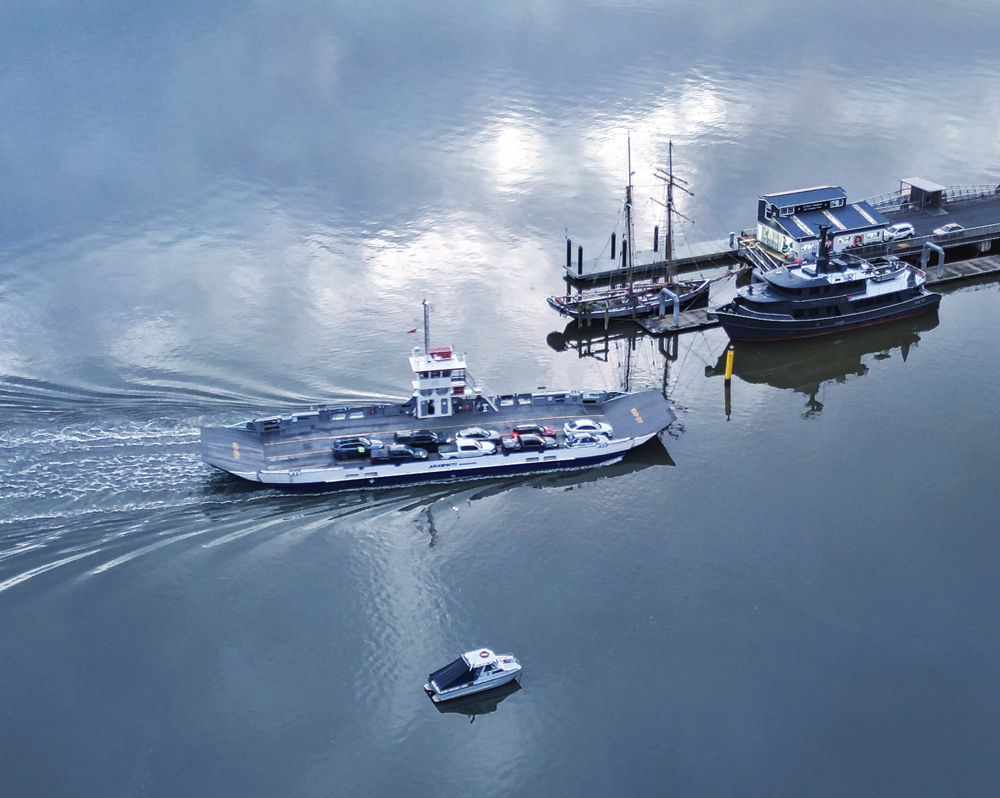
Hi Julie. I like how you captured the reflections on the water, and I agree with you about the wake behind the boat. I think everyone is in agreement that the color could be a little better. I tried playing with it and it is indeed difficult to adjust. I tried adding a little more gray-blue. I would also crop it down. I tried cropping it on the right between the boats. Not ideal but I think better than the distractions with the boats on the right, especially those that are cut off. I then cropped the top down closer to the sky reflections, and cropped a bit off the bottom. The buoy on the bottom needs to go, even if you don't crop, you should clone it out. If the viewer's eye lands there and they sit there trying to figure out what it is, then it has grabbed their attention away from your subject.
When I cropped I tried to save as much of the wake as I could. What do you think? |
Sep 7th |
 |
| 85 |
Sep 22 |
Comment |
Hi Don. I think you have darkened down this image a little too much, and saturated the sky a little too much. I agree, the clouds are lovely. Try to darken them a bit without adding blue color to them (I suspect you might have used the temperature slider in Lightroom, unfortunately, it colors the clouds as much as the sky). I think the original color of the sky is better.
The lower part of the picture was flat in the original, and I suggest increasing the contrast. And instead of darkening down the entire bottom, just darken it down in the lower corners. Use a dodge and burn layer to paint some light and dark arees in the foreground. There is some interesting detail there and if you create a visual path up to the sky, I think it will add to the picture, which would be better than cropping it out in my opinion. |
Sep 7th |
| 85 |
Sep 22 |
Comment |
Hi Janos. Great subject, but I agree with Pete, there are too many distracting elements in this picture. I see you did a crop that took out the far background, but I still think you could do more. Ask yourself what your subject is (the castle, obviously) and what are the supporting characters. I would say the shadows, which are somewhat leading lines to the main subject. Everything else in the picture competes for attention and distracts from your main character. I would recommend cropping down so you just have the castle, the brown sand, and the shadows of the trees pointing towards the castle. (You might have to clone out some of the green in the corners to remove those distractions). Great subject, it just needs a little more work. Don't be afraid to crop!
|
Sep 7th |
| 85 |
Sep 22 |
Comment |
Hi Lou. I like what you have done with this picture. the colors are much better and it looks much more like the color of sand. There are a couple of small tweaks I would recommend. First, I would not crop in quite as tight. I agree with Janos about trying to leave the circles intact, at least the one directly behind the tractor. If you cropped this to a 1:1 ratio, put the tractor on the 1/3 line vertically (it is almost there anyway), and it would have the diagonal line on the right exit the picture right at the middle. Give it a bit more breathing room where the circle behind the tractor is not touching the edge of the picture, or at least just a little inside the picture. You could also bring up the green saturation on the tractor a little to make it stand out in the picture. If you crop it that way there is a bit of the shadow on the sand behind the tractor, but if you lighten those areas to match the rest of the sand, it will not disrupt your pattern.
I like what you do with the patterns you have captured in your drone images! |
Sep 7th |
| 85 |
Sep 22 |
Comment |
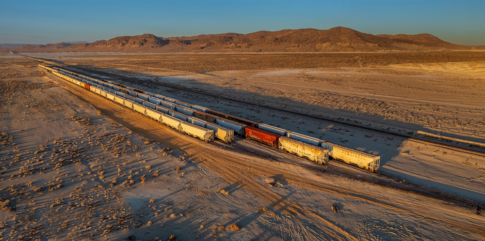
Hi Pete. I like how you have captured the morning light and brought it out in the processing. It makes for an interesting subject too, although I would hope that you have captured some shots around Trona Pinnacles too (I wanted to shoot there when I lived in southern CA but never got to it... maybe in a future visit!).
I like that you cropped off some of the sky, there was too much at the top. But I see that you have added some on the bottom and on the right in the final image. I think the addition on the right is good, it makes it a little more balanced with the background mountains more centered, but I think it only adds some distractions to the bottom. The angled road on the lower left and the pile of old steel (rebar?) on the ground is a bit distracting. I would recommend you crop off the bottom similar to the unprocessed shot you posted or clone out the distractions, and perhaps crop a little off the left side so the railroad tracks (and the mountains) start closer to the corner.
Here is a quick edit I did with the crop and cloning in the corner. Do you think it helped? |
Sep 7th |
 |
| 85 |
Sep 22 |
Comment |
Hi Lisa. I like what you have done with this image. I'm a bit partial to abstract scenes from above taken with a drone. Some of the most interesting shots I've seen with a drone have been those that I had to think hard about what they might be.
And I like what you have done with the processing. I like the look of the curve on the right side (different color of pavement) and how it brings the eye back into the main part of the picture. You straightened the horizontal line just right, and you removed a few things along the outside that distract the eye from the main subjects. I also like the colors you chose. There isn't too much I would recommend to do differently. Perhaps clone out the small spot on the right side (on the lower part of the curve) and perhaps the little drain in the upper center (I rather like the line made by the different color pavement there, so don't change that).
Overall, good job! |
Sep 7th |
6 comments - 3 replies for Group 85
|
6 comments - 3 replies Total
|


