|
| Group |
Round |
C/R |
Comment |
Date |
Image |
| 85 |
Apr 22 |
Reply |
Thanks, Pete. This is a case where you give up one thing trying to get another. I didn't want to lose the trees that have the light on them on the left by cropping that side anymore than I already have. I think the answer is to just re-shoot it! I'll try that this Spring or Summer. Perhaps I can get a much better sky! I really appreciate all the feedback from everyone! |
Apr 14th |
| 85 |
Apr 22 |
Reply |
Thanks, Pete. I have another shot taken from that angle. It is the shot I mentioned above where the lights were starting to come on at the bottom of the lighthouse. One thing I didn't like as much about it is the more straight-on angle as you describe. I have found that buildings typically look better when shot from above more towards a corner than straight on, but I realize that might be personal preference. |
Apr 13th |
| 85 |
Apr 22 |
Reply |
Thanks Janos! |
Apr 12th |
| 85 |
Apr 22 |
Comment |
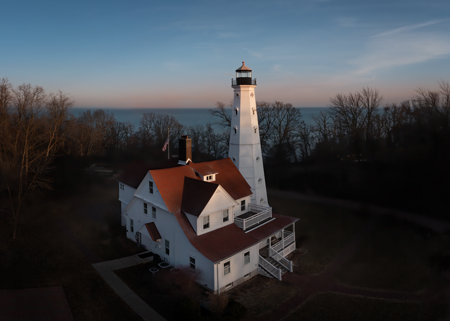
I cropped some of those dark trees off the right side (and also a little off the bottom to keep the same aspect ratio) and I lightened the bottom of the house and the grass a tiny bit. Does that help, or does it not make much difference? I had been trying to keep the lighthouse centered but I think the new crop looks a bit more balanced. |
Apr 8th |
 |
| 85 |
Apr 22 |
Comment |
Thanks, Lou! I was kind of wondering about that myself. It was almost dark and although there was still light in the sky and lighting up the lake, the trees this time of year are still darkish brown and that added to the bottom of the picture looking darker. I have another shot taken a few minutes later where the lights were starting to come on at the bottom of the lighthouse, but I chose this one because I rather liked the late-day light that was still shining on the top of the lighthouse and the tops of the trees, but I agree it looks a little incongruous. I think I might go back there and try again when the leaves and trees are green and when there is more sunset color. |
Apr 5th |
| 85 |
Apr 22 |
Comment |
Hi Don! A very nice ocean view! It appears to me that the only edit is to increase the contrast and saturation. I'm ok with that, but there are several things I would change in this photo:
1. The horizon needs to be leveled up.
2. The subject of this photo is the lighthouse and the rocky cliffs behind it. Everything else is a distraction. The buildings in the cityscape in the upper left take up too much of the photo, as well as the parking lot with the cars in the lower left. They don't add much to your photo and I would recommend cropping off the whole left side of the photo. I would recommend using the rule of thirds and putting the top of the lighthouse at the lower 1/3 point in the photo. This would leave enough of the city in the upper corner to get a feel it is there yet not be so much that it is distracting. I would then burn in what is left of the parking lot so it is not so bright that the eye is drawn there. I would then darken the corners with a vignette, at least the left and lower corners.
3. Clone out the little building at the edge of the picture in the lower right, or crop that area (although I don't recommend losing any of the ocean view there, the waves are very nice!) |
Apr 1st |
| 85 |
Apr 22 |
Comment |
Hi Janus. The way you have captured the light and clouds reflecting off the water in this image is lovely. There are a couple of things I would recommend to make it a better photo. First, you almost have two competing subjects. While the main subject of the island with the tower is lovely, the complex patterns in the lower right, although interesting, pull away from your subject. I was wondering what to do about them, so I opened it in Photoshop and tried cropping them, but that didn't work because it removed one of the most interesting parts of the photo. Then I tried darkening it down some, and that seemed to work. The eye was not so strongly drawn to the area that it distracted from the main subject, but enough was visible to provide the interest.
Secondly, I think you have increased the contrast and/or sharpness in the upper part of the photo too much. The tower looks a little crunchy, and the land in the background has lost its depth. It is natural for haze to increases with distance, so to maintain depth in a photo you can decrease haze in the foreground and increase it at a distance. In the case of this photo that haze was already there, but I think you decreased it a bit too much. It is ok to reduce it around the island, but the background should remain a little hazy to maintain the depth in the image.
The leading line of the channel toward the island is good, but I'm wondering if it might have been a little better leading line if you had moved to the right a bit and tried to get that leading line leading from the patterns in the water up to the island. |
Apr 1st |
| 85 |
Apr 22 |
Comment |
Hi Lou. Lovely image, and I like the composition. Moving the people was a good idea, but it looks a bit like you lightened them too. You might try adding a bit of contrast to bring them back. Also perhaps clone out the chairs at the top of the sand area... they are too small to identify and my eye was distracted for too long trying to identify what they were.
I think the sky could use a little bit of a polarizing gradient, and I recommend darkening down the bottom corners, especially the lower right. Remember, the eye is drawn to the lightest part of a photo, and the sand is much brighter than the rest of the photo. That is where your subject is, so it is ok to be brighter but not so much that it becomes a distraction. In fact, you might try darkening down all of the sand a little bit to make the image feel a little more balanced. The rocks and ocean are lovely (although the rocks in the lower left are a little too bright at the edge of the picture), and I love the details of the boats on the water.
Lovely image overall! |
Apr 1st |
| 85 |
Apr 22 |
Comment |
Hi Pete. Nice composition. I'm wondering if the trees would have not been so stretched out in the corners if the drone had been a little higher, although I realize perhaps that was an artistic decision. As a former Southern California resident, I commend you for finding such a nice snow scene there :) I like the sun's streaks and the shadows. Although lightening the snow was a good idea, I think making it more blue took away some of the golden hour glow. The original looks a little greenish to me, perhaps you could have kept some of the color in the trees and perhaps add a little red to preserve a little of the golden hour feel. |
Apr 1st |
| 85 |
Apr 22 |
Comment |
Hi Lisa. I like the idea of this image. I love taking pictures of city skylines, and it is one of the reasons I wanted to do drone photography. I love how you centered the Christmas tree in the image, and the city skyline provides a good backdrop. A couple of things I think would help you improve the image... first, the obvious blown-out area in the sky. I see you cropped quite a bit of the sky out, perhaps to reduce some of the clipped highlights. But most of the sky is lovely and you put the top of the tallest building a little too close to the top edge. I would give that a little more room and save some of the sky (I would recommend keeping about 1/3 of the image as sky). Perhaps you can clone a little color or lighter clouds into the clipped areas. The other thing I would recommend is to lighten the area around the top half of the Christmas tree so the eye is drawn into your subject a little more. I would try to separate it a little from the dark area of the buildings behind it, especially around the star. I also think you could have kept a little more of the rings at the bottom. They provide a nice symmetry for the picture leading the eye up, although I agree that cutting out the wet concrete at the bottom was the right thing to do. |
Apr 1st |
7 comments - 3 replies for Group 85
|
7 comments - 3 replies Total
|


