|
| Group |
Round |
C/R |
Comment |
Date |
Image |
| 62 |
May 22 |
Reply |
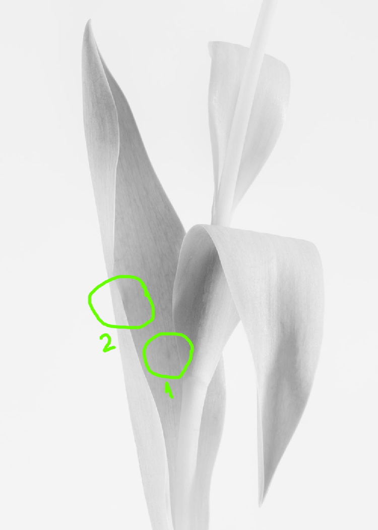
LuAnn I marked the area I was talking about as #1, but on second taught I believe the #2 could be improved too.
I consider the minimalist photography is not so easy to analyze because the fewer elements you have in a picture, the more difficult could be to elaborate constructive critique.
|
May 14th |
 |
| 62 |
May 22 |
Reply |
LuAnn, thanks for the comment. As the other colleagues proposed, different treatments could be applied to this photograph. I'm not to sure the image will benefit from the setup you suggested because there is little information, so I expect to get rather noise that something useful.
|
May 14th |
| 62 |
May 22 |
Comment |
Hi Israel,
This is a very powerful image, so difficult to comment... I like it as it is, but I also wondered how this could look if the only thing to see will be the light beam falling on the pilgrim. Again, it's just a possible way to explore and maybe not the right one.
Anyway, you had a very interesting experience for sure, thank you for sharing it with us.
|
May 13th |
 |
| 62 |
May 22 |
Comment |
Hi Bob,
The b&w treatment you applied to this picture enhanced the impact on the viewer for sure. I certainly like to have this image hang out on my wall! I have no comments that could help, just personal preferences.
|
May 13th |
| 62 |
May 22 |
Comment |
Hello Bunny,
I have to say the same thing I said to Emil: I love your b&w treatment, more than the original picture. Nice!
Maybe some touch-ups to clean up the image here and there could help, but, hey, sometimes you may want to show something as it is, so this is a matter of personal choice.
|
May 13th |
| 62 |
May 22 |
Comment |
Hi Emil,
I love the treatment you applied to this image. Maybe the 3 thin reeds that extend above the grasses on the left are too close to the edge of the frame, but you did well by burning them out.
I like better the black and white version than the original one, well done!
|
May 13th |
| 62 |
May 22 |
Comment |
Hello LuAnn,
Plain and simple photography - one of the most difficult to analyze. In my opinion, this photograph define your style.
I can see a distracting small spot in the middle of the biggest leaf - I personally have removed it. Other than that, I feel purity just by looking at this image.
|
May 13th |
| 62 |
May 22 |
Comment |
Hi Pete,
There is not much to say, excepting maybe editing or framing things which are more personal taste than helpful opinions. I like the work Israel did, I believe that help considerably the composition and so the impact on viewers.
|
May 13th |
| 62 |
May 22 |
Reply |
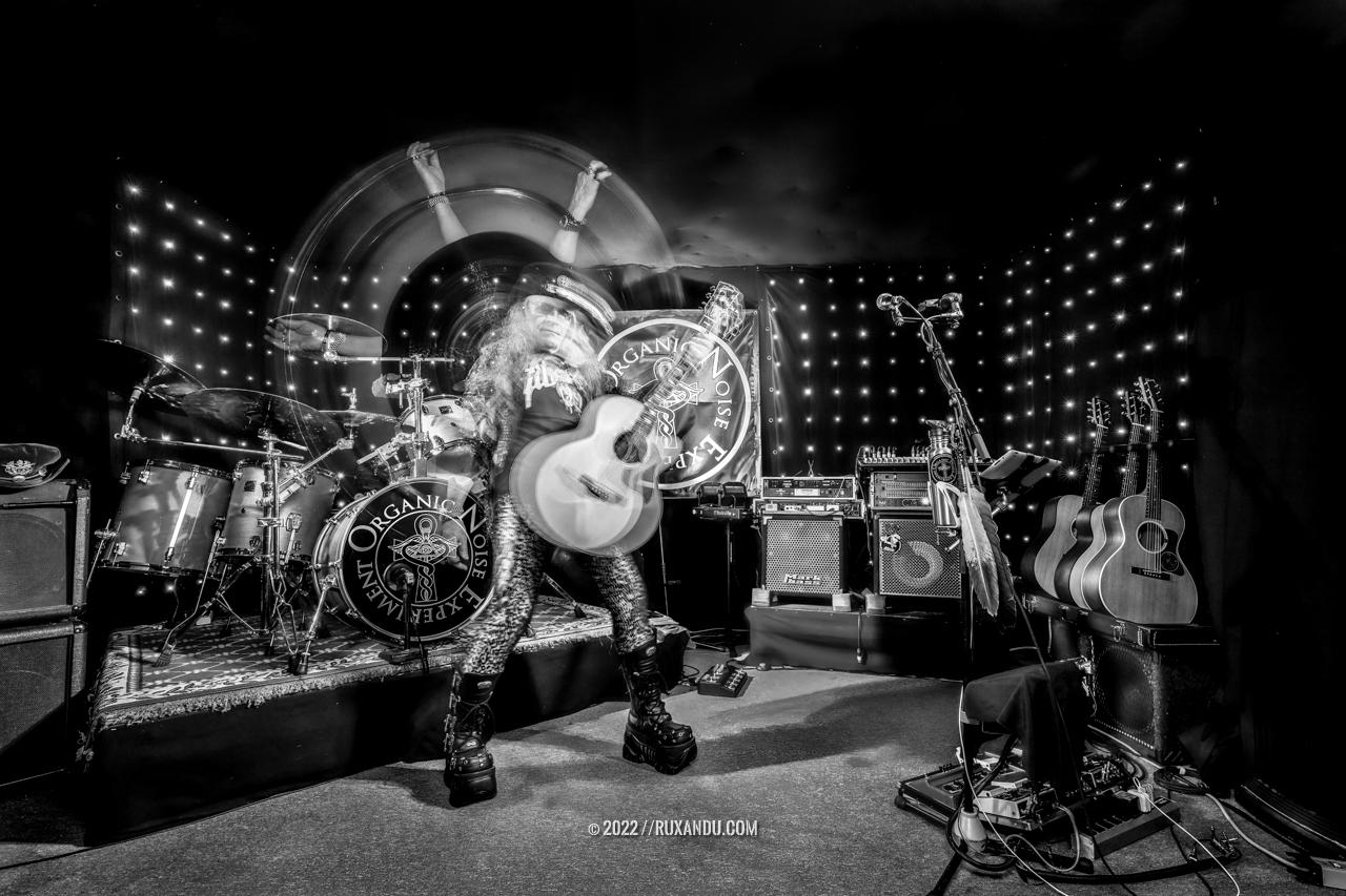
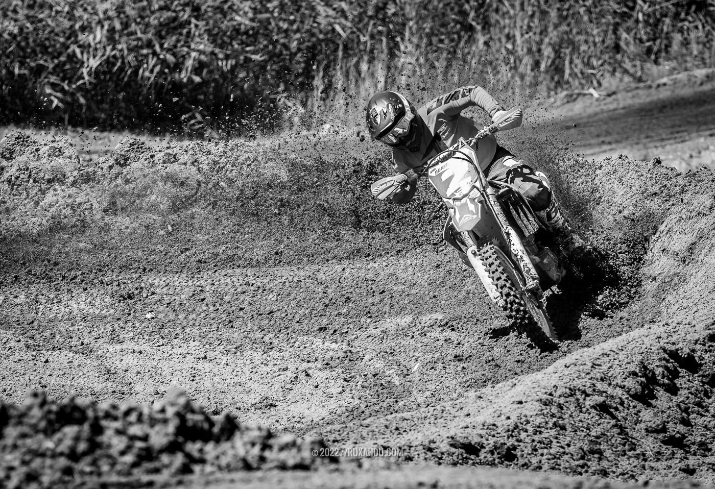
Emil, thanks for the comment. Interesting approach, we can't miss the racer and his effort indeed. I choose to keep the wide crop emphasizing all the movement, and this is why I named the image Glissando.
|
May 13th |
| 62 |
May 22 |
Reply |
Hi Bunny thanks for the comment.
|
May 13th |
| 62 |
May 22 |
Reply |
Bob, thanks for the comment. I choose this frame also because it was the best "roaster tail" - unfortunately they just wetted the track and these are kids not pro-racers… I agree about that small area but it's pretty much impossible to get a perfect exposure all around while you cover this kind of live event.
|
May 13th |
| 62 |
May 22 |
Reply |
Pete, thanks for the comment. At first, I thought to crop a bit the photo, but is one of the planes that give deep to the image. Maybe the burn tool could help in that area to make it less distractive, indeed it's an approach to try.
|
May 13th |
6 comments - 6 replies for Group 62
|
6 comments - 6 replies Total
|