|
| Group |
Round |
C/R |
Comment |
Date |
Image |
| 62 |
Mar 22 |
Reply |
What I meant by following the rules was this limit us sometimes, but if there is a choice, I'll personally go for a creative approach.
For example, if I have to shoot this pen and this document for a competition, I will not include other props in the composition. Probably I will use a wider framing to give some dimension and I will lower more the camera so I can play with the deep of the field to draw the attention where I want on the document.
|
Mar 20th |
| 62 |
Mar 22 |
Reply |
Well, I'm not sure what is the proper way to photograph a letter document for a competition. I'll go for an artistic approach, if I have to choose.
But more than that, it's important to read the rules of the competition and the ones of the category you apply for. If for the creative zone the sky is the limit, for the black and white you should check your image to be sure is not having any colour (https://labs.tineye.com/color/).
What would be your approach LuAnn?
|
Mar 20th |
| 62 |
Mar 22 |
Reply |
Yep, it's a "quick and dirty" Photoshop (they teach you to do this way while studying photography @ Dawson College).
|
Mar 20th |
| 62 |
Mar 22 |
Comment |
Hi Emil,
Just by looking at your image I feel part of an old adventure/mystery movie… I find the b&w treatment you applied is appropriate and helps keep the attention on the couple. Nice move bringing some light to the faces!
In my opinion, something that could help even more is to darken the background (the trees with the locomotive), to diminish the strong light of the locomotive, and reframe a bit so you can have less space beneath the couple.
You picked a good spot with the rails acting as leading lines.
Have a good day!
|
Mar 20th |
| 62 |
Mar 22 |
Comment |
Hello LuAnn,
Your image remembers me a photo shoot I did in the Dawson College Library years ago…
I like the black and white treatment you applied and the way you send the eyes to the text by using the pen. Interesting vignette too, not so heavy as we can see sometimes, but enough to help the composition and direct the attention.
Have a great Sunday!
|
Mar 20th |
| 62 |
Mar 22 |
Comment |
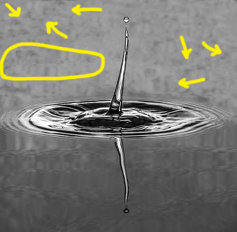
Hello Pete,
Looking your image, I wonder why I still haven't used the fish tank I bought to experiment this king of photography…
I believe you did a great job by replacing the original background and keeping the image sharp. The only thing I see it's a strange line (see my capture) and some banding on the new background (only the upper half part of the image).
I'm sure it was not easy work to get this image as well as to do the post treatment.
Have a good Sunday!
|
Mar 20th |
 |
| 62 |
Mar 22 |
Comment |
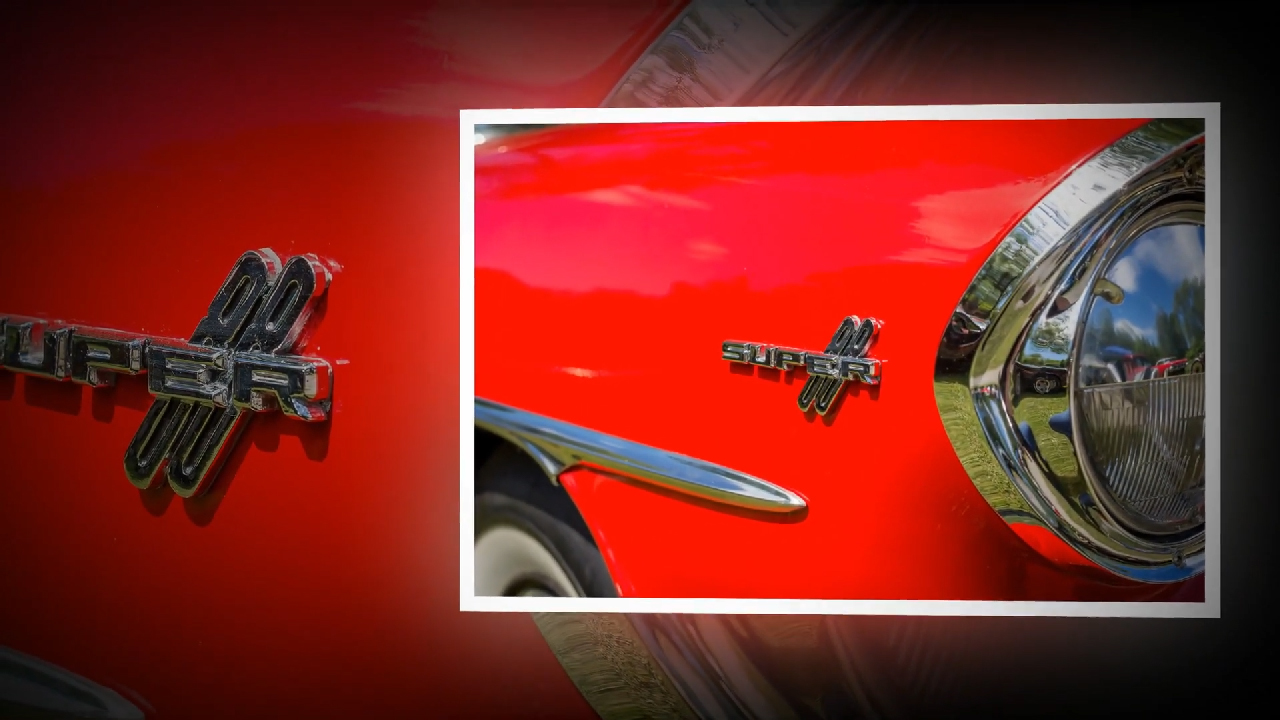
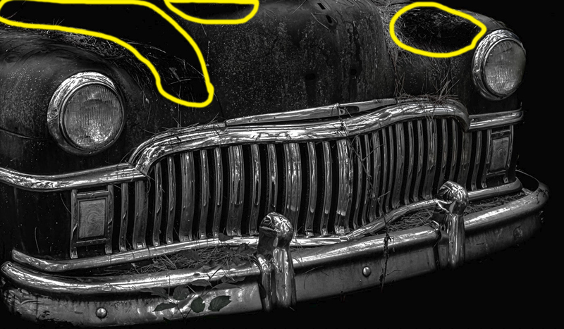
Hi Bob,
I like old cars and b&w photography - you got me here! The image is having nice textures and a good contrast. Like LuAnn, I find the chrome looks nice, it's shiny.
I agree with Pete about the cropping of the hood. Also, in my opinion, the darkened areas (see my capture) are not helping the image.
Nice move removing the distracting background.
Have a good day!
|
Mar 20th |
 |
| 62 |
Mar 22 |
Reply |
Hi Bob,
Indeed "Kondiaronk Belvedere" on Mont Royal is a nice elevated place with several spots for observation and photography - don't forget to check it when you visit Montreal!
I took this picture during a flat cloudy day and I like to remember it the way it was (did I mention I don't like the sky swap or heavy edit?). If someday I will license this image for commercial use, changing the sky could be an option. Re-cropping, not.
Thank you for the welcome and have a good light!
|
Mar 19th |
| 62 |
Mar 22 |
Reply |
Hi Bunny,
I myself experiment with other images - I did it with yours too. :-) So, no problem.
By cropping the way you did, a tension was created on the upper side, the image suffocate. Also, the antennas are now touching the margin of the frame.
Thank you for the comment and have a good light!
|
Mar 19th |
| 62 |
Mar 22 |
Reply |
Stan, indeed, there are so many choices when you have to decide the look you like, in black and white… But, hey, we have the same Lightroom workflow!
I assume you visited the Notre-Dame Basilica when you came in Montréal? It's very impressive, I did several 360 photographs there back in May 2015.
Thank you for your comment and have a good light!
|
Mar 10th |
| 62 |
Mar 22 |
Comment |
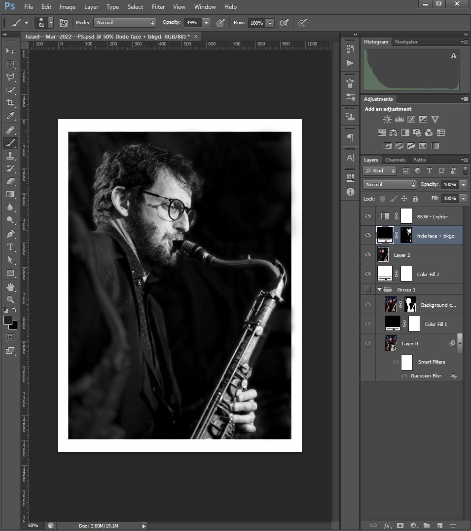
Hello Israel,
I like how you did the conversion in black and white, with high contrast but without losing the details of the jacket and the shirt. I think your photo could be used to make a poster for a concert!
If I had to prepare your image for this poster, I would put in evidence the saxophonist by darkening the background - the face of the person behind can be distracting. In addition, the human brain is taught to look and to draw the attention to known things, such as other people's faces.
This way you will also get some negative spaces needed for the text to be inserted by the editor.
I attach a screenshot to show what I'm talking about (yep, it's a quick and dirty PS, I'm not a big specialist).
Have a good light!
|
Mar 9th |
 |
| 62 |
Mar 22 |
Reply |
Hello LuAnn,
I'm so happy when someone sees details not so "visible" for most viewers… no wonder you're a group admin!
Thank you so much for your comment and have a good light!
|
Mar 8th |
| 62 |
Mar 22 |
Reply |
Thank you Pete, maybe someday will have a photo-walk in the "Vieux Port" of Montréal, who knows?
I not using too much contrast or too much black in my b&w images as I always try to get maximum details and textures. Sometime I push the limits too, but is not my default approach. I have to mention that day was cloudy with a pretty flat sky. Unless I'm working on a 360 photo, my workflow involves only Lightroom - I'm not a fan of the sky swap or heavy interventions.
However, I agree the image could benefit from a more dramatic sky which will balance a bit the composition too.
Thank you for the comment and have a good light!
|
Mar 7th |
| 62 |
Mar 22 |
Comment |
Bunny, you're so lucky to have such scenery near you, and the moment you caught it's great! I think your photo could be used in magazines, because the editor can exploit the negative space at the bottom left of your image for text input. Additionally, several sun rays lead the eye to the same spot (which is a bit lighter compared to the rest, so the eye will naturally follow anyway).
I allowed myself to make some adjustments, as I would have worked it out. By the way, I wonder if your monitor is calibrated because I find the black and white image a bit dark and with a pretty strong contrast, compared to the original. Of course, black and white photography has different approaches, and this can be your way of interpreting (I personally try to extract as many details and textures as possible).
So, here's how I handled your image in Lightroom (main steps):
- I applied my own preset for black and white images (but I also did some slight adjustments);
- I cropped in 8x10 ratio then slightly rotate the image to the left;
- I cloned the area with the hose and the one in front of the boulder (quick and dirty as you can tell…).
I'm attaching a screenshot of what I did - I hope this help.
Keep doing what you like and have a good light! |
Mar 6th |
 |
6 comments - 8 replies for Group 62
|
6 comments - 8 replies Total
|