|
| Group |
Round |
C/R |
Comment |
Date |
Image |
| 3 |
Jun 22 |
Comment |
Thanks, LouAnn. I was able to tone down the white cord. Good idea. Cheers, John |
Jun 20th |
| 3 |
Jun 22 |
Comment |
Thanks, Michael. I usually shoot RAW with my Nikon mirrorless and I have that capability on my iPhone 13 Pro, but in this case I shot jpeg. It would have gioven more dynamic range to have shot RAW though. |
Jun 11th |
| 3 |
Jun 22 |
Reply |
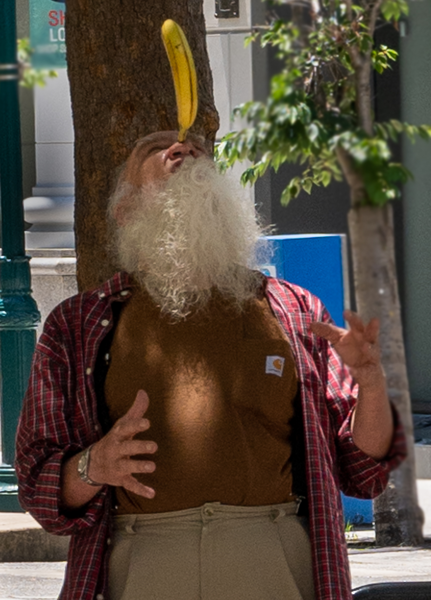
Hi John, Yes, I would have liked more cords. Alas, this was the only board there. Interesting, I didn't realize it was possibly and army board. |
Jun 10th |
| 3 |
Jun 22 |
Reply |
Hi Ruth,I'm glad my revisions, as suggested by Kieu-Hanh, improved the image. I toned down the white cord a little, but I can now see that needs more, which I'm happy to do. Good suggestion, thanks. |
Jun 10th |
| 3 |
Jun 22 |
Reply |
Hi Tom, that's fantastic. I wonder how the event place got hold of this one.Yes, we have moved on, but I guess it had to start somewhere.Cheers! |
Jun 8th |
| 3 |
Jun 22 |
Comment |
Much better. Good job! |
Jun 7th |
| 3 |
Jun 22 |
Comment |
Much better. Good job! |
Jun 7th |
| 3 |
Jun 22 |
Reply |
I agree, LouAnn, photography renders such diverse feelings and impressions, depending where you are. That's the beauty of it.And it's inspiring how we're able to share our thoughts openly in this group. |
Jun 7th |
| 3 |
Jun 22 |
Reply |
How's this? |
Jun 7th |
 |
| 3 |
Jun 22 |
Comment |
This does look like a cross between a lighthouse and a water tower. For that reason, it makes a great subject. I find myself wanting to see more lighthouse, so I'm curious if you have any shots from a different point-of-view? Perhaps one without the plams in the foreground? |
Jun 7th |
| 3 |
Jun 22 |
Comment |
Hi Mary Ann,
Thnak you for capturing my favorite flower so well. I really like the smooth bokeh in your image, which isolates the flower so well. I also like LouAnn's edits too.The class sounds very helpful. |
Jun 7th |
| 3 |
Jun 22 |
Comment |
Hi Kieu-Hanh,
This is a very strong photojournalism image. It's well-balanced and shows humanity. I like how you've captured the shdows of the marine and the trees. I might suggest a slight crop on the right of the frame to keep the eye on the marine. |
Jun 7th |
| 3 |
Jun 22 |
Comment |
I agree with Michael that this is great storytelling.You've captured communication between the woman and the birds. I feel that it might be even more intimate if you cropped out the bird to the far left of the frame and a little from behind the woman. |
Jun 7th |
| 3 |
Jun 22 |
Comment |
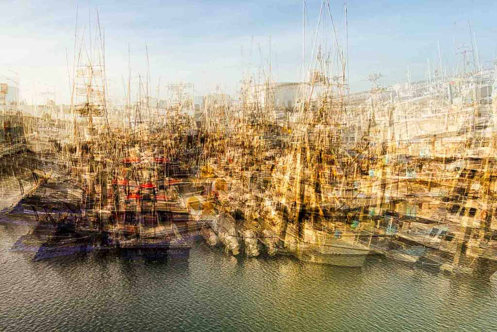
Hi Michael,
With the reflection in the channel, I get the impression that a slice of sky has fallen off and landed between the boats. This makes the image so much stronger. I agree that perhaps the skys could be toned down a little, bu then again, it adds an almost surreal nature. |
Jun 7th |
| 3 |
Jun 22 |
Comment |
Hi LuAnn,
This is such a beutiful image, full of tranquility. It belongs in National Geographic Magazine. I have to agree with the previous comments about preferring the orginal, even undedited. Th trees do seem to distract in this version. Also, the mist layer seems a little harsher than in the original. |
Jun 7th |
| 3 |
Jun 22 |
Reply |
Hi Kieu-Hanh,
Thank you for your kind commnets and excellent suggestions, which I'm happy to apply. I tend to throw my images up there without due care and attention, so it's good to get this kind of feedback. |
Jun 7th |
10 comments - 6 replies for Group 3
|
| 18 |
Jun 22 |
Comment |
I hand't thought of adding colors to panes, but I'll give that a go. Good suggestions, thanks. |
Jun 23rd |
| 18 |
Jun 22 |
Comment |
Good idea to darken the door and window Ian. It does help identify the focal point. Thanks. |
Jun 20th |
| 18 |
Jun 22 |
Comment |
For me, Jim, it looks very busy. I think it would be stronger if you cropped just around the grill.Perhaps even put a texture in the background that will make grill and frame stand out. |
Jun 13th |
| 18 |
Jun 22 |
Comment |
For me, Jim, it looks very busy. I think it would be stronger if you cropped just around the grill.Perhaps even put a texture in the background that will make grill and frame stand out. |
Jun 13th |
| 18 |
Jun 22 |
Comment |
I like the ffect and agree with Mike that it doesn't work as well on the statue. Just a thought - have you tried a version cloning out the statue? That way, the leading lines takes us to the house. |
Jun 13th |
| 18 |
Jun 22 |
Comment |
This image really punches. I like the contrast between the vibrant flower and the plain background. I'm cruious how it would look if you lowered the opacity on the stroke? |
Jun 11th |
| 18 |
Jun 22 |
Reply |
Thanks, Jim. |
Jun 11th |
| 18 |
Jun 22 |
Comment |
Hi Mike,
I really like what you've done to transform this image. The graphic effect dramatizes the action of the bee chomping on the flower. By making it a graphic image, you have isolated the two important subjects, bee and flower, while reducing potential distractions. The pastel colors are very appealing too. Nice job! |
Jun 7th |
| 18 |
Jun 22 |
Reply |
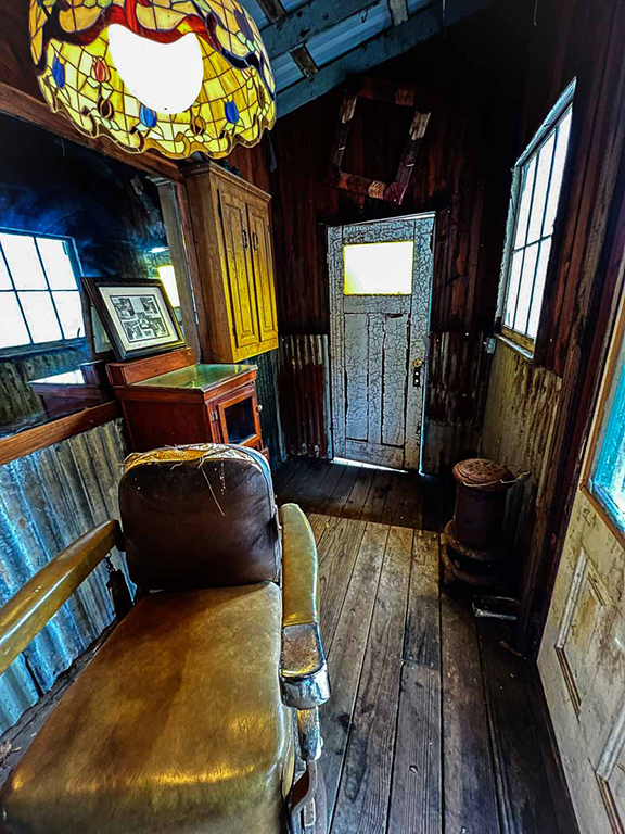
Mike,spot on! I see what you mean about the lampshade, which I didn't catch myself. That's the value of having seasoned photographers such as yourself critique our images. We're simply too close to them to notice all of the faults. You did a good job and the image is much-improved. Thank you. |
Jun 6th |
8 comments - 2 replies for Group 18
|
18 comments - 8 replies Total
|