|
| Group |
Round |
C/R |
Comment |
Date |
Image |
| 3 |
Apr 22 |
Comment |
Thanks Mary Ann. I appreciate your feedback and I'm so glad that I joined this group. |
Apr 8th |
| 3 |
Apr 22 |
Comment |
It looks like a scotty to me. Maybe a lab.
I'll check out Bev Doolittle's work. Thanks for the lead. |
Apr 5th |
| 3 |
Apr 22 |
Comment |
Hi Ruth,
It's a difficult choice between getting a technically perfect image versus a good story. Given the conditions you found yourself in, I believe you've captured a very special decisive moment, which compensates for the blurred Frigate. It sounds like you may have shot this hand-held. Did you have a tripod available, or was this a spur-of-the-monent event?
JW |
Apr 4th |
| 3 |
Apr 22 |
Comment |
Wow, I love the vibrancy in this image. You can almost smell
the autumnal leaves. Please forgive the pun, but the peeling leaves are appealing. I cannot think of anything that would enhance it.
As for the creative category, I feel that it definetly belongs there and I see images like this in our camera club.
|
Apr 4th |
| 3 |
Apr 22 |
Reply |
Good ideas! |
Apr 4th |
| 3 |
Apr 22 |
Comment |
LuAnn,
I think you've framed the image very well with leading lines formed by the rocks. I appreciate what you were going for with the color, given the iron ranges in Minnesota, but I feel that it does wrk better in blabk & white. When I look carefully look at the water in the left bewteen the two jutting rocks, I see the face of a dog. You have achieved a wonderful rorschach test.
|
Apr 4th |
| 3 |
Apr 22 |
Reply |
Hi LuAnn,
Thank you for your condideration about my intent for the image.It's very interesting that one image can evoke so many different feelings. I find it challenging to decide how best to present images, especially ones that could do equally well in color of b&w.
I did deliberately unsaturate the image, but I can see what you mean about the reddish tones in the roof tiles. I guess my best cause of action would be to be more deleibrate in going one way of the other - completely mono or richer color.
I'm very impressed with this group and find the comments really helpful. |
Apr 4th |
| 3 |
Apr 22 |
Reply |
Hi Michael,
Thanks for the welcome to the group. Interesting, I had at first considered making this a monochrome image, because that tends to emphasize shape and textures. I opted for going for color because I belong to a monochrome group as well. It seems that it could work either way. I deliberately cropped the sky to focus on the building, which is the subject of this image. I do like the brooding sky that you've chosen. I like your thoughts. |
Apr 4th |
| 3 |
Apr 22 |
Reply |
Thanks, Ruth. I appreciate your comments. |
Apr 4th |
| 3 |
Apr 22 |
Reply |
I really like what you did. I was cocerrend that the building wasn't punchy enough but didn't want to overdo it. Your modications work well. Thanks. |
Apr 3rd |
5 comments - 5 replies for Group 3
|
| 18 |
Apr 22 |
Reply |
Thanks. I'll give the reds a try. |
Apr 20th |
| 18 |
Apr 22 |
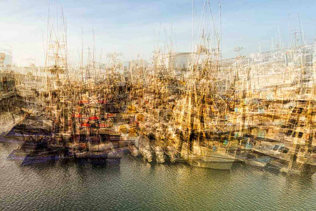
Reply |
I agree with Mike and yourself about the crops, which I'll make. I was worried about the lack of a focal point, as there didn't seem to be a good candidate for that in this group of boats. Tye cropping should help. Thanks. |
Apr 13th |
| 18 |
Apr 22 |
Reply |
Thank you, Mark. The tools seem to be getting better and better, which allows for more latitude. |
Apr 13th |
| 18 |
Apr 22 |
Reply |
Thanks, David. That was exactly what I was trying to convey. In fact, I think I ' ll change the title to that. |
Apr 11th |
| 18 |
Apr 22 |
Comment |
I agree with Mike that original 2 works best. Love the contrast and simple elegance of the shot. Would work really well as a product shot. |
Apr 10th |
| 18 |
Apr 22 |
Comment |
Very inventive and original. If I may suggest a possible title, "Mug in Mug." |
Apr 10th |
| 18 |
Apr 22 |
Comment |
Clever graphic image. Love the tonal qualities. Can't think of any improvements. |
Apr 10th |
| 18 |
Apr 22 |
Comment |
Almost like a floral Rorschach test. Th eye bounces from the bright flower to the background. Lots of interesting layers and good symmetry. I can't suggest amy improvements. |
Apr 10th |
| 18 |
Apr 22 |
Comment |
Love the reflection - very ethereal. Turner is my favorite artist. What is the Turner filter? |
Apr 10th |
| 18 |
Apr 22 |
Comment |
Nice background separation to make the flower pop. Love the title. |
Apr 10th |
| 18 |
Apr 22 |
Reply |
Good suggestion. I'll give that a try. Thanks so much. |
Apr 10th |
| 18 |
Apr 22 |
Reply |
Thank you! |
Apr 10th |
| 18 |
Apr 22 |
Reply |
Thank you, Stephen. Surpisingly, I got it on the first go. It's so easy to do with this App. |
Apr 4th |
6 comments - 7 replies for Group 18
|
11 comments - 12 replies Total
|