|
| Group |
Round |
C/R |
Comment |
Date |
Image |
| 47 |
Sep 25 |
Reply |
Hi Ed - thanks for your comments.
I see what you mean about the 'busy-ness' of it.
I'm going to try this again later this fall and see if I can improve it based on everyone's suggestions. |
Sep 23rd |
| 47 |
Sep 25 |
Reply |
Thanks, Barbara, I appreciate your comments.
I think there is a photo to be had here - I'll try again and try to incorporate the suggestions everyone has shared. |
Sep 23rd |
| 47 |
Sep 25 |
Reply |
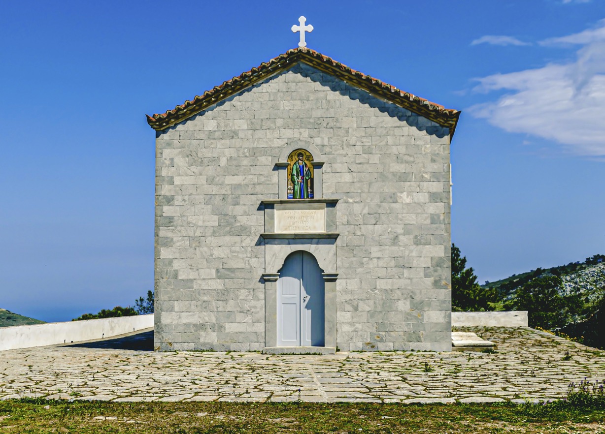
Did you get to St. Pat's for a shot? |
Sep 15th |
| 47 |
Sep 25 |
Comment |
I too like the crop of the original better but I see where you are going with your crop - the imposing clouds are more the focus of your B&W. Perhaps a compromise and just crop out a little more of the top and bottom of the photo.
Douglas's version is very nice but I think it does not convey the imposing clouds as much as your B&W version.
Rob |
Sep 15th |
| 47 |
Sep 25 |
Comment |
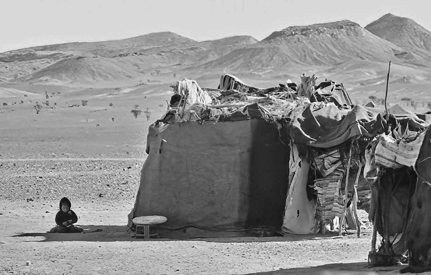
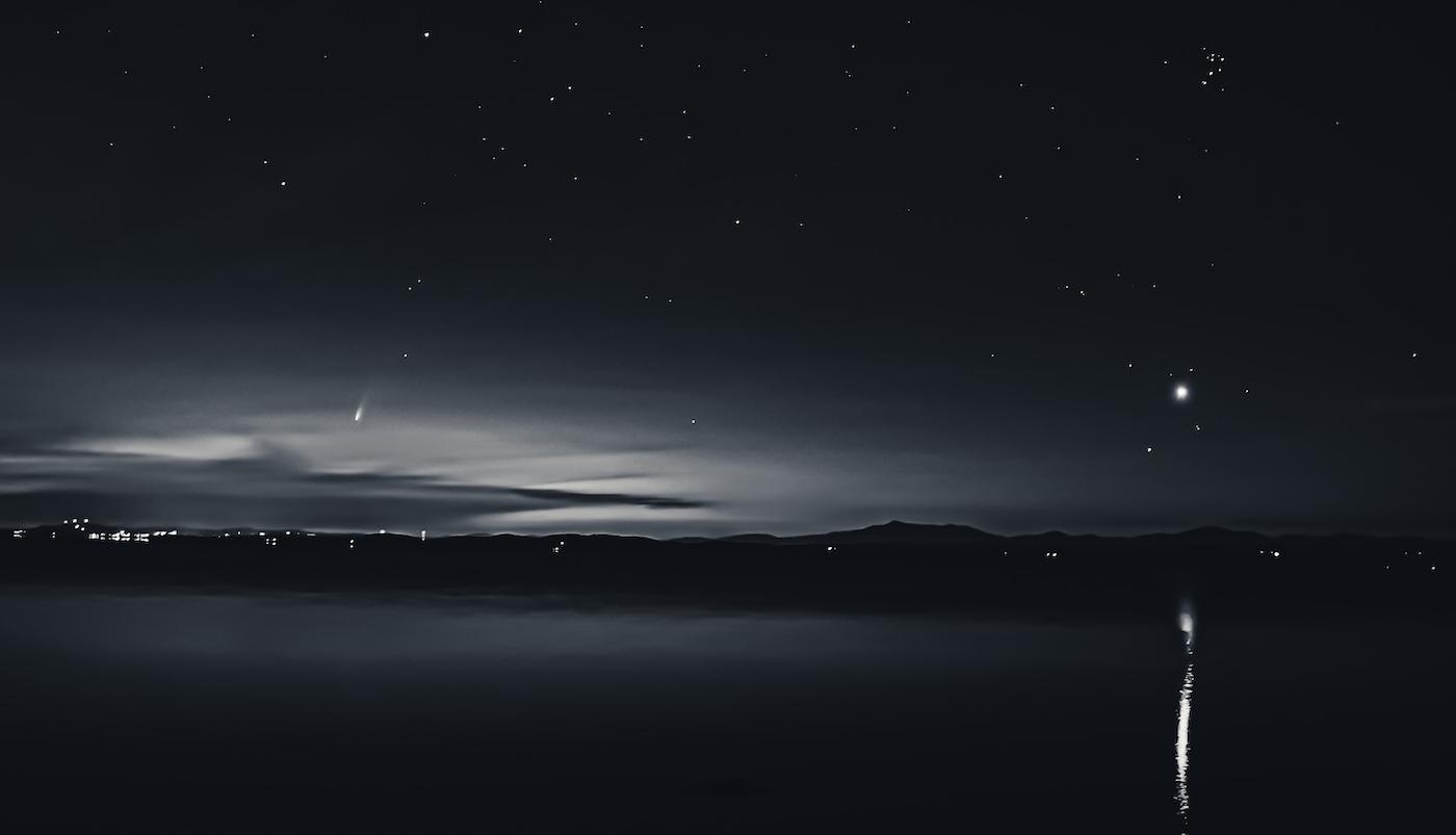
I feel less a sense of mystery and more of an appreciation for the beauty of the location as seen at night through natural lighting of the moon. The calm sea adds to that feeling.
Re the moon: if the ring around the moon is the result of some post processing, I would correct it. If it is natural, then I would leave it in. I've not seen that affect before.
Terrific image, Al. |
Sep 15th |
| 47 |
Sep 25 |
Comment |
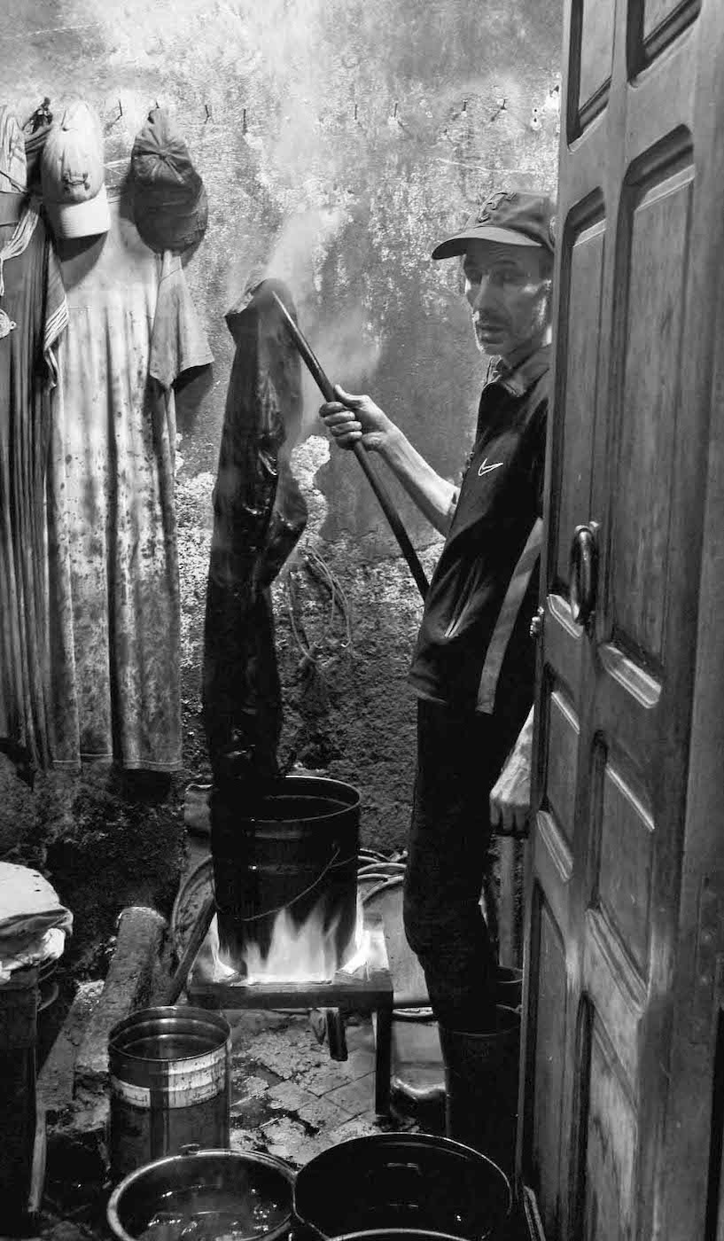
I was recently talking to a friend of my son about "double exposure" with a digital camera, compared to how I used to do it was a film camera. So, your timing of this photo fits nicely into what I want to attempt. Thanks for sharing the technique - I will give it a go also!
There's a lot one can conjecture in the photo - I saw it almost as the spirit leaving the body. And I too thought the cord was meant to imitate a tear in an old photo. I would leave it in in order to create some additional tension in the scene.
Always creative with those workshops, Kirsti!
Rob |
Sep 14th |
| 47 |
Sep 25 |
Comment |
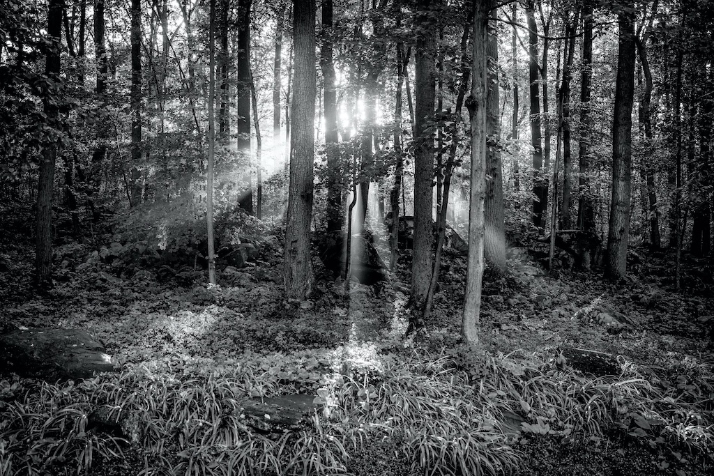
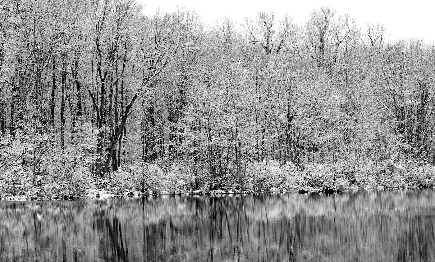
My initial reaction was that this was an IR photo or processing. I like each individual section of the photo but I'm having trouble gaining a sense of the depth in the photo. Maybe a little tweaking to put some distance between the foreground and background?
Other than that, it's a wonderful photo of a beautiful location!
Rob
|
Sep 14th |
| 47 |
Sep 25 |
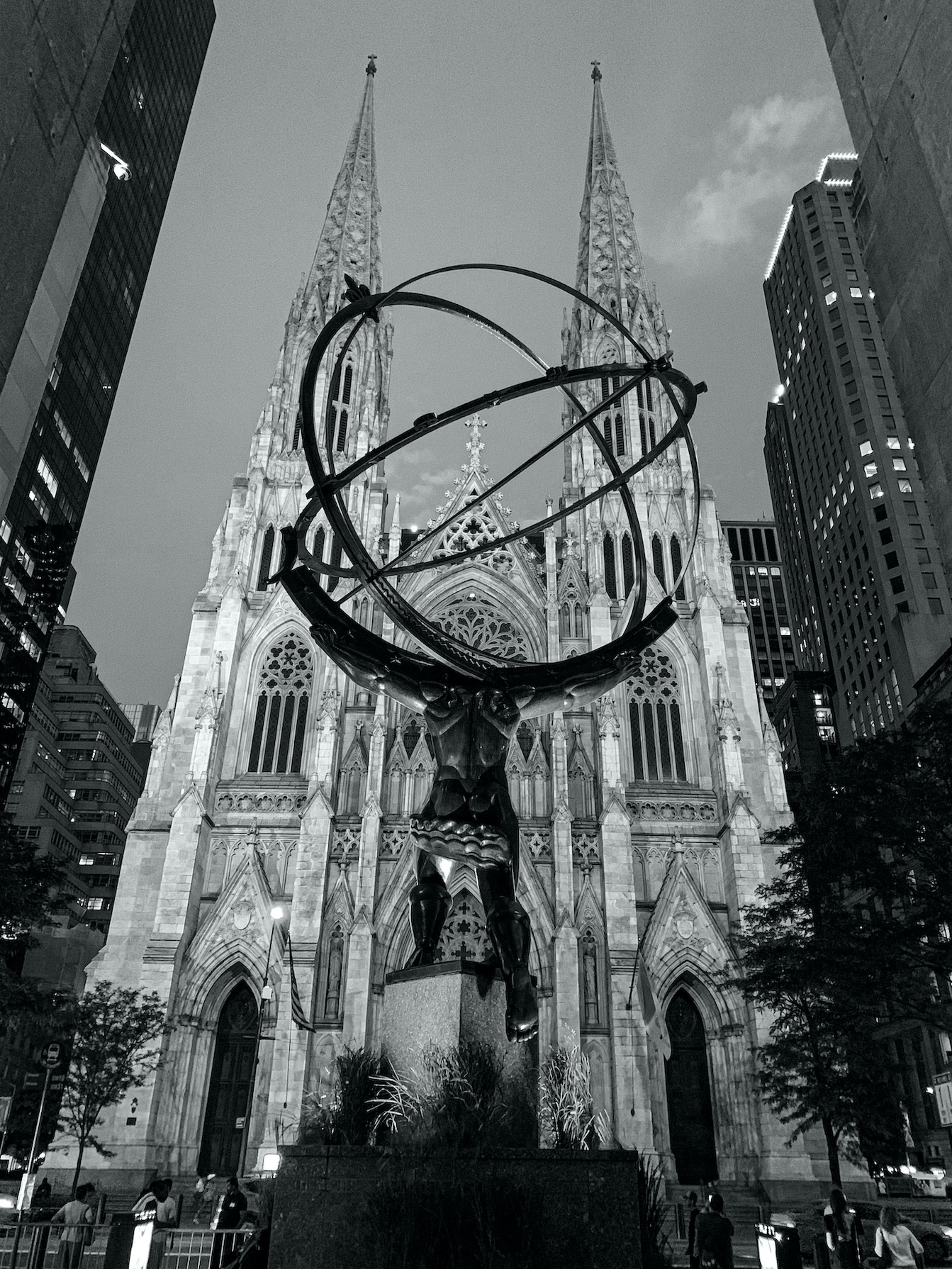
Comment |
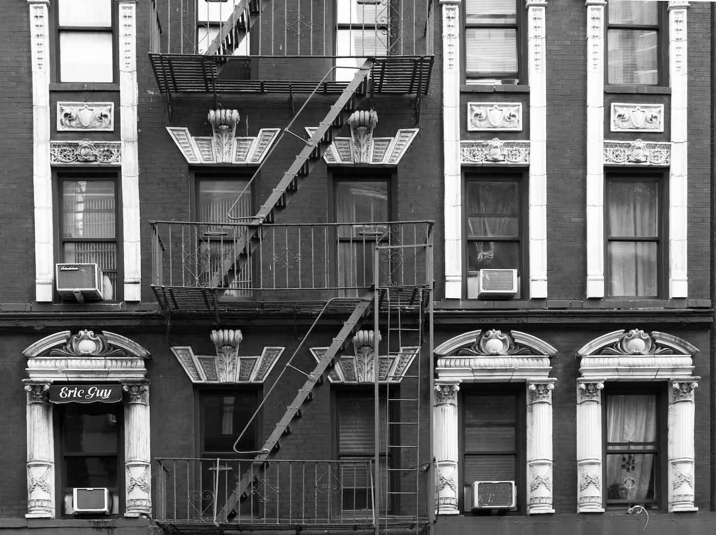
I love the perspective of your photograph. And, the framing is perfect to my eye. I'm wondering if you waited while looking through the lens to what looked right to you? Or did you just compose it the way you wanted to and then shoot?
I think the suggestions for lightening up the trees and in Douglas's case removing the one from the right side improved an already tremendous photo.
Rob
|
Sep 14th |
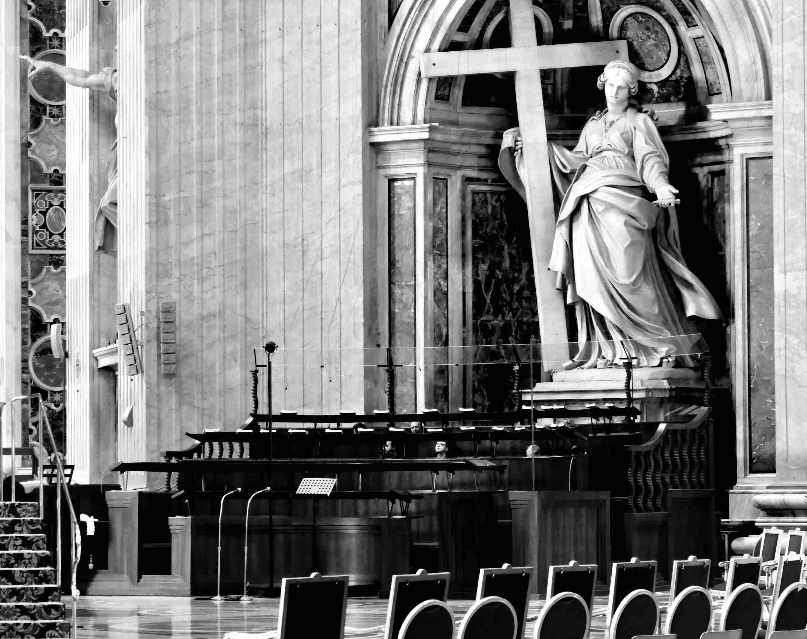
| 47 |
Sep 25 |
Reply |
Thanks, Douglas,
I see what you did there and I like your suggestion.
I do see that there is a green effect at the base of the statue in your edit. However, I will try another technique to open up the blacks.
And, good luck if you give it a shot also!
Rob
|
Sep 14th |
| 47 |
Sep 25 |
Reply |
Hi Jeff,
Yes, I like your and Kirsti's suggestions about opening up the black at the base of the statue. I will give that a go!
Much appreciated,
Rob
|
Sep 14th |
| 47 |
Sep 25 |
Reply |
Thanks, Kirsti! I will open up the dark areas at the base of the statue as you suggest. Since my son lives in NYC I will have other opportunities to get this the way I want it! |
Sep 14th |
| 47 |
Sep 25 |
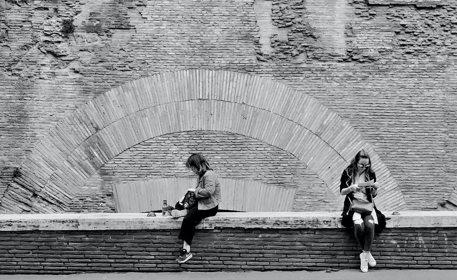
Comment |
Hi Douglas,
I like the composition of your photo - similar to the one I submitted a few months back of 2 girls sitting on a wall - but I like your balance much more.
I think Jeff's suggestions were spot on and your edited version is terrific!
Rob |
Sep 14th |
6 comments - 6 replies for Group 47
|
6 comments - 6 replies Total
|