|
| Group |
Round |
C/R |
Comment |
Date |
Image |
| 47 |
Apr 25 |
Comment |
I love the story telling of the photo. I too like the color version better - I think the B&W would work better if some of the halos around the outline of the elephants and background trees weren't so pronounced. It's an amazing capture of a wonderful nature scene.
One other observation - is that the shadow of the removed elephant on the right side of the photo?
You are fortunate to have been able to take this wonderful photo. |
Apr 16th |
| 47 |
Apr 25 |
Reply |
Thanks, Barbara. I like the color version much better but had fun converting to B&W. It was shot through the aquarium glass, and I was surprised how well it turned out. |
Apr 16th |
| 47 |
Apr 25 |
Reply |
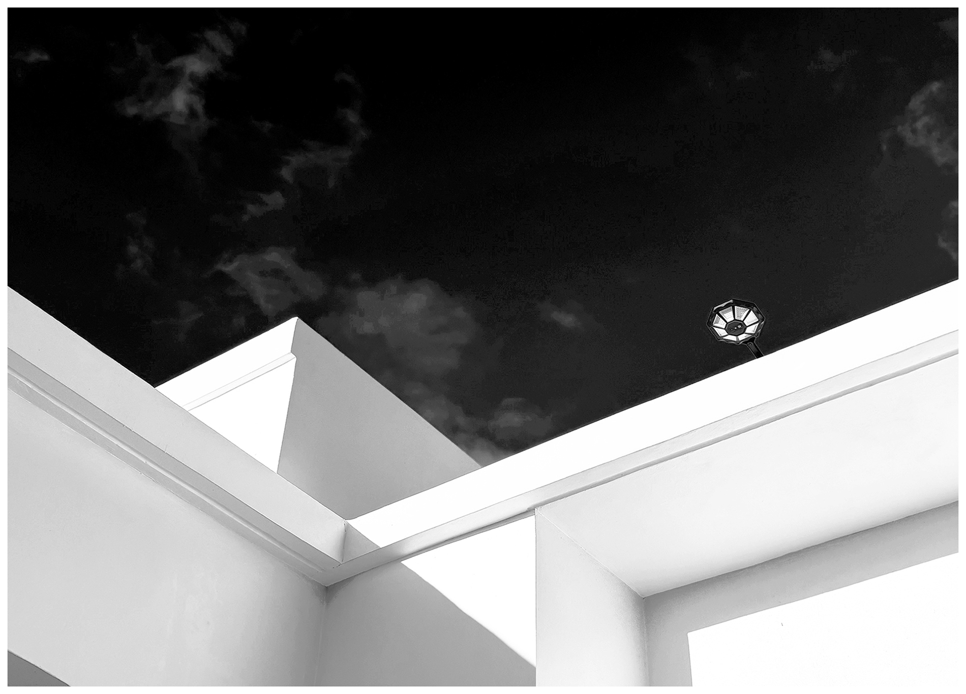
Thanks, Douglas, it was the geometrical shapes and abstract nature that led me to convert to B&W. |
Apr 16th |
| 47 |
Apr 25 |
Comment |
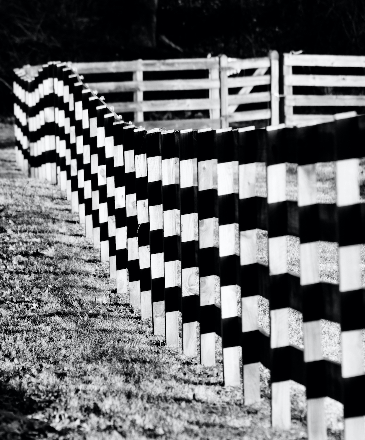
Hi Douglas - welcome to the group!
This is a very nice spontaneous photo. Was this taken in Delaware?
I like the composition a lot. It tells the story that you shared - that of hikers taking a rest.
My only suggestion would be perhaps tone down the background in order for the poles to stand out more.
I look forward to seeing more of your photos!
Rob
|
Apr 11th |
| 47 |
Apr 25 |
Comment |
Hi Kirsti - you do so many creative things with your photography club and this is certainly one of them - what an original photo!
I seem to find patterns or similarities in photos so I noticed how the angel's wings compliment the tulip petals. The placement of the angel works perfectly.
And I love the mottling effect! |
Apr 10th |
| 47 |
Apr 25 |
Reply |
Thanks, Kirsti and Jeff!
I agree with you both. The B&W image gets flattened. I saw that immediately. I think I can fool around with it some more to bring out more depth. |
Apr 10th |
| 47 |
Apr 25 |
Reply |
Thanks, Kirsti and Jeff!
I agree with you both. The B&W image gets flattened. I saw that immediately. I think I can fool around with it some more to bring out more depth. |
Apr 10th |
| 47 |
Apr 25 |
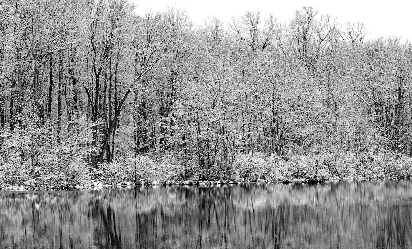
Comment |
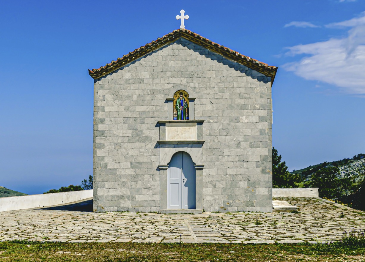
It's an amazing difference between the original and the final version. The final version really highlights the decay and passing of time on an abandoned building.
I like how the highlights on the foreground shrubs lead into the subject, and also how those highlights are complimented by the texture of the clouds. And the dark clouds add to the overall feel of the photo.
It's a very well composed photo.
Rob |
Apr 9th |
| 47 |
Apr 25 |
Comment |
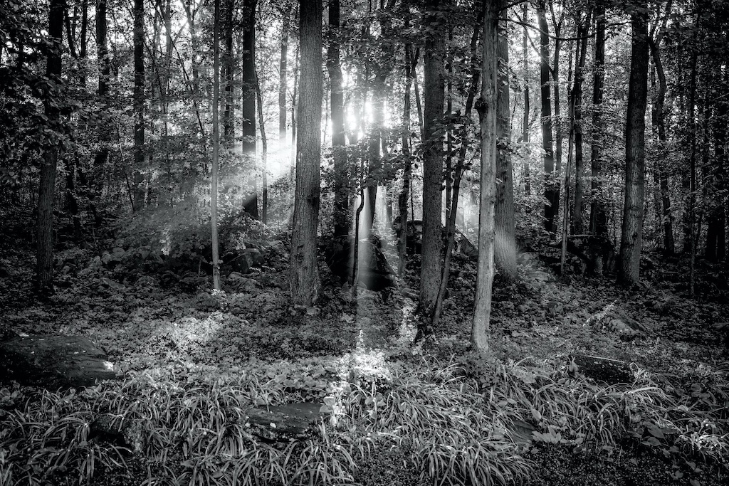
Another fantastic image, Jeff.
The exposure is spot on and the contrast if perfect.
The depth created with foreground and middle ground leading to the subject is very effective.
I also like how the clouds act almost like leading lines to the subject.
I go back and forth with whether the foreground might be toned down just a bit, but other than that, nothing I can offer to improve this wonderful photo. |
Apr 9th |
5 comments - 4 replies for Group 47
|
5 comments - 4 replies Total
|