|
| Group |
Round |
C/R |
Comment |
Date |
Image |
| 47 |
Feb 23 |
Comment |
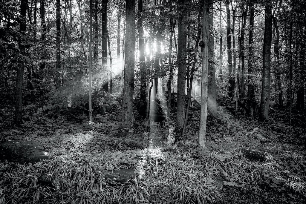
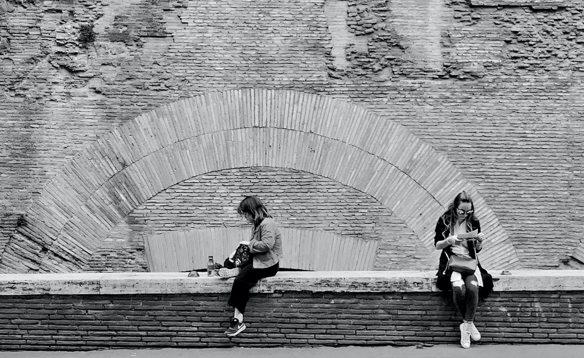
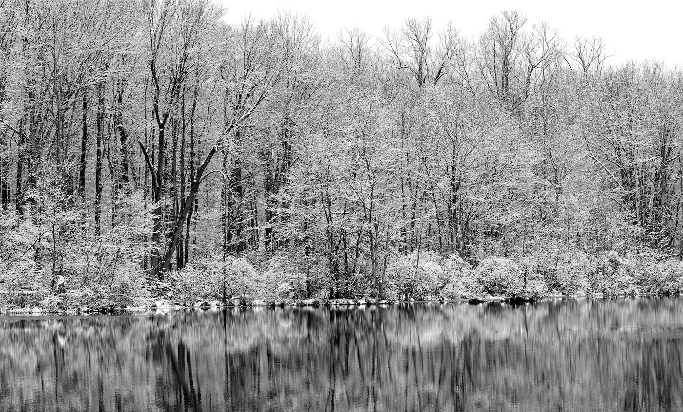
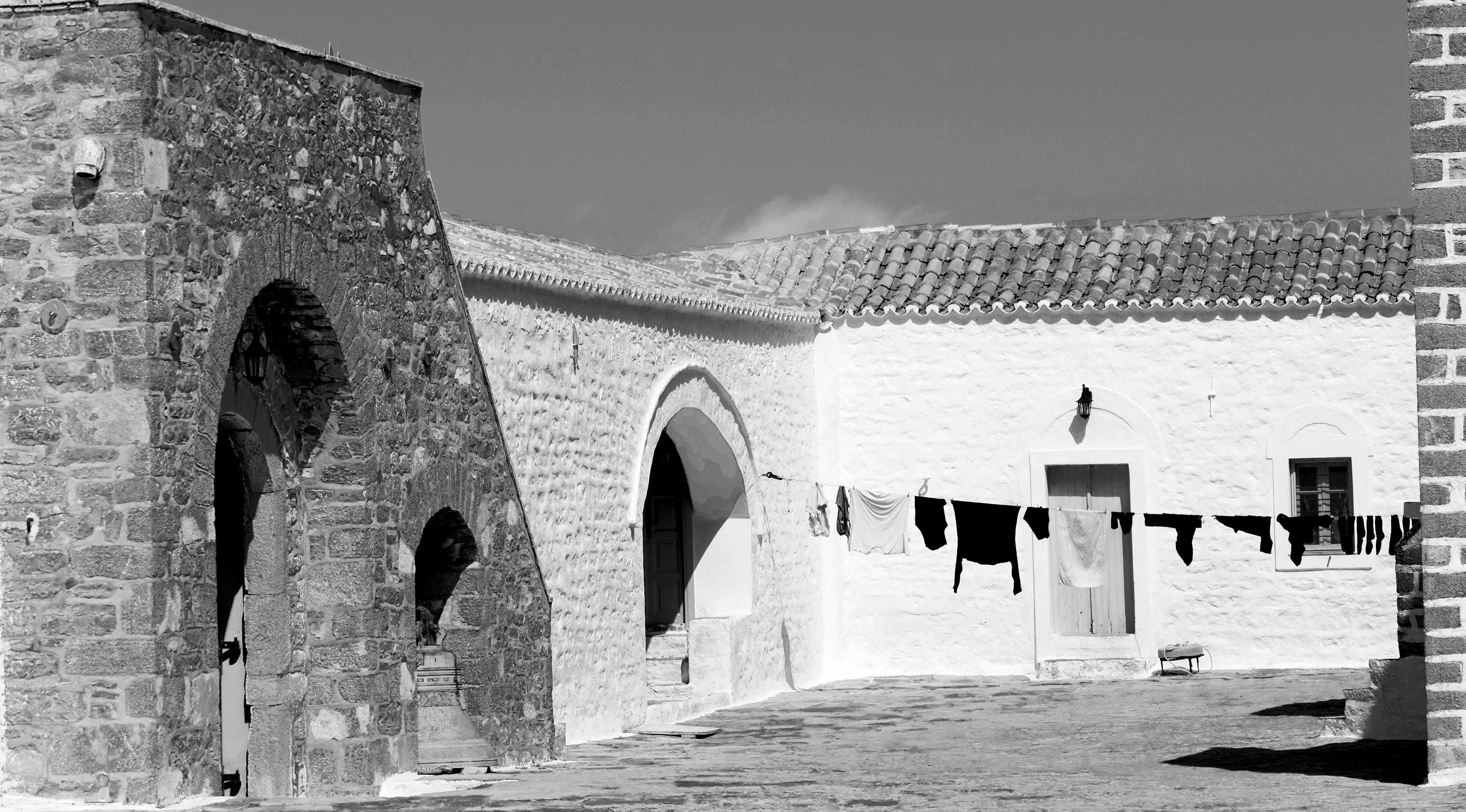
All of these versions are terrific - I like the first one you submitted (not the "original" you show) because I like the hue of that first photo very much. I could see darkening the sky a little would help. You definitely captured the mood of the story; I thought it looked like a WWII photo at first glance.
Very nicely captured and it's a shame when they buildings with character are left to decay and then replaced with condos or a strip mall, etc... |
Feb 9th |
| 47 |
Feb 23 |
Comment |
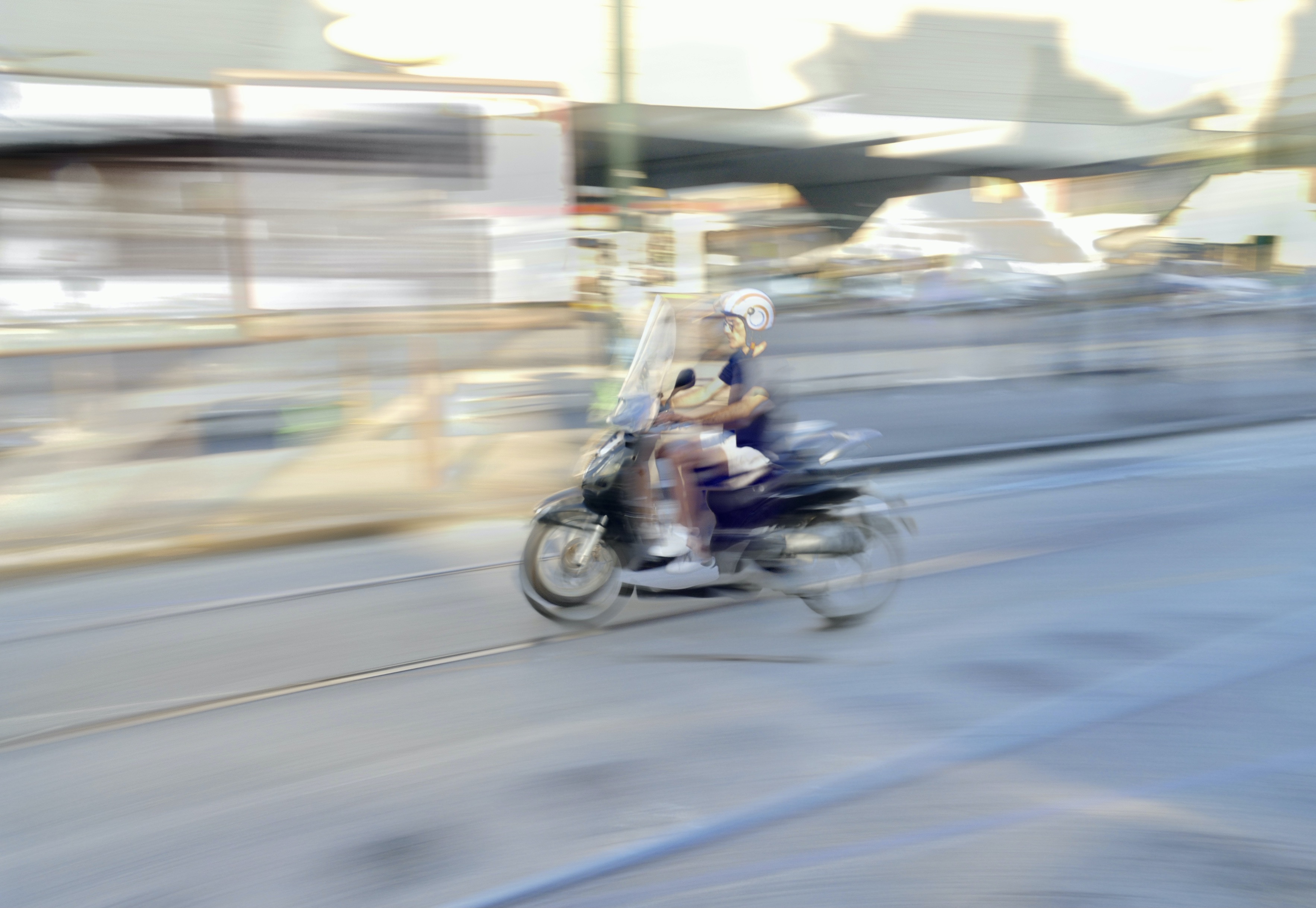
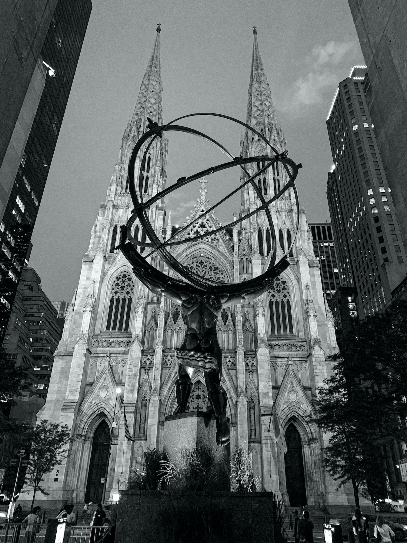
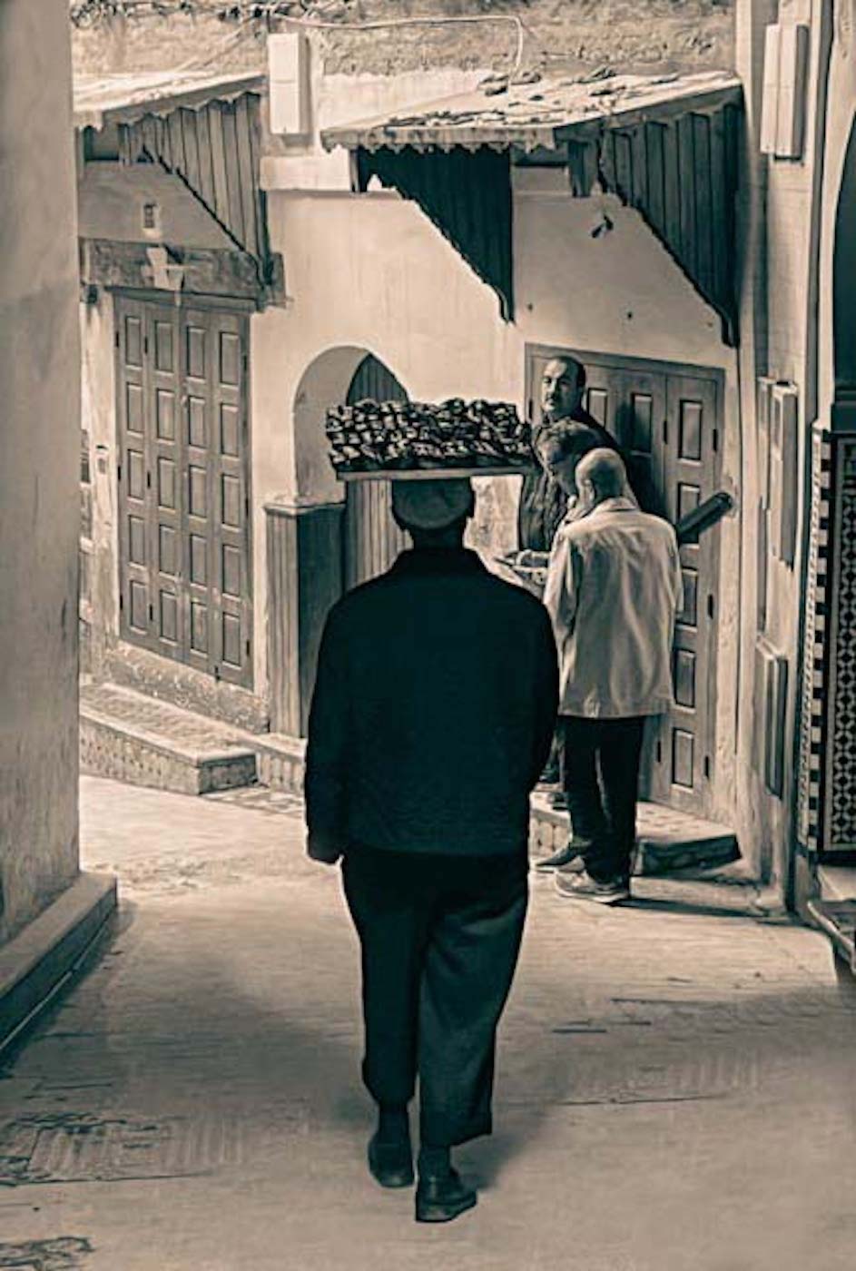
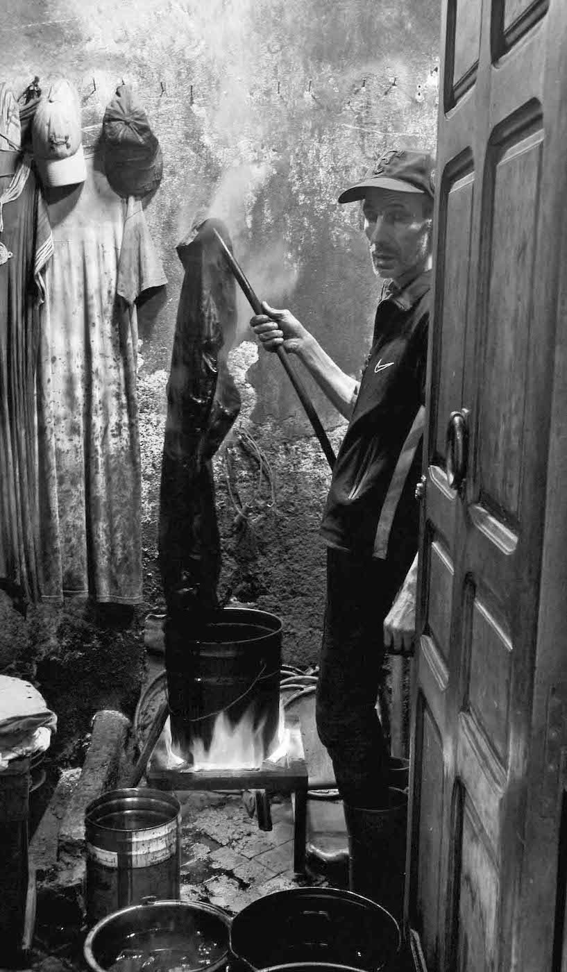
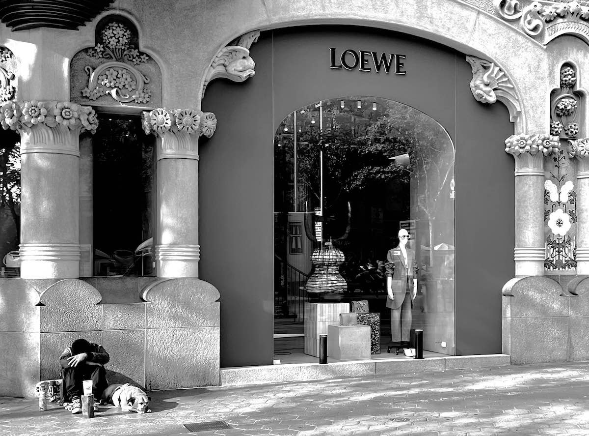
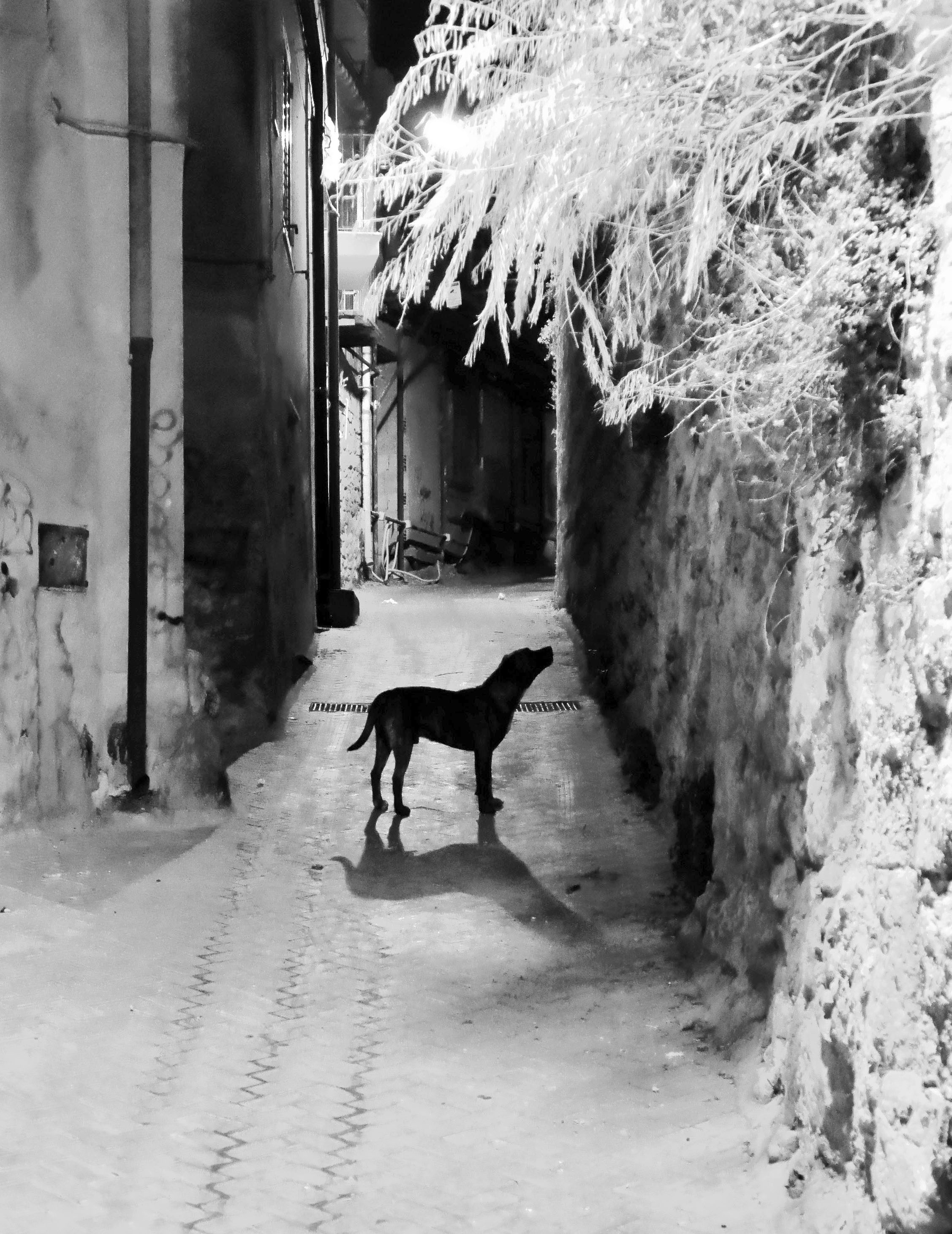
This is a very mysterious photo indeed. The detail on the poncho makes the man look ominous - my initial reaction was that he is coming from somewhere, not necessarily going somewhere. But where was he and what was he doing?? I would also be interested in seeing a little more detail on the wall on the right but it's not critical. I opened the photo in PS so I could put a lighter background around the photo - the black background of this website absorbs the edges. It really helped to see the framing of the photo and appreciate it even more - maybe consider a lighter border around the photo if you submit if for competition.
|
Feb 9th |
| 47 |
Feb 23 |
Reply |
Yes - I like that version a lot. |
Feb 7th |
| 47 |
Feb 23 |
Reply |
Yes - i like this a lot. Especially the corner images - they stand out much better. Thanks! |
Feb 7th |
| 47 |
Feb 23 |
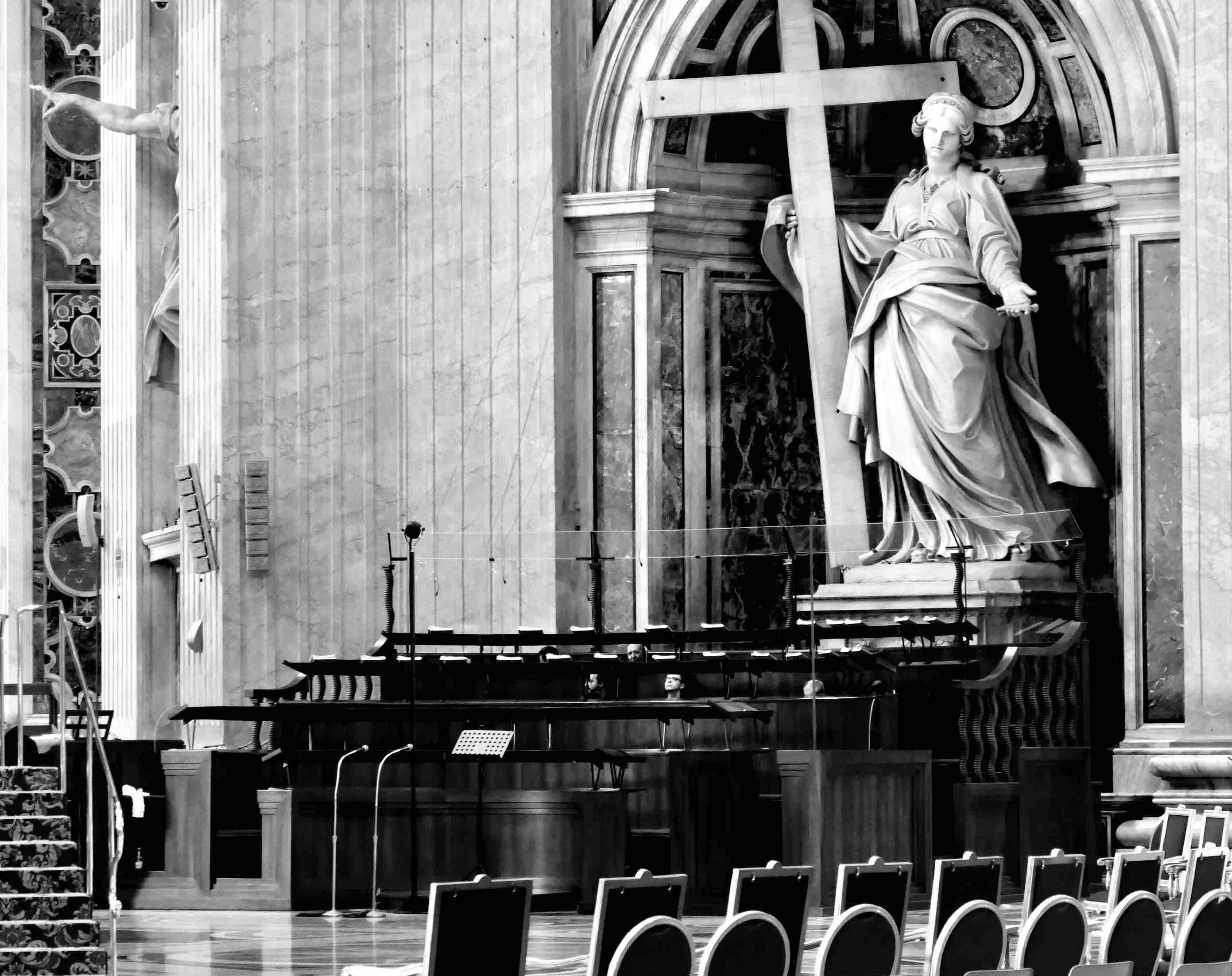
Comment |
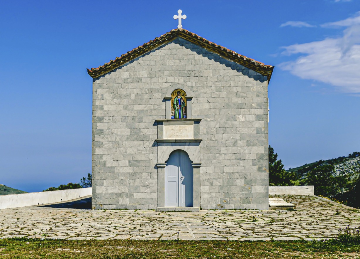
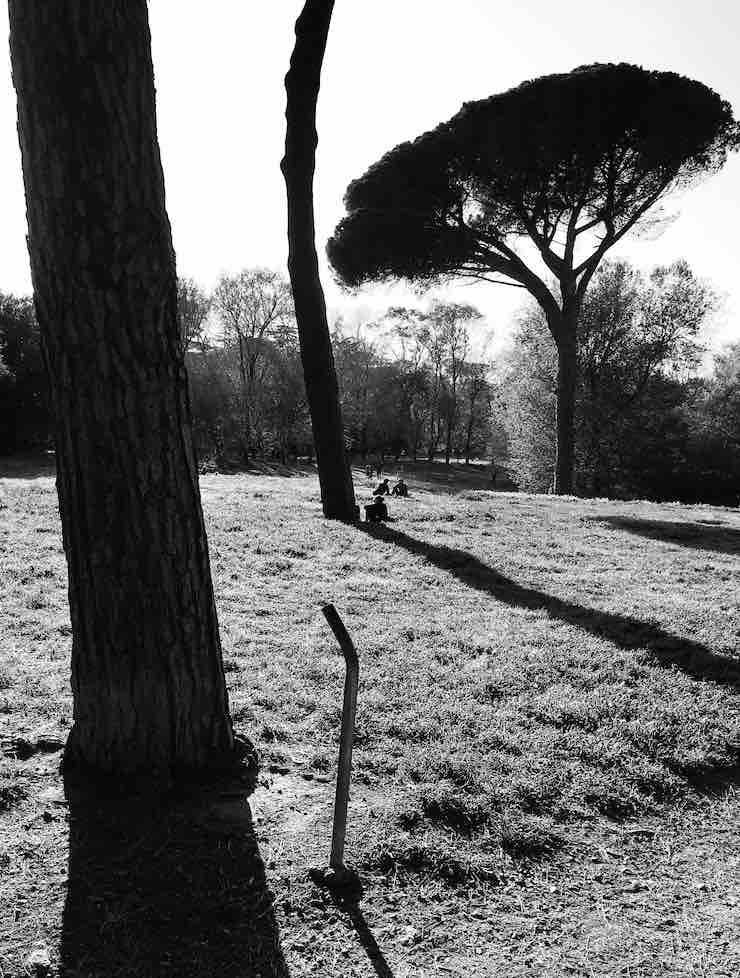
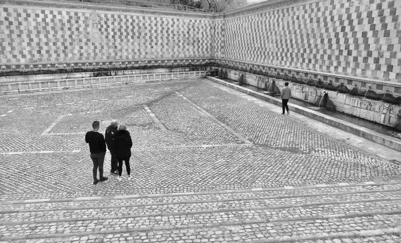
I like the composition of the photo. I would not crop off the people on the right but I might clone them out to see if it helps. The pathway is an excellent leading line into the main subject and the people on the walkway are well positioned. I converted to B&W just for comparison. I see what you mean about the sepia matching the age of the church - the B&W looks very nice also. The sky didn't seem to bother me that much but I guess if you can tone it down it's worth it to see if it improves the image.
|
Feb 7th |
| 47 |
Feb 23 |
Comment |
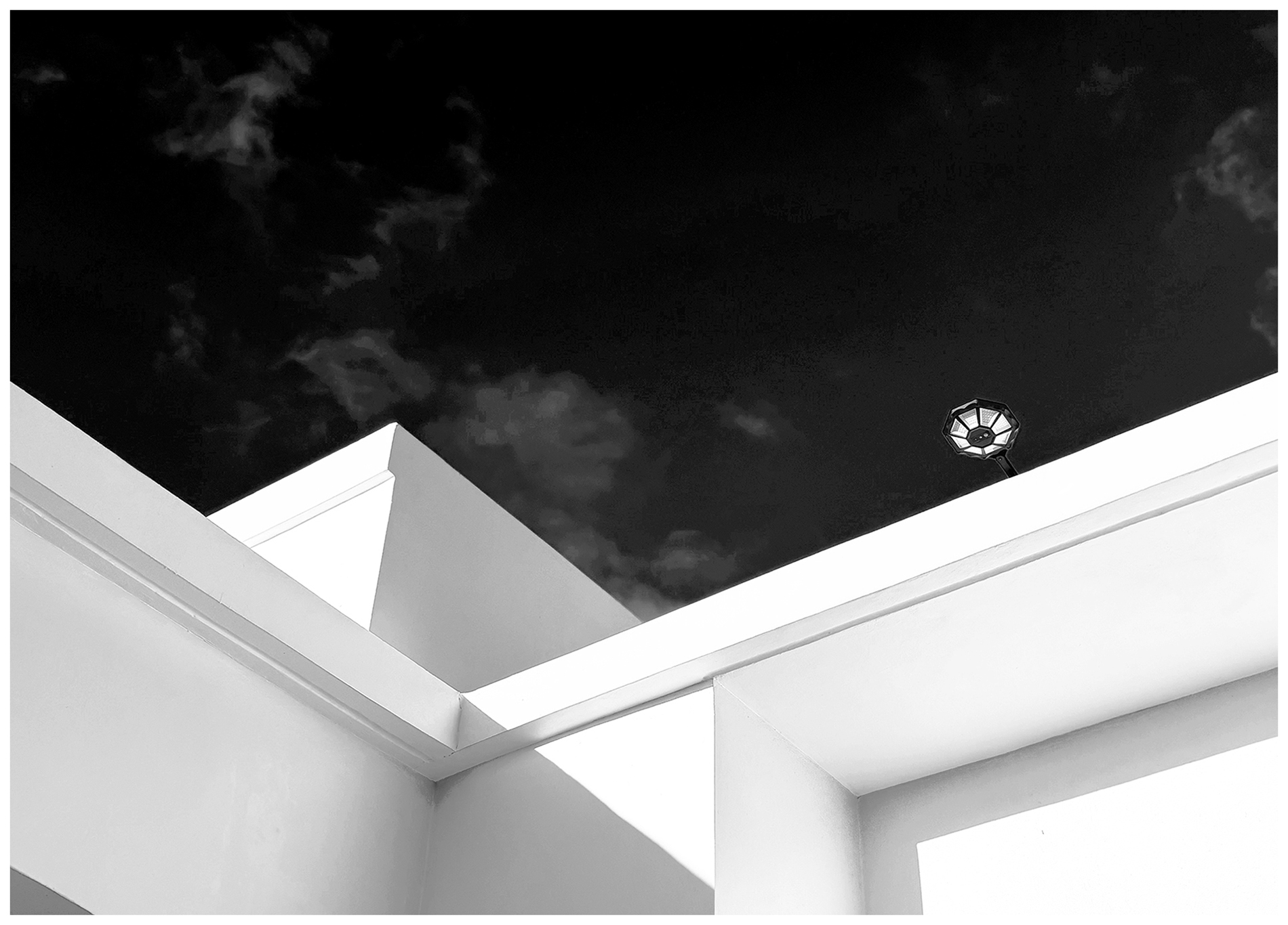
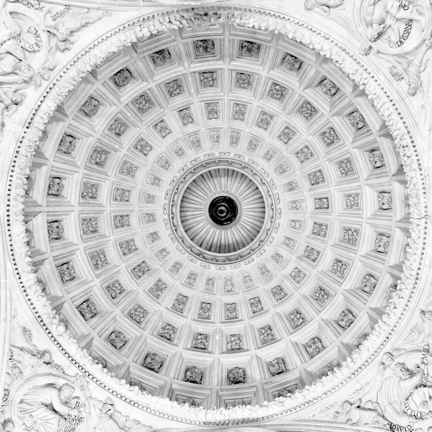
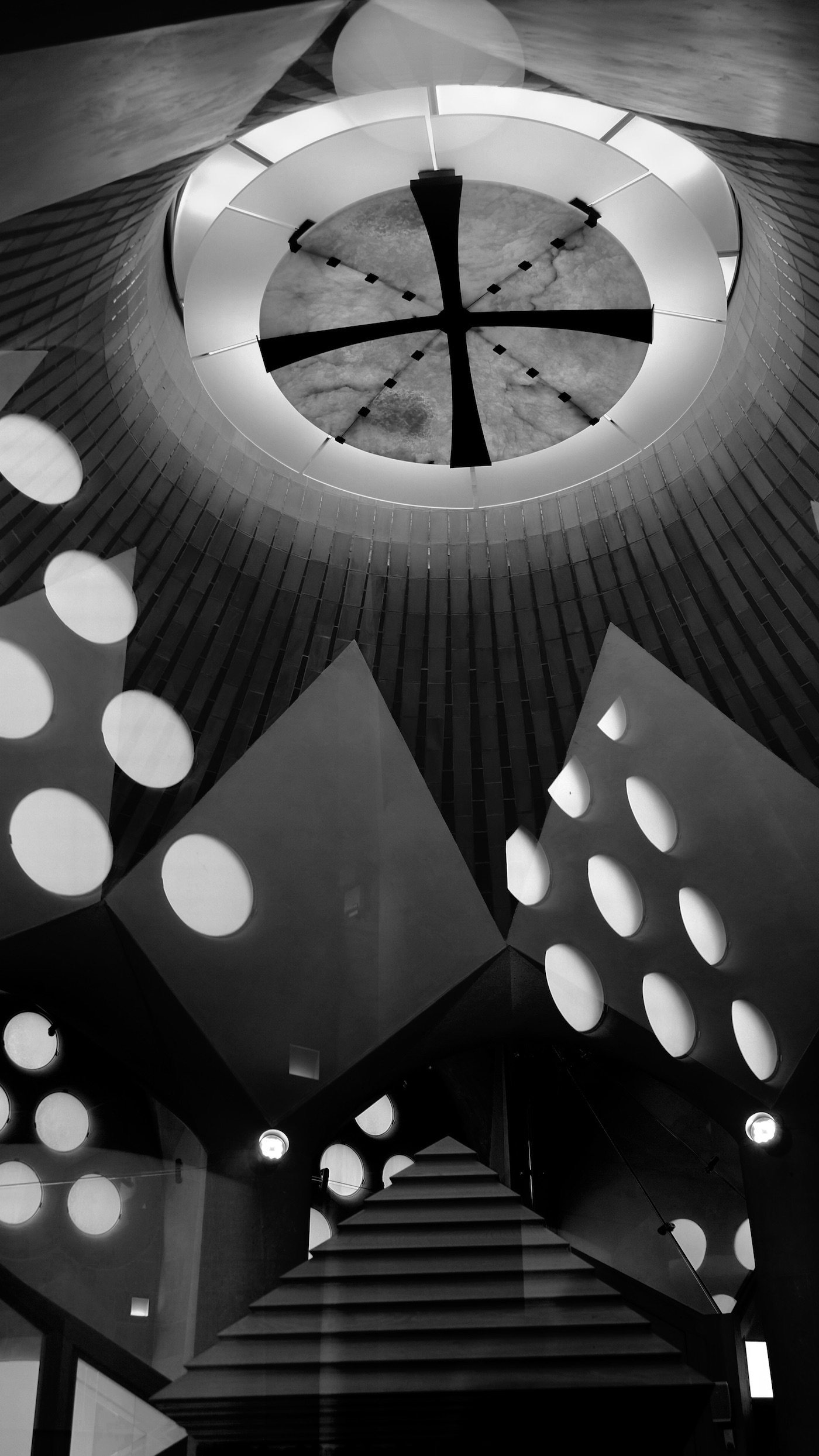
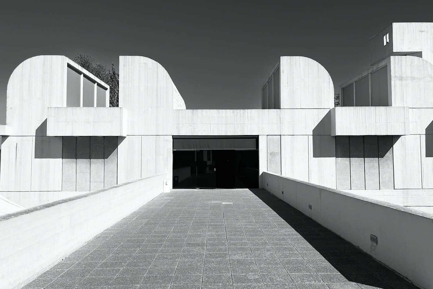
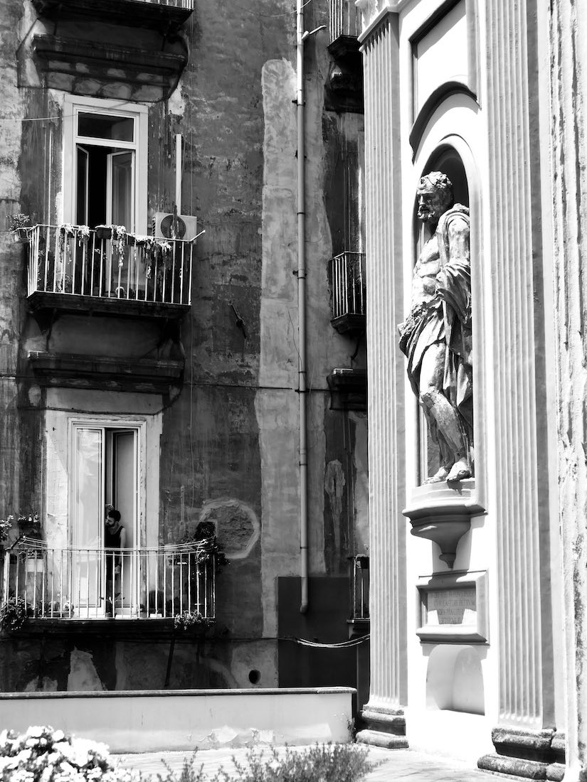
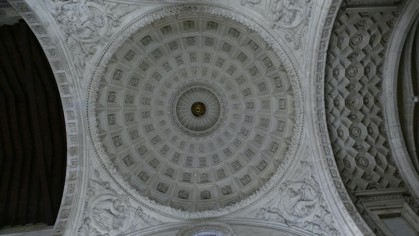
I'm curious as to what time of day (mid to late afternoon?) you shot this. The side lighting really works perfectly. The entire photo feels out of balance but somehow not distractingly - it has a very futuristic look to it for my eye. I look forward to seeing more of your photos as I like to take architectural photos also. |
Feb 7th |
| 47 |
Feb 23 |
Reply |
Jeff - I'd be interested in seeing your modifications to the tones - go ahead and drop it in here.
Thanks for taking the time to work on it. |
Feb 7th |
| 47 |
Feb 23 |
Reply |
The image was definitely not as bright as what I submitted. Maybe I went overboard?? Here is the original. |
Feb 7th |
 |
| 47 |
Feb 23 |
Reply |
The image was definitely not as bright as what I submitted. Maybe I went overboard?? Here is the original. |
Feb 7th |
 |
4 comments - 5 replies for Group 47
|
4 comments - 5 replies Total
|