|
| Group |
Round |
C/R |
Comment |
Date |
Image |
| 10 |
Jul 22 |
Reply |
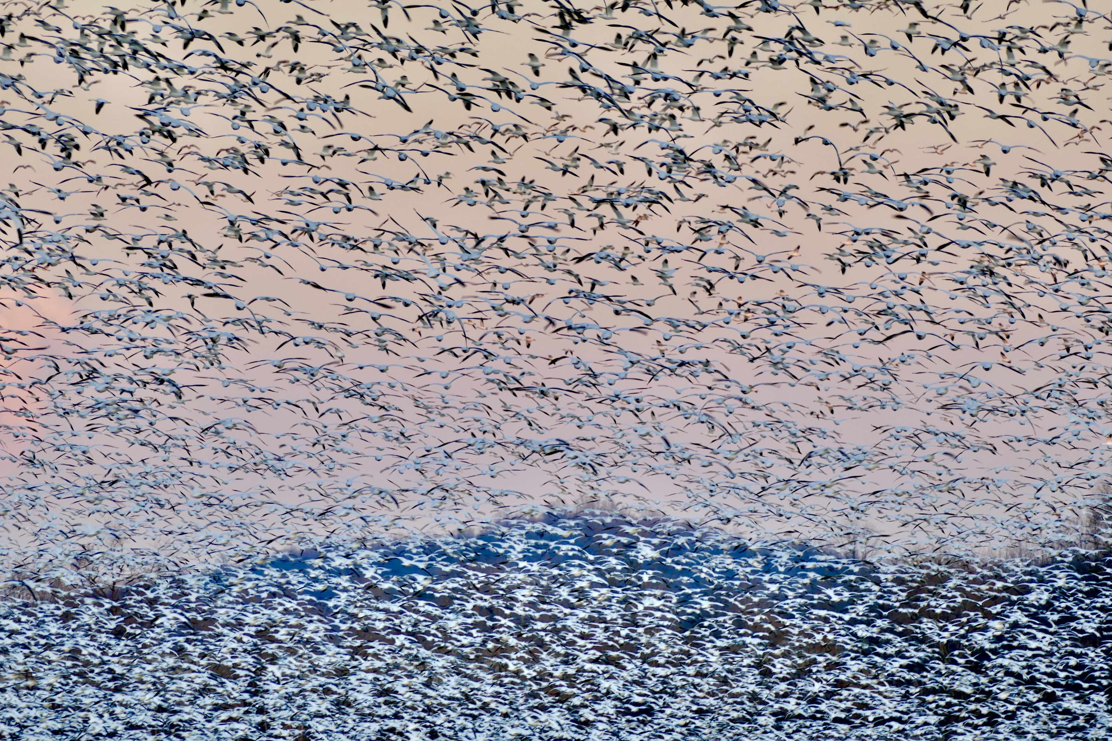
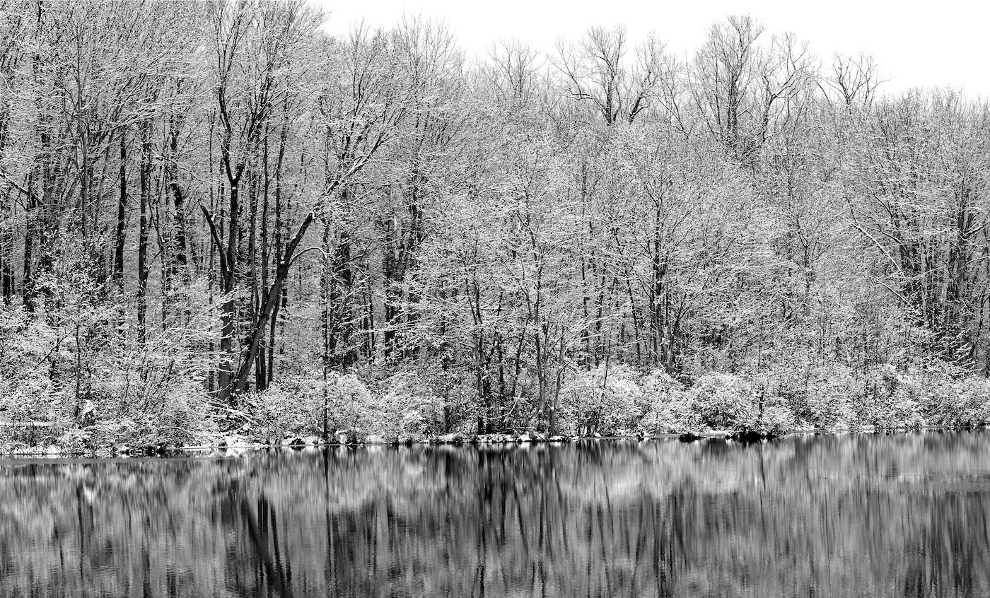
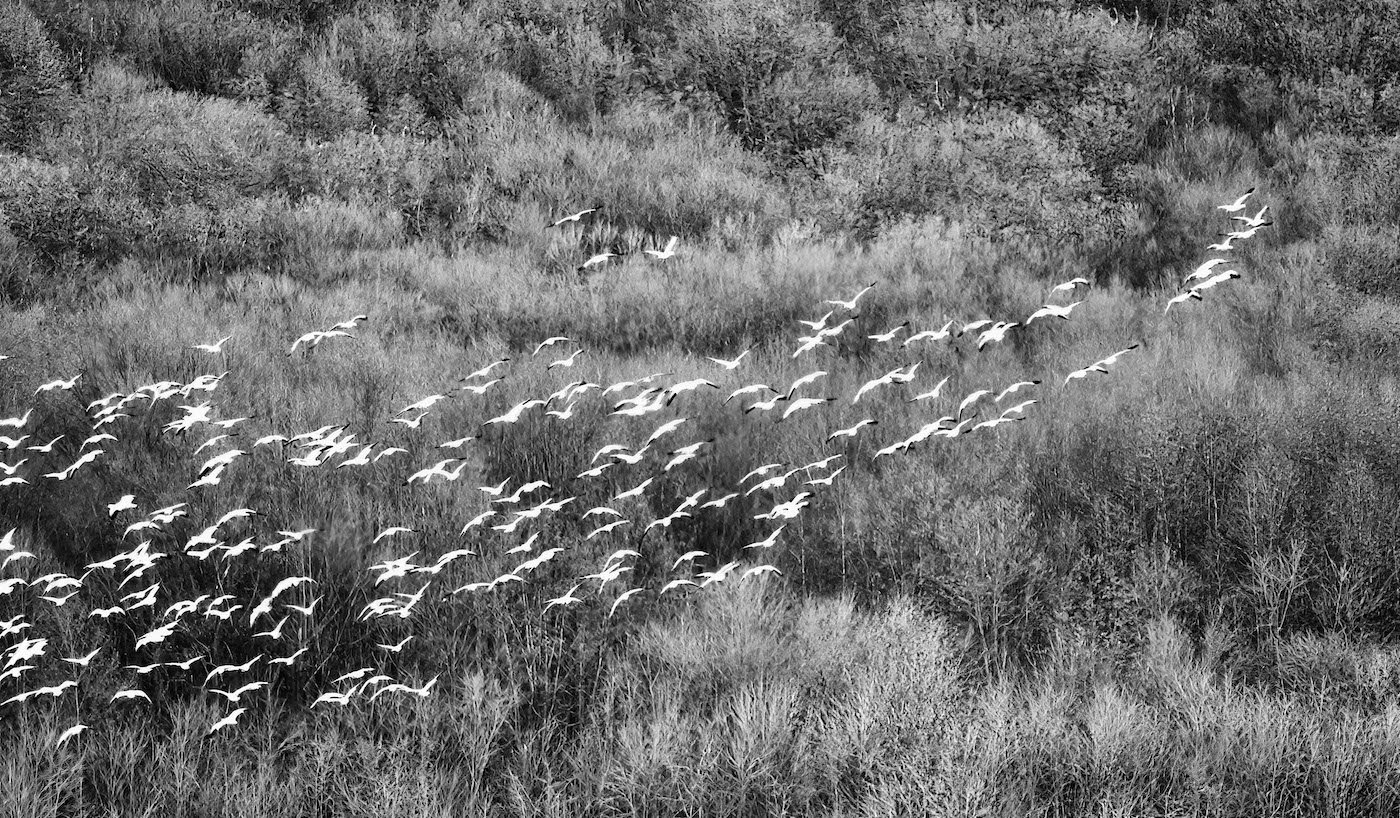
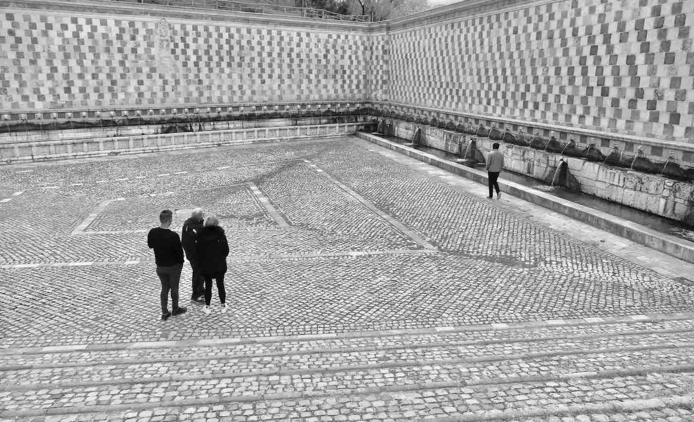
Yes - this was taken at Middlecreek. It's an annual event for my wife and I. It never disappoints. |
Jul 24th |
| 10 |
Jul 22 |
Reply |
It's a small hill in the background - there were just sooo many geese! I will look at my other photos that afternoon to see if any of them have that deeper pink in the sky. |
Jul 12th |
| 10 |
Jul 22 |
Comment |
I like the photo also except for the angle. Isn't there a feature in PS that let's you straighten that out? It might help it a lot - it's a really nice image. |
Jul 12th |
| 10 |
Jul 22 |
Comment |
Maybe run it through one of the sharpening software programs, it might improve the softness of it some. Beautiful capture on your part. |
Jul 12th |
| 10 |
Jul 22 |
Comment |
I really like the composition of the photo, how the line of the rainbow kind of connects to the painted line on the road. I agree with the cropping and saturation suggestion. It's a really nice shot. |
Jul 12th |
| 10 |
Jul 22 |
Comment |
I've never seen anything like this before so I don't know how to critique it - I can tell you that they are very unique and beautiful to look at. |
Jul 12th |
| 10 |
Jul 22 |
Comment |
I like the composition of this photo and the water droplets really add to the beauty of it. I do believe the photo run through the Sharpen software looks a little crisper to my eye. A really nicely composed photo! |
Jul 12th |
5 comments - 2 replies for Group 10
|
| 47 |
Jul 22 |
Comment |
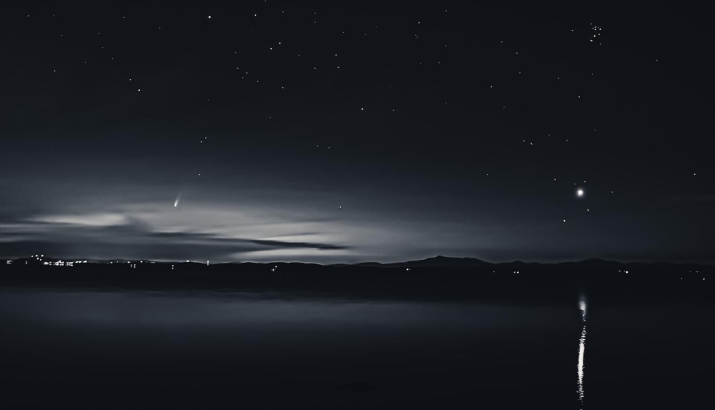
Thanks Ed, and thanks Krista for the recommendation for the ND on the sky - it looks great and I'll make sure to consider that for other photos. I'm undecided on the cropping but that's minor, I'll play around with it.
Thanks for everyone for helping improve the photo - it is much appreciated! |
Jul 14th |
| 47 |
Jul 22 |
Comment |
I edited some: 1) cropping (I like it better); 2) contrast (I think it's improved) 3) sky?? Still not good. Any suggestions? |
Jul 13th |
 |
| 47 |
Jul 22 |
Comment |
Some images work in many different ways and this is one of them. The original is awesome but I also think Jeff's adjustments are good too. Especially the lightening of the face. If you like the original better you should consider that edit. |
Jul 12th |
| 47 |
Jul 22 |
Comment |
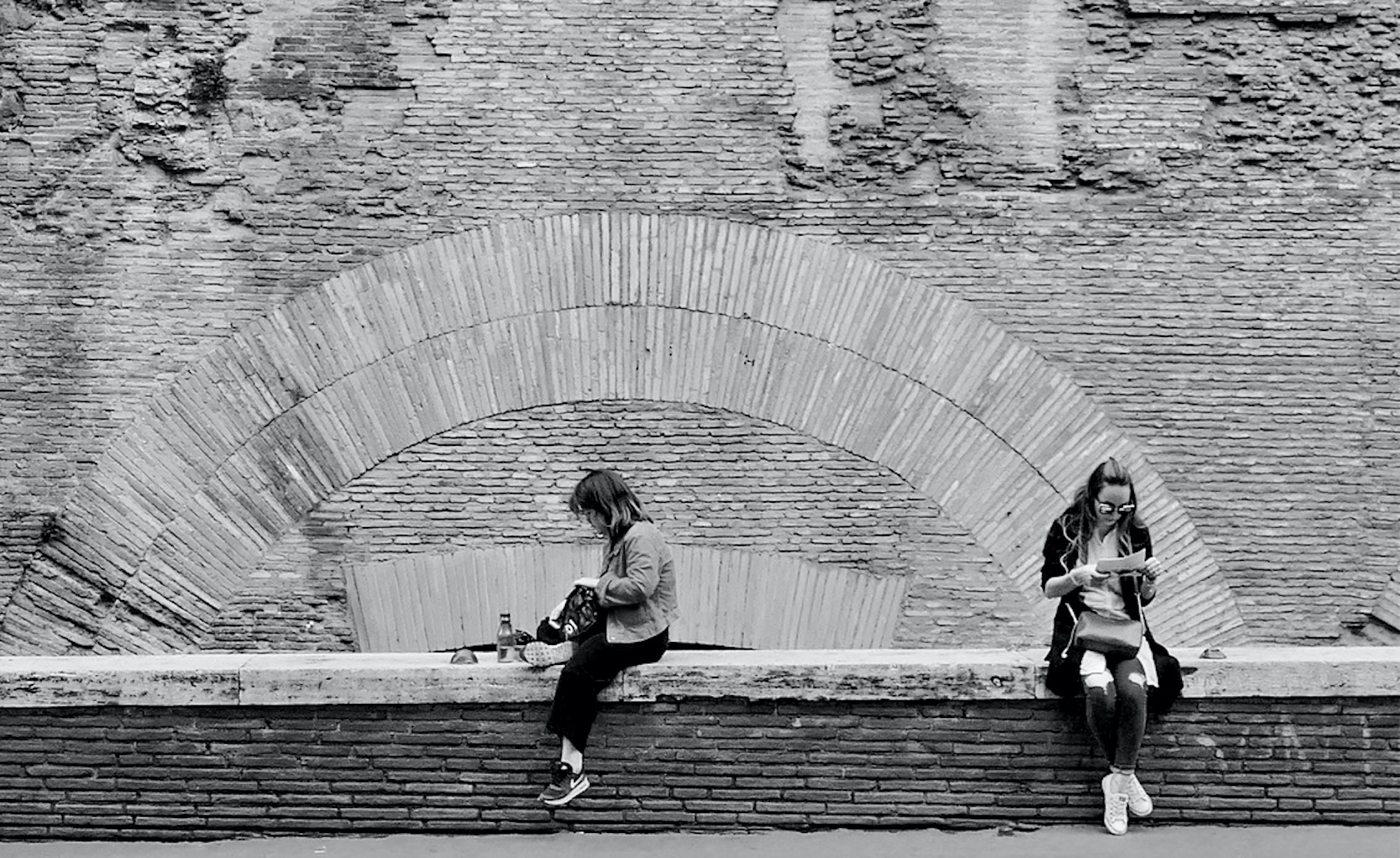
I agree that the background flower is a little distracting and that darkening that area would help. I like the right side of the photo - there's just a hint of something showing through to give the perception of depth. And I like how many different textures there are in the photo - I particularly like the bottom petal for some reason. |
Jul 12th |
| 47 |
Jul 22 |
Comment |
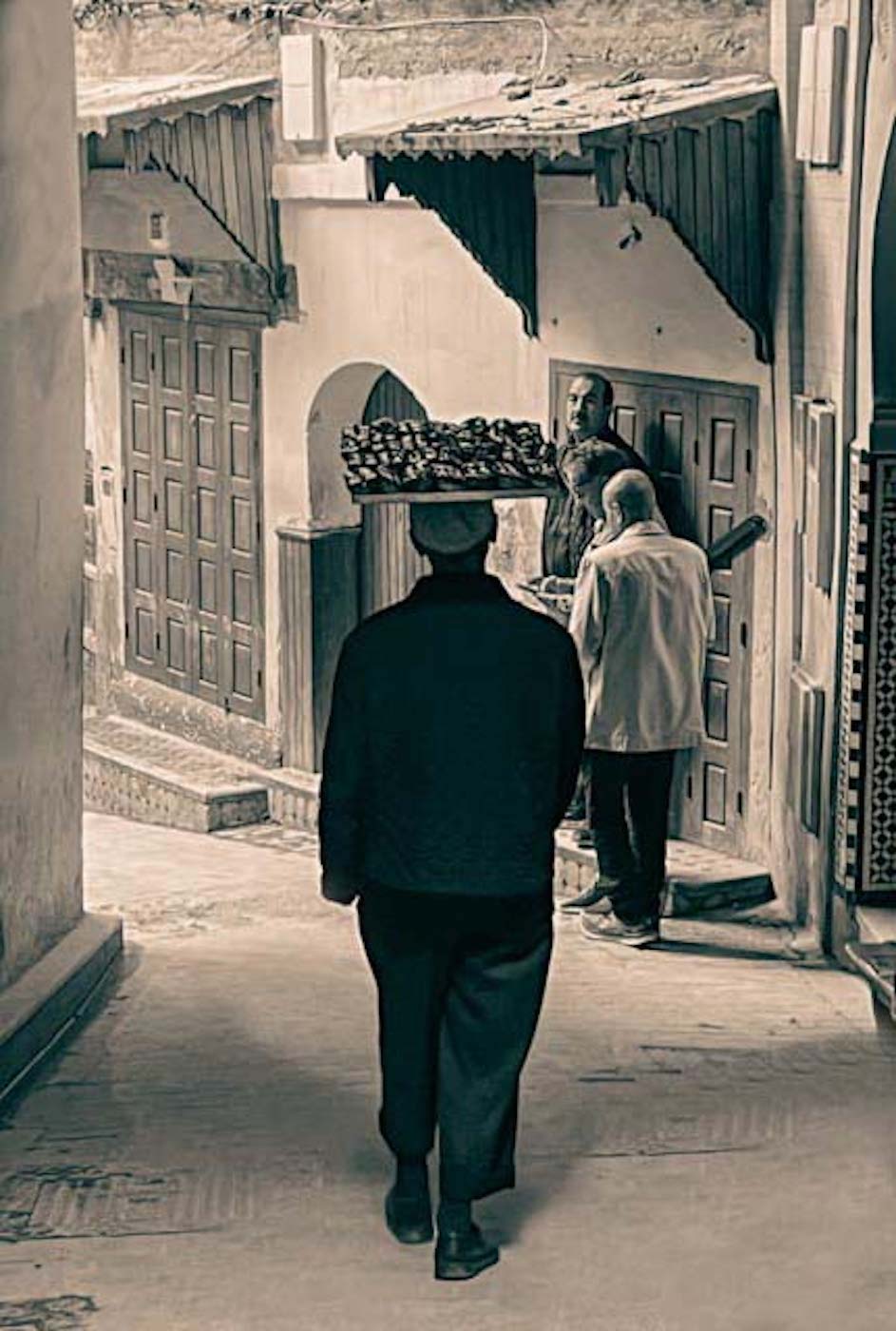
You're very fortunate to have access to the actors you do - you get the most out of your subjects. And the sepia tone is perfect for this subject. I also like how the stripes in the man's shirt, the tablecloth, and to some extent the older woman's blouse, all compliment one another. Congratulations on have it chosen to be exhibited. |
Jul 12th |
| 47 |
Jul 22 |
Comment |
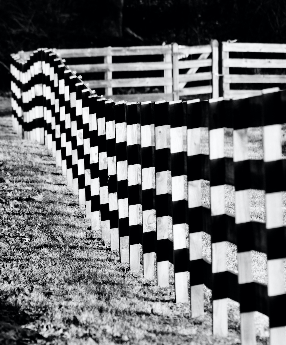
I'm not sure how you can improve the photo - maybe a little bit of a crop but it works as is. I really like the monochrome over the color of course - the tones and contrast feel just right. And, I love how you worked your photographic knowledge into the title. |
Jul 12th |
| 47 |
Jul 22 |
Comment |
The second photo is a tremendous improvement over the first. I live not far from VF, but I'm not familiar with the monument - I will check it out the next time I'm in the area. Eliminating the busy background was a great idea. |
Jul 12th |
| 47 |
Jul 22 |
Comment |
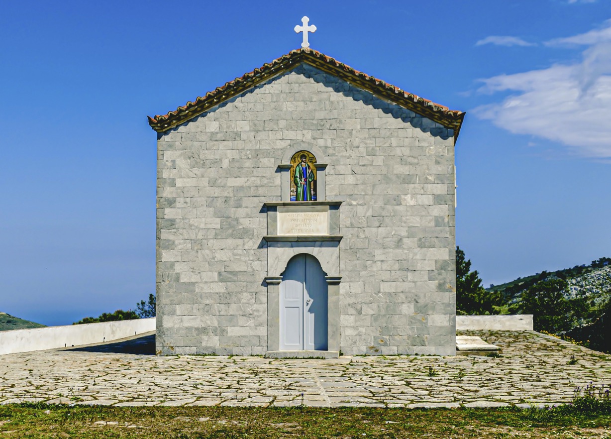
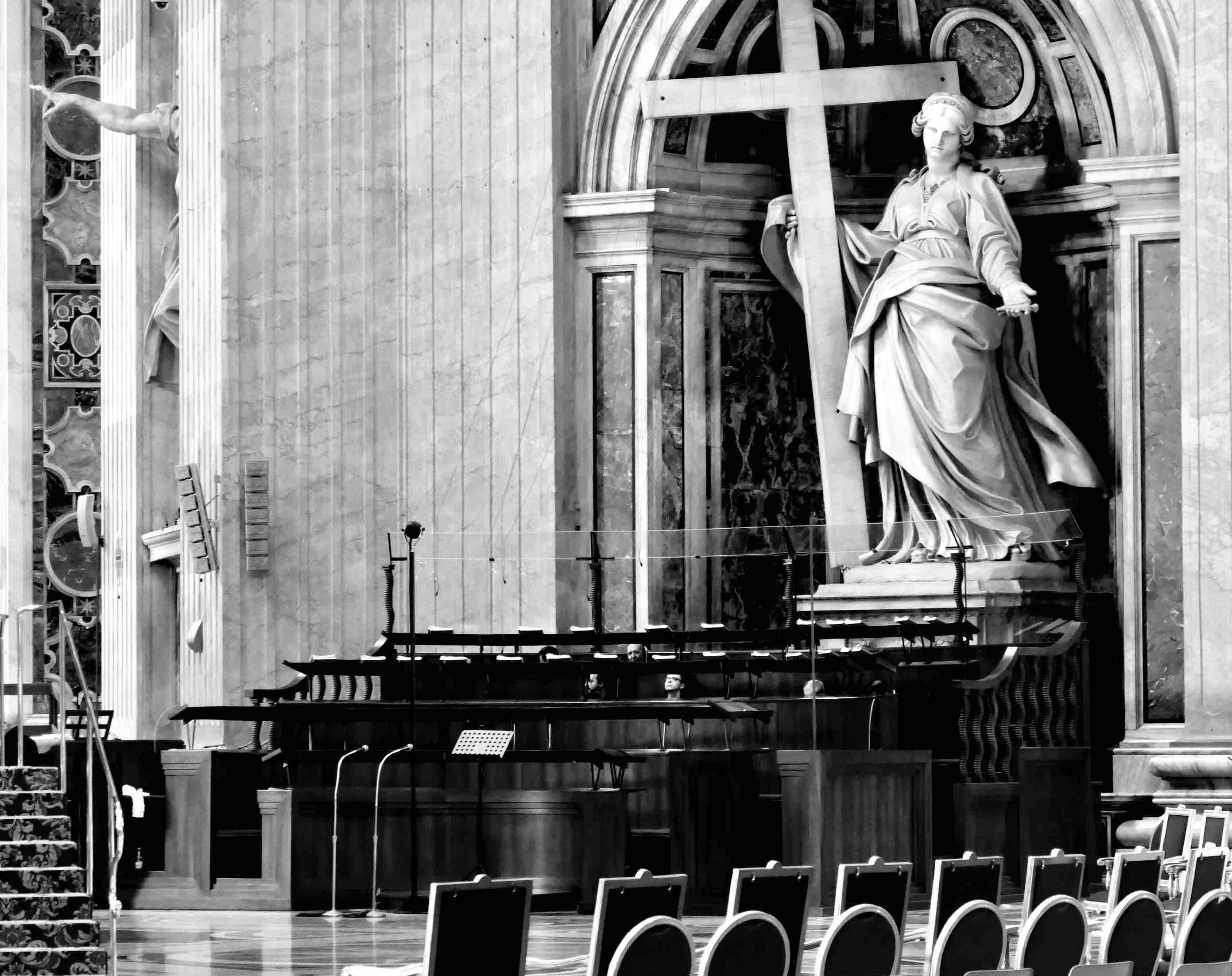
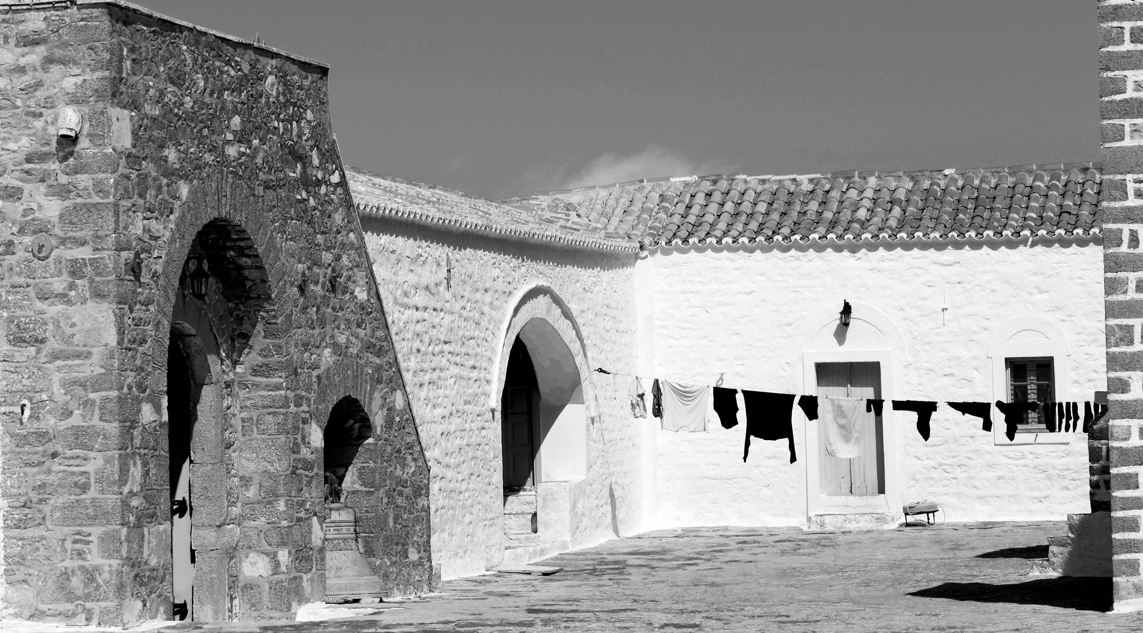
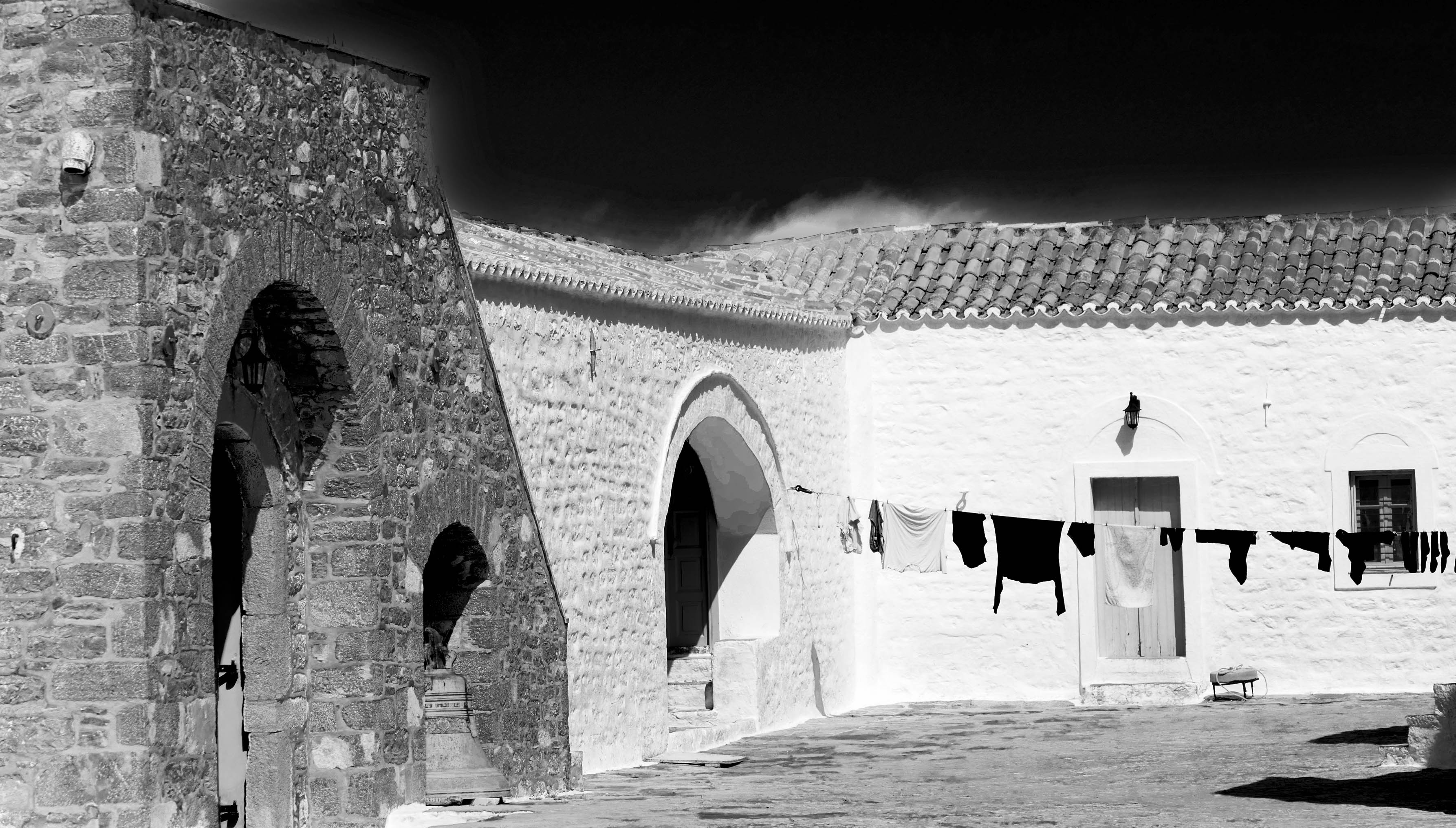
Thanks for the comments - I knew the sky would be an issue when I took the photo and even when I worked on it. I will try darkening it as I like the entire photo composition.
This photo was taken at Monastery of Prophet Elias, Hydra, Greece in the month of July and it was indeed hot.
Thanks
Rob |
Jul 11th |
8 comments - 0 replies for Group 47
|
13 comments - 2 replies Total
|