|
| Group |
Round |
C/R |
Comment |
Date |
Image |
| 10 |
May 22 |
Reply |
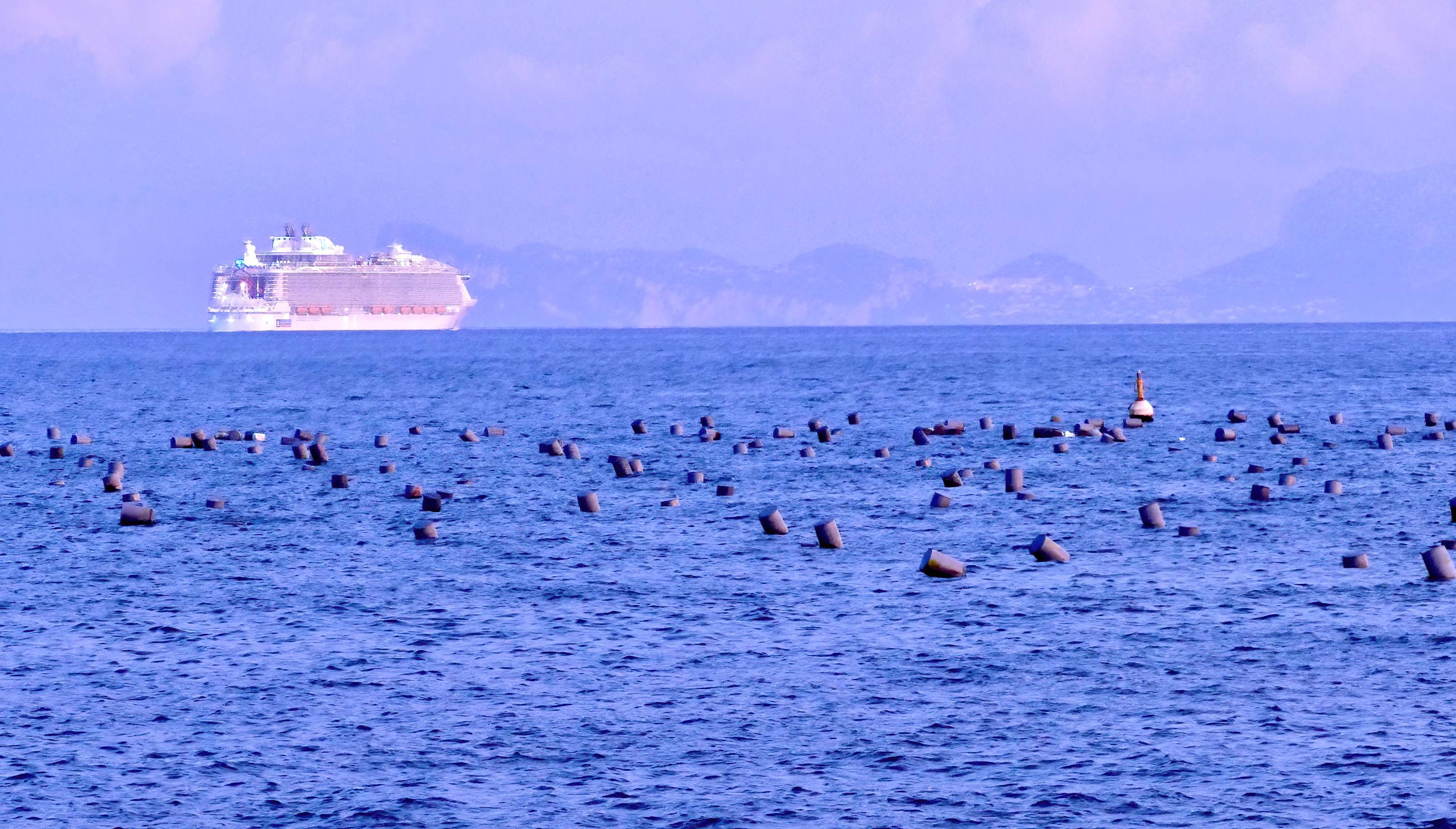
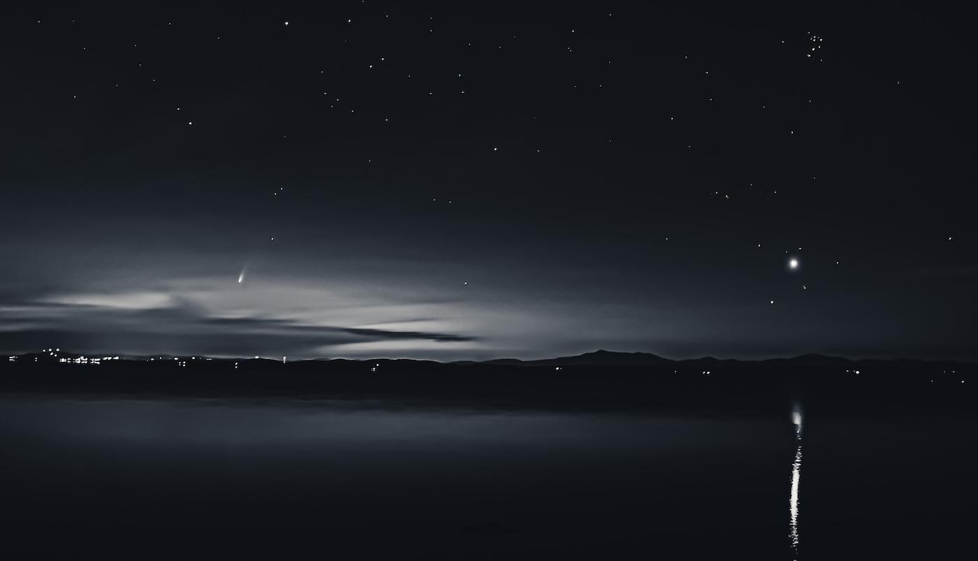
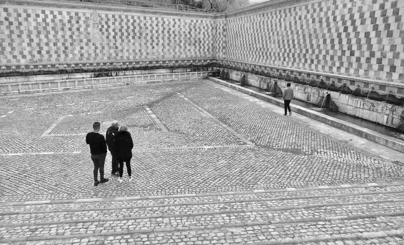
I fooled around with more cropping and contrast and think it gets a little better. Thanks for the suggestions. The cans in the foreground are fishing traps (I'm pretty certain) so it adds a bit to what I was trying to convey: The locals have a beautiful spot where they do commerce - and the cruise ship is an interloper.
Thanks.
Rob |
May 24th |
 |
| 10 |
May 22 |
Reply |
I love your comment about the ship being like a decorated cake.
It was an eyesore set against a very beautiful backdrop. |
May 20th |
| 10 |
May 22 |
Comment |
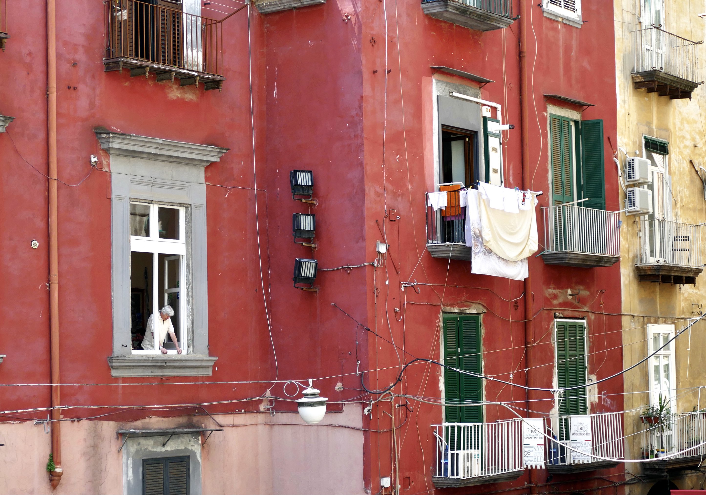
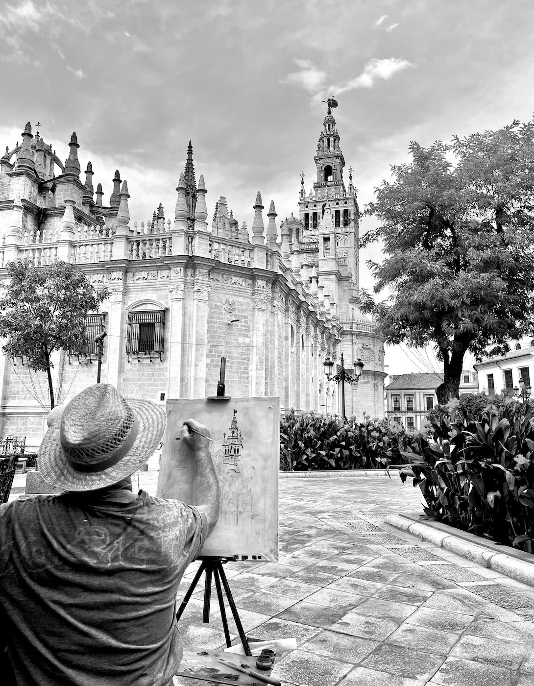
You've captured the mood you were looking for - I'm curious as to your position when you took the photo. It appears that you were not shooting from the center of the subject - was that intentional? I'd like to see that same photo taken on a cloudy day with a naturally ominous sky. Hopefully you live nearby and can return to take more photos of this interesting building. |
May 20th |
| 10 |
May 22 |
Comment |
I'm not familiar with lensbaby - you mention the ss and iso but not the fstop. I too think the image looks just a tad soft, but a nice composition and the colors compliment one another very nicely. |
May 20th |
| 10 |
May 22 |
Comment |
I agree with the horizontal comment. If you enlarge the photo to show just the bottom half in a horizontal format I think it works nicely. I like the softness of the color throughout the photo. |
May 20th |
| 10 |
May 22 |
Comment |
The photo is really well balanced and I like the color variations with the yellows and golds in the dying petals. The black background makes the entire photo stand out very nicely. |
May 20th |
| 10 |
May 22 |
Comment |
I too really like this photo a lot. The bubbles are really incredible and there is so much going on for the eye to dance to. I would like to see what a noncropped image would look like - I feel like a square format might work really well. Nice abstract. |
May 20th |
| 10 |
May 22 |
Comment |
I like the composition also and the water droplets are a nice touch. I only distraction I see is the upper third of the background. Otherwise, a really nice composition and finished product. |
May 18th |
| 10 |
May 22 |
Reply |
I think this is probably the best I can do with this photo. |
May 18th |
 |
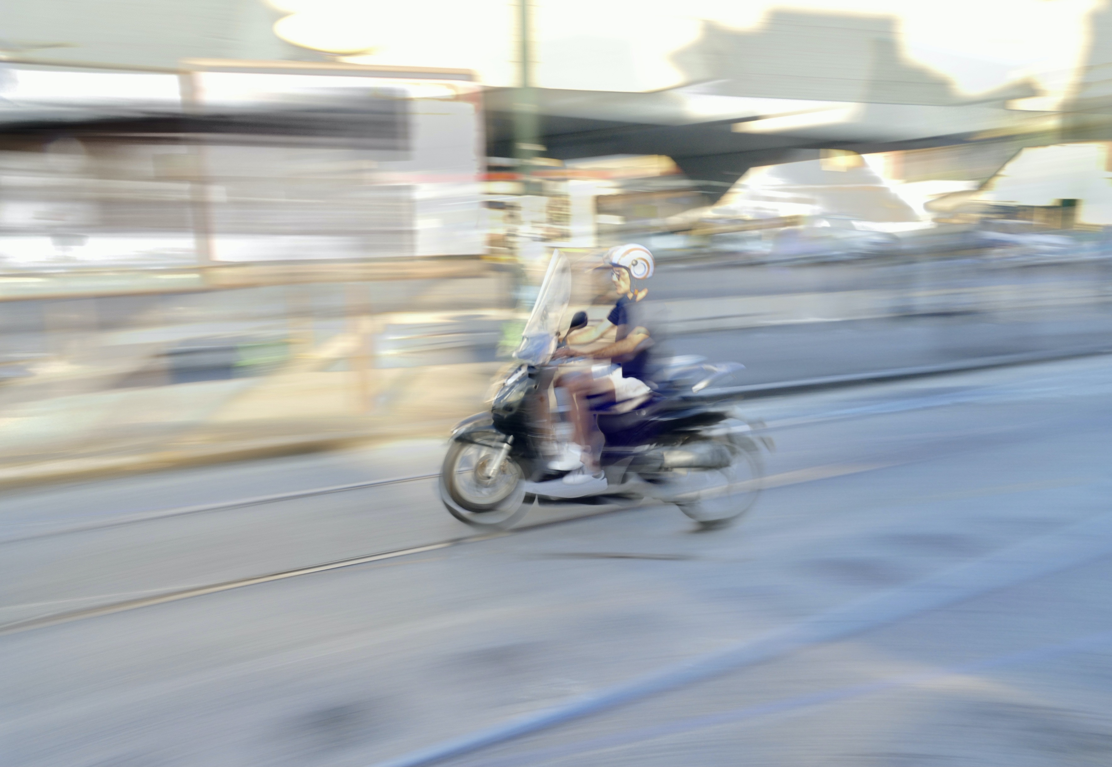
| 10 |
May 22 |
Reply |
I was standing on the shoreline. I have no idea what the cans are for. I will try cropping some of the front and right side and see if that makes a difference. Thanks for the input. |
May 18th |
6 comments - 4 replies for Group 10
|
| 47 |
May 22 |
Reply |
I took the suggestions that were made but went back and adjusted the contrast and cropped to a horizontal format - I really like the horizontal look even though it puts the main subject right in the middle. |
May 24th |
 |
| 47 |
May 22 |
Reply |
You and Kristi have both made good suggestions and improvements to the photo, which is what I was hoping for. Thanks very much for your input. |
May 22nd |
| 47 |
May 22 |
Comment |
Yes - the tighter crop works also - lots of possibilities - thanks for your feedback! |
May 20th |
| 47 |
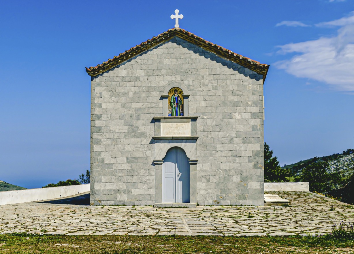
May 22 |
Comment |
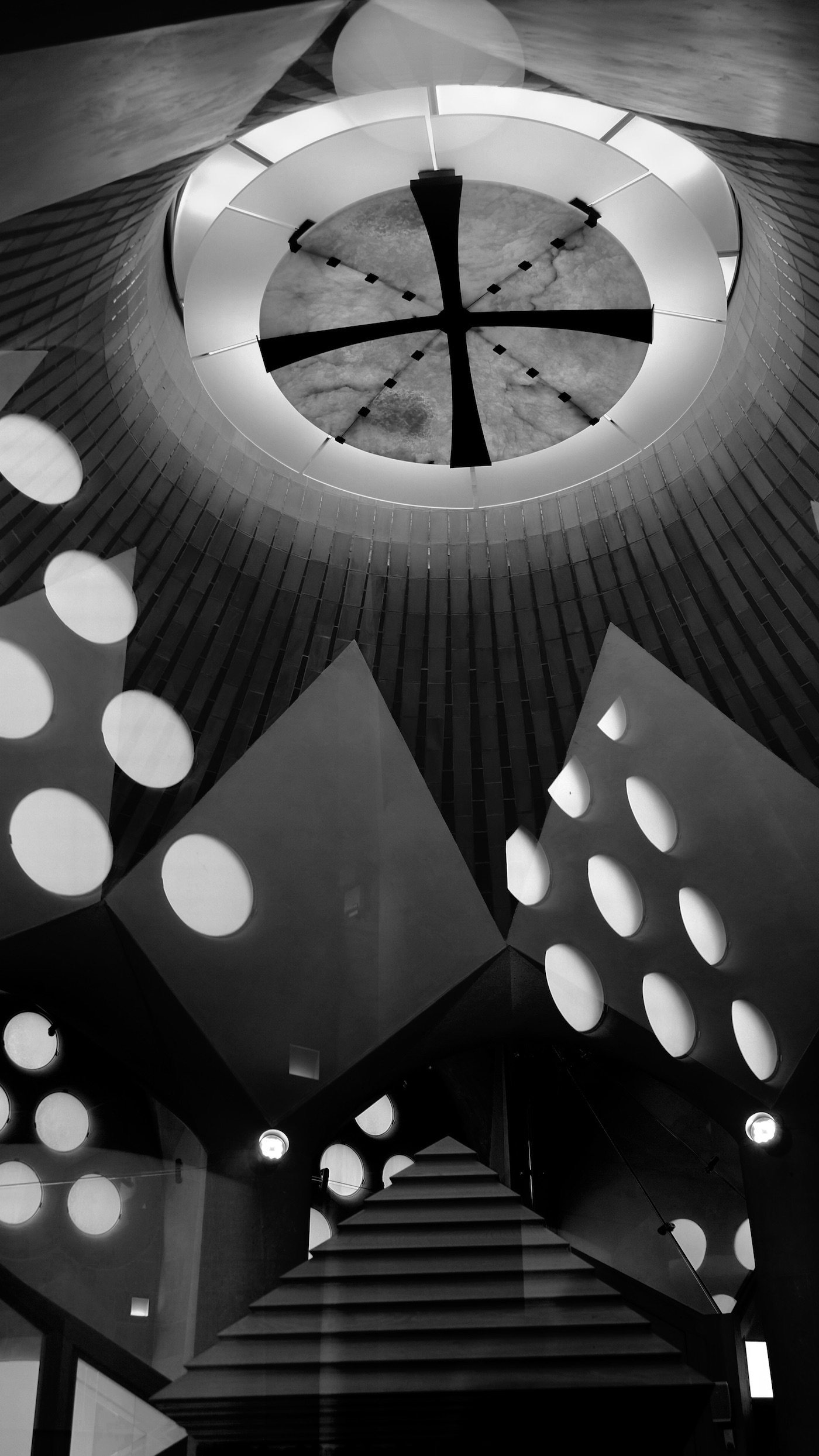
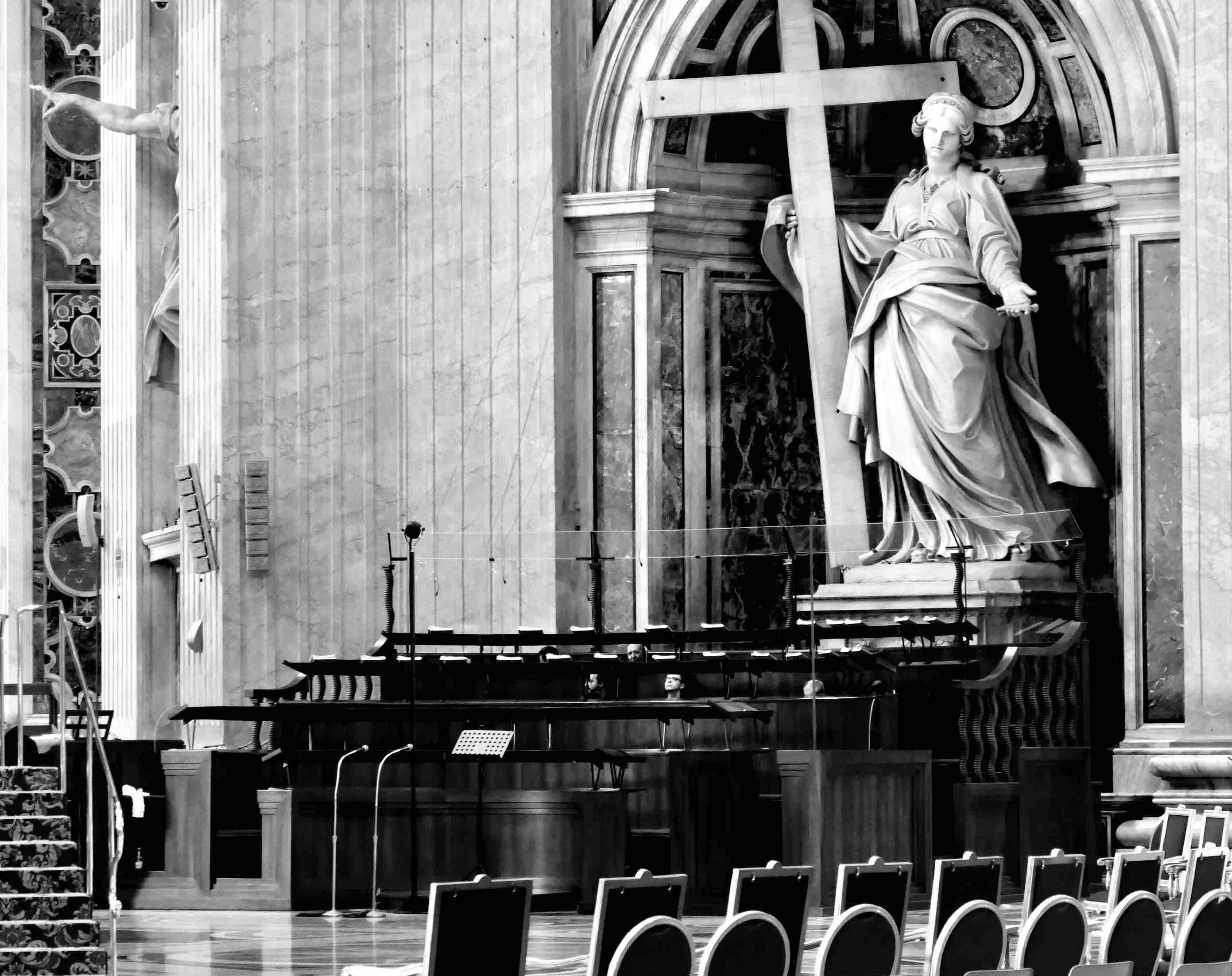
I don't think I've ever seen a black church - I wonder what the story behind it is? I like how the wall and the shadow of it balance out the photo. I agree that it might be a good idea to try to show more of the cross - did you dodge/burn that area already? The sky contrast really enhances the photo. |
May 13th |
| 47 |
May 22 |
Comment |
I particularly like this photo because I just finished reading Alice's Adventures in Wonderland and your image is very much like the artist's image in the version of the book I had.
I think for this photo you can get away without the eyes - I think it's more mysterious - the eyes aren't giving anything away - why is this cat smiling remains a mystery.
I agree that some more contrast might help. I think you captured the spirit of the cheshire cat perfectly! |
May 13th |
| 47 |
May 22 |
Comment |
I love the composition of the photo and not only the natural symmetry but also the way the women on each side of the photo balance one another out.
Maybe some contrast tweaking? The first busts on each side of the photo look a little washed out. And maybe try running it through one of the sharpening tools - I assume you shot this handheld but you didn't mention the camera setting.
And, I also love the square format - it's perfect for the composition. Really nice photo. |
May 13th |
| 47 |
May 22 |
Reply |
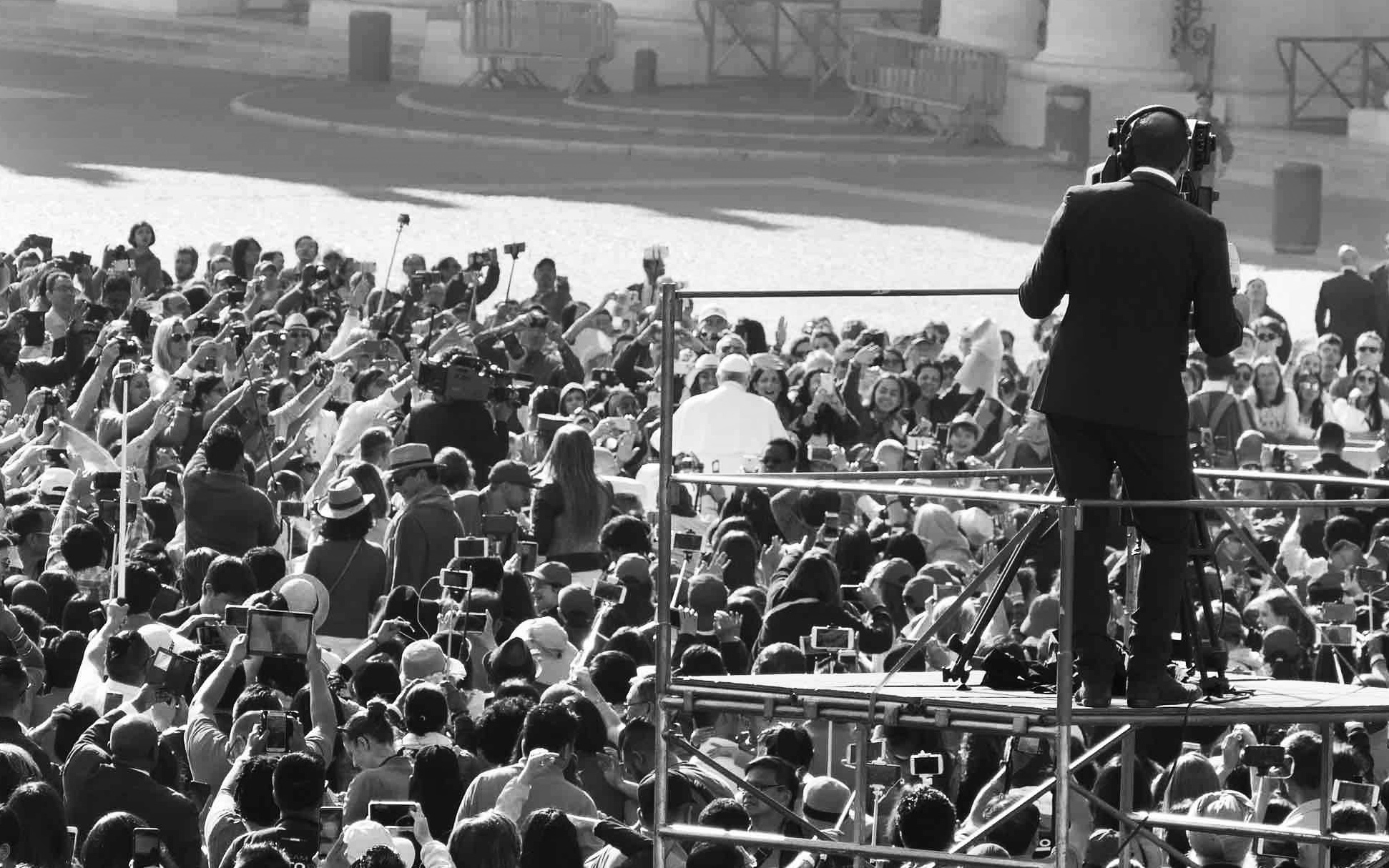
You've hit on a lot of what I've looked at with this photo. Maybe I should title it The Pope!! :) I too focused on those outstretched arms and wanted them to be more a focal part of the image. The background can be both an asset and a liability - I have to figure that part out. When I played around with cropping, the photographer started to become more prominent than I wanted. I'll play around with it some more - thanks very much for your input. |
May 11th |
4 comments - 3 replies for Group 47
|
10 comments - 7 replies Total
|