|
| Group |
Round |
C/R |
Comment |
Date |
Image |
| 10 |
Apr 22 |
Comment |
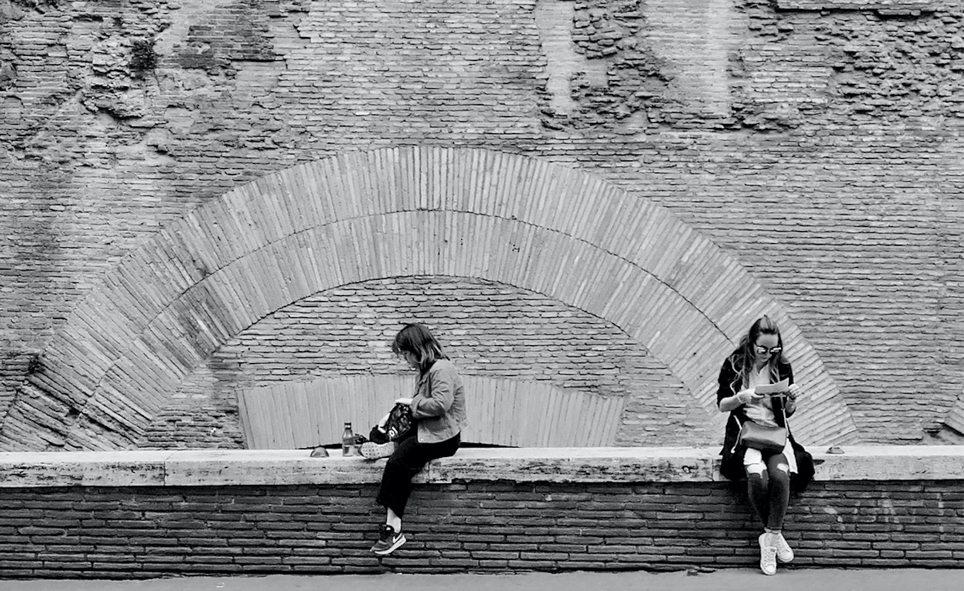
Thanks Carrie - I prefer the color version also, though I do find the B&W interesting. I will play around with the dodging/burning of the highlights and shadows - I just learned how to do that so it will be a good test for me. Thanks for the suggestion. |
Apr 26th |
| 10 |
Apr 22 |
Comment |
I've been going back and forth between liking the image as is or wanting to see a little more of the grill. Maybe showing a little more of the left side and cropping off some of the right side, thus eliminating some of the sky, might be a good compromise?
I'm not a fan of adding fake skies but maybe you could darken that area a little so it's not so eye catching.
The truck itself looks fantastic and the the work you did in post production must have enhanced the overall image a lot. |
Apr 11th |
| 10 |
Apr 22 |
Reply |
I like this finished version - I felt the cropping of the right side was necessary but hadn't thought about removing some of those branches. |
Apr 11th |
| 10 |
Apr 22 |
Comment |
I also like the main image better than the original for the same reason. I'm not familiar with the Lensbaby - will research it. I am curious about what causes the halo around the border of the image. Excuse my lack of knowledge for these kind of photos. A very pleasing photo. |
Apr 11th |
| 10 |
Apr 22 |
Comment |
I really like this abstract. I agree with Donna that it's almost like two photos. I played around with enlarging it and there are so many areas of interest at higher magnification - they become "photos within the photo". I particularly like the different textures in the upper left side.
It's great that you were able to use a tripod - I have to force myself to bring mine along whenever I throw my camera in the car - I get into too many situations where I wish I had it with me.
I live only about 45 minutes from Ridley Creek, in northern Chester County so I'm familiar with the park. |
Apr 11th |
| 10 |
Apr 22 |
Reply |
I like how this transformed from your original submission to this final version - it works very well now. |
Apr 11th |
| 10 |
Apr 22 |
Reply |
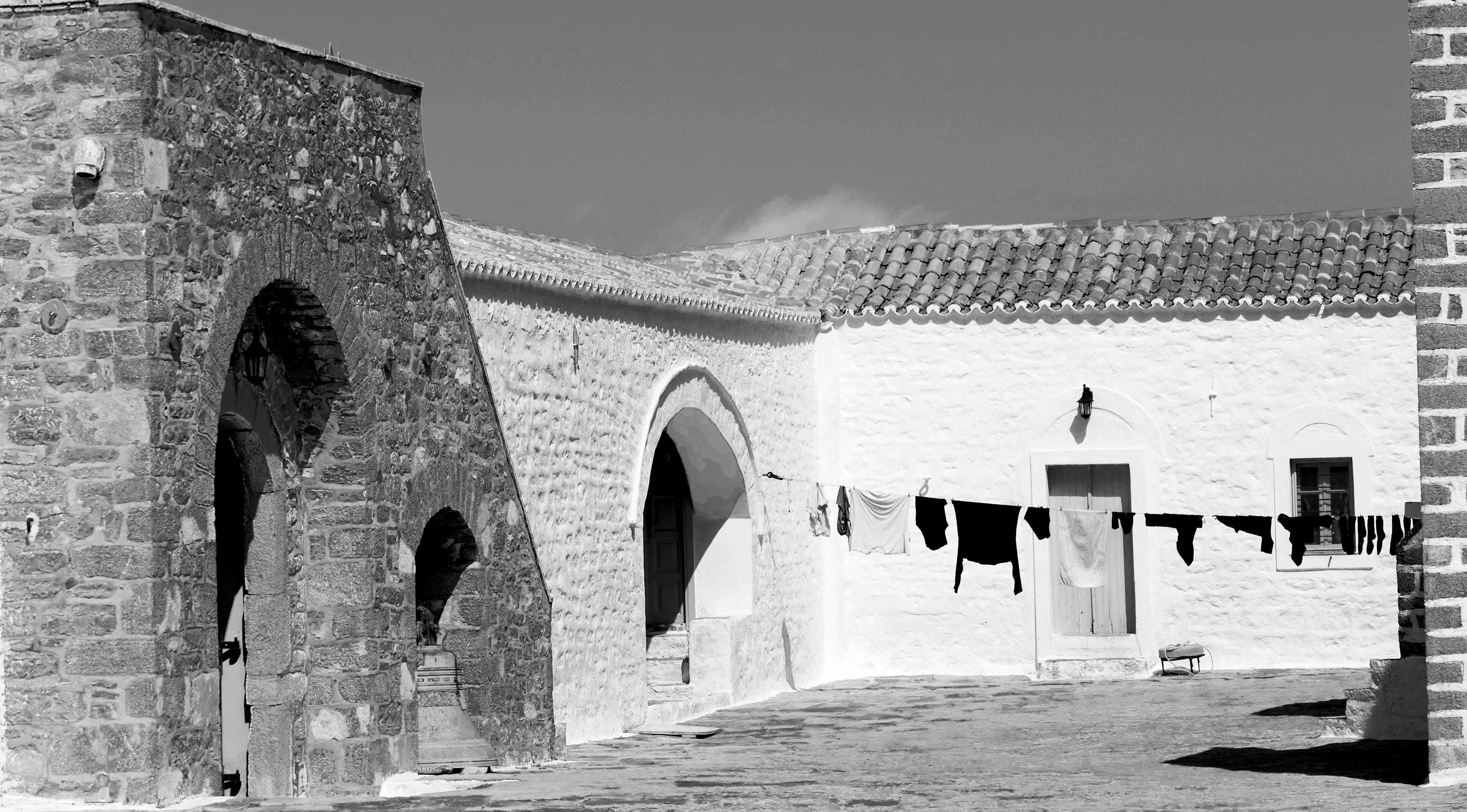
I don't usually alter my photos too much so I wouldn't change the shirt color - I like the white as it balances out the hanging sheets. Thanks for providing info on the LR features - I will definitely check that out! |
Apr 10th |
| 10 |
Apr 22 |
Reply |
I like the way you cropped the right side - I was thinking a little off the left side also also. I agree, it is always hard to know how much to crop. |
Apr 9th |
 |
| 10 |
Apr 22 |
Comment |
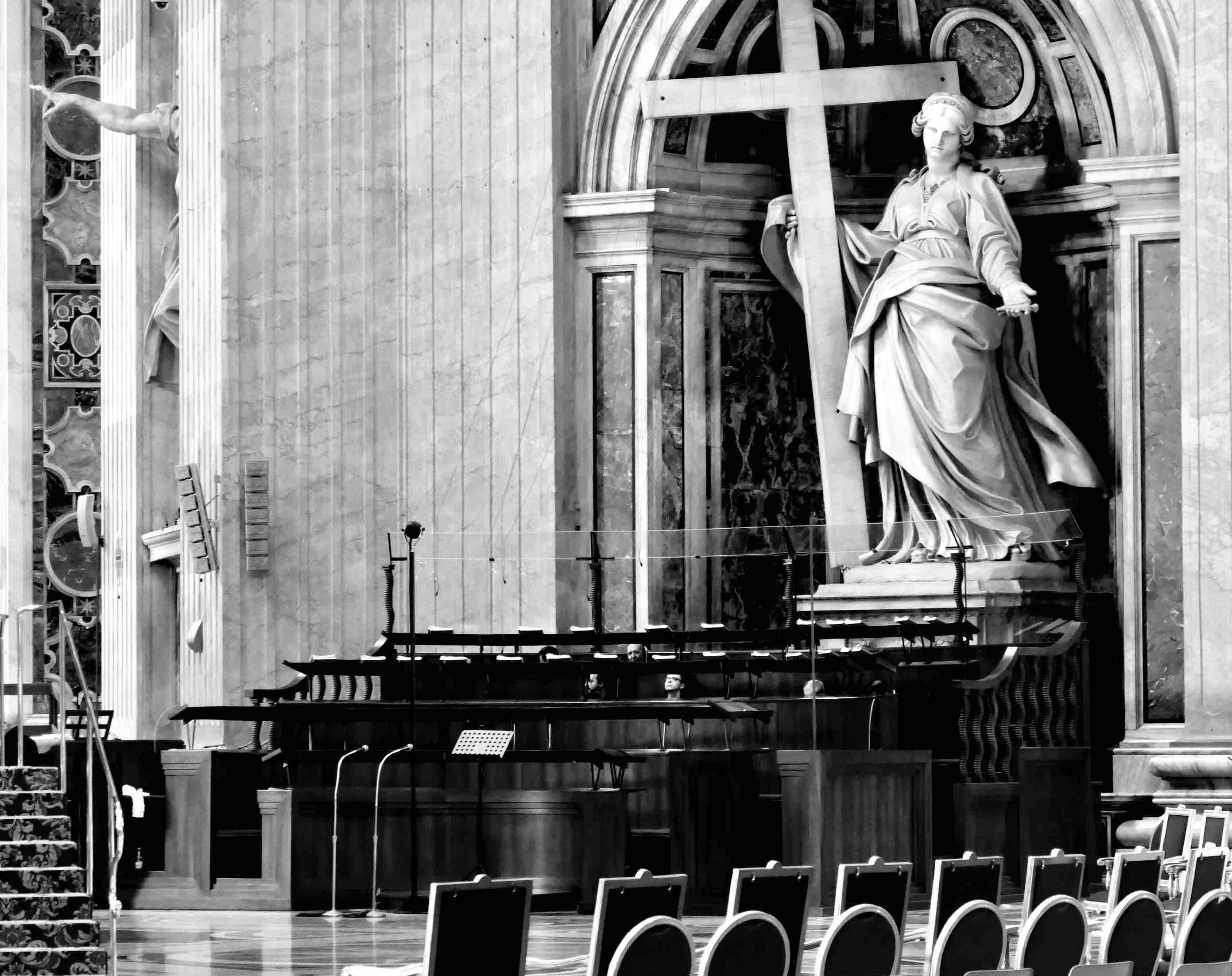
I hadn't thought of monochrome for this photo - it's an interesting look. How did you go about straightening the vertical lines? |
Apr 9th |
| 10 |
Apr 22 |
Comment |
This is a fantastic photo of the finch. I don't think I can provide any technical comments that could improve the photo. The only thing I tried was to crop it some more off the bottom and top and a little off the right side to make the bird even larger in the image. But it's really not a necessity - the image stands as is. I wish I could offer some better feedback. |
Apr 8th |
| 10 |
Apr 22 |
Comment |
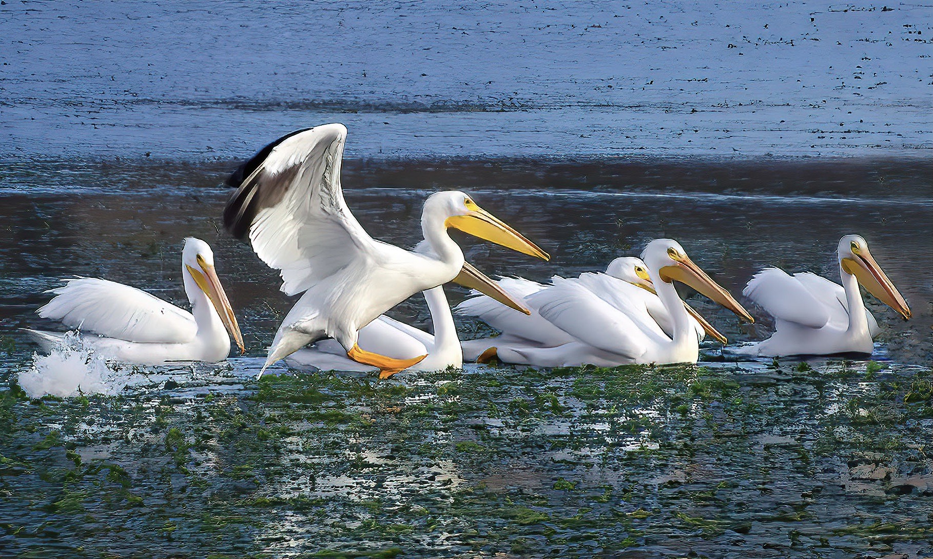
This is a wonderful photo moment - I love the contrast between the calm pelicans in the water with the bird in flight, landing. I also like the reflections in the water and the different layers and colors of the water.
My only suggestion would be to crop off some of the left side to make it match closer to the right side. And the only thing that doesn't work I think - which is unfortunate because you'd have no way to control it when taking the photo nor in post production, is the presence of the pelican in the background of the bird in flight. But you've captured the beauty and uniqueness of these very singular birds. |
Apr 7th |
| 10 |
Apr 22 |
Comment |
This is a beautiful shot of a beautiful bird! I like the empty space to the right but I also think you could fool around with cropping it some more off the bottom and side - but I'm sure that's more of a personal preference.
My only suggestion might be to open up the shadows a bit to show just a little more of that majestic face. Terrific shot. |
Apr 7th |
8 comments - 4 replies for Group 10
|
| 47 |
Apr 22 |
Reply |
I really like this finished edit. The castle is more noticeable now, and the man is more visible, yet I don't think anything was lost in the changes. It's neat to see how these photos can improve. |
Apr 12th |
| 47 |
Apr 22 |
Reply |
I agree with your comment about the statue - I think I like Kirst's adjustment to that area better than my original and my adjustment. My adjustment also ended up brightening the area around the statue - so I plan to lighten up the statue a bit and darken the area around it.
Thanks for all of your helpful comments. |
Apr 8th |
| 47 |
Apr 22 |
Comment |
This is a wonderful photo. I can't add much more, Jeff covered what I reacted to also. The framing is magnificent and the eye goes down the path to the castle perfectly. I agree that lightening up the man would enhance the photo greatly. Great sky also. |
Apr 8th |
| 47 |
Apr 22 |
Reply |
That makes sense; the smoke may have helped under different conditions but it's certainly a great photo as is.
And I will keep pushing myself to ask for permission to photograph stangers. |
Apr 8th |
| 47 |
Apr 22 |
Comment |
I love how you tell stories with your photos - I've been trying to keep that in mind when I'm shooting now. It's helped me focus more (no pun intended!).
Having access to models really opens up a lot of possibilities and you take advantage of them well. I have to mimic Jeff's comment that I don't have the technical background to comment on how you created the photo, but great job in doing it. My initial reaction upon seeing the photo was maybe some more transparency in the woman's face to show just a little more of the house of the left side? And maybe it would give her more of that ghost like persona? It's a really neat production you put together. |
Apr 7th |
| 47 |
Apr 22 |
Comment |
I love these majestic mountain photos. My wife and I were in Iceland in 2013 - I'd love to go back. My only suggestion, and it matches what Jeff suggested, would be to add some contrast so that the foreground and middle ground differentiate more from one another. It might even make the mountains seem more massive than they already appear.
Is that a glacier in the left middle ground? I'd like to see the color version also as I'm sure it is also very beautiful.
I appreciate the overall composition of the photo with the foreground, middleground and background all playing a role.
|
Apr 7th |
| 47 |
Apr 22 |
Comment |
My first reaction is kudos to you for asking permission to take some shots. I tried that a few weeks ago on a beach and the person said yes but I was just taking a snapshot with my phone but I will get more bold in trying to do this more often.
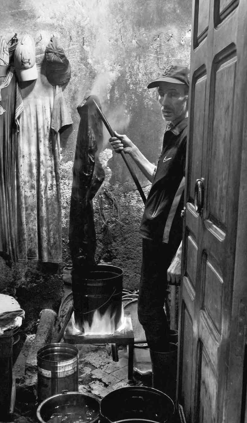
I love the contrast of the textures of the man's skin compared to the smoothness of his mask and collar. That works really well. I wondering if you have any versions that showed any of the smoke from his cigar. That may provide an additional layer of texture. Otherwise, I think it's a terrific photo. |
Apr 7th |
| 47 |
Apr 22 |
Reply |
Thanks Kirsti, and Jeff. I took Jeff's suggestion and cropped back, and my crop is very close to your version, Kirsti. I also darkened the statue and tried to lighten the porch per Jeff's suggestion. I like your lightened image, Kirsti - I'll play around with the contrast and light but I think you both hit on the same thing - that cropping and bringout out the man on the porch more was a very useful suggestion. Thank you for the feedback. |
Apr 7th |
 |
4 comments - 4 replies for Group 47
|
12 comments - 8 replies Total
|