|
| Group |
Round |
C/R |
Comment |
Date |
Image |
| 49 |
Oct 25 |
Reply |
Thanks David and Cindy!
(BTW, the PSA email notifications for responses have definitely NOT been fixed (I emailed them)).
Thanks for the feedback David, and good call on his arm intersecting the LEGO build, I hadn't noticed - but great call! |
Oct 30th |
| 49 |
Oct 25 |
Comment |
Hey all, I'm heading on a photography workshop with Action Photo Tours down to the Bisti Badlands on Saturday morning for a week+ and will probably be out of pocket for the rest of this review cycle so unable to respond to any further comments.
Talk to you all again in November!
Josh |
Oct 16th |
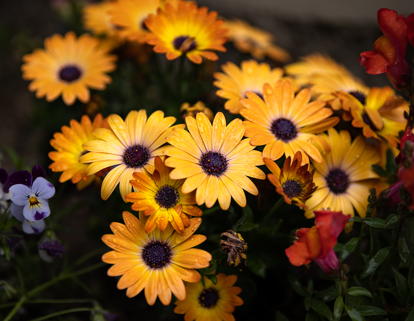
| 49 |
Oct 25 |
Comment |
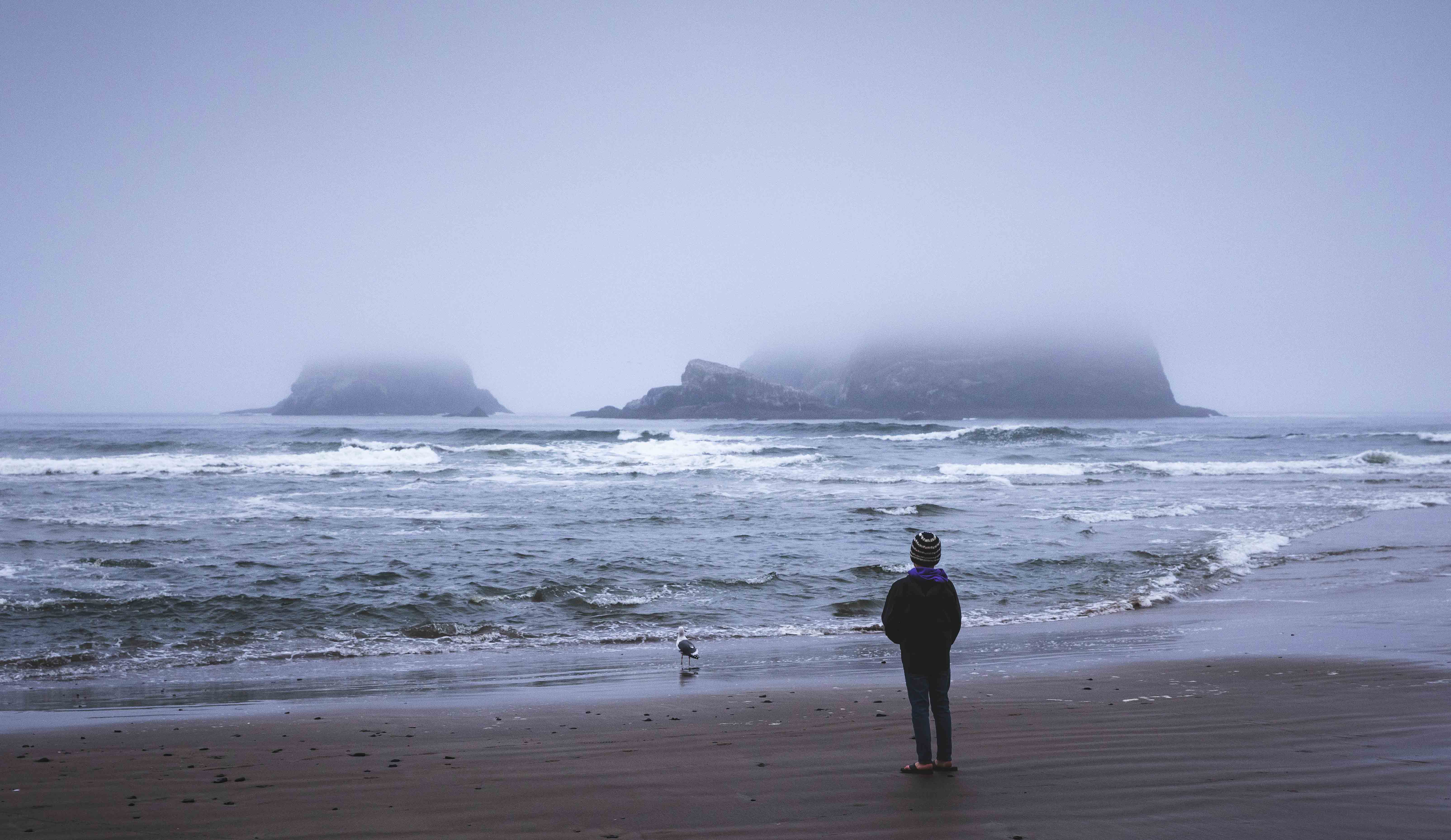
Hi Alan
These are some gorgeous colors you've captured here. Nice work on the saturation too, it's so easy to overdue those in post with shots like this but you've portrayed them nicely.
I've found the same thing to be true with polarizers and clear blue skies. They're fine (and I do use them) if there are clouds, but I typically avoid using them with clear blue skies for this very reason.
A thought for next time, throw a 5 or 10 stop filter on and bump your exposure time up and it'll smooth out that water, giving it a more uniform look. Also, this image feels like it needs to rotate clockwise a couple of degrees, she's tilting to the left!
Thanks for sharing
Josh |
Oct 16th |
| 49 |
Oct 25 |
Comment |
Hey Morrie
Man… this is great. Did you add those birds in front of the moon in post, or did you catch them there as part of the shot?
Your image has a ton of impact, I mean it REALLY catches the eye and pulls you in. The alignment of the moon w/the lighthouse is just so striking, and the diagonal lines of the bridge are very complimentary w/out being distracting.
As for the smoke/haze that turned this image pink, I think it works quite well.
There is some graffiti on the bricks under the lighthouse that wouldn't be too tough to clean up and may compliment the overall presentation. Also, there's some red hazing (maybe something in the foreground that's very out of focus?), that you could consider addressing.
Overall, this image screams of intention, which in my experience often has a positive outcome, as you've achieved here - great work.
Thanks
Josh |
Oct 11th |
| 49 |
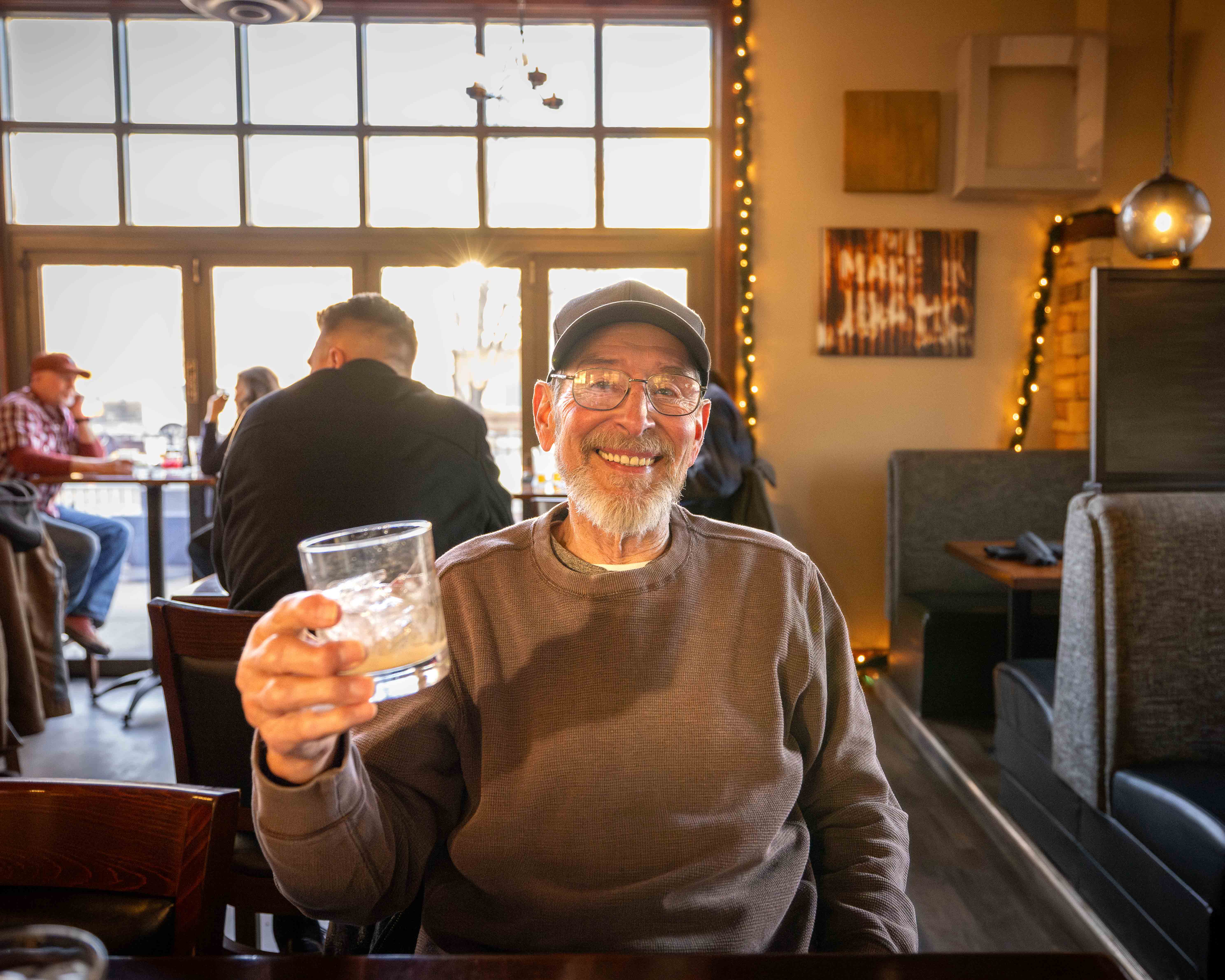
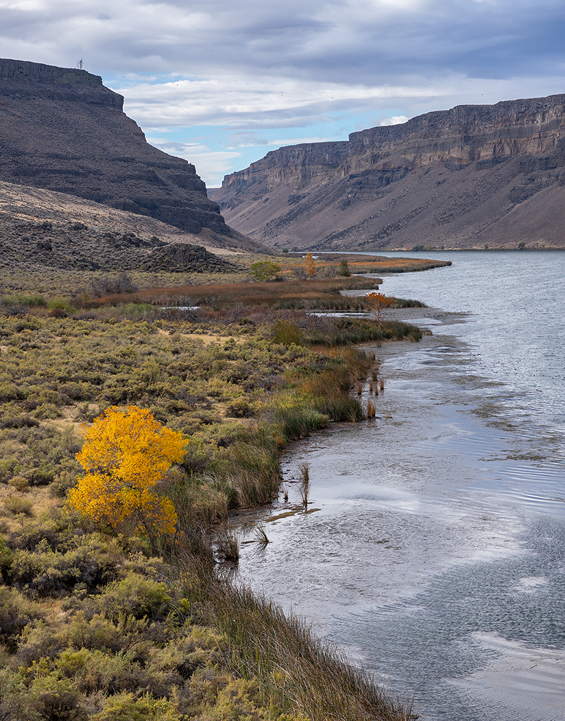
Oct 25 |
Comment |
Good Morning David
This a great image, I feel like I'm being cheated by the resolution though - I want to see it bigger! We have up to 1,024 KB file size, in case you're up for bumping that up a bit.
Anyway, I love your question about whether they stand out enough because I think the millions of years of evolution they've gone through has been to specifically keep them from standing out ;)
My opinion though, they're perfect. You can see them, but they don't look like little snowballs that you've tried to overemphasize. They have just enough highlights though that you can tell what they are against their surroundings and you're right, the spacing (and framing) is awesome.
I could see this being a big ol' wall print in someone's living room or gallery.
Thanks
Josh |
Oct 11th |
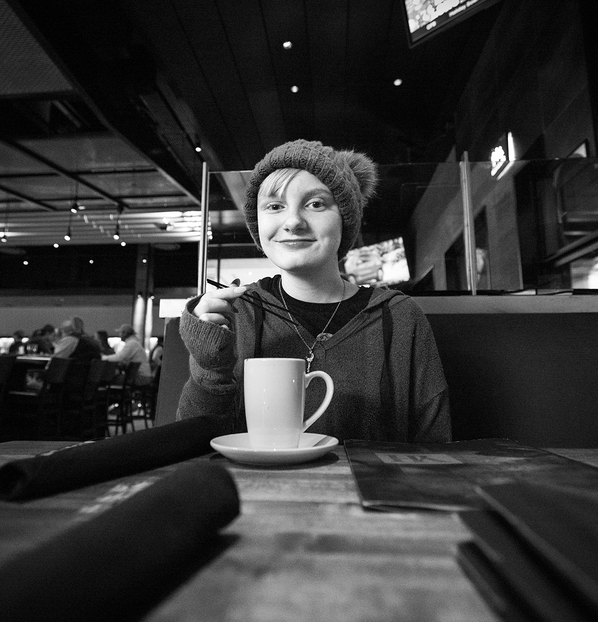
| 49 |
Oct 25 |
Comment |
Hi Craig
Great picture man… for me - it's all about her expression, I love the smile. I really like the texture and detail you've captured here with those tobacco leaves and the old equipment too, even the wood of the shelf behind her looks like it's been in use for a very long time.
A slightly faster shutter speed would have sharpened things up a bit, and while ISO 3200 is already high for some people's taste, I bet that Z7 would handle it nicely.
Last thought, if you've got any real estate up top in the raw file, you might consider adjusting the crop just slightly, so her hair bun isn't touching the frame.
Thanks
Josh |
Oct 11th |
| 49 |
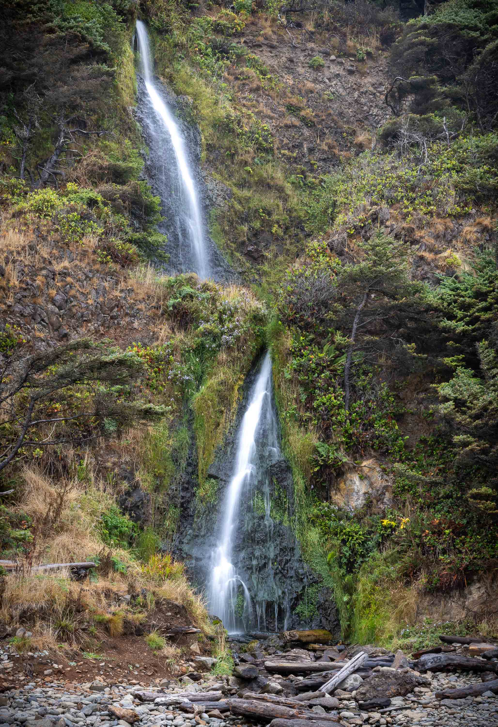
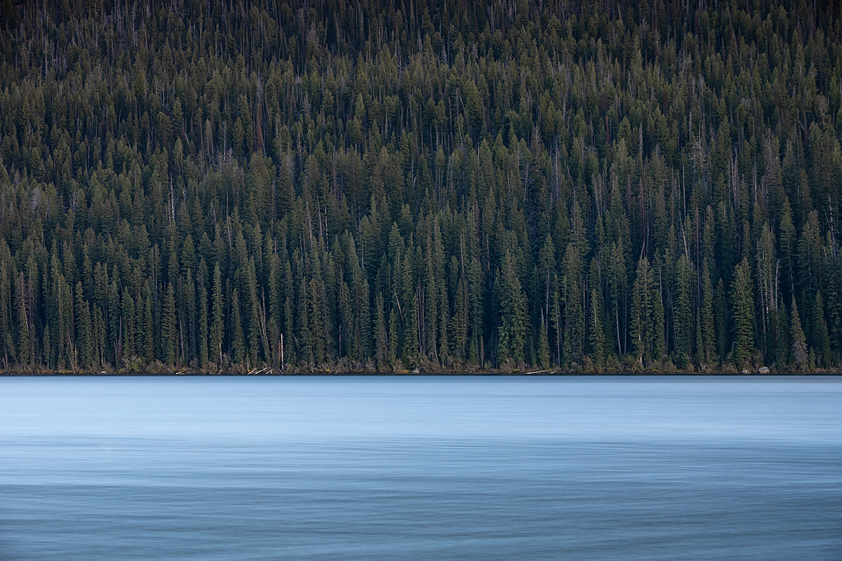
Oct 25 |
Comment |
G'morning Cindy
I like the simplicity of the subject of your image; it's a busy world we live in these days and it's refreshing.
As far as addressing the light top part of your image, a linear gradient (it's called in the Adobe world anyway) would do nicely here to target the highlights and bring them down a bit. The one thing to bear in mind is that you may need to do something similar to the ripples below, as the discerning eye may catch that the reflection shouldn't be brighter than source of light it's based on.
The image does feel a little under-exposed, so once you get your linear gradients added, you could play with bumping your highlights / whites / overall exposure a bit.
Thanks
Josh |
Oct 11th |
6 comments - 1 reply for Group 49
|
6 comments - 1 reply Total
|