|
| Group |
Round |
C/R |
Comment |
Date |
Image |
| 49 |
Jan 25 |
Reply |
Thanks for the feedback Tyrah, much appreciated! |
Jan 29th |
| 49 |
Jan 25 |
Reply |
Hi Tyrah - that makes sense about the export, I really wish PSA would bump the limit - I get it in 1998, but I think it's time to eliminate / drastically reduce that silly file size limit.
Your resolution of this image is massive (7,008 x 3,703). If you reduce that to 2 or 3 thousand on the width, it would enable you to export it at a much higher quality that would still be small enough to submit to PSA. |
Jan 29th |
| 49 |
Jan 25 |
Reply |
Gotcha - OK, thanks for the feedback Alan. I always worry about over processing but I think that sometimes ends up going the other direction. |
Jan 22nd |
| 49 |
Jan 25 |
Reply |
Nice work on removing that stick - I'd never have known! |
Jan 21st |
| 49 |
Jan 25 |
Comment |
Hi Alan
Wow, talk about impact! The color and sharpness that you've captured here is breathtaking. I really appreciate the processing you've done on this with keeping the head and neck plumage nice and bright and vignetting the rest subtly out a bit.
It's easy to push colors like this too far too, but it doesn't feel overdone here - nice job.
Sounds like you did quite a bit in post on the sticks, and the only thing that I see that I'd suggest would be to get those few little ones out, just behind his head, as well. They're kinda bright (relatively speaking) and are a little distracting.
Awesome shot
Josh |
Jan 21st |
| 49 |
Jan 25 |
Comment |
Hey David
This is an interesting image - it's always fun to see a unique take on a subject we're used to seeing. I really like your use of the shallow DOF and agree with Alan that blurring the sharp pedals on the left and right would help strengthen your intent and the overall presentation. It also creates a natural sort of vignette, further supporting your goal here.
Unless it's intentional, the overall exposure of this image is a little dark so you could play with bumping the highlights and whites in that center area a bit too.
Thanks for sharing!
Josh |
Jan 21st |
| 49 |
Jan 25 |
Comment |
Hi Craig
The lighting works well here, with the model's face being the brightest part of the image.
I'm finding some of the edits to the image a bit distracting though. There's a couple of smudged looking spots on the bottom of her hair to the left, and the top of her hand, as well as a big line going from under her chin to the right of the image. The finish to your model's skin has a bit of an uncanny valley feel to it where it doesn't look "normal" / human, but it hasn't been pushed far enough in the "artsy" direction for me to know that it's not supposed to represent reality, so I'm left feeling a little lost in that regard.
Thanks
Josh |
Jan 21st |
| 49 |
Jan 25 |
Comment |
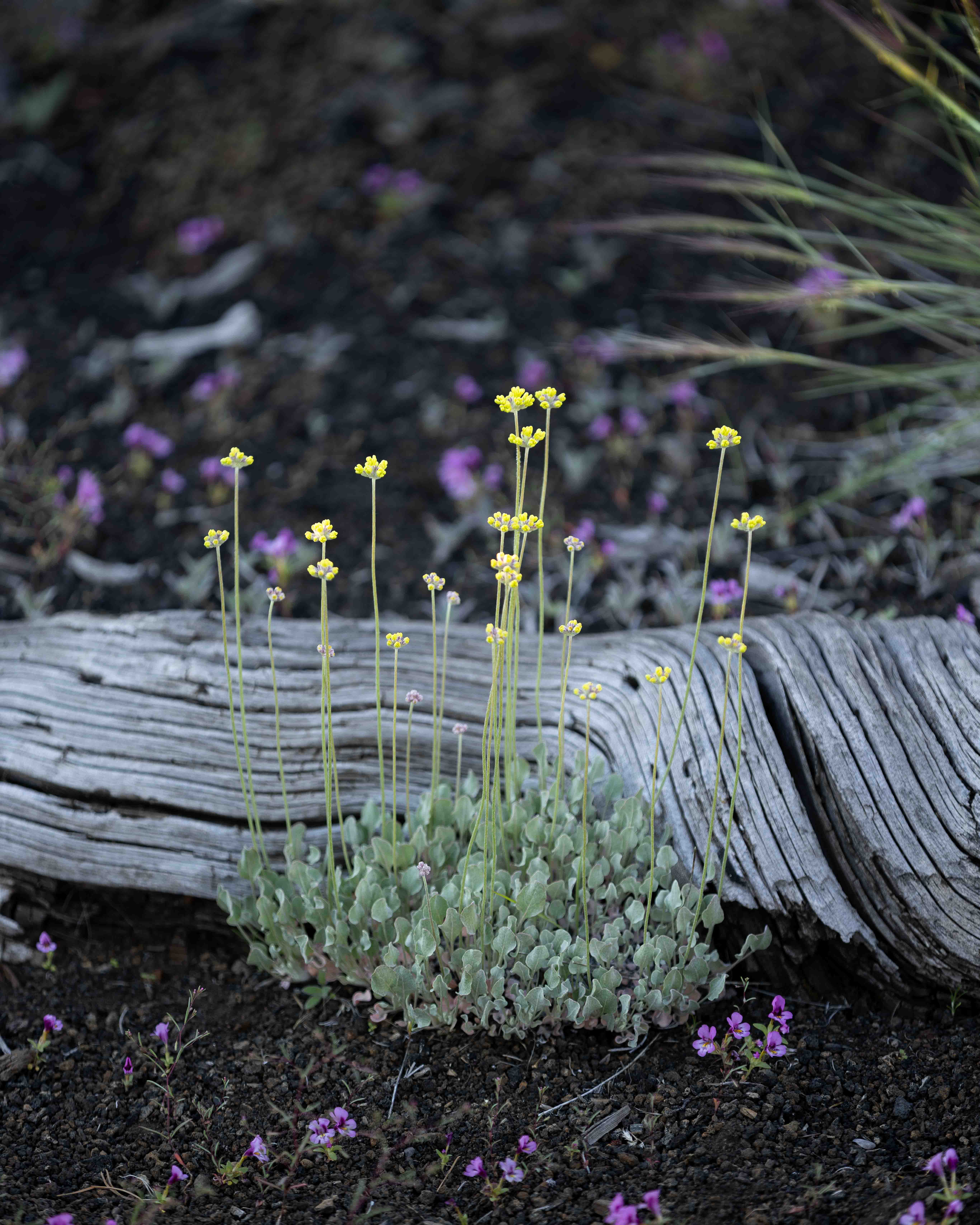
Hi Tyrah
I think the composition you've presented here works well. I didn't see what it looked like w/the dirt in the foreground, but the yellow flowers provide a nice anchor at the bottom of the image with the lines of yellow, green, and then red/brown of the stone. Your ratio of sky to ground feels about right too.
For considerations, the gradient lines in the sky, both the blue part and clouds are pretty distracting. Not sure if they're a result of setting the quality to a very low level in the export or what but you might tinker with that and see if you can resolve them. You might also consider cropping in from the right a little, to bring the border to that little high point that's very close anyway and half cut off.
Thanks
Josh |
Jan 21st |
| 49 |
Jan 25 |
Reply |
Hi Alan
Thanks for the feedback man, I always appreciate you taking the time. I'm wondering if the version that exported is displaying poorly for some reason. When I look at this image in Lightroom, the bright spots aren't blown out and I can see details in the lights down to the lightbulb themselves. The histogram runs the full gamut from blacks to whites and everything in between (I'll upload a copy) - who knows!
As far as it being flat, are you thinking it needs more blacks, i.e., the histogram should be leaning more to the left overall? Just curious if this is something that could be addressed in post, or if it's a capture issue.
Thanks again Alan! |
Jan 21st |
 |
4 comments - 5 replies for Group 49
|
4 comments - 5 replies Total
|