|
| Group |
Round |
C/R |
Comment |
Date |
Image |
| 49 |
Jul 24 |
Reply |
LOL, thanks Craig! Also, I ordered its print for competition prior to considering cropping it, so appreciate the kudos on that direction. |
Jul 27th |
| 49 |
Jul 24 |
Reply |
LOL, thanks Craig! Also, I ordered its print for competition prior to considering cropping it, so appreciate the kudos on that direction. |
Jul 26th |
| 49 |
Jul 24 |
Reply |
Hi David
Alan suggested removing the flower and cropping up from the bottom, so I did that and uploaded a fresh copy below. While I was at it, I took your advice and removed the flower but didn't crop (see attached).
I thought I'd tried this previously and ruled it out, but I think I like it more this way, so not sure why I'd have done that ;)
Alas, thanks again for the feedback!
Josh |
Jul 22nd |
 |
| 49 |
Jul 24 |
Reply |
Hi Alan
Thanks for the kind words and the suggestion (always appreciated). Attached is a copy w/the flower removed and the crop pulled up a bit from the bottom. I like it... I feel like I tried it previously and felt like I didn't, but this feels stronger. Unfortunately, I've already sent it off for print for our fair competition. Oh well, we learn and move on!
Thanks again
Josh |
Jul 22nd |
 |
| 49 |
Jul 24 |
Reply |
Good Morning Stephen!
Thanks for the feedback sir. I tried knocking a little of the brightness/highlights on the top right corner down, but struggled w/the transition between the sun's starburst and the sky (and keeping it realistic looking), so didn't share a copy here.
I'll let you know if I come up with anything worth sharing though.
Thanks again!
Josh |
Jul 20th |
| 49 |
Jul 24 |
Reply |
Hi Tyrah, thanks for the feedback, it's generous :) |
Jul 19th |
| 49 |
Jul 24 |
Reply |
Good Morning Alan
Gotcha, thanks for the additional context. I like David's suggestion of getting rid of that little tree. |
Jul 16th |
| 49 |
Jul 24 |
Comment |
Hi Alan
I went to school at the University of Idaho, about 30 miles from here, it's a cool area.
The textures and lines that you've captured here are great! They really make you want to wander around the image and explore all of the rolling hills and intersecting lines. Compositionally, I'm a little uncertain on the subject though, is it the house and farm in the corner (which feels a little under-emphasized, given its location), or is it the crops, stream and road (which if this is the case, the buildings feel a little distracting).
Thanks
Josh |
Jul 15th |
| 49 |
Jul 24 |
Comment |
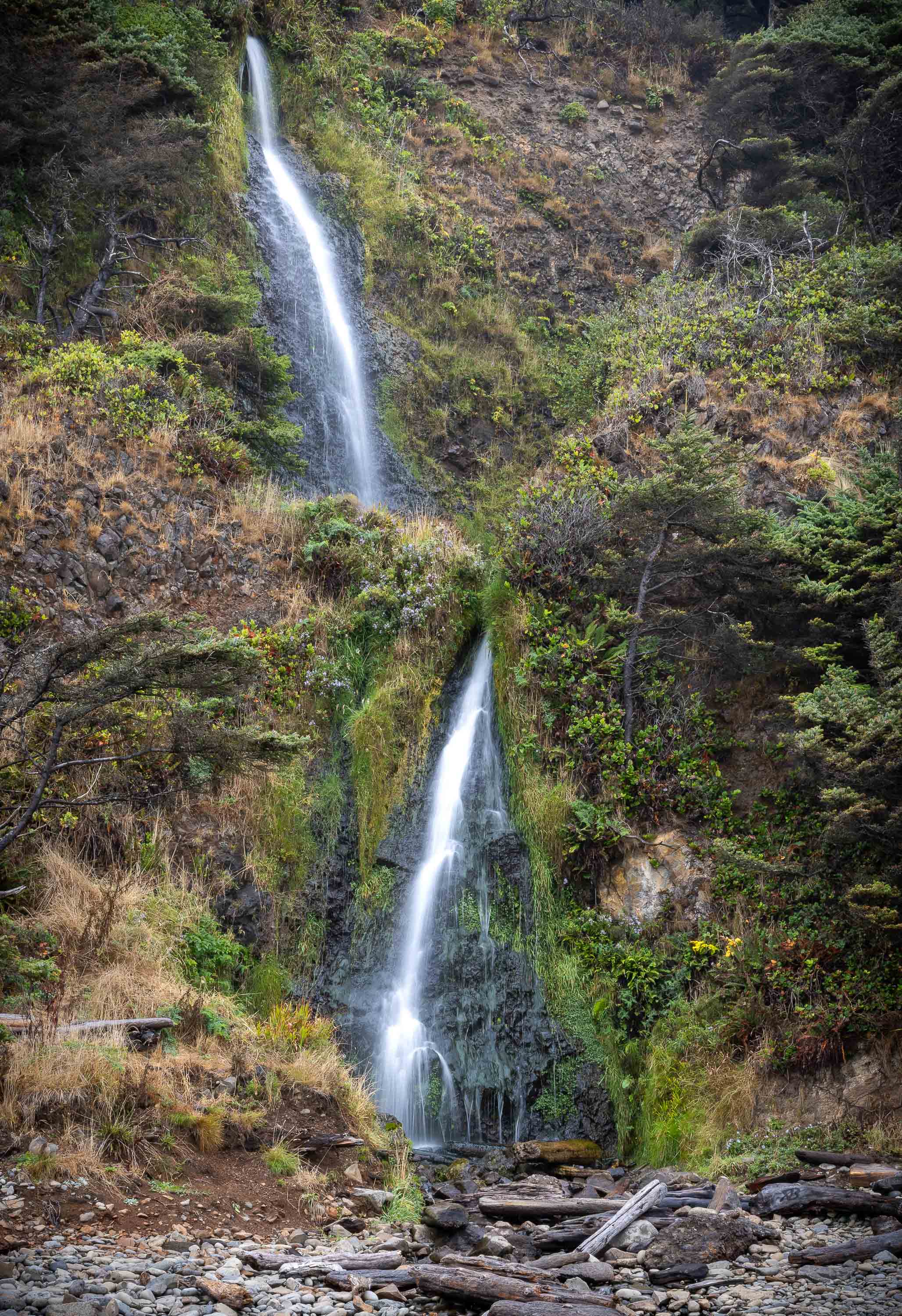
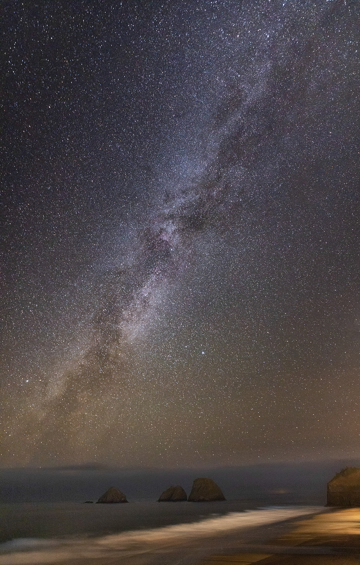
Hi David
I really wish we could do away with, or at least increase, the file size limits. My camera club here in Boise, ID does the same thing. If it's 1999, we're all using dialup, storage is expensive, etc., I get it, but come on.
Anyway, the reason I brought it up is because I'm guessing this image looks different in full resolution, but my attention was immediately caught by what I'm guessing are characteristics of file size and quality reduction to achieve the miniscule maximum file size.
My rant aside, I really like the composition of your image (I'm a sucker for lighthouses too :)). I like how the dip in the mountains lines up nicely w/the lighthouse and the clouds add a nice balance as well. There are some pretty distinct layers in this image that I think work well too, and I appreciate that the top of the lighthouse just stays inside the fog line.
Nothing jumps out at me to offer-up from a suggestion standpoint, but I would be interested in seeing the color version.
Thanks
Josh |
Jul 15th |
| 49 |
Jul 24 |
Comment |
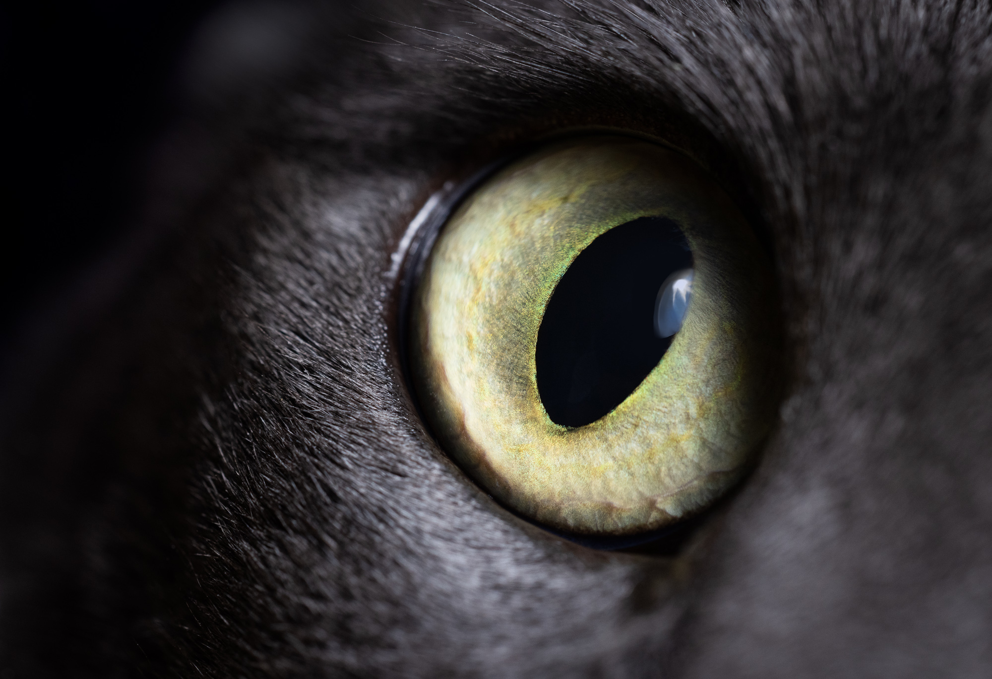
Hi Stephen
What a cool shot! The impact of this is outstanding, with those bright vibrant colors against the dark shadows. I'm really enjoying how you've framed the chameleon's eye in the v of the branches. You've got the basics covered well and I don't have anything to offer up for suggestions - nice one :)
Thanks
Josh |
Jul 15th |
| 49 |
Jul 24 |
Comment |
Hi Craig
He's a handsome devil (or she?). Good balance of ISO/aperture/shutter speed to get as much depth of field as possible, while maintaining a fast enough aperture to not have too high of an ISO. Everything that should be in focus is.
Two thoughts on modifications. There's some kind of dark artifact above the owl's head that needs addressing. Consider removing, or making larger, the item on the left side of the screen. I don't mind the nice border behind him, but the top gets really skinny, which I'm not a fan of.
Thanks
Josh |
Jul 15th |
| 49 |
Jul 24 |
Reply |
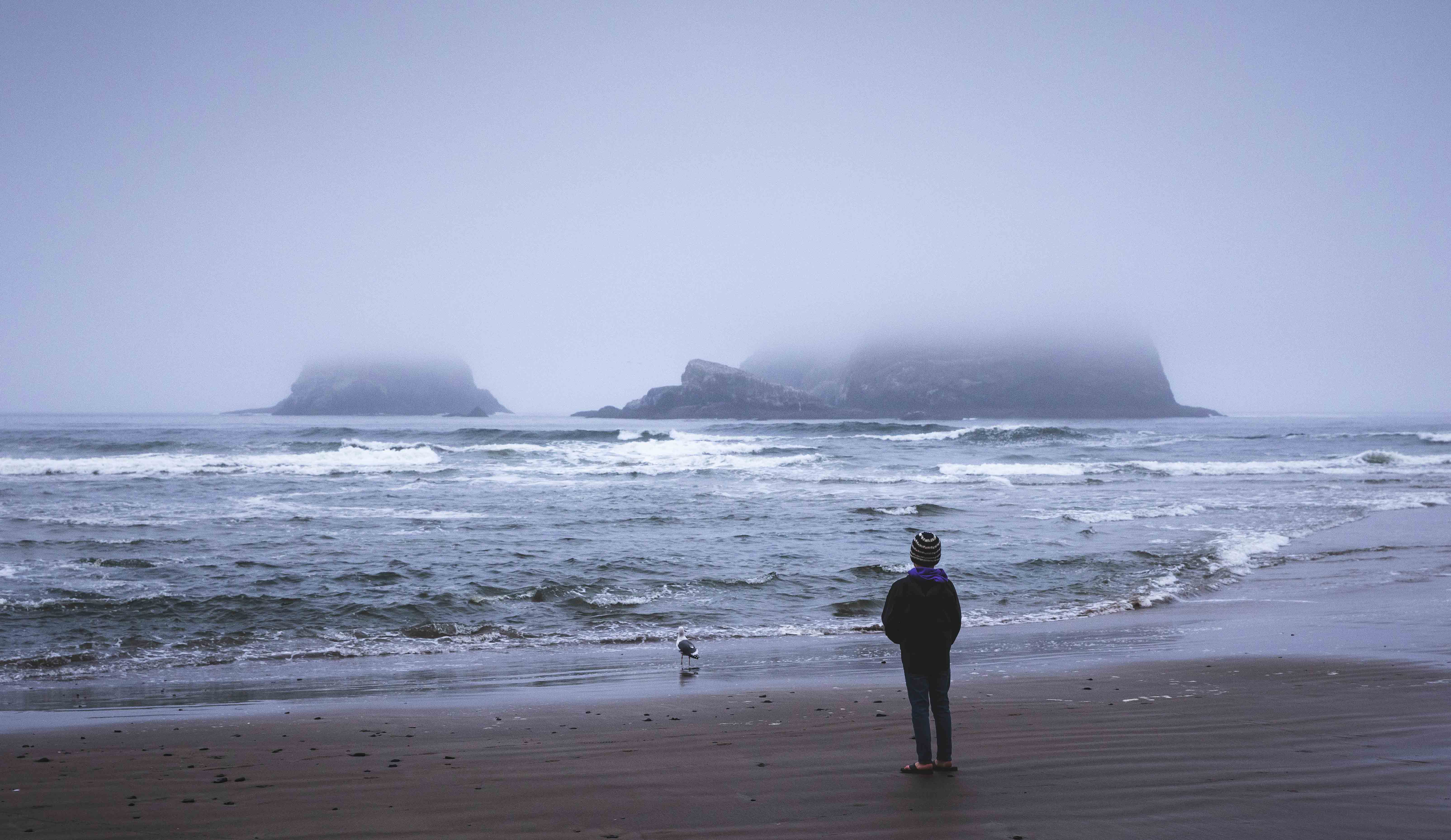
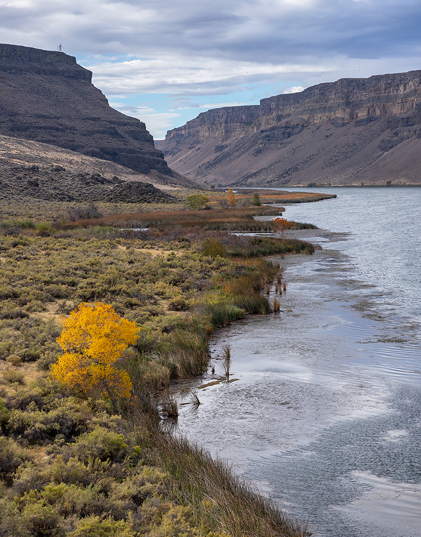
Hi Dave
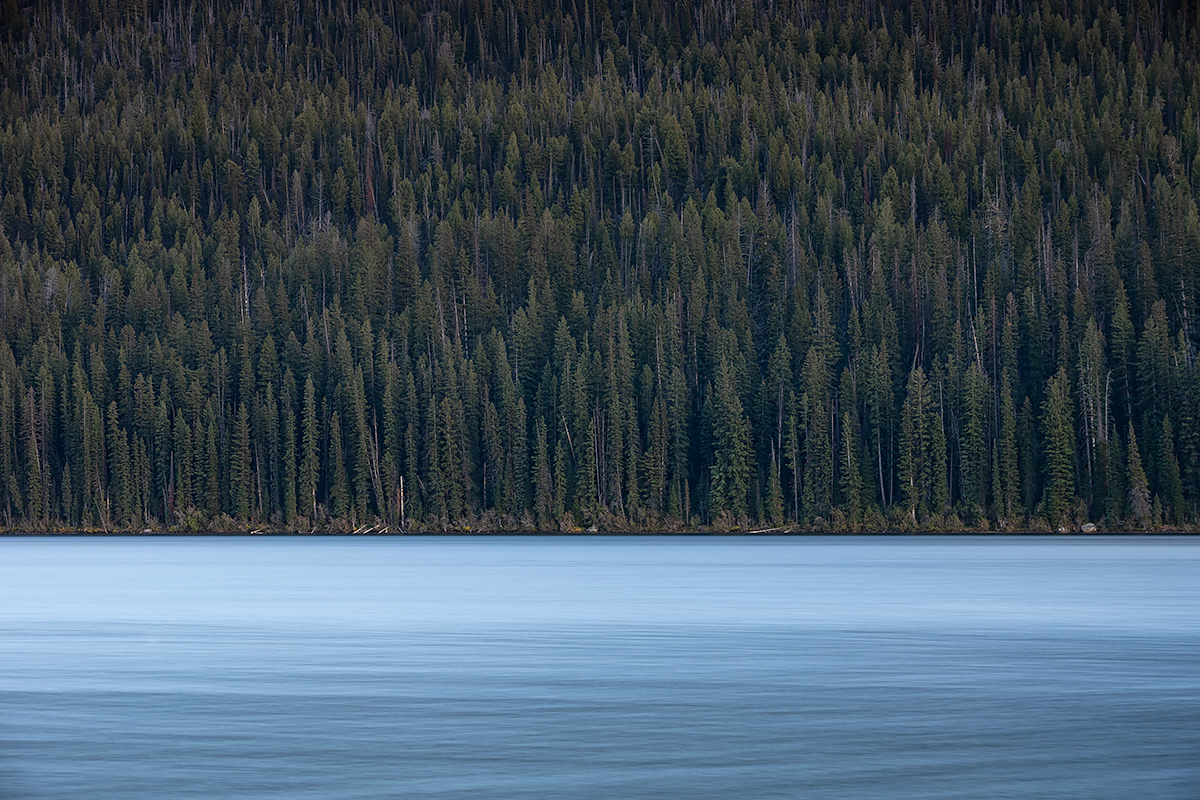
Thank man! I was pretty excited about this one too. That entire week was annoyingly cloudless, but I suppose I could explore a little sky replacement.
That's funny you noticed the flowers, I did remove some of them (perhaps I should have left those), but if I pulled the bottom one that remains, it leaves a green space there that felt weird. Damned if you do, damned if you don't ;)
Thanks for the kind words sir - very much appreciated!!
Josh |
Jul 15th |
4 comments - 8 replies for Group 49
|
4 comments - 8 replies Total
|