|
| Group |
Round |
C/R |
Comment |
Date |
Image |
| 49 |
Feb 24 |
Reply |
Hi David - thanks for the feedback! One of the sentiments often thrown around my camera club is that if it's not adding... it's taking away (or maybe it should be taken away). Regardless, that seems to align with what your saying - I'll give it a go. Thanks again. |
Feb 23rd |
| 49 |
Feb 24 |
Reply |
Thank you for the kind words Stephen, I appreciate the feedback! |
Feb 14th |
| 49 |
Feb 24 |
Reply |
Thank you Alan! |
Feb 14th |
| 49 |
Feb 24 |
Reply |
Thank you Craig! |
Feb 14th |
| 49 |
Feb 24 |
Comment |
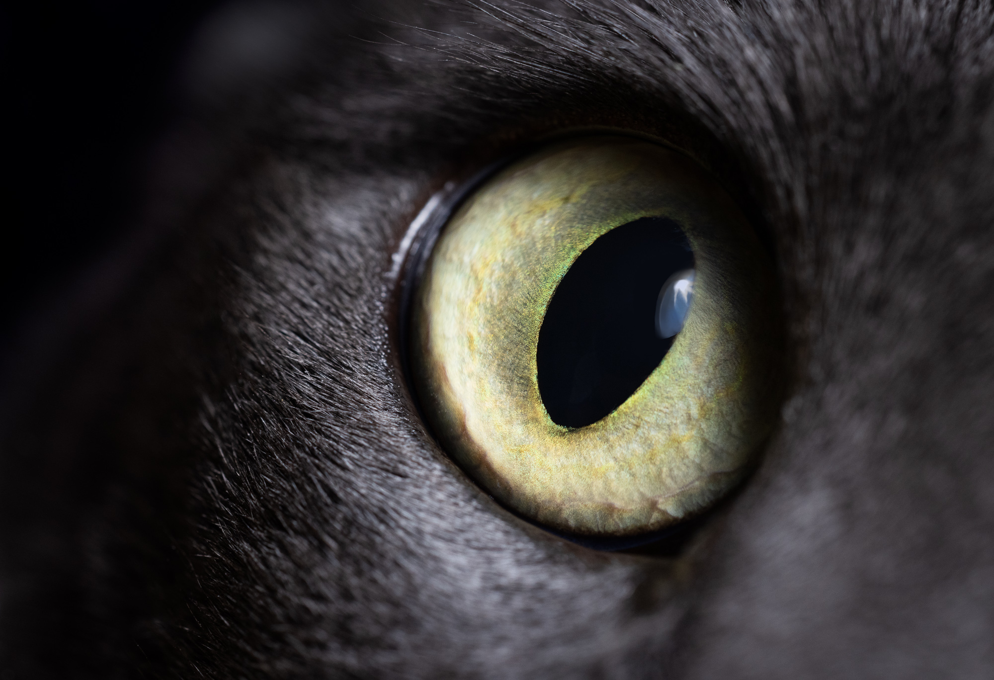
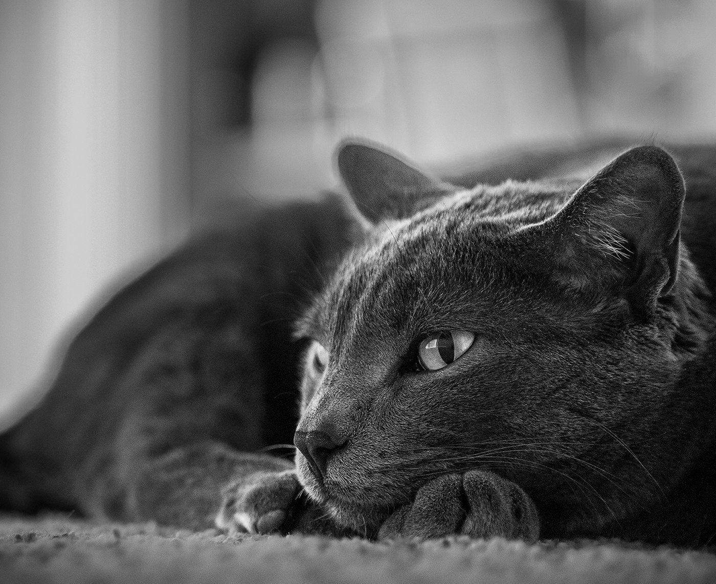
Hey Alan - nice image! The way you've captured and processed it provides real impact. That cobalt blue belly of the bird is amazing, but doesn't feel overemphasized, just nicely celebrated. That light tan head is perfect too. It really takes me there first, as the subject should, and then these great lines from the branches wander my eye around to check out the rest.
Excellent tac-sharp detail on the eye too, which always feels like a prerequisite for an image like this.
The ISO performance has gotten amazing on cameras over the years. My usual mode of operation is to let ISO float (with a ceiling defined) and then I manually control everything else, and over the years that ceiling value's gone from around ISO 1200 on my Canon Rebele T3i to ISO 25600 on my Canon R5. Admittedly, the 25K does get a bit crunchy, but it's still amazing the detail you're able to capture.
|
Feb 11th |
| 49 |
Feb 24 |
Comment |
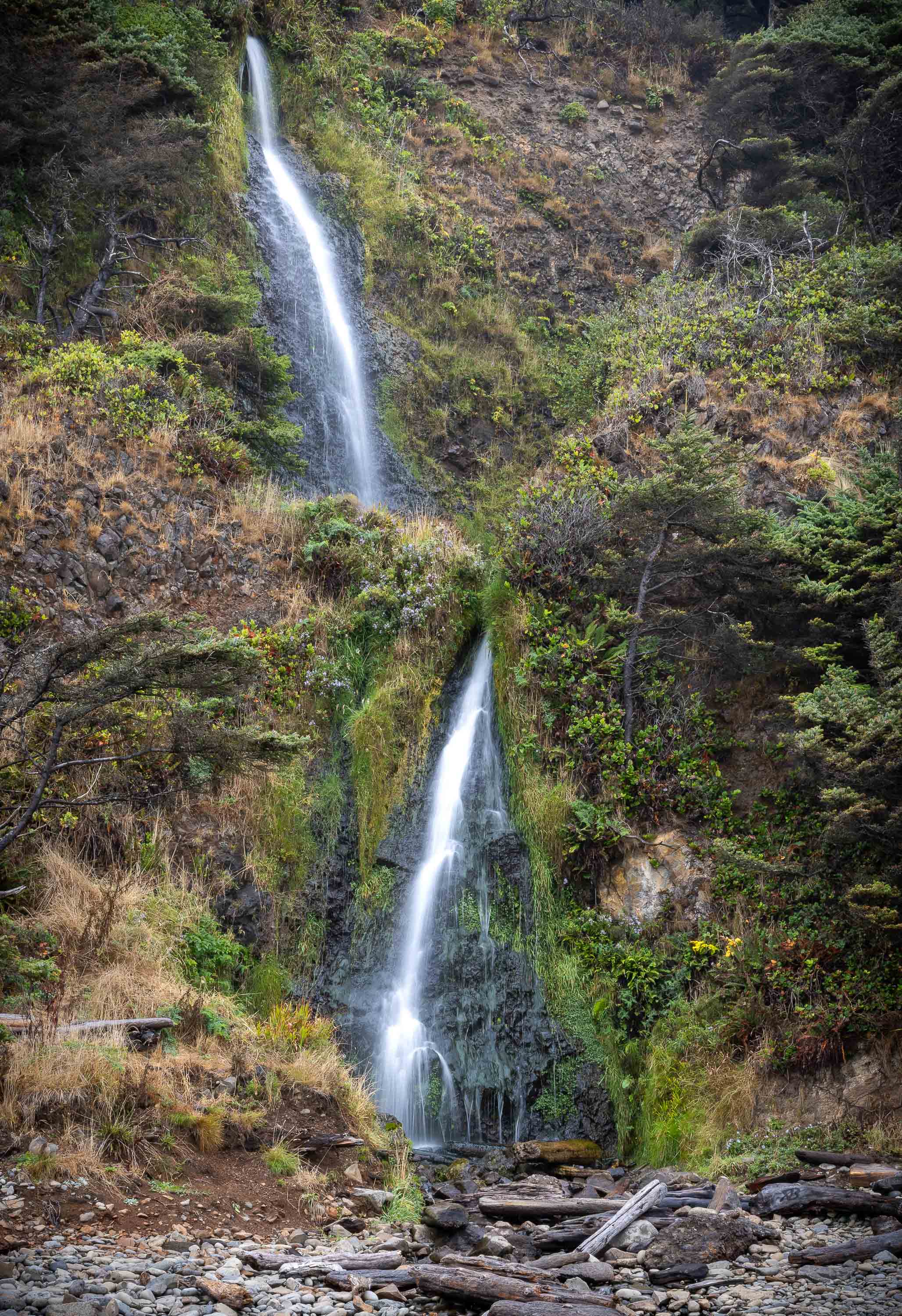
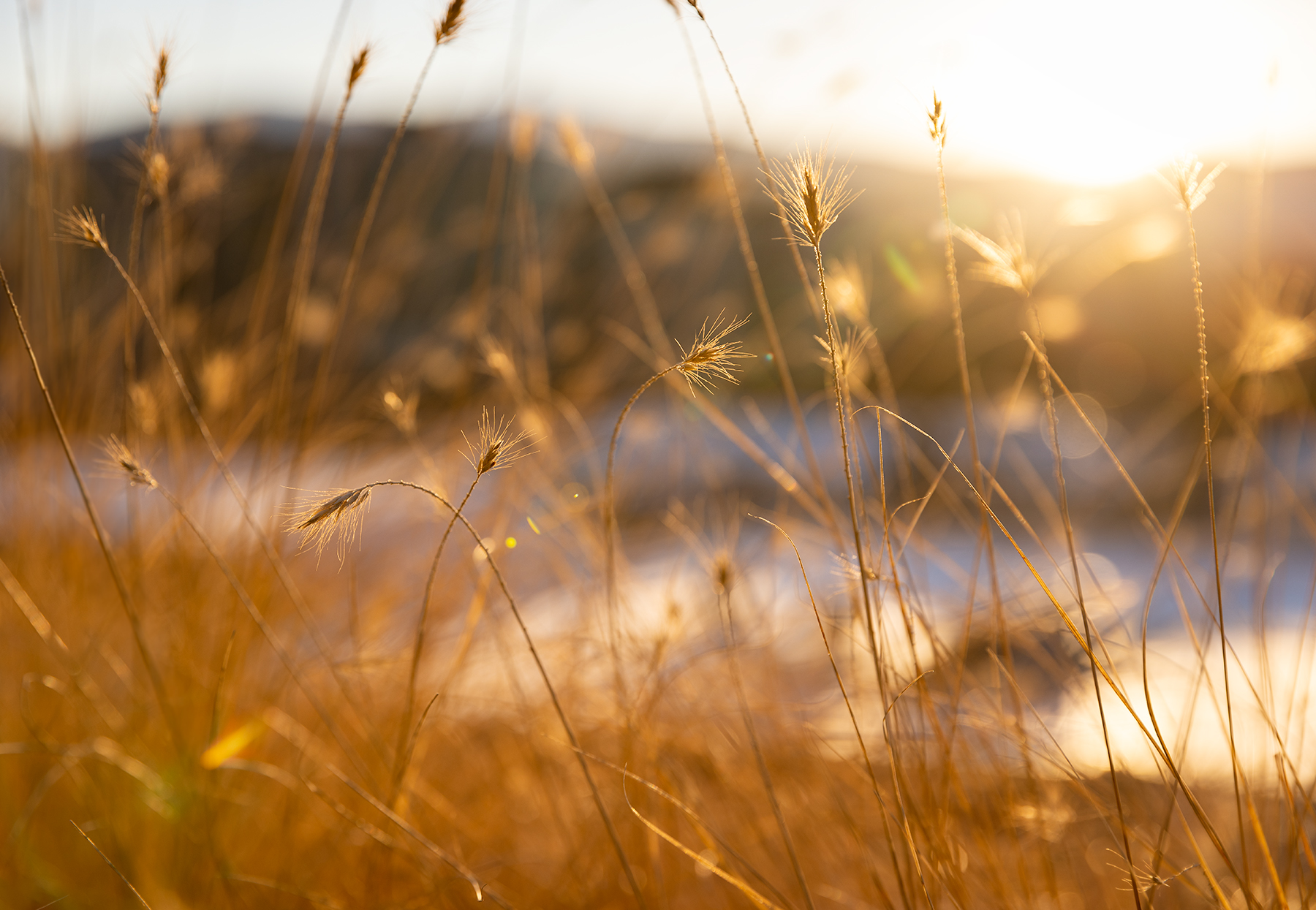
Hi David - it's nice to not see the usual shots from Yosemite, this is something I haven't seen before and appreciate a taste of your experience from the trip.
The water and rock textures are very appealing to me and the way the sun is flashing across them is a dream-come-true for a photographer trying to emphasize his subject - excellent capture!
I have two consideration points:
1. Play with reducing saturation a little bit on the rainbow. It may prove to be perfect where it's at, but it may not.
2. Drop the highlights/exposure (overall brightness) of the small section of green bush on the upper left. That nice bright sun is lighting it up beautifully, but I don't think it's where my eye's supposed to be going in this image. |
Feb 11th |
| 49 |
Feb 24 |
Comment |
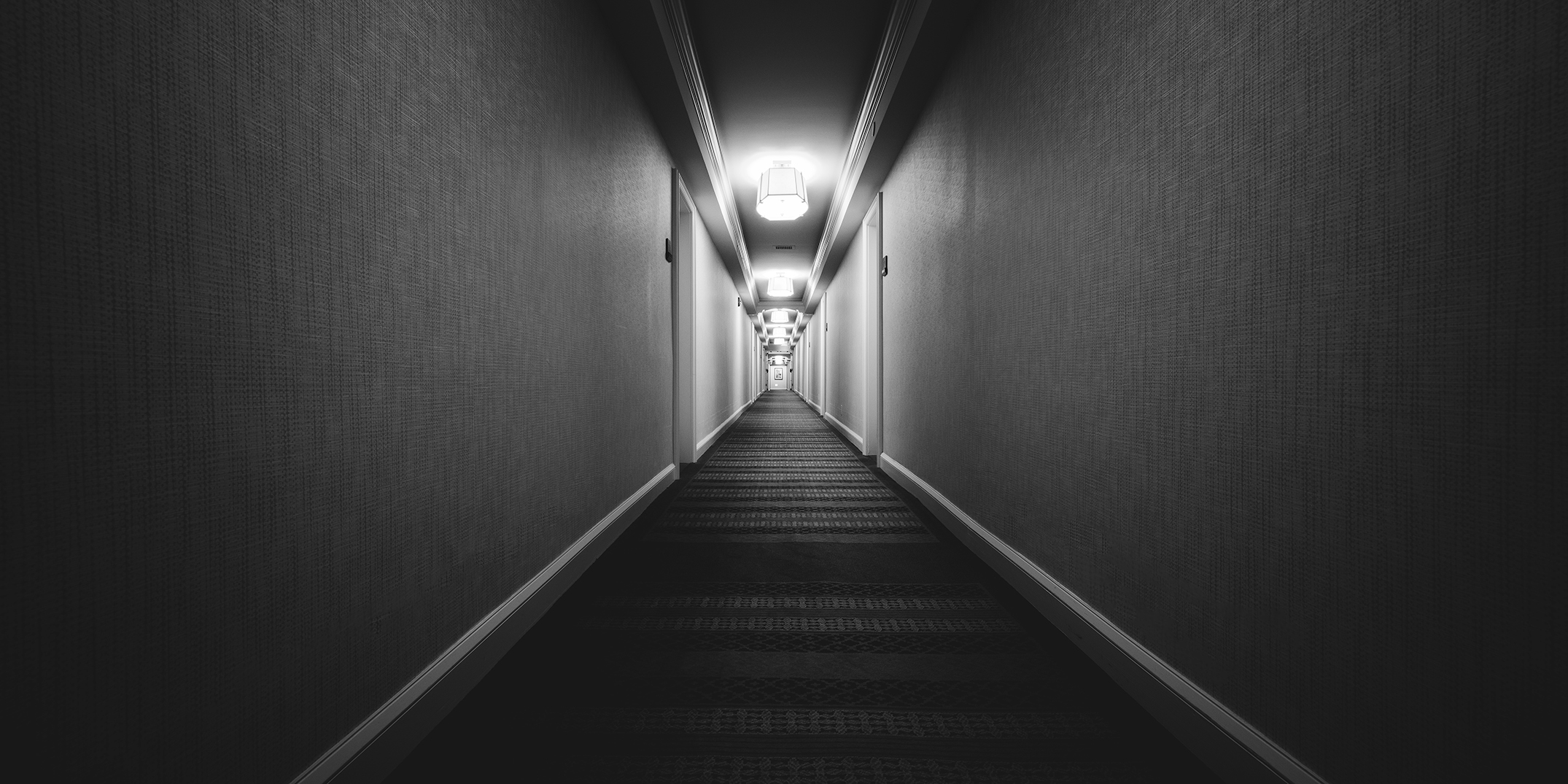
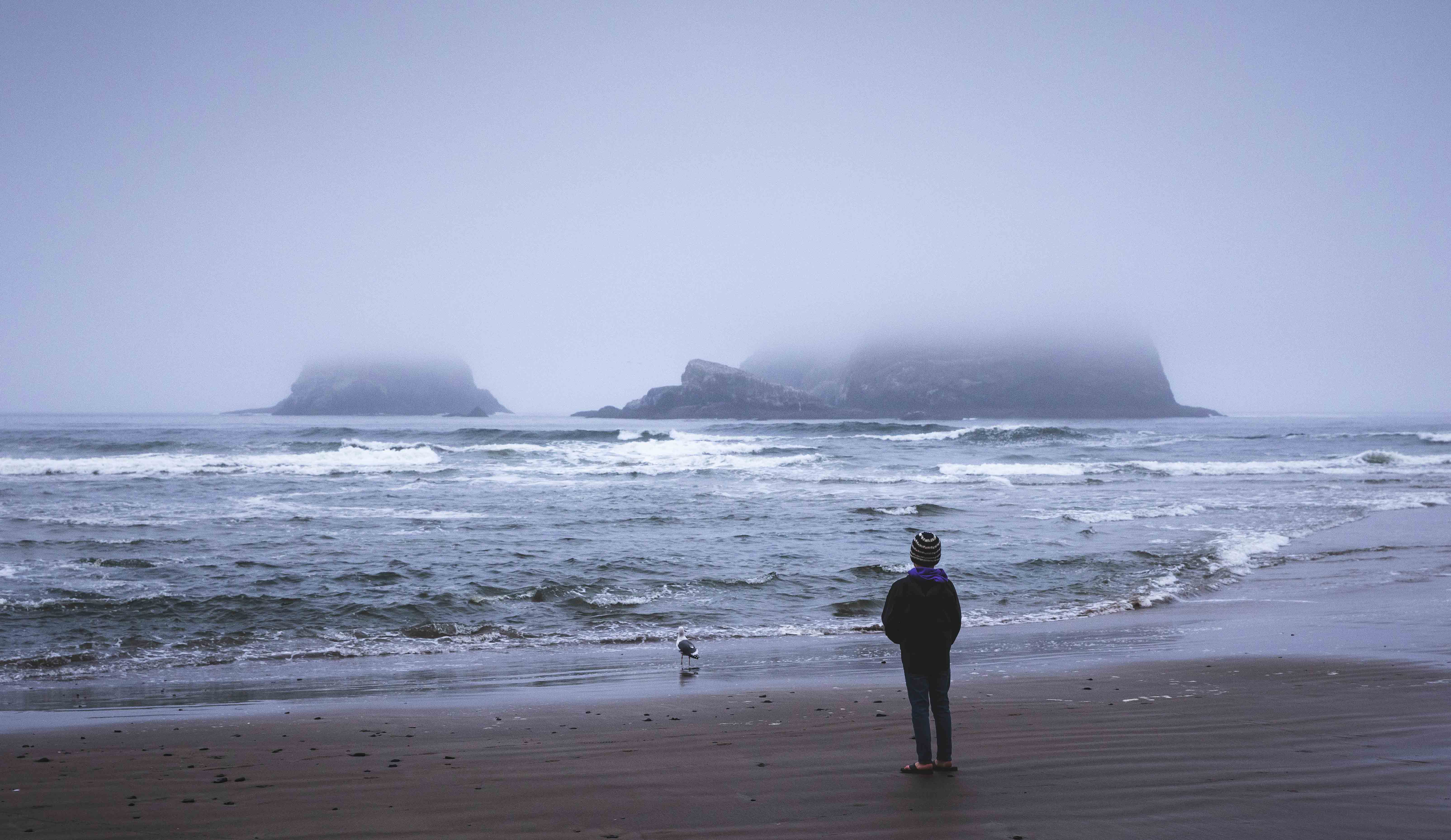
Very cool picture Stephen. It immediately caught my attention when I hit our landing page, and your added verbiage was helpful too. The reasoning behind these lighted pads and the fact that they're even being created is a little mind-blowing.
Anyway, a couple of thoughts on your image. I appreciate the balance of light and dark you've captured here. You've left JUST enough light in those shadows to see what's going on and not feel lost in the image. The lit-up pad is super cool too, and I'm not sure if they were like that, or you did it, but the matching color of the streetlamps works well too.
I'm curious about the non-level framing. What was the motivation behind that? I like it, and feel it works well for this image, and am curious why you chose it. |
Feb 11th |
| 49 |
Feb 24 |
Comment |
Hi Craig, this is a fun, lively picture. I like how the storks are all in different poses and you've got a nice clear separation from them and the background.
There is a vertical line on the right side of the screen that's a little distracting and you might play w/cloning out the lone branch on the lower right, and the string of cobweb (or whatever that is) just below stork #2. |
Feb 11th |
4 comments - 4 replies for Group 49
|
4 comments - 4 replies Total
|