|
| Group |
Round |
C/R |
Comment |
Date |
Image |
| 49 |
Nov 23 |
Reply |
Hey Stephen, please see my response in Craig's response. |
Nov 19th |
| 49 |
Nov 23 |
Reply |
Hey David, please see my response in Craig's response. |
Nov 19th |
| 49 |
Nov 23 |
Reply |
Good Afternoon Craig, David and Stephen
Thanks for the suggestions, and taking the time to apply them!
I do like the revised version and I'm with you Stephen, about bring the crop down just a bit.
This has been one of the most interactive critiques I've had, it's been great!
Happy Holidays Gents
Josh |
Nov 19th |
| 49 |
Nov 23 |
Reply |
Nicely done Stephen. I like the changes you made to the light in this image, it feels more natural. Alan was spot-on w/the lens blur too, it really "de-busied" the image and made it about this glass maker. Excellent! |
Nov 16th |
| 49 |
Nov 23 |
Comment |
Hey Alan. It never ceases to amaze me how obvious things seem once someone points them out! The arm on the right IS way too bright and definitely draws the eye away from the subject. Normally, I'd have shot something like this at f/2.8, which would have helped blur out the faces in the background; however, I'll admit to being a little overwhelmed, this being my first on-field sporting event, and even though I could have dropped this lens to f/4, I didn't even have the presence of mind to do that!
Regardless, the issues w/it could have been addressed in post. Thanks for the feedback, I really appreciate it!
|
Nov 14th |
| 49 |
Nov 23 |
Reply |
Sure thing! |
Nov 14th |
| 49 |
Nov 23 |
Reply |
Good morning Alan! I like it with that partial piece of tree cloned out.
As far as the crop, I'm leaning towards the original. The cropped down version feels like a little tight up top and makes the wider ratio not feel quite as natural to me. |
Nov 14th |
| 49 |
Nov 23 |
Comment |
Hi Peggy. I like your image; it makes me want to go explore where you captured it!! The leading lines of the road pull my eye into things nicely and I'm always a sucker for lines ending right on the corner.
The barn itself is great, and while old and rustic of course, it's well taken care of, and it makes me want to understand what the story is with all those flowers! And�� how do they water those pots so far up on the wall?! Drip lines maybe�� but I digress.
As far as suggestions go - you could consider widening and heightening the crop a bit, especially on the top. It's not touching, which is good, but it's really close, which is a little distracting. Sometimes there are elements in the environment that prevent including more of the picture, which may have been the case here, but that is one thing that caught my eye. |
Nov 13th |
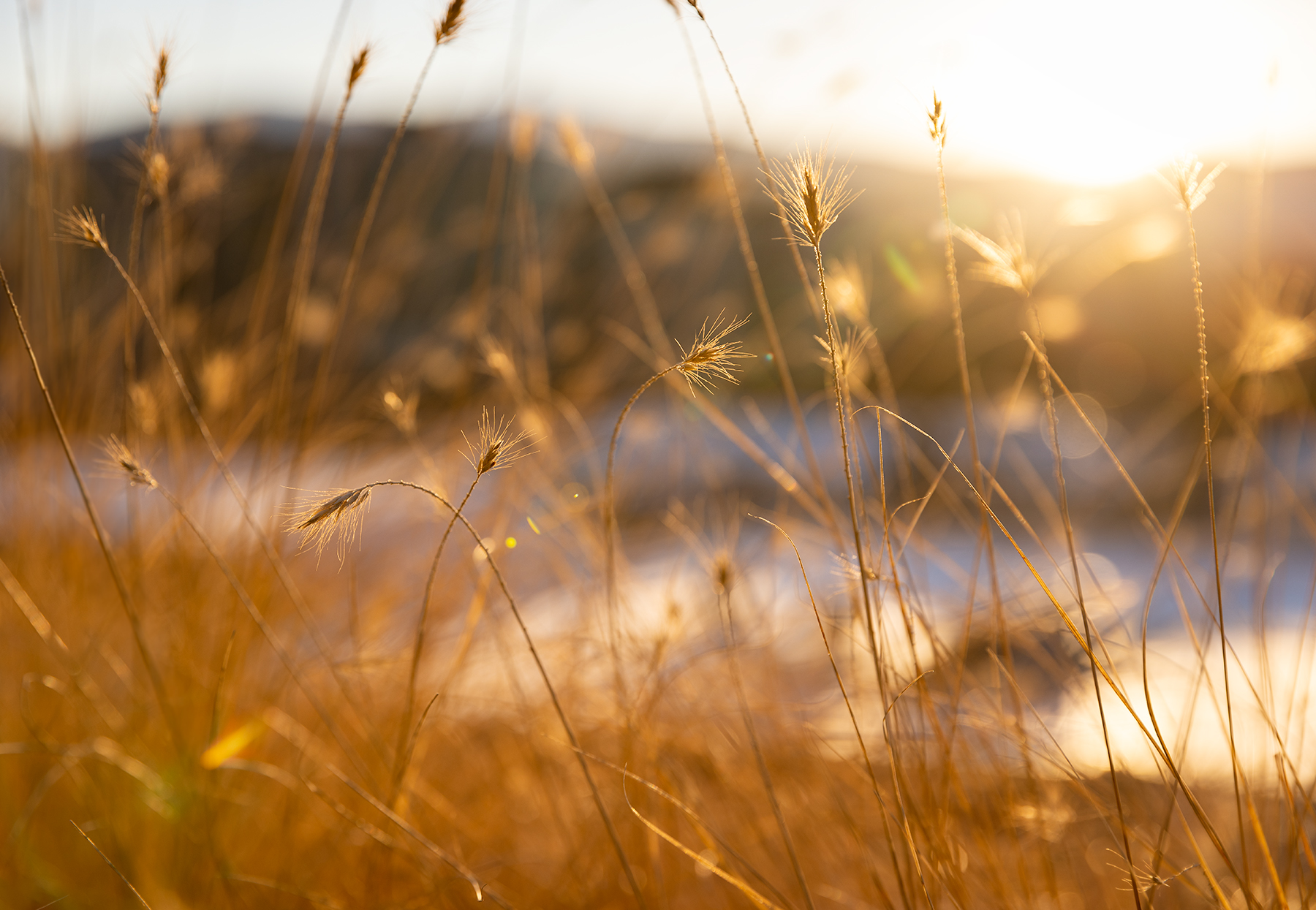
| 49 |
Nov 23 |
Comment |
Hi Alan. Nice light on this capture. I like how you've maintained that warm sunset (or rise?) tone and still given us a little detail in the shadows of the mountain. You've bisected the horizon with one of these Joshua Trees but done it aggressively and taken it well above the horizon, which makes it work. All the thirds are nice too. The one suggestion I'd offer here would be to clone out that chunk of "tree" that's peeking its head in on the right. |
Nov 13th |
| 49 |
Nov 23 |
Comment |
Hi David - it works for me sir! The contrast between those deep reds, and grays and blacks are wonderful. The reds are so vibrant, but don't feel like too much so - nicely done. The movement adds a sense of peace to the image too, makes me want to be there!
I tried playing with the crop on this a bit and trimming the right helps with two things, eliminating that stick that shoots at a 45 degree angle and that big black section that distracts my eye from this peaceful scene occupying the left 85% of the image. There's a saying that gets thrown around in our camera club that's something to the effect of, "if it's not adding, it's taking away" and I feel like that applies here.
|
Nov 13th |
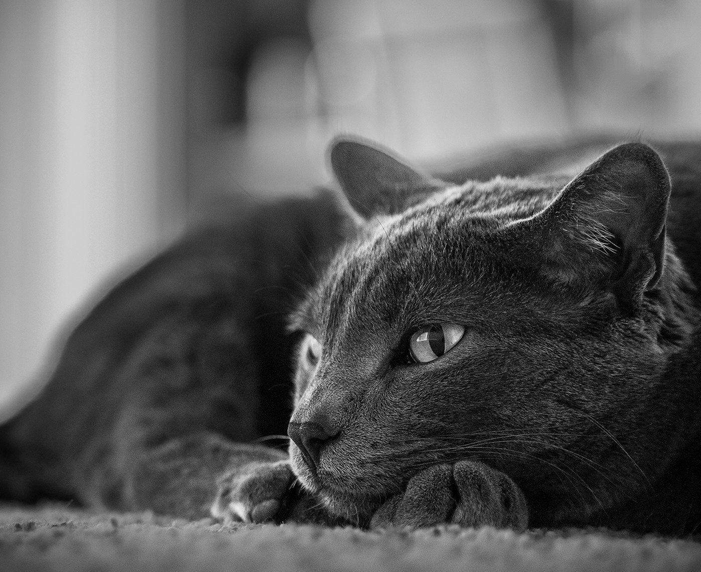
| 49 |
Nov 23 |
Comment |
Hi Stephen, thanks for providing the detail on the shutter speed - it was one of the first things I noticed, and the backstory makes sense. The effect of balancing out the image as a result of the bright background has given it kind of an industrial finish, which works well for the subject matter. All the black, grays and metal really gives it that rugged feel and the themes of orange throughout compliment the darkness nicely. Another detail I appreciate about this is that the overall image is about the glass (it feels like anyway) and that's one of the clearest parts of this image.
One consideration point for this would be to brighten the glass a bit. As presented, the top of the glassblower's head is one of the brightest parts of the image, and my eye gets pulled to it. Brightening the glass (or cutting highlights a bit on the glassblower) might help balance the emphasis of the subject.
|
Nov 13th |
| 49 |
Nov 23 |
Comment |
Hi Craig - your story of capturing this image is a fun one, and I'm guessing one you won't forget anytime soon. I could give you the "Nice image!" type of feedback, or comment on the technical details like that it's sharp, and exposed nicely, but I find limited value in feedback like that, so I'll take a different path and say that I'm not quite sure what I'm supposed to focus on in this image. It has some very cool aspects, like the graffiti and its nice reflection, or that gnarly I-beam that's all rusted, bent and painted, or even the trash, that sets the stage. Perhaps it's all of it? Perhaps one could have been emphasized?
Thanks for sharing, I had to really think on this one�� and I guess that's the point of these!
|
Nov 13th |
6 comments - 6 replies for Group 49
|
6 comments - 6 replies Total
|