|
| Group |
Round |
C/R |
Comment |
Date |
Image |
| 49 |
Jan 23 |
Reply |
Thanks Owen, I appreciate the feedback! |
Jan 16th |
| 49 |
Jan 23 |
Reply |
Thank you sir! |
Jan 16th |
| 49 |
Jan 23 |
Reply |
Good catch on the masts Alan, I hadn't noticed, but after you pointed it out, it's clear as day! |
Jan 16th |
| 49 |
Jan 23 |
Reply |
Sure thing Alan! |
Jan 16th |
| 49 |
Jan 23 |
Comment |
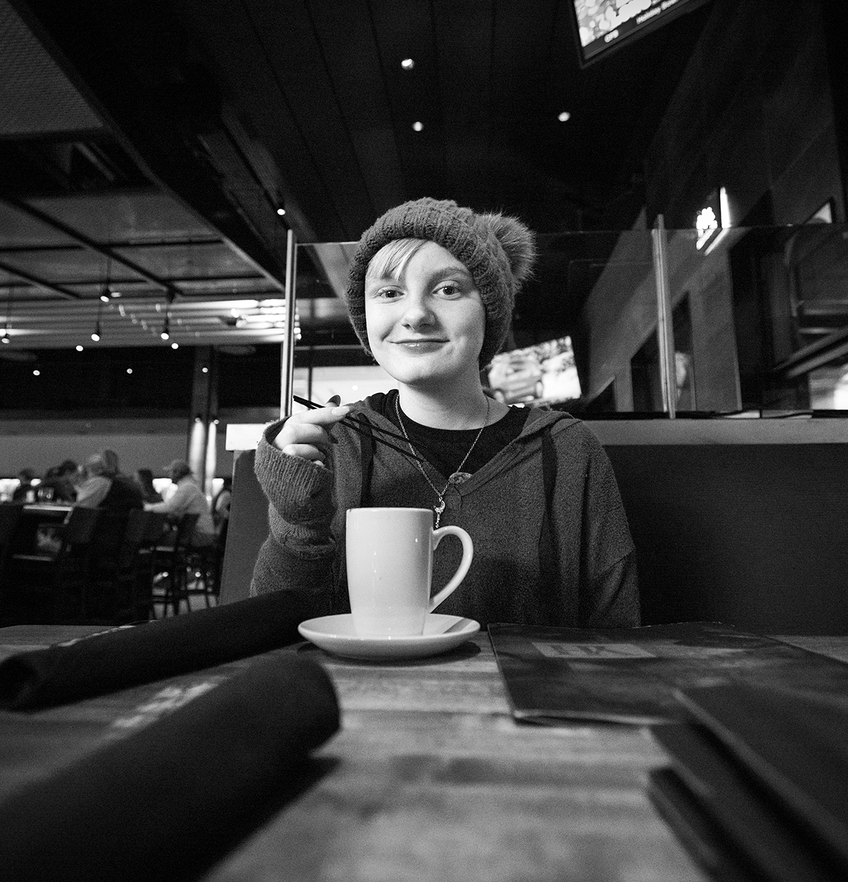
Hey Alan
This is image is great, and I dare anyone to not smile when they look at it :) Hopefully this little guy gets a copy of it, at some point - it belongs in someone's family photo album!
I regularly fight with flash photography too, also not being a big fan of the harsh light that an open flash often creates. That said, the way that you've toned down the background of this image, it really doesn't hit me as being what I usually think of as a super bright flash shot, nice work! It's a really sweet image.
A portrait photographer friend of mine that does a lot of outside work, in the evenings, turned me on to these: https://smile.amazon.com/FOTOCREAT-Balance-Portable-Diffuser-Speedlite/dp/B072LMVTGJ/ref=sr_1_3?crid=36OMYCQYEY6LE&keywords=fstoppers%2Bflashdisc&qid=1673751334&sprefix=fstoppers%2Bflashdisc%2Caps%2C158&sr=8-3&th=1. It appears the Fstoppers brand no longer makes the one I have, but this seems to be similar, if not identical. It gives you the benefit of a softbox, but the mobility to not have to lug a tripoded softbox around. Of course, it's still kinda big and in your face, but it may be the happy-medium you're looking for.
My only other feedback on this image would be to pop it into Photoshop and clean up the selection on the front of the little guy - there are some bright spots shining through that I'm guessing are what the image looked like prior to you toning it down. |
Jan 14th |
| 49 |
Jan 23 |
Comment |
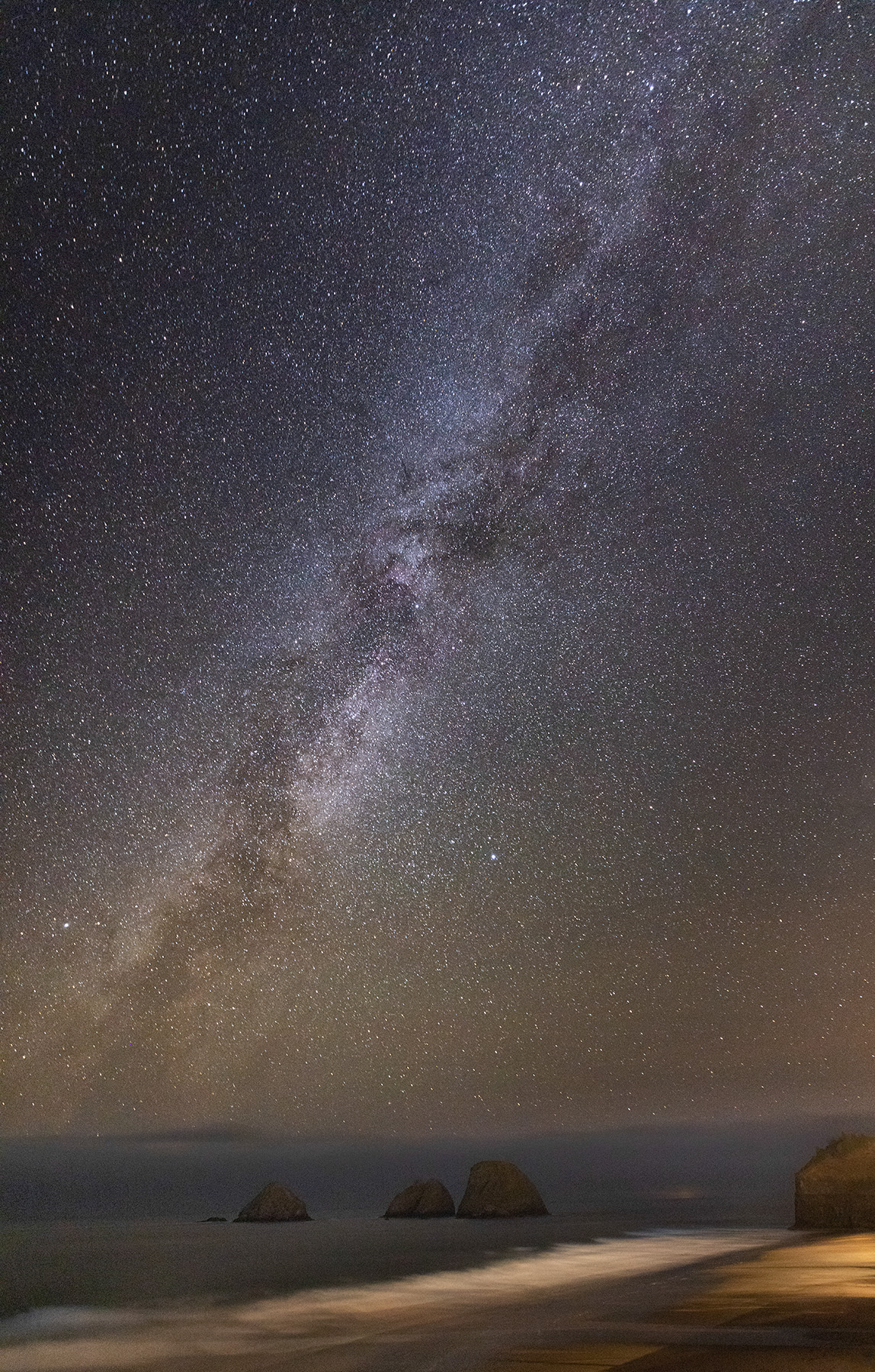
Hey David
I'm a sucker for the ocean, so can't help but love the subject - especially the offset triple spires, but there are a few challenges with it.
The halos for sure are distracting and an instant sign of the image having been manipulated. The very tip of the middle stack just touching (or maybe crossing) the horizon line is distracting too. Not sure if you have another shot where the ship you're on is on the crest of a wave, and maybe the top is below the horizon?
I tried selecting the sky and intersecting it with a linear gradient, to fade the mask in from the top, and darkened it a little and that seemed to balance out the dark stacks with the light, faded background.
Overall, it's a beautiful scene! |
Jan 14th |
| 49 |
Jan 23 |
Comment |
Hi Jo-Ann
What a nice image! And I couldn't help but notice you've got a Rebel T3i too! My R5 is currently with CPS and my only body at this point is the T3i - how far cameras have come!
Anyway, this is one of those images that makes me want to be there.
I agree with Craig, the composition works well. If the boats weren't there, it might feel like there is too much water, but they tell a story in and of themselves. Speaking of them, you might consider cloning out the partials at the bottom of the frame - Lightroom makes it really quick and easy.
I'm not sure what part of the processing you did to achieve it, or maybe just captured it this way, but it has a bit of a film photograph feel to it�� I can't quite put my finger on it, but I like it - like it's capture this wonderful place on the ocean from a time in the past.
One other thing to consider, bump the Temp slide up just a little bit to balance out some of that blue. |
Jan 14th |
| 49 |
Jan 23 |
Comment |
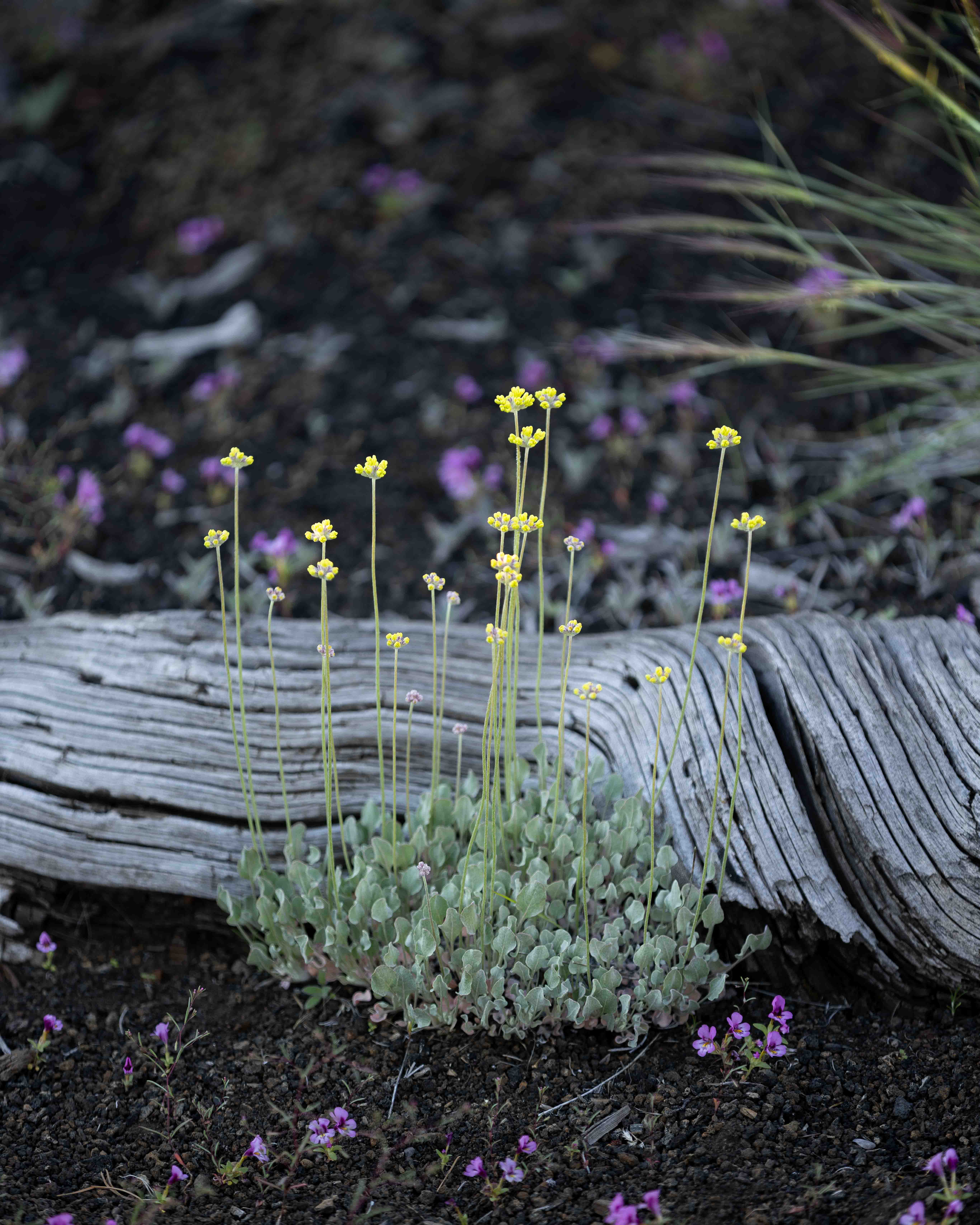
Hi Craig
Beautiful shot, and nicely exposed. F/10 seems to have given you a nice depth of field for this shot. I also like the texture that you've chosen, it, combined with the image itself, feels very jungle like to me. The subtle vignette contributes to this too!
I agree with David about the some of the detail in the background. Perhaps consider dropping the sharpness, using a gaussian blur (there's a dozen ways to do it) on the area you masked outside of the subject flower. Seeing as you're in Photoshop tinkering mode, you could even select that second background flower and drop its saturation a bit. It's a tree, so other flowers are expected, but deemphasizing it a bit may strengthen your overall image here.
Thanks for the color, we've got nothing but browns and grays this time of year up in Idaho ;) |
Jan 14th |
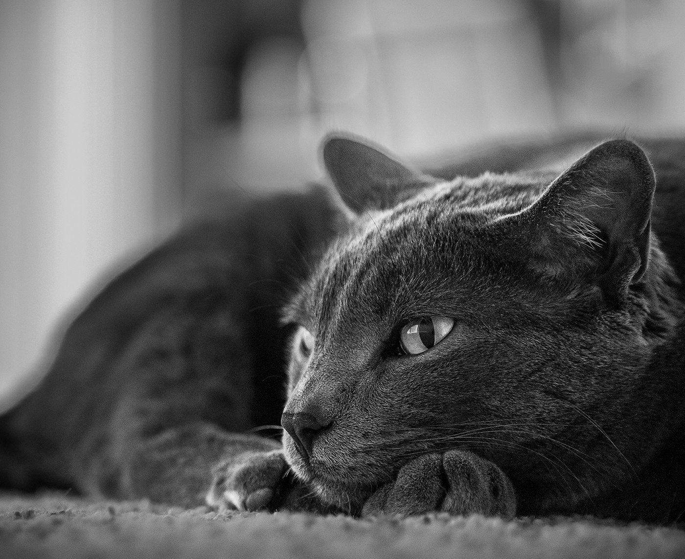
| 49 |
Jan 23 |
Comment |
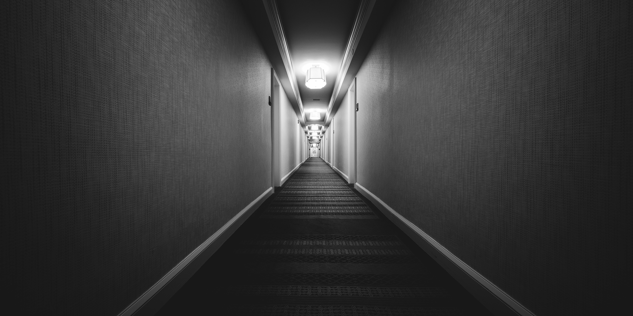
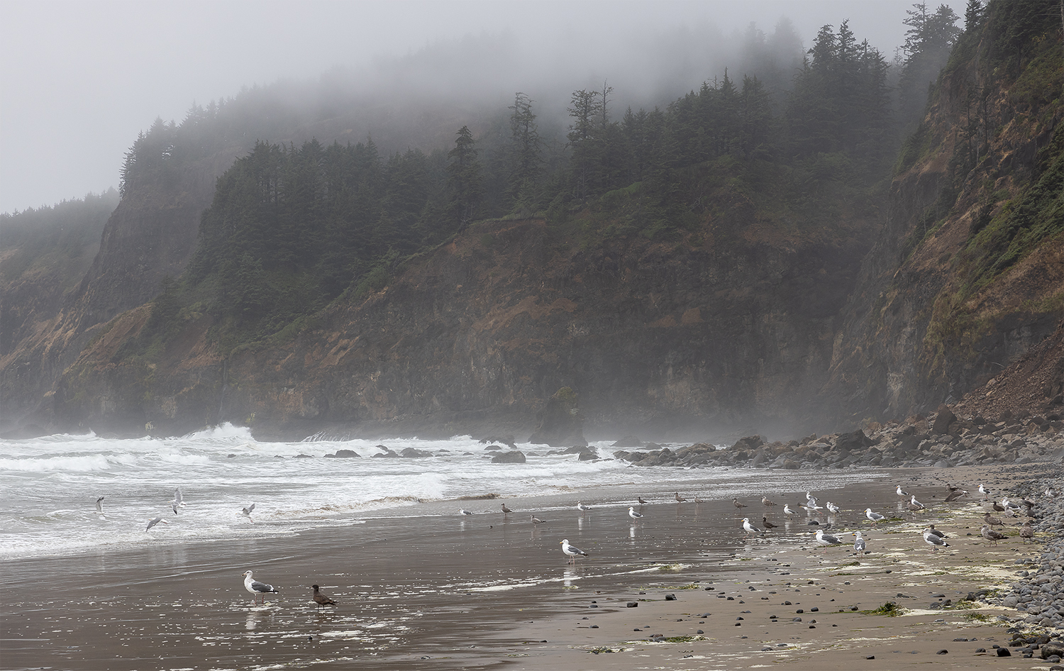
Hey Owen
Great shot! The monochrome processing on this works really well for me. The highlights are definitely a little hot, maybe bordering on too much so, but they feel evenly balanced by the rest of the image. Both the ratio of light to dark content, plus the nice transition from highlights up top, down to the your shadows at the bottom of the image.
I appreciate how you've maintained details in all of your shadows too, gives a very subtle, but effective life to a significant portion of your image.
Was this taken w/a tripod? 1/30th of a second is right on the cusp and if it was taken free hand, kudos - it's remarkably clear.
A few consideration points that occurred to me, you could bring the crop in on the right a little, just make sure you don't crop any of that curving staircase off. My eye keeps jumping to two spots that would be piece of cake to remove, the power receptacle (I think is what it is) on the bottom left and the spec below and left of the guy at the bottom. Not big things, but they do keep pulling my eye from the rest of the awesomeness.
Thanks for sharing this!
|
Jan 14th |
| 49 |
Jan 23 |
Reply |
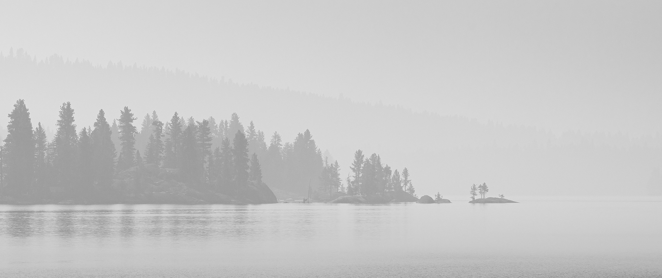
Hi Jo-Ann, it's interesting, the smoke was so thick on that day that the image was almost monochrome to begin with! Interesting perspective about how the water and sky frame the peninsula and island - you're right! |
Jan 14th |
| 49 |
Jan 23 |
Reply |
Thanks very much Craig! |
Jan 14th |
| 49 |
Jan 23 |
Reply |
Hi David, thanks for the kind and generous critique. It's funny you mention fog, the smoke was so thick and so engrained in my brain, it never even occurred to me that they do share a very similar look and that that is what this could be.
I appreciate the feedback on the tree cropping location, it always seems difficult finding the "right" location to cut a big section of subject like that in half, I'm glad it worked for you!
Thanks for the cropping suggestion - I kinda like the texture in the water, but that sky could easily come down a bit.
Thanks again!
|
Jan 14th |
5 comments - 7 replies for Group 49
|
5 comments - 7 replies Total
|