|
| Group |
Round |
C/R |
Comment |
Date |
Image |
| 49 |
Oct 22 |
Reply |
Good morning Alan - no apology necessary! I'm here to grow, and I appreciate you being willing to share the alternative viewpoint on my image. I learn through being challenged so am grateful for the opportunity.
I could easily see how you'd look at this image and it would immediately zip your eye from left to right, right out on out of the frame ;) That's one of the things I enjoy so much about photography, you just can't know how your audience will interpret what you present. -Thanks for the feedback! |
Oct 23rd |
| 49 |
Oct 22 |
Reply |
Hey David, yep - that would totally do it. Even playing w/the hue sliders, if you're really looking to alter it. |
Oct 23rd |
| 49 |
Oct 22 |
Reply |
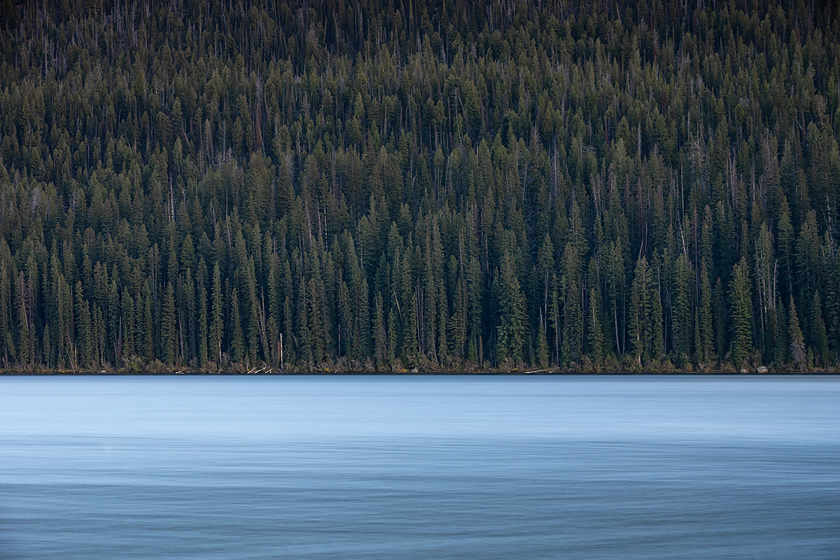
Good morning David - I'm glad you like it! I cloned out a fair bit of junk but didn't want to take it so far as to remove all of it, not wanting it to the lose the natural look.
As to the crop, now that I see it again, I remember why I left more of a 2/3 / 1/3 crop. The water is so much brighter than the trees, that I thought the larger dark section of the image balanced out the smaller, but much brighter water. For me, the 50/50 split feels overwhelmed by the water.
Thanks for taking a look and responding!
|
Oct 21st |
| 49 |
Oct 22 |
Reply |
Hi David, thanks for taking a look! I've uploaded a copy of the 50/50 split, I'd like to hear what you think. |
Oct 19th |
 |
| 49 |
Oct 22 |
Comment |
I really enjoy this image Dicky - I think this is the best piece of your work I've seen yet. It's really interesting to look at and makes my eye want to explore and just keeping looking! There are a number of interesting visual elements to hold my attention, it's excellent.
You've also handled the difference between these amazing sun rays and the darkness of the shop beautifully. It's really easy to underexpose the shop in a setting like this, trying to keep the sun beams from blowing out, but you've struck a great balance between the two. I hadn't thought to crop in from the left as Craig suggested, but I think it definitely helps draw your eye to the lights and reduces the possible distraction of the deer, just don't come in so far as to crop those cool hanging candles. Great work!
|
Oct 11th |
| 49 |
Oct 22 |
Comment |
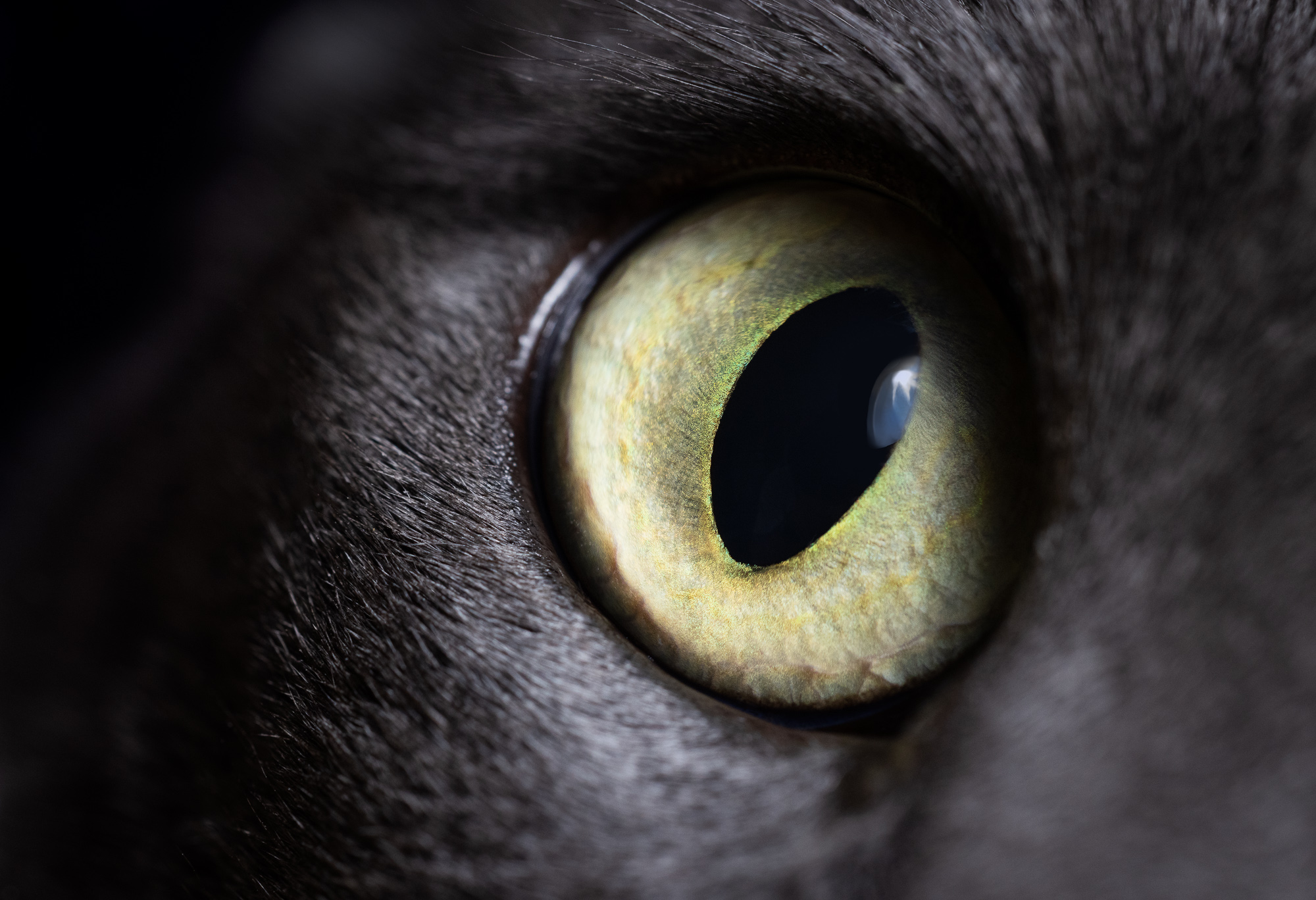
Hi Alan - I think this works, and it's interesting how you've taken the blacks completely black and whites completely white, no shades of gray! I like the bushes at the bottom, they anchor the whole thing, but I would clone out the next tallest branch/tree on the right, I feel like it competes with the subject, as well as those few little specs of white down at the bottom. |
Oct 11th |
| 49 |
Oct 22 |
Comment |
Hey David - this is really nice. The way you've split the road in half w/the bottom right corner just pulls me into the landscape with two hands, it's wonderful. You've then got these great leading lines from the rock wall/fence and horizons taking you to the end point of the road too - very well seen.
If you wanted to put a little more emphasis on the home, you could play with adding a little additional light to it and subtle vignette might help too. It's beautiful as-is though, nicely done.
|
Oct 11th |
| 49 |
Oct 22 |
Reply |
Haha, that's awesome - very generous of you! I'd have to disagree, regarding this gal anyway - she's lovely, I'd like to see her in the sharpness I suspect you captured her in. Dropping clarity is my trick to soften the age lines bit.
It definitely feels a little dark on my screen (which is calibrated). Here, I tried bumping it up a bit, but still not blowing anything out, just as a comparison point. |
Oct 11th |
 |
| 49 |
Oct 22 |
Reply |
For sure, there's a "Choose File" button below this comments fields, you can upload revised versions there and they'll show up in-line w/the corresponding comment. |
Oct 11th |
| 49 |
Oct 22 |
Reply |
Thanks for the kind words Craig, I really appreciate it. Simplicity in photography seems like it would be such an easy and obvious thing to achieve (and maybe it is!), but I rarely manage it. |
Oct 10th |
| 49 |
Oct 22 |
Reply |
Hey Jo-Ann, thanks for the feedback on my image - I really appreciate you taking the time. I was wondering if you could expand on it being an "aerial view", I'm just not sure what you mean and was hoping to understand. |
Oct 10th |
| 49 |
Oct 22 |
Comment |
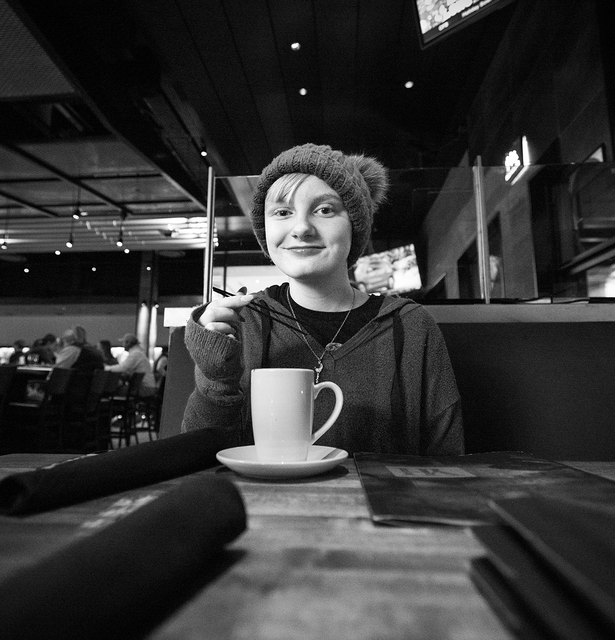
Hi Jo-Ann
Your granddaughter is beautifully exposed, it's amazing what iPhones can do these days! She's sharp throughout and evenly exposed, and the way you've presented her leaves no doubt as to what this image is about.
I am a bit distracted w/the borders surrounding her though, so much so that for me, it detracts from her. Lightroom has some super easy "Select Subject" functionality that could be leveraged to achieve this and of course Photoshop does too, but that does get a little more complicated (although it's getting easier and faster with every new version).
One more consideration point, what is your intent of the use of negative space in this image?
|
Oct 10th |
| 49 |
Oct 22 |
Comment |
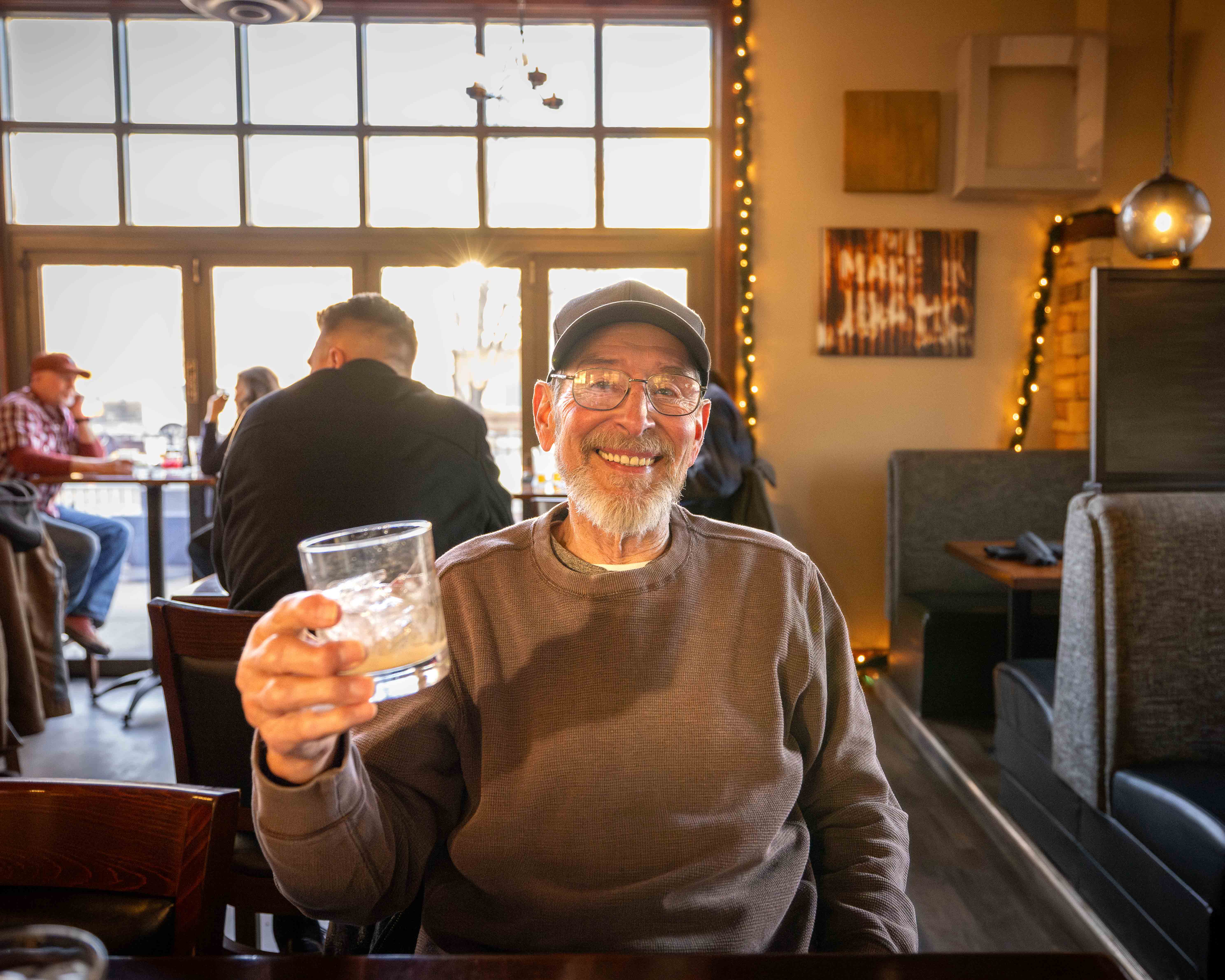
Hi Craig. Fun image - she does look like a character! Nice work on the sky replacement, it adds a nice balance to the image and compliments it well w/out being distracting. If you wouldn't have mentioned it was manually added, I wouldn't have noticed it.
A few things for consideration, bump-up the overall exposure. According to the histogram, there are no whites in this image and not a lot in the way of highlights. Also, the overall image has a softness to it, not sure if it's a slow shudder speed, or something more intentional done in post, but with as much visual interest and detail as this model has, it makes me want to see the detail clearly!
|
Oct 10th |
| 49 |
Oct 22 |
Comment |
Welcome to the group Owen! I was dubious about cropping this image down, but after playing with it a bit - I agree with Jo-Ann. Pulling in the left a bit creates this cool double S-curve that kind of bounces your eye back and forth and pulling up the bottom a bit addresses fuzzy detail that Craig mentioned. I agree on the color too, I think you can safely adjust the vibrance of your yellows (via a few different methods) w/out pushing it over the top and helping more accurately represent this beautiful scene. |
Oct 10th |
6 comments - 8 replies for Group 49
|
6 comments - 8 replies Total
|