|
| Group |
Round |
C/R |
Comment |
Date |
Image |
| 49 |
Sep 22 |
Reply |
Mmmm, I like the crop - a lot (for a number of reasons), good call Craig! And I'm leaving the powerlines and pole ;) |
Sep 18th |
 |
| 49 |
Sep 22 |
Comment |
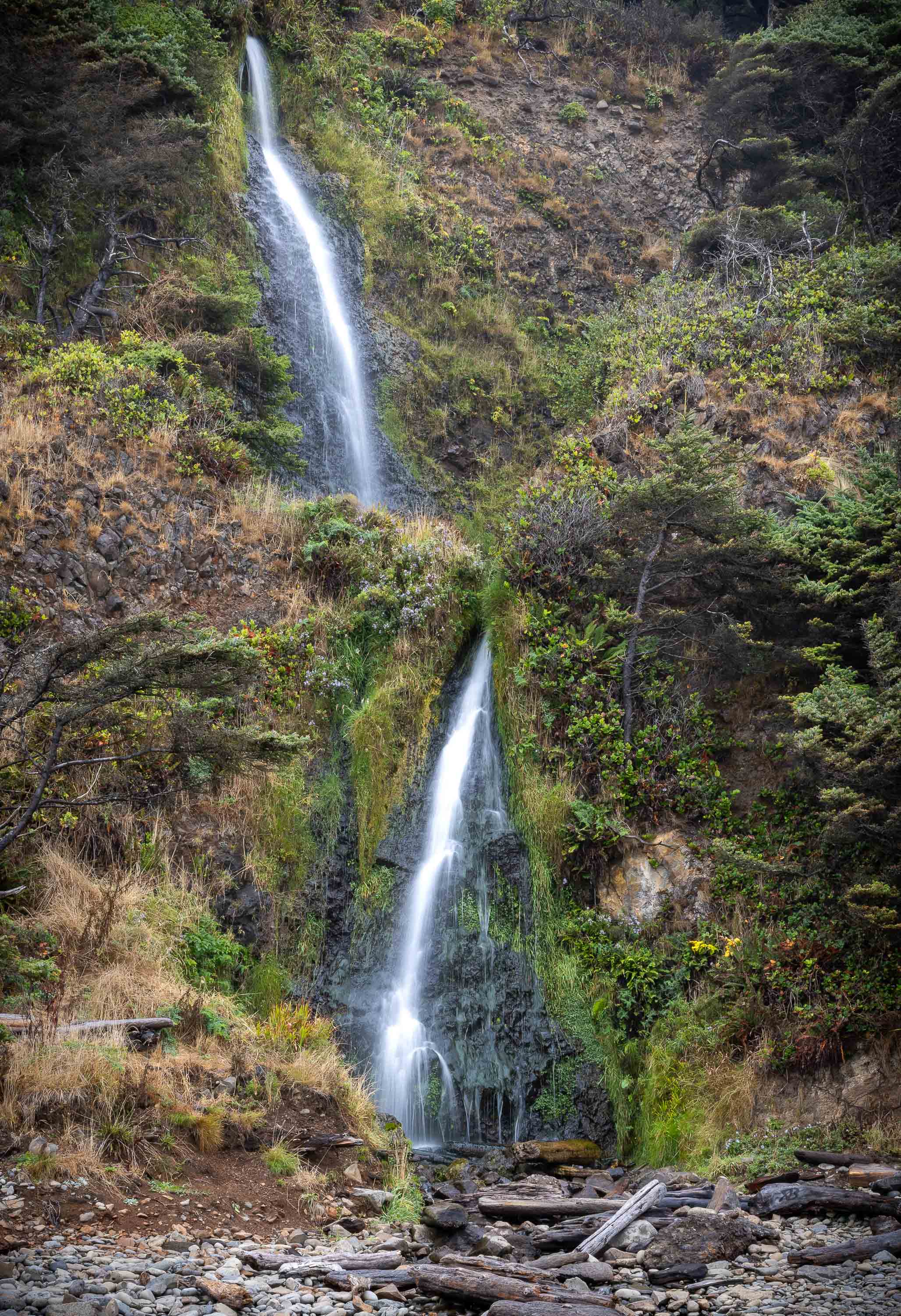
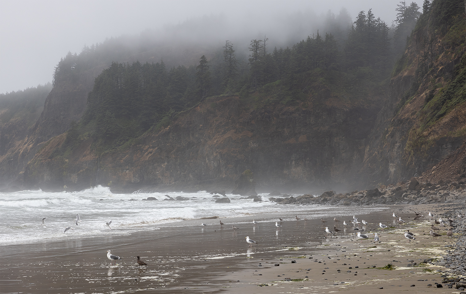
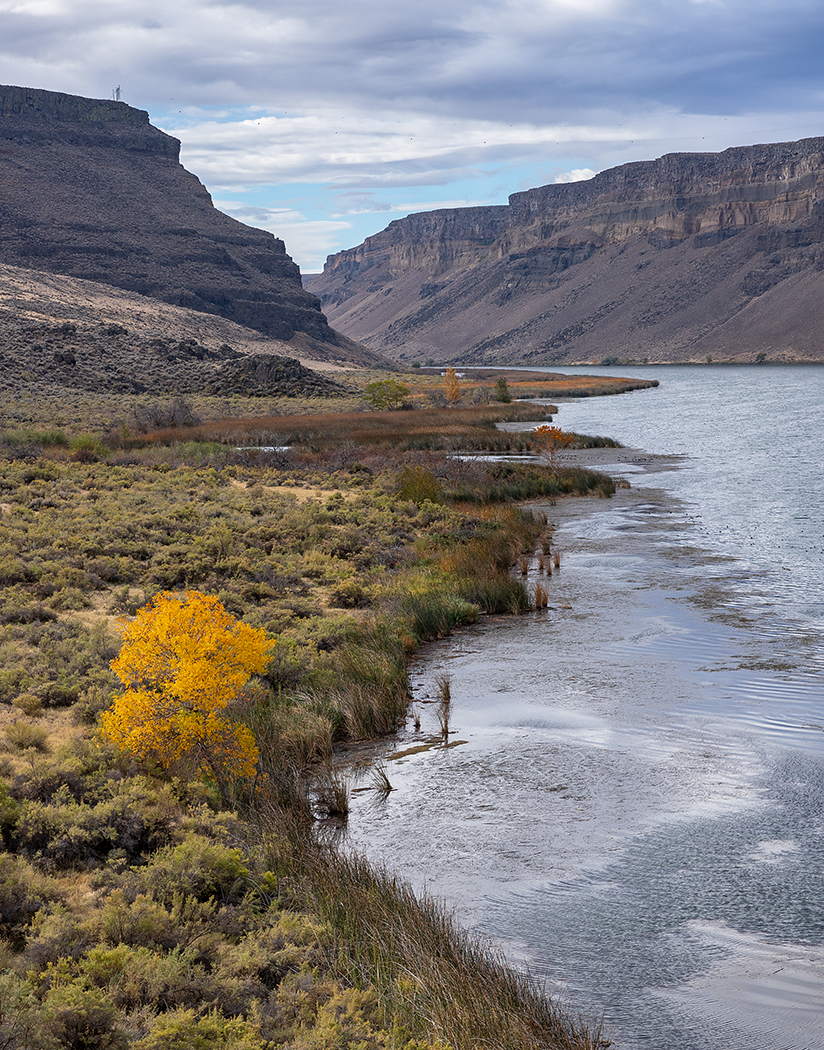
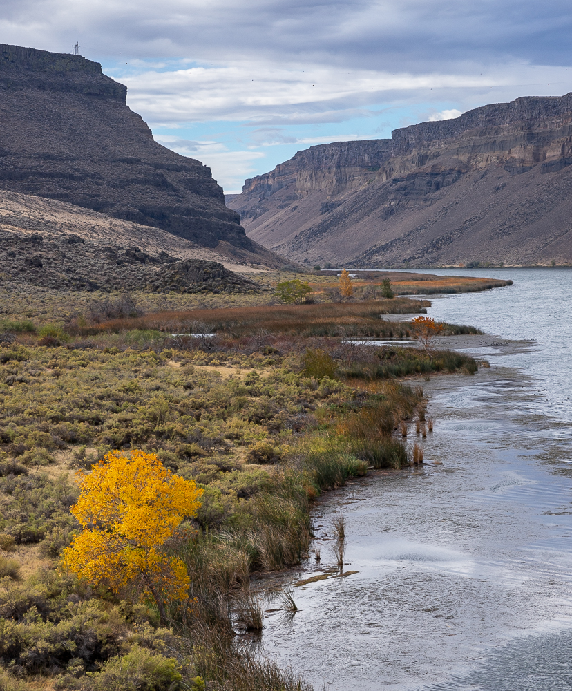
Hi Dicky
Subject-wise, I'm not sure what I'm supposed to be looking at. I think David makes a good point about cropping, and with that - my eye would know where it should be focusing. It appears there is some cool texture in that foreground mud that might make a compelling image, especially w/those birds in the background. The other interesting detail you could have focus on would be to capture the sky that you like in the reflect of those little pools! Just a thought.
|
Sep 17th |
| 49 |
Sep 22 |
Comment |
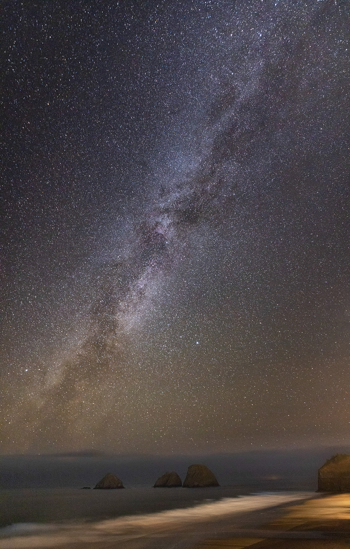
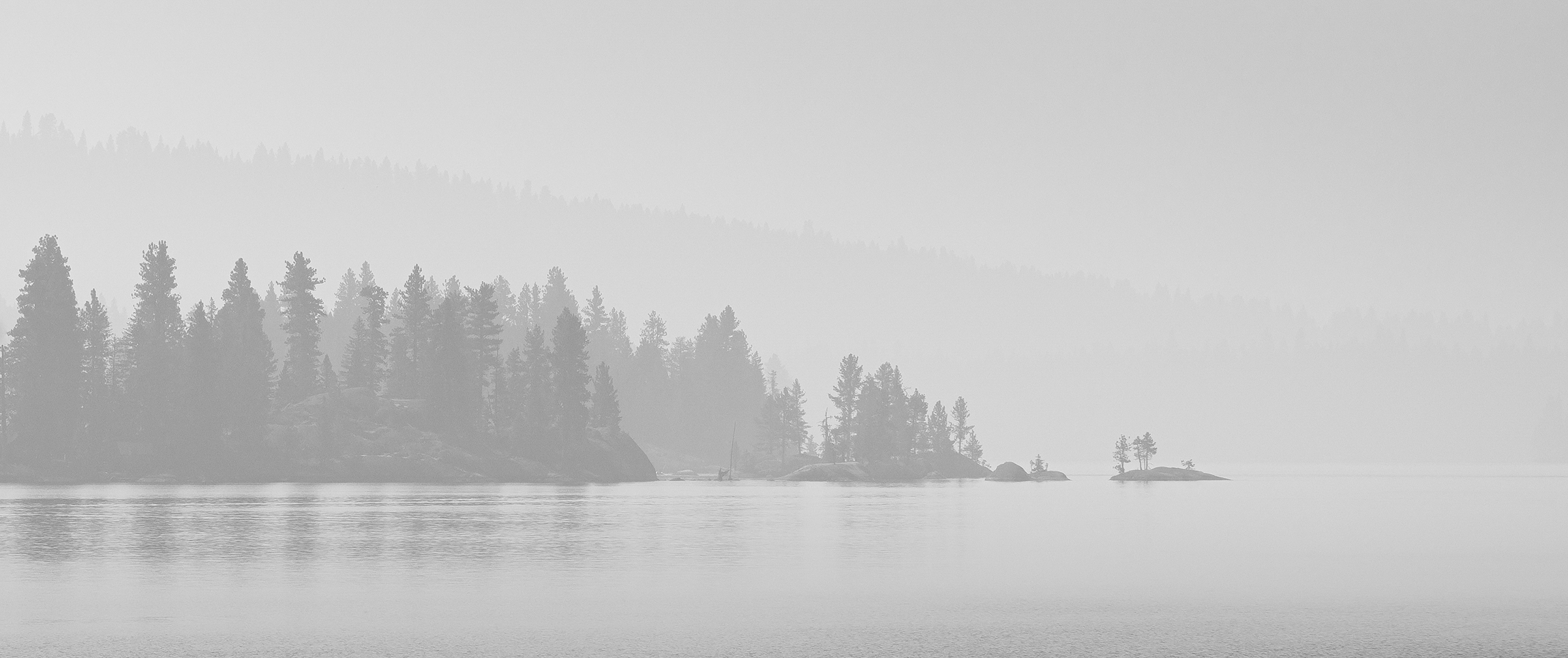
Hi Alan
I agree w/the others about the island's exposure - beautiful capture of the Milky Way!
|
Sep 17th |
| 49 |
Sep 22 |
Comment |
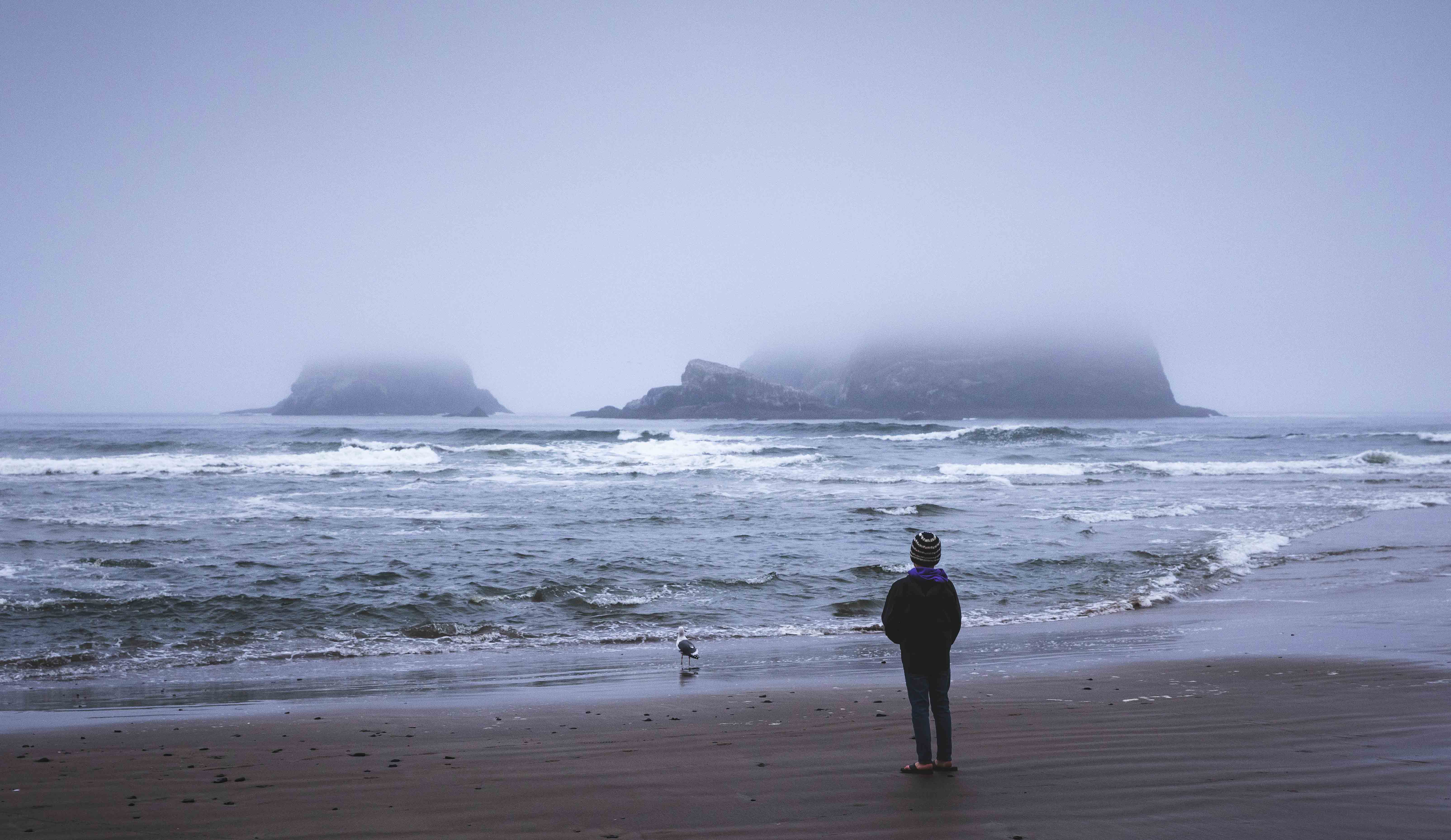
Hi David
What a trip this must have been! The scenery is gorgeous, and it looks like you may have even gotten a little sunlight. Exposure feels about right (nothing blown out, nothing clipped) and the color is nice and bright, but it feels natural - well done.
I am struggling w/the composition a little�� With the giant swath of green, and the lighthouse being such a proportionately small part of the image, I feel like that deemphasizes it. Perhaps a little more rocky coast and ocean (and maybe use a few more millimeters of that big ol' lens to zoom in) may have strengthened the lighthouse story for me. The way the image is framed now, I've got about 50% of my brain wanting to see what's over in the green field and the other 50% wanting to see more ocean, and neither side is happy about it 😉 |
Sep 17th |
| 49 |
Sep 22 |
Comment |
Hi Jo-Ann
The first thing that catches my eye about this image is that it's not level - a quick easy fix to strengthen your image. Also, the bottom edge of the plinth has just a sliver of exposure which is a bit distracting. If your raw image has a little space under that, I'd include that to provide separation with the edge of the image. If it doesn't, I'd level it and then crop up just a bit, so you've got a nice solid dark line and that lighter colored stone lip will act as a nice border.
Not sure if it was an option but shifting your perspective so that the weeds aren't obstructing your subject would be something to consider too.
|
Sep 17th |
| 49 |
Sep 22 |
Comment |
Nice capture Craig - I bet the raw of this looked very different from what you've shared, with that bright background. The depth of field separation works really well, super soft and pleasant and even the yellow flowers balance out the bird's bill nicely.
The detail of the bird is amazing, sharp through-and-through, from those great neck feathers, to the detail in the bill, to the eye.
The only suggestion I'd make would be to do a little more of what you've already done, in terms of lightening the subject and possibly darkening the background. It still feels a little "glowy" and like my eye is being pulled to the brightest thing on the screen, despite it not being the subject. |
Sep 17th |
| 49 |
Sep 22 |
Reply |
Hi Dicky, they're actually not sensor spots - they're visibility markers for airplanes, but you, along with David, as well as my wife all seem to think they should go! |
Sep 17th |
| 49 |
Sep 22 |
Reply |
Hey David, thanks for the feedback! Yours confirms my usual challenge of overcoming my inclination to not overdue my edits (especially when it comes to dodging/burning and emphasizing). In an effort to not overdue it, I often end up not achieving what I set out to do. Oh well - I will keep trying!
Your comment about the tower cracks me up - my wife said the same thing, but I liked it and the visibility markers spanning the gap - like a little Easter egg. Dicky thought they were sensor spots - guess I'm in the minority here ;) |
Sep 17th |
5 comments - 3 replies for Group 49
|
5 comments - 3 replies Total
|